Pricing|
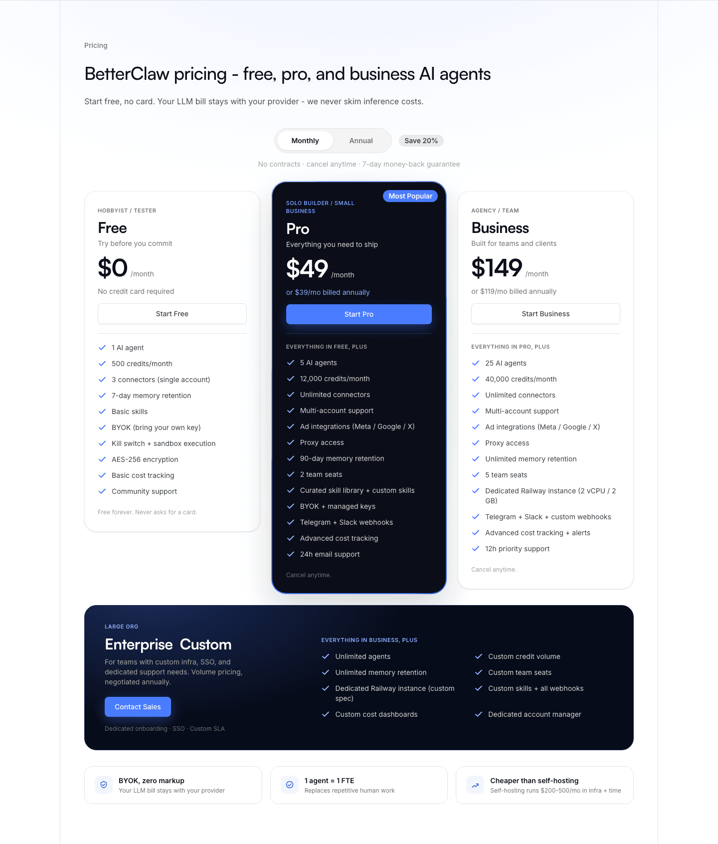
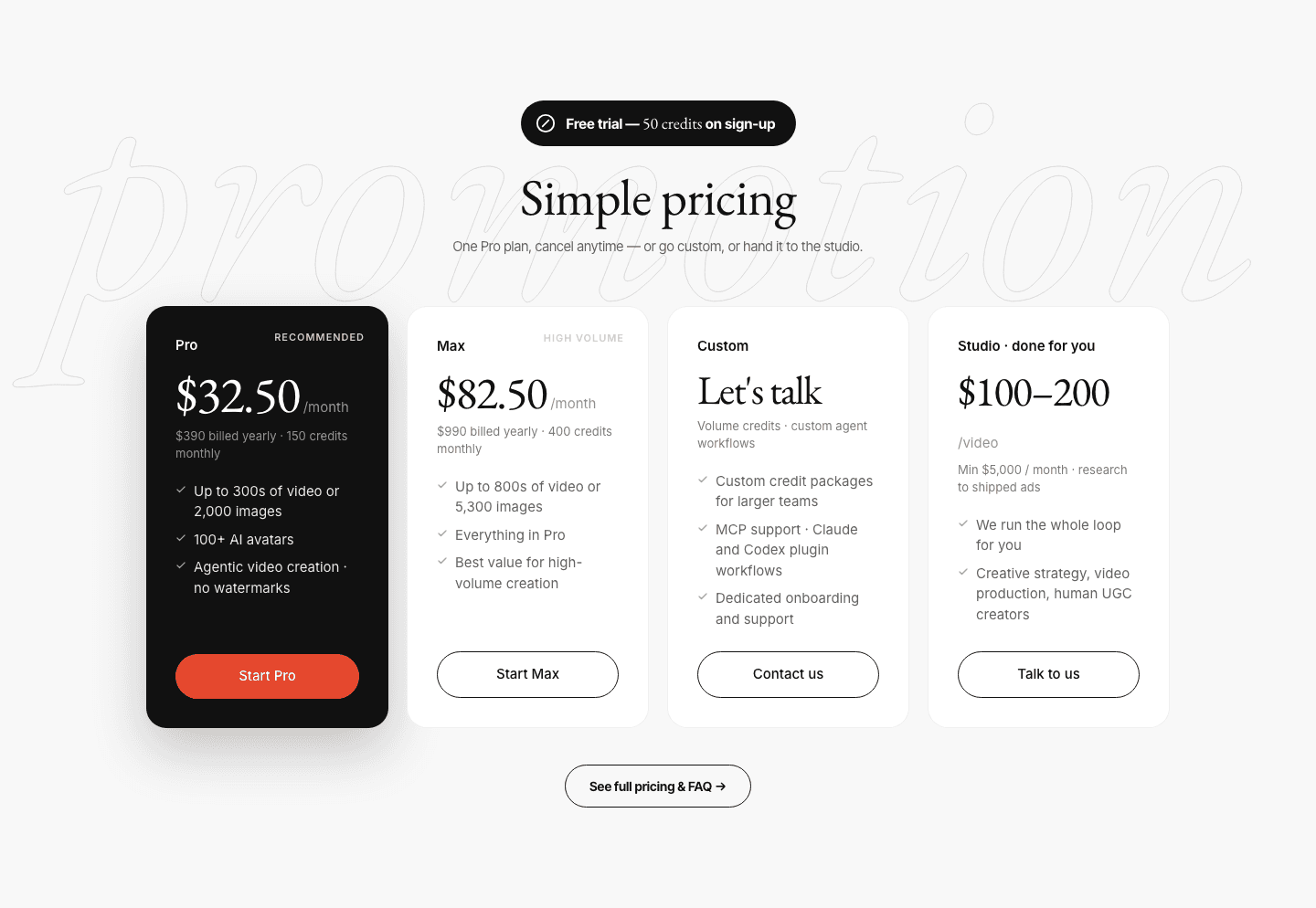
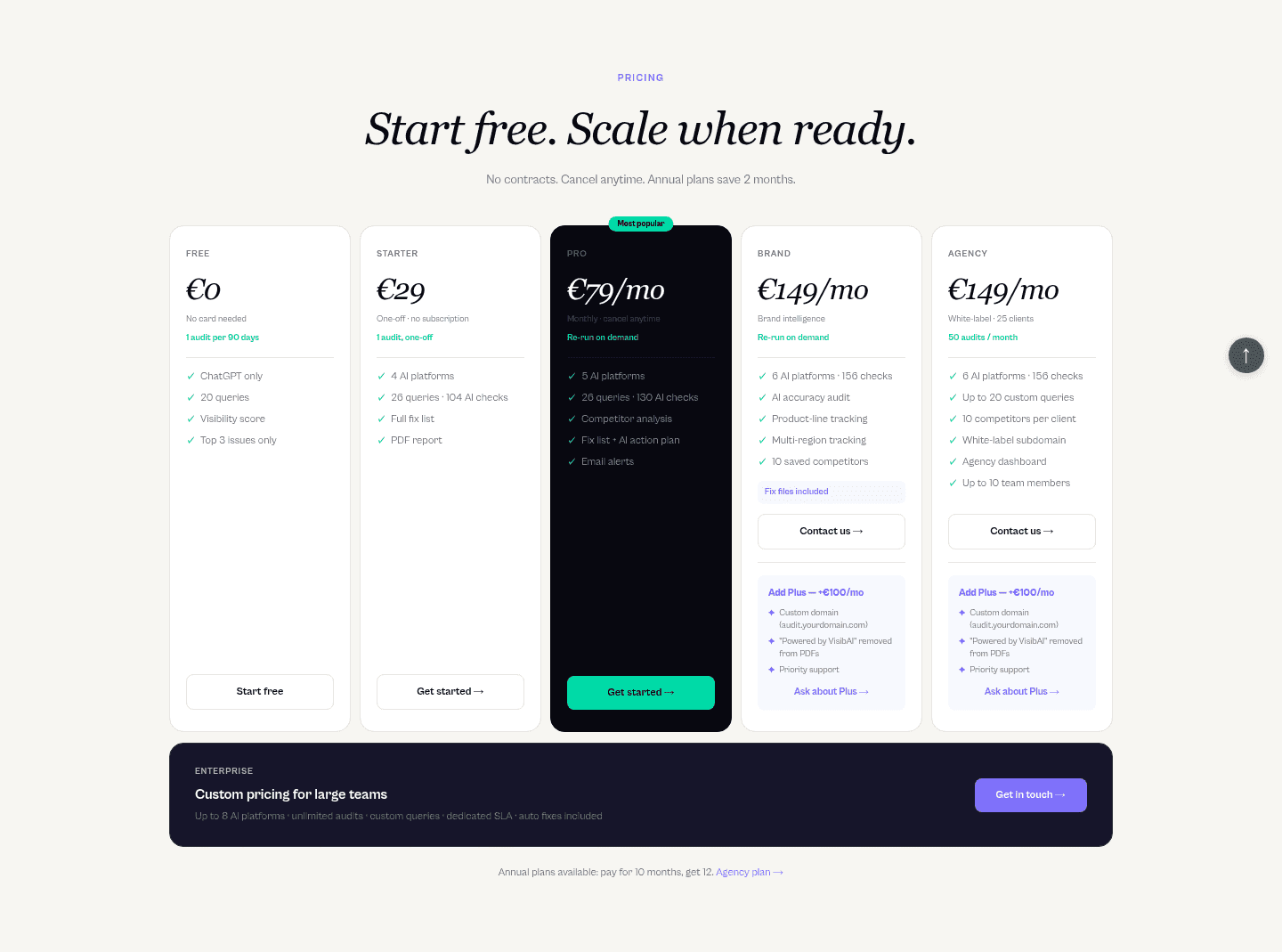
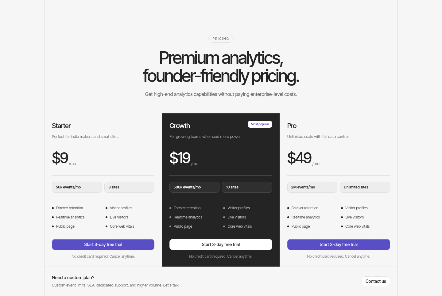
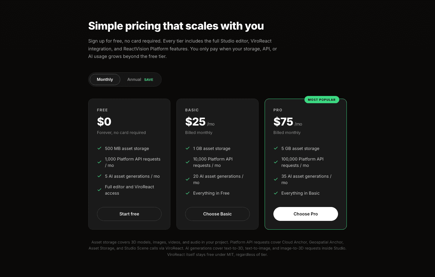
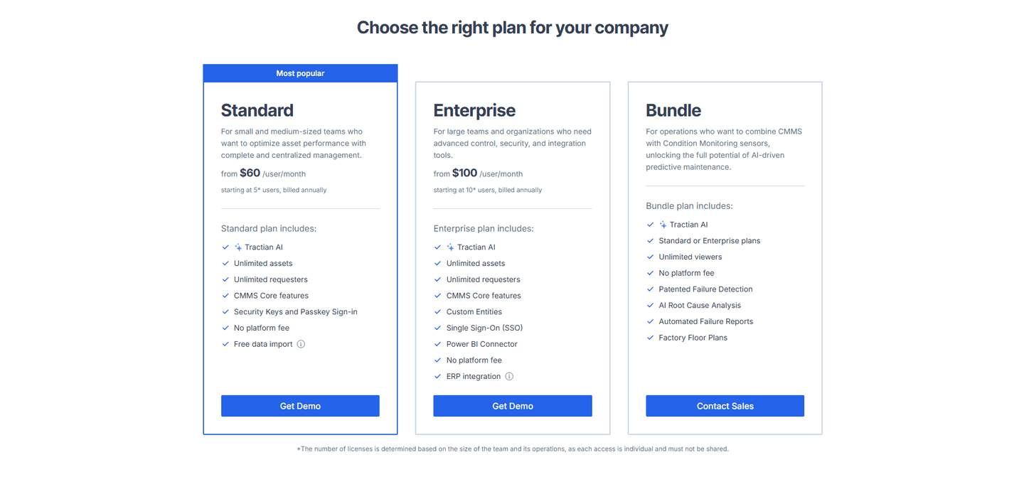
A 'Most Popular' or 'Recommended' badge, paired with a highlighted card, steers attention to one plan so a visitor facing several tiers has an obvious place to start.
Key takeaways
Showing 1–28 of 57 examples

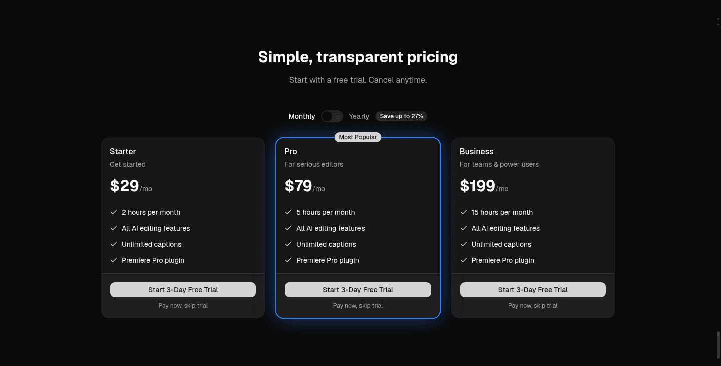
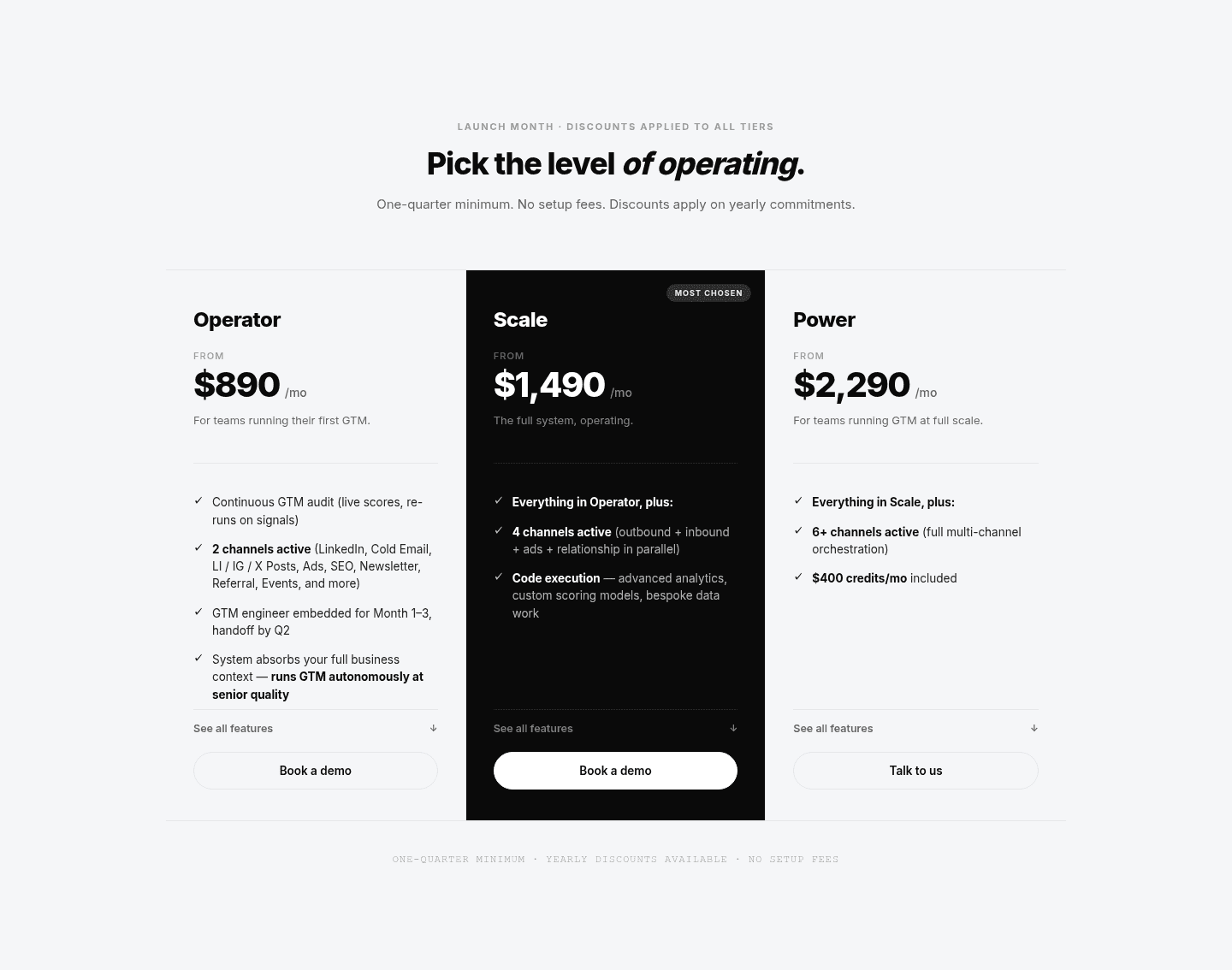
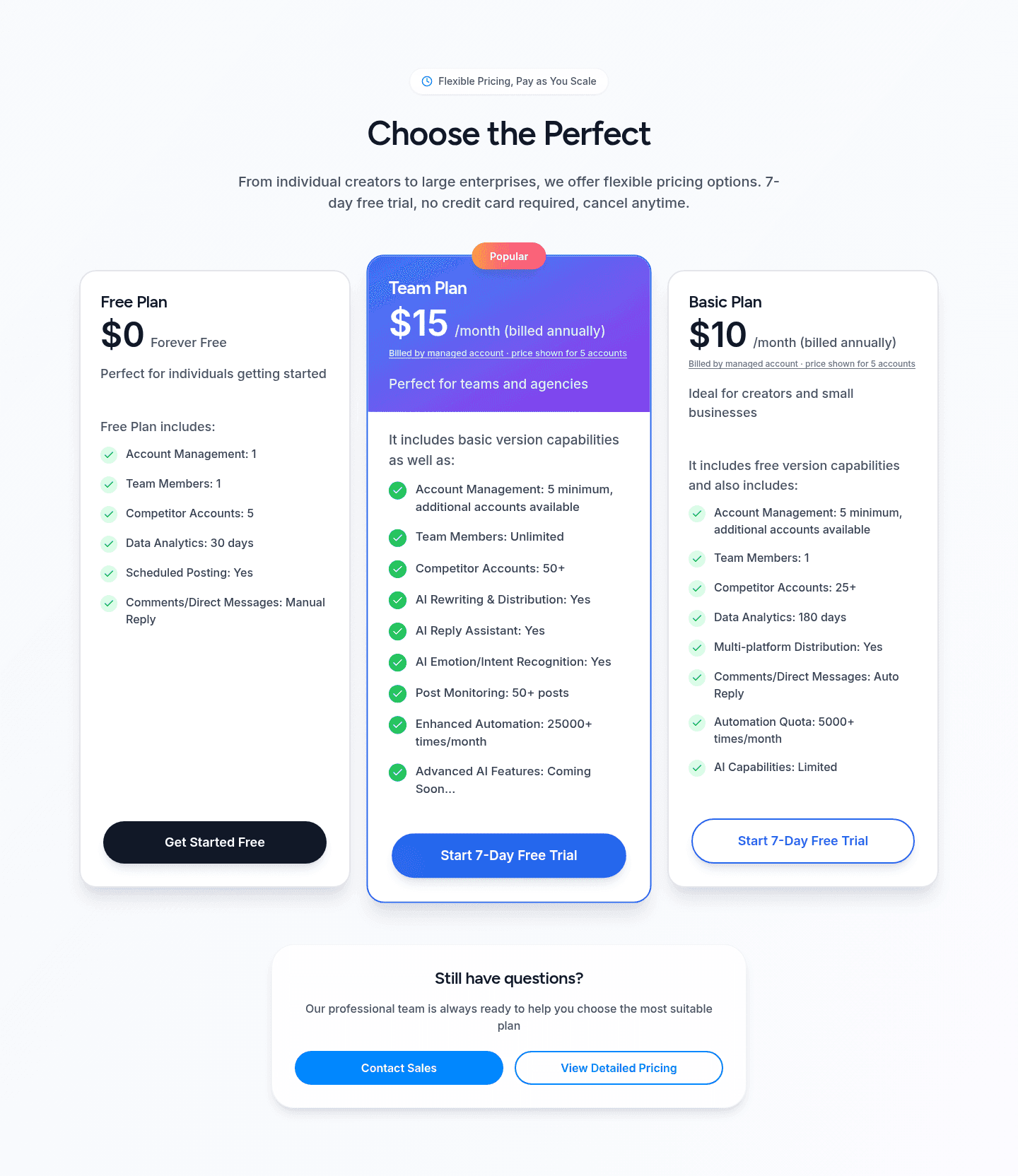
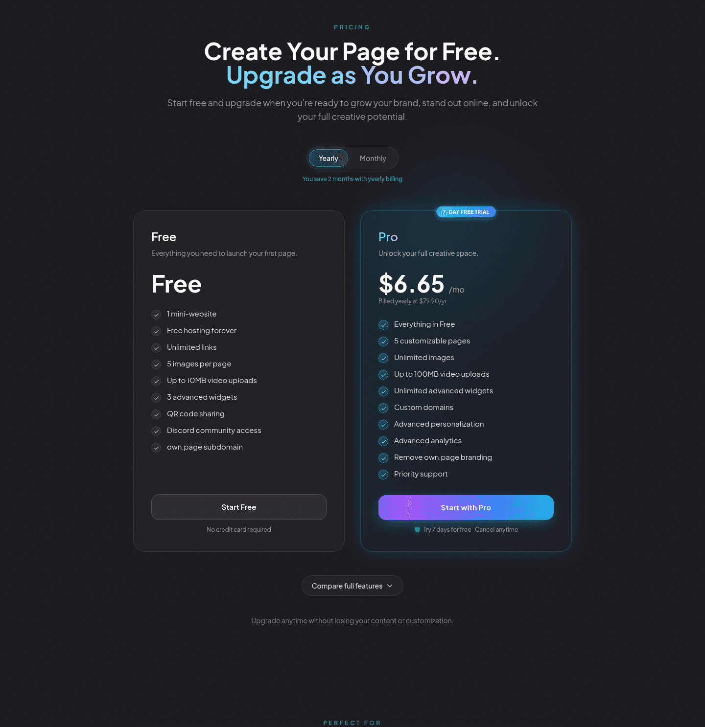
Browse every pricing pattern by UX best practice, or jump to an industry view.
Every pricing section is scored across 8 conversion best practices. Copy the best practice stack, not the layout. See what converts and why.
Hand-picked from {companies} companies and analyzed by our AI conversion agent. Not a random dump of pricing tables. Every entry earns its spot.
Found a pricing table you admire? Run yours through the same scoring engine. See where you stand on the same best practices, and what to fix first.
An anchoring badge is the decision to mark one plan as the recommended choice instead of presenting every tier as equal. A pricing table with three or four similar cards leaves the visitor to compare all of them at once. A single "Most Popular" tag on one highlighted card turns that open comparison into a default they can accept or adjust, which is a far easier decision to make.
The badge shows up in a few consistent forms, and the strongest pricing sections combine the tag with a visual cue so the plan reads as recommended at a glance:
Faced with several priced tiers, a visitor has to do the sorting themselves, and that work is where hesitation creeps in. Marking one plan as the popular choice hands them a starting point. Accepting a default, or nudging one step up or down from it, is easier than building the decision from nothing.
The badge also sets a reference price. Once one plan is the anchor, the cheaper tier reads as the basic option and the pricier one as the upgrade, so the marked plan lands as the sensible middle. That is why the anchored plan is so rarely the most expensive one: the pattern works by making a genuinely reasonable plan feel like the obvious pick, not by steering buyers to the top of the table.
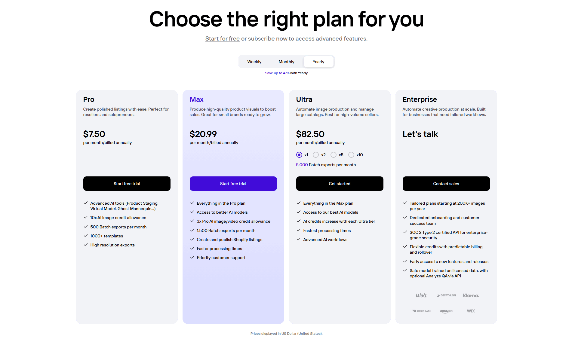
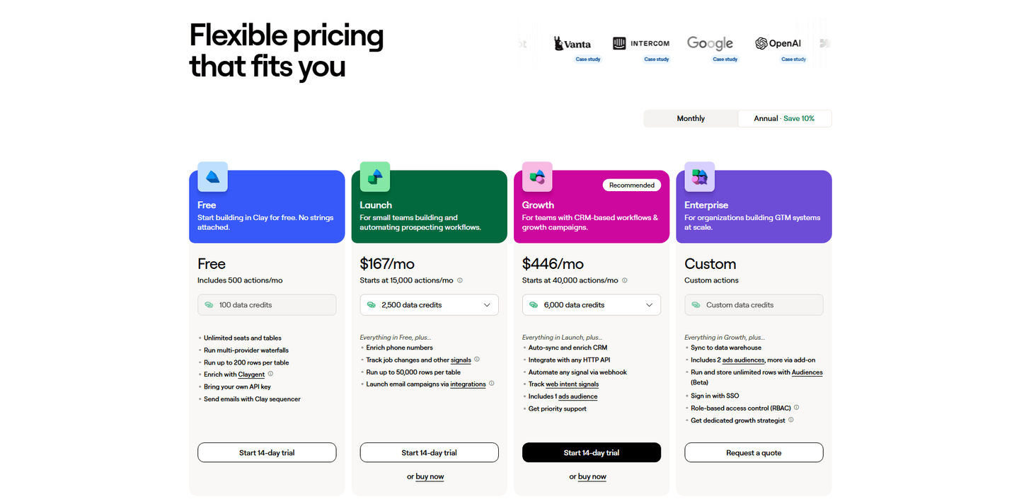
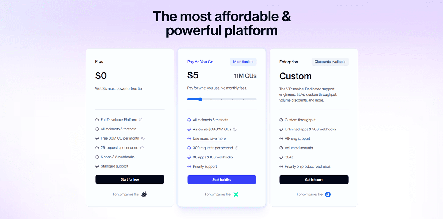
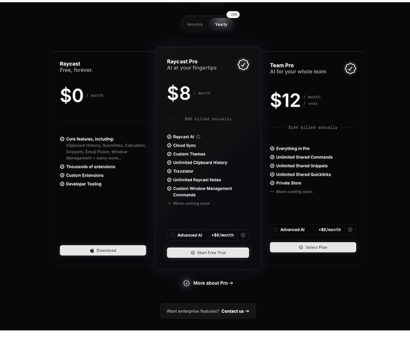
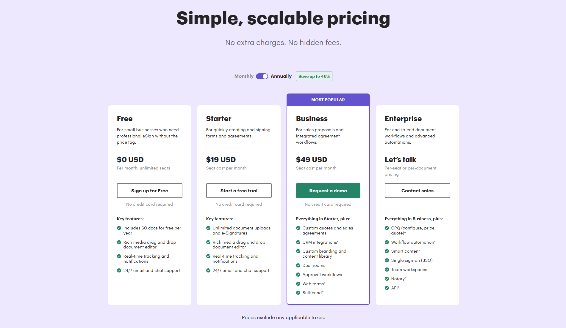
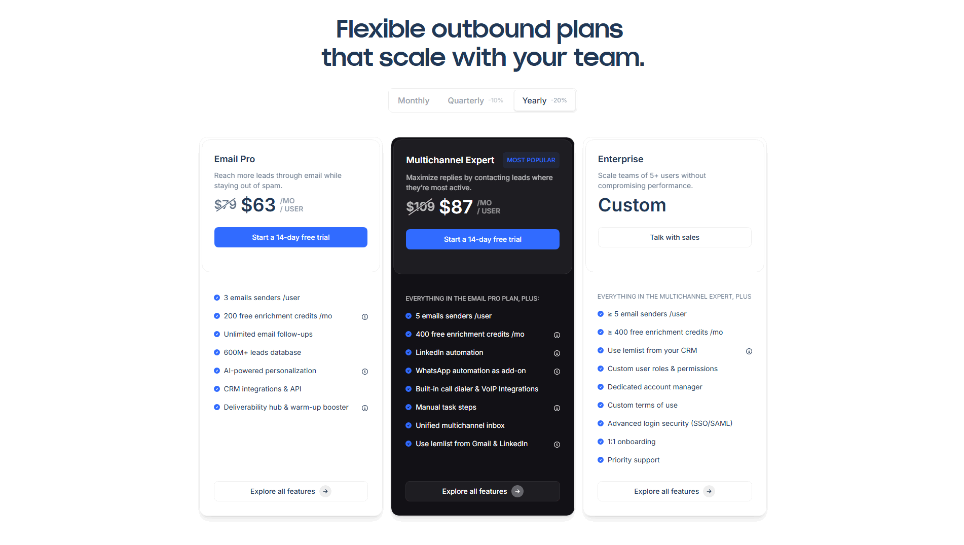
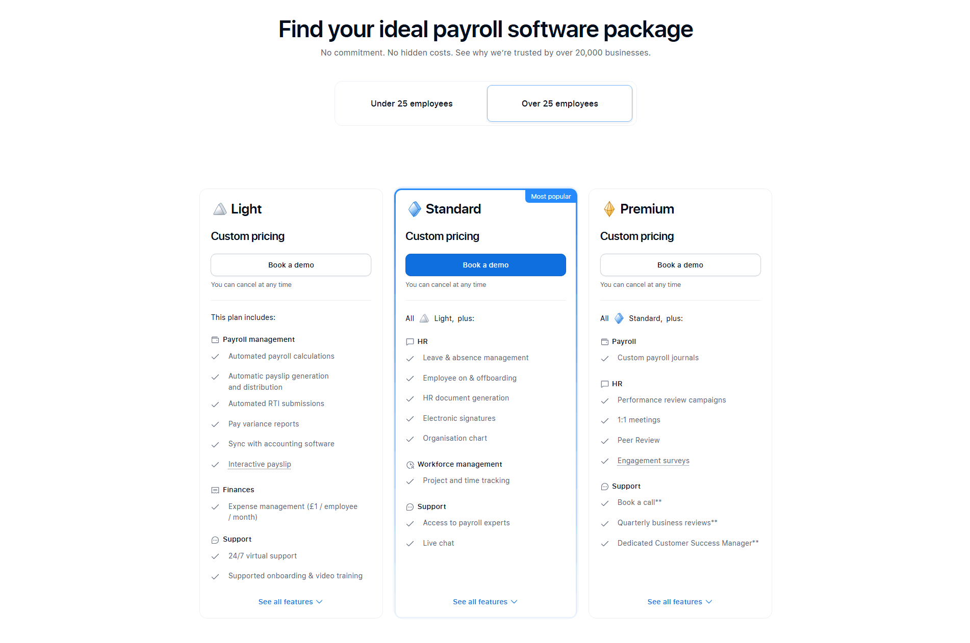
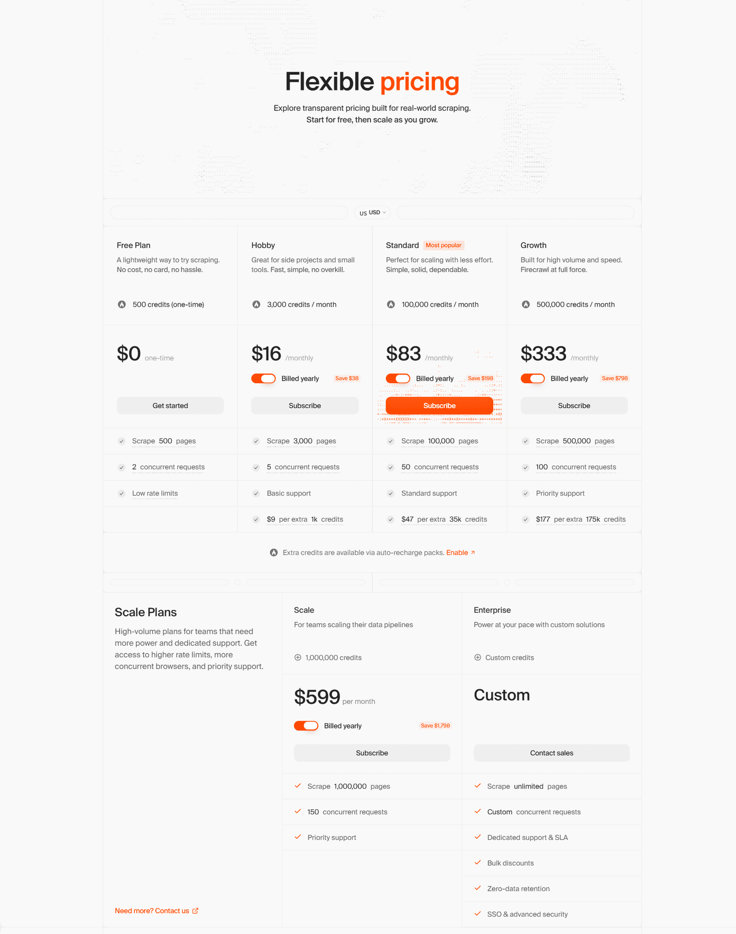
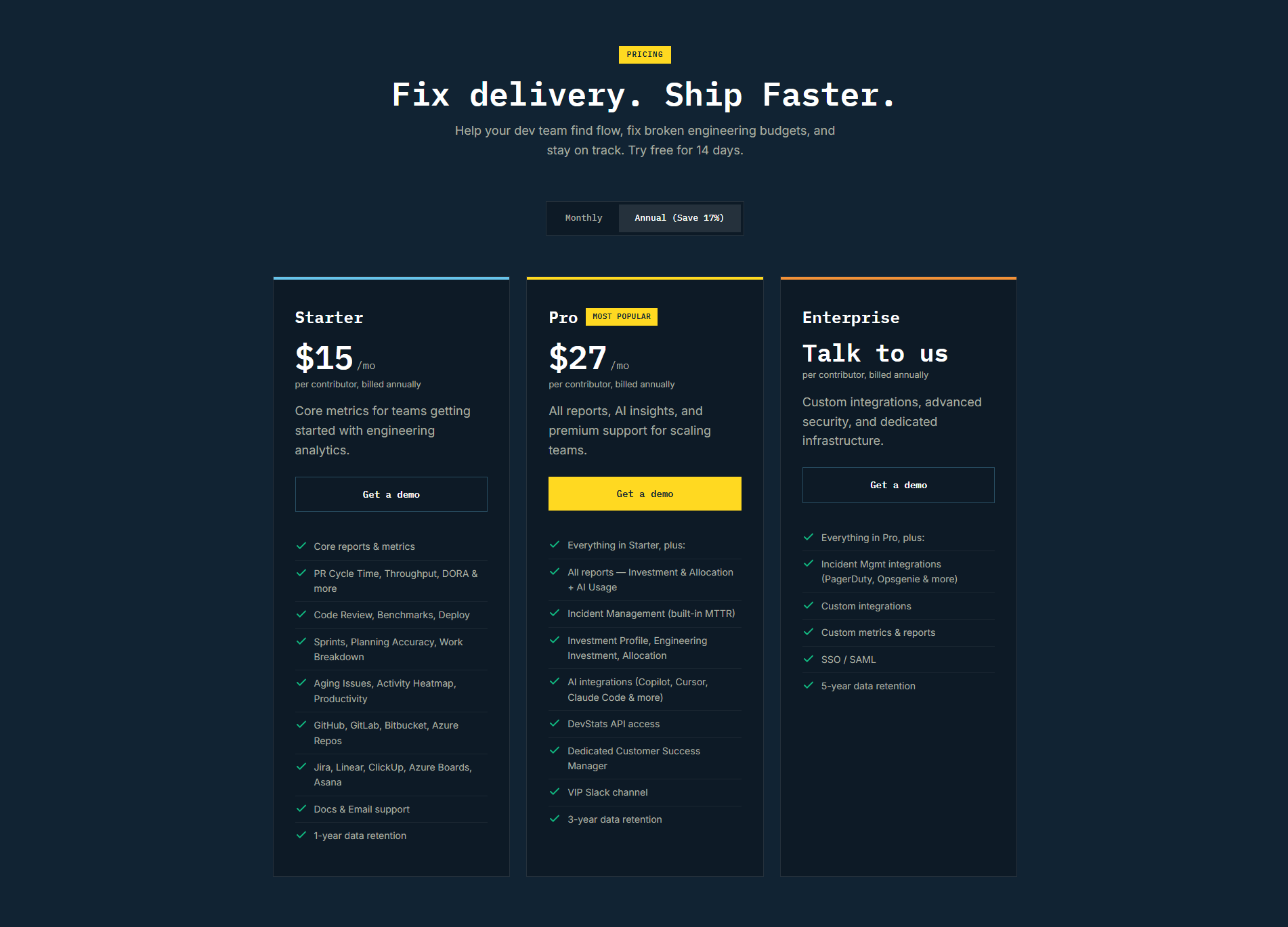
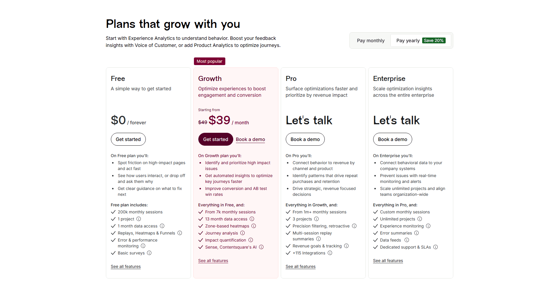
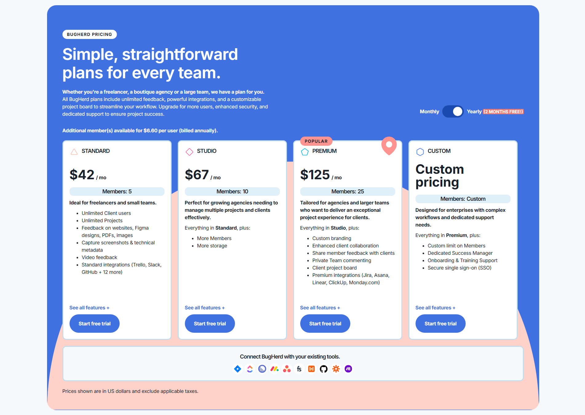
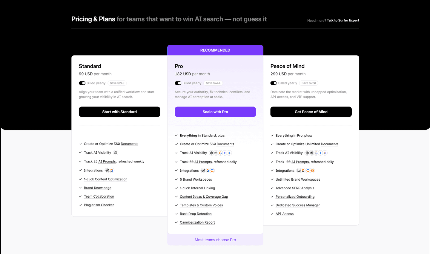
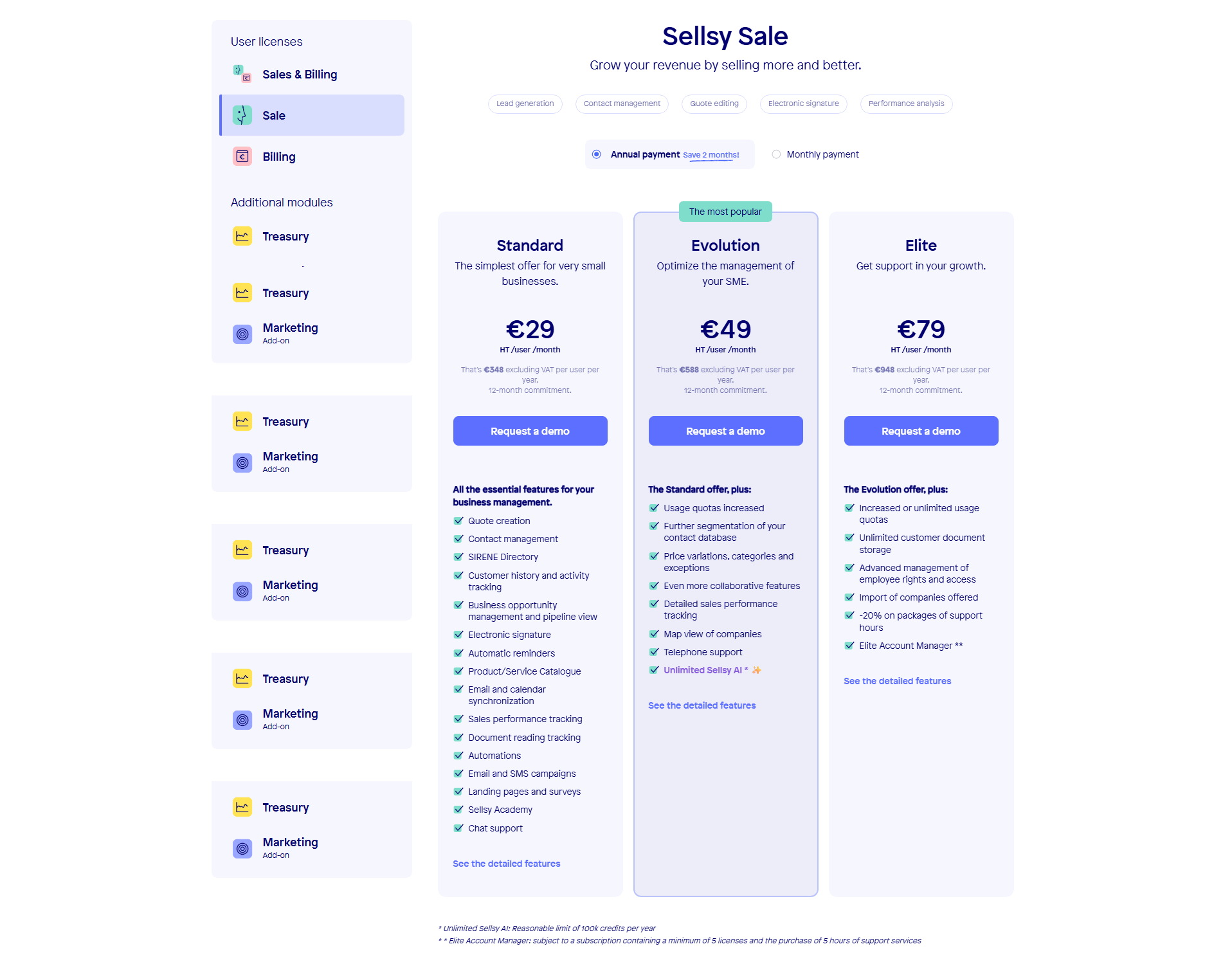
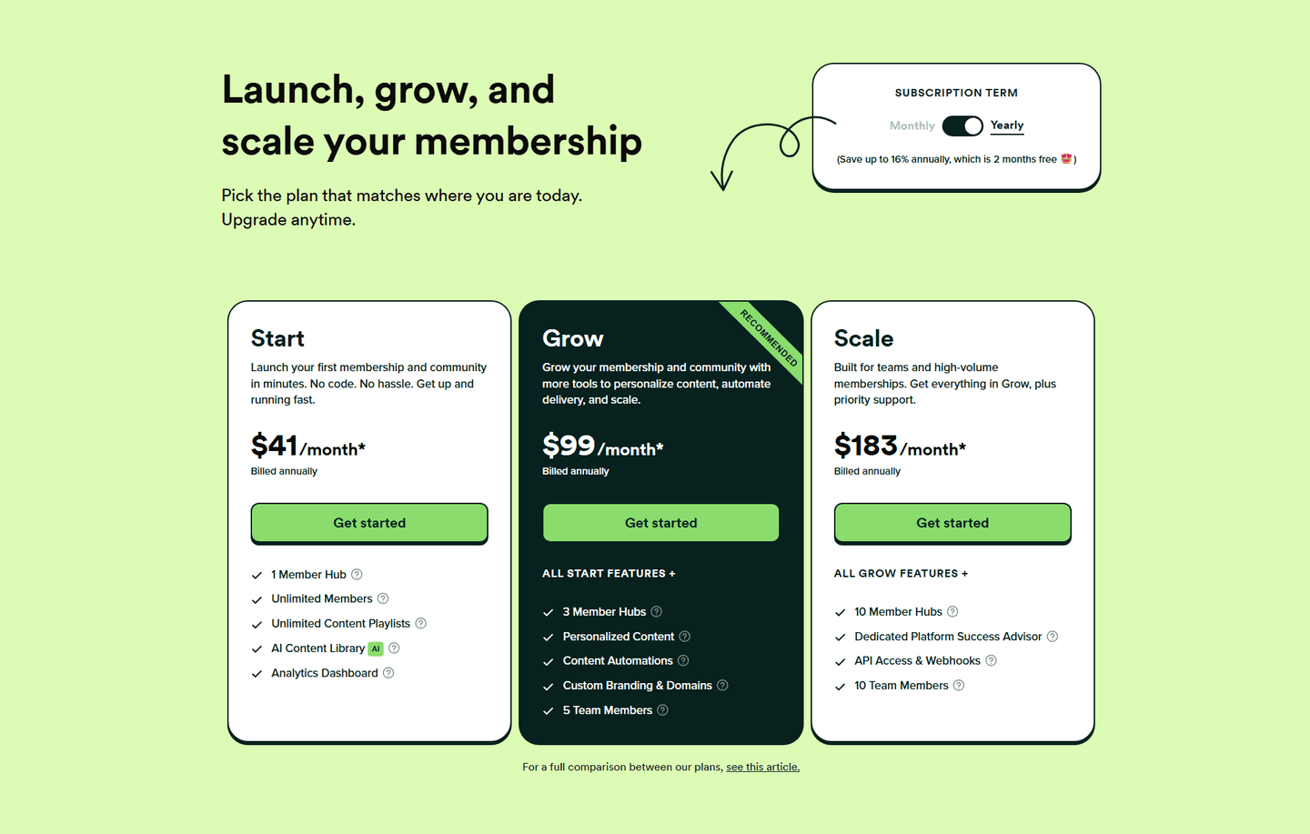
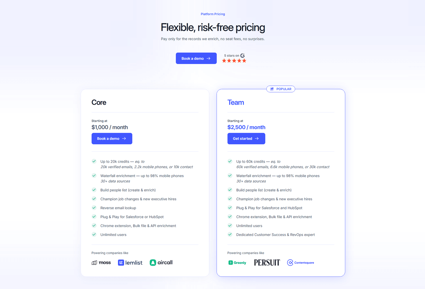
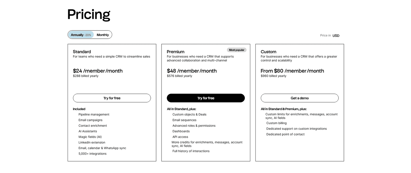
Nearly two-thirds of the scored pricing sections in the library anchor one plan this way. Across the examples below, the discipline is consistent. The badge sits on a single tier, and it is almost always the middle or the primary paid plan: Surfer SEO, Lemlist, Contentsquare, and Sellsy all anchor a mid tier, PandaDoc puts its "Most Popular" ribbon on the Business plan, and PhotoRoom highlights its Max plan rather than the pricier Ultra tier above it. Alchemy and Raycast do the same on a usage or recommended paid plan.
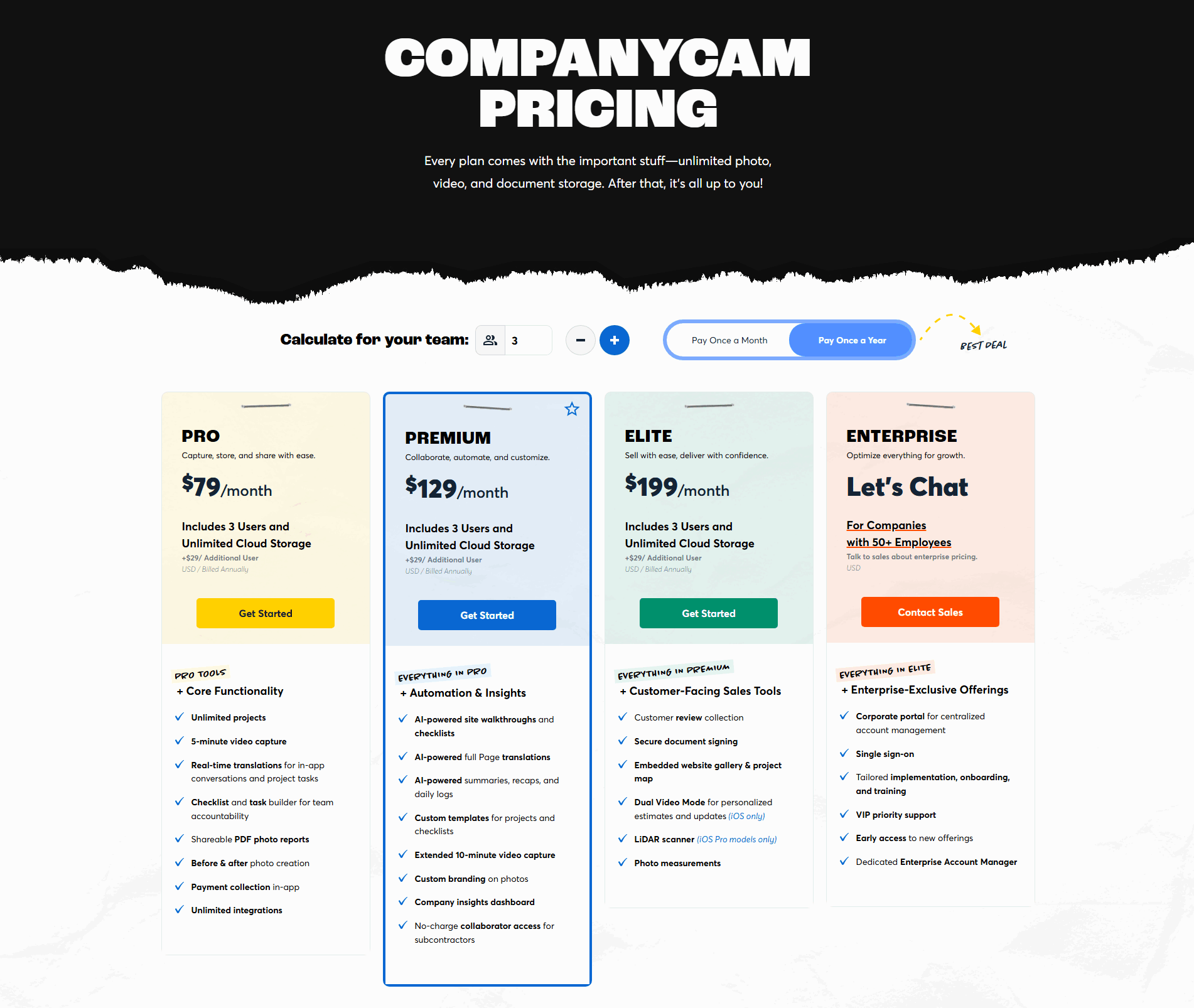
The badge almost never stands alone. PandaDoc pairs it with a purple highlight and ribbon, CompanyCam with a blue border and a star, Lemlist and Membership with a dark filled card, and Surfer SEO with a highlighted card and the line "Most teams choose Pro". The tag names the choice; the visual weight makes the eye land there first. The anchor also works hardest when the surrounding table is easy to read, so the best pricing sections pair it with a clear annual and monthly toggle and risk reducers under the CTA so the anchored plan sits inside a table a buyer can actually scan.
100/100 11/100
The usual failure is a badge with no visual weight: a "Most Popular" tag in plain text on a card that looks identical to the others, easy to skim straight past. The second is over-marking, where two or three plans each carry a badge, which cancels the effect and drops the visitor back into comparing everything at once. The third is anchoring the most expensive tier, which reads as a sales push rather than a recommendation and undercuts the trust the badge is meant to build. Mark one plan, usually the middle tier, give it real visual weight, and let the rest of the table stay quiet.

Curated by
Gabriel Amzallag , Founder, Web Anatomy
5 years CRO + SEO at Qonto (2021–2025). After advising 15+ SaaS on their websites (Payfit, Pigment…), the same patterns kept breaking, so I decided to build the source of truth on what works on the web: the intelligence layer every tool, builder, and team uses to ship sites that perform.
Paste your URL. Get a scored analysis of your pricing section, including whether it anchors one plan clearly. Free, no signup.
The common questions about the 'Most Popular' badge in pricing, with answers drawn from 57 scored examples.
It is the small tag on one plan card that reads 'Most Popular', 'Recommended', 'Best Value', or 'Most Chosen', usually paired with a visual highlight on the same card. It tells a visitor which plan most people pick, so they have a default to compare the others against instead of weighing every tier from scratch.
A table of three or four similar tiers puts the whole comparison on the visitor. Marking one plan as the popular choice gives them a starting point, which is easier to accept or adjust than an empty decision. It also sets a reference price: once one plan is the anchor, the cheaper tier reads as basic and the pricier one as an upgrade, so the marked plan feels like the balanced pick.
Across the scored examples, the badge almost always sits on the middle tier or the primary paid plan, not the most expensive one. Surfer SEO, Lemlist, Contentsquare, and Sellsy all anchor a mid tier, and PhotoRoom highlights its Max plan rather than the pricier Ultra tier above it. The anchored plan should be the one most buyers would genuinely be happy with, so the recommendation reads as helpful rather than pushy.
Almost always. In the strongest examples the badge never stands alone: it pairs with a filled card, a colored border, or a ribbon so the eye lands on the plan before the words are even read. PandaDoc uses a purple highlight and ribbon, CompanyCam a blue border and star, and Lemlist a dark filled card. A badge in plain text on an otherwise identical card is easy to skim past.
One. The badge works because it singles out a plan; putting a tag on every card cancels the effect and leaves the visitor back where they started, comparing everything at once. Pick the single plan you want most buyers to choose, mark it clearly, and leave the others plain.
