Contact|
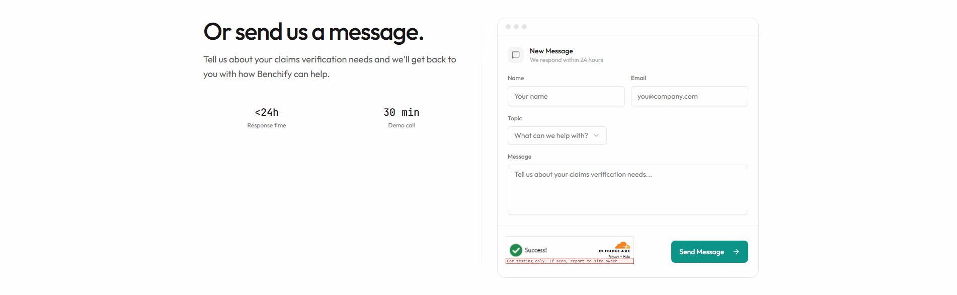
A response-time commitment tells a visitor exactly how fast a real person will reply, so hitting send stops feeling like shouting into a void.
Key takeaways
Showing 1–5 of 5 examples
Browse every contact pattern by UX best practice.
Every contact section is scored across 5 conversion best practices. Copy the best practice stack, not the layout. See what converts and why.
Hand-picked from {companies} companies and analyzed by our AI conversion agent. Not a random dump of contact forms. Every entry earns its spot.
Built a contact section? Run yours through the same scoring engine. See where you stand on the same best practices, and what to fix first.
A response-time commitment is the decision to answer one silent question every visitor asks before they fill out a contact form: if I send this, when will I hear back? Most forms leave it unanswered. A contact section with this pattern states the reply window in plain words, on the form itself, so the visitor knows what they are agreeing to before they type a single character.
The commitments in our library take a few concrete shapes:
Sending a contact form is a small act of trust with an uncertain payoff. The visitor gives up their email and their intent, then waits with no idea whether the reply comes in an hour or never. That gap is where second thoughts live. A stated reply window closes the gap at the exact moment of hesitation, and the form stops reading as a message dropped into a void.
There is a second effect that is easy to miss. A company willing to name a deadline is making a promise it can be held to, and visitors read that as confidence. The specific number does the persuading: "within 24 hours" lands as a fact a real team has organized itself around, while "we will be in touch soon" lands as the thing every form says and no one means.
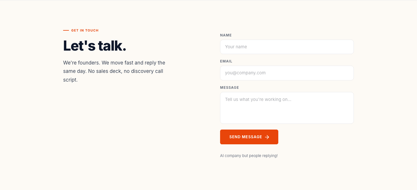
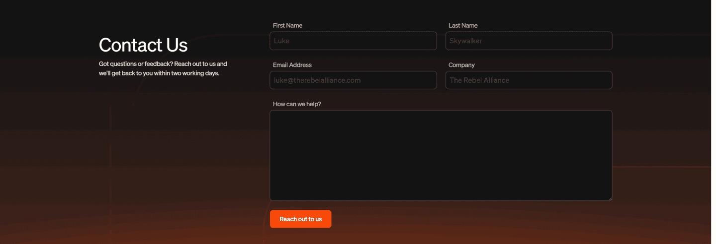
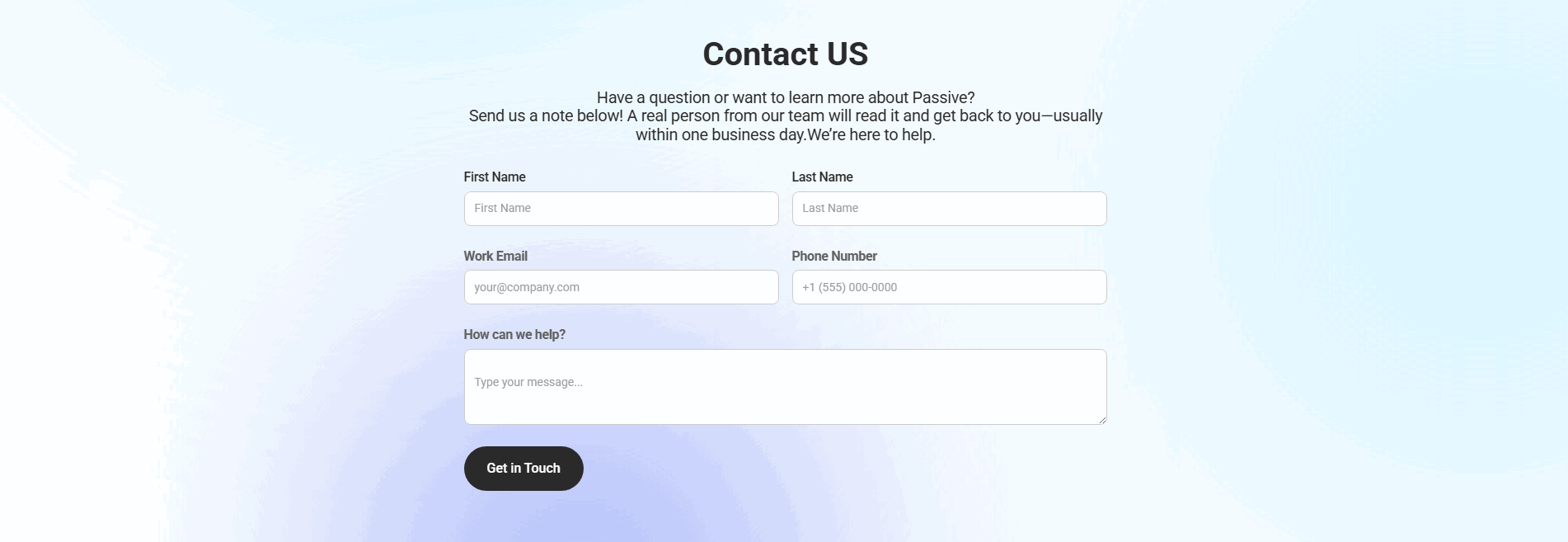
This is a rare move. Fewer than one in ten of the contact sections in our library states a response time at all, which is exactly why it stands out when a page does. Across the scored examples below, the pattern that works is a specific, modest promise placed where the visitor is about to act. Benchify prints "we respond within 24 hours" in the form header. Tobiko Cloud states it will get back within two working days. Passive promises that a real person reads the note and replies, usually within one business day. Causo for Fundraising goes further and names who is answering, telling visitors the founders reply the same day.
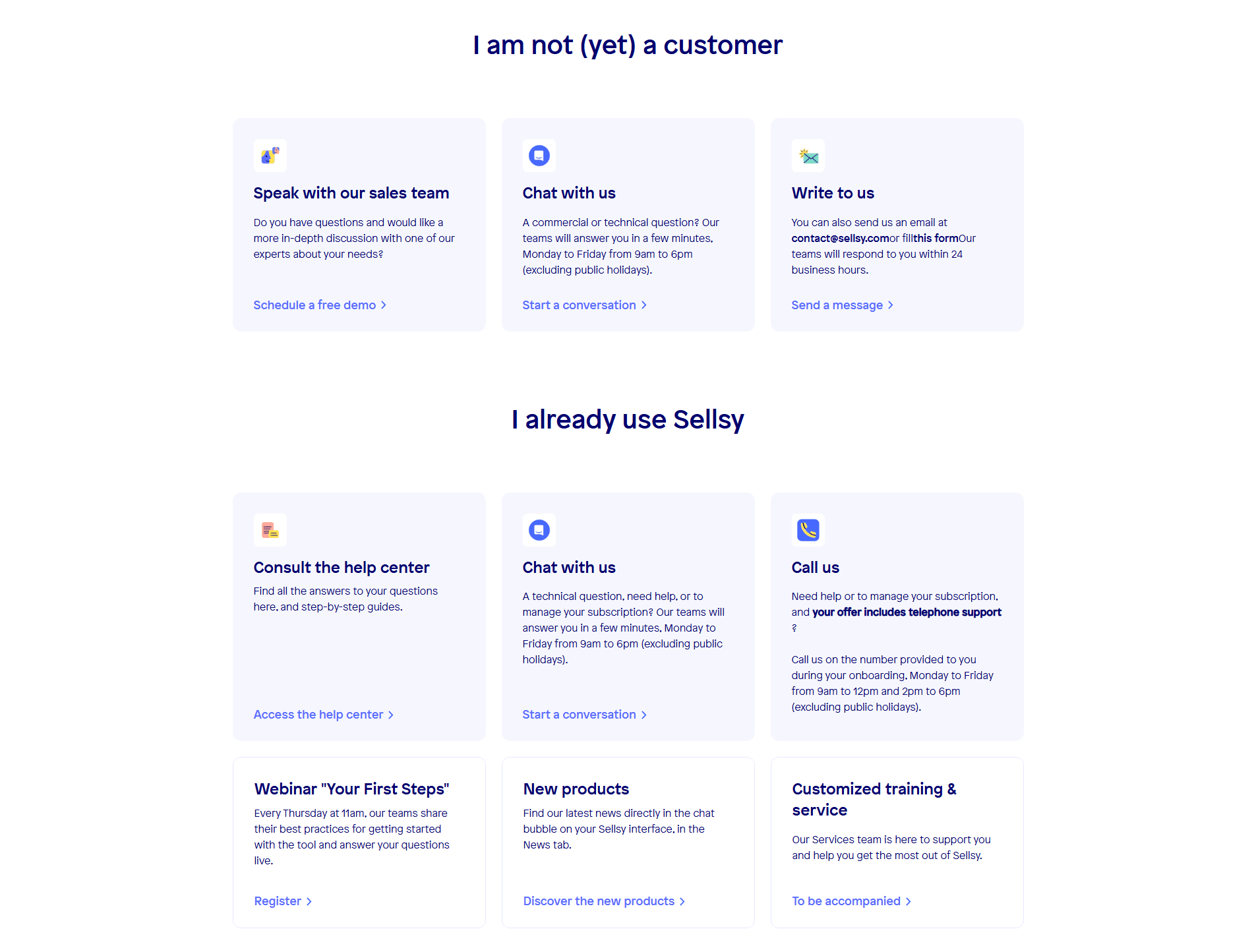
The best versions pair the promise with a genuinely light form, since a reply commitment means little if the form is exhausting to complete. The disciplined pages keep the ask short and honest, the same instinct behind a short contact form and a clear confirmation of what happens after submit. Sellsy shows the fuller expression of the idea, stating that email replies land within 24 business hours and chat answers within minutes, with the hours a person is reachable spelled out.
100/100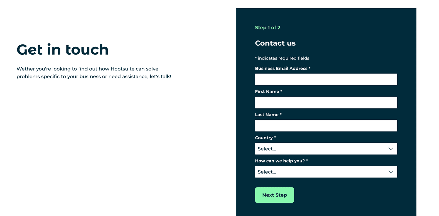 0/100
0/100The usual failure is the empty promise: "we will get back to you as soon as possible," which names no window and reassures no one because every form says it. The second failure is over-promising. A page that pledges a two-hour reply and then goes quiet for three days has spent trust rather than built it, so the safe move is to commit to the window you can hold on your worst day. The third failure is placement, where a real, specific promise is written but hidden in the footer or held back until a confirmation screen, arriving long after the hesitation it was meant to answer.

Curated by
Gabriel Amzallag , Founder, Web Anatomy
5 years CRO + SEO at Qonto (2021–2025). After advising 15+ SaaS on their websites (Payfit, Pigment…), the same patterns kept breaking, so I decided to build the source of truth on what works on the web: the intelligence layer every tool, builder, and team uses to ship sites that perform.
We find every way to grow your website’s visibility and conversions: SEO, AI search (AEO), backlinks and mentions, and UX/UI. 3 free opportunities, delivered by email.
The common questions about promising a reply window on a contact form, with answers drawn from 5 scored examples.
It is a short, specific promise, placed on the contact section itself, that tells a visitor how fast someone will reply after they submit. The clearest ones name a real window, such as 'we respond within 24 hours', 'we reply the same day', or 'within one business day', rather than a vague 'we will be in touch soon'.
Submitting a contact form is an act of faith. The visitor hands over their details and hears nothing back for an unknown stretch of time. A stated reply window removes that uncertainty at the exact moment of hesitation, so the form reads as a real conversation with a real team rather than a message dropped into a black hole. It is also a signal of confidence: a company that commits to a deadline is telling you it takes inbound seriously.
Promise the window you can actually hold on your slowest day, not your fastest. Across the examples here, the commitments range from same-day replies to within two working days, and each is credible because it is specific and modest. A promise you miss does more damage than no promise at all, so under-commit and let the fast replies feel like a bonus.
Next to the thing the visitor is about to click. The strongest versions print the promise in the form header or directly under the send button, so it shares the screen with the decision to submit. A reply window hidden in the footer, or on a separate confirmation page, arrives too late to calm the hesitation it was meant to address.
Rare. Fewer than one in ten of the contact sections in our library states a response time at all, which makes it one of the cheapest ways for a contact page to stand out. Most forms ask for a submission and promise nothing in return, so a single specific line about when a person will reply reads as unusually considerate.