Contact|
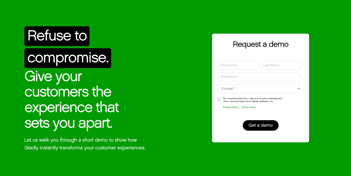
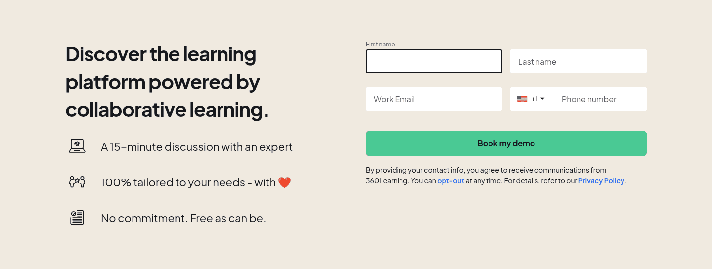
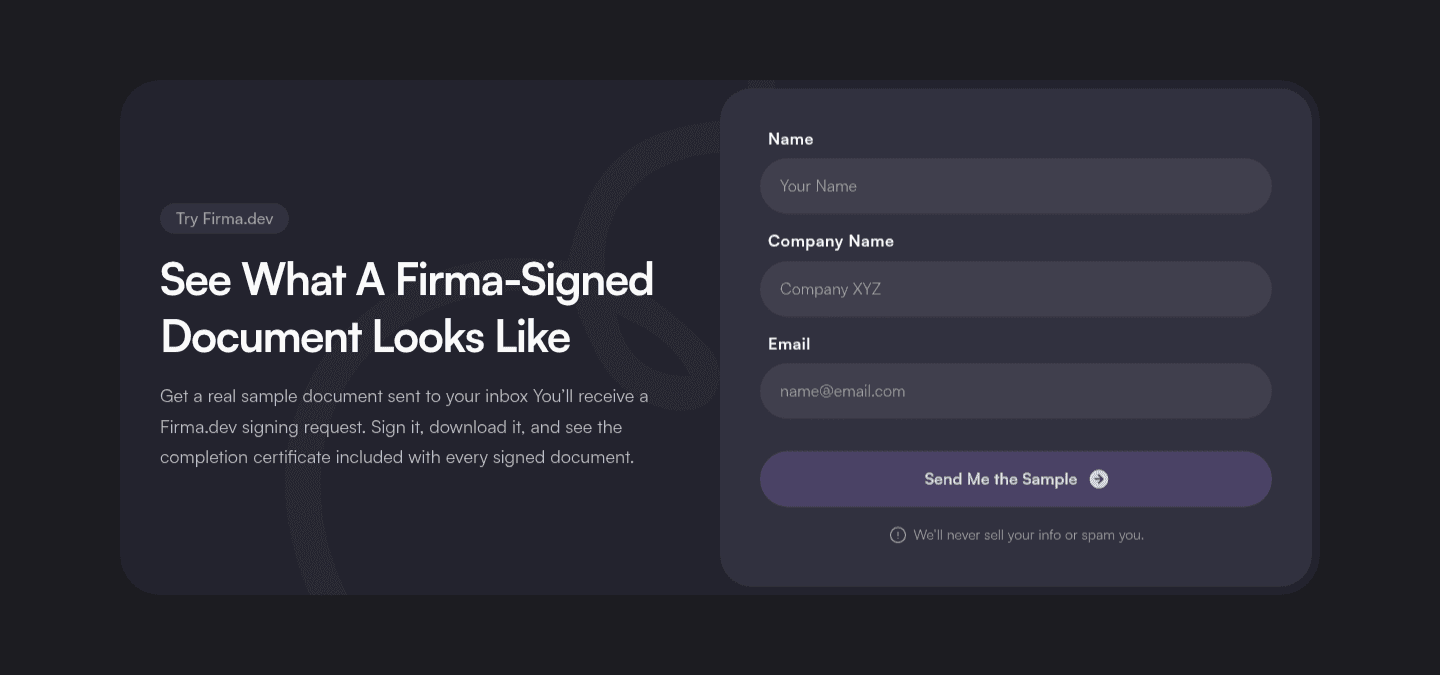
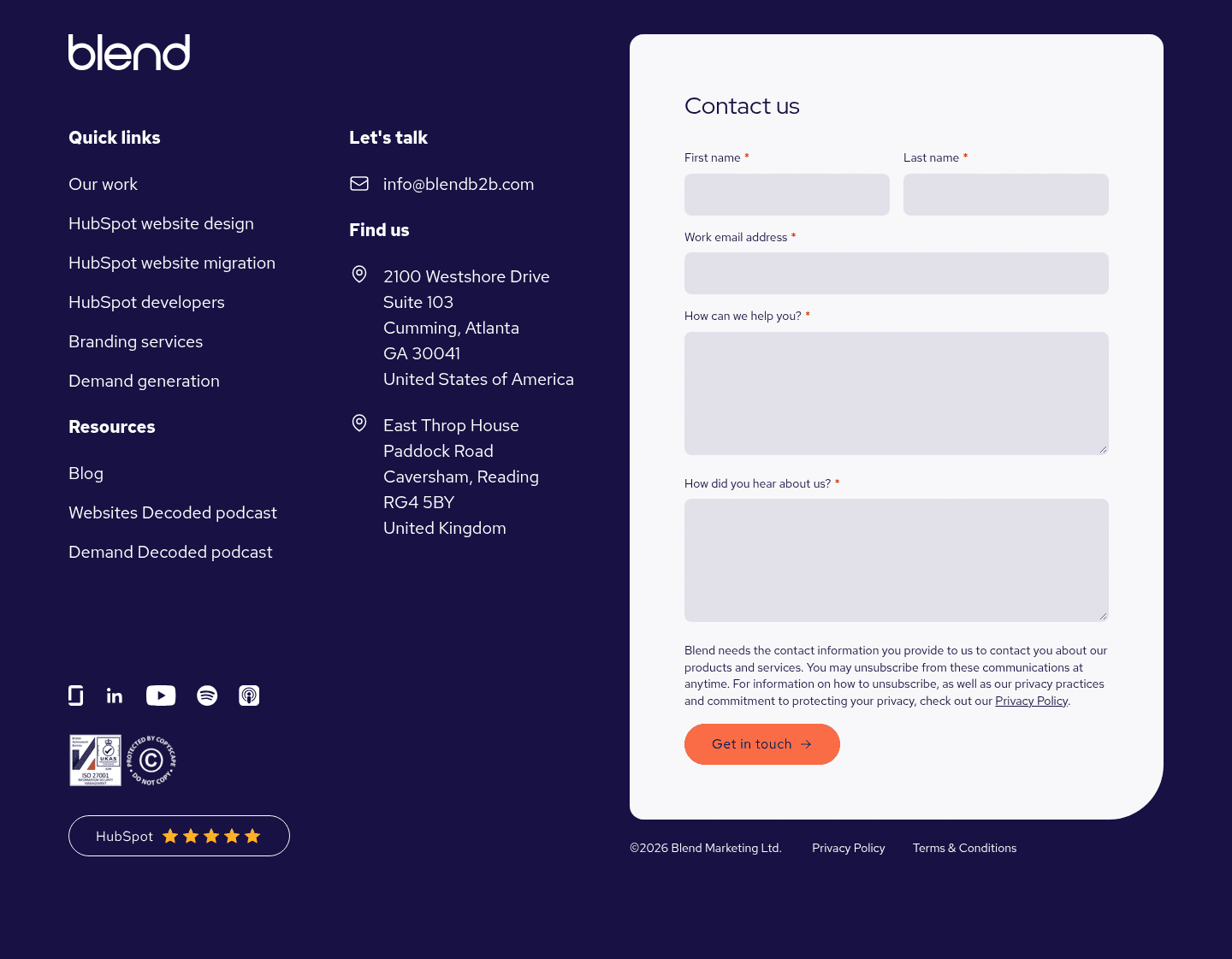
Trust signals in a contact form lower the hesitation of handing over details, so a visitor feels safe in the second before they type their email or hit submit.
Key takeaways
Showing 1–28 of 40 examples
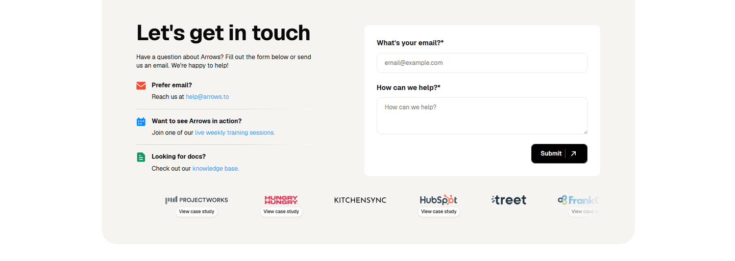
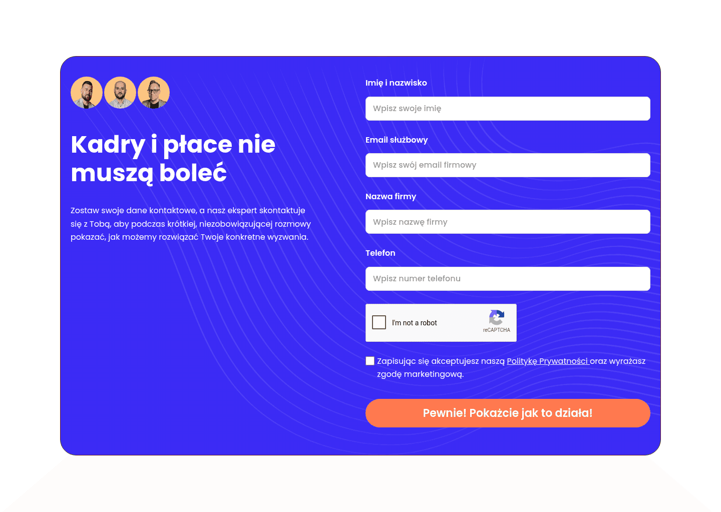

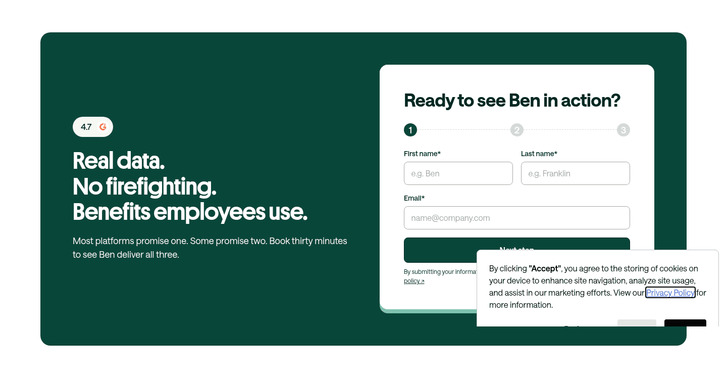
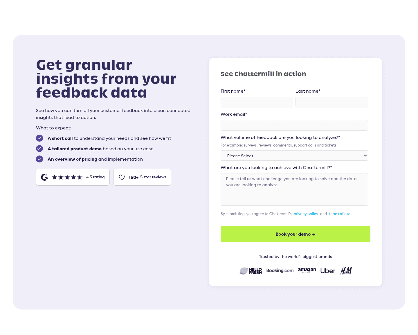
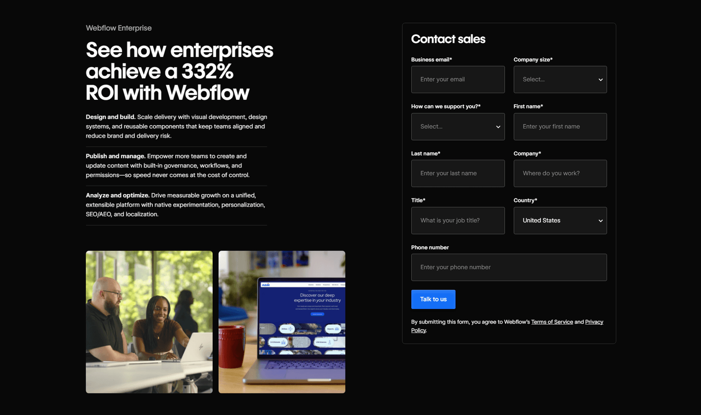
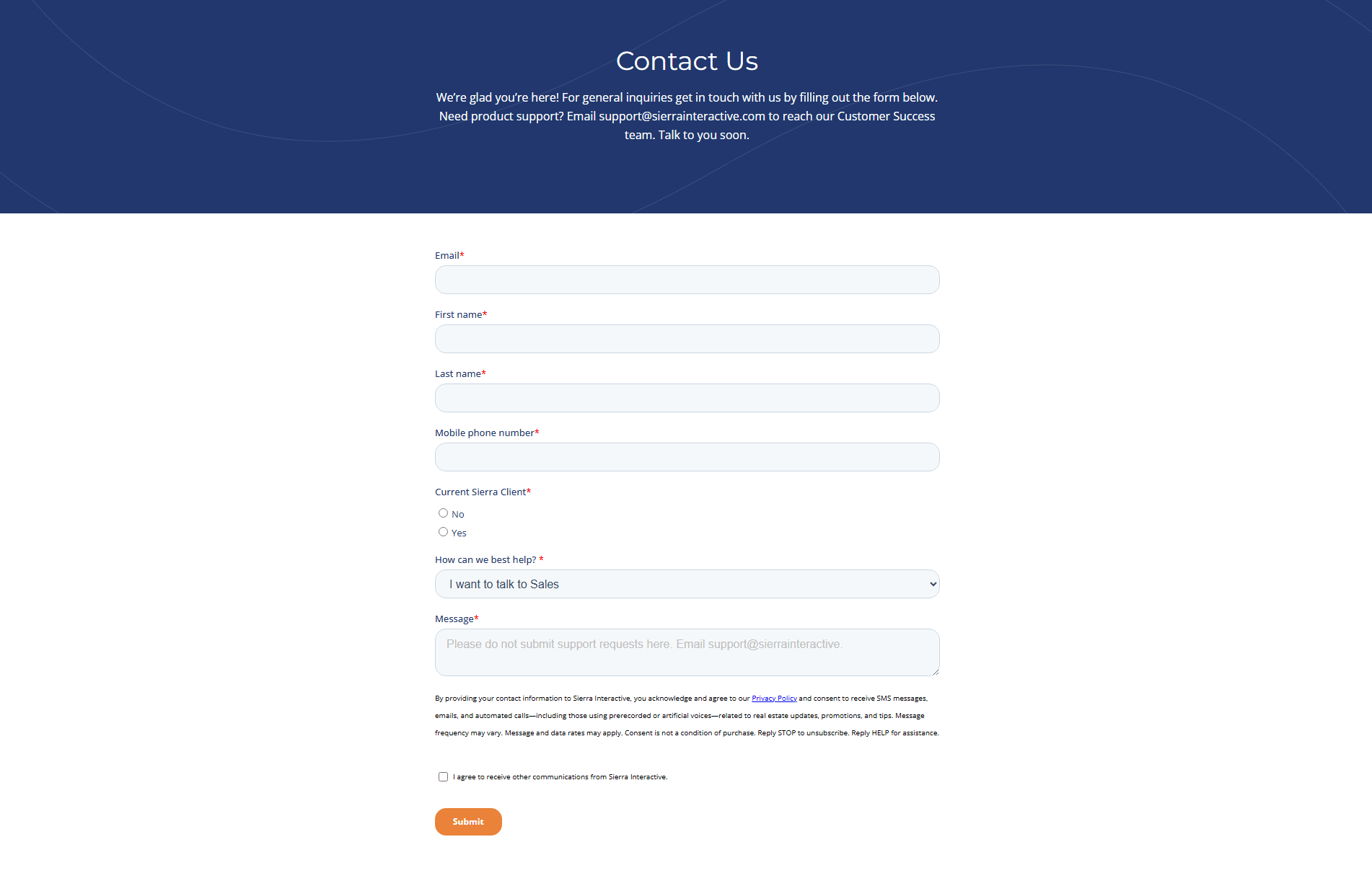
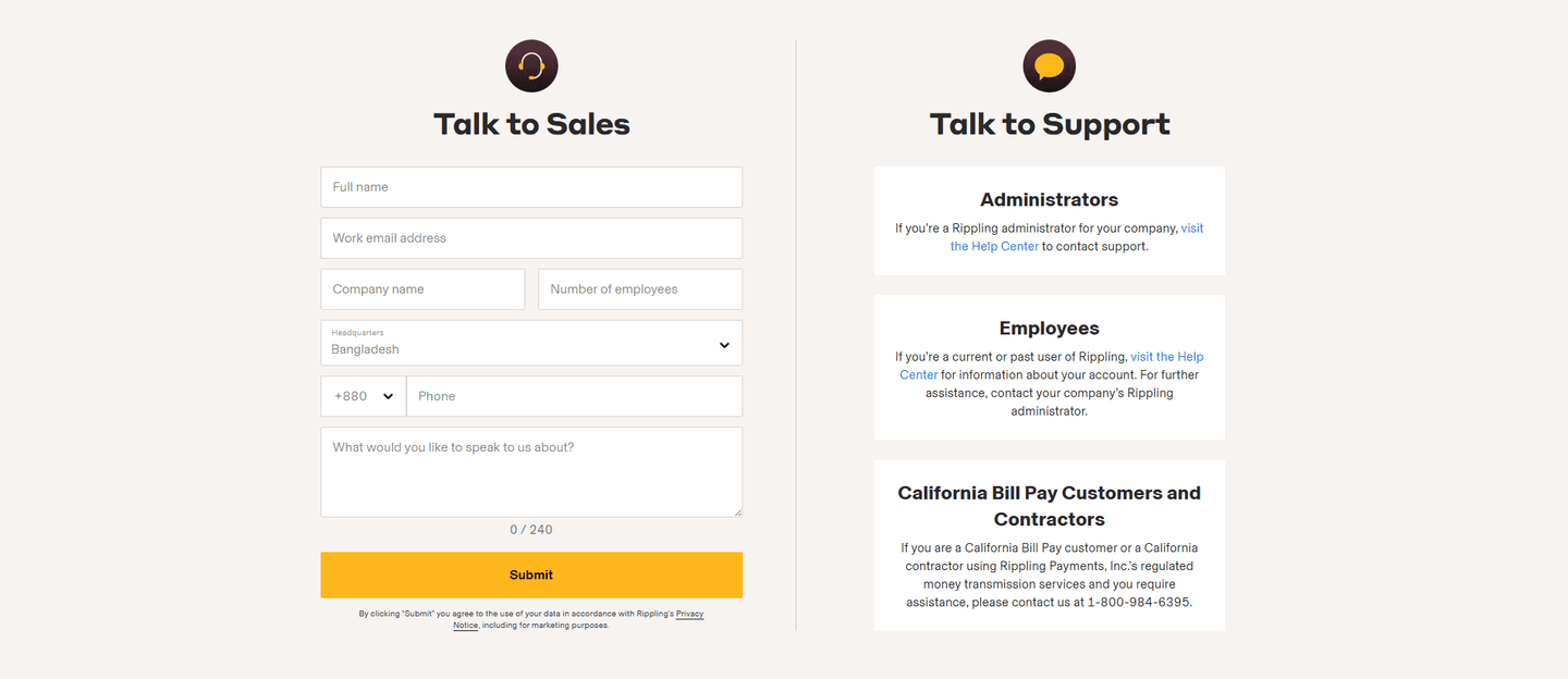
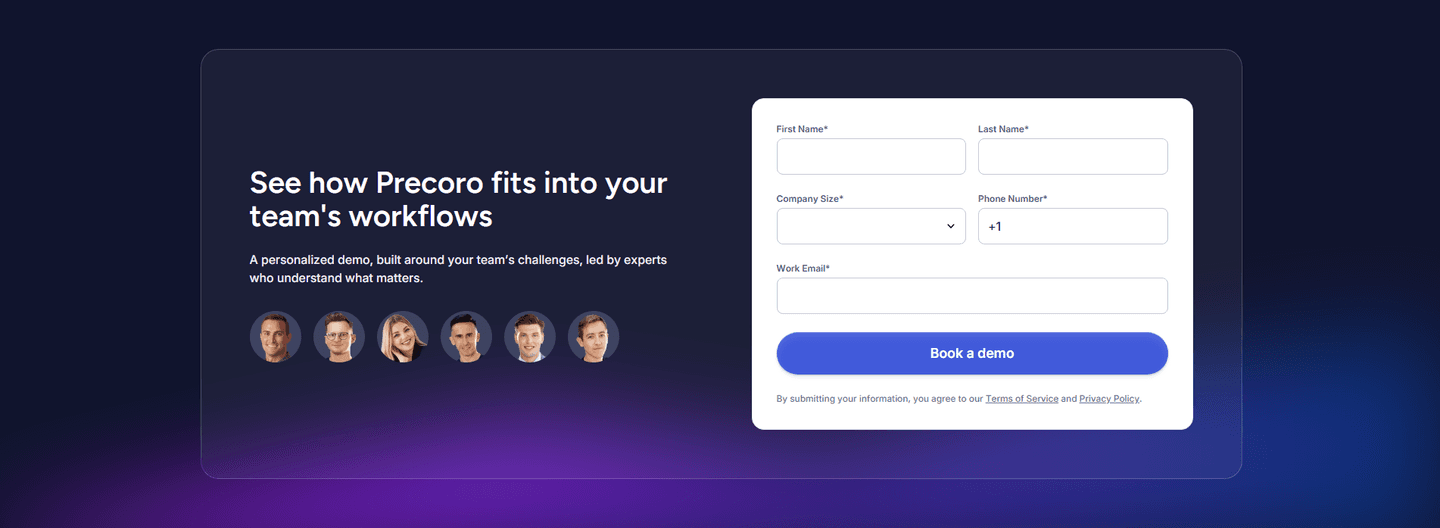
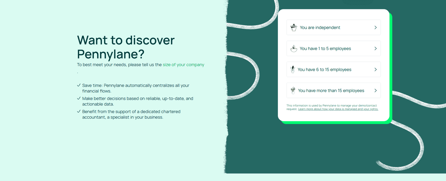
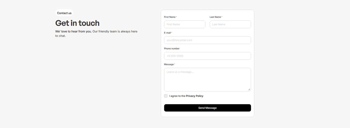
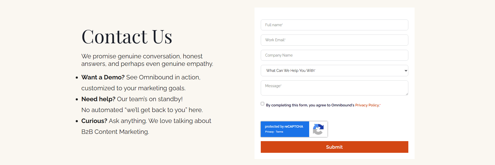
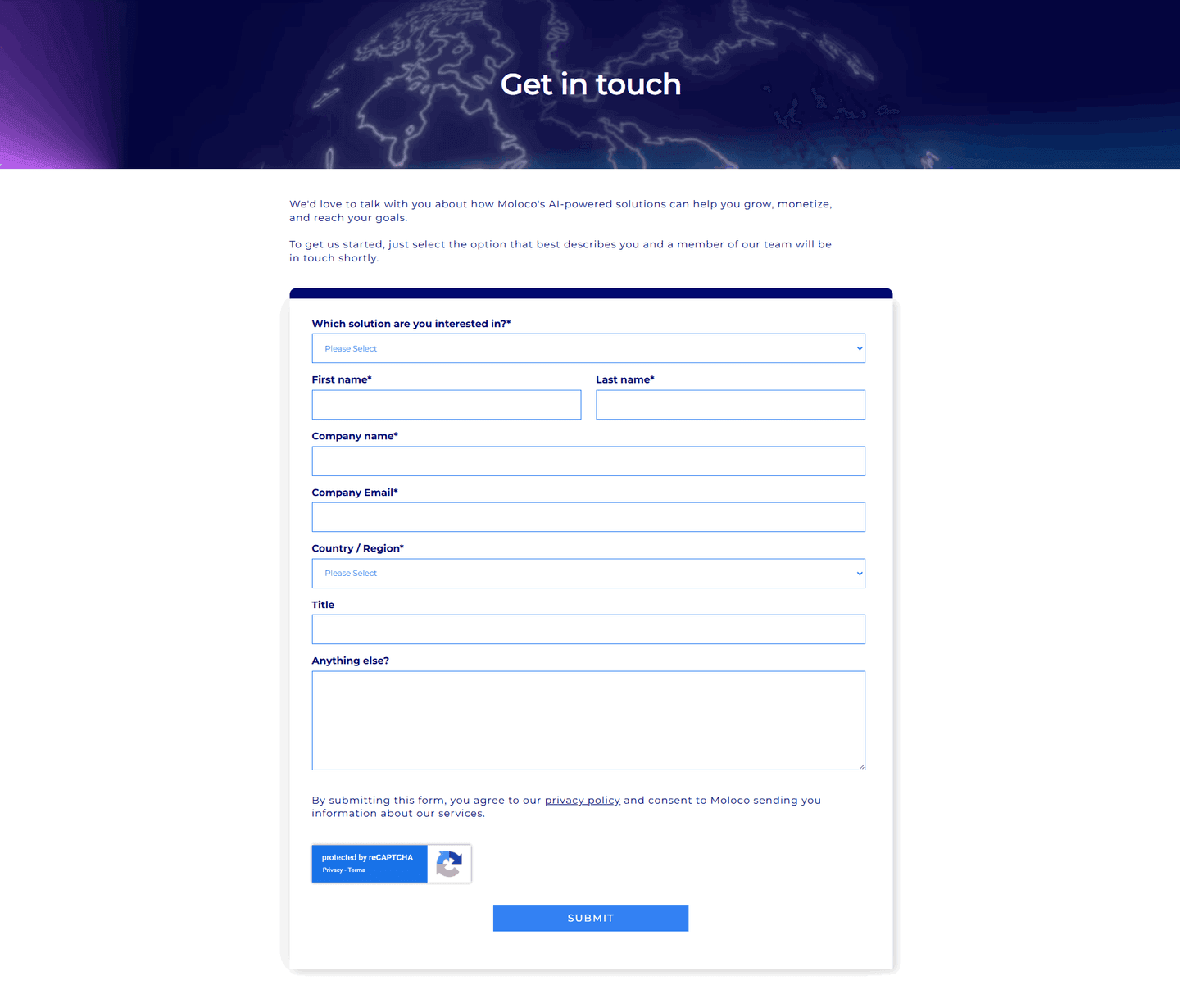
Browse every contact pattern by UX best practice.
Every contact section is scored across 5 conversion best practices. Copy the best practice stack, not the layout. See what converts and why.
Hand-picked from {companies} companies and analyzed by our AI conversion agent. Not a random dump of contact forms. Every entry earns its spot.
Built a contact section? Run yours through the same scoring engine. See where you stand on the same best practices, and what to fix first.
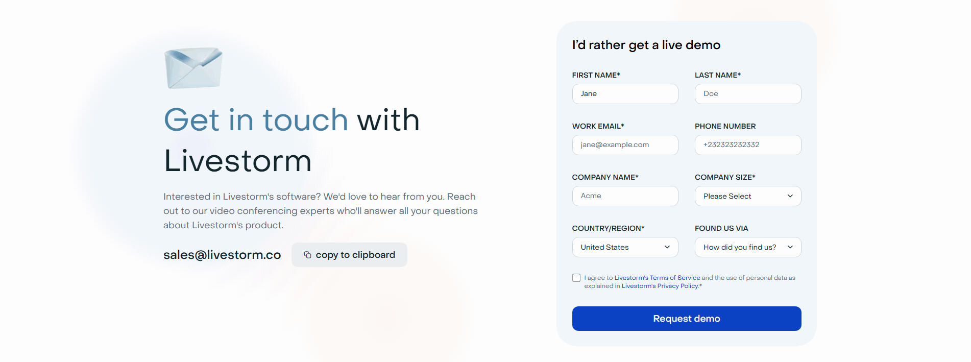
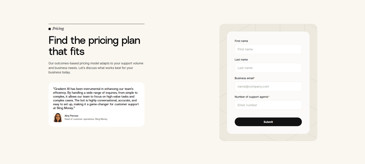
A trust signal in a contact form is anything placed beside the fields that answers the quiet question a visitor asks before they type: what happens to my details after I hit submit? A form with no reassurance reads as a cold lead-capture. The same form with a privacy line, a familiar logo, or a rating reads as a safe conversation with a real team.
The pattern takes a few concrete forms, often two together:
Handing over an email address is a small act with an outsized amount of hesitation behind it. The visitor is weighing spam, sales pressure, and the vague sense that their details will end up somewhere they cannot see. A blank form does nothing to settle that. A form that names its privacy promise, shows a security check, or borrows the credibility of a known customer settles it at the exact moment the doubt appears: the second before the cursor lands in the first field.
The placement is the whole point. Proof that lives on a separate page, or three scrolls up, never reaches the visitor at the moment of the decision. A reassurance sitting directly under the submit button reaches everyone who is about to leave the field blank and close the tab.
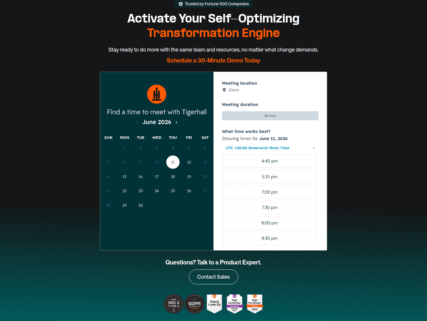
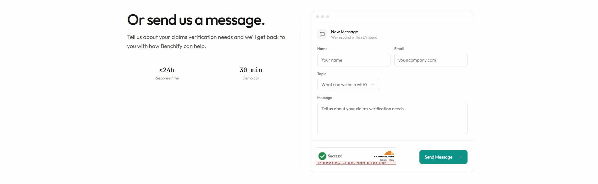
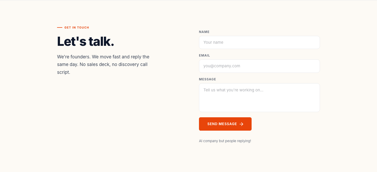
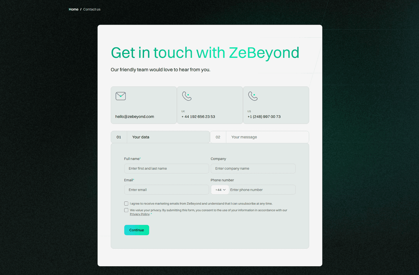
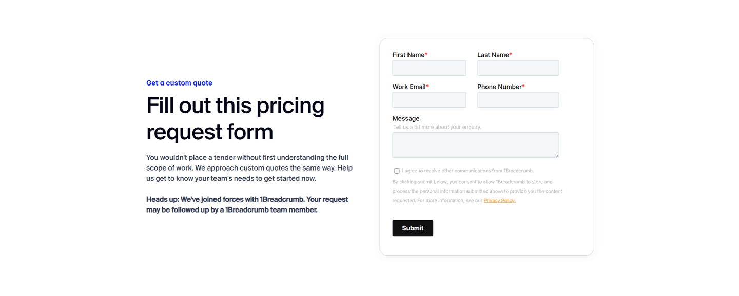
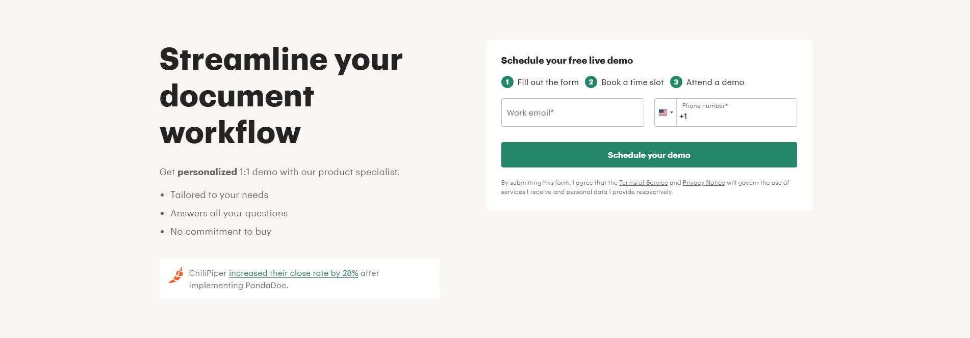
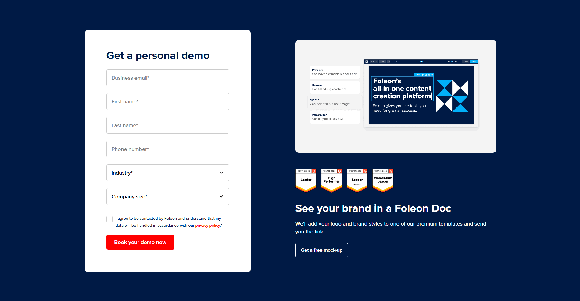
Most of the scored contact sections below carry at least one trust signal in or beside the form, so the practice is common without being universal, and that gap is the opportunity. The versions that work share a discipline: they answer the specific worry, not a generic one. Benchify sets a concrete expectation with "We respond within 24 hours" in the form header, so the visitor knows a real person is on the other end. Tigerhall frames its booking with SOC 2 Type II and GDPR badges, which speak to exactly the buyer who cares about where the data ends up. The strongest forms keep the reassurance legible and close to the action rather than buried in a legal footer.
Trust in the form rarely does the job alone. The best contact sections pair it with the credibility built across the rest of the page, so it is worth browsing the full contact section library and the dedicated trust section examples to see how the two reinforce each other.
100/100 0/100
0/100The first failure is reassurance that reads as fine print: a privacy line set in pale six-point type under the button, technically present and effectively invisible. The second is borrowing credibility the form has not earned, a wall of logos or badges with no privacy promise beside them, which raises the question of data handling without answering it. The last is stacking every trust element at once until the form itself, the thing the visitor came to fill in, gets crowded off the screen. Lead with the one reassurance the buyer actually needs, make it legible, and keep it beside the field where the hesitation lives.

Curated by
Gabriel Amzallag , Founder, Web Anatomy
5 years CRO + SEO at Qonto (2021–2025). After advising 15+ SaaS on their websites (Payfit, Pigment…), the same patterns kept breaking, so I decided to build the source of truth on what works on the web: the intelligence layer every tool, builder, and team uses to ship sites that perform.
Paste your URL. Get a scored analysis of your contact section, including whether the form reassures a visitor before they hit submit. Free, no signup.
The common questions about making a contact form feel safe to submit, with answers drawn from 40 scored examples.
It means placing reassurance next to the fields so handing over details feels safe rather than risky. The most common forms are a privacy or no-spam note under the button, a visible security or spam check at submit, a rating or review score beside the form, and a small row of recognizable customer logos.
Giving up an email address carries more hesitation than its size suggests. The visitor is weighing spam, sales pressure, and the sense that their details will end up somewhere they cannot see. A privacy promise, a security check, or a familiar logo answers that worry at the exact moment it appears, the second before the cursor lands in the first field.
A privacy or no-spam line, a consent note with a policy link, a security or spam check like a Turnstile or reCAPTCHA badge, a review rating such as a G2 score, recognizable customer logos, a compliance mark like SOC 2 or GDPR, and a clear response-time promise all count. The strongest forms combine two, for example a privacy note plus a known logo, so the form is both safe and credible.
As close to the submit button and the fields as possible. A privacy note reads best directly under the button, where the hesitation actually lives, and logos or a rating read best beside the fields rather than three scrolls away on a separate trust page. The goal is that the reassurance shares the screen with the action it is meant to unlock.
Enough to answer the real worry without crowding the form. One legible privacy line, or one rating plus one known logo, is usually right. Stacking every badge, logo, and disclaimer at once buries the fields the visitor came to fill in. Lead with the single reassurance the buyer actually needs.