Contact|
A product visual next to the contact form shows visitors what they are signing up to see, so filling it in feels like a step toward the product instead of a leap of faith.
Key takeaways
Showing 1–5 of 5 examples
Browse every contact pattern by UX best practice.
Every contact section is scored across 5 conversion best practices. Copy the best practice stack, not the layout. See what converts and why.
Hand-picked from {companies} companies and analyzed by our AI conversion agent. Not a random dump of contact forms. Every entry earns its spot.
Built a contact section? Run yours through the same scoring engine. See where you stand on the same best practices, and what to fix first.
A product visual beside the form is the decision to put a picture of the real product next to the contact or demo fields, in the same view, so the visitor sees the tool while they fill it in. A bare form asks for details up front and shows nothing in return. The same form with the product next to it answers the question every visitor is already asking: what am I signing up to see?
The pattern takes a few concrete forms:
A contact form is a moment of hesitation. The visitor is being asked to hand over a work email, a name, sometimes a phone number, in exchange for a promise they cannot yet see. Anything that makes the exchange feel concrete lowers the hesitation, and nothing is more concrete than the product itself.
Placement is what makes the visual work. A screenshot three scrolls above the form has already faded from memory by the time the visitor reaches the fields. Sitting the product next to the form keeps the reward and the request on the same screen, so the visitor weighs one against the other in the same glance. The form reads less like a gate and more like the door to something they can already picture.
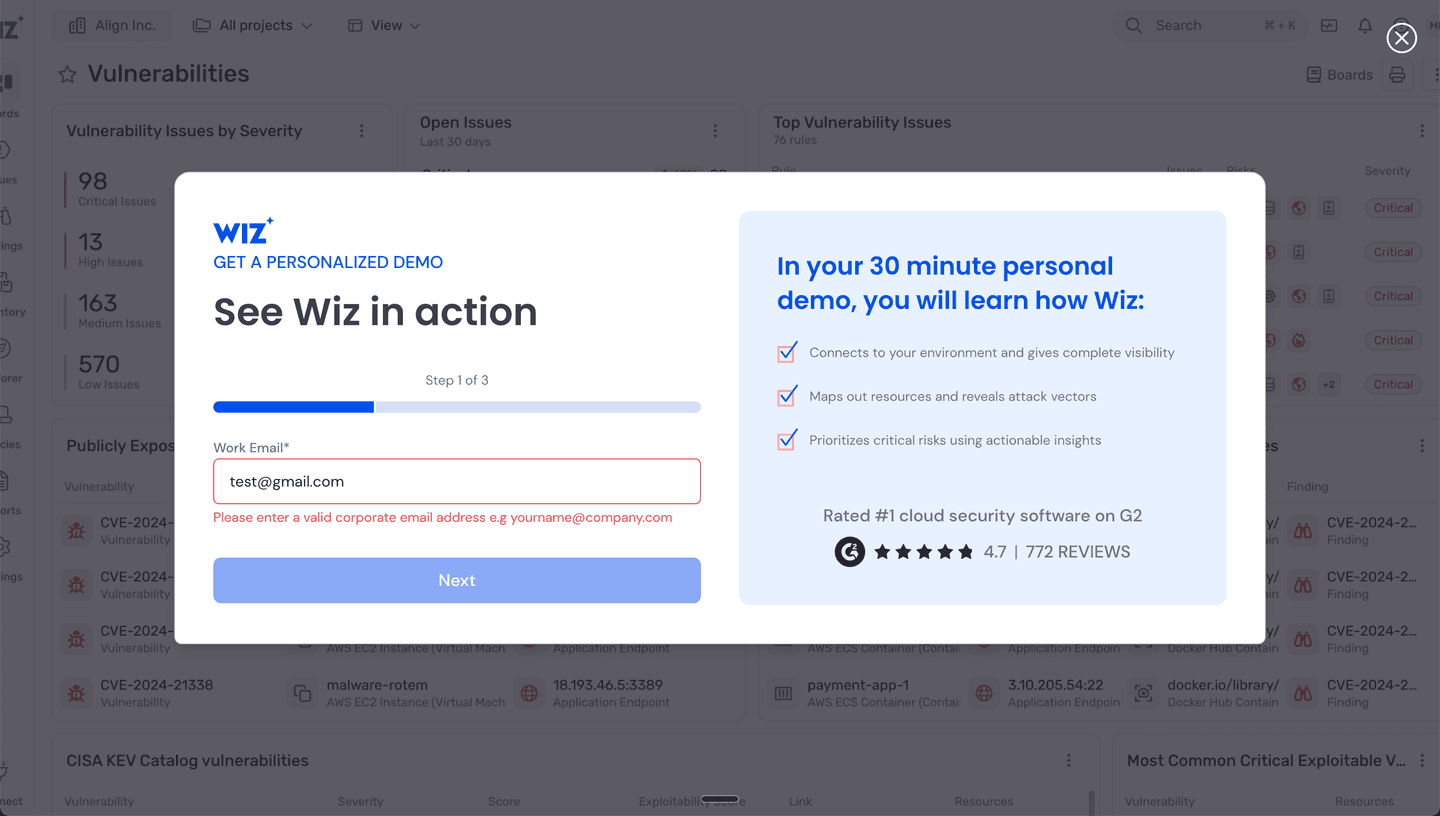
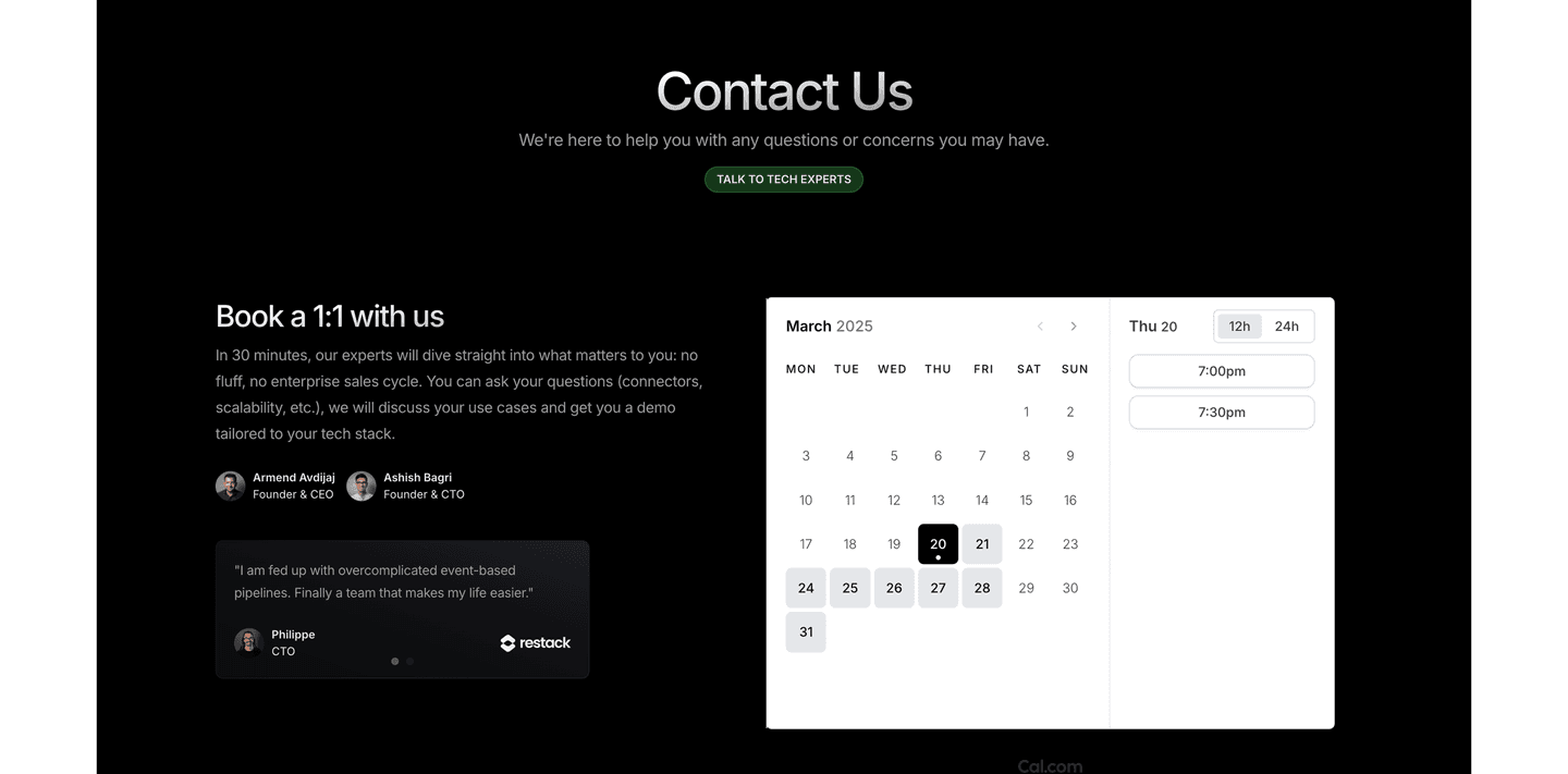
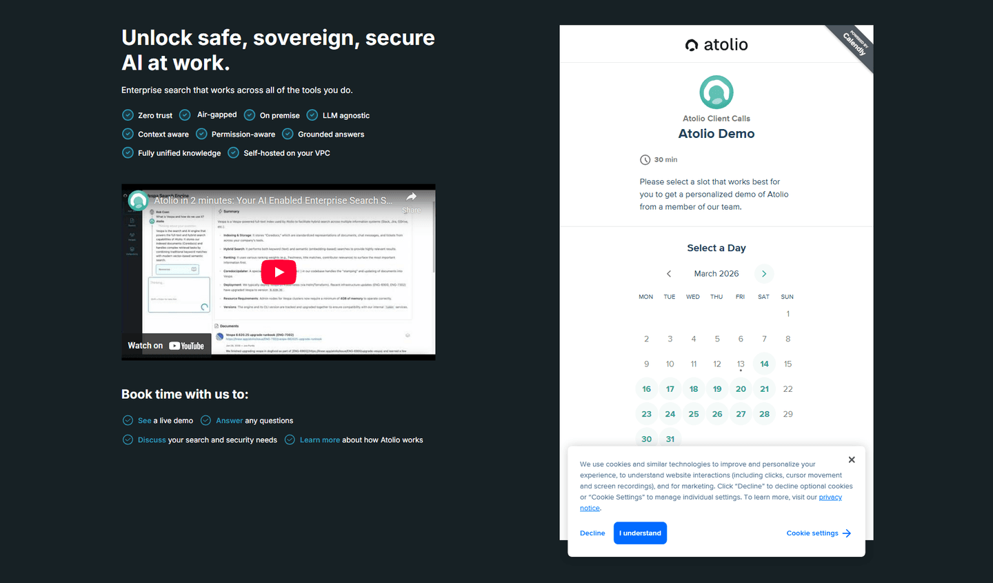
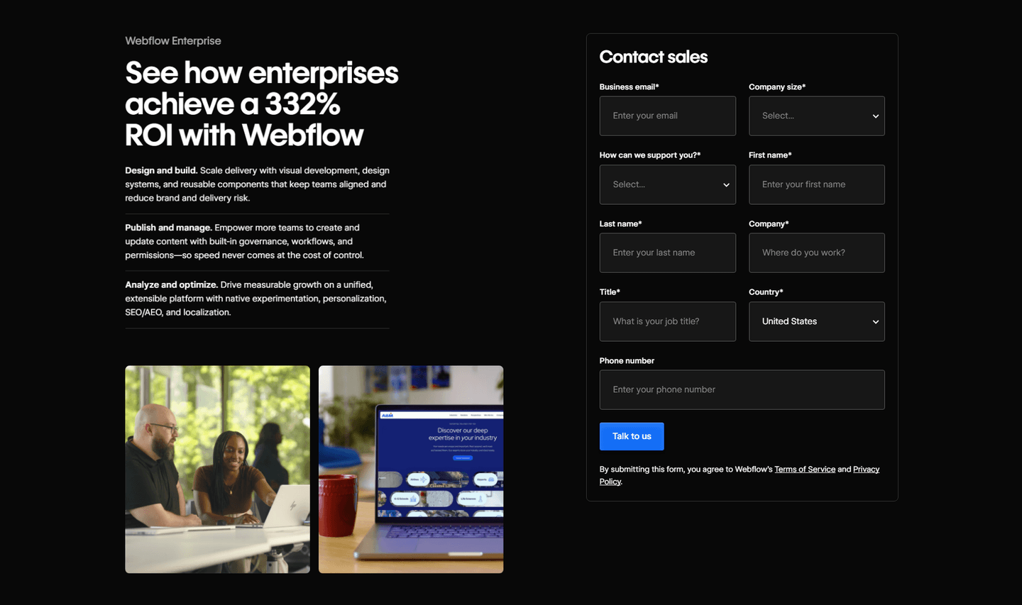
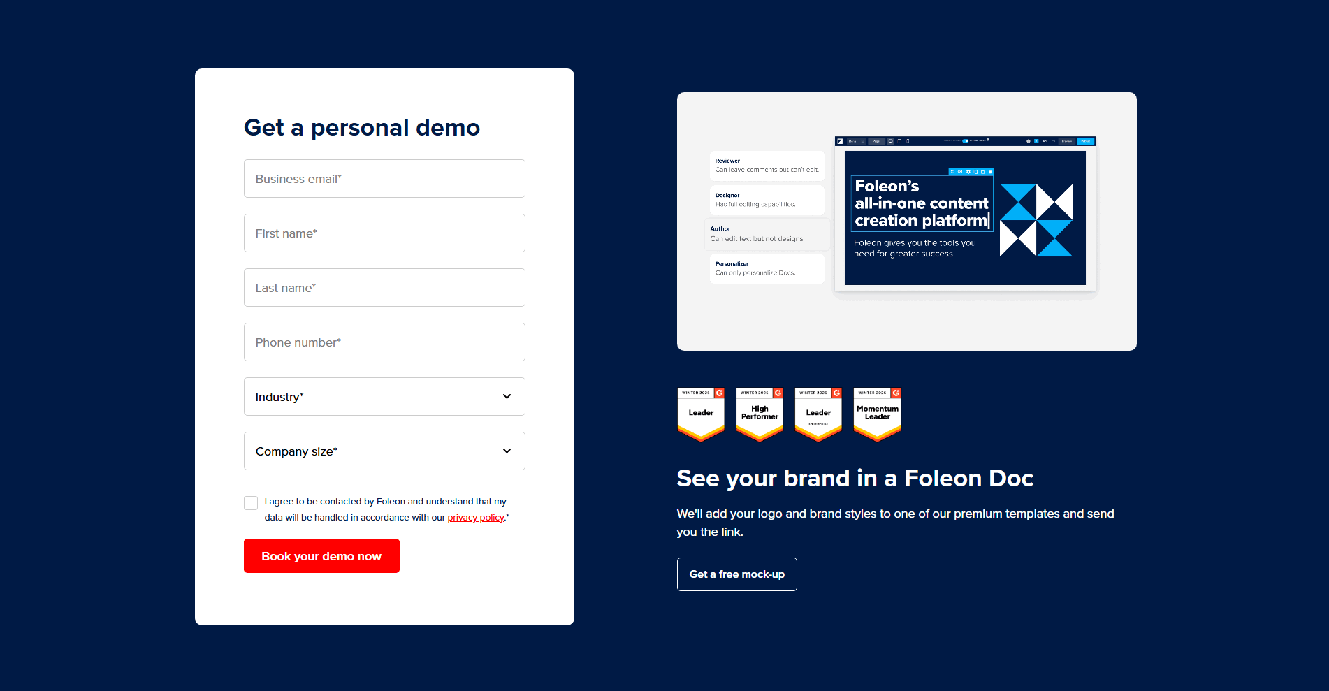
Fewer than one in ten contact sections in the library pair the form with a product visual, so the ones that do stand apart. Across the scored examples below, the discipline is to show the real thing. Wiz places its live vulnerabilities dashboard behind the demo modal, so the product a visitor is signing up to see is already on screen. Cal.com embeds its own scheduler next to the copy, so the booking widget is itself a working demo. Foleon sets a real screenshot of its editor beside the form, and Webflow previews the platform on a laptop next to the fields, so enterprise buyers see what they will adopt before they submit.
The visual rarely carries the section alone. The same discipline applies whether the section also keeps the form itself short so the first commitment is a single field, or places trust signals right inside the form to ease concerns about handing over data. The product answers what the visitor gets; the shorter form and the trust marks answer whether it is safe to ask.
100/100 0/100
0/100The usual failure is a visual that shows everything except the product: a stock illustration, an abstract gradient, or a smiling stock photo that could sit on any page. It fills the space next to the form without answering what the visitor is signing up for. The second failure is distance. A product shot that lives far above the form, or collapses several scrolls away on mobile, no longer shares the screen with the fields and stops doing its job. Show the real product, and keep it next to the form on the devices your buyers actually use.

Curated by
Gabriel Amzallag , Founder, Web Anatomy
5 years CRO + SEO at Qonto (2021–2025). After advising 15+ SaaS on their websites (Payfit, Pigment…), the same patterns kept breaking, so I decided to build the source of truth on what works on the web: the intelligence layer every tool, builder, and team uses to ship sites that perform.
We find every way to grow your website’s visibility and conversions: SEO, AI search (AEO), backlinks and mentions, and UX/UI. 3 free opportunities, delivered by email.
The common questions about pairing a contact form with a product visual, with answers drawn from 5 scored examples.
It means placing a picture of the actual product next to the contact or demo form, in the same view, so the visitor sees the tool while they fill in the fields. The visual can be a real interface screenshot, a short product video, a live booking widget that is itself the product, or a preview of the dashboard the visitor will get access to.
A bare form asks the visitor to give up their details before they have seen anything concrete. Placing the product right next to the fields answers the quiet question every visitor has: what am I actually signing up for? The form stops being a blank commitment and becomes a step toward something the visitor can already see.
A screenshot of the real interface, a short looping product video, a live scheduler or dashboard that doubles as a demo, or an annotated preview of what the visitor gets after they submit. The point is that it shows the product itself, not a stock illustration or an abstract graphic that could belong to any company.
Close enough that it shares the screen with the fields on a standard laptop, usually in a two-column layout with the form on one side and the product on the other. On mobile the two stack, so the visual should sit directly above or below the form rather than several scrolls away, where it stops doing its job.
No. The product visual and trust signals do different jobs and the strongest contact sections use both. The visual answers what the visitor is getting; ratings, badges, and privacy links answer whether the visitor can trust handing over their details. Pairing the two is more convincing than either on its own.