Contact|
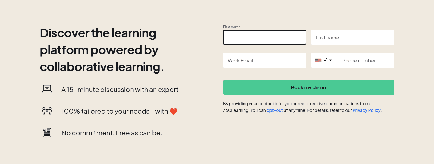
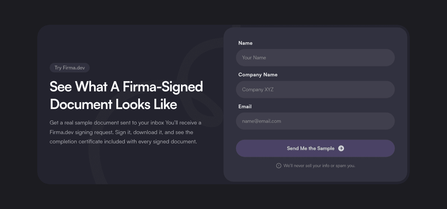
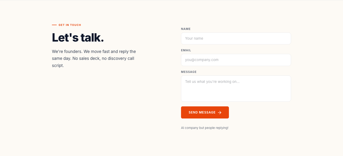
A short contact form keeps the first ask small, one email or a few fields, so a visitor can start the conversation before they have to decide whether the whole thing is worth it.
Key takeaways
Showing 1–28 of 34 examples
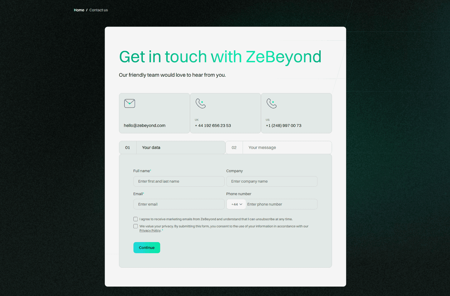
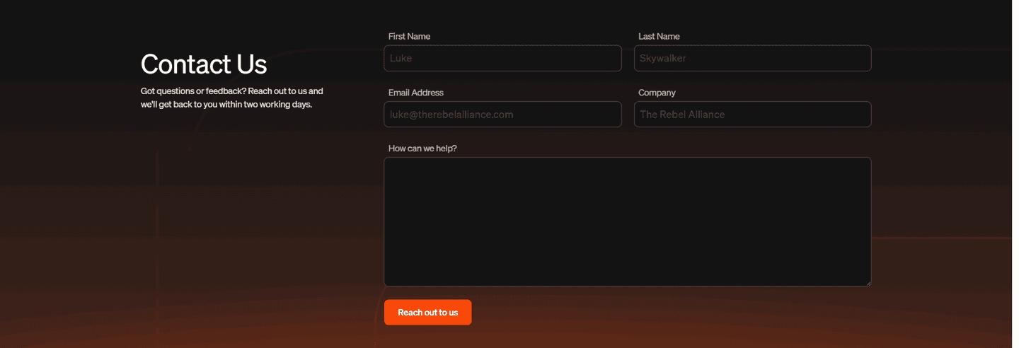
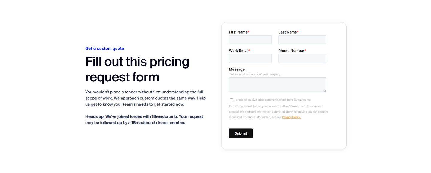
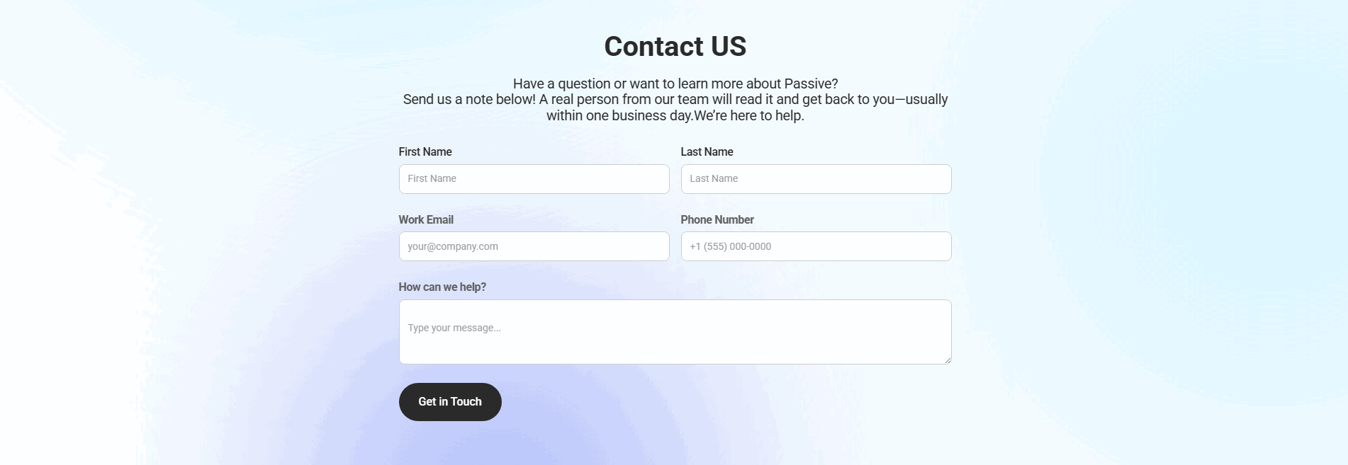
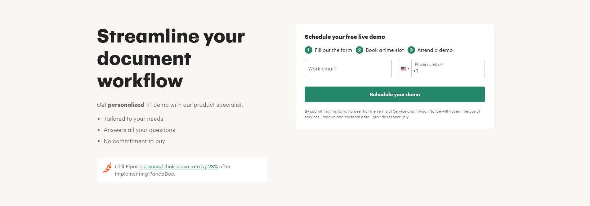
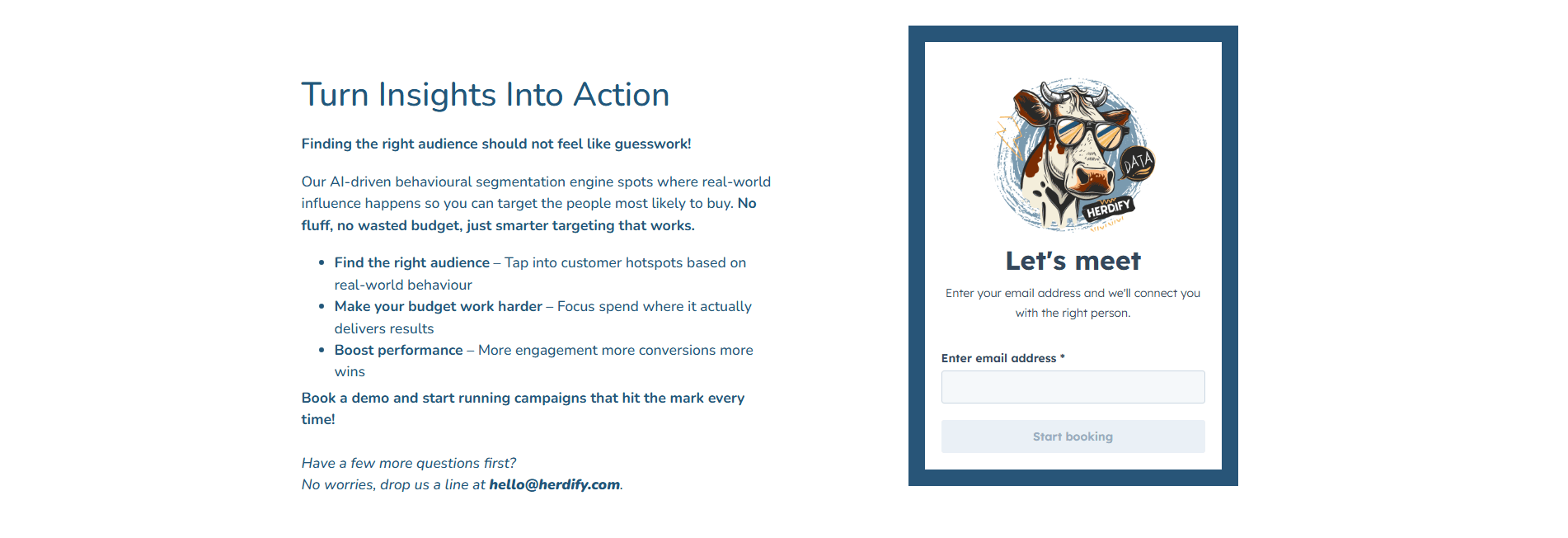
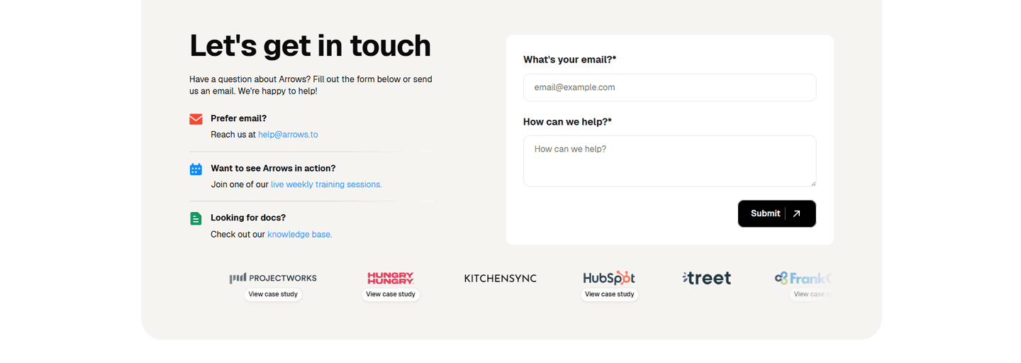
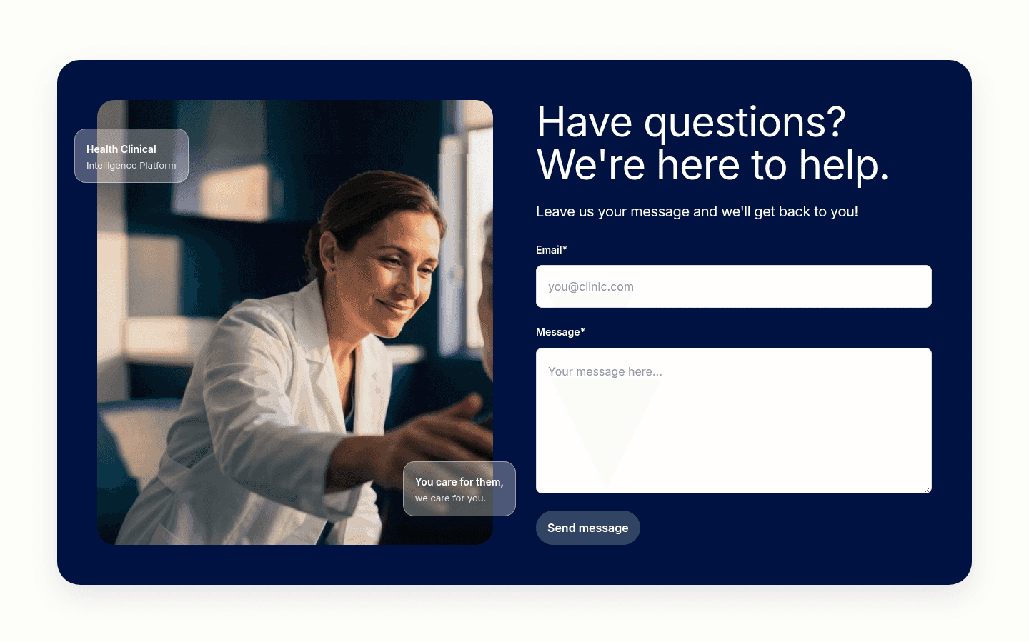


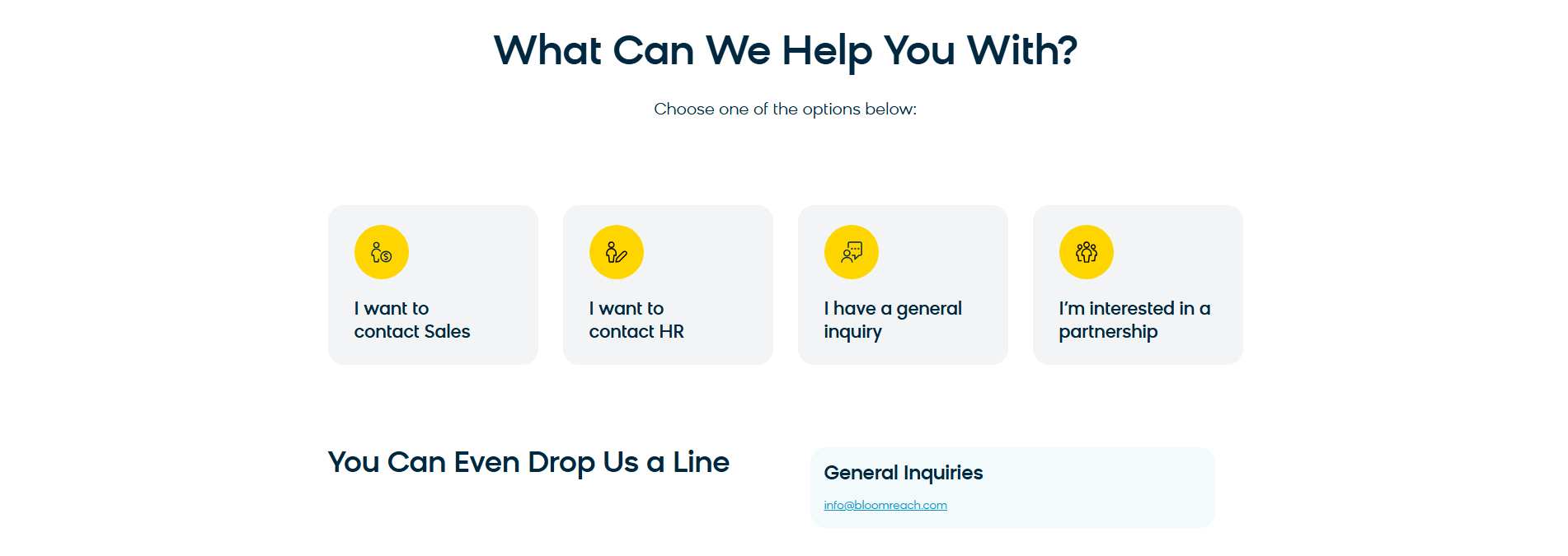
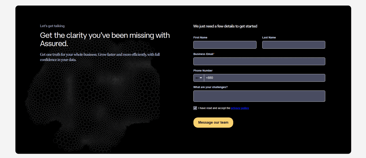
Browse every contact pattern by UX best practice.
Every contact section is scored across 5 conversion best practices. Copy the best practice stack, not the layout. See what converts and why.
Hand-picked from {companies} companies and analyzed by our AI conversion agent. Not a random dump of contact forms. Every entry earns its spot.
Built a contact section? Run yours through the same scoring engine. See where you stand on the same best practices, and what to fix first.
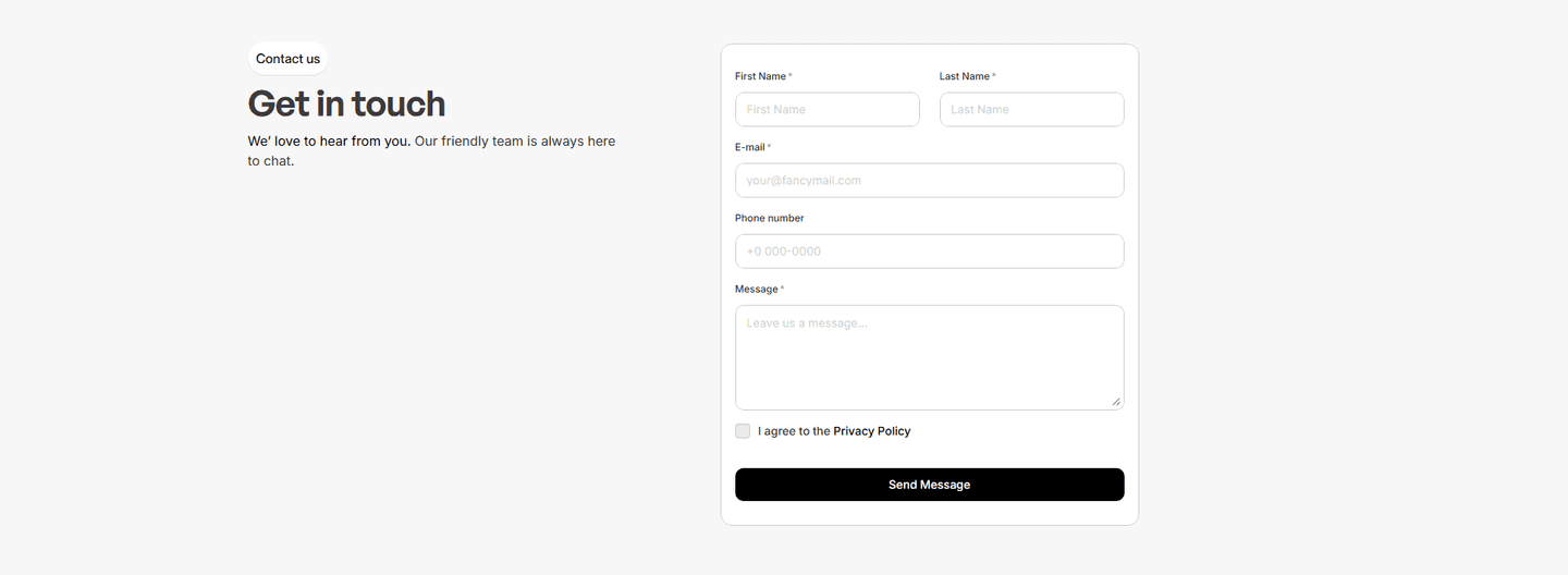
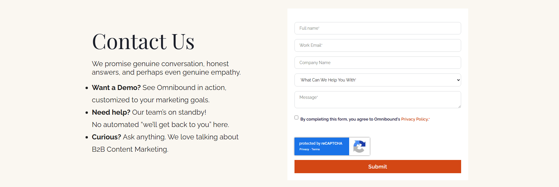
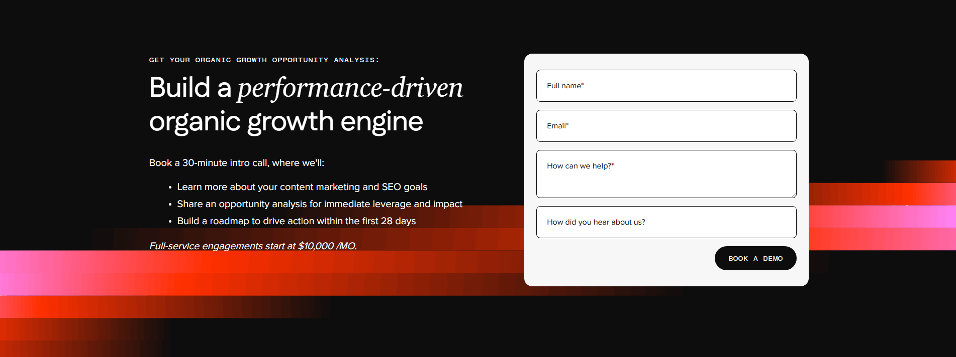
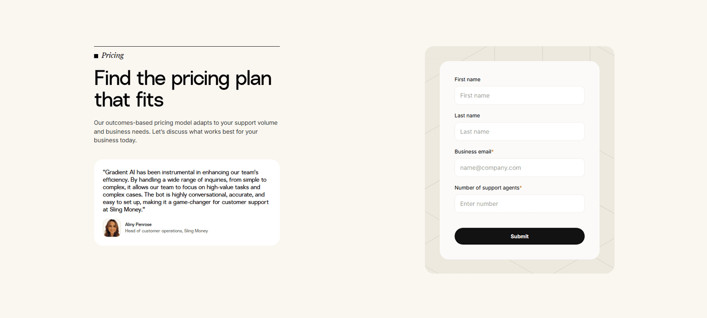
A short contact form is the decision to keep the first ask small. Instead of a fourteen-field qualifier that reads like a job application, the visitor is asked for one thing, an email or a name, and the conversation starts from there. The long form treats the visitor as a lead to be scored. The short form treats them as a person who has not decided yet.
The pattern takes a few concrete forms:
Every field on a contact form is a small negotiation. The visitor reads it, decides whether the answer is worth giving, and each one is a fresh chance to close the tab. A form with fourteen fields does not collect fourteen answers, it collects fewer submissions. The visitor who would happily type an email is not willing to hand over their phone number, job title, and company size to a team they have not spoken to yet.
The short form works because it matches the size of the ask to the size of the trust. Early in the relationship the visitor will give an email. They will not give a full profile. Asking for the small thing first gets the conversation started, and the rest can come once there is a reason to continue.
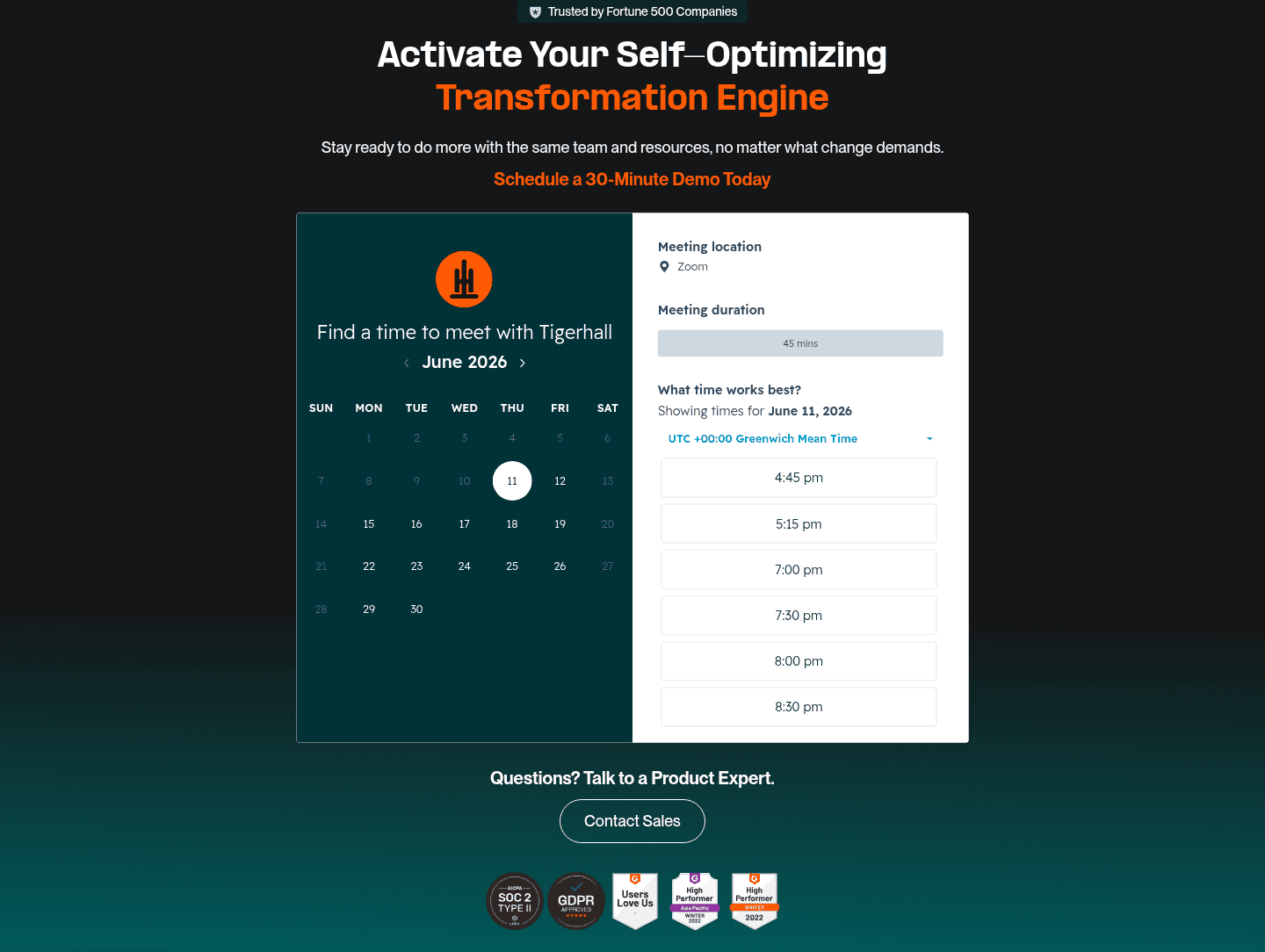
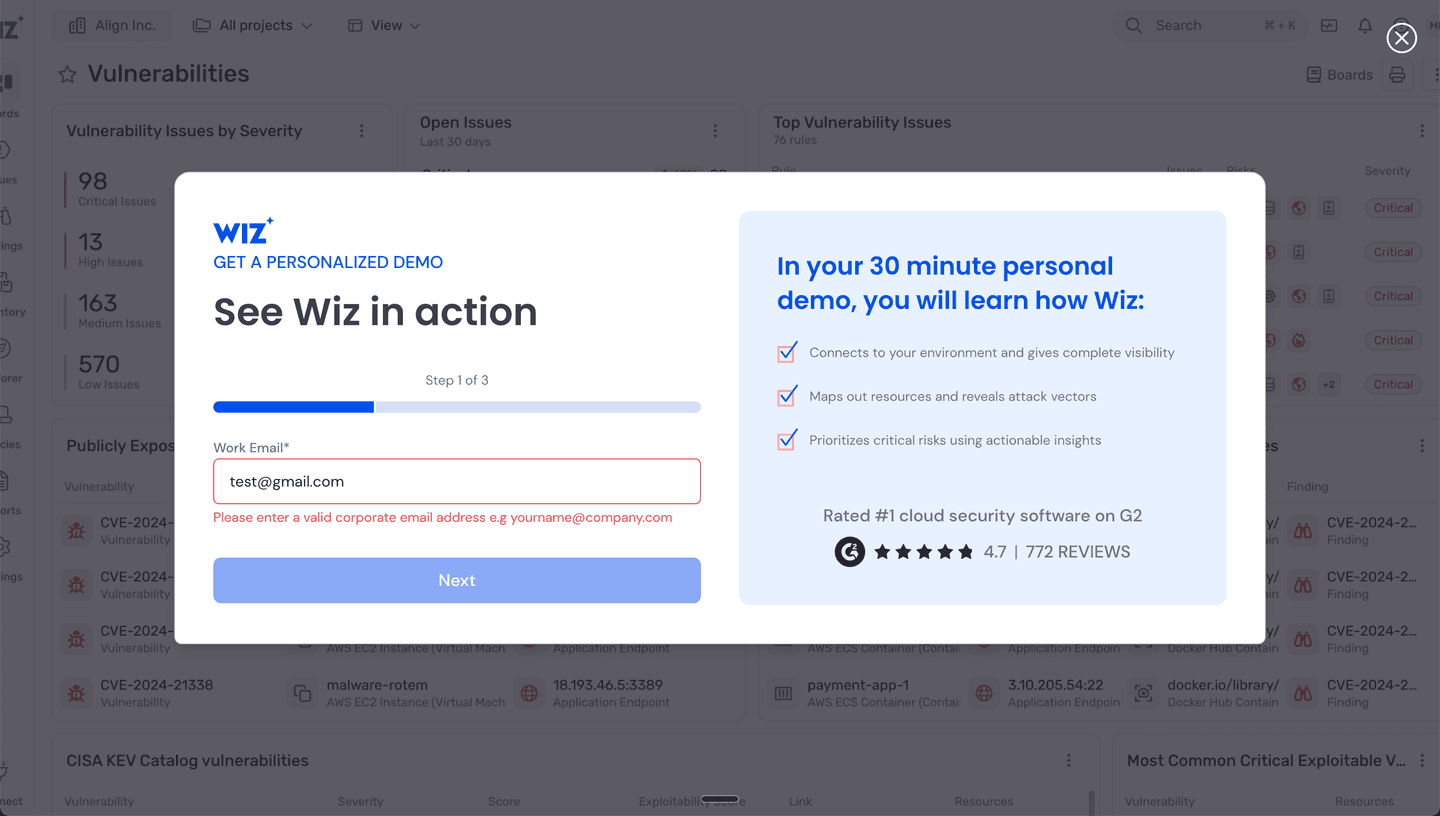
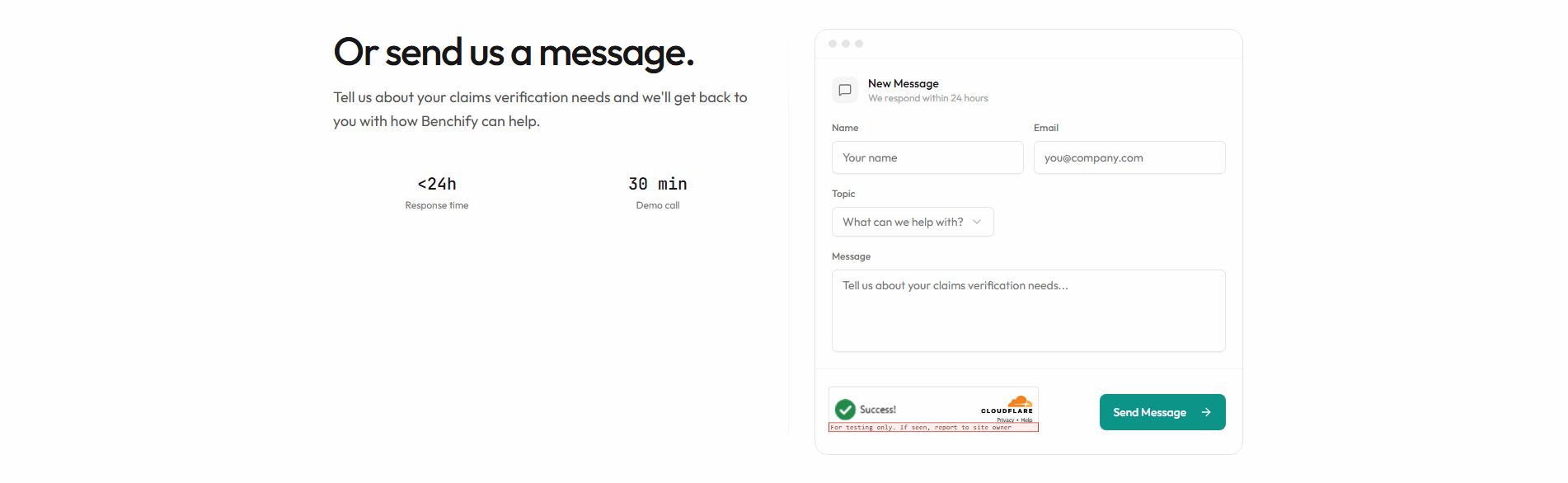
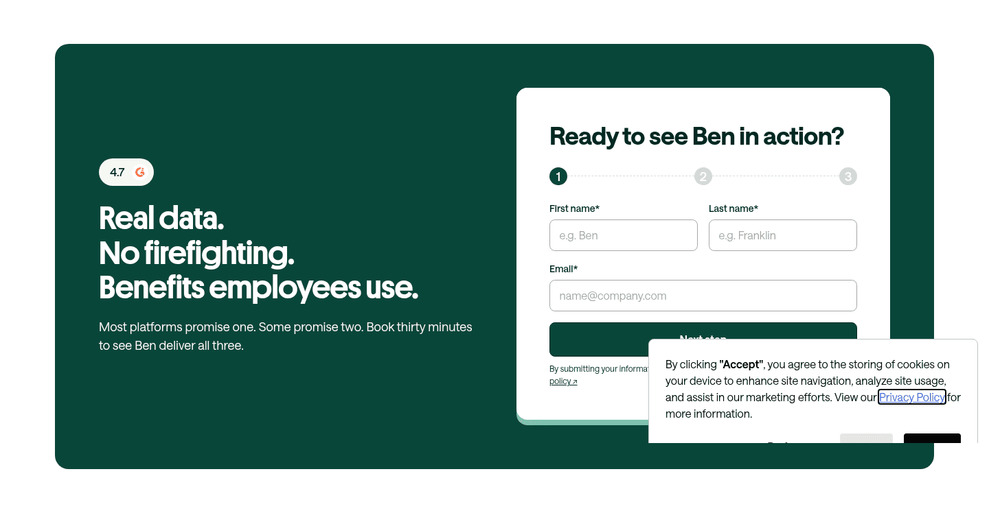
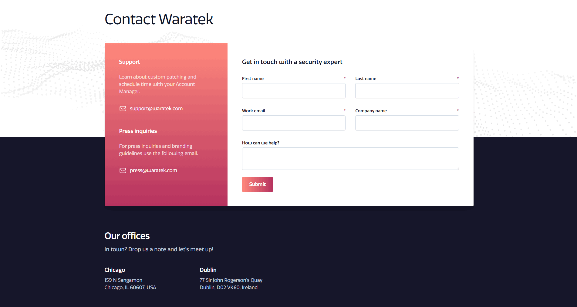
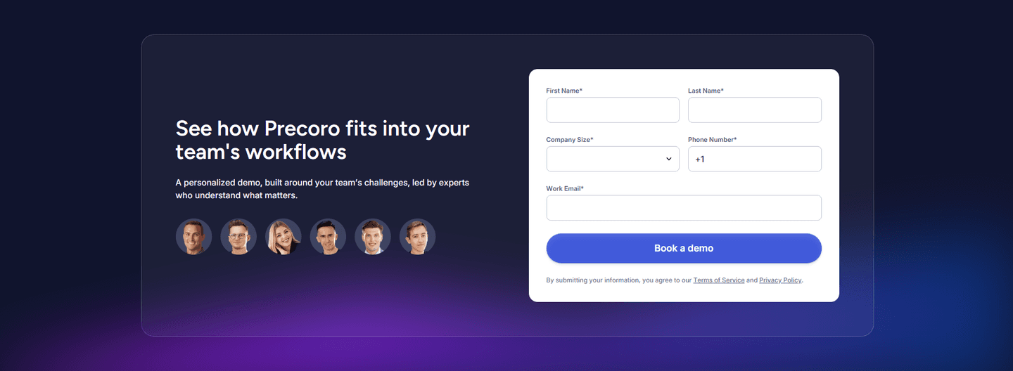
Just over half of the scored contact sections below keep the first ask short, so the discipline is common without being universal, and that gap is the opportunity. The versions that work are deliberate about what they cut. Wiz stages the ask so only a work email stands between the visitor and the demo. Tigerhall removes the form entirely, letting a prospect book a 45-minute slot with the location and duration spelled out in advance. Benchify keeps four fields and spends the saved space on a "We respond within 24 hours" promise, so the short form feels attended rather than automated. The pattern is not "collect less data forever," it is "ask for the smallest first commitment and earn the rest."
A short form rarely stands alone. The best contact sections pair the low ask with the reassurance that makes it feel safe to take, so it is worth reading how the same pages handle trust signals in the contact form and browsing the full contact section library to see the two together.
100/100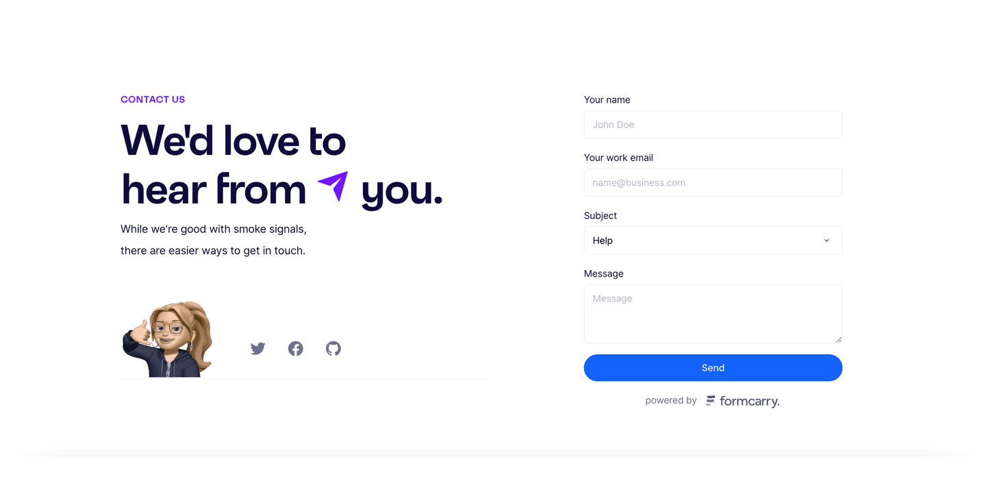 0/100
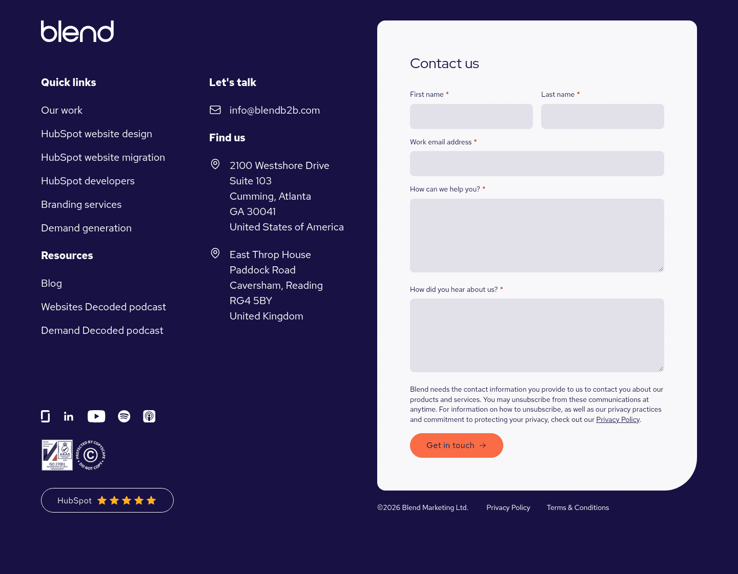
0/100The first failure is the qualifier disguised as a contact form: ten required fields, a phone number, a company-size dropdown, all demanded before the visitor has any reason to trust the team on the other end. The second is the short form that hides the next step, a single email box with no hint of what happens after submit, which trades friction for uncertainty. The last is cutting the form down but keeping every ask required, so a "short" form still refuses to submit until each optional-looking field is filled. Ask for the smallest first commitment, say plainly what happens next, and make everything past the first field genuinely optional.

Curated by
Gabriel Amzallag , Founder, Web Anatomy
5 years CRO + SEO at Qonto (2021–2025). After advising 15+ SaaS on their websites (Payfit, Pigment…), the same patterns kept breaking, so I decided to build the source of truth on what works on the web: the intelligence layer every tool, builder, and team uses to ship sites that perform.
Paste your URL. Get a scored analysis of your contact section, including whether the first ask is short enough to get a reply. Free, no signup.
The common questions about keeping a contact form short and low-friction, with answers drawn from 34 scored examples.
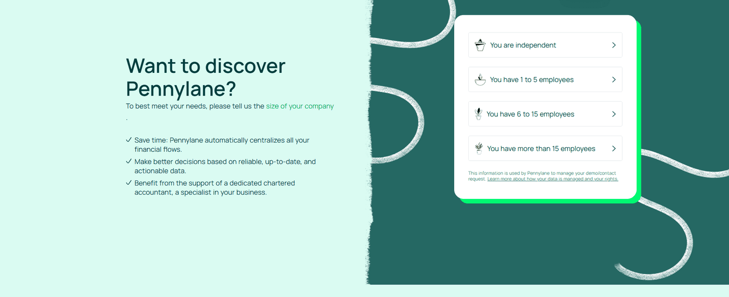
It is a contact, demo, or sales form that keeps the first ask small so a visitor can start with one low commitment. The most common forms are a single email step that reveals the rest later, a genuinely short form of three or four fields, an embedded calendar booking in place of a form, and a one-click qualifier that replaces typing with a single choice.
Every field is a small negotiation the visitor can lose. A long form does not collect more answers, it collects fewer submissions, because each extra field is a fresh reason to close the tab. A short form matches the size of the ask to the trust that exists early in the relationship: a visitor will give an email before they hand over a phone number, a job title, and a company size to a team they have not spoken to yet.
As few as the next step genuinely needs. Three or four fields is a common sweet spot for a contact or demo request, and some of the strongest forms go lower, to a single email step or a two-field demo request. The test is not a fixed number but whether every field earns its place. If a field is not needed to take the next action, it belongs in a later step, not the first one.
Stage the ask instead of front-loading it. A progressive form can open with just an email and reveal the rest once the visitor has committed, the way a Step 1 of 3 form does. An embedded booking can collect the detail during scheduling rather than on the page. The goal is not to collect less forever, it is to ask for the smallest first commitment and earn the rest once the conversation has started.
Shorter is usually better, but only when the next step stays clear. A single email box with no hint of what happens after submit trades friction for uncertainty, which is its own kind of drop-off. The best short forms cut the fields and keep the clarity: they say what happens next, when the team will reply, and what the visitor is signing up for.