Problem|
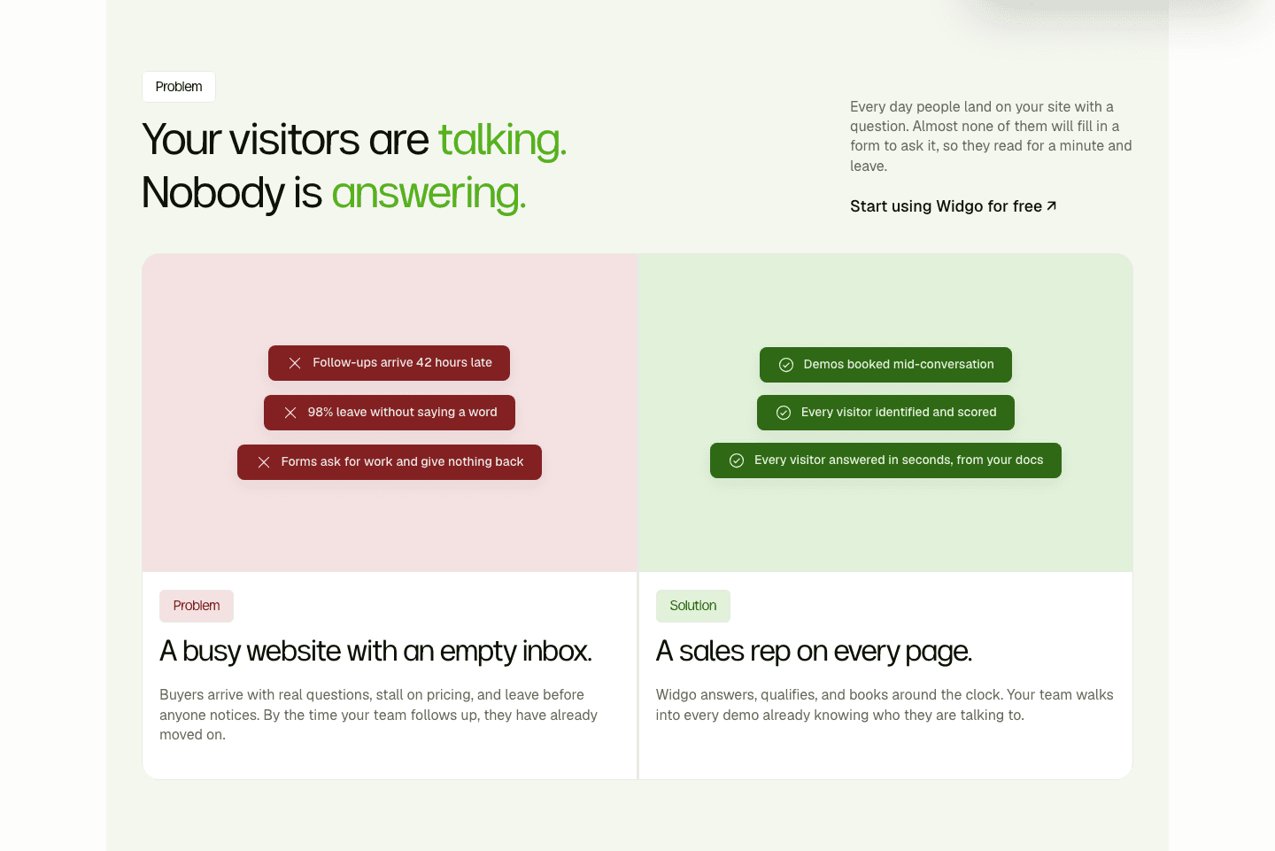
The before/after setup frames the old, messy way of working so the product's fix lands as a clear contrast the moment a visitor reads it.
Key takeaways
Showing 1–28 of 41 examples
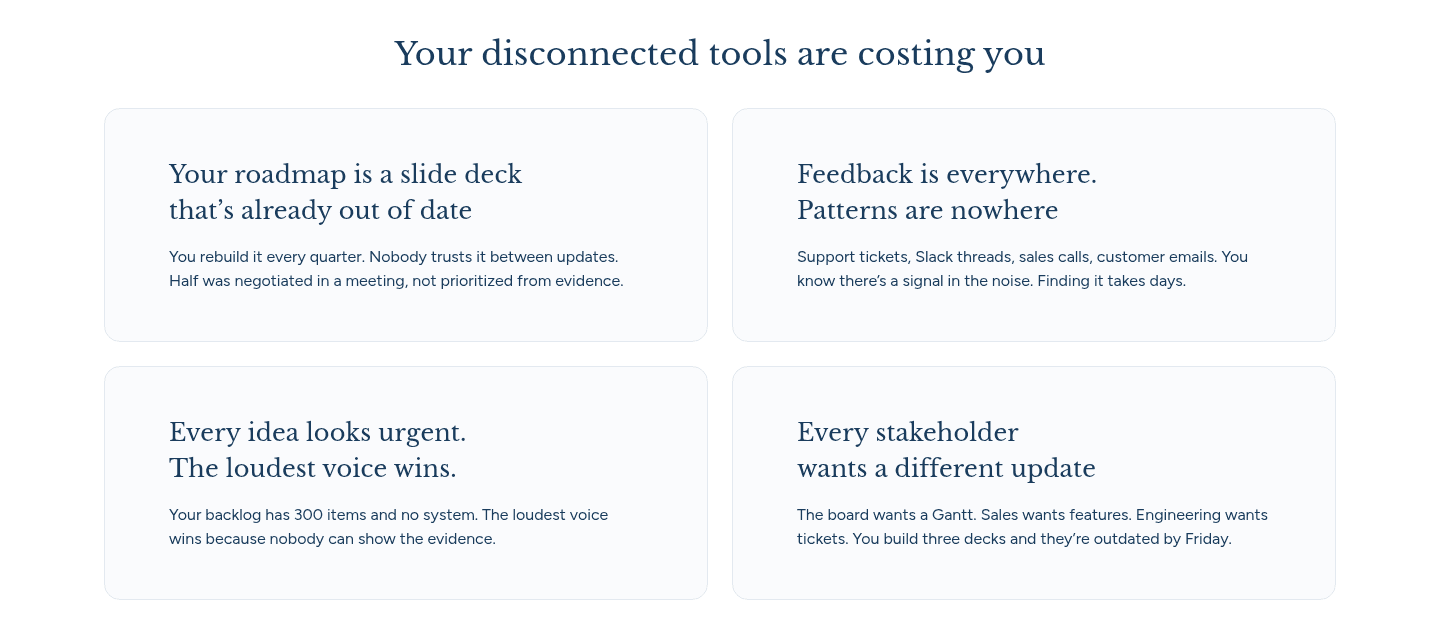
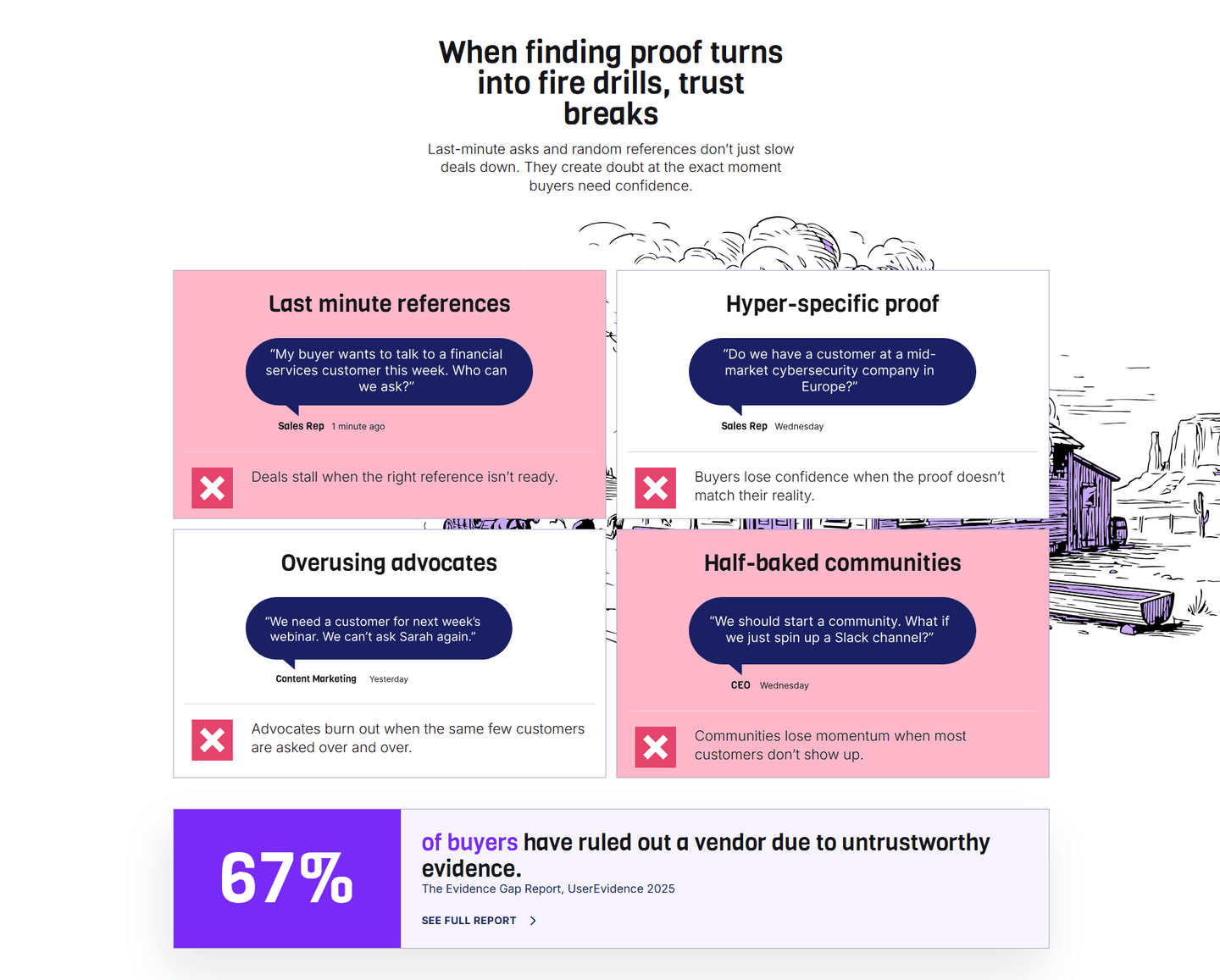
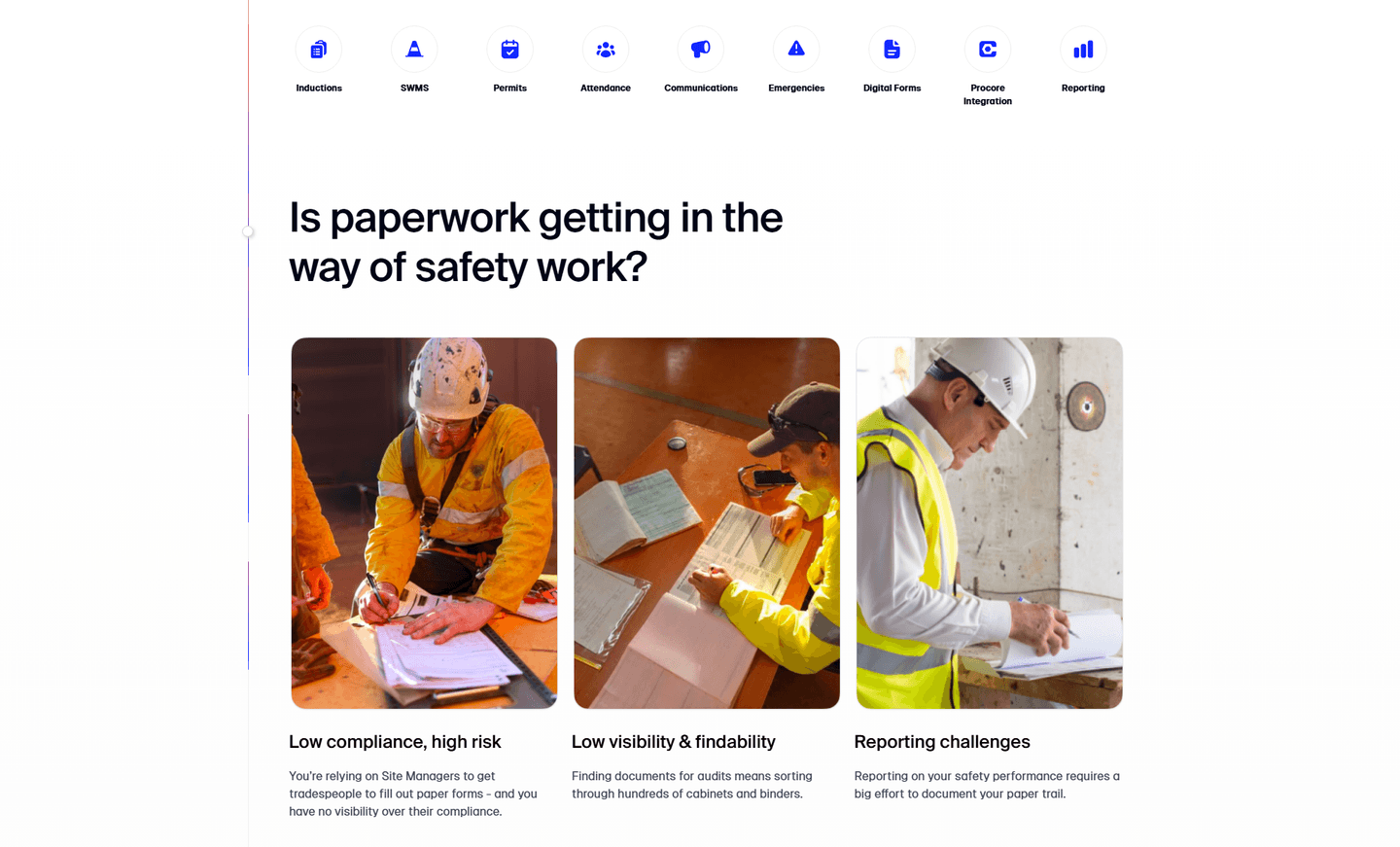

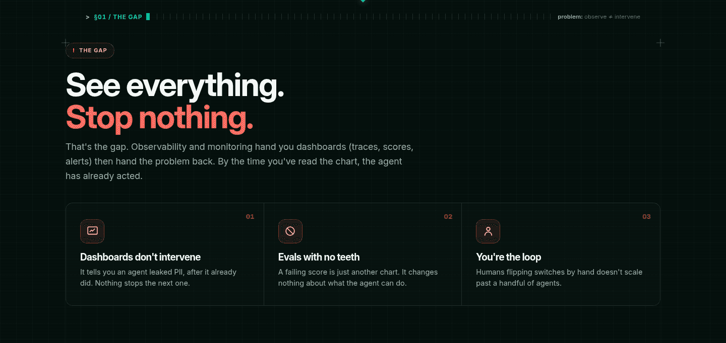
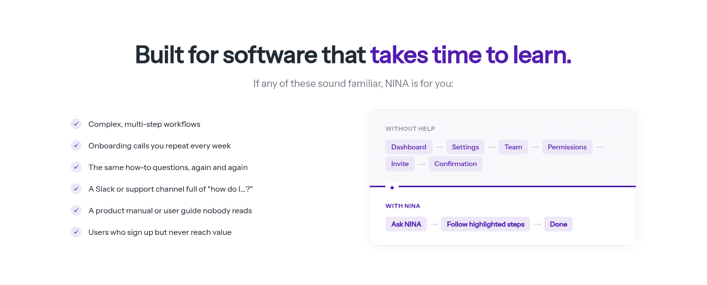
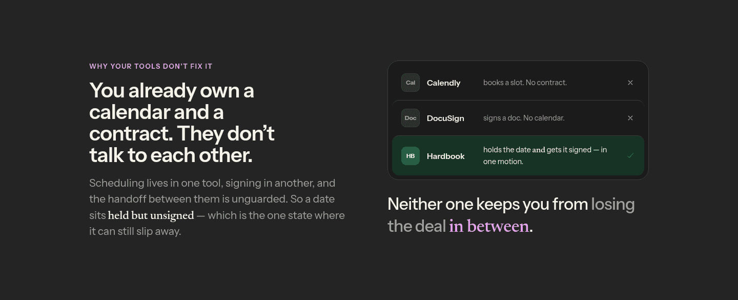
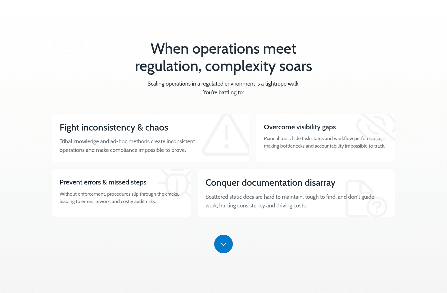

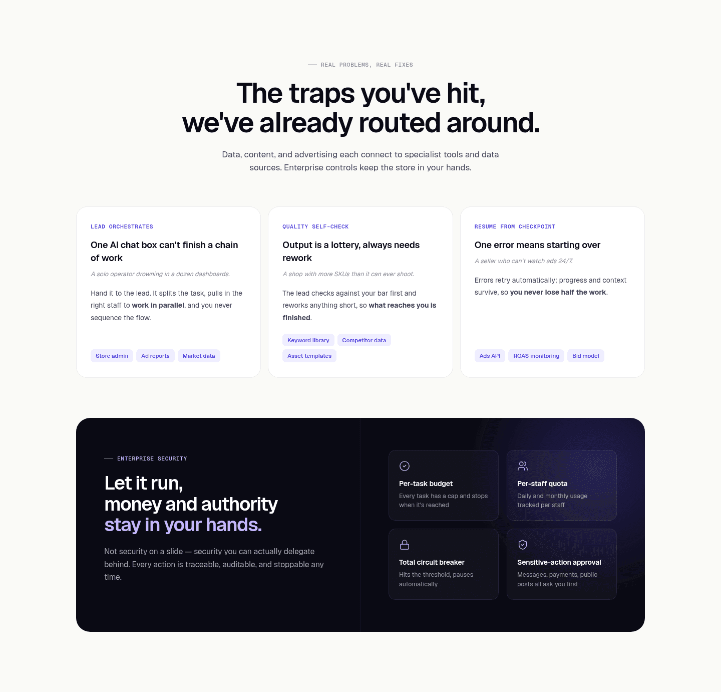
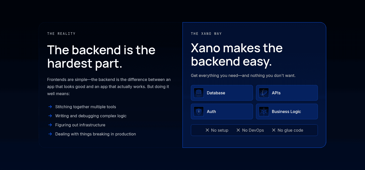
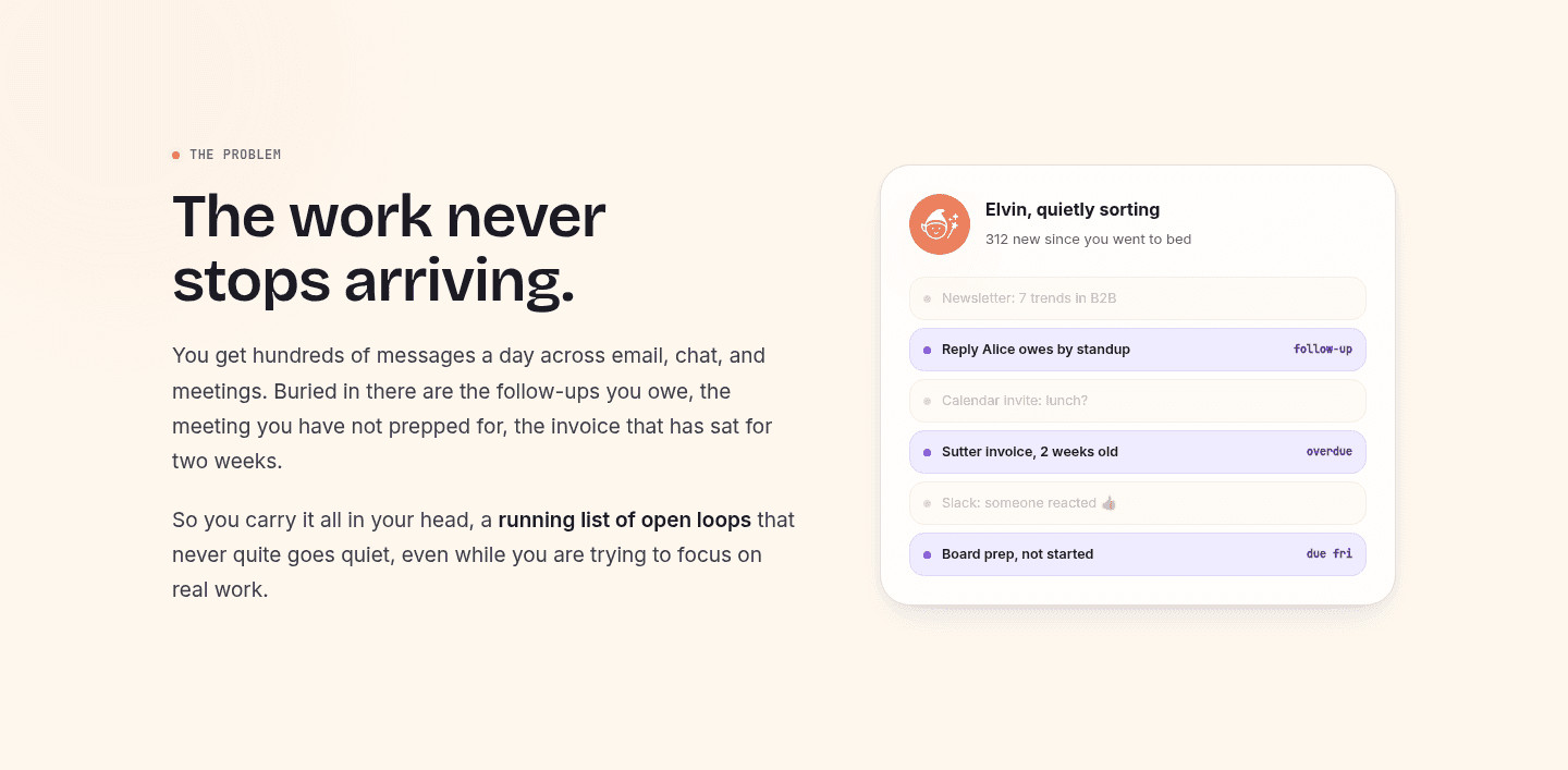
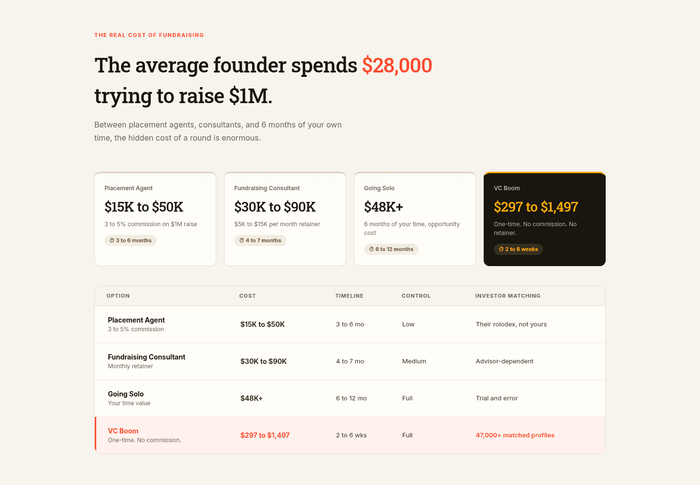
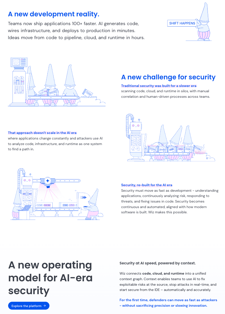
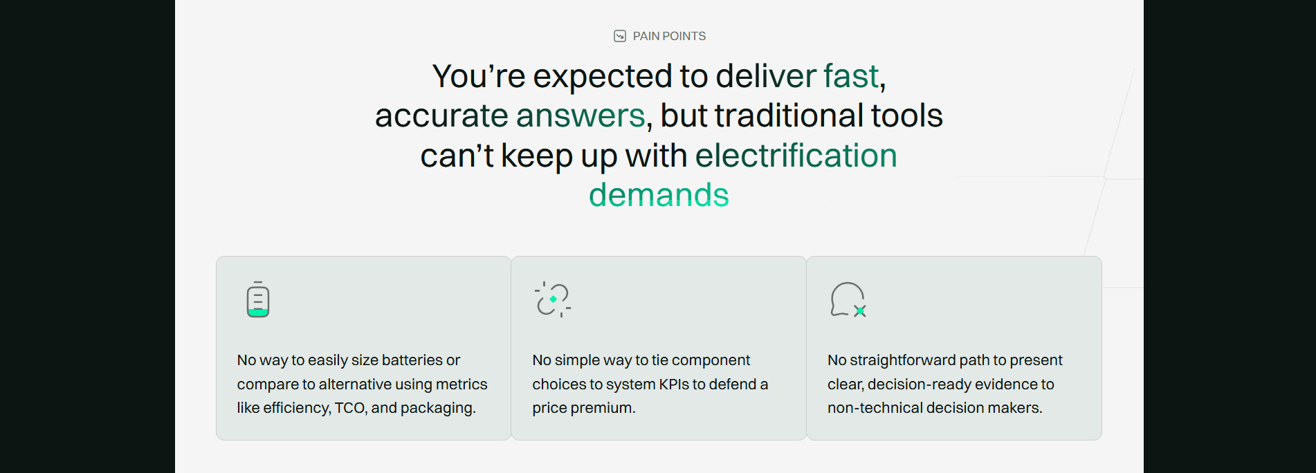



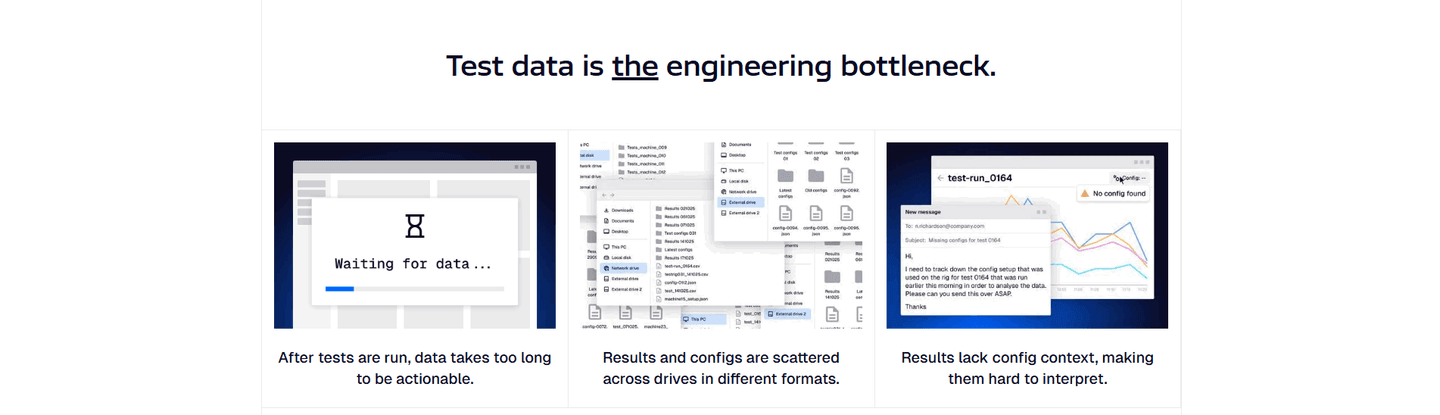
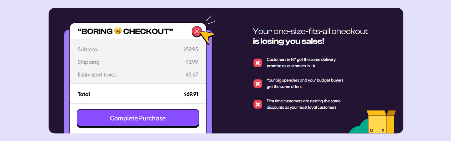
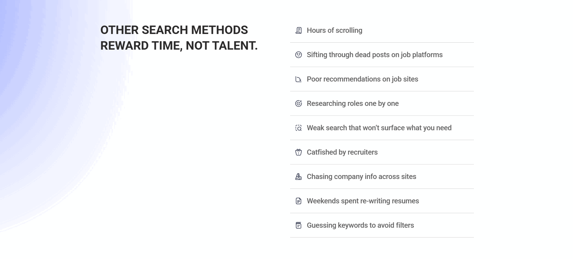
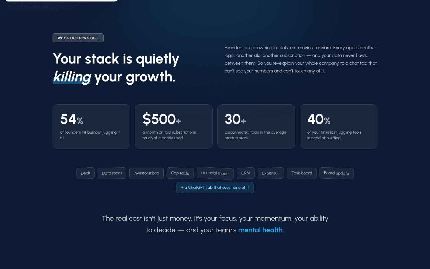
Browse every problem pattern by UX best practice.
Every problem section is scored across 5 conversion best practices. Copy the best practice stack, not the layout. See what converts and why.
Hand-picked from {companies} companies and analyzed by our AI conversion agent. Real problem sections on live landing pages. Every entry earns its spot.
Found a problem section you admire? Run yours through the same scoring engine. See where you stand on the same best practices, and what to fix first.
A before/after setup is a problem section that describes the old, messy way of working in enough detail that the product's fix reads as a clean contrast. It spends its first half on the before, the scattered tools, the manual copying, the hours lost, so the after the product promises has something concrete to beat. The section is not there to depress the reader. It is there to name the status quo so precisely that the fix feels inevitable.
The best problem sections build the contrast in one of a few ways:
A product claim in a vacuum is just an adjective. "Simple," "all in one," and "fast" mean nothing until the reader has felt the opposite. The before/after setup supplies that opposite first, so by the time the product speaks, the reader is already nodding along to the pain and primed for the relief.
It also earns trust in the diagnosis. When a section describes the current mess in the reader's own words, the reader concludes that the people behind the product actually understand the job. A fix offered by someone who clearly gets the problem is far easier to believe than a fix that arrives cold, ahead of any evidence the problem was understood.
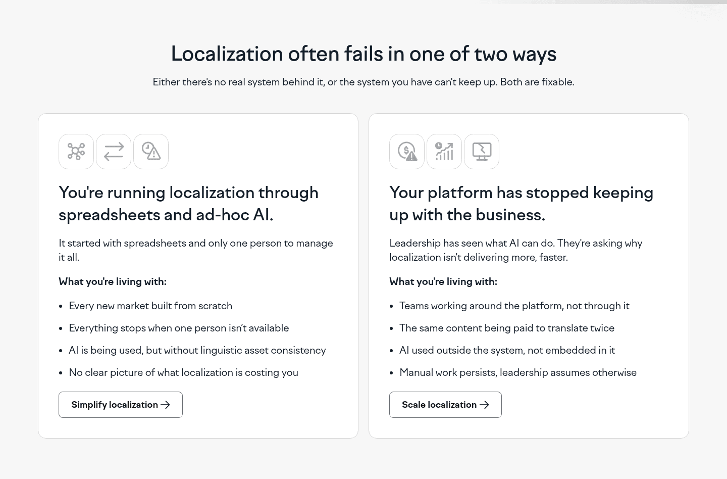
Across the scored examples below, the strongest before/after setups make the before specific and the after tight. Lokalise splits its section into two current setups and defuses the pain with a subhead ("Both are fixable"), so the contrast motivates instead of deflating. Omnibound sets its after directly against the alternative, framing generic AI output as slop next to content that actually fits. The move is the same shape every time: stage a concrete before, then hand over an after that answers it point for point.
The after does not have to live in the same block. Many pages let the problem section carry the before and pass the after to the feature section's before/after contrast, or you can browse the full problem section gallery to see the range of setups.
100/100 10/100
The most common failure is a before that is too vague to recognize. "Managing your work is hard" describes no one's Tuesday, so no one leans in. The fix is specificity: name the real tools, the real hours, the real workaround, the way the best examples do. The second failure is a before with no bridge, a section that stacks up pain and then stops, leaving the reader stranded in the mess with no visible way out. Every strong before/after setup closes on a line that turns the page toward the fix.

Curated by
Gabriel Amzallag , Founder, Web Anatomy
5 years CRO + SEO at Qonto (2021–2025). After advising 15+ SaaS on their websites (Payfit, Pigment…), the same patterns kept breaking, so I decided to build the source of truth on what works on the web: the intelligence layer every tool, builder, and team uses to ship sites that perform.
Paste your URL. Get a scored analysis of your problem section, including whether the before is concrete enough to make the after land. Free, no signup.
The common questions about staging the before so the after lands, with answers drawn from 41 scored examples.
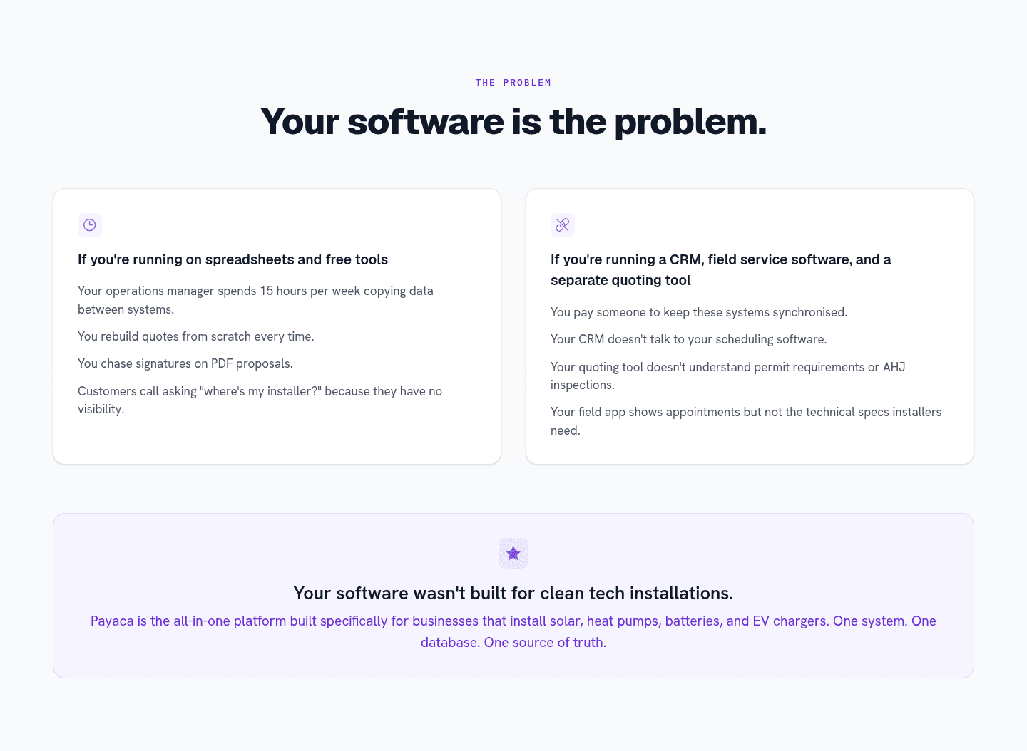
It is a problem section that describes the old, messy way of working in detail so the product's fix reads as a clear contrast. The section stages the before, the scattered tools and manual workarounds and wasted hours, then points to an after that answers that exact mess. Payaca does this cleanly, closing a fragmented status quo with 'One system. One database. One source of truth.'
A product claim means little until the reader has felt the opposite. Words like 'simple' or 'all in one' only carry weight once the current mess is fresh in mind. Describing the before first also signals that the product's makers understand the job, which makes the fix easier to believe than one that arrives cold.
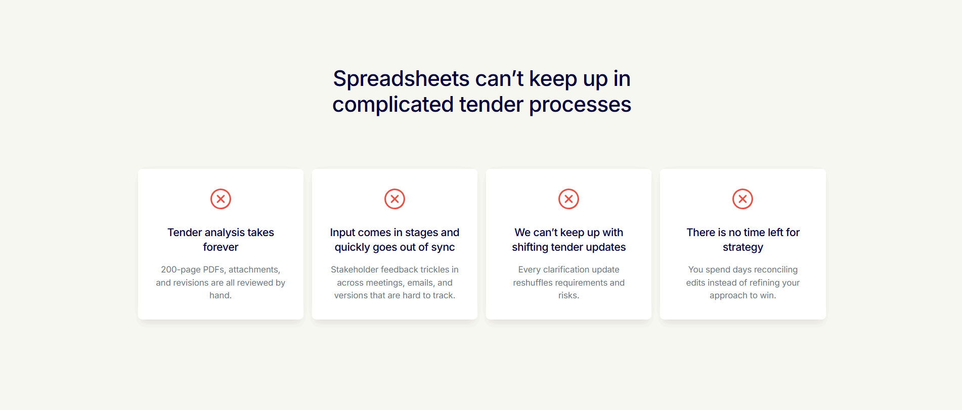
As specific as the reader's real week. A vague line like 'managing work is hard' recognizes no one; a concrete one names the actual tools, hours, and workarounds. Altura pins its before on 'spreadsheets cannot keep up in complicated tender processes,' so bid and tender teams see their own setup on the screen.
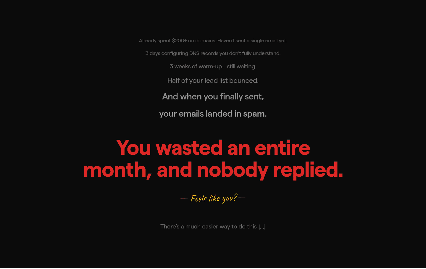
A plain pain list stops at the problem. A before/after setup adds the turn: a bridge line or a tight promise that points from the mess to the fix. Saleshandy ends its pain stack on 'There is a much easier way to do this,' which pulls the eye down toward the solution instead of leaving the reader stuck in the mess.
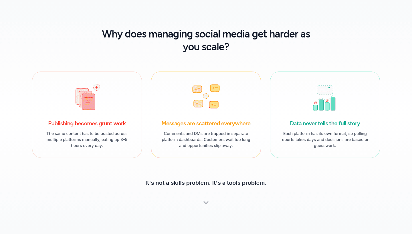
Right before the section that carries the solution, usually the features or how-it-works block. The problem section stages the before and hands off the after, so the two read as one continuous argument. Some pages keep both halves inside the problem section itself, closing on a reframe like SocialEcho's 'It's not a skills problem. It's a tools problem.'