Features|
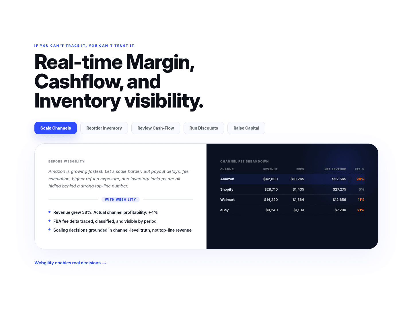
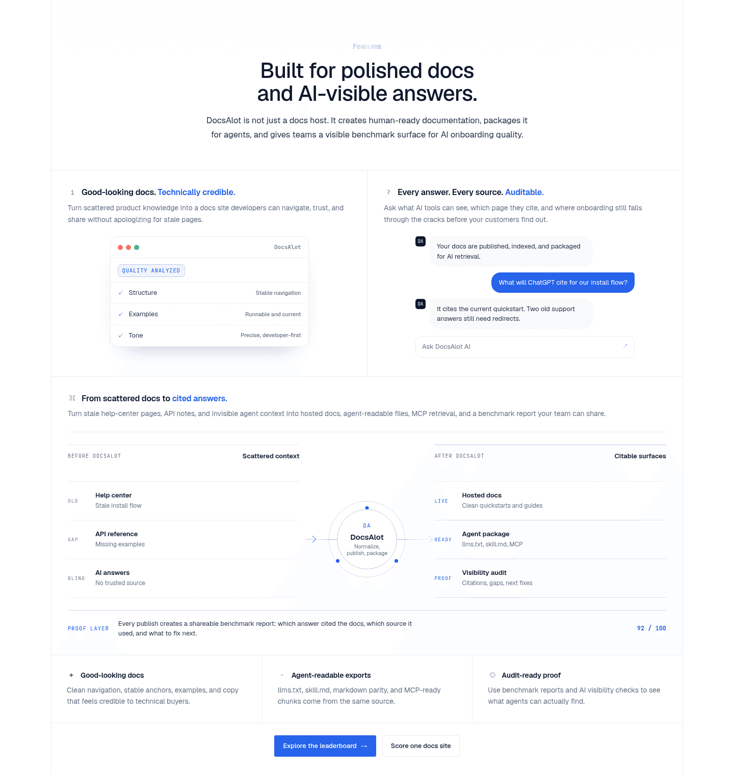
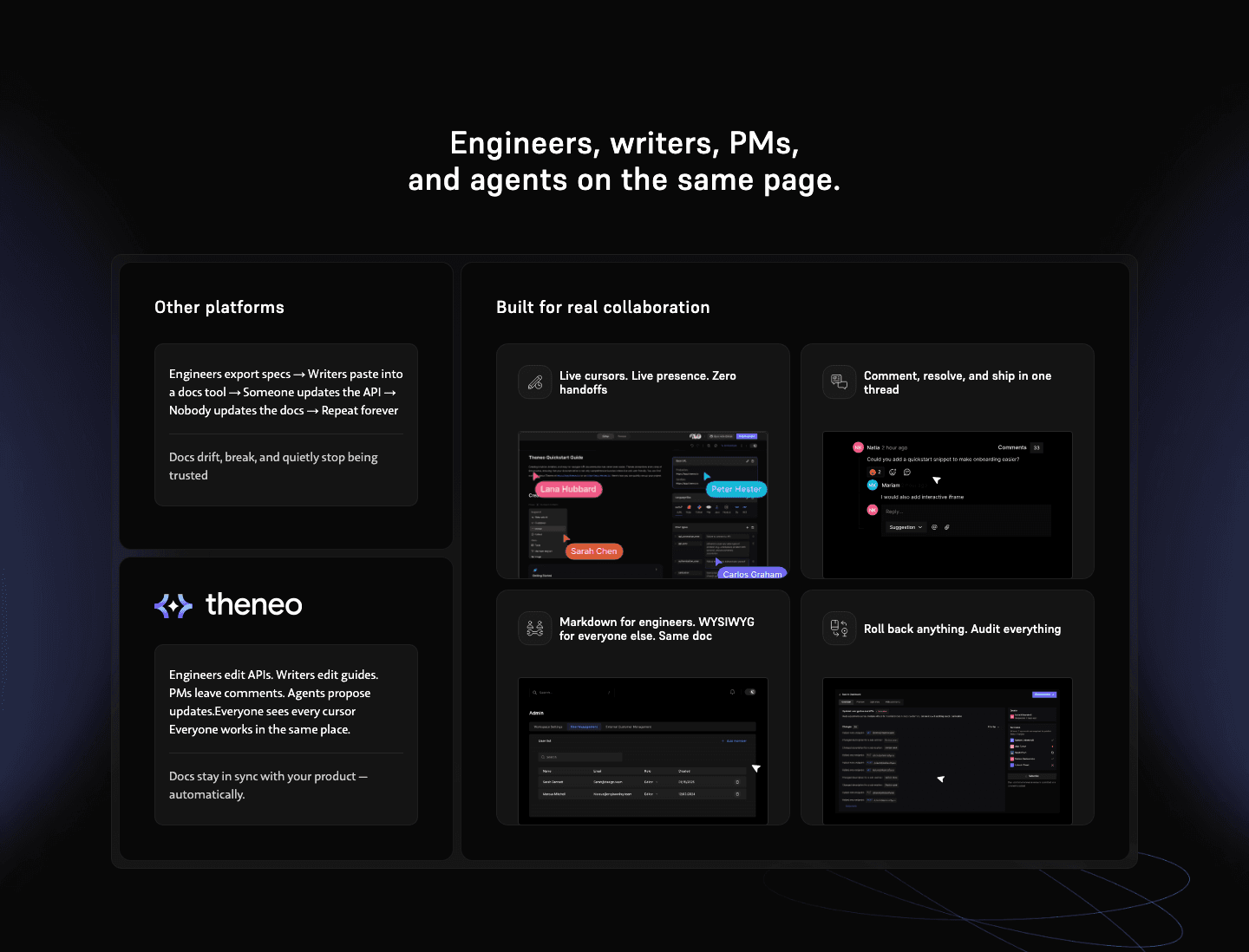
Before/after contrast sets the old way beside the new so the gain is visible at a glance, turning a feature list into a change the visitor can measure.
Key takeaways
Showing 1–28 of 32 examples


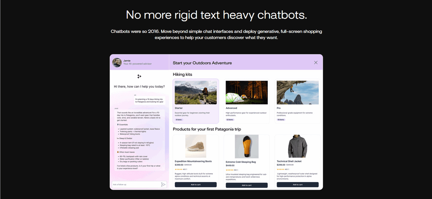
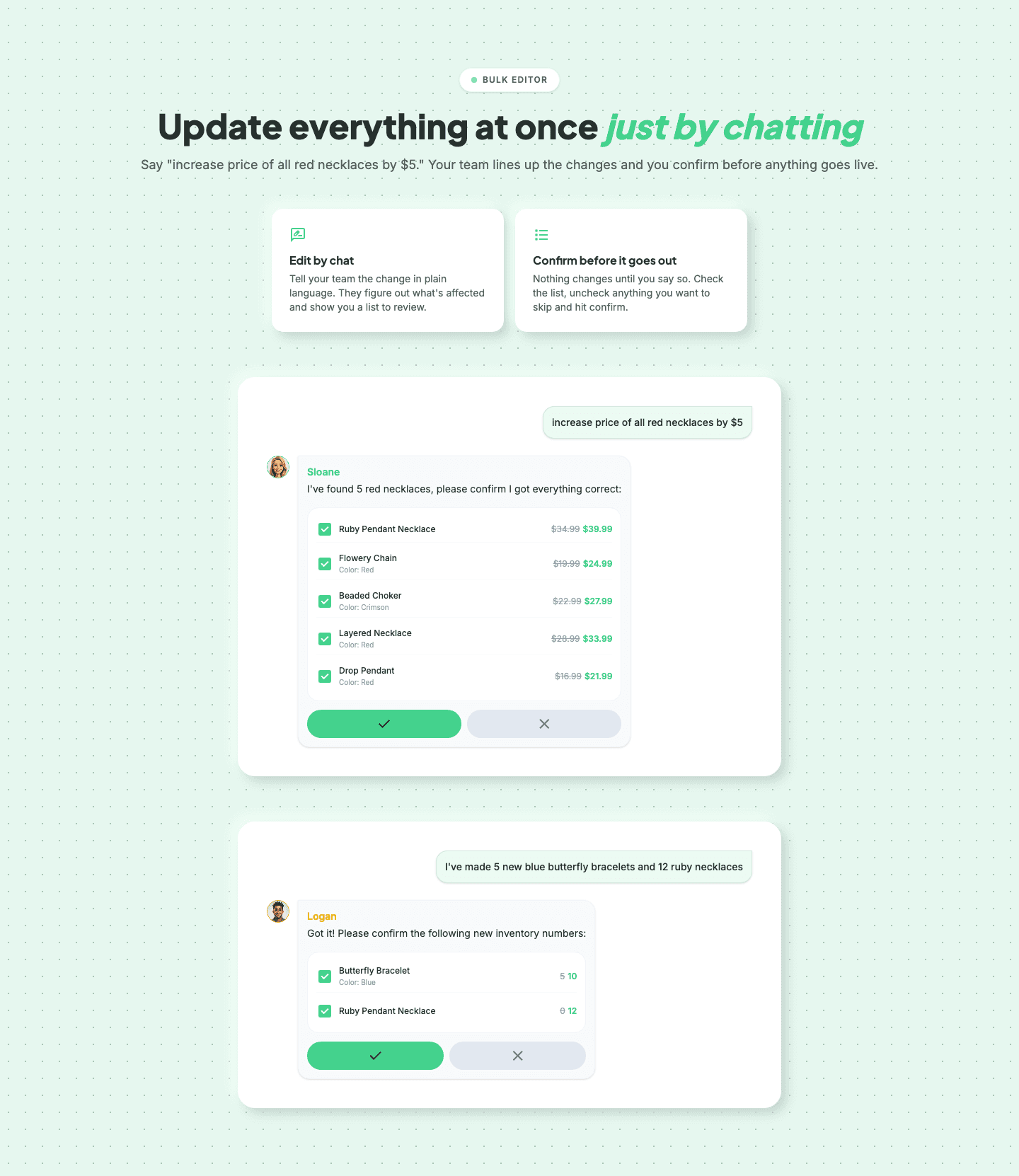



Browse every features pattern by UX best practice.
Every features section is scored across 6 conversion best practices. Copy the best practice stack, not the layout. See what converts and why.
Hand-picked from {companies} companies and analyzed by our AI conversion agent. Not a random dump of feature grids. Every entry earns its spot.
Found a features section you admire? Run yours through the same scoring engine. See where you stand on the same best practices, and what to fix first.
Before/after contrast organizes the features section around a change, not a checklist. A plain list of capabilities describes what the product does. A before/after shows the world without it beside the world with it, so the improvement is something the visitor can see instead of something they have to take on faith. The claim is the same; what changes is that the old way is now on the page giving the new way something to beat.
The best features sections build the contrast in one of a few forms:
A generic feature list asks the visitor to imagine the improvement. They read what the product does, then picture how much better their day would be, which is work most visitors will not do. Before/after contrast does that picturing for them: it puts the starting point on the screen next to the result, so the size of the gain is measured rather than guessed.
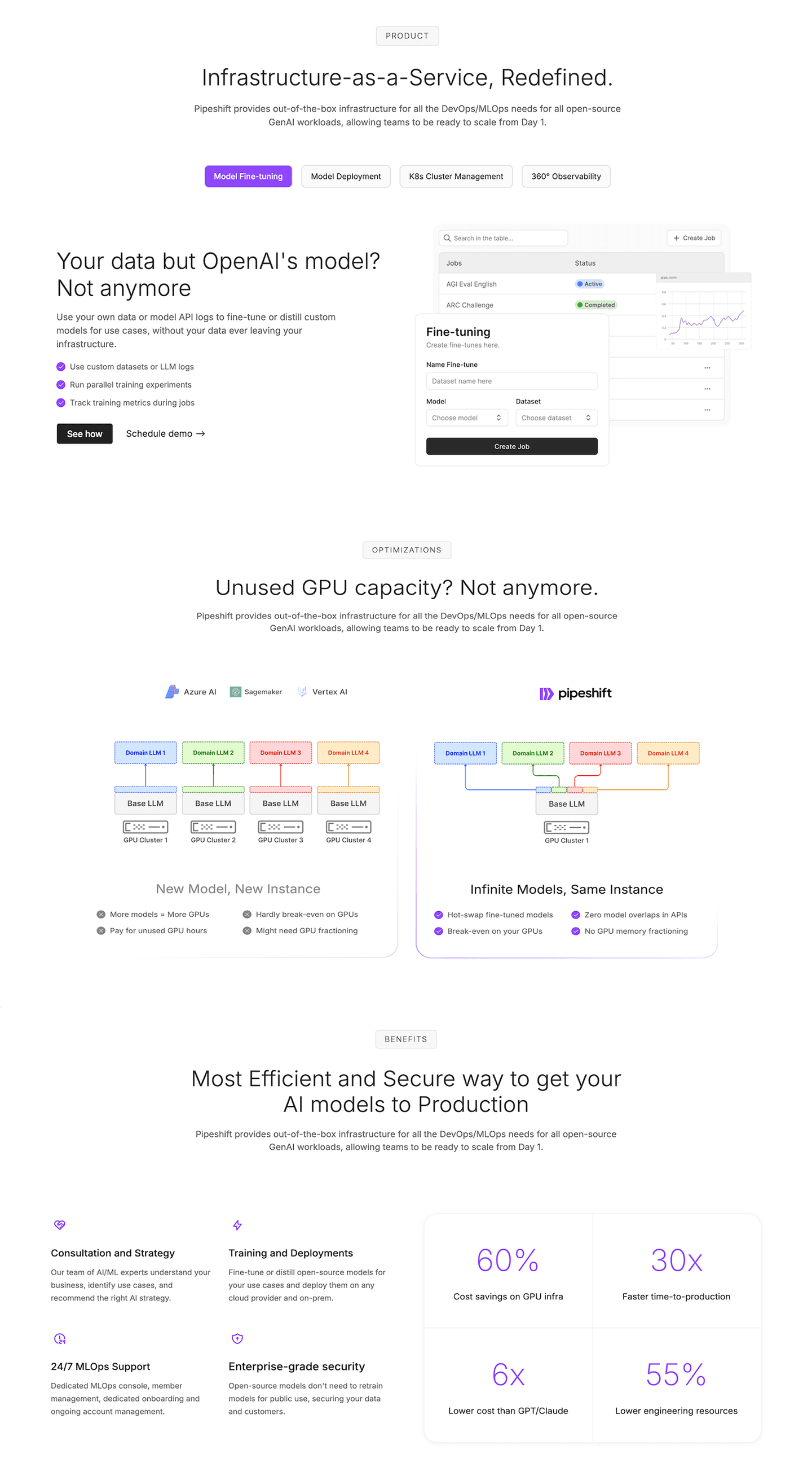
Naming the old way also makes the new way credible. A claim on its own reads as marketing. The same claim standing next to the problem it replaces reads as a fix, because the visitor recognizes the before from their own experience. When Pipeshift lists the old way (pay for unused GPU hours) beside the new one (break even on your GPUs), the promise lands as a solution to a pain the reader already feels.
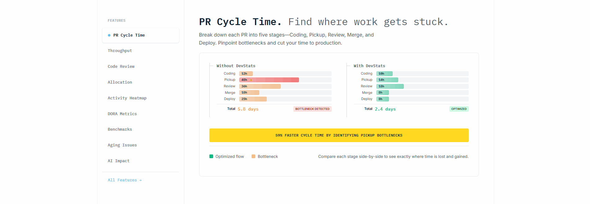
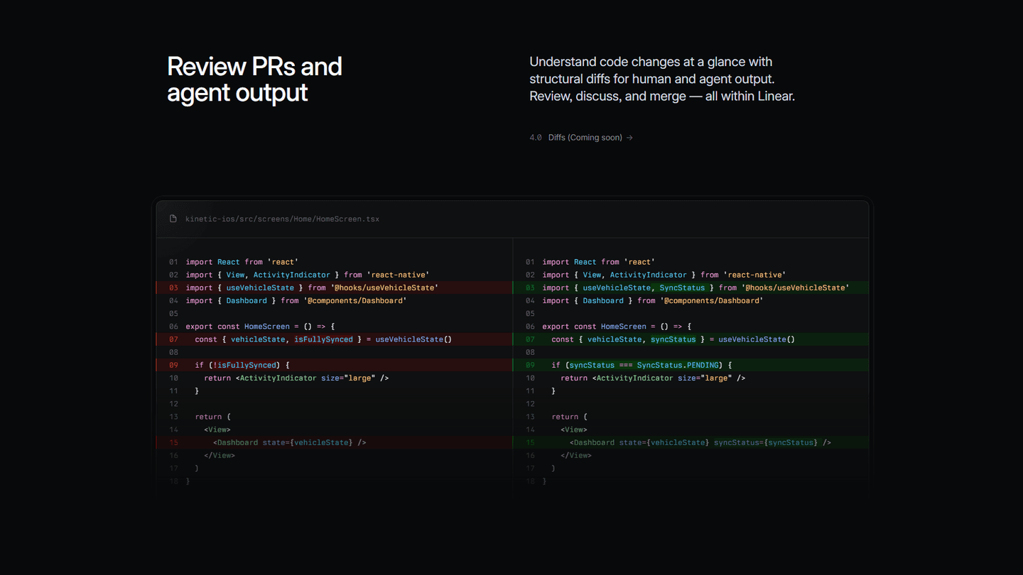
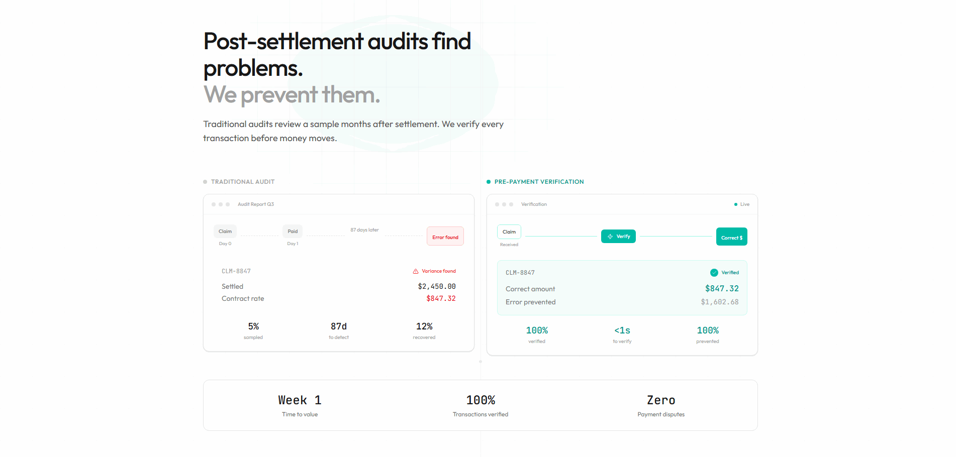
Across the examples below, the contrast that works shares a discipline. The before is honest and specific, not a straw man: DevStats names a real 5.8 day bottleneck rather than a vague slowdown, and Benchify pins the old audit to a concrete detection lag. The after is backed by real product output rather than an illustration, the way CtrlOps closes the loop with a live terminal and a Your site is back online status, and Linear shows the actual code diff instead of an abstract mockup. And the strongest sections keep the two states legible in one glance, so the reader never has to scroll from the problem to the fix to connect them.
The contrast often rides alongside features grouped by persona, where each audience gets its own old-way-to-new-way story, and it pairs naturally with a demo video in the features section, which plays the after state in motion. The wider features section gallery shows how contrast sits alongside the other ways a features section earns a click.
100/100 0/100
0/100The usual failure is an after with no before: a polished result on screen with nothing to measure it against, so the gain has no size. The second is a before that is exaggerated or vague, an old way drawn so bleak it reads as a straw man, which makes the whole contrast feel staged. The third is a contrast the visitor has to assemble, with the problem in one section and the fix three scrolls later, so the two states never share the screen. Keep the before honest, put it next to the after, and let real product output carry the result.

Curated by
Gabriel Amzallag , Founder, Web Anatomy
5 years CRO + SEO at Qonto (2021–2025). After advising 15+ SaaS on their websites (Payfit, Pigment…), the same patterns kept breaking, so I decided to build the source of truth on what works on the web: the intelligence layer every tool, builder, and team uses to ship sites that perform.
We find every way to grow your website’s visibility and conversions: SEO, AI search (AEO), backlinks and mentions, and UX/UI. 3 free opportunities, delivered by email.
The common questions about showing an old way and a new way in the features section, with answers drawn from 32 examples.
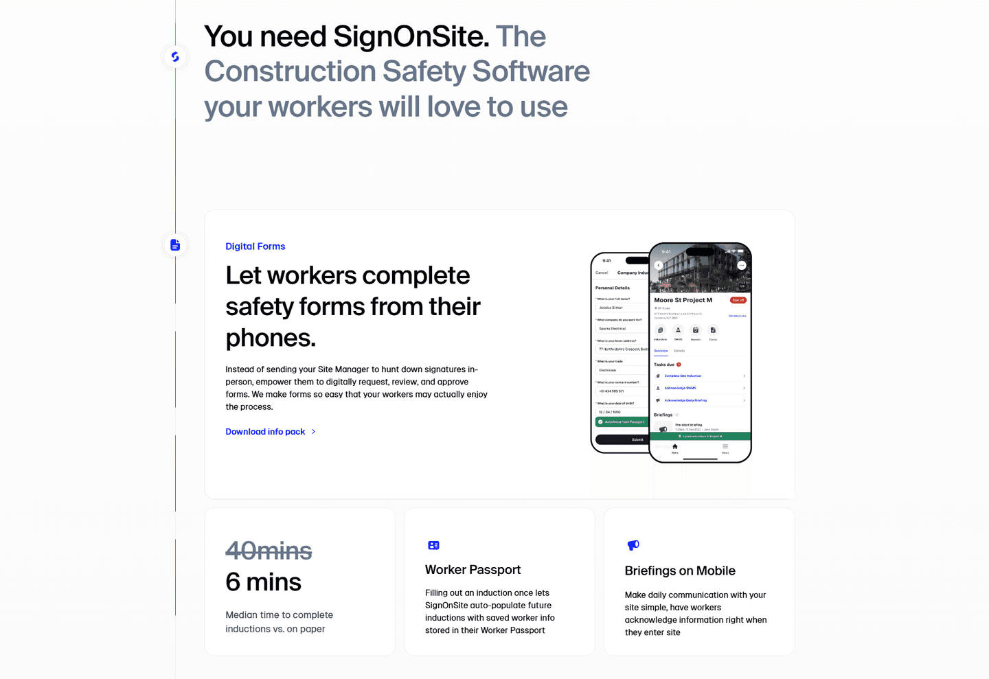
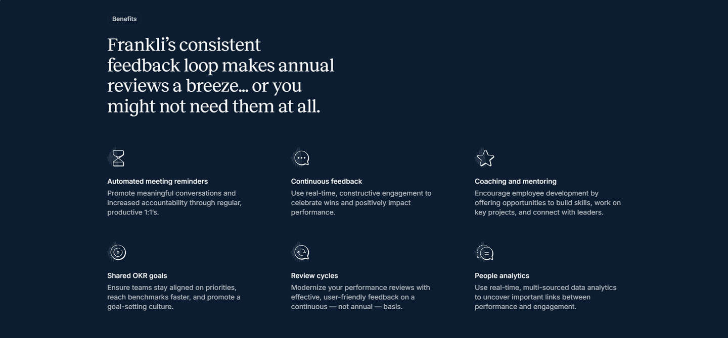
It is a features section that shows the old way and the new way side by side, so the improvement is visible rather than asserted. The contrast takes a few forms: two columns like DevStats setting Without DevStats against With DevStats, a struck-through stat like SignOnSite cutting 40 minutes to 6, or old-way-versus-new-way copy like Frankli reframing dreaded annual reviews as a continuous cadence.
A plain list describes what the product does; a before/after shows what changes when a visitor uses it. Naming the old way gives the new way something to beat, so the gain is measured instead of merely promised. When Benchify puts a Traditional Audit next to Pre-Payment Verification, the visitor sees the problem and the fix in one glance and does not have to imagine the difference.
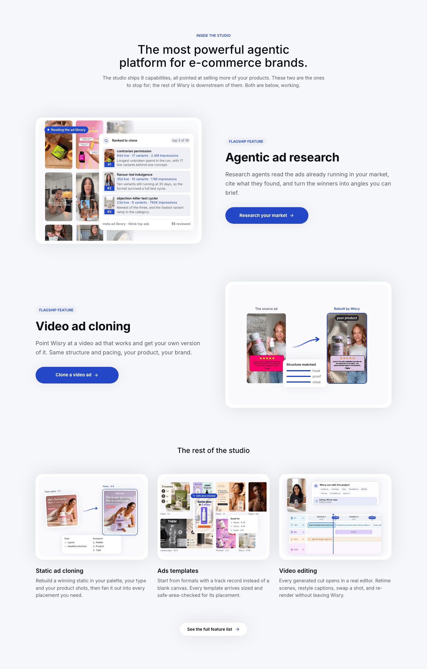
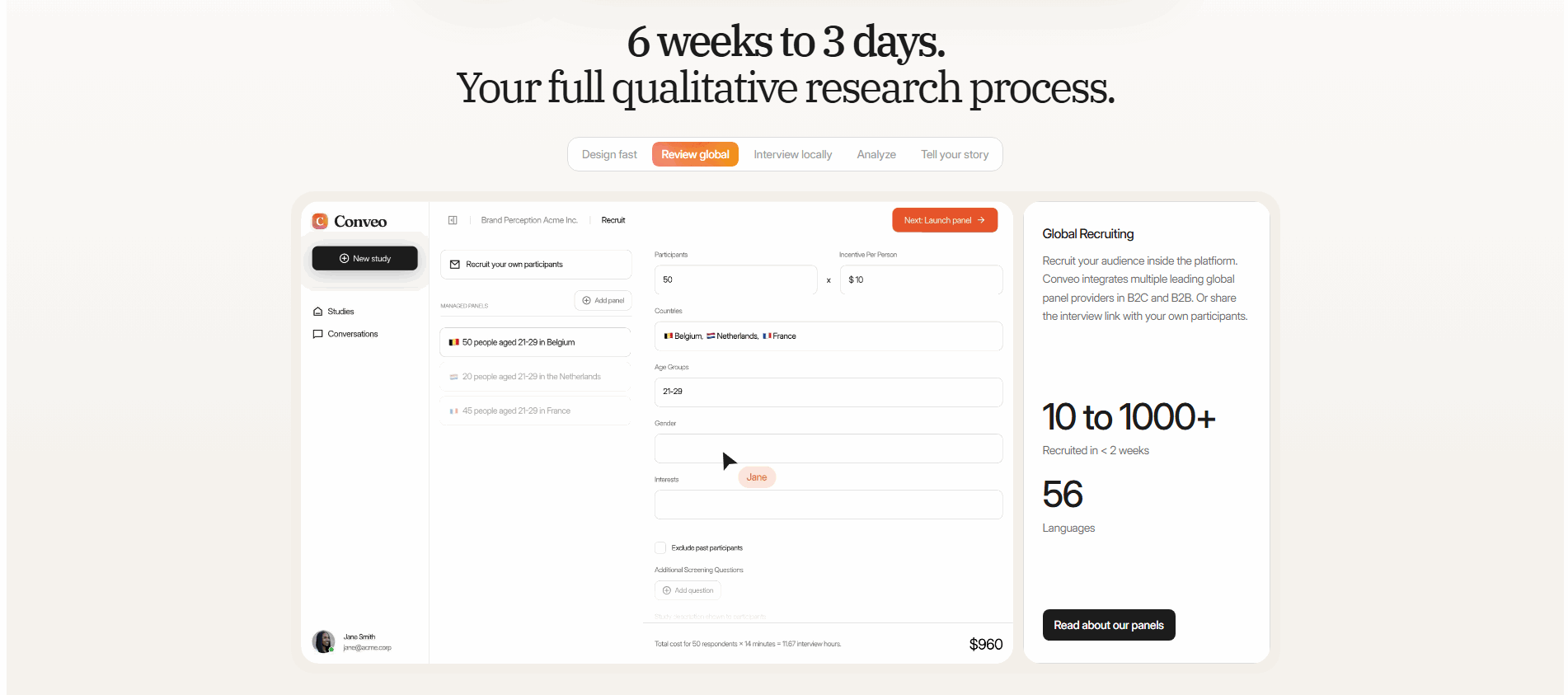
The common forms are a two-column split, a single stat that moves from bad to good, old-way-versus-new-way copy, and a transformation arrow. Conveo makes 6 weeks to 3 days the centerpiece; Waratek diagrams its inline protection against the old out-of-band approach; Kittl shows a flat label turning into a photoreal mockup through a connecting arrow. Each one carries a starting state to a finished one so the reader can see the distance covered.
They back it with real product output, not a stock illustration. TestSprite annotates a jump from 42% to 93% directly on the screenshot; CtrlOps closes the loop with a live terminal and a Your site is back online status; Linear renders an actual red-versus-green code diff. The before earns attention, but the after is what concrete product proof has to make credible.
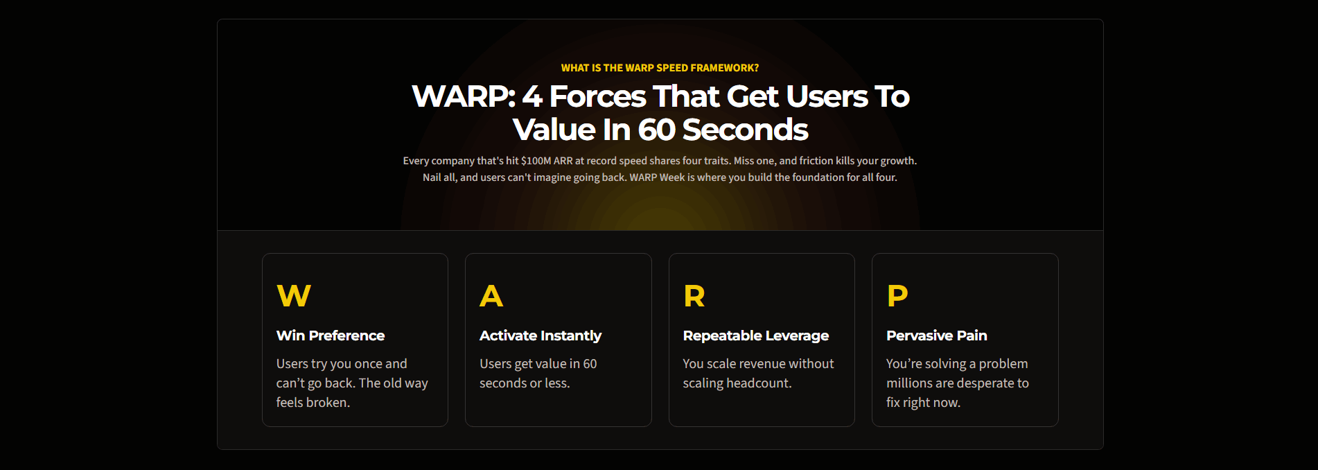
Showing the after with no before, so there is nothing to measure the gain against. The second is an exaggerated or vague old way that reads as a straw man, which makes the whole contrast feel staged. The strongest examples, like ProductLed contrasting an old way that feels broken with users who cannot go back, keep the before honest and specific so the after is trusted.