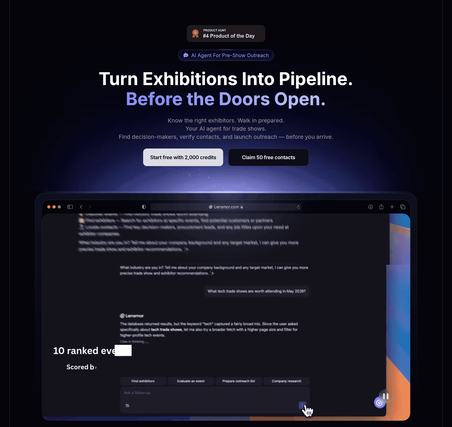
Hero Sections with a Product Visual (246)

A product visual in the hero shows what the product is and what using it looks like, with the real interface instead of an abstract graphic.

Key takeaways

  • Show the real interface, not an abstract illustration.
  • Crop to the one screen that makes the value obvious.
  • Keep it from crowding out the headline and CTA.

Showing 1–29 of 246 examples

Lensmor Hero
Hero|

Lensmor Lead Generation Hero Design

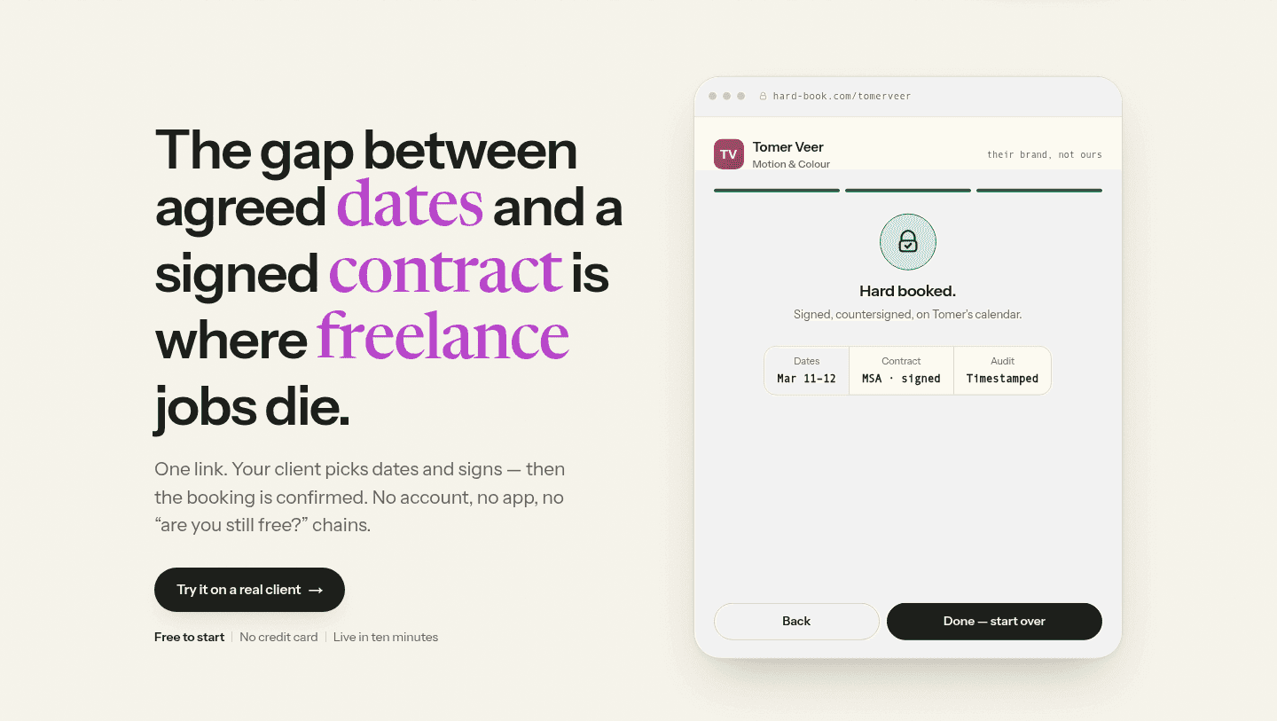
Hardbook Hero
Hero|

Hardbook Productivity Hero Design

Perfai Security Hero
Hero|

Perfai Security Cybersecurity Hero Design

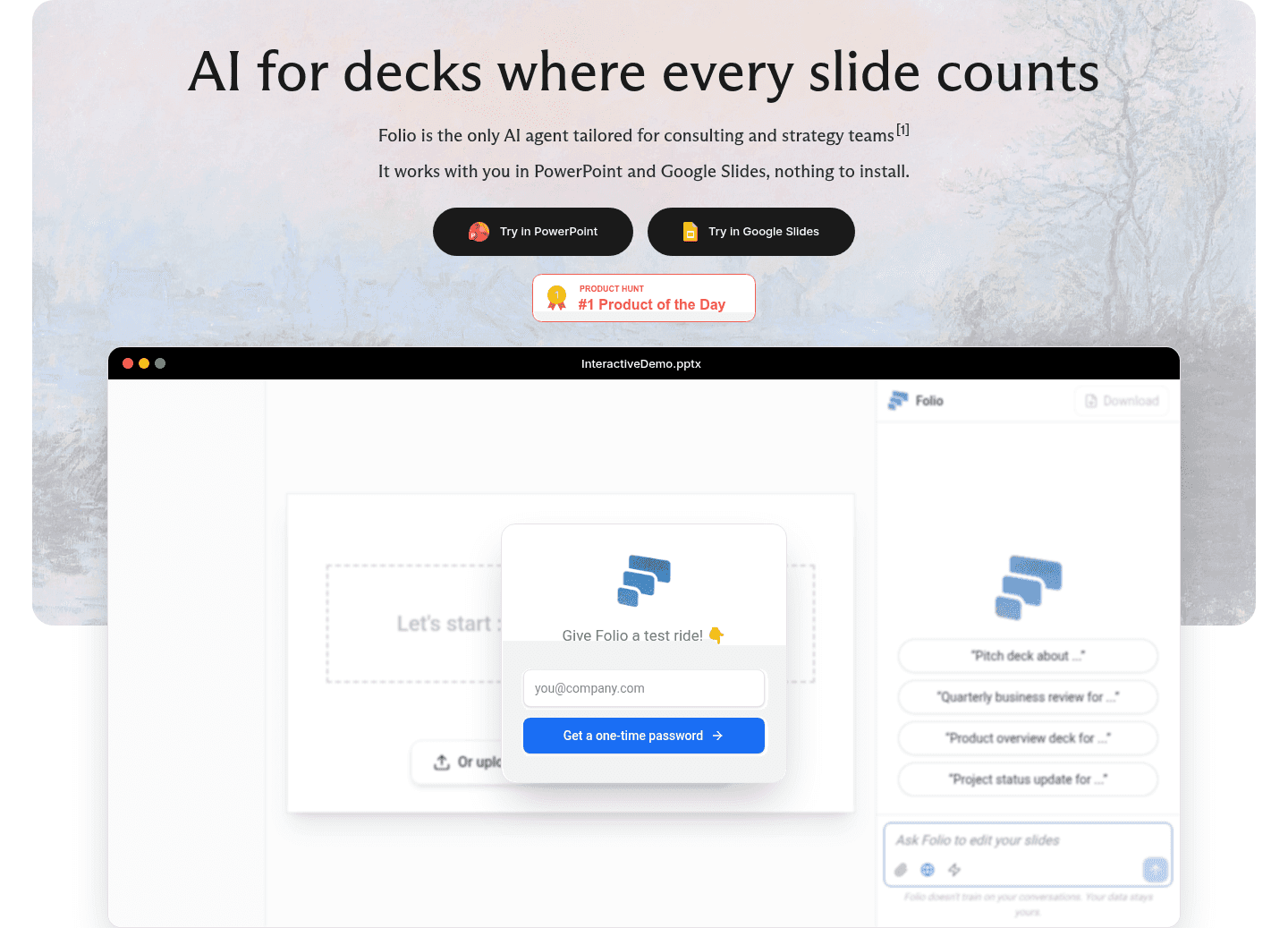
Folio AI Hero
Hero|

Folio AI AI Hero Design

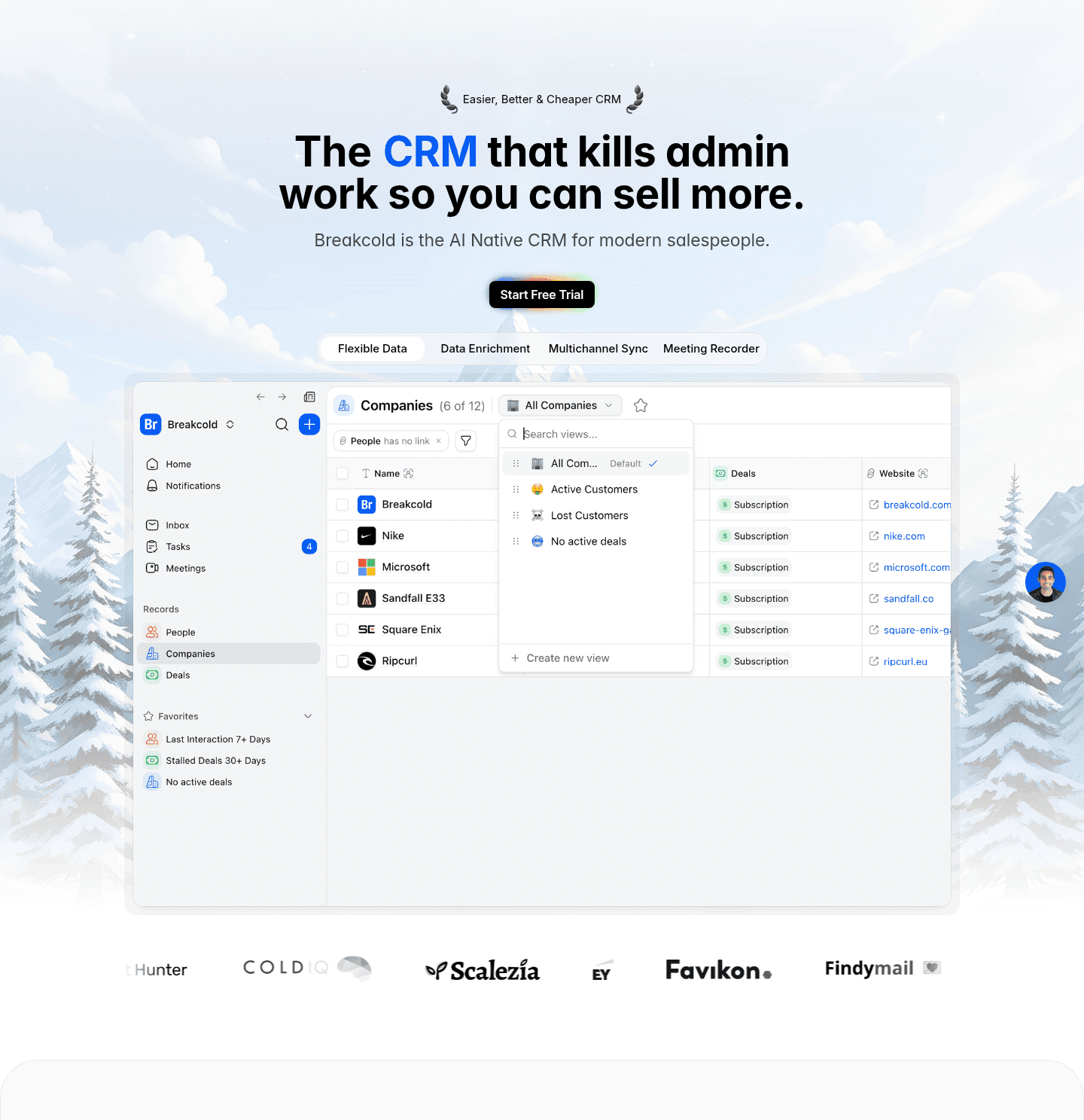
Breakcold Hero
Hero|

Breakcold CRM Hero Design

mailX by mailwarm Hero
Hero|

mailX by mailwarm Marketing Hero Design

Synthesia Hero
Hero|

Synthesia AI Hero Design

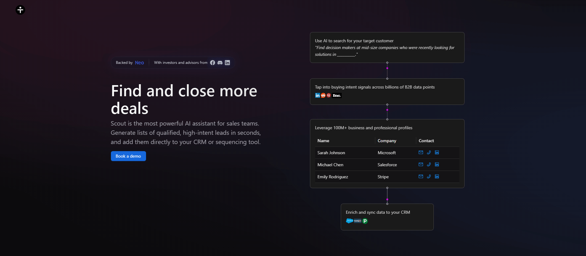
Scout Hero
Hero|

Scout AI Hero Design

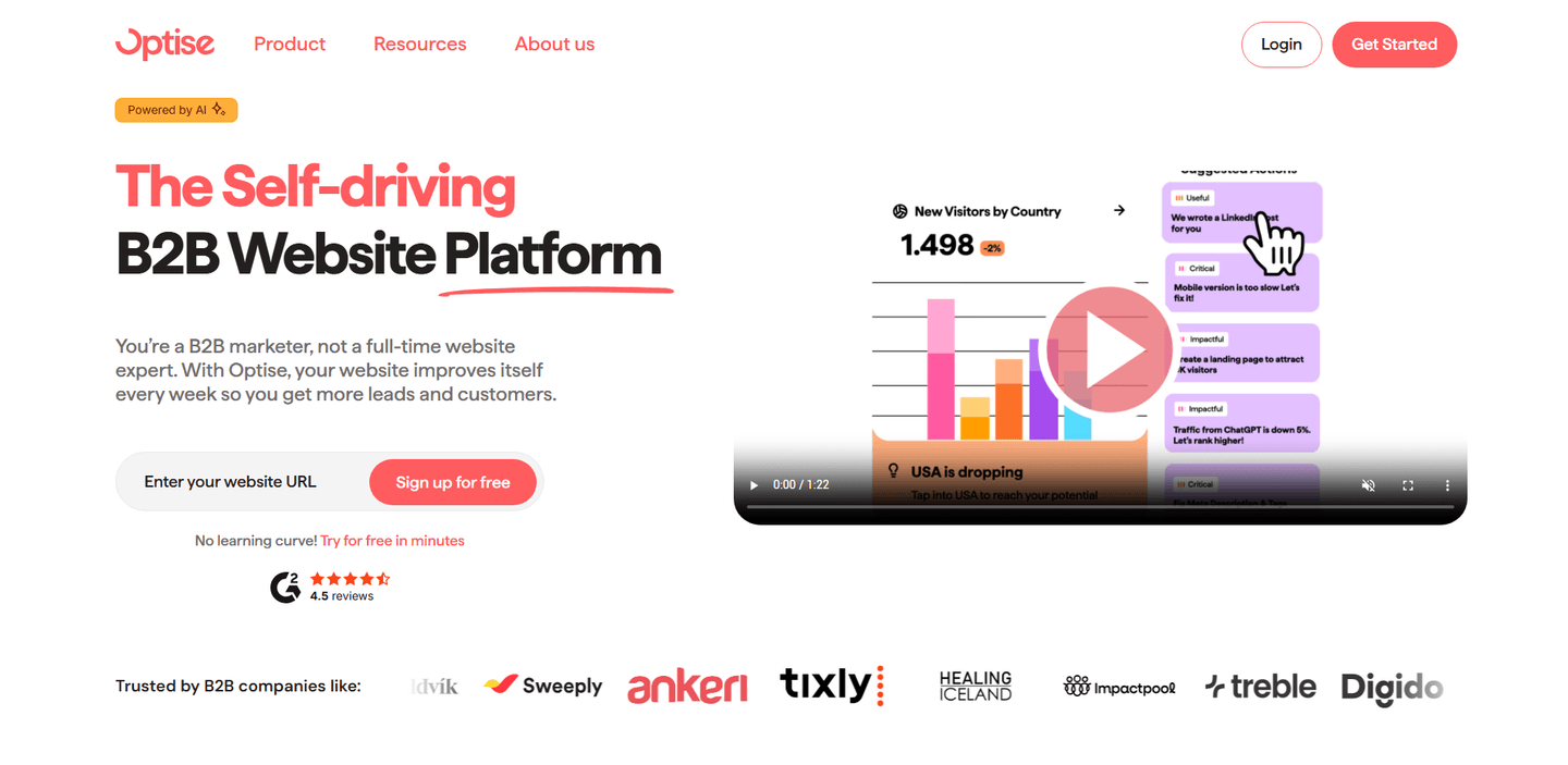
Optise Hero
Hero|

Optise SaaS Hero Design

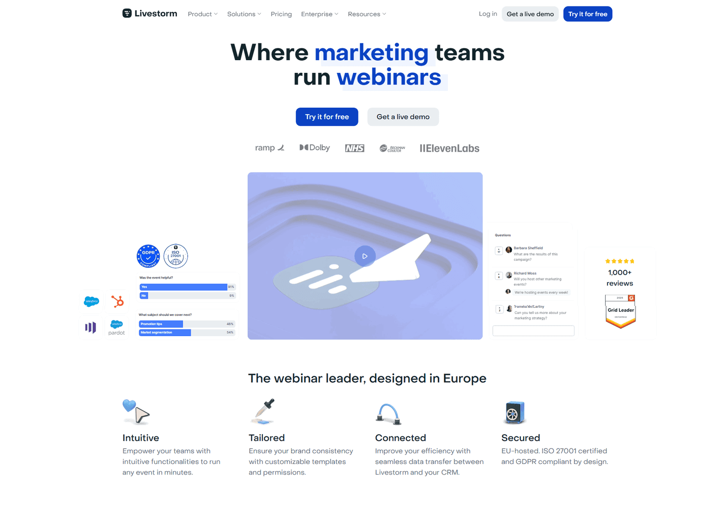
Livestorm Hero
Hero|

Livestorm SaaS Hero Design

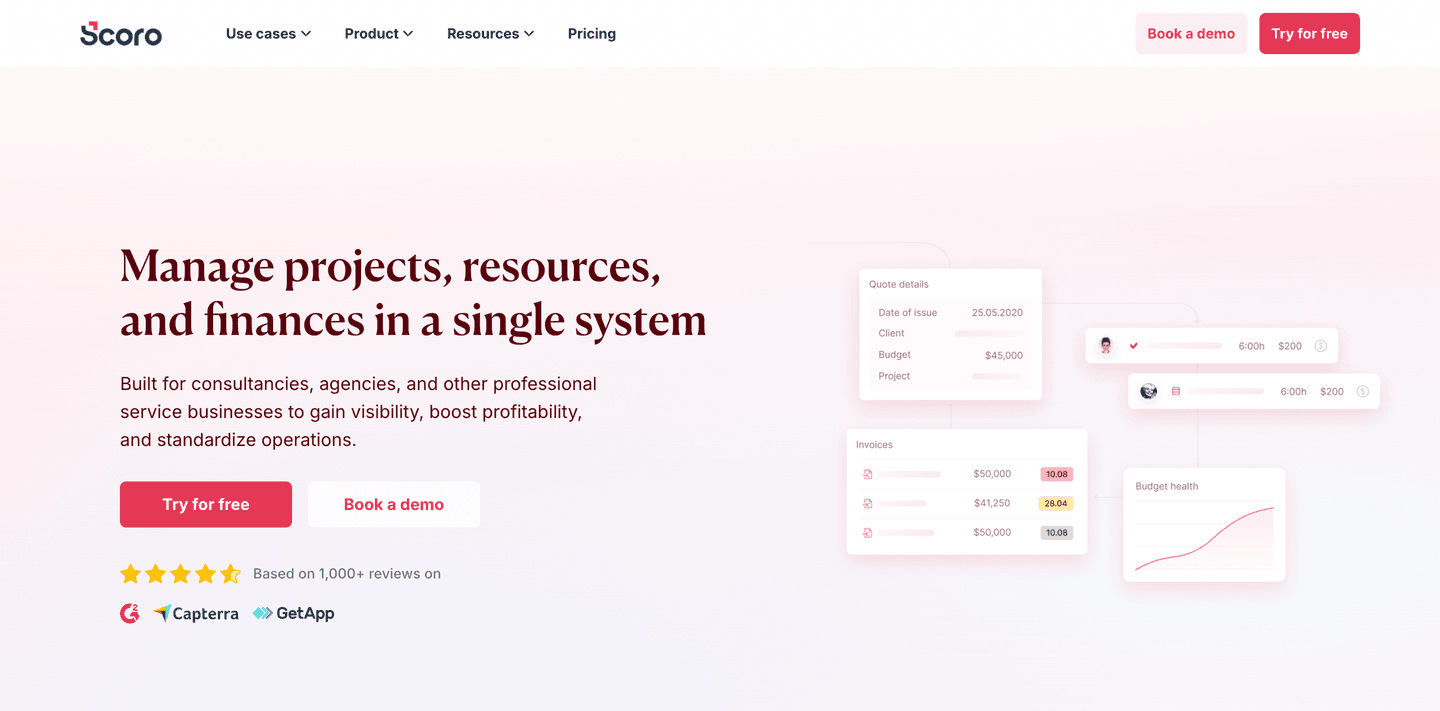
Scoro Hero
Hero|

Scoro SaaS Hero Design

ZooWork Hero
Hero|

ZooWork AI Hero Design

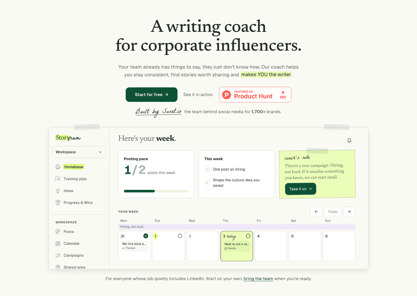
thestory.run Hero
Hero|

thestory.run Marketing Hero Design

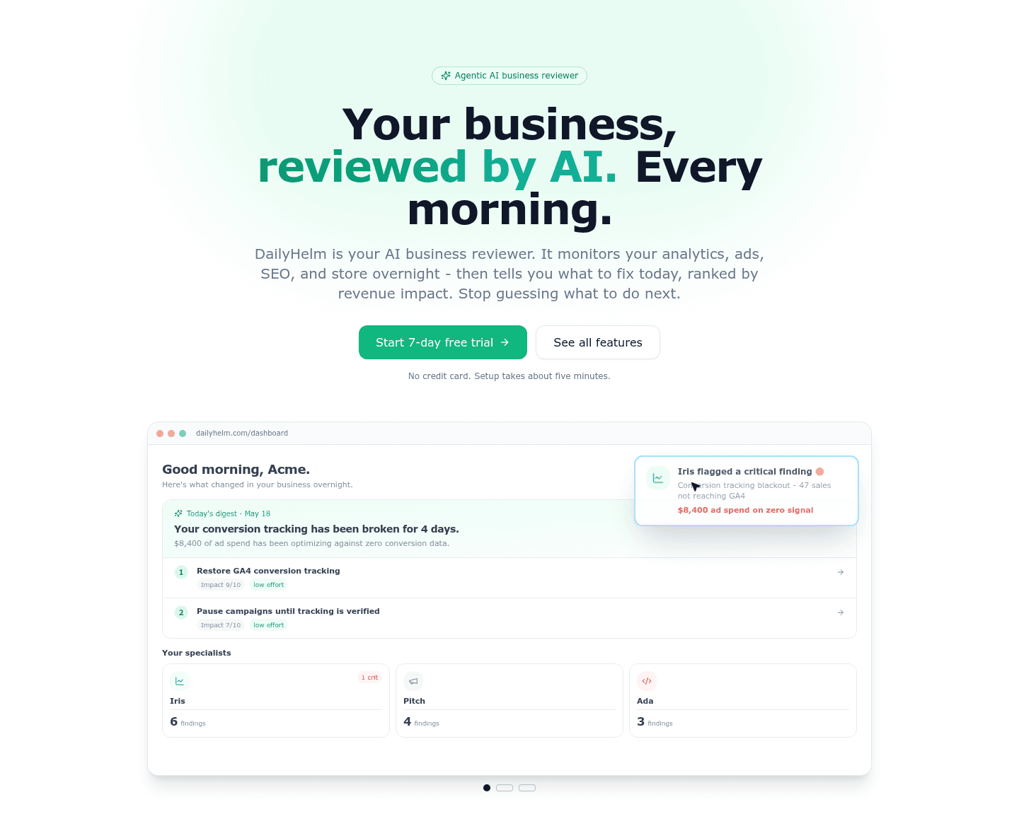
DailyHelm Hero
Hero|

DailyHelm Analytics Hero Design

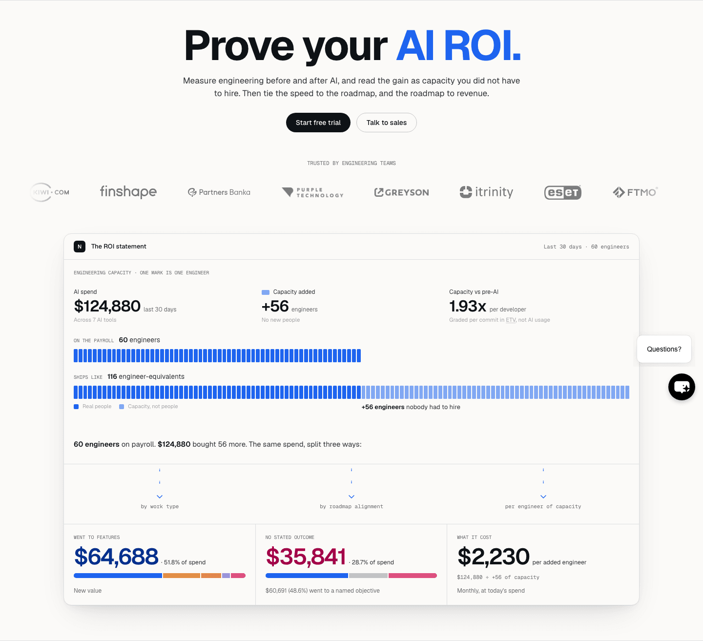
Navigara Hero
Hero|

Navigara Developer Tools Hero Design

PromptQL Hero
Hero|

PromptQL AI Hero Design

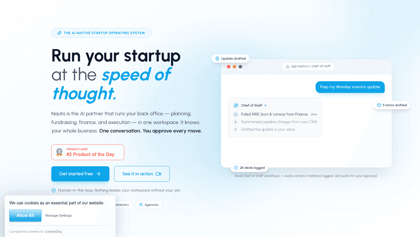
Nautis Hero
Hero|

Nautis Productivity Hero Design

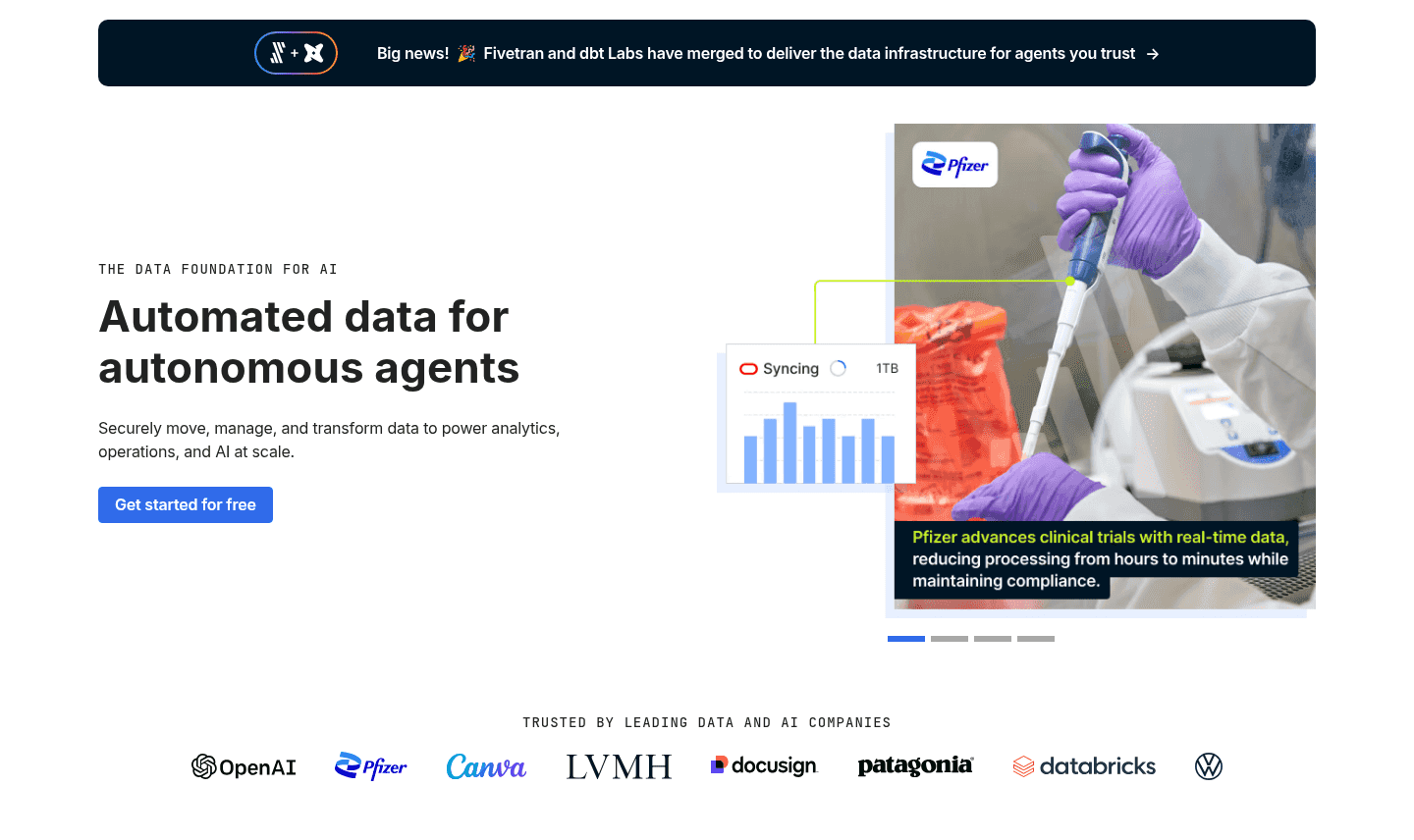
Getcensus Hero
Hero|

Getcensus Analytics Hero Design

Super Hero
Hero|

Super No-Code Hero Design

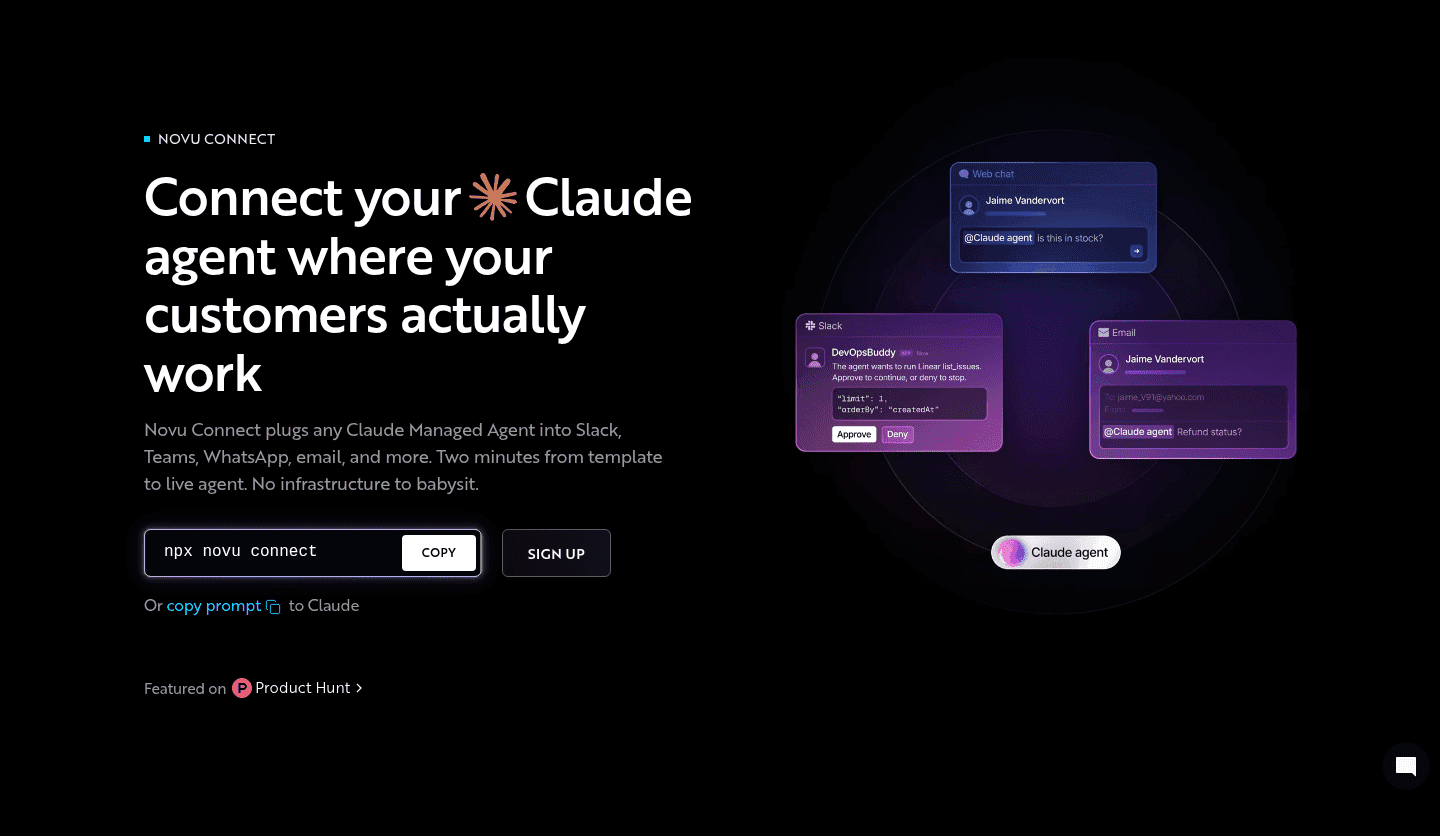
Novu Connect Hero
Hero|

Novu Connect Developer Tools Hero Design

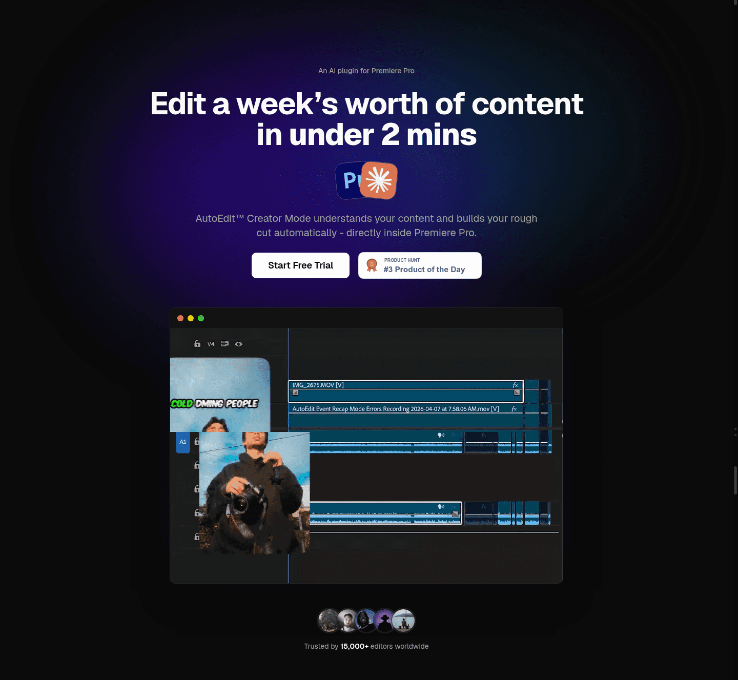
AutoEdit Hero
Hero|

AutoEdit AI Hero Design

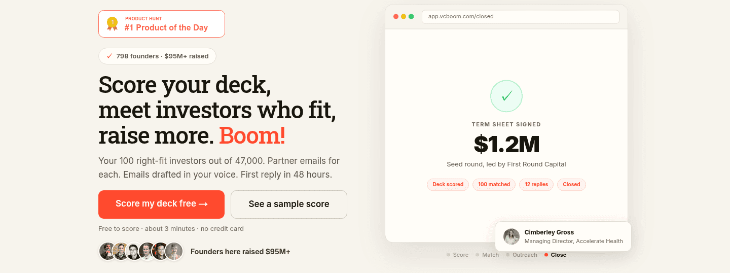
VC Boom Hero
Hero|

VC Boom Startup Hero Design

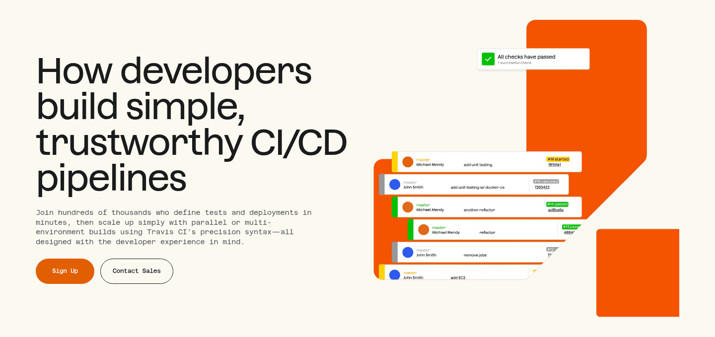
Travis Ci Hero
Hero|

Travis Ci Developer Tools Hero Design

Storyblok Hero
Hero|

Storyblok Developer Tools Hero Design

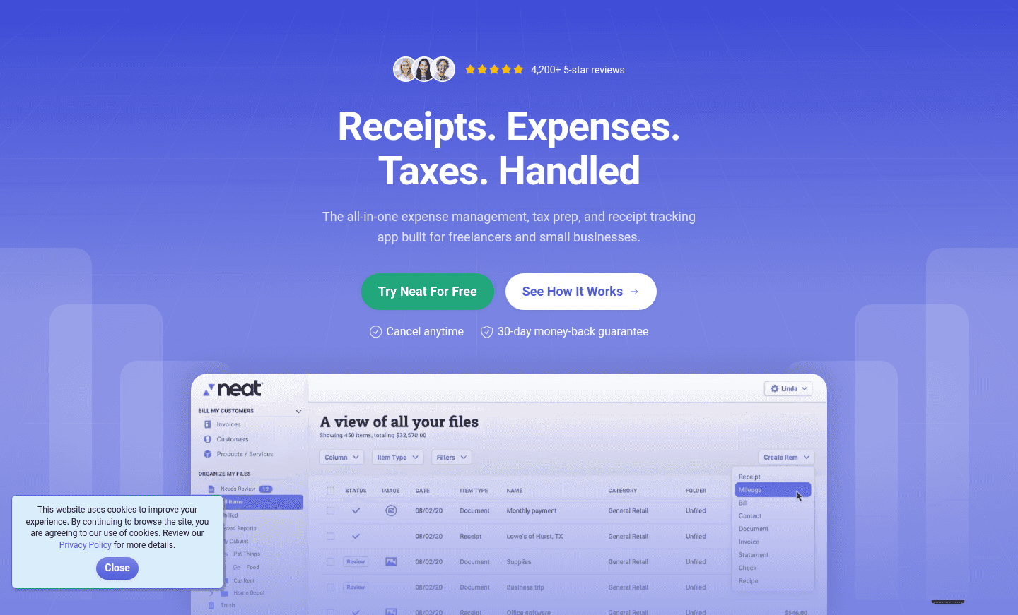
Neat Hero
Hero|

Neat Telecom Hero Design

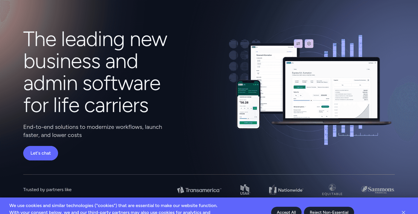
Bestow Hero
Hero|

Bestow InsurTech Hero Design

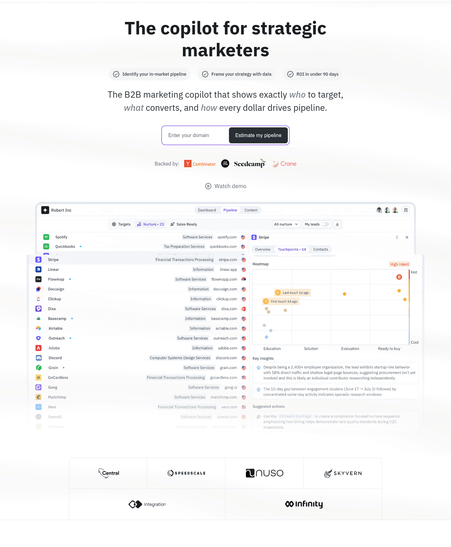
Openline Hero
Hero|

Openline AI Hero Design

Behiiv Hero
Hero|

Behiiv Marketing Hero Design

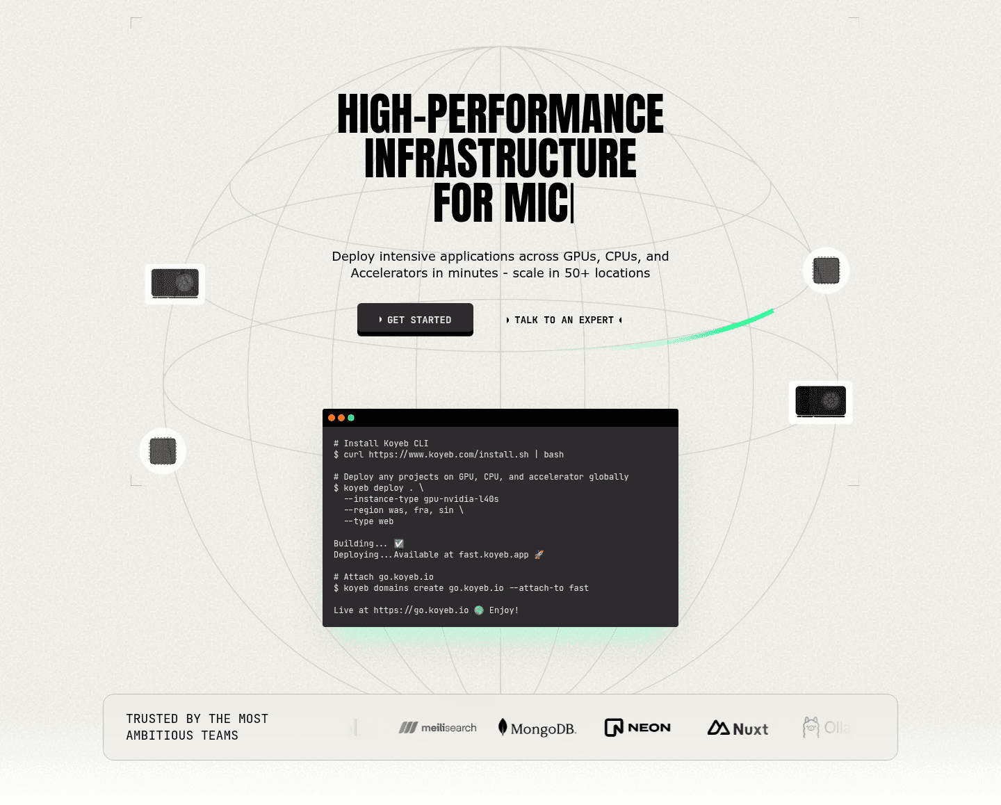
Koyeb Hero
Hero|

Koyeb Developer Tools Hero Design

Didn't find the hero you were looking for?

Browse every hero pattern by UX best practice, or jump to an industry view.

What it is

A product visual in the hero shows instead of tells. Instead of an illustration that could sit on any company's site, the hero carries the real thing, so the visitor can see the product and start judging whether it fits.

It takes one of four forms:

  • A real screenshot. The actual interface, clean and legible, not a stock mockup.
  • A focused crop. One screen or one feature that carries the core value, rather than a full dashboard shrunk to fit.
  • A short demo. A looping clip that plays on its own and shows the product in motion without asking for a click.
  • A guided moment. A small annotation or callout that points the eye to the part that matters.

Why it matters

A real interface shows the category, the level of polish and what using the product looks like, all in one view. That is the judgment a visitor is trying to make in the hero. An abstract graphic leaves them to guess, or to scroll and look for a screenshot further down.

How the best heroes do it

The best examples below crop to the moment of value. They resist showing everything and show the one screen that makes the value obvious, clean enough to read at a glance. The strongest pair the visual with social proof above the fold, so the interface is backed by other people's trust.

Hardbook hero section
Hardbook does this well.

Common mistakes

Forestadmin hero section0/100
Forestadmin skips this.

The usual failure is no product at all: abstract art or a pattern where the interface should be. The second is a full dashboard shrunk until nothing is readable. The third is a "product" image that is really a stock illustration in disguise.

Gabriel Amzallag

Curated by

Gabriel Amzallag , Founder, Web Anatomy

5 years CRO + SEO at Qonto (2021–2025). After advising 15+ SaaS on their websites (Payfit, Pigment…), the same patterns kept breaking, so I decided to build the source of truth on what works on the web: the intelligence layer every tool, builder, and team uses to ship sites that perform.

FAQ

The product visual in the hero, answered

The common questions about showing your product in the hero, with answers drawn from 246 scored examples.

How much of the hero should the product visual take?

01

Enough to be legible, not so much that it pushes the headline and the call to action out of view. The visual supports the message. On a laptop screen, the headline, the button and a readable view of the product should all fit before the scroll.

When is a product visual the wrong choice?

02

When the product is visually unremarkable or not launched yet, or when the value is an outcome rather than an interface. Then a picture of the result, a diagram of how it works, or a strong proof element can carry the hero better than a plain screenshot.