
Trust|
Showing real human faces makes the proof feel like it comes from actual people, which is harder to fake and easier to believe than logos or text alone.
Key takeaways
Showing 1–16 of 16 examples
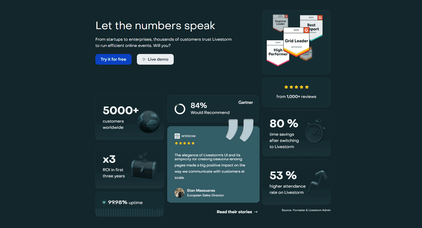

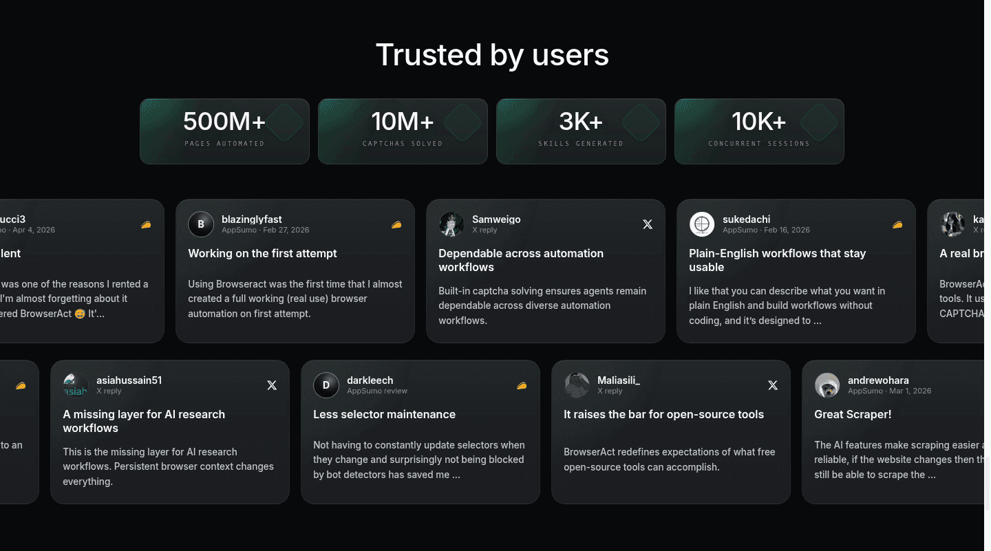

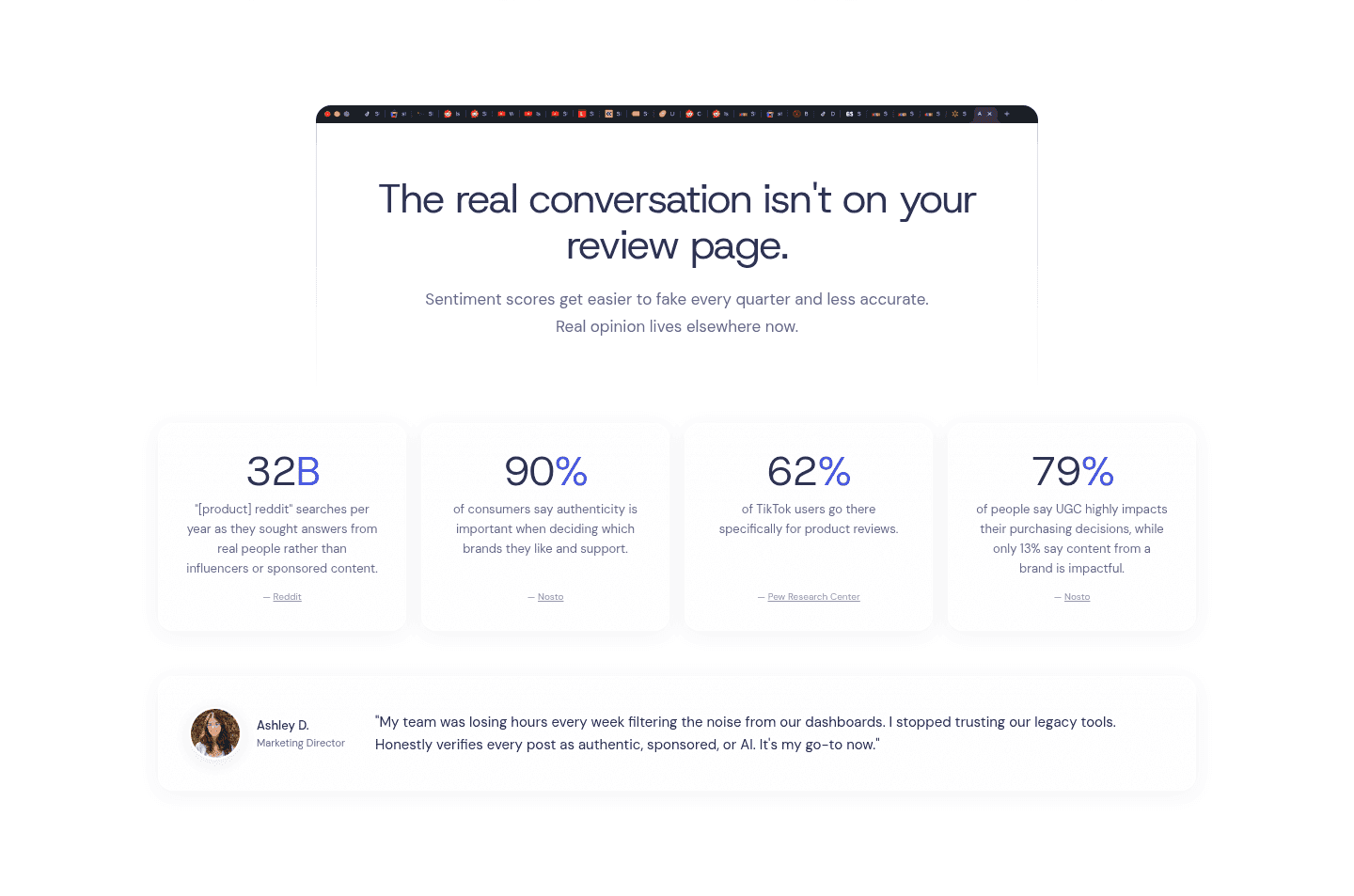

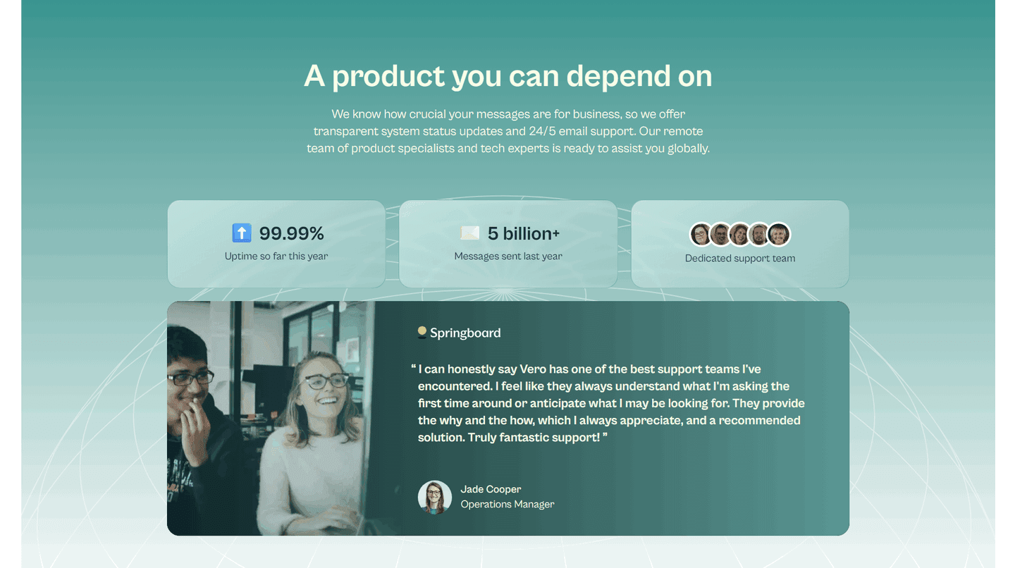
Browse every trust pattern by UX best practice.
Every trust section is scored across 6 conversion best practices. Copy the best practice stack, not the design. See what converts and why.
Hand-picked from {companies} companies and analyzed by our AI conversion agent. Not a random dump of logo bars. Every entry earns its spot.
Found a trust section you admire? Run yours through the same scoring engine. See where you stand on the same best practices, and what to fix first.
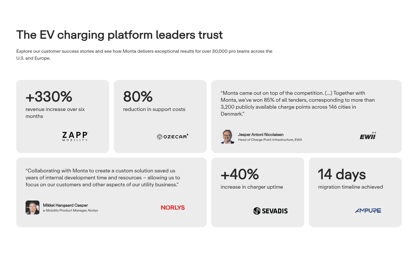
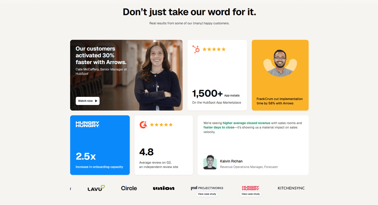
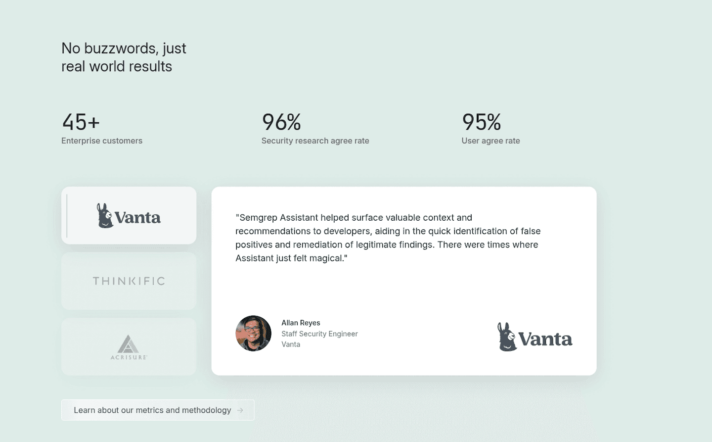
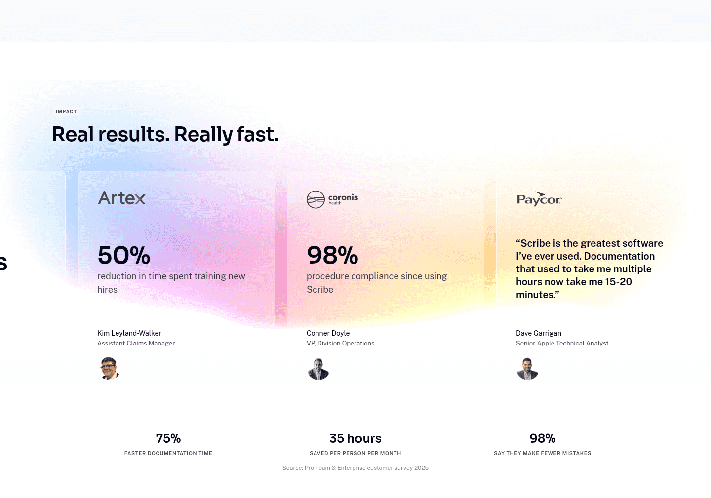
Faces for reassurance is the choice to show real human faces next to the proof, so credibility feels like it comes from people instead of logos, badges, or lines of text. A quote with no face is easy to dismiss as copywriting. The same quote next to a photo, a full name, a title, and a company reads as a real person who put their name behind it.
The best trust sections use one or more of these forms:
A visitor arrives skeptical, and the fastest thing to fake on a landing page is a glowing quote. A face is far harder to fake convincingly, and a face attached to a full name, a title, and a real company is something a visitor could in principle look up. That verifiability is what moves a testimonial from "the marketing team wrote this" to "a real person said this."
A face also does something a logo cannot: it lets the visitor recognize themselves. When the photo is a QA lead, a people officer, or a head of DevOps, the buyer weighing the same decision sees someone in their own role vouching for the product. That is why a face works best sitting right next to the claim it supports, so the abstract result becomes a person who actually got it.
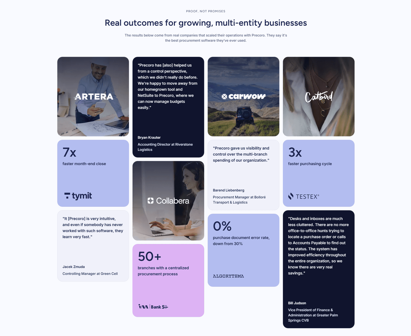
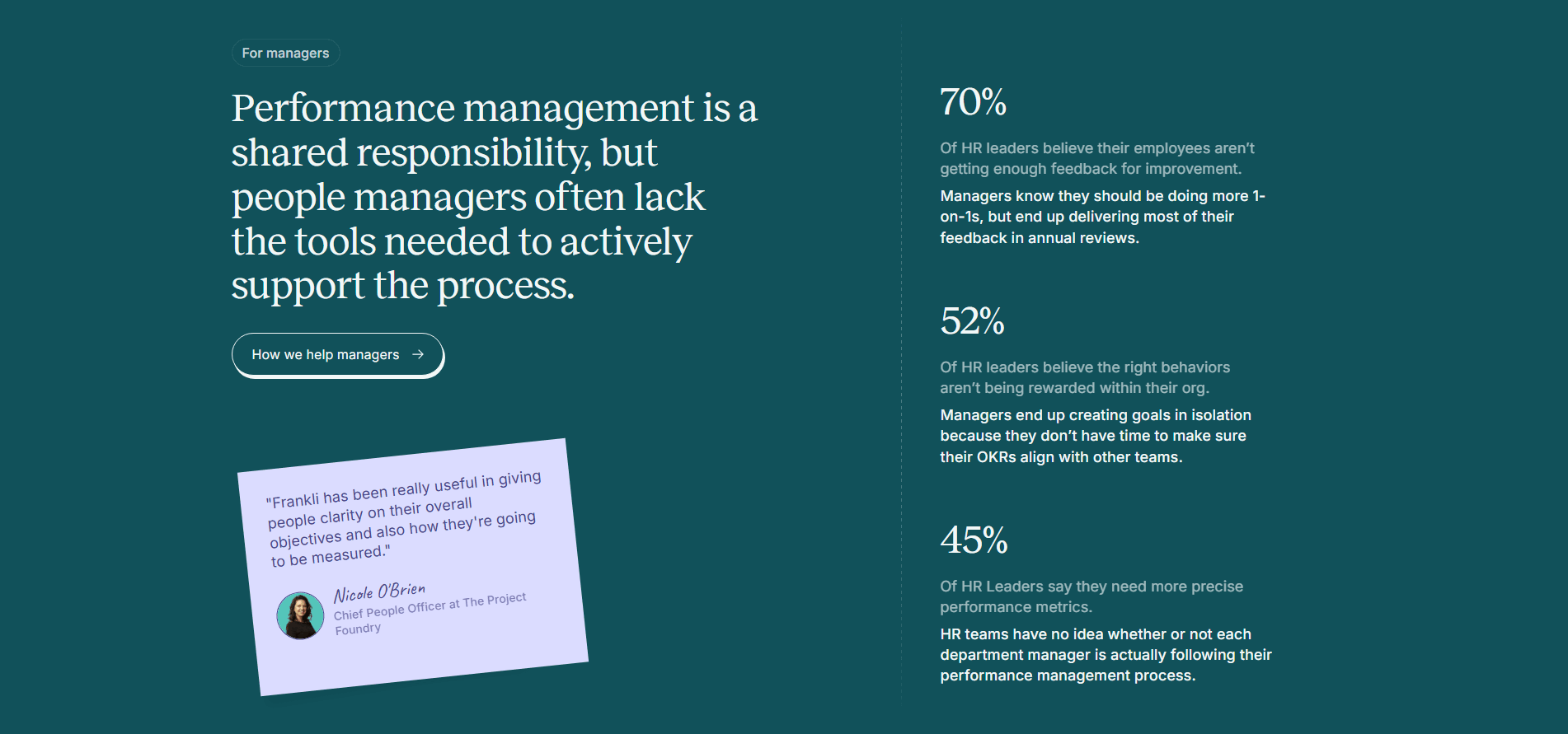
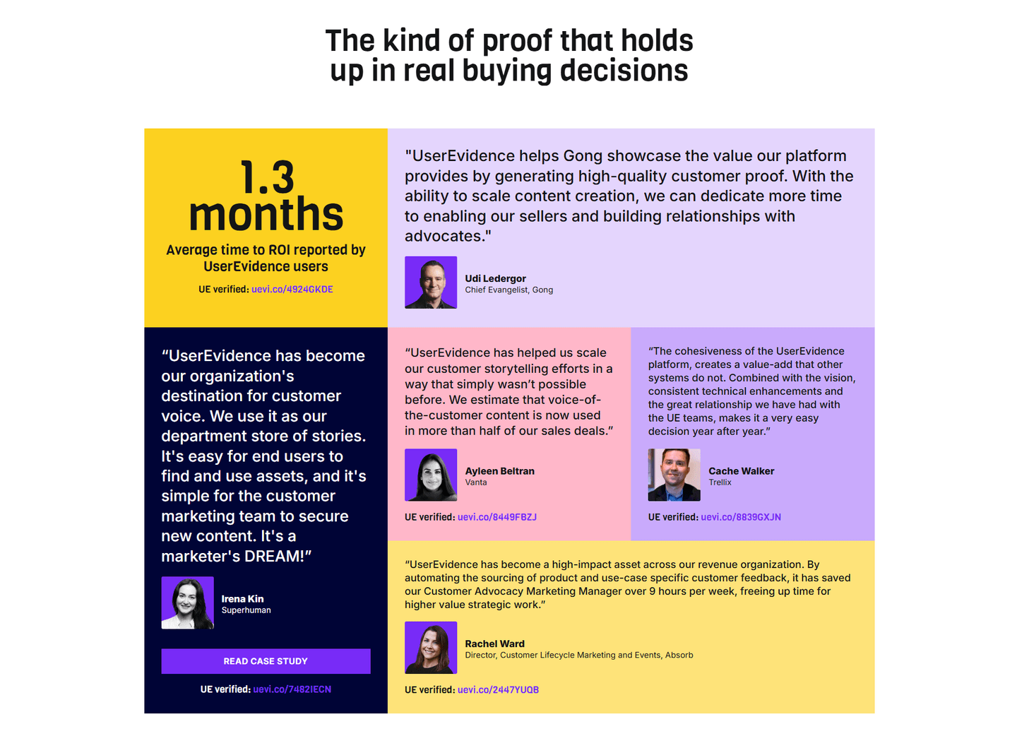
Only about one in six trust sections in the library put a real face on the proof, so doing it well is a genuine edge. Across the scored examples below, the discipline is the same: the face never travels alone. Precoro and Scribehow place a customer headshot next to each result, so a metric like a faster month-end close belongs to a named person, not a floating number. UserEvidence shows a real headshot on every quote and tags each one as verified. Browserstack and Monta pair photos with named titles like Lead Quality Engineer and Chief People Officer, so the proof reads as coming from people who do the buyer's job.
Faces rarely carry a trust section on their own. The strongest pages combine a human face with the borrowed authority of recognizable customer logos and the layered credibility of stacking several proof types at once, so no single signal has to do all the convincing.
100/100 0/100
0/100The usual failure is a face with nothing attached: a smiling photo, no name, no title, no company, which reads as a stock model and quietly erodes trust instead of building it. The second is separating the face from its claim, dropping headshots into a standalone carousel while the quotes and metrics live elsewhere, so the visitor never connects the person to the result. The fix is simple: use real customers, put the full name, title, and company under each face, and keep the photo next to the exact claim it is meant to back.
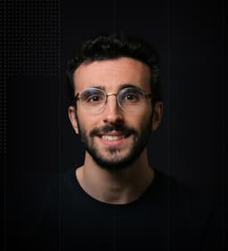
Curated by
Gabriel Amzallag , Founder, Web Anatomy
5 years CRO + SEO at Qonto (2021–2025). After advising 15+ SaaS on their websites (Payfit, Pigment…), the same patterns kept breaking, so I decided to build the source of truth on what works on the web: the intelligence layer every tool, builder, and team uses to ship sites that perform.
Paste your URL. Get a scored analysis of your trust section, including whether your proof reads as human or anonymous. Free, no signup.
The common questions about putting real human faces on trust proof, with answers drawn from 16 scored examples.
It means the trust section shows real human faces alongside the proof, so credibility feels like it comes from people rather than anonymous logos or text. The common forms are a headshot beside a customer quote, a grid of real user photos, founder or team portraits, and a small avatar on each review card.
A quote with no face is easy to read as something the marketing team wrote. The same quote next to a photo, a full name, a job title, and a company reads as a real person who can be looked up and who put their name behind the claim. A face is the most human proof signal there is, and it is the hardest to fake convincingly.
Customer headshots in testimonials, portraits of the founders or the team, a wall of real user photos, and reviewer avatars on quote cards all count. The strongest trust sections use faces of the actual buyer, a QA lead, a people officer, a head of DevOps, so the person in the photo looks like the visitor deciding whether to trust the product.
Right next to the claim they support. A headshot belongs beside its quote, not floating in a separate carousel, and a name and title belong under the face so the proof is attributable. When a face sits next to a hard result, the abstract number turns into a person who actually got it.
No, they work best together. Logos give breadth, numbers give scale, and faces give humanity. The most convincing trust sections stack all three, so credibility never rests on a single signal. A face makes a quote human, but a named company and a hard metric are what make it verifiable.