Integrations|
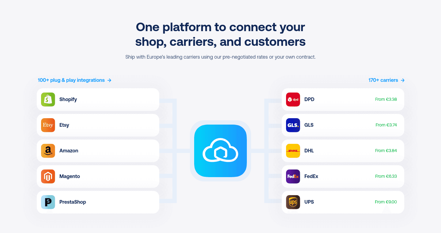
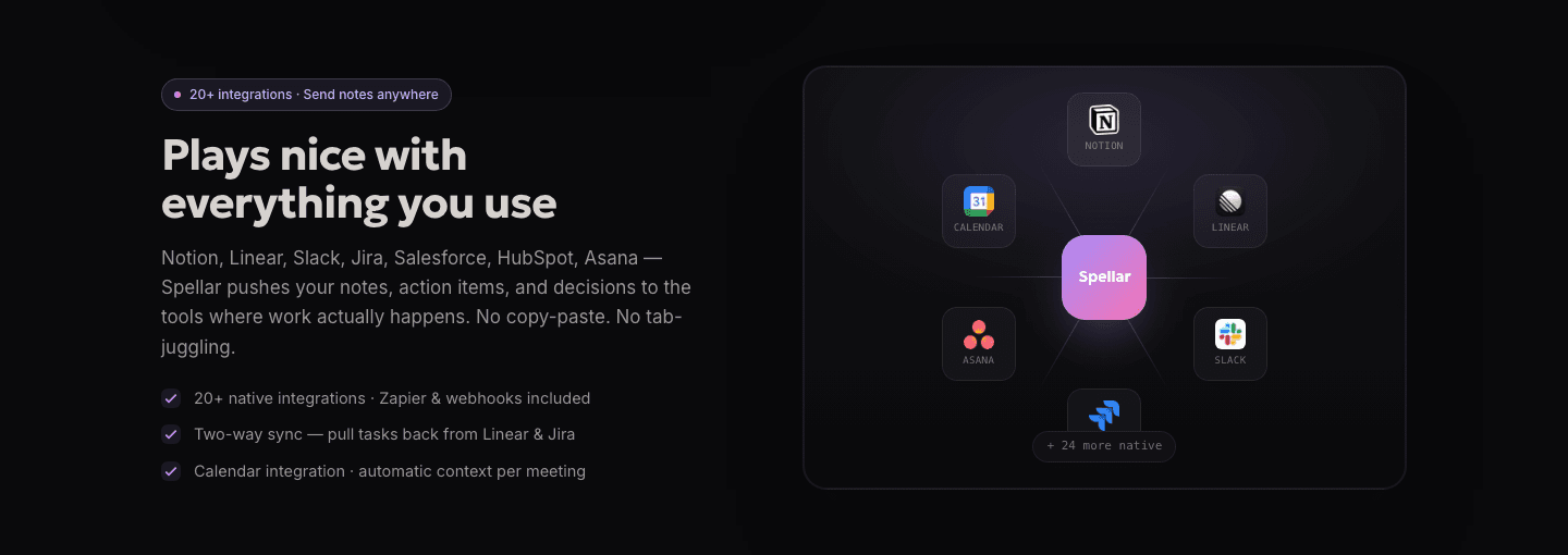
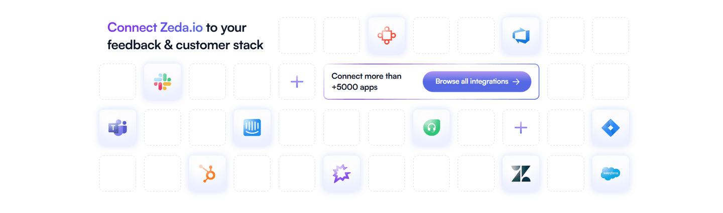
Across 37 scored examples, these integrations sections open with the total number of apps or connectors available, so a visitor reads the scale of the ecosystem before hunting for the one tool they depend on.
Key takeaways
Showing 1–28 of 37 examples

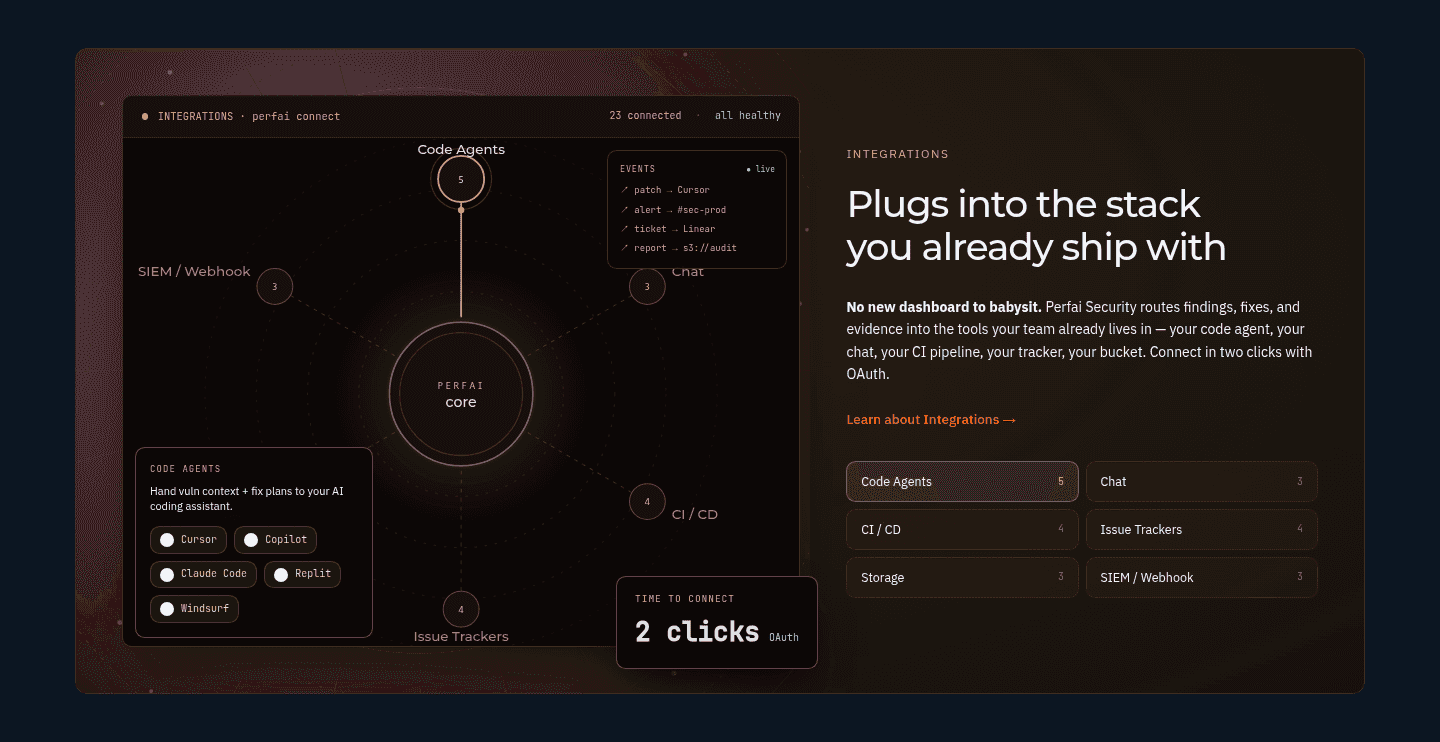
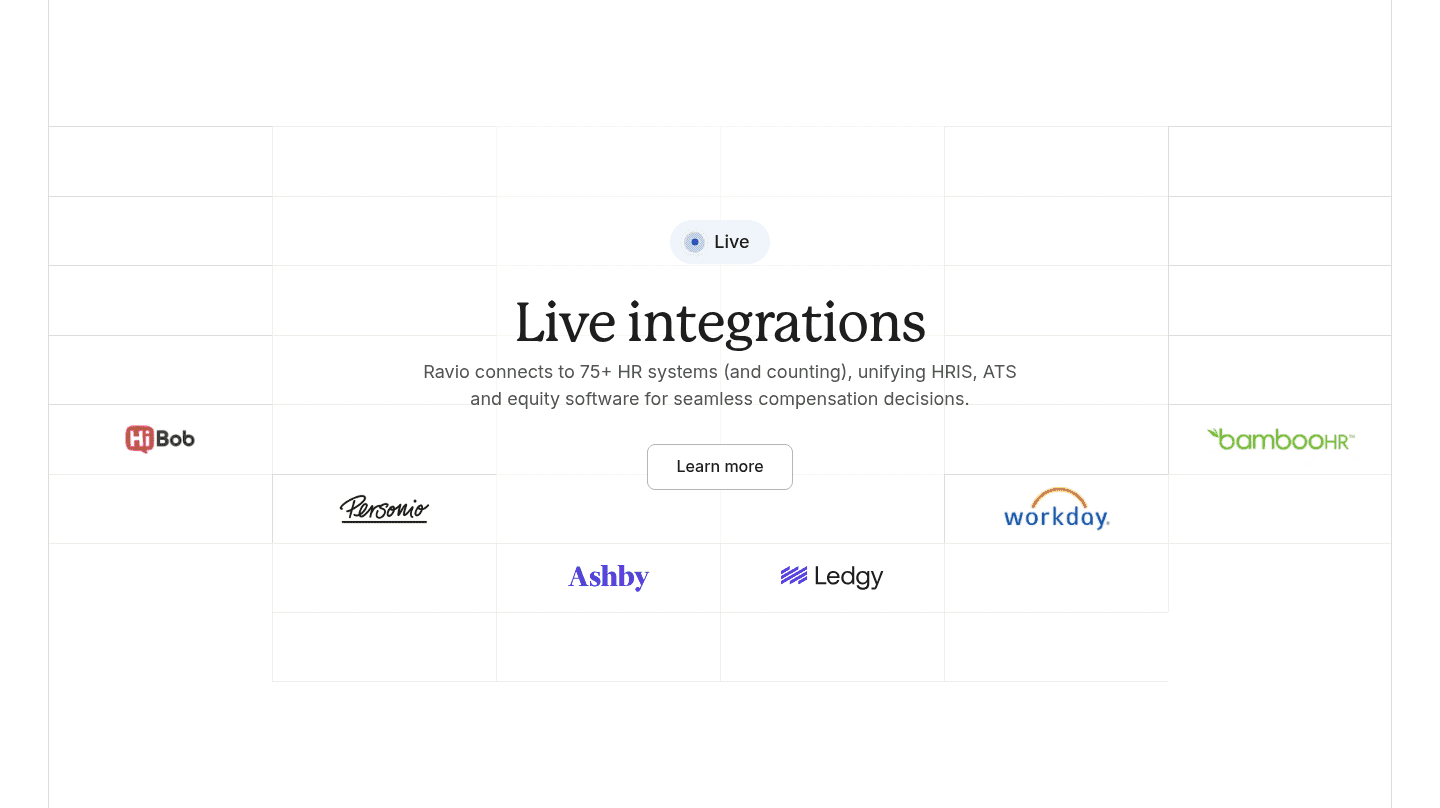
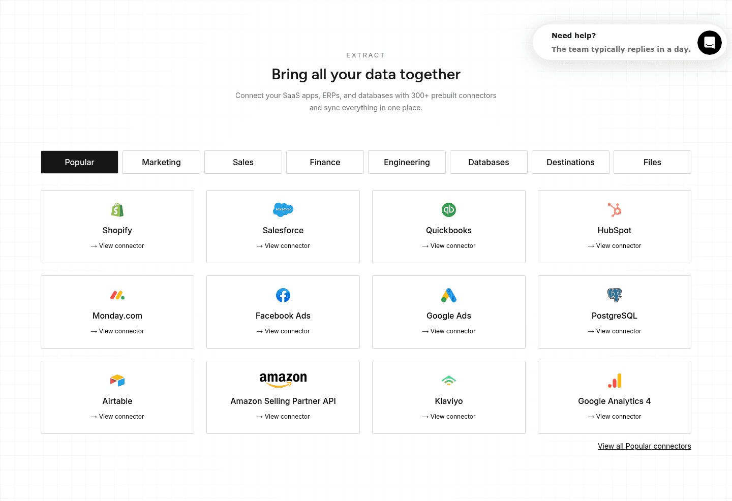
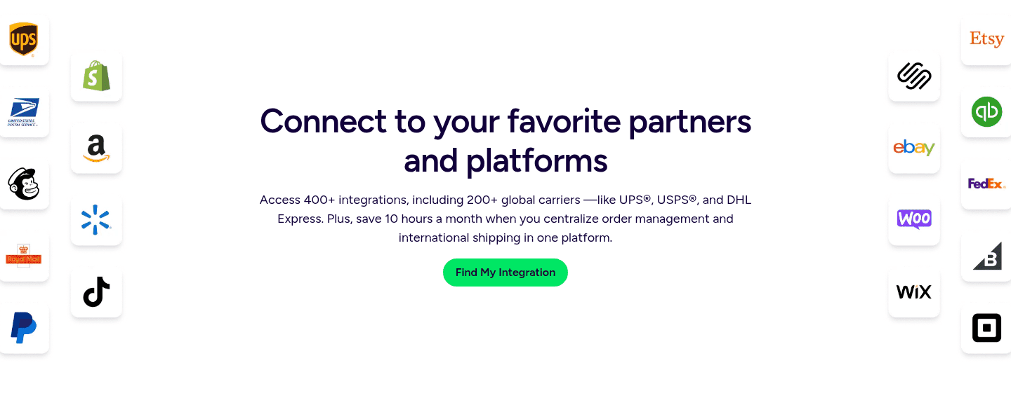
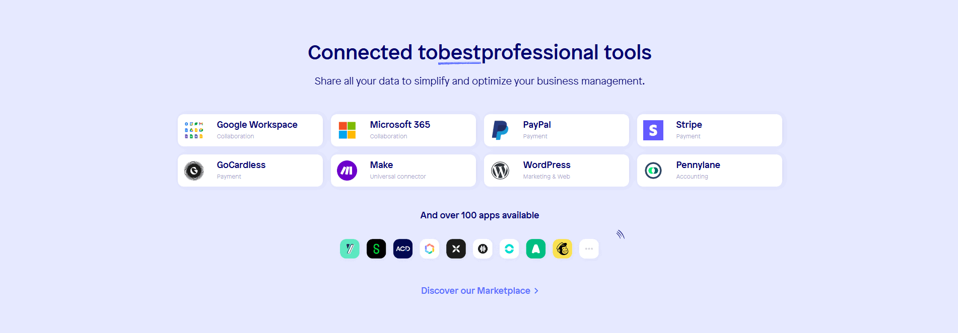
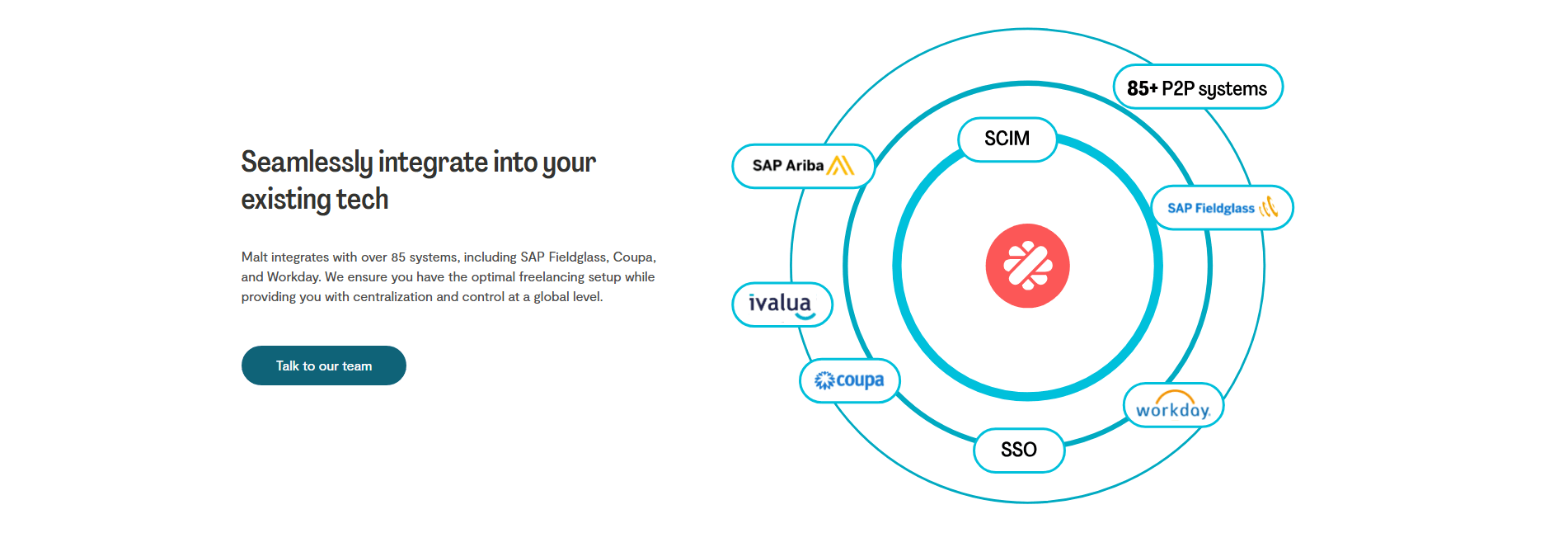


Browse every integrations pattern by UX best practice.
Every integrations section is scored across 4 conversion best practices. Copy the best practice stack, not the design. See what converts and why.
Hand-picked from {companies} companies and analyzed by our AI conversion agent. Not a random dump of homepages. Every entry earns its spot.
Found an integrations section you admire? Run yours through the same scoring engine. See where you stand on the same best practices, and what to fix first.
Leading with an integration count is the decision to make the size of the ecosystem the first thing a visitor reads, stated as a real number rather than implied by a handful of logos. A logo grid says "we connect to tools you know." A count says "we connect to far more than we can show here," and it says it in a form the buyer cannot round down in their head.
The best integrations sections state the number in one of a few forms, sometimes more than one at once:
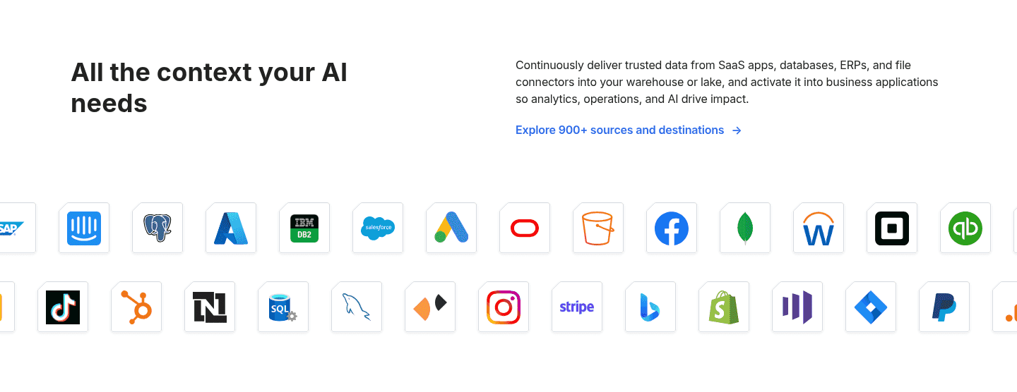
A wall of logos can only ever show a dozen tools, and a buyer scanning it is really asking a private question: is the one system I cannot live without in here? Logos answer that for the tools that happen to be on display and leave every other buyer guessing. A number answers it for everyone. Seeing 300+ connectors or 900+ sources tells a visitor the odds are strong that their stack is covered, before they have found a single familiar mark.
The count also reframes the switching risk. Without it, a visitor evaluates integrations by hoping their tools appear. With it, they start from the assumption that the ecosystem is broad enough to include them, and the logos below become confirmation rather than the entire case. That shift, from hoping to assuming, is what moves an integrations-sensitive buyer toward the decision.
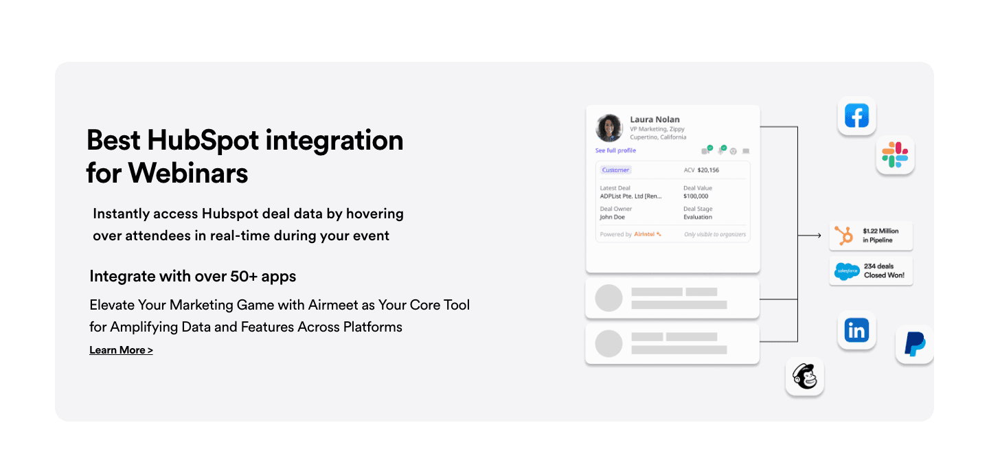
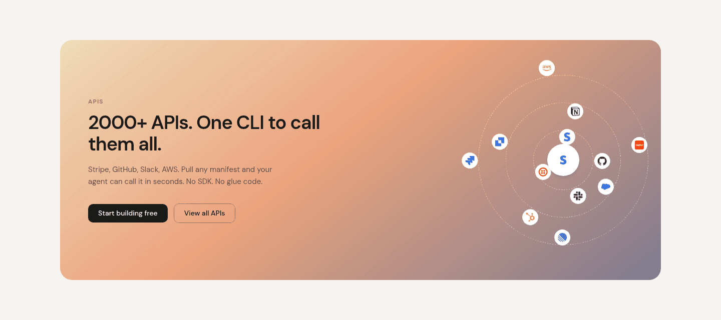
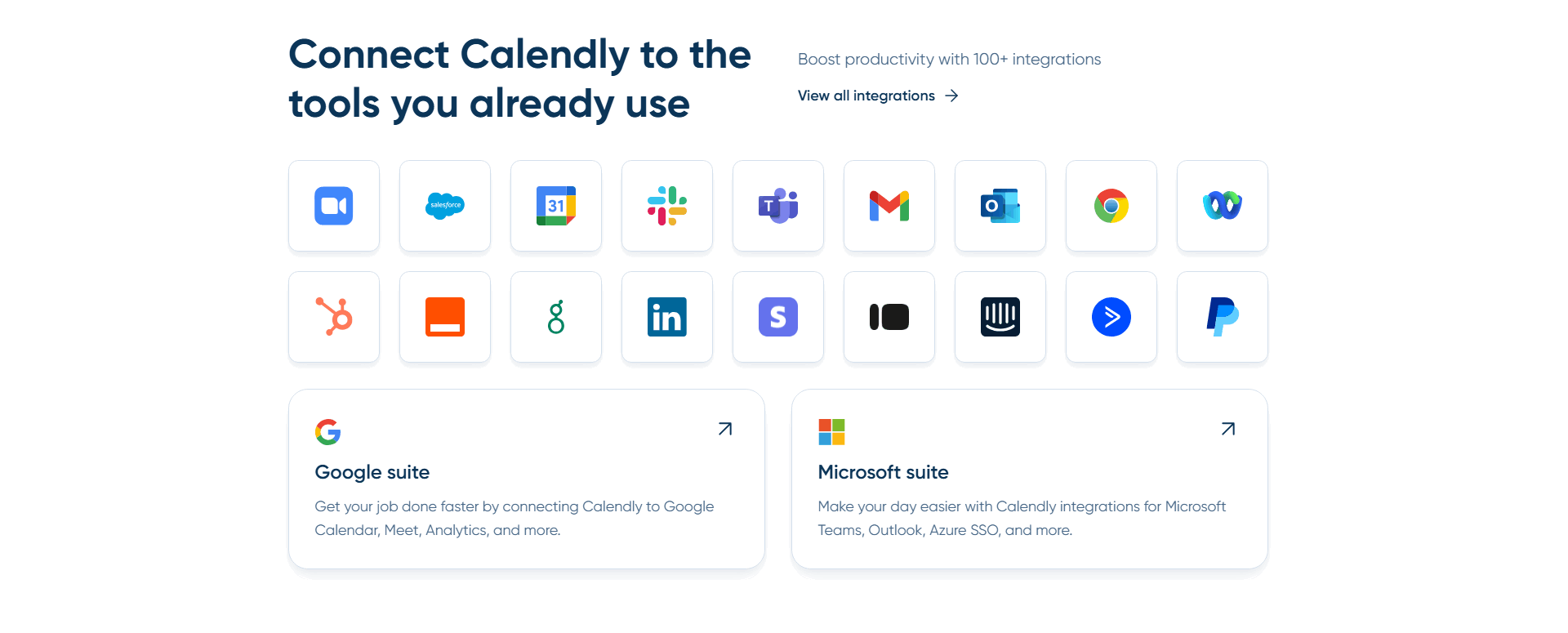
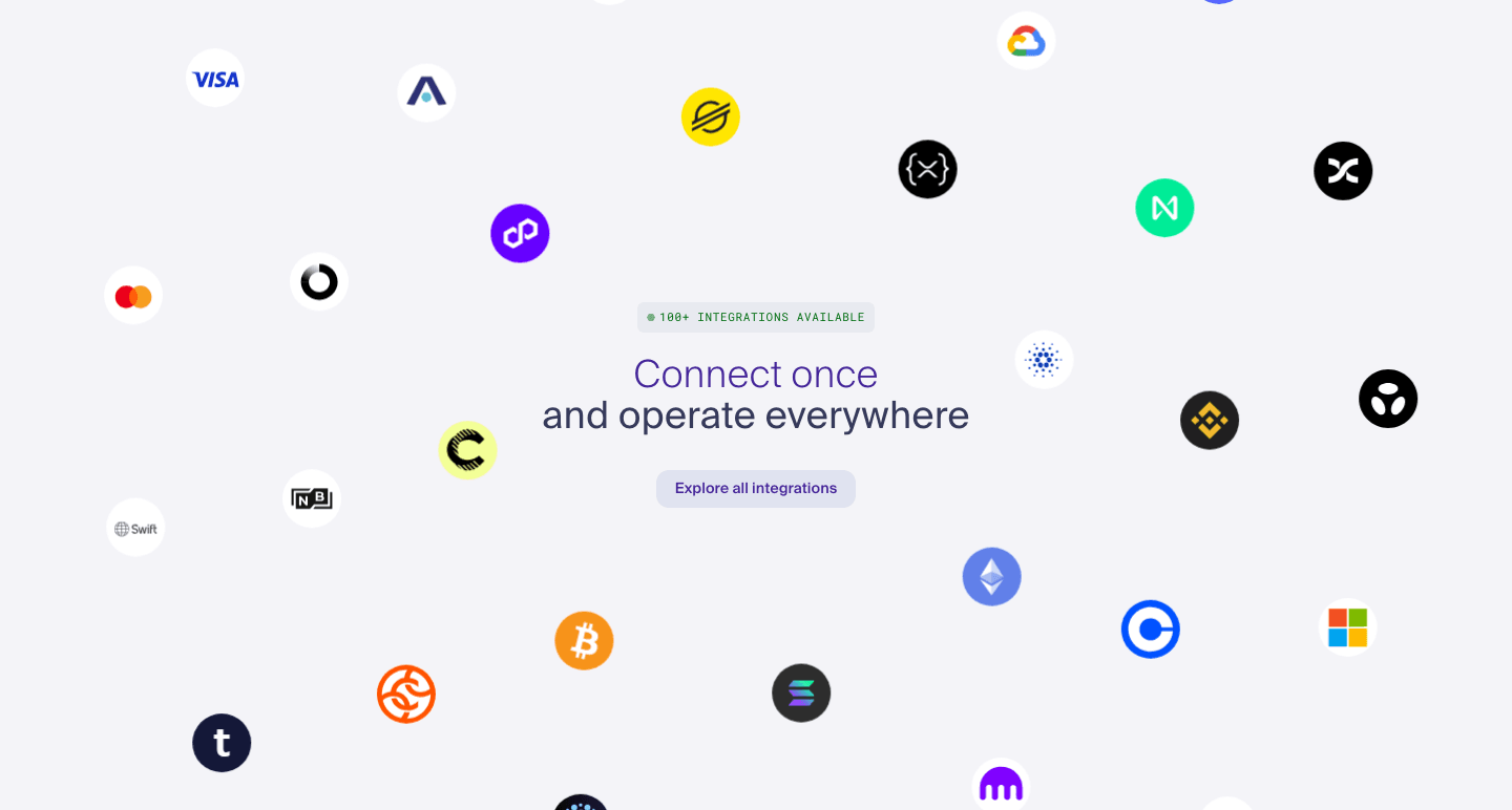
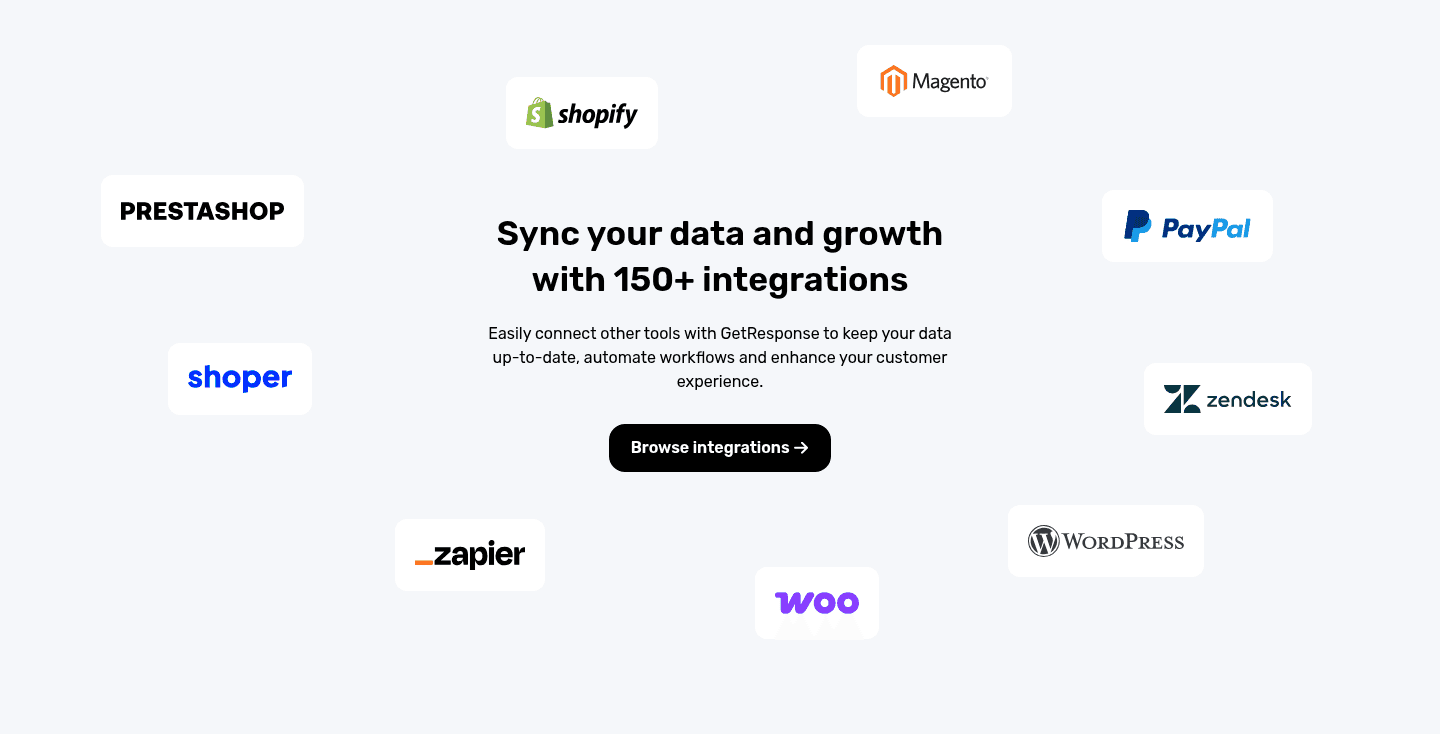
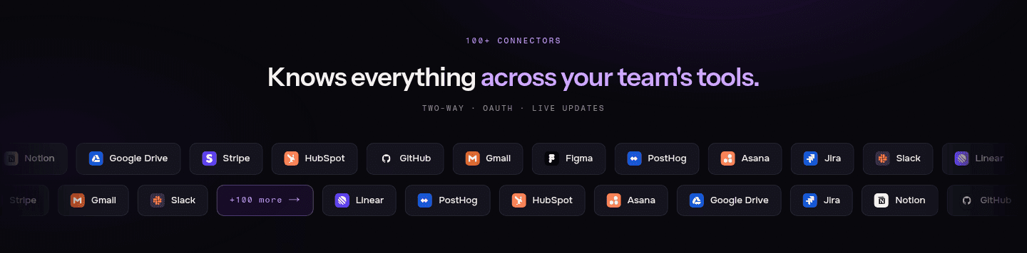
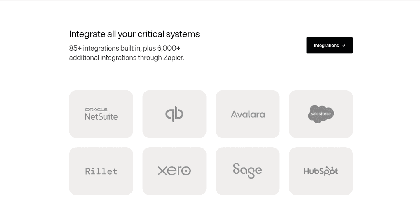
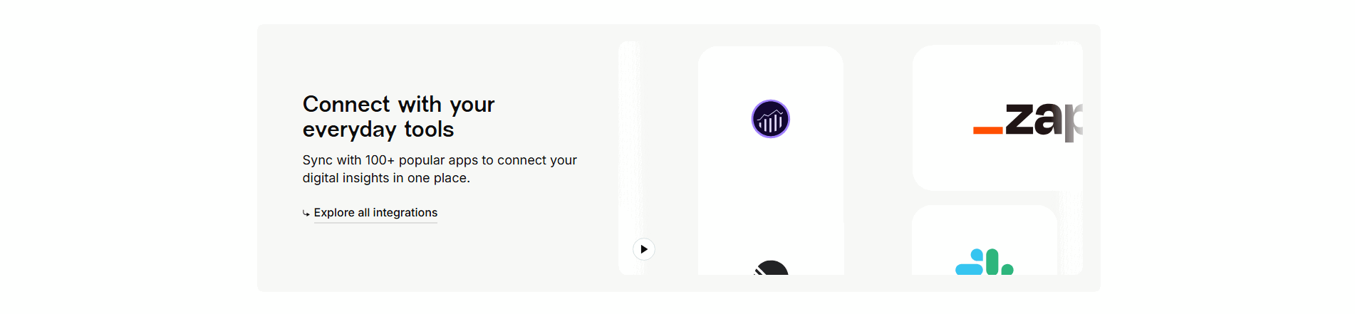
Across the scored examples below, the pattern that performs is a number that never stands alone. HubSpot opens with 2,000+ integrations and ActiveCampaign with 1,000+ marketing tools, each immediately backed by a wall of recognizable logos and a link to the full marketplace, so the figure reads as breadth a buyer can verify rather than a boast. Calendly pairs 100+ integrations with a dense logo grid and a View all integrations link. Maxio is honest about how the breadth is built, splitting the claim into built-in integrations plus thousands more reachable through Zapier, and Weld frames 300+ prebuilt connectors alongside category tabs so a visitor jumps straight to their own stack. In every strong case the number sets the scale, the logos prove it, and a link lets the careful buyer confirm the tool their decision hinges on.
The count is the opening move, not the whole argument. The strongest sections follow it with a concrete workflow, the way the integrations sections that show a use-case example do, and they give the number somewhere to go, the way the integrations sections that link to detail pages let a buyer verify a single connector before committing.
100/100 0/100
0/100The usual failure is a number with nothing behind it: a bold thousands of integrations claim, no recognizable logos, and no link a buyer can use to check whether their own tool is one of them. It reads as a vanity metric, and a skeptical buyer treats it as one. The second failure is an inflated count, padded with trivial connectors, so the visitor who clicks through to find the tool they actually need discovers it is missing, which costs more trust than a smaller honest number ever would. State a real figure, prove it with logos the buyer recognizes, and give them a path to confirm the specific integration they came for.

Curated by
Gabriel Amzallag , Founder, Web Anatomy
5 years CRO + SEO at Qonto (2021–2025). After advising 15+ SaaS on their websites (Payfit, Pigment…), the same patterns kept breaking, so I decided to build the source of truth on what works on the web: the intelligence layer every tool, builder, and team uses to ship sites that perform.
We find every way to grow your website’s visibility and conversions: SEO, AI search (AEO), backlinks and mentions, and UX/UI. 3 free opportunities, delivered by email.
The common questions about opening an integrations section with a headline count, with answers drawn from 37 scored examples.
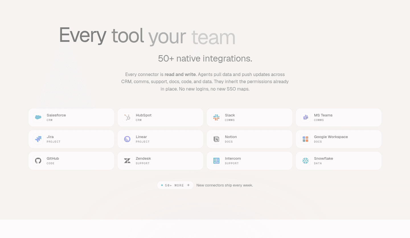
It means the integrations section opens with the total number of apps or connectors available, stated as a specific figure, rather than only showing a few logos. The most common forms are a single headline tally such as 100+ integrations or 2,000+ integrations, split counts that separate native connectors from those reached through a partner like Zapier, per-category subtotals, and a count paired with a momentum line such as new connectors ship every week.
A logo grid answers whether a product connects to tools a visitor recognizes, but it cannot show how deep the ecosystem goes. A number does. Seeing 300+ connectors or 900+ sources tells the buyer that the odds their own stack is supported are high, before they have scanned a single logo. It reframes the risk of switching: instead of hoping their tools are covered, the visitor starts from the assumption that they probably are, which is exactly the reassurance an integrations-sensitive buyer needs.
Specific and honest beats big and vague. A precise figure such as 85+ built-in integrations reads as a real count someone maintains, while a round 'thousands of integrations' with nothing behind it reads as marketing. The strongest sections back the number with a verifiable path: a link to the full directory where a buyer can search for their exact tool. A count a visitor can check is a count they will trust.
Recognizable logos and a link to the full catalog. The number signals breadth, the logos prove the ecosystem includes tools the buyer already uses, and the link lets a careful buyer confirm the one integration their decision depends on. Many of the strongest sections also pair the count with a category filter or a short workflow line, so the breadth claim connects to a concrete payoff rather than sitting as a bare statistic.
When the number is the only thing the section offers. A large count with no recognizable logos, no link to verify it, and no sense of what the integrations actually do reads as a vanity metric. It also backfires when the figure is inflated by counting every trivial connector, so a buyer who clicks through finds the specific tool they need is missing. The count should promise breadth the rest of the section can deliver on.