Best Customer Support Website Examples (And Why They Convert)
We scored 15 customer support homepages against a shared set of conversion criteria. See which sections separate the top performers, and what your page is probably missing.
Updated October 202615 pages analyzed
#CompanyScore
Scored by AI across 60+ conversion criteria
#1
78/100
Scroll to explore
Botmind
What high-performing customer support homepage design gets right
Customer support pages have to prove the product resolves real issues and earns trust fast. The strongest pages in this set do four jobs early:
54/100
Avg. page score
Name the support job the product owns in the first screen, so the right buyer knows they are in the right place.
Layer proof in before the ask, using customer logos, quantified outcomes, review scores, or compliance badges.
Show the real support workflow so the promise feels operational instead of abstract.
Give a cautious buyer a low-friction next step with specific button copy and supportive microcopy.
6 best customer support homepages analyzed in detail
Each company below is paired with its strongest section and scored across 60+ conversion criteria. See what they get right, and what you can borrow.
01
Dixa, The agentic support platform behind ecommerce brands.
5 years CRO + SEO at Qonto (2021–2025). After advising 15+ SaaS on their websites (Payfit, Pigment…), the same patterns kept breaking, so I decided to build the source of truth on what works on the web: the intelligence layer every tool, builder, and team uses to ship sites that perform.
“The clearest value story in the set. Dixa runs three distinct pillars, each with its own hard metric and a real product view, then routes curious buyers to case-study deep dives. The page explains how the product works, not just what it claims, so the promise reads as operational.”
What makes this page stand out
The hero subhead “Resolve issues faster with agentic AI and intelligent handovers” clarifies outcome and mechanism in one line.
The above-the-fold CTAs pair “Book a demo” with a lower-friction “Product tour” link to support different intent levels.
The trust strip “Trusted by brands across 42 countries” is reinforced by a dense grid of recognizable logos like Rapha and AllSaints.
The testimonial section adds named roles and quantified results like “59% email containment” and “-90% seasonal hires at peak.”
Section we love
·Value PropositionBest in class
1Three distinct value pillars (answer in seconds, full customer history, routed and scored automatically) each stand alone
2Every block carries hard metric chips (70% faster response, -40% handling time, 1.5h saved per agent per day, -25% wait time)
3Explains the how, not just the what: AI agent resolves across chat, email and WhatsApp; visual routing by skill, language, VIP status
4Each pillar pairs a real product screenshot with a named customer logo (dott, organicbasics) and a Read case study deep-dive link
02
Openline, The B2B copilot for strategic marketers.
5 years CRO + SEO at Qonto (2021–2025). After advising 15+ SaaS on their websites (Payfit, Pigment…), the same patterns kept breaking, so I decided to build the source of truth on what works on the web: the intelligence layer every tool, builder, and team uses to ship sites that perform.
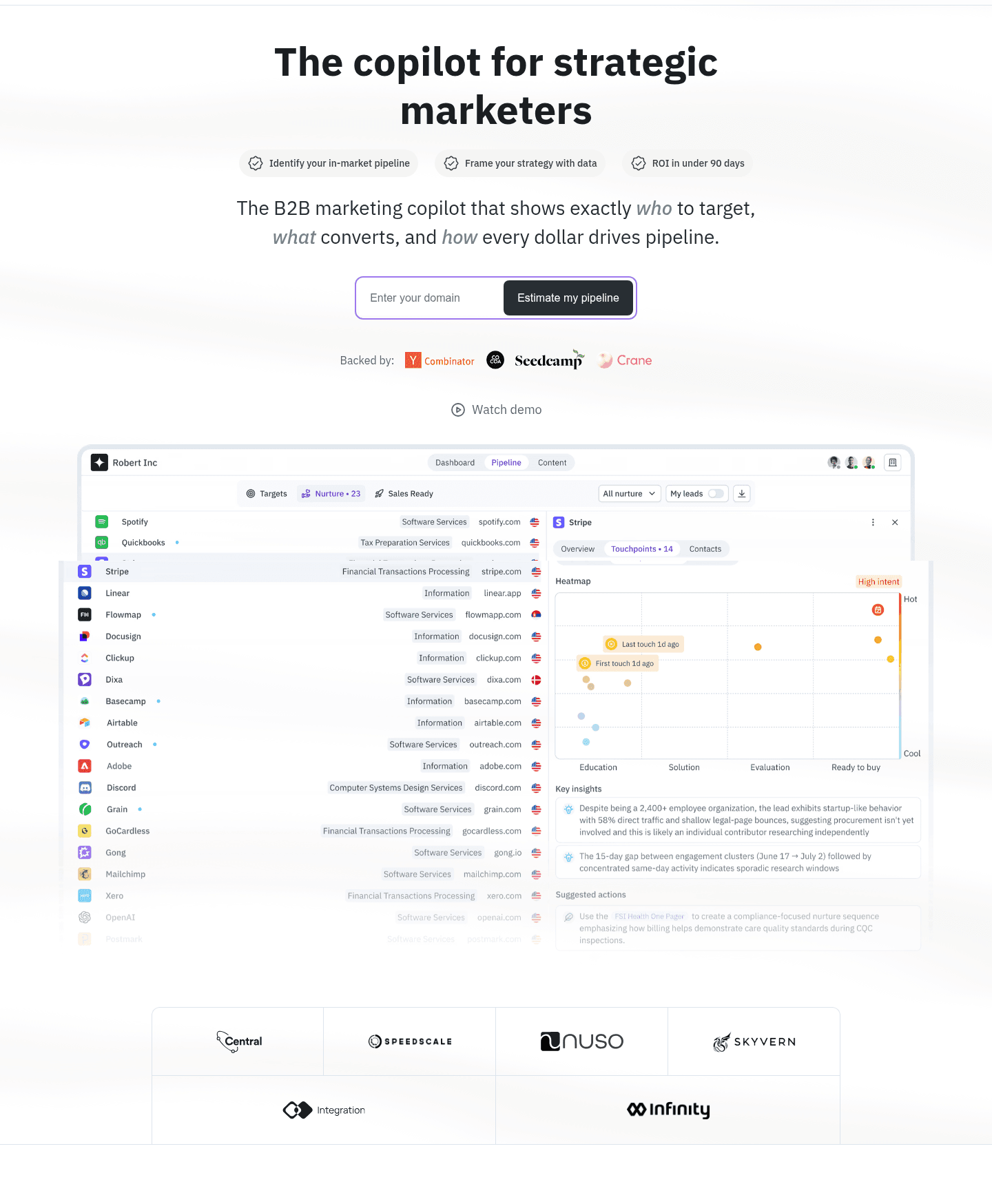
“A hero built to move. Openline captures a domain inline so the first action feels personal, names the exact buyer it wants, and stacks investor and customer proof above the fold beside a real dashboard view of the product.”
What makes this page stand out
The primary CTA “Estimate my pipeline” sits above the fold, with a secondary “Watch demo” link.
The nav includes “Pricing,” “Sign in,” and a repeated “Start today” button to drive immediate action.
The “Backed by:” row shows Y Combinator, Cocoa, Seedcamp, and Crane logos as investor credibility.
A customer quote section ends with “Read full story” and names “Matt McGillicuddy, Marketing Director” plus Infinity logo.
Section we love
·Hero
1Inline domain capture (Enter your domain plus Estimate my pipeline) turns the hero CTA into a personalized, low-friction first step
2Names the audience and category outright (The B2B marketing copilot for strategic marketers) so the right visitor self-identifies fast
3Double social proof above the fold with investor logos (Y Combinator, Seedcamp) and a customer logo row (Nuso, Skyvern)
4Large real dashboard screenshot shows the actual pipeline and account scoring UI prospects will work in
03
Typewise Nova
74/100
Section we love
·Trust
1Big-number strip (3,500+ integrations, 10M+ tickets resolved) proves scale in one line
2G2 badge with a 4.5 star rating adds outside validation next to the company's own numbers
3Mixing usage stats with a third-party review score covers both how much and how good
4Thin dividers and large numerals make the band readable in a second, even while scrolling fast
04
ProductBridge
70/100
Section we love
·Integrations
1Logo grid of well-known tools (Slack, HubSpot, Zendesk, GitHub, Notion, Jira, Linear, Intercom) scrolls beside the copy
2Copy spells out the flow: bring in feedback from Slack, Intercom, G2 and Trustpilot, send work to Linear and Jira
3Explore integrations button gives a clear path to the full integrations page
4Short headline (Connect what you already run) tells buyers they keep their current stack
05
Botsify, Custom support agents, built for agencies.
5 years CRO + SEO at Qonto (2021–2025). After advising 15+ SaaS on their websites (Payfit, Pigment…), the same patterns kept breaking, so I decided to build the source of truth on what works on the web: the intelligence layer every tool, builder, and team uses to ship sites that perform.
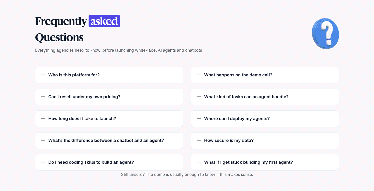
“Doubts answered right on the page. Botsify anchors its promise with hard numbers and an explicit done-for-you mechanism, then works through resale, security, and setup questions in a clean accordion that closes with a nudge to the demo.”
What makes this page stand out
The hero uses two CTAs—“Book Agency Demo” and “Try for FREE” with a blue arrow icon—to split intent.
A large dashboard screenshot sits above-the-fold, showing the actual product interface instead of an abstract illustration.
A scrolling strip of recognizable customer logos (Unilever, Ministry, Malaysia, UnityHealth) provides immediate credibility.
The testimonials include hard revenue proof—“$60,000 ARR in 2 years” and “$40,000 ARR”—plus founder names and logos.
Section we love
·Faq
1Objection-heavy questions (Can I resell under my own pricing?, How secure is my data?, Do I need coding skills?) tackle real buying blockers
2Accordion format with plus icons keeps 10 questions scannable across two clean columns
3Standard question and answer accordion structure signals FAQ schema markup for Google rich results
4Closing line (Still unsure? The demo is usually enough to know if this makes sense) nudges hesitant agencies to the demo
06
NINA, Answer questions in minutes, live the same afternoon.
5 years CRO + SEO at Qonto (2021–2025). After advising 15+ SaaS on their websites (Payfit, Pigment…), the same patterns kept breaking, so I decided to build the source of truth on what works on the web: the intelligence layer every tool, builder, and team uses to ship sites that perform.
“Speed to value made visible. NINA puts the setup timeline in the headline, gives each step its own time pill, and proves the lightweight claim with a single line of install code and a plain promise of no rebuild and no migration.”
Section we love
·How It Works
1Headline puts the whole timeline up front: answering questions in 10 minutes, fully live in an afternoon
2Each of the three numbered steps carries its own time pill (About 10 minutes, Immediately, A few hours)
3A single line of install code sits under the steps and proves the lightweight SDK claim
4Closing strip removes the migration fear: no rebuild, no migration, no separate learning portal
Your top 3 opportunities for more revenue.
We find every way to grow your website’s visibility and conversions: SEO, AI search (AEO), backlinks and mentions, and UX/UI. 3 free opportunities, delivered by email.
Design patterns we see across high-performing customer support pages
Across 15 customer support pages reviewed, the pages that convert make the first screen do one job: state a clear promise and remove obvious doubt.
The strongest patterns pair specific, outcome-led claims with single-focus layouts, then back those claims with proof a first-time visitor can verify quickly. That matters here, where a buyer is handing you their customers and needs to believe the product is safe. Use website section examples to compare how these building blocks show up across page types.
1Category pill (AI Voice of Customer and Feedback Analysis Platform) plus outcome headline (feedback into decision-ready insights) makes the what and the why instant
2Primary Book a demo button is paired with a lower-commitment Take a 2 min product tour overlaid on the dashboard
3Detailed real product UI (negative-sentiment themes, AI Insights summary, sentiment gauge) shows exactly what buyers get
4Trusted by 100+ line over a wall of known logos (Uber, Booking.com, Tesco, H&M) delivers strong above-fold proof
Reviewed design-pattern pick from Chattermill’s hero section.
What I love about this section
Category pill (AI Voice of Customer and Feedback Analysis Platform) plus outcome headline (feedback into decision-ready insights) makes the what and the why instant
Primary Book a demo button is paired with a lower-commitment Take a 2 min product tour overlaid on the dashboard
Detailed real product UI (negative-sentiment themes, AI Insights summary, sentiment gauge) shows exactly what buyers get
Trusted by 100+ line over a wall of known logos (Uber, Booking.com, Tesco, H&M) delivers strong above-fold proof
Overlooked sections that quietly drive clarity and trust
In this set, footer and integrations sections often do more work than teams expect. They confirm the product fits an existing support stack, keep proof visible below the fold, and give a wandering visitor a path back into the story.
The biggest gaps usually appear where the page should answer objections and show pricing in plain language. When those sections are thin, the hero gets forced to do all the trust work, and visitors are left guessing about fit and cost.
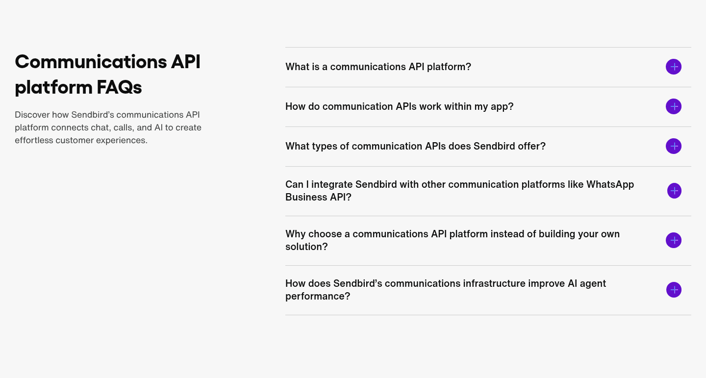
1Accordion with + toggles keeps a long FAQ scannable so visitors expand only what matters to them
2Build vs buy objection handled directly (Why choose a platform instead of building your own solution?)
3Integration worry addressed up front (Can I integrate with WhatsApp Business API?) to clear a common blocker
4Clean question and answer pairs are the structured format search engines index for FAQ rich results
Reviewed overlooked-section pick from Sendbird’s faq section.
What I love about this section
Accordion with + toggles keeps a long FAQ scannable so visitors expand only what matters to them
Build vs buy objection handled directly (Why choose a platform instead of building your own solution?)
Integration worry addressed up front (Can I integrate with WhatsApp Business API?) to clear a common blocker
Clean question and answer pairs are the structured format search engines index for FAQ rich results
Use the examples below as prompts for what to standardize, not just what to redesign.
Checklist: a practical audit for customer support website design
If you're iterating on a customer support homepage design, this checklist helps you spot missing sections and messaging gaps quickly, especially around Value Proposition, Hero, and Trust.
Built from 28 sections across 6 customer support homepages in this October 2026 benchmark. Each check below is a move the highest-scoring pages share, each paired with a real example.
Hero
Can a visitor tell what the product is and who it's for in five seconds?
The hero states the category and the buyer in plain words.
Example: Openline names the audience and category outright with "The B2B marketing copilot for strategic marketers," and Chattermill runs a category pill over an outcome headline.
Proof shows before the first scroll.
Example: Openline stacks investor logos (Y Combinator, Seedcamp) and a customer logo row above the fold, and Chattermill runs a "Trusted by 100+" wall of known brands.
Trust
Does the page earn belief before it asks for anything?
Proof is quantified with real numbers.
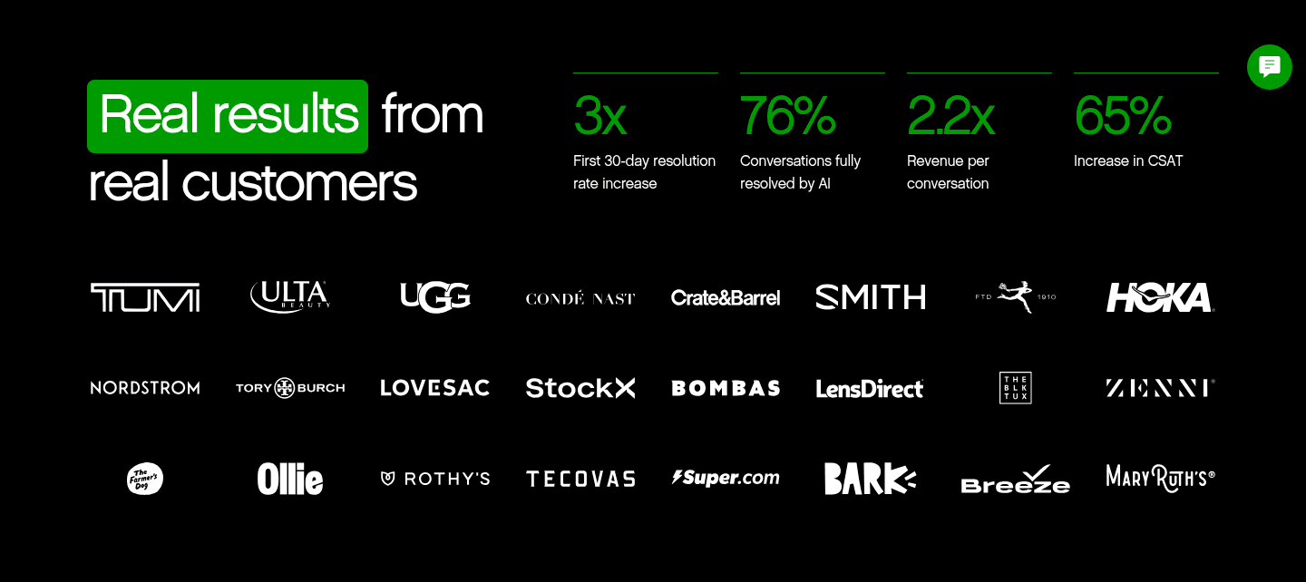
Example: Gladly lines up four outcome metrics (3x first 30-day resolution, 76% resolved by AI), and Sendbird cites a customer's 93% weekly return rate.
A security or compliance cue answers the "is it safe" question.
Example: Chattermill runs four recognizable badges (SOC 2, ISO 27001, GDPR, CCPA) that signal enterprise readiness at a glance.
Value proposition
Is the value concrete, or just adjectives?
The page runs several distinct value pillars.
Example: Dixa runs three pillars that each stand alone, answer in seconds, full customer history, and routed and scored automatically.
The promise is quantified with a number or a timeframe.
Example: Botsify anchors its promise with hard numbers, replaces up to 90% of repetitive work, 5,000+ integrations, and live in about one week.
Features
Do features connect to outcomes the buyer cares about?
Feature copy leads with the outcome, not the feature name.
Example: Sendbird leads with outcomes like increases conversions and double conversions at half the SMS cost instead of spec names.
Features split by audience so each reader sees their own use case.
Example: Dixa splits its features into two cards, AI for customers and AI for your team, so each reader lands on their own story.
Call to action
Does the next click feel safe and singular?
One primary action dominates the block, with action-led copy.
Example: Dixa lets one "Book a demo" button own the block with no competing links, and Sendbird keeps a single dominant dark button.
The gap most customer support pages leave open is pricing.
Pricing is the rarest section in the customer support set. None of the homepages scored in detail expose a pricing block clear enough to score, so a buyer comparing tools has to book a call before learning what anything costs. The pages that would win here make the cautious buyer's job easy by lining up named plans side by side. Hiding price behind "contact sales" hands the cheapest trust to whichever competitor decides to show it.
Run it on your current page, then decide what to rewrite, what to reorder, and what proof to add before you touch visual polish. Score your own page against the same framework below, or try our landing page analyzer for a faster baseline.
Interactive quiz
What would your customer support homepage score?
Question 1 of 5
0%
Can a buyer tell what your support product does in under five seconds?
"AI support agents trained on your data" beats "reimagine your customer experience."
Reviewed by
Gabriel Amzallag , Founder, Web Anatomy
5 years CRO + SEO at Qonto (2021–2025). After advising 15+ SaaS on their websites (Payfit, Pigment…), the same patterns kept breaking, so I decided to build the source of truth on what works on the web: the intelligence layer every tool, builder, and team uses to ship sites that perform.
We find every way to grow your website’s visibility and conversions: SEO, AI search (AEO), backlinks and mentions, and UX/UI. 3 free opportunities, delivered by email.
Benchmark-backed customer support homepage inspiration
Customer Support FAQ
Quick answers based on our customer support website benchmark dataset.
What are the best customer support websites?
[01]
The strongest performers in this October 2026 review are Botmind, Dixa, and Openline, with Sendbird and Gladly standing out on trust and demo flow. Across 15 customer support homepages scored against the same criteria, these pages win by pairing a clear product promise with fast proof: Dixa's three quantified value pillars, Openline's inline domain capture and above-the-fold logos, and Gladly's low-friction demo form.
What makes customer support websites harder to convert than generic SaaS pages?
[02]
Support buyers arrive skeptical and will not click until they believe the product resolves real issues safely. Across 15 homepages reviewed, the pages that convert make the claim specific and verifiable: Dixa attaches a hard metric to every value pillar, Sendbird mixes logos, awards, and outcome stats in one block, and Botsify answers security and setup doubts on the page.
What is the biggest design mistake on customer support homepages?
[03]
Leading with polished branding while delaying concrete proof and pricing. The average page in this review scored 54. Top performers answer "why trust you?" early: Sendbird stacks several kinds of proof at once, Gladly bakes reassurance into the demo form, and NINA shows the setup clock on every step so speed to value is impossible to miss.
What sections should a customer support homepage include?
[04]
A hero with one primary action, an early trust layer (logos, quantified outcomes, or compliance cues), a how-it-works or product overview, features tied to support outcomes, and a clear next step like a demo or a free start. Dixa and Openline stack these well. Across 15 pages, the ones that skip the trust layer lose buyers before they reach features, and almost none show pricing.
How many customer support examples should I review before redesigning?
[05]
Three to five is enough if you pick by support model and compare each section in turn. Only 1% of pages in this set score in the top tier, so the gap is concentrated in a few blocks. Study Dixa for value clarity, Sendbird for trust, Botsify for answering buyer doubts, NINA for setup speed, and Gladly for a low-friction demo.
Where can I find great inspiration for my customer support website?
Use a structured rubric that checks clarity, trust, and friction instead of relying on subjective feedback. Run your page through the landing page audit for a section-level score against the same criteria used in this review.