Faq|
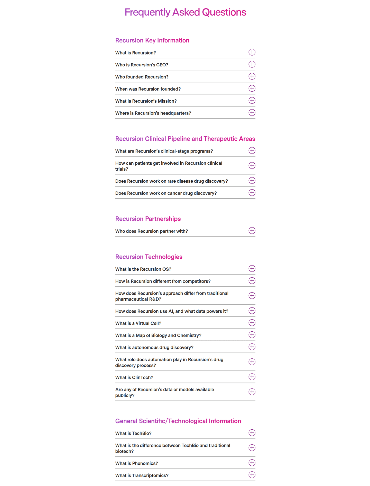
Grouping FAQ questions into labeled topics lets a visitor jump straight to the concern holding them back, instead of scanning a long undivided list.
Key takeaways
Showing 1–13 of 13 examples

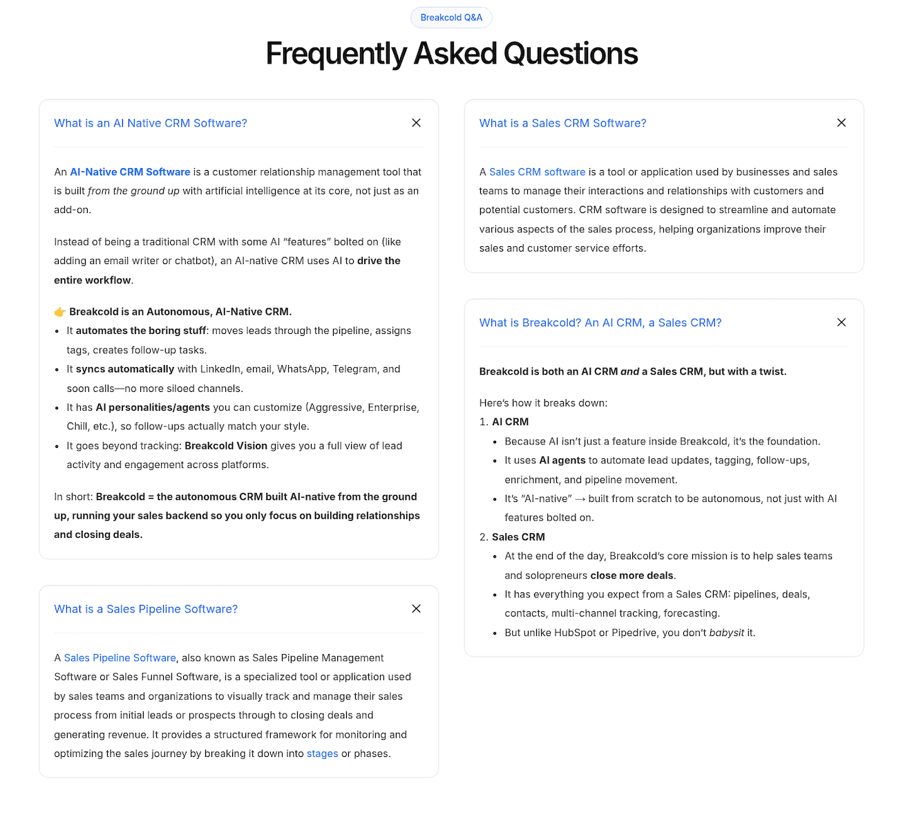
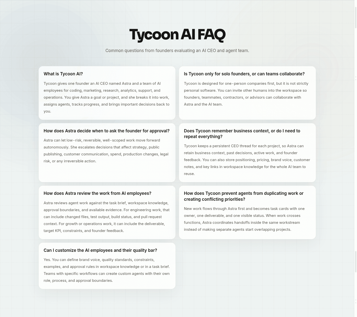
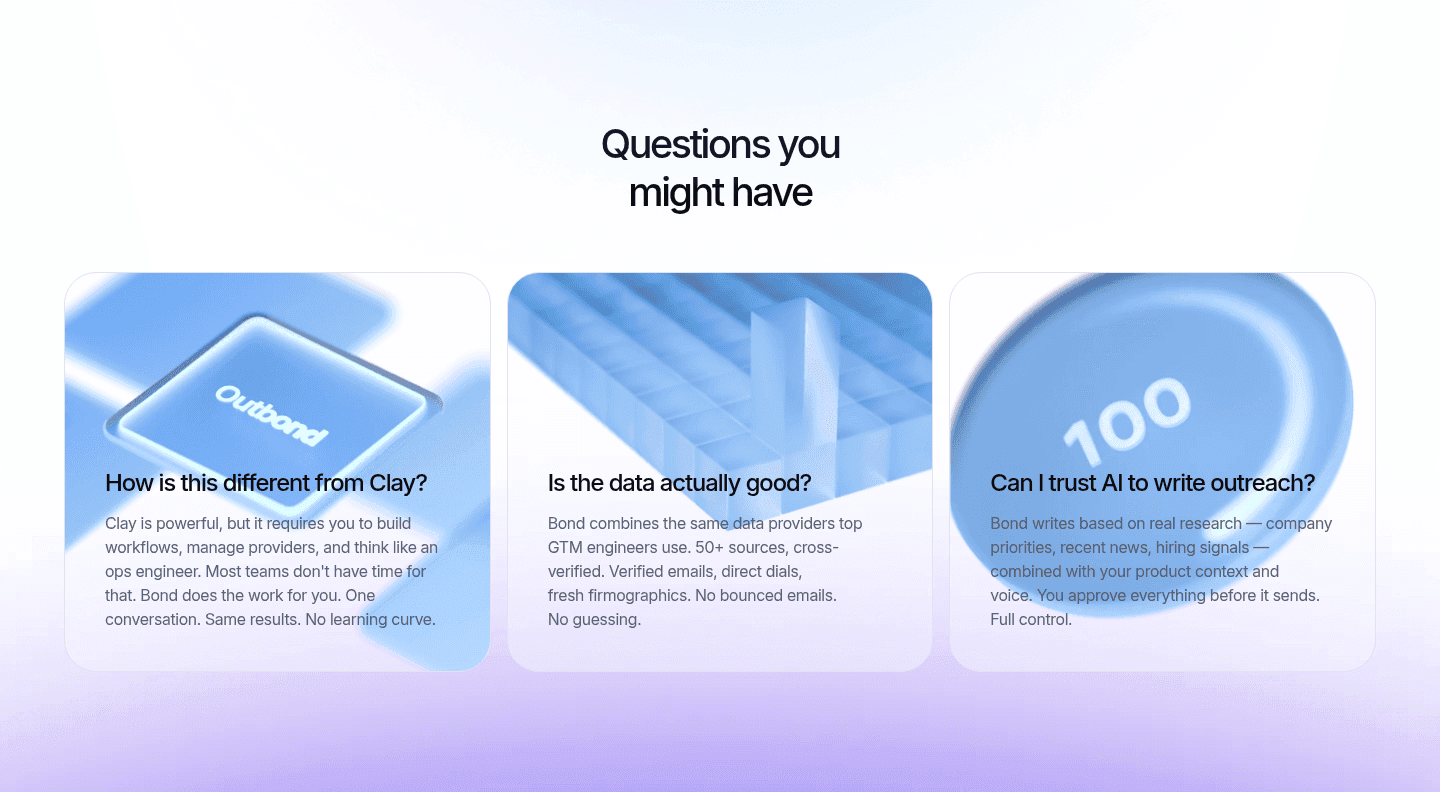
Browse every faq pattern by UX best practice.
Every FAQ section is scored across 5 conversion best practices. Copy the best practice stack, not the layout. See what converts and why.
Hand-picked from {companies} companies and analyzed by our AI conversion agent. Not a random dump of FAQ pages. Every entry earns its spot.
Found a FAQ section you admire? Run yours through the same scoring engine. See where you stand on the same best practices, and what to fix first.
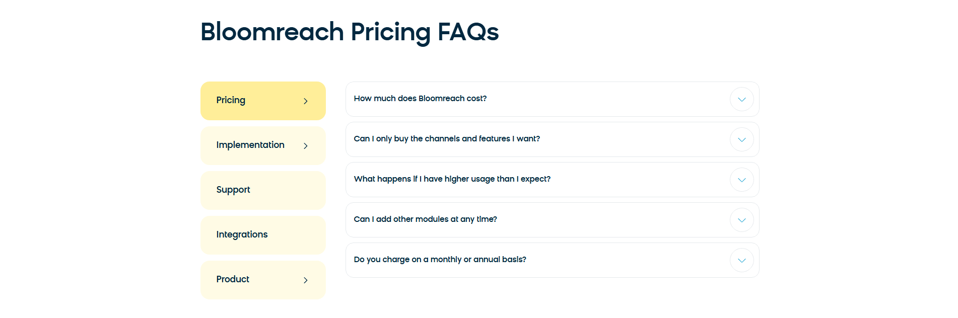
A topic-grouped FAQ sorts the questions into a few labeled buckets instead of one long list. The visitor reads the labels first, picks the one that matches the concern they arrived with, and only then reads the answers inside it. The labels can take a few forms, and the best pages pick the one that fits the volume of questions:
A visitor almost never reads an FAQ end to end. They arrive with one question, usually about price, security, or setup, and they want that one answer fast. A single undivided list makes them read past everything that does not apply to reach the part that does, and a good share leave before they get there.
Labeled topics turn that scan into a single choice. The labels also do quiet reassurance work: a visitor who spots a Security tab or a Pricing group knows the answer is there before opening it, which settles a worry even when they never click. Grouping does the sorting so the visitor does not have to.
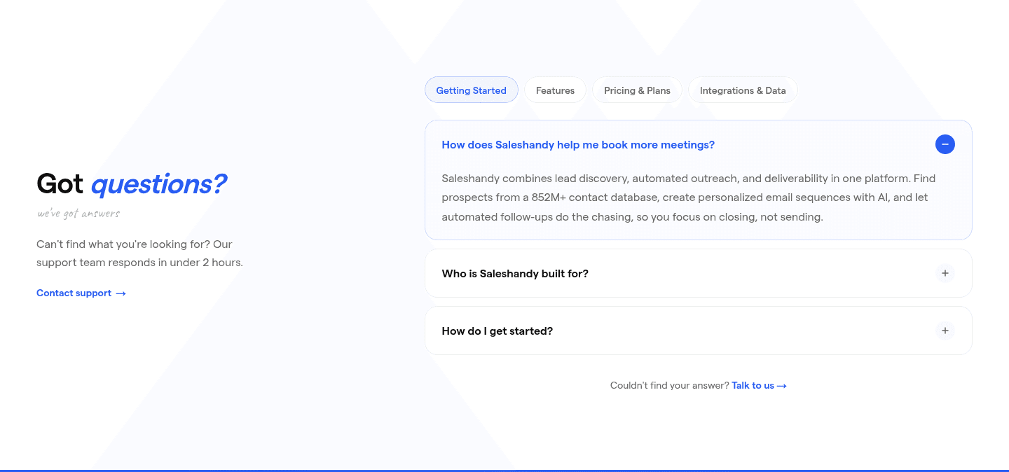
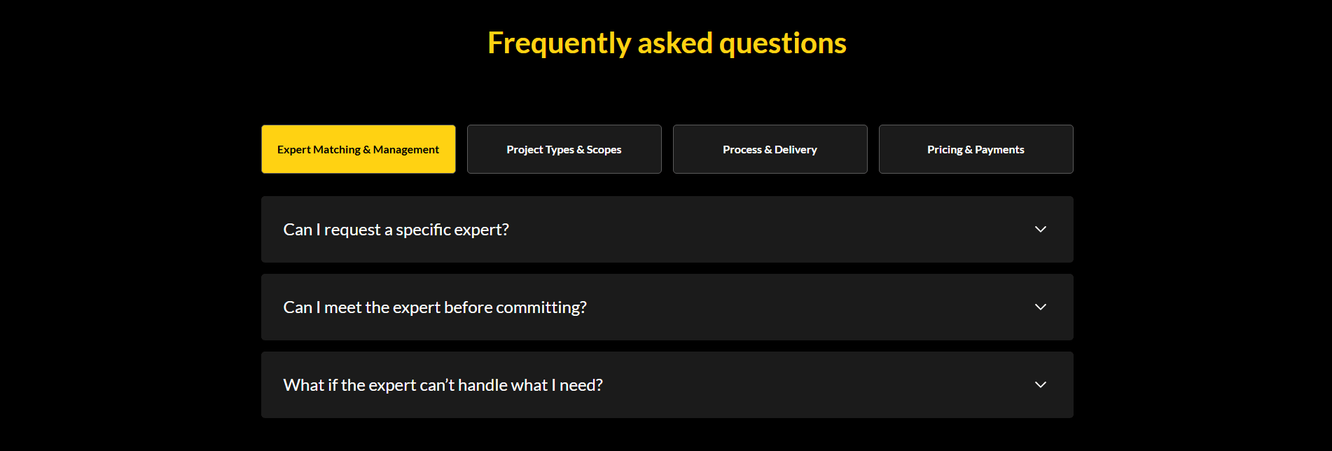
Across the examples below, the strongest topic-grouped FAQs name their buckets after the concerns that decide the sale, not after internal product structure. Saleshandy uses pills a buyer recognizes instantly: Getting Started, Features, Pricing and Plans, Integrations and Data. GourmetPro routes each buyer to their own blocker with Expert Matching, Project Types, Process and Delivery, and Pricing and Payments.
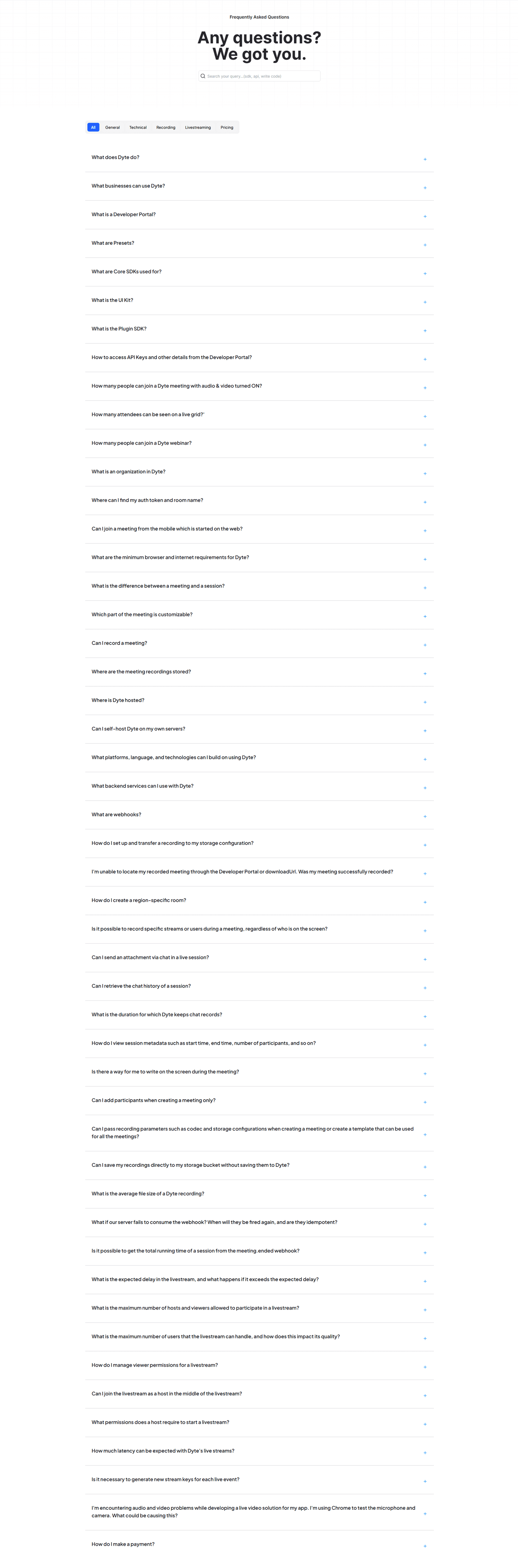
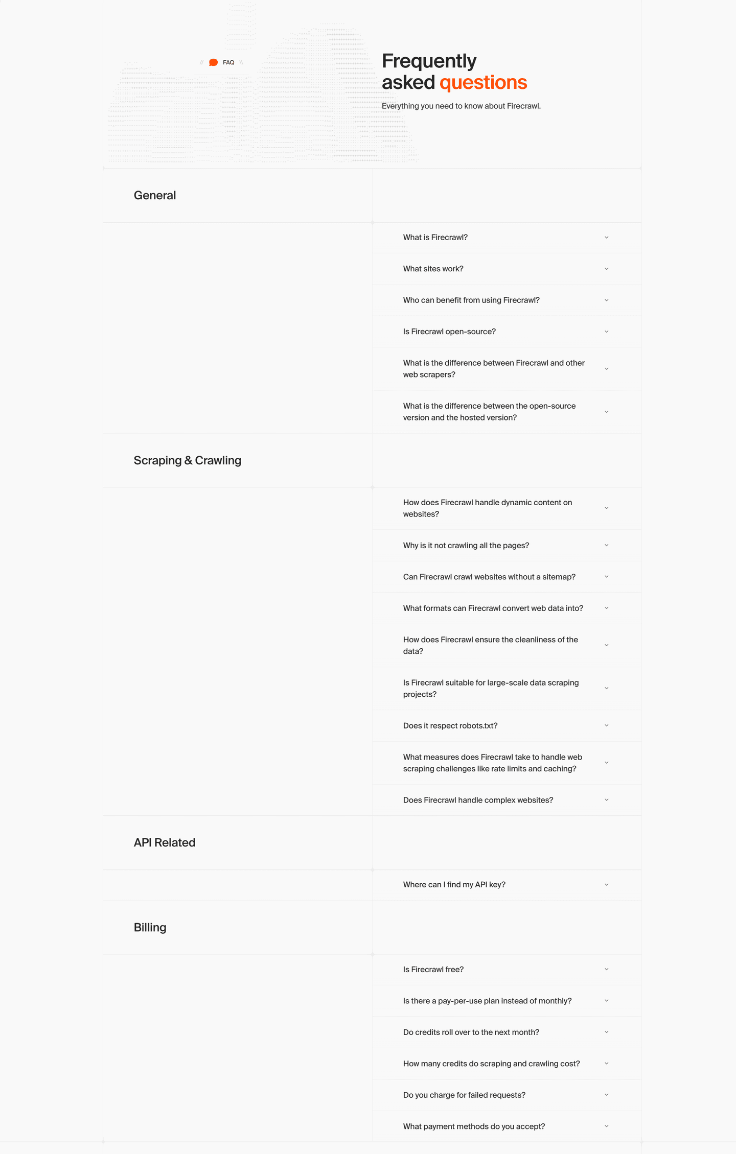
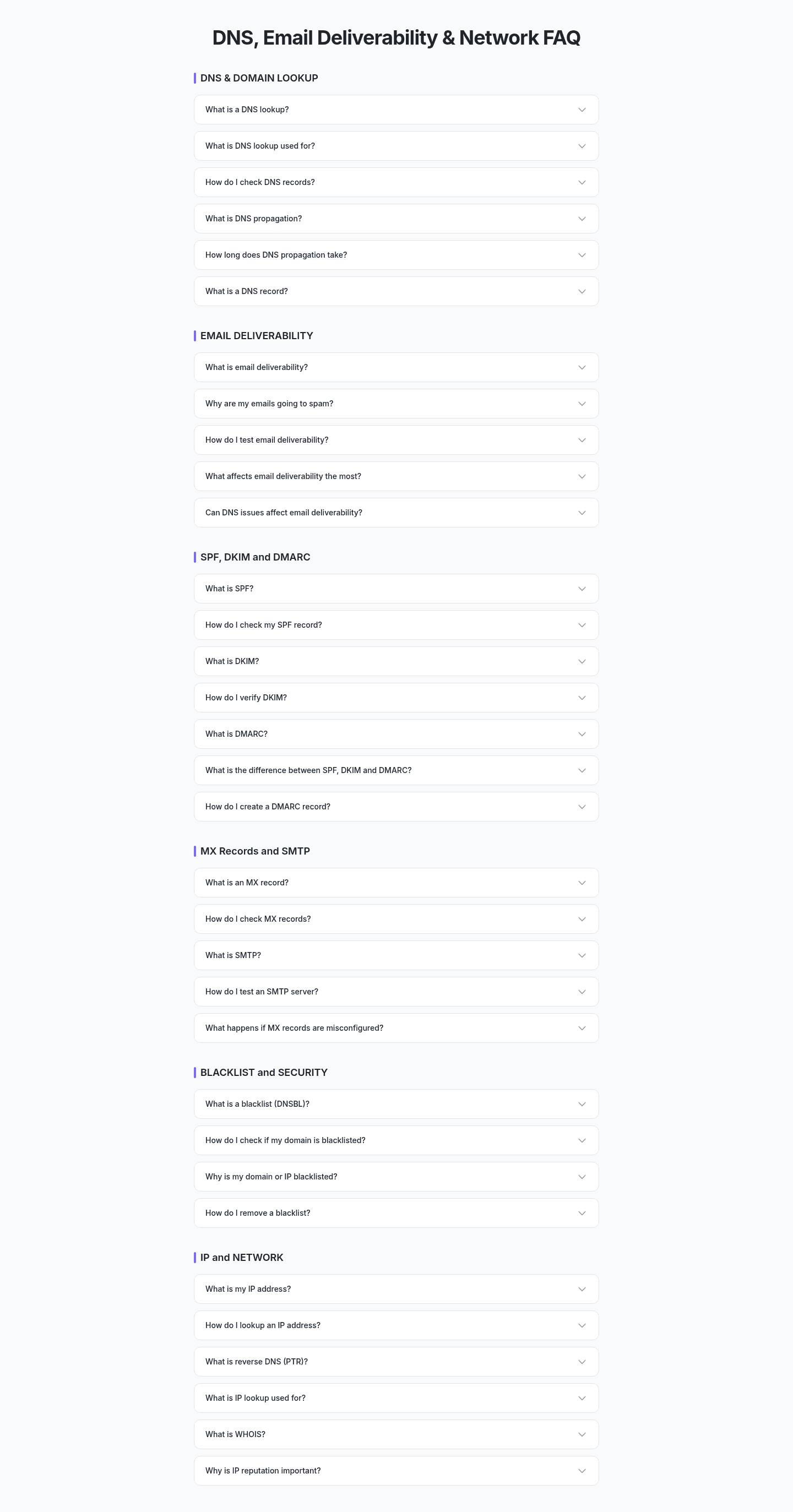
The best pages also match the format to the volume. When the set is large, tabs or a search box keep it compact, the way Dyte and mailX by mailwarm do with their many technical questions. When the set is smaller, a few labeled headers let the visitor skim every topic at once. Either way the labels stay visible before any answer opens, so the visitor is choosing a topic rather than hunting through prose.
100/100 0/100
0/100The usual failure is labels that describe the company instead of the visitor's concern, so a buyer worried about cost cannot tell which tab holds the pricing answer. The second is too many groups, where a dozen thin labels create more sorting work than the single list they replaced. The third is a topic bar that looks decorative rather than clickable, so visitors never realize the questions are filtered behind it. Keep the labels few, name them in the visitor's own words, and make it obvious they can be tapped.

Curated by
Gabriel Amzallag , Founder, Web Anatomy
5 years CRO + SEO at Qonto (2021–2025). After advising 15+ SaaS on their websites (Payfit, Pigment…), the same patterns kept breaking, so I decided to build the source of truth on what works on the web: the intelligence layer every tool, builder, and team uses to ship sites that perform.
Paste your URL. Get a scored analysis of your FAQ section, including whether visitors can find the answer they came for. Free, no signup.
The common questions about organizing an FAQ into labeled topics, with answers drawn from 13 real examples.
It is an FAQ section where the questions are sorted into a few labeled groups instead of one long list. The labels can be tabs, pills, or headers, with names like Getting Started, Pricing and Plans, Security, or Integrations. A visitor reads the labels first, picks the one that matches the concern, and only then expands the questions inside it.
A visitor arrives at the FAQ with one specific worry, not ten. A single undivided list forces them to read past every question that does not apply to reach the one that does, and many give up first. Labeled topics turn that scan into a single click. The labels also reassure at a glance, because seeing a Security or Pricing tab signals the answer exists before the visitor even opens it.
Group by the concerns that decide the sale, not by internal product structure. The common buckets on SaaS pages are Getting Started or setup, Pricing and Plans, Security and data, and Integrations. Developer tools often add an API or technical group. The right labels are the ones a buyer would recognize as their own question, so name them in the visitor's words.
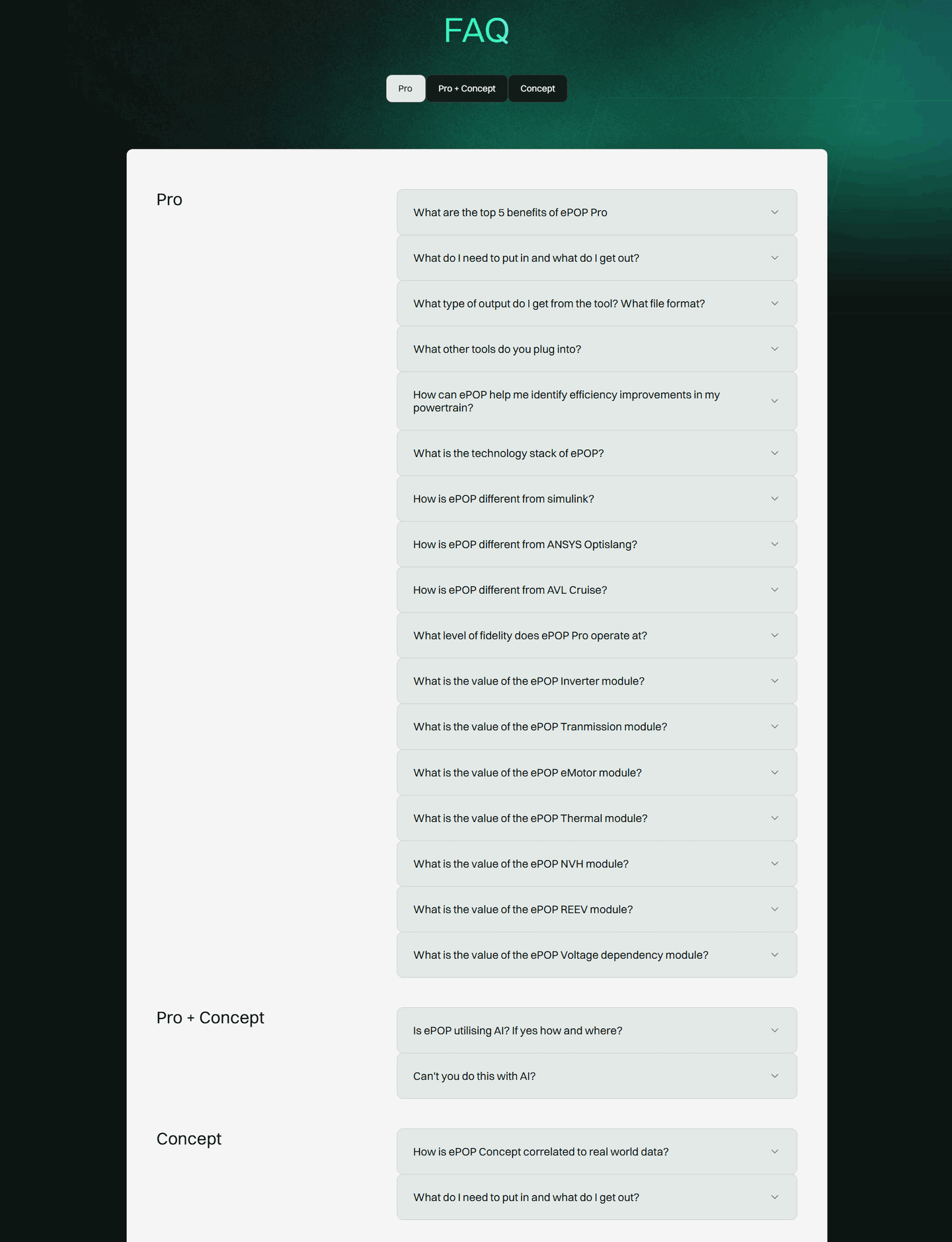
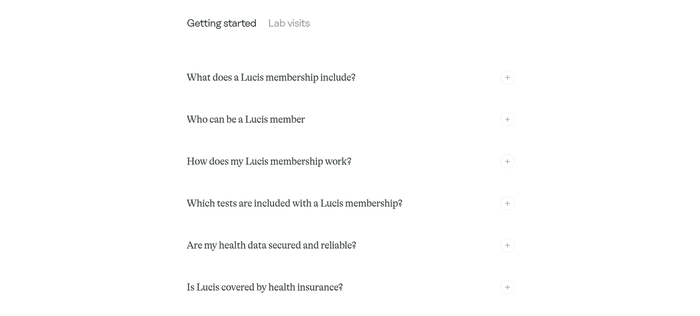
Both work, and the choice depends on volume. Tabs or pills keep a large question set compact, because only one group is visible at a time, which suits pages with thirty or more questions. Labeled section headers stacked down the page suit a smaller set, since the visitor can skim every topic without clicking. Either way, the labels have to be visible before any answer is opened.
Enough to feel complete without burying the important ones. Roughly three to six questions per topic keeps each group scannable. If a bucket grows past that, it is usually a sign it holds two concerns that should be split into separate labels. A topic with a single question rarely earns its own label and reads better folded into a neighbor.