New
Faq|
Most FAQ sections stop at the answer. The rare few that add a next step, a link to plans, a trial, or a way to reach support, turn a doubt-clearing section into a place people move forward from.
Key takeaways
Showing 1–8 of 8 examples
Browse every faq pattern by UX best practice.
Every FAQ section is scored across 5 conversion best practices. Copy the best practice stack, not the layout. See what converts and why.
Hand-picked from {companies} companies and analyzed by our AI conversion agent. Not a random dump of FAQ pages. Every entry earns its spot.
Found a FAQ section you admire? Run yours through the same scoring engine. See where you stand on the same best practices, and what to fix first.
A next step inside an FAQ answer is the decision to end an answer by pointing somewhere, not just by resolving the doubt. The answer still does its first job, it settles the question in plain language. Then, instead of leaving the visitor to scroll back up and hunt for the pricing or signup section, it hands them the link that matches what they just asked.
The best FAQ sections use one of a few forms, and often two together:
An FAQ is the last stop for a visitor who is close but not convinced. By the time someone reads it, they have a specific doubt, and the moment that doubt is cleared is the moment their intent is at its highest. A plain answer spends that moment and gives nothing back. The visitor nods, then has to find their own way to the next step, and many simply leave.
Putting the step inside the answer removes that gap. The link arrives at the peak of intent, matched to the exact question, so acting is easier than leaving. It is also rare enough to be an edge: only around 3% of the FAQ sections in our library do it, so a page that does reads as more finished than the ones that stop at the answer. Browse the full FAQ gallery and the difference is easy to spot.
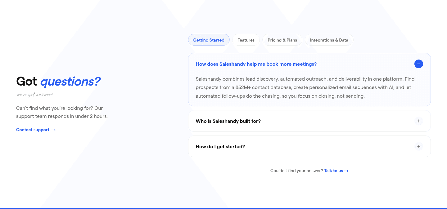
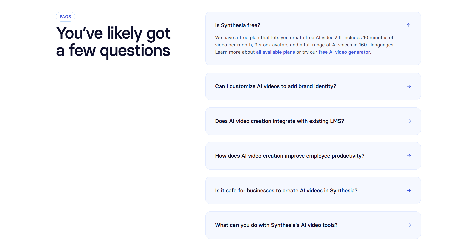
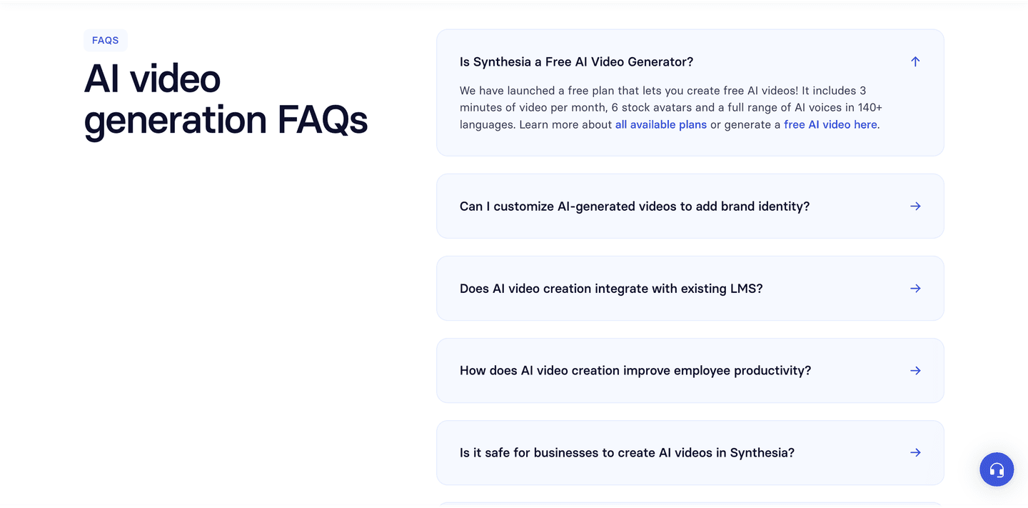
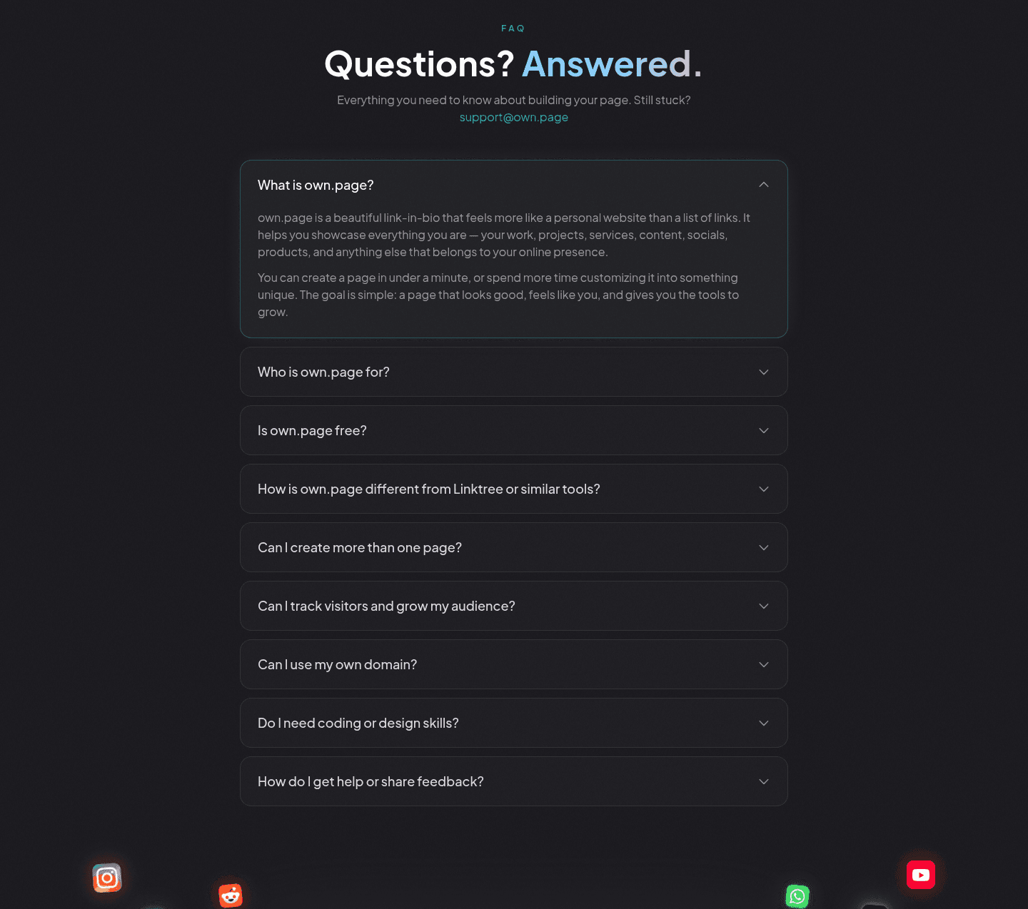
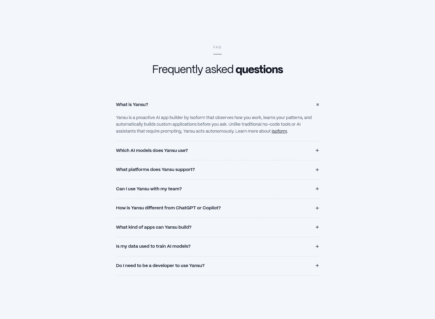
Across the scored examples below, the discipline is the same: answer first, then point. Synthesia opens with the questions buyers actually carry (is it free, is it safe for businesses, does it integrate) and embeds the links to all the plans and the free AI video generator right in the answer, so a pricing doubt becomes a trial in one click. Saleshandy groups its questions behind topic pills for Getting Started, Features, Pricing, and Integrations, then backs the section with a response-time promise and a contact-support link, so the visitor whose question is not covered still has a route. own.page leads with a top answer card that spells out what the product is and who it is for, then keeps a support email under the heading as the always-visible catch-all. Yansu turns its opening question into a stealth value proposition, so the first answer works as both reassurance and a first click.
What unites them is that the answer never stops being an answer. The next step is added as the natural move, not wedged in as an ad, and it is matched to the doubt rather than bolted on generically.
80/100 0/100
0/100The usual failure is the dead-end answer: the question is resolved cleanly, and then nothing, no link, no route, so the visitor who is finally ready has to scroll back up and find their own way. The second failure is the opposite, a link stuffed into every answer until the section reads like a pitch and the answers stop feeling honest. The third is leaving no catch-all, so the visitor whose exact question is not listed hits a wall. Answer the question first, add the step that matches it, and keep one visible support or contact route for everyone else.

Curated by
Gabriel Amzallag , Founder, Web Anatomy
5 years CRO + SEO at Qonto (2021–2025). After advising 15+ SaaS on their websites (Payfit, Pigment…), the same patterns kept breaking, so I decided to build the source of truth on what works on the web: the intelligence layer every tool, builder, and team uses to ship sites that perform.
Paste your URL. Get a scored analysis of your FAQ section, including whether your answers point to a next step. Free, no signup.
The common questions about turning FAQ answers into a next step, with answers drawn from 8 scored examples.
It means the answer does not just resolve a question, it points to the next step. Instead of ending flat, the answer links to plans or pricing, starts a free trial, opens a demo or contact route, or sends the visitor to a support email. The FAQ becomes a place to move forward from, not only a place to reassure.
An FAQ is where a visitor lands with their last remaining doubt. The moment that doubt is cleared is the moment they are most ready to act, and a plain answer wastes it by leaving them to scroll back up. A next step inside the answer captures that moment while intent is high. It is rare: only around 3% of the FAQ sections in our library do it, which is exactly why it stands out.
The one that matches the question. A pricing question should link straight to the plans. A 'is it free' question should open the trial or the free tool. A safety or privacy question should link to the proof. A question the page did not anticipate needs a visible support or contact route so the visitor is never left with nowhere to go.
Not when the answer comes first. The strongest examples resolve the question in plain language, then add the link as the natural next move, not as an ad wedged into the copy. The answer still reads as an answer. The link simply saves the visitor the trip back to the pricing or signup section they would have hunted for anyway.
Two places work together. Inside the specific answer, where the link matches the doubt just resolved, and once at the section level as a catch-all, a support email or contact link under the heading for the visitor whose question is not listed. The first captures intent at its peak; the second makes sure no one leaves empty-handed.