Cta|
Urgency and scarcity give a visitor a reason to act now instead of leaving to decide later, and only a small share of CTA sections use them well.
Key takeaways
Showing 1–6 of 6 examples


Browse every cta pattern by UX best practice.
Every CTA section is scored across 6 conversion best practices. See which ones stack friction reducers, microcopy, and secondary paths, not just which ones look clean.
Hand-picked from {companies} companies and analyzed by our AI conversion agent. Real CTA sections from real products, not UI kit mockups.
Found a CTA you want to beat? Run yours through the same scoring engine and see where you stand on the same best practices, and what to fix first.
Urgency and scarcity are the two ways a call to action can attach a cost to waiting. Urgency works on time: a trial that starts today, an event on a set date, a promotion that ends this month. Scarcity works on supply: a capped beta, a limited number of spots, a bonus that runs out. Both answer the same silent question a visitor asks at the button, "why now and not later?"
The best CTA sections express it in one of a few concrete forms:
Most visitors who like an offer do not say no. They say "later," and later usually never arrives. A real deadline or a real limit removes the option to postpone at no cost. The visitor now has to weigh acting today against losing the spot, the bonus, or the window, and that trade tips more decisions into the current visit.
The word that matters is real. Urgency persuades when it points at something a visitor could verify: a beta that genuinely has a cap, an event that genuinely happens on a date, a promotion that genuinely ends. The moment it reads as invented, it does the opposite of its job, so the discipline is to make the limit honest and specific rather than loud.
Urgency is rare in this set. Only about one in fifty of the CTA sections we reviewed reaches for it at all, which is exactly why the ones that do it well stand out. Across the scored examples below, the pattern that works is a single honest limit paired with a single clear action, never a wall of pressure.
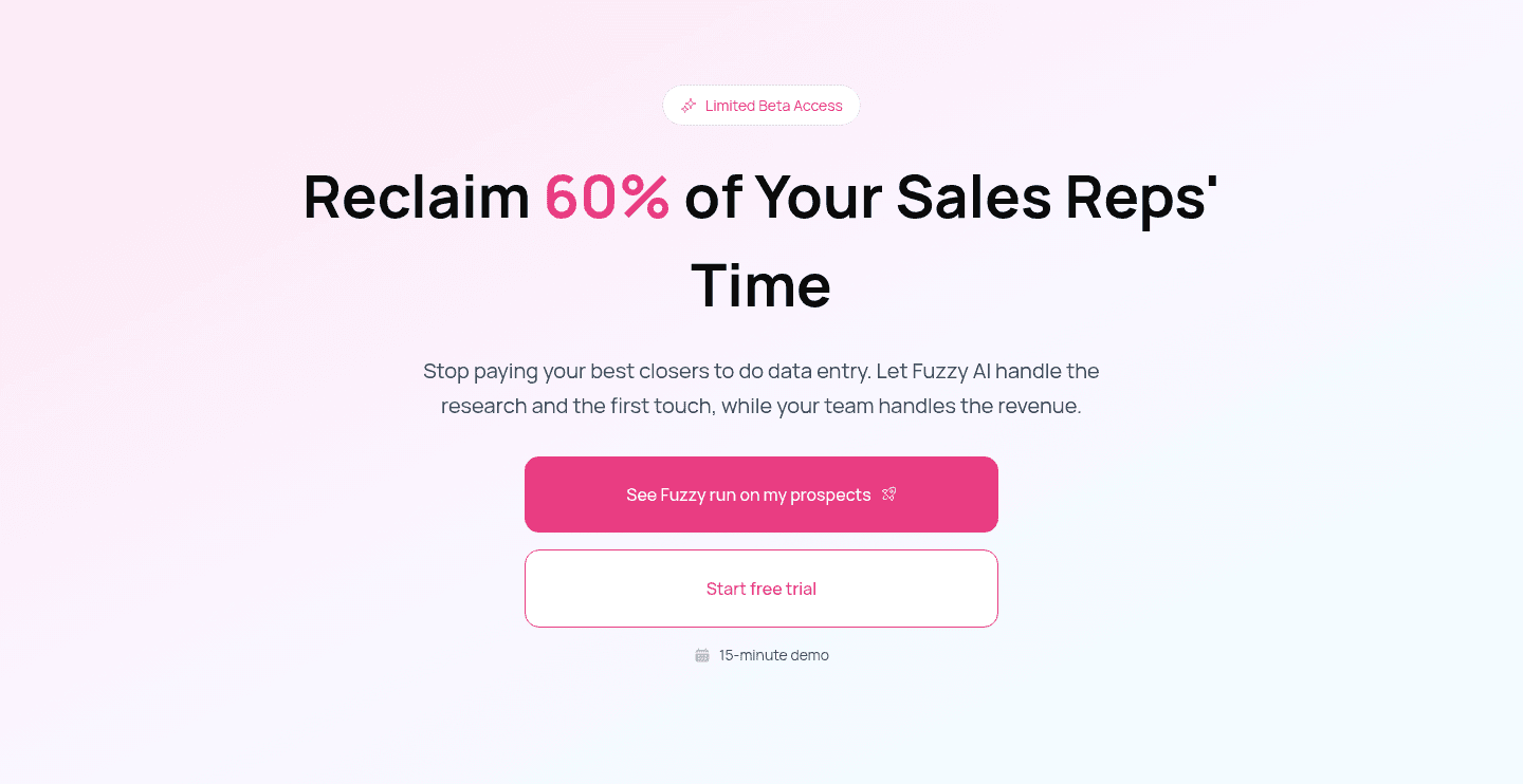
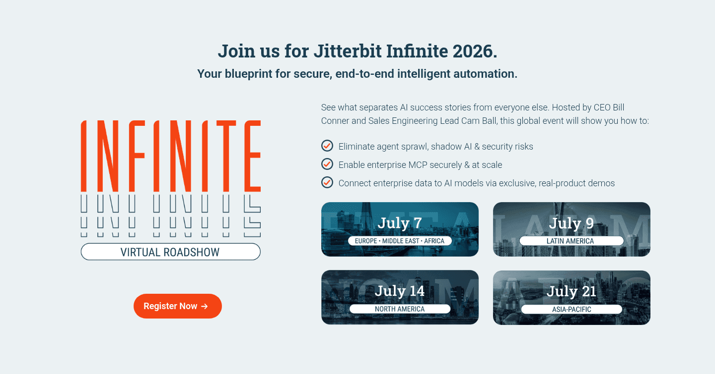
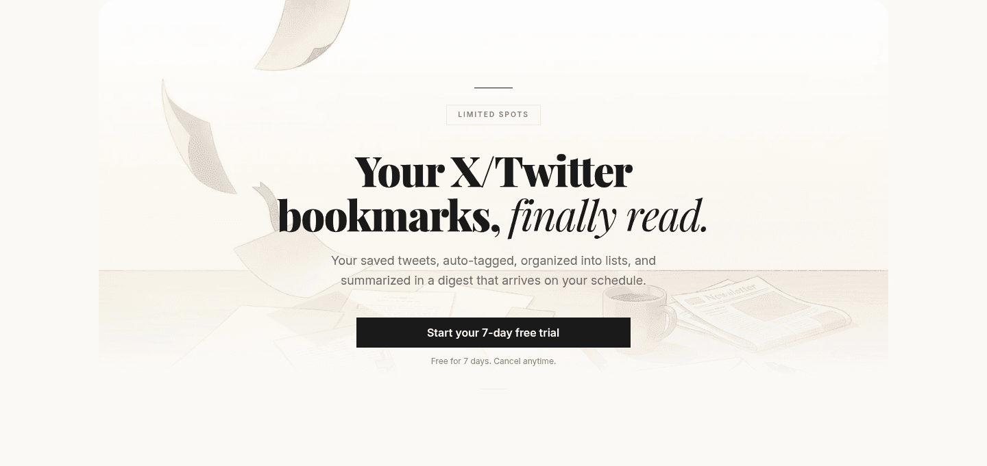
Bulkmark puts a "Limited Spots" pill above the headline and pairs it with a "Start your 7-day free trial" button, then defuses the commitment right under it with "Free for 7 days. Cancel anytime." Fuzzy AI does the same balancing act, a "Limited Beta Access" tag for scarcity alongside a fifteen-minute demo note that caps what the visitor is signing up for. Jitterbit turns an event into a deadline with four dated regional sessions, so registering feels like claiming a slot rather than accepting an open invite. SocialEcho states an explicit campaign window that runs June 1 to June 30, 2026, giving the offer a hard end. ProductLed leans on a closing-window line, "The window is closing," backed by the sharper "Your Competitors Are Already Working On This."
A deadline only converts when the underlying offer is easy to say yes to. The strongest versions keep the block to a single focused action and back the limit with reassuring microcopy under the button so the push never tips into pressure.
100/100 0/100
0/100The first failure is fake urgency: a countdown that resets on refresh, a "only 2 left" that never changes, a deadline that was clearly always "today." Visitors have seen all of these, and a limit that is obviously invented costs more trust than the click was worth. The second failure is urgency with no reassurance, where the pressure lands but the visitor is left worried about being charged or locked in, so a strong scarcity signal with no "cancel anytime" beside it can suppress the very action it was meant to drive. Make the limit real, make it specific, and give the nervous visitor a reason it is safe to act on it now.

Curated by
Gabriel Amzallag , Founder, Web Anatomy
5 years CRO + SEO at Qonto (2021–2025). After advising 15+ SaaS on their websites (Payfit, Pigment…), the same patterns kept breaking, so I decided to build the source of truth on what works on the web: the intelligence layer every tool, builder, and team uses to ship sites that perform.
Paste your URL. Get a scored analysis of your CTA section, including whether it gives visitors a real reason to act today. Free, no signup.
The common questions about adding a real deadline or limit to a call to action, with answers drawn from 6 scored examples.
It means giving a visitor a concrete reason to act now instead of later. Urgency is about time, a trial that starts today, an event on a set date, a campaign that ends this month. Scarcity is about supply, a limited number of spots or seats, closed beta access, a bonus that runs out. Both work by attaching a cost to waiting.
Most visitors who like an offer still leave to decide later, and later rarely comes. A real deadline or a real limit removes the option to postpone without a cost. When the reason to act is specific, a date, a spot count, a closing window, it reads as a fact about the offer rather than a sales trick, and it moves the decision into the current visit.
The common ones are a limited-spots or beta-access pill above the headline, a timed free trial such as seven days, a dated event or webinar with named sessions, an explicit campaign window with a start and end date, and a closing-window line that names what a visitor loses by waiting. The strongest CTA sections pick one, keep it honest, and pair it with a single clear action.
It is when the limit is invented, a countdown that resets on refresh or a 'only 2 left' that never changes. That kind of urgency is easy to spot and it costs trust. Honest urgency points at something real: a beta that genuinely has a cap, an event that genuinely happens on a date, a promotion that genuinely ends. Real limits persuade because they are verifiable.
Rare. Only about one in fifty of the CTA sections we reviewed reaches for urgency or scarcity, which makes it one of the least-used angles in the whole set. That is part of why it stands out: on a page full of open-ended 'Get started' buttons, a CTA with a real deadline or a real limit is doing something most of its peers are not.