New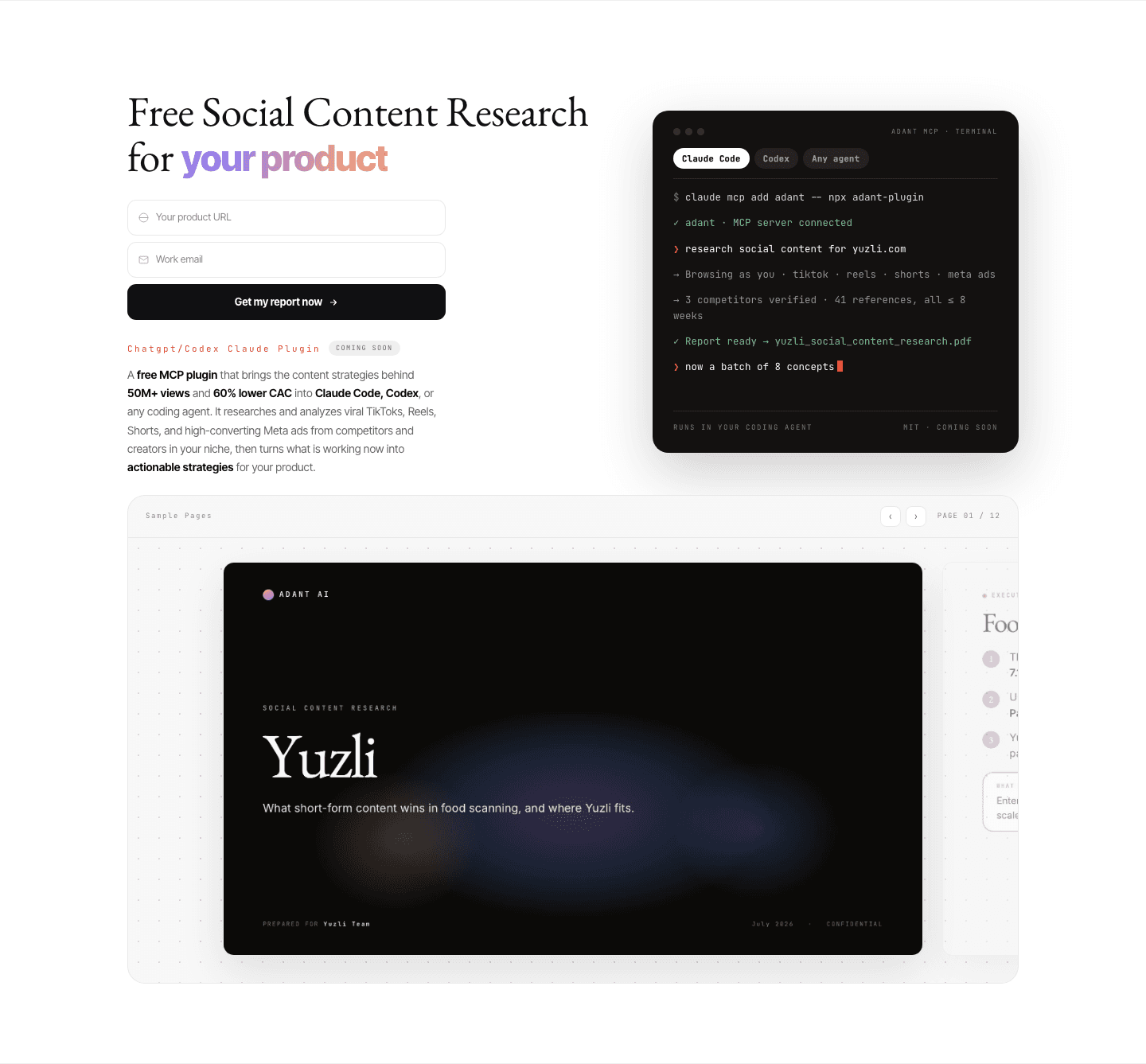
Cta|
An inline email capture puts the signup field right inside the closing section, so a ready visitor starts the trial or subscribes on the spot, without being sent to a separate form first.
Key takeaways
Showing 1–22 of 22 examples









Browse every cta pattern by UX best practice.
Every CTA section is scored across 6 conversion best practices. See which ones stack friction reducers, microcopy, and secondary paths, not just which ones look clean.
Hand-picked from {companies} companies and analyzed by our AI conversion agent. Real CTA sections from real products, not UI kit mockups.
Found a CTA you want to beat? Run yours through the same scoring engine and see where you stand on the same best practices, and what to fix first.
Inline email capture is the decision to put the signup field right in the closing section, so the visitor acts inside the block instead of clicking out to a separate form. By the time someone reaches the bottom of the page, the argument is made. A button that links to a signup page asks them to load a new screen and start over. A field sitting right there asks them only to type. The section stops being a doorway to the conversion and becomes the conversion.
The pattern shows up in three concrete forms:
A visitor who scrolls to the closing section has usually decided. What is left is the mechanical act of signing up, and every step between the decision and that act is a place where intent leaks away. A button that opens a fresh signup page adds a load, a new layout, and a quiet second chance to reconsider. An inline field removes all of it: the input is already in front of the visitor at the moment they commit, so acting is one keystroke away rather than one page away.
The rarity is the other half of the story. Most closing sections still link out to a signup page, so a field built directly into the block is something few visitors encounter. That makes a clean inline capture a real differentiator, not a commodity: it shortens the path to signup at the exact point where intent runs highest, on the one screen where most competitors are still adding a click.
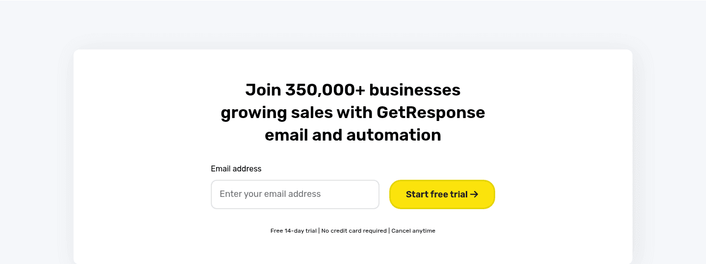
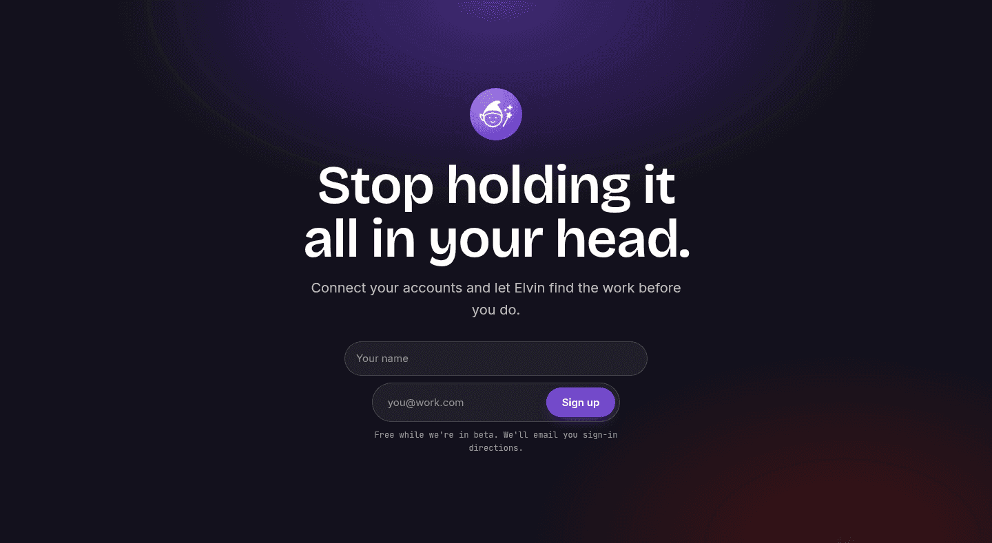
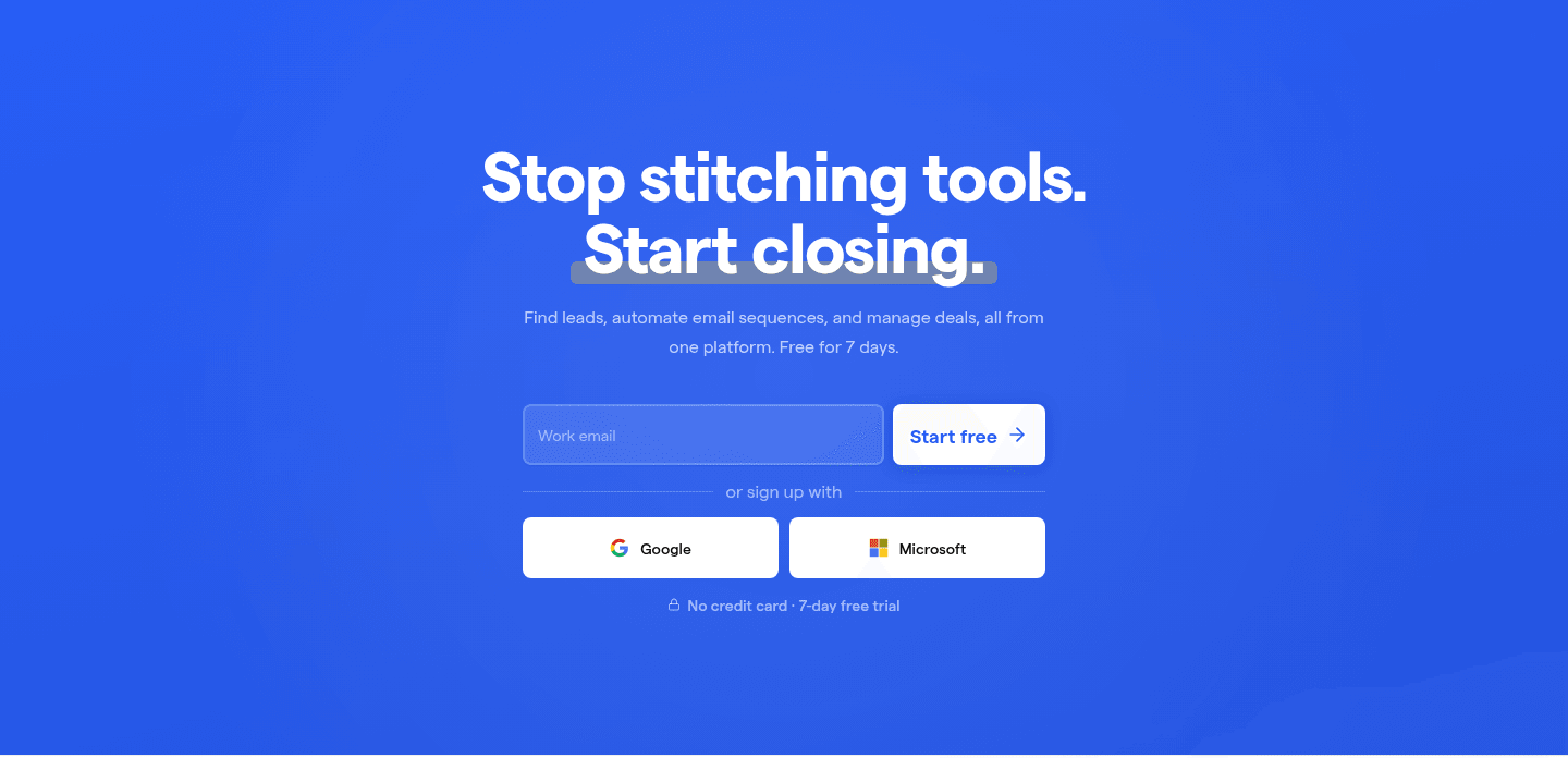
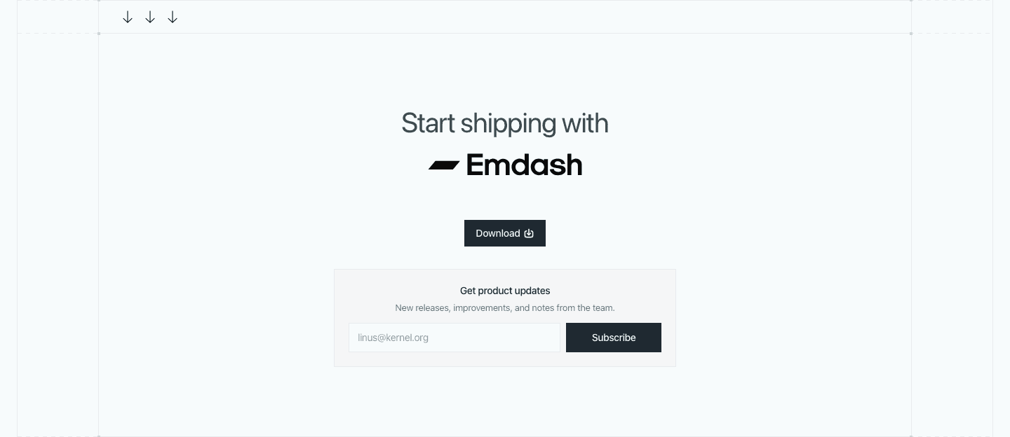
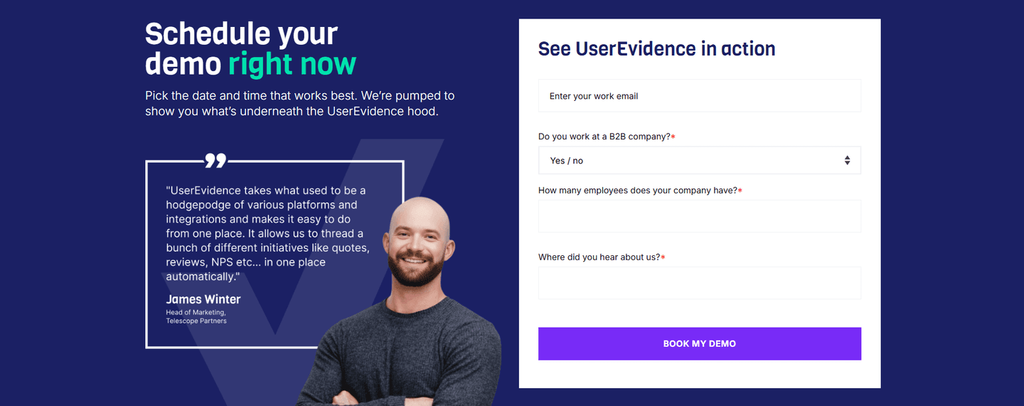
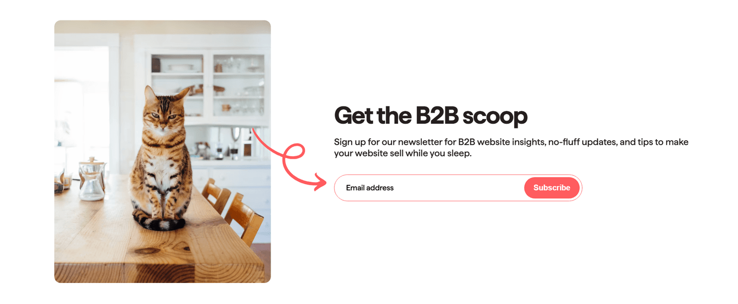
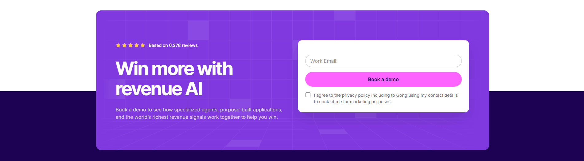
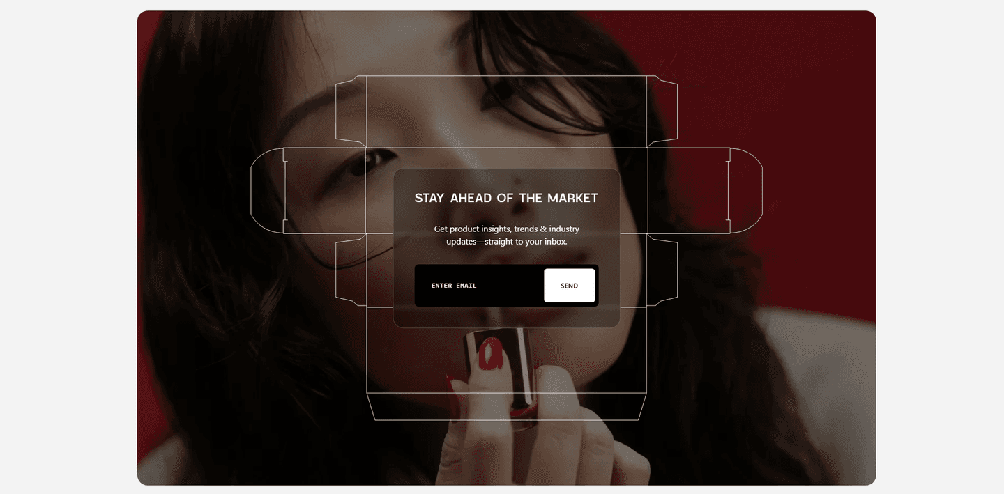
Across the scored examples below, the strongest inline captures keep the block to three things: one field, one button, and one line of reassurance. Saleshandy sits a lock icon with No credit card and a 7-day free trial directly under the form, so the two most common trial objections are answered before the visitor types. ActiveCampaign does the same with No credit card needed and Instant setup, and Elvin sets expectations with Free while we are in beta and a note that sign-in directions will follow by email. The button copy carries its weight too: Get a demo on Parabola, Book a demo on Gong, and Subscribe on Moloco each name exactly what the click does, so the field never feels like a trap.
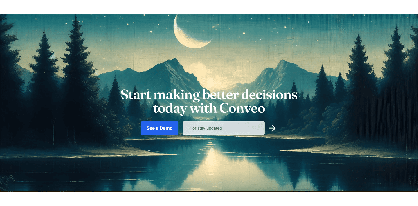
The discipline is in what gets left out. The best inline captures pair the field with reassuring microcopy sitting right under the button and keep the block to one dominant action so nothing competes with the input. When two audiences genuinely need different paths, the field can share the block with a lighter option, the way Conveo places See a Demo beside an or stay updated capture, but the primary still clearly wins the eye.
100/100 0/100
0/100The usual failure is a field that promises more work than it says. A single email input that actually leads to a long multi-step form breaks the trust the inline pattern is built on, because the visitor typed expecting one step and got five. The second failure is clutter around the input: a second loud button, a row of footer links, or a nav bar hovering right above the field, all of which pull focus off the one action the section exists to capture. The fix is to make the field mean what it shows. One input, one button, one short line of reassurance, and nothing else competing for the click.

Curated by
Gabriel Amzallag , Founder, Web Anatomy
5 years CRO + SEO at Qonto (2021–2025). After advising 15+ SaaS on their websites (Payfit, Pigment…), the same patterns kept breaking, so I decided to build the source of truth on what works on the web: the intelligence layer every tool, builder, and team uses to ship sites that perform.
Paste your URL. Get a scored analysis of your CTA section, including whether the signup starts in the block or gets pushed to a separate form. Free, no signup.
The common questions about building the signup field into the closing section, with answers drawn from 22 scored examples.
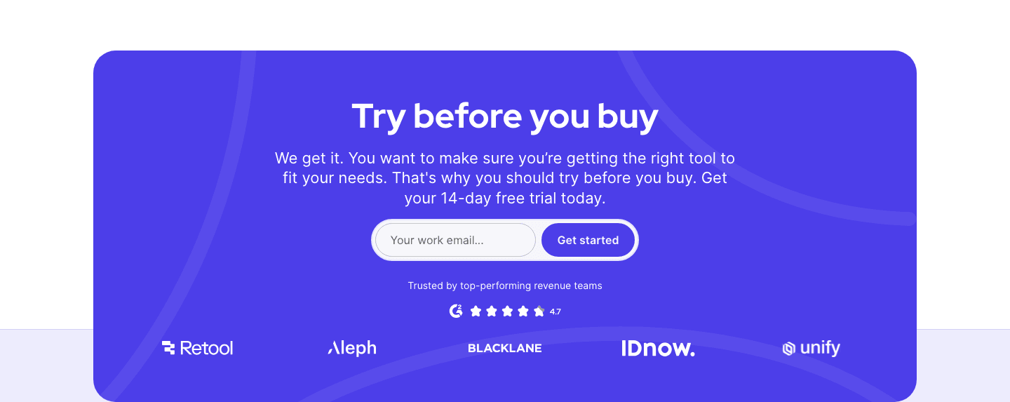
It is a closing call-to-action that puts the signup field right in the block, so the visitor types their email and acts without being sent to a separate form page. It takes three main forms: a work-email field next to a trial button like Start free or Get started, an address paired with a Subscribe button for a newsletter, and a domain field that starts a demo or an analysis in place. In every case the last section on the page is the signup step, not a link to it.
Every click between the decision and the signup is a place to lose the visitor. A button that opens a new signup page adds a load, a fresh screen, and a second chance to reconsider. An inline field removes that gap: the visitor is already looking at the input at the moment they decide, so acting is one keystroke away rather than one page away. The closing section stops pointing at the conversion and becomes the conversion.
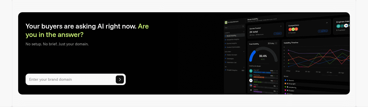
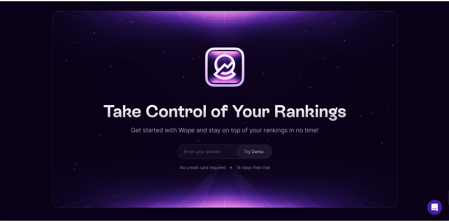
Use it when the next step really is a low-friction signup: a free trial, a newsletter, a demo request, or a domain-based analysis. Saleshandy and ActiveCampaign put a work-email field beside a trial button, Voltaiq and Moloco pair an address with Subscribe, and Wope and Scribble Network take a domain instead of an email. Skip it when the next step is heavy or high-consideration, where a single field would misrepresent the effort and set the wrong expectation.
One line of reassurance and nothing that competes. Saleshandy places a lock icon with No credit card and a 7-day free trial under the field, ActiveCampaign adds No credit card needed and Instant setup, and Elvin sets expectations with Free while we are in beta. A single field, one button, and a short reassuring line is the whole pattern. Extra links or a second loud button pull focus off the one action the section exists to capture.
No, and that is the opportunity. Most closing sections still use a button that links out to a signup page, so only a small share of CTA sections embed the field directly. Because it is rare, a well-built inline capture is a genuine differentiator: it shortens the path to signup at the exact moment intent is highest, on a page area where most competitors are still adding a click.