Navbar|
A visible Pricing tab in the navbar sends deal-ready buyers straight to plans, the shortest path from interest to a real evaluation.
Key takeaways
Showing 1–29 of 100 examples
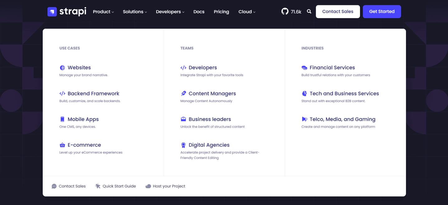
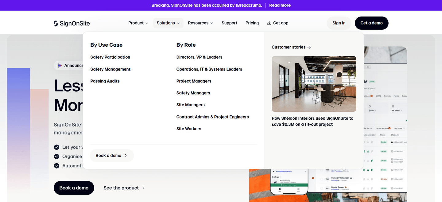
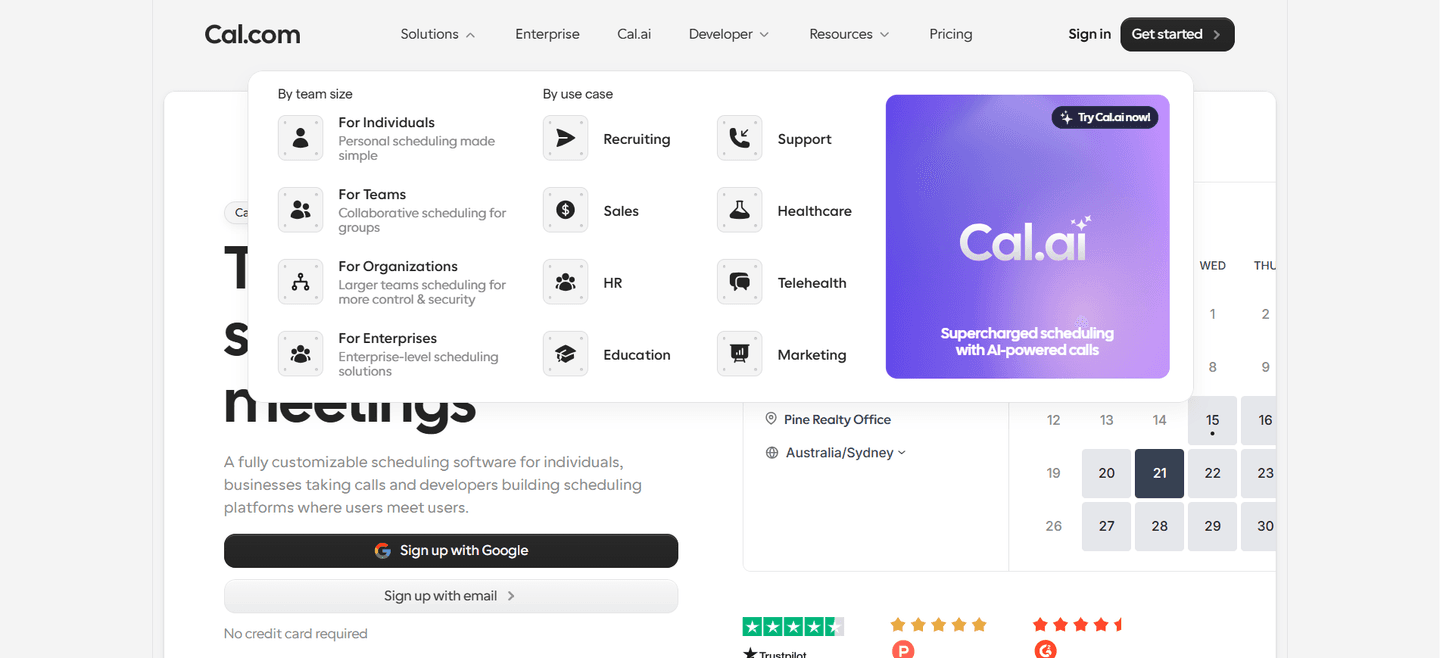
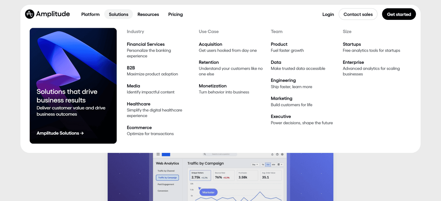
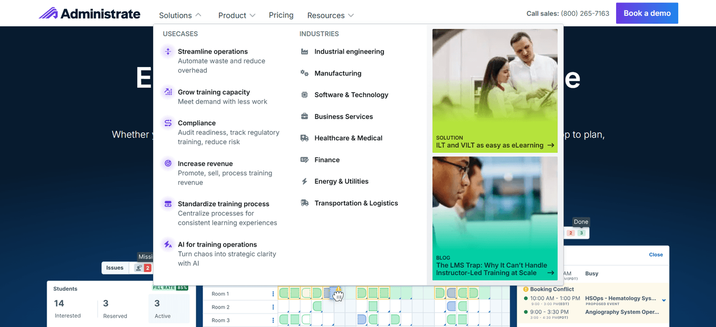
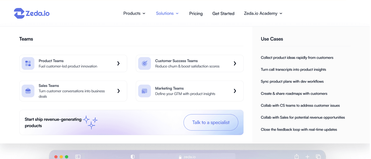
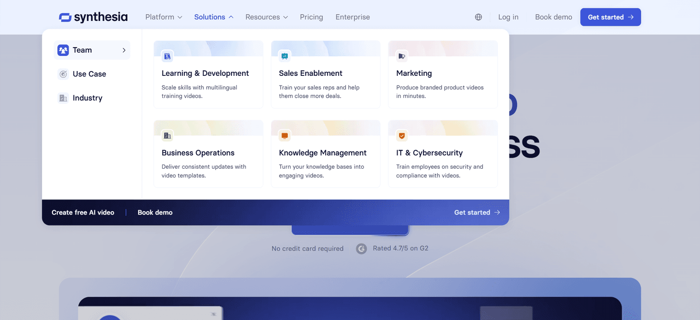
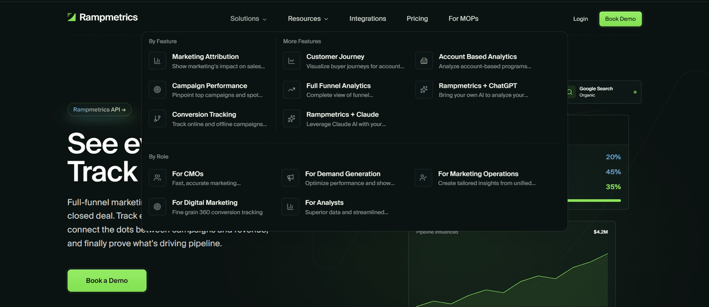
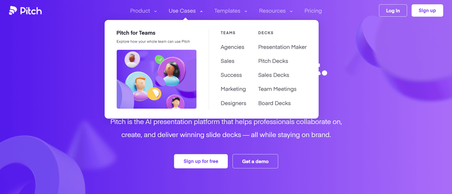
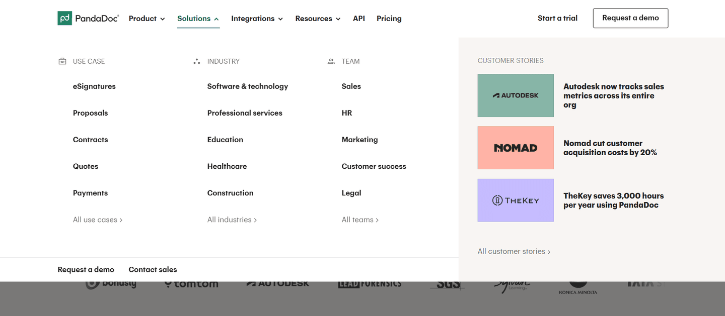
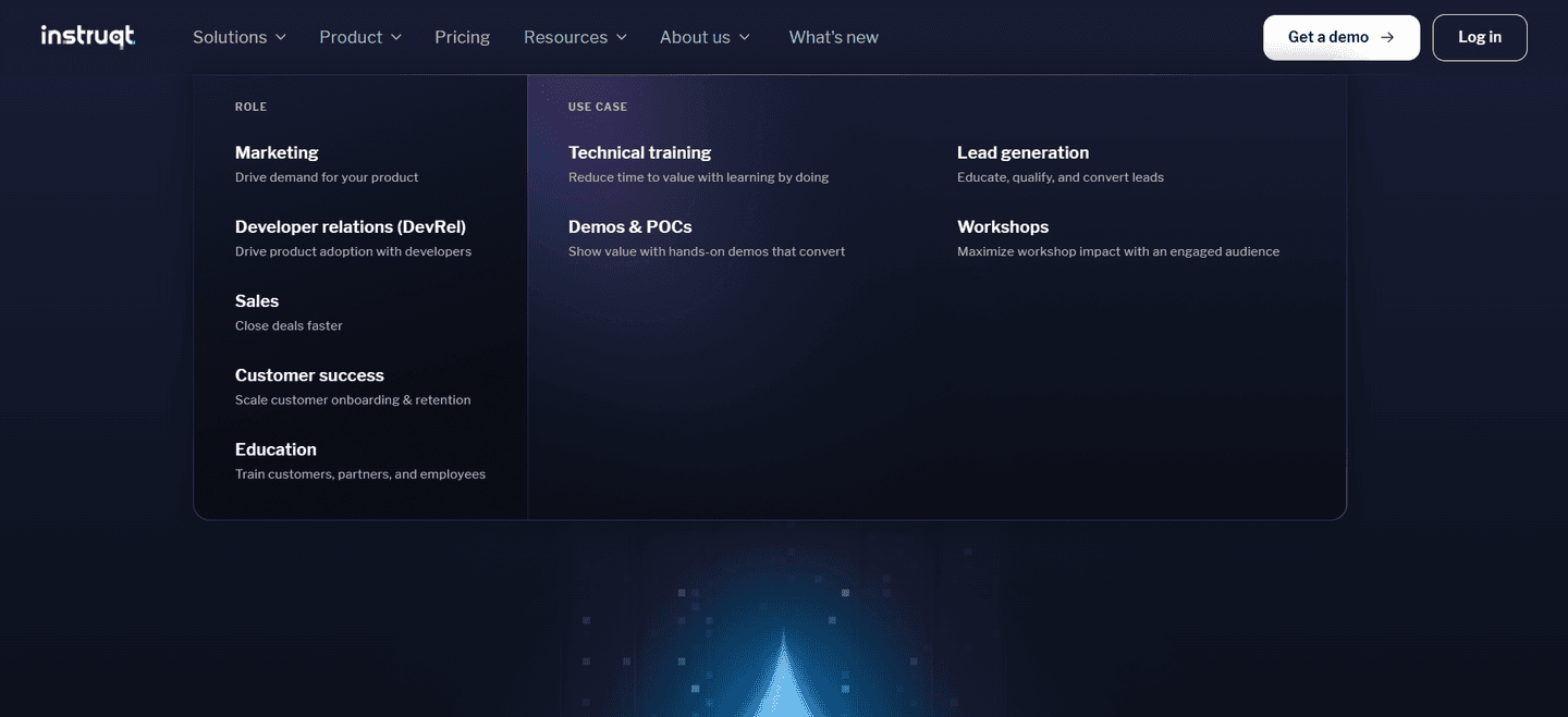
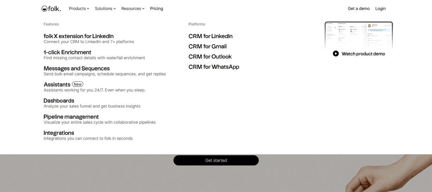
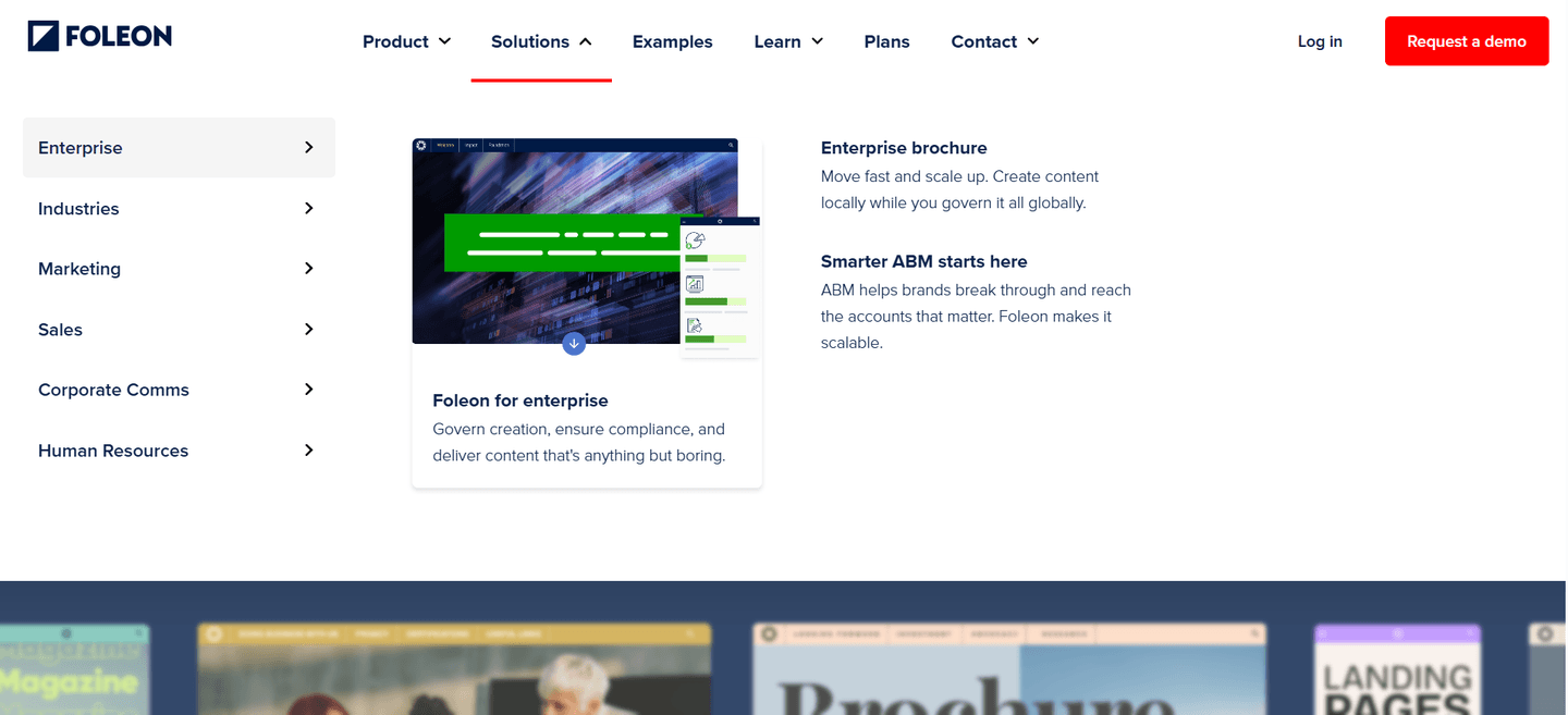
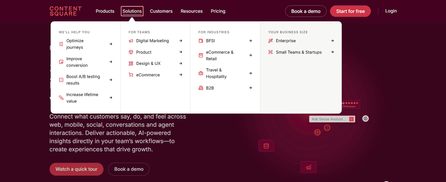
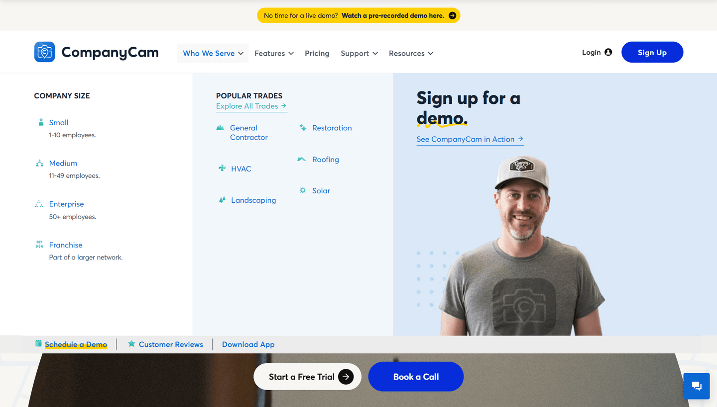
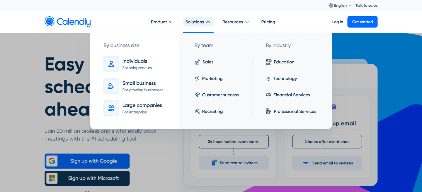
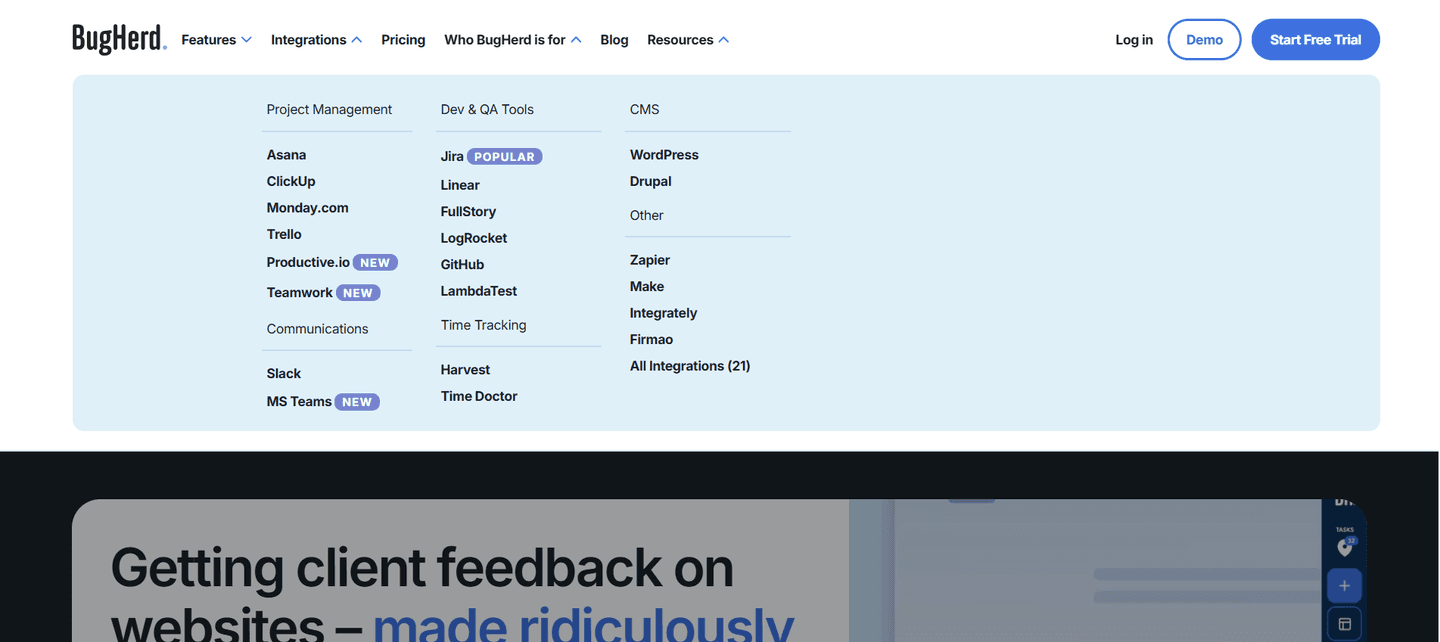
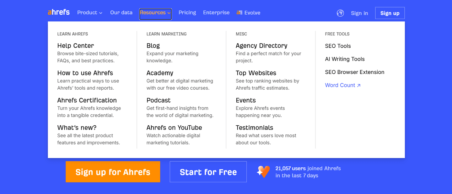
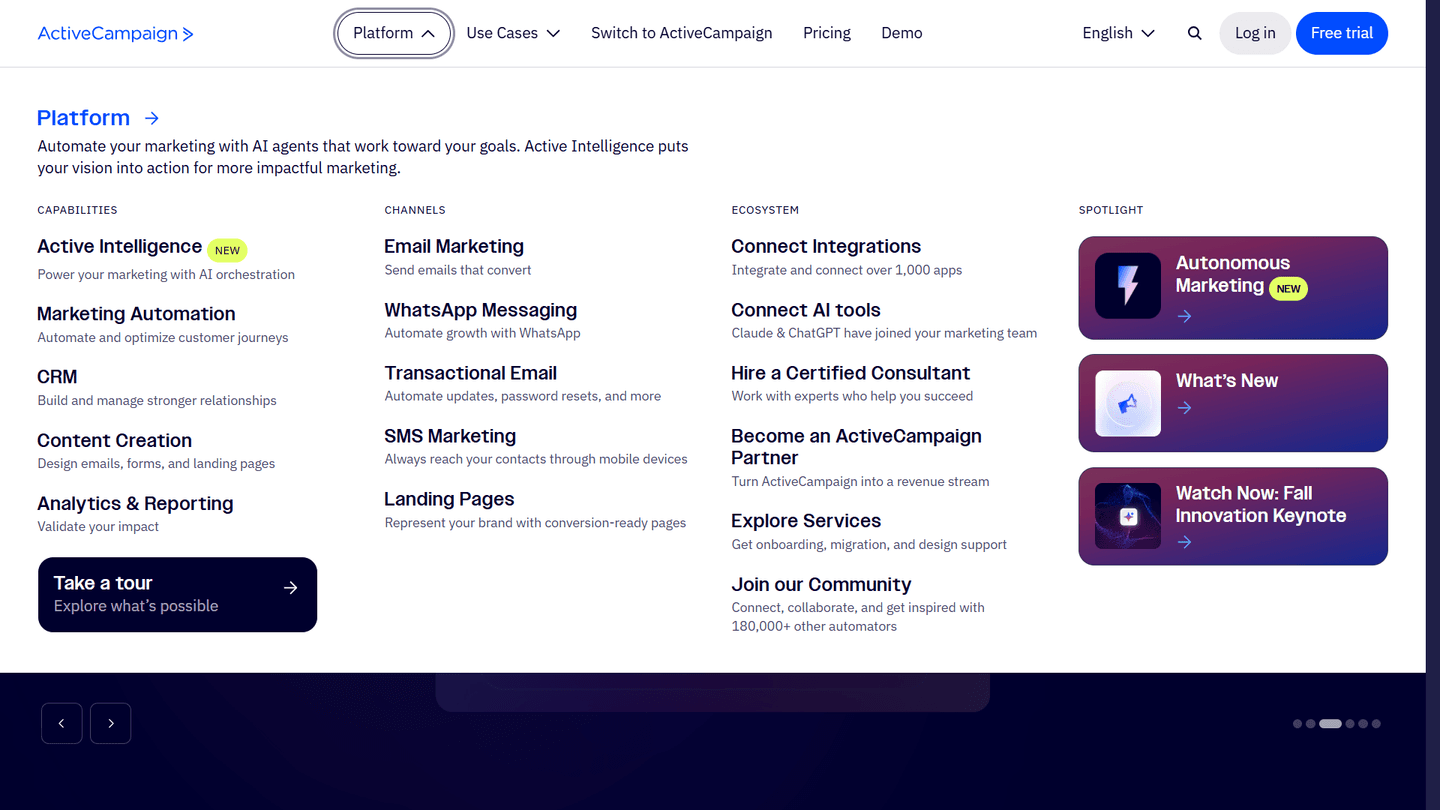
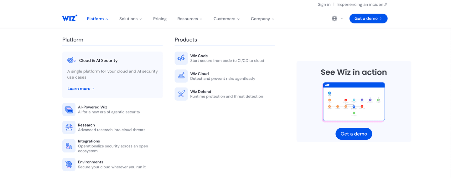
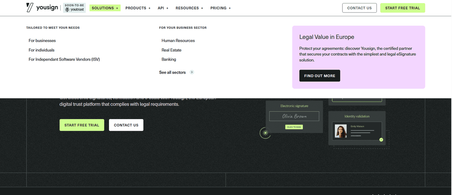
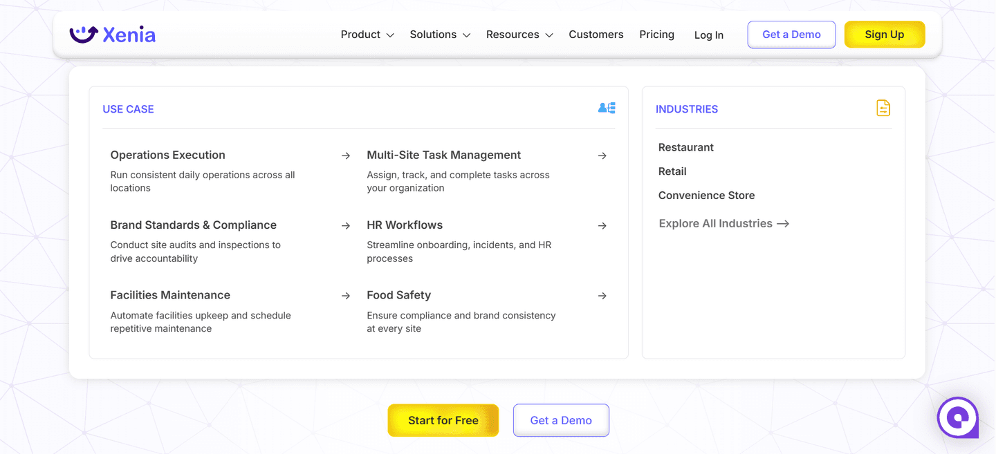
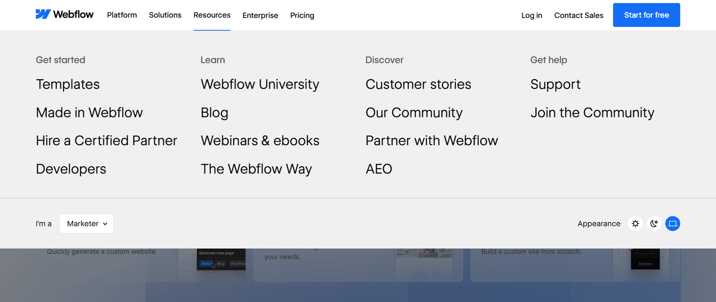
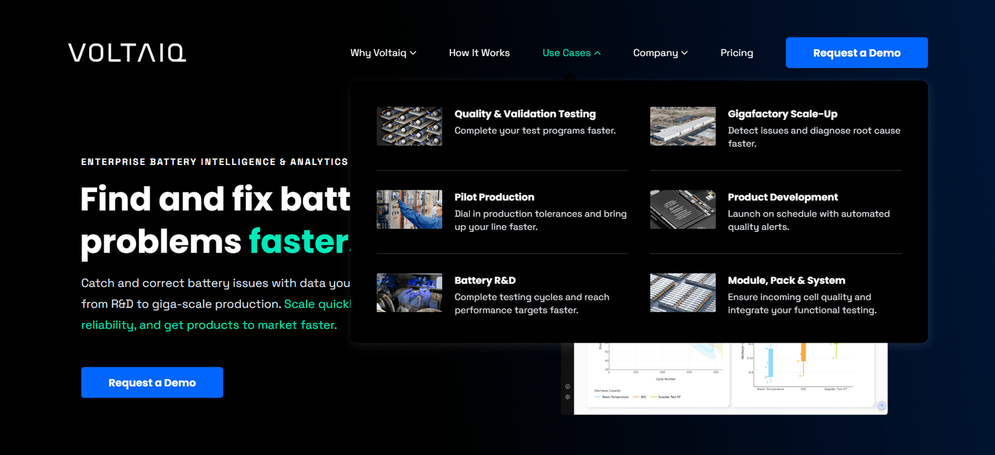
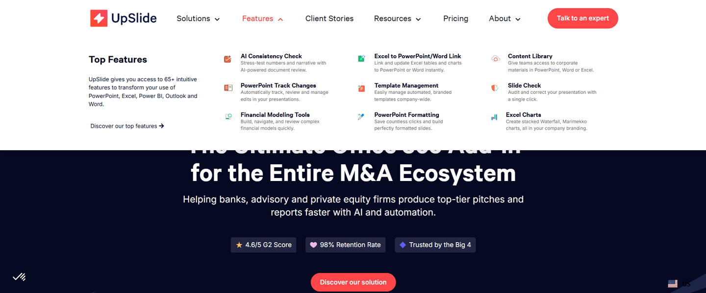
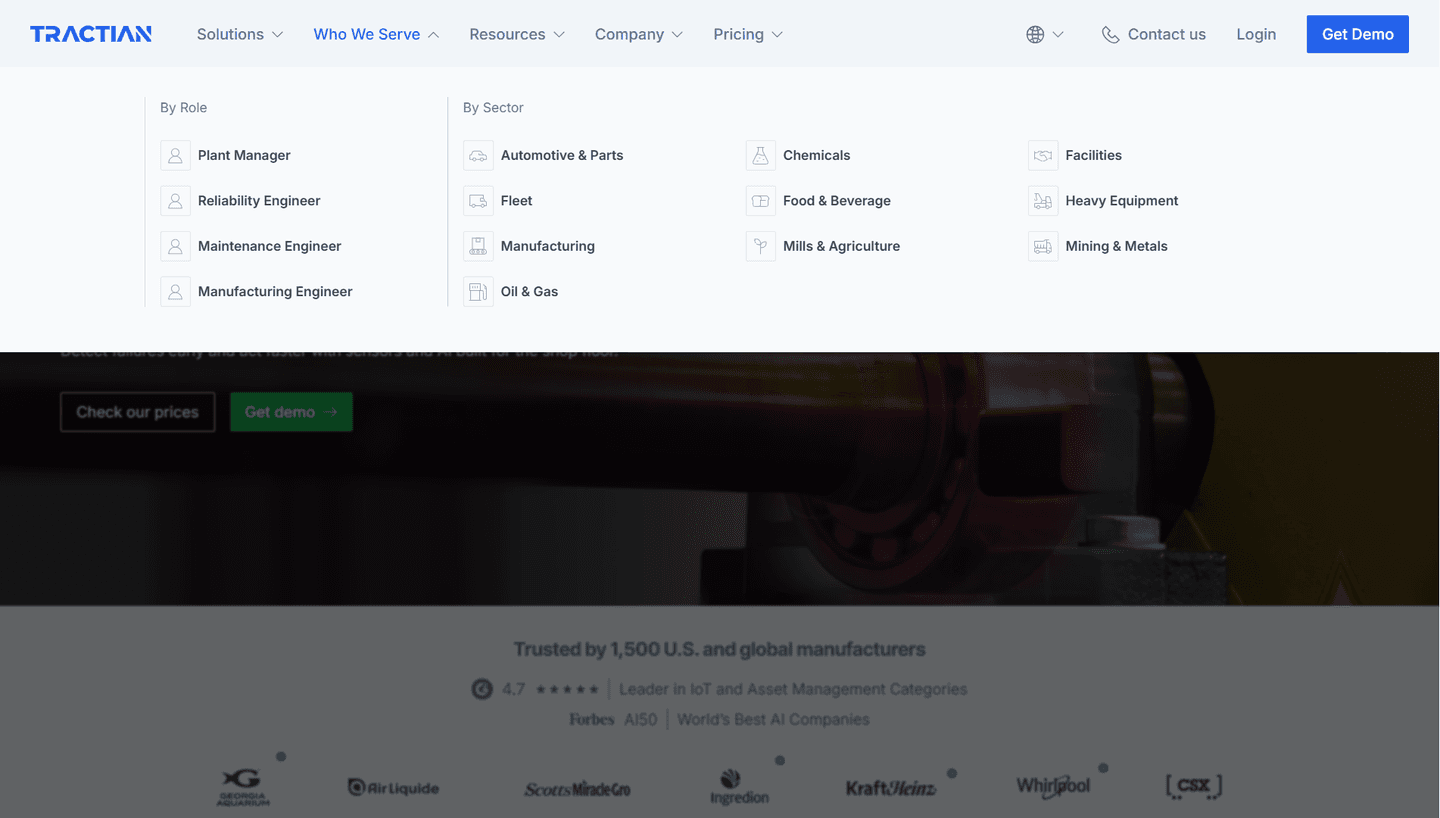

Browse every navbar pattern by UX best practice.
A navbar Pricing tab names cost directly in the top navigation, as a top-level link a visitor sees as soon as the page loads. It sits beside items like Product, Solutions and Resources, and it answers the question almost every buyer asks sooner or later: what does this cost?
It takes two forms:
A visitor who goes looking for the price has a concrete question. A visible Pricing tab answers it in one click, instead of making them dig through a dropdown or scroll to the footer. Hiding the price does the opposite: it reads as evasive, and it makes the people closest to a decision work hardest to get an answer.
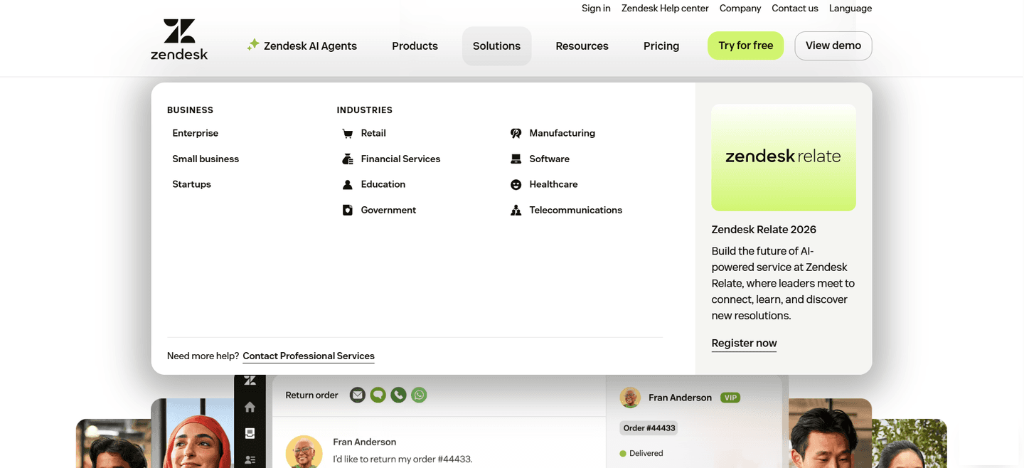
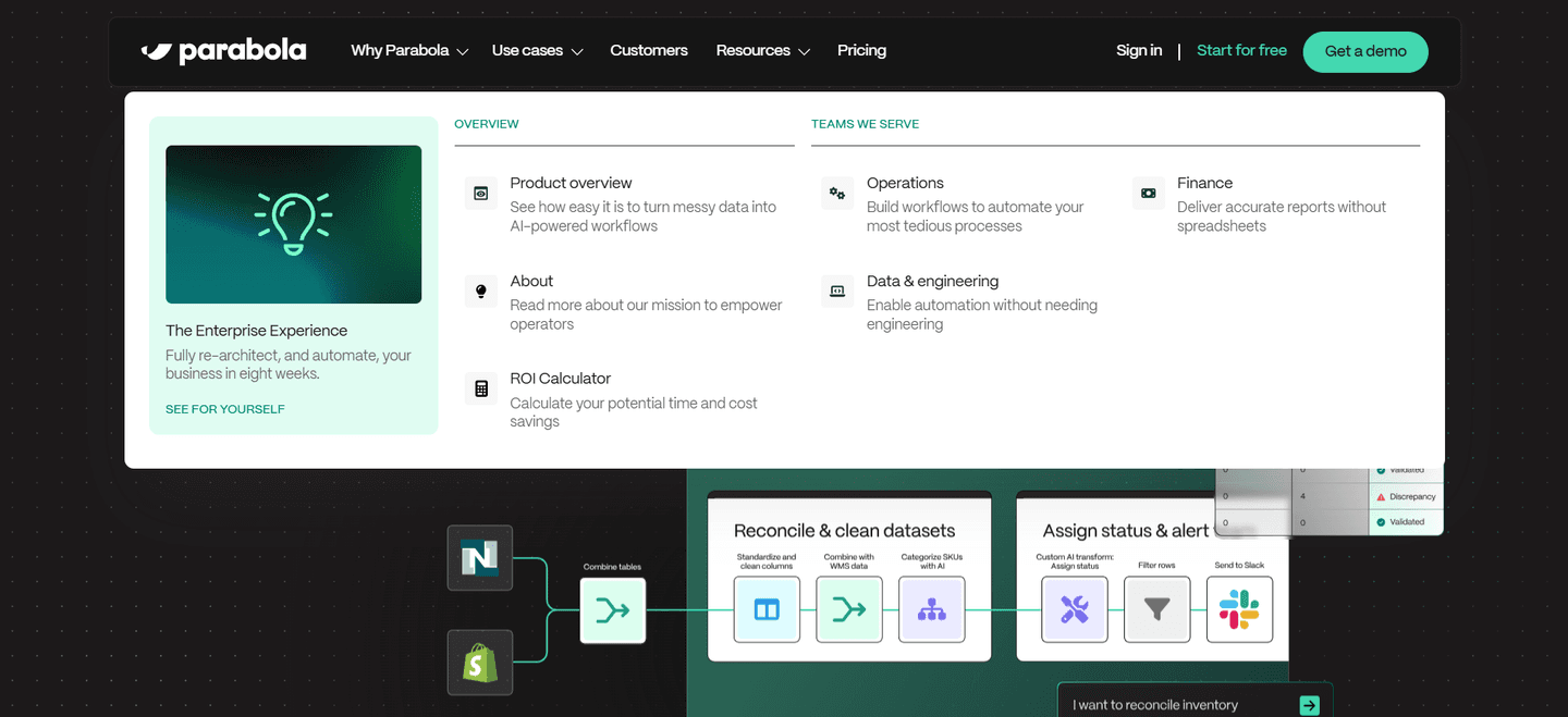
The best examples below keep Pricing flat and in plain view. Zendesk puts its Pricing tab right next to a green Try for free button. Amplitude places Pricing beside a Get started button, with Login and Contact sales close by. Notion drops a Pricing tab into the top row next to Product and Solutions. What repeats is the pairing: the price and the main action sit in the same corner, so a visitor can check the cost or sign up without looking elsewhere. Parabola and Ahrefs keep pricing one click away even though the rest of their menus open into large dropdowns.
A Pricing tab rarely works alone. The best navbars also let visitors self-select by job with use-case tabs in the navigation. The complete navbar gallery shows the full range.
100/100
The usual failure is burying pricing inside a Solutions or Product dropdown, so the one link buyers most want costs them a hover and a search. The second is leaving pricing out of the navbar entirely, as in the example above, where the bar offers a free trial but no way to see what comes after it.

Curated by
Gabriel Amzallag , Founder, Web Anatomy
5 years CRO + SEO at Qonto (2021–2025). After advising 15+ SaaS on their websites (Payfit, Pigment…), the same patterns kept breaking, so I decided to build the source of truth on what works on the web: the intelligence layer every tool, builder, and team uses to ship sites that perform.
The common questions about surfacing pricing in the top navigation, with answers drawn from 100 scored examples.
Either works as long as it names cost plainly. Most navbars use Pricing because it is the word buyers look for. Plans reads well when the offer is clearly tiered. A clever or vague label makes cost-checkers guess, which defeats the point of having the tab.
Keep the tab anyway. A Pricing tab that leads to a plan comparison or a clear Contact sales route tells buyers where the budget conversation happens. What frustrates them is a navbar that hides cost entirely and sends every question through a demo request.