
Cta|
A secondary CTA is the lighter second option beside the main button. It catches the visitors who are not ready for the primary action yet.
Key takeaways
Showing 1–29 of 190 examples
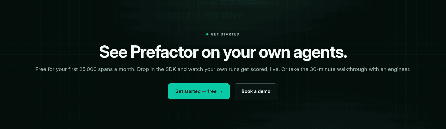
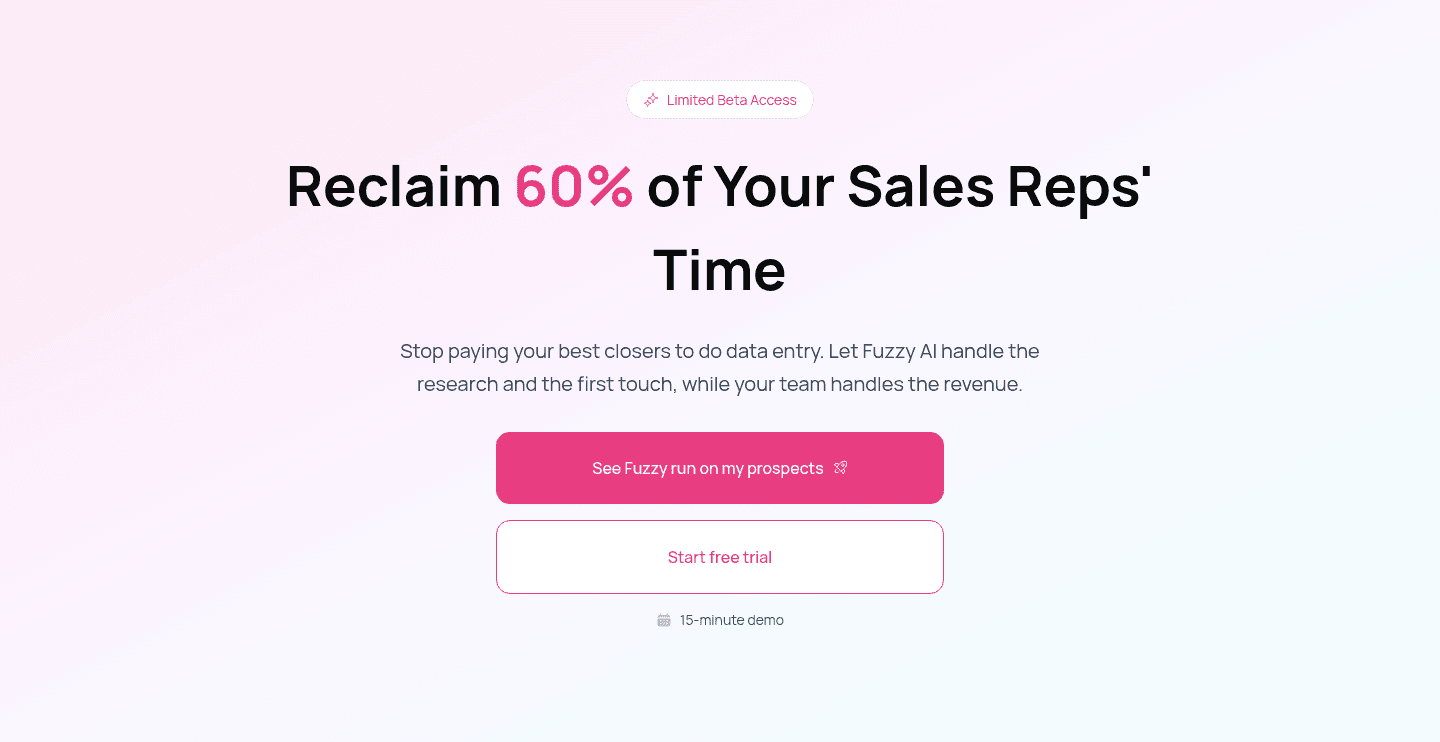
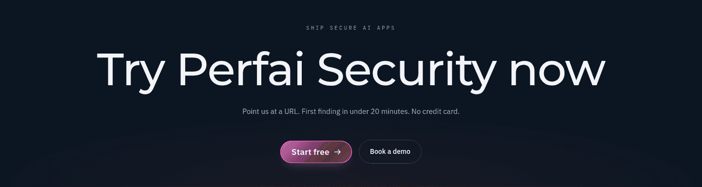
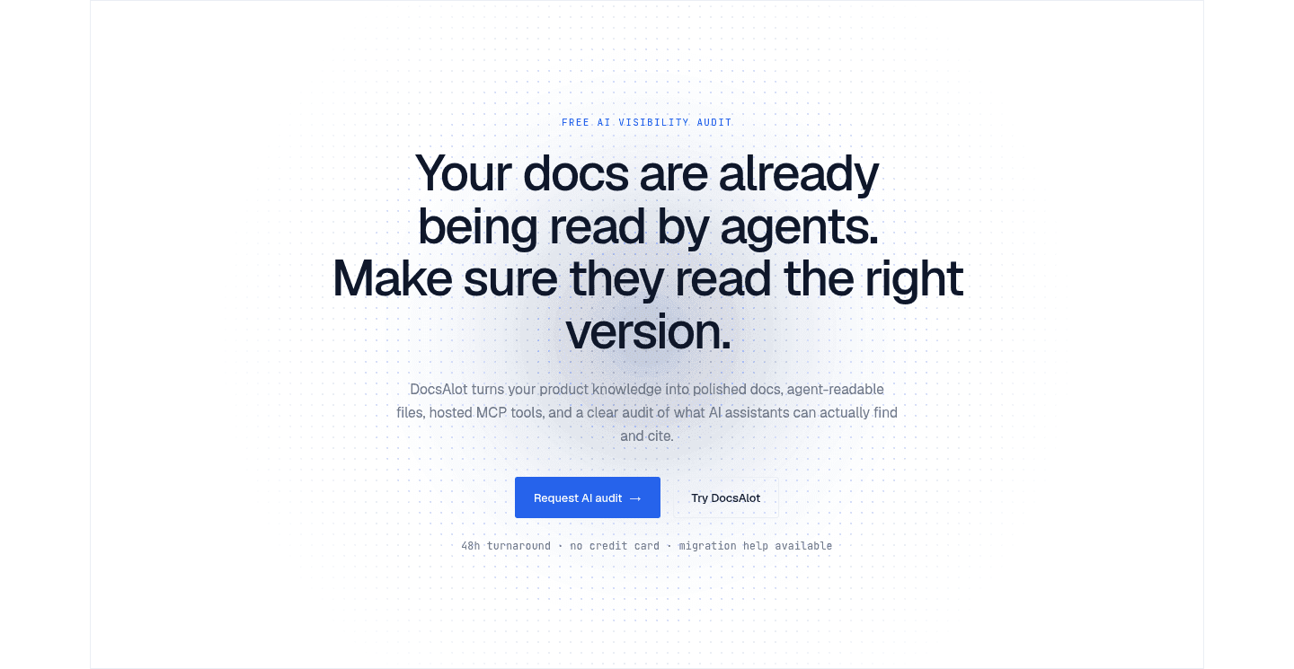
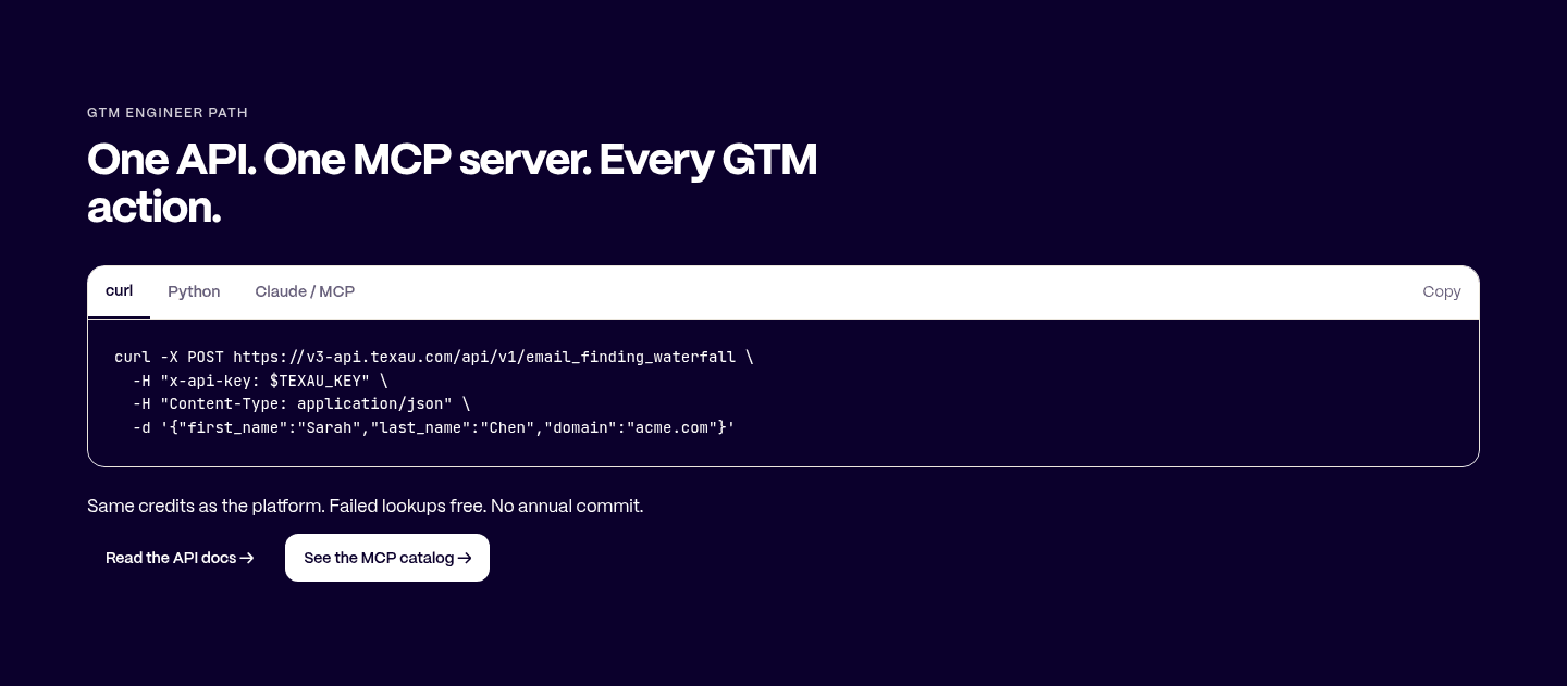
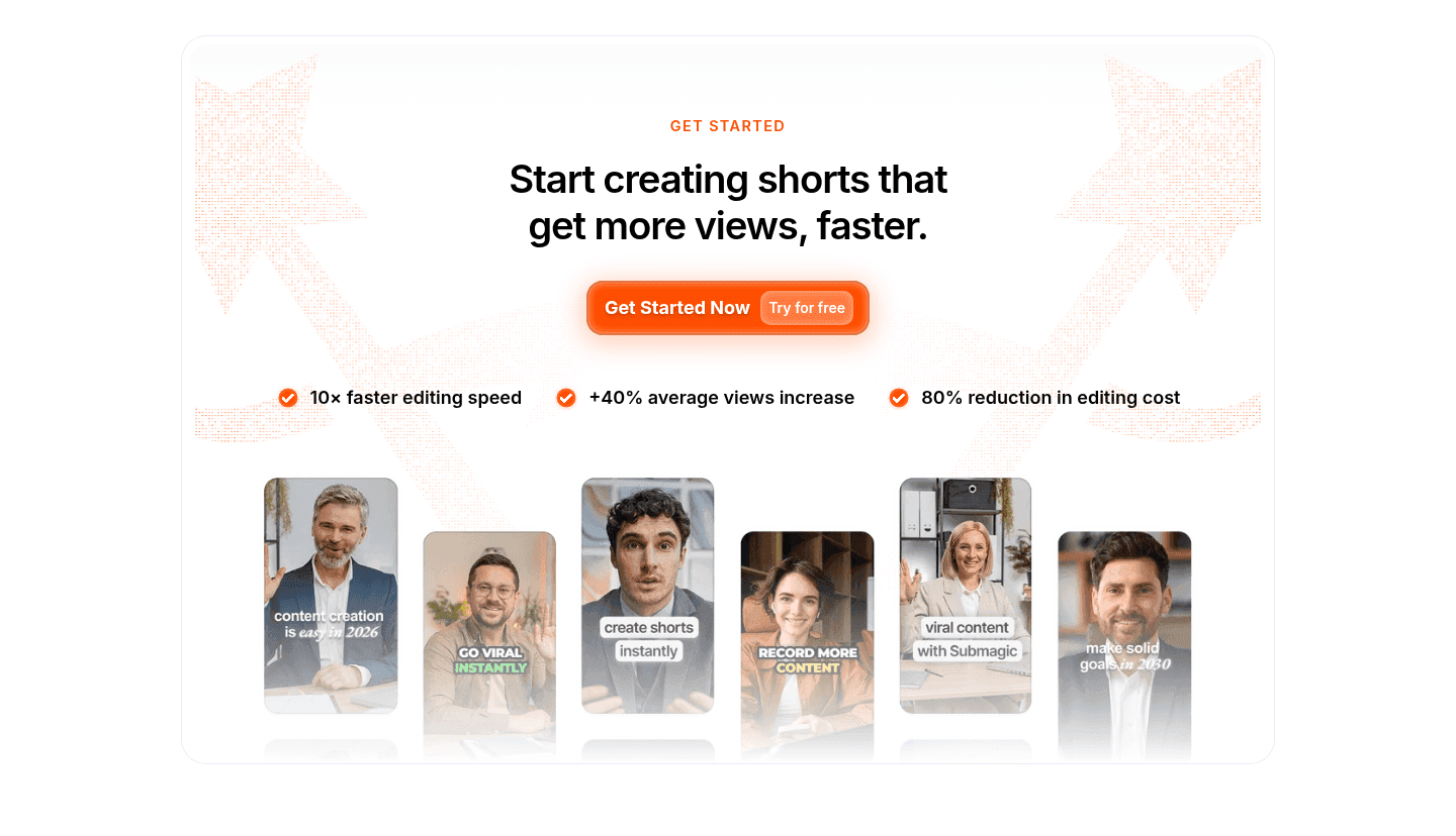
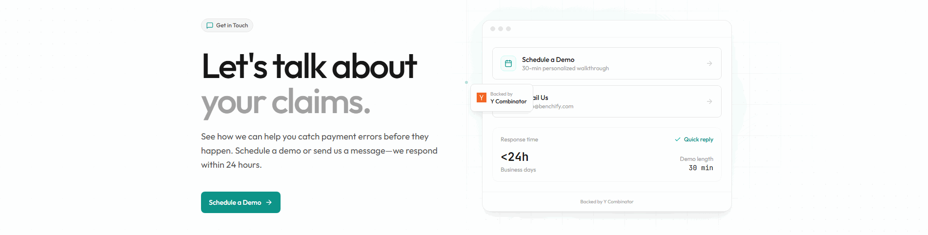
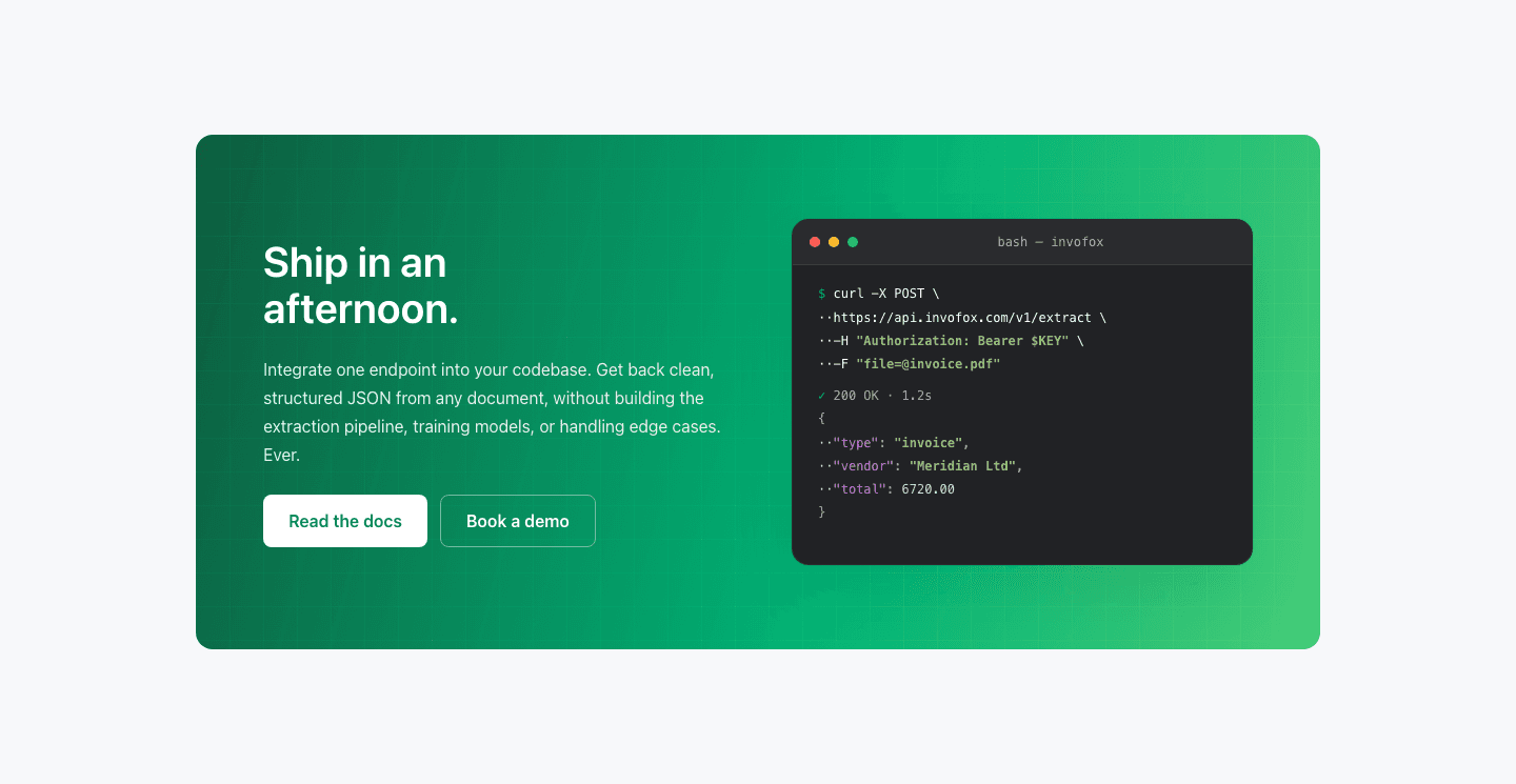
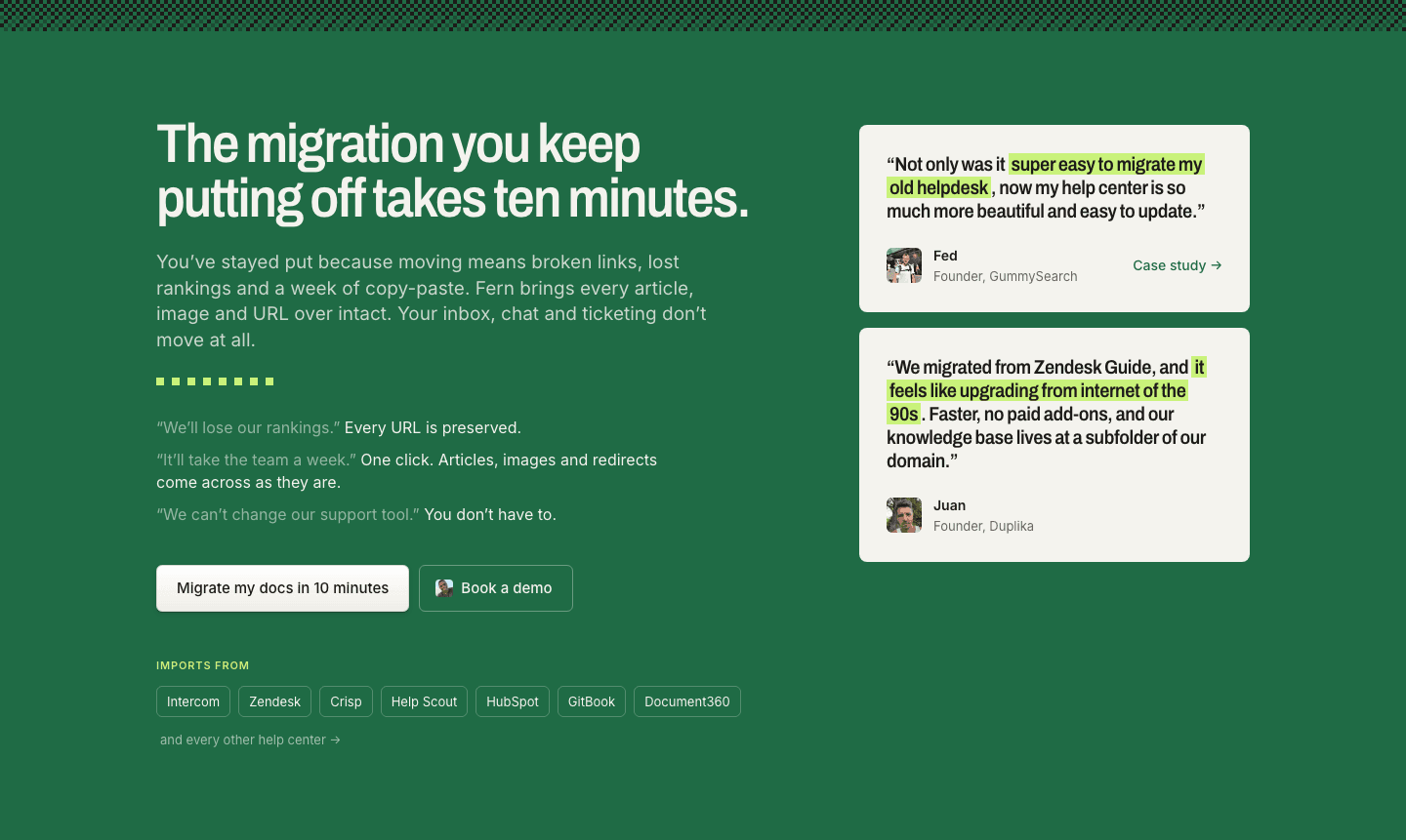
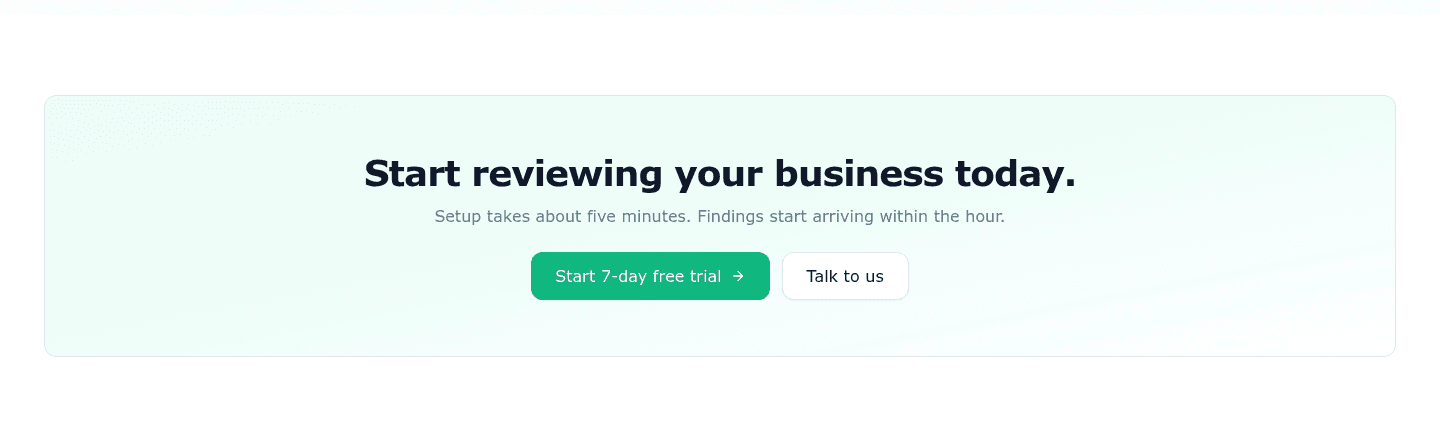
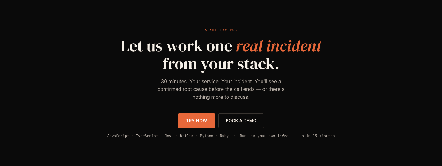
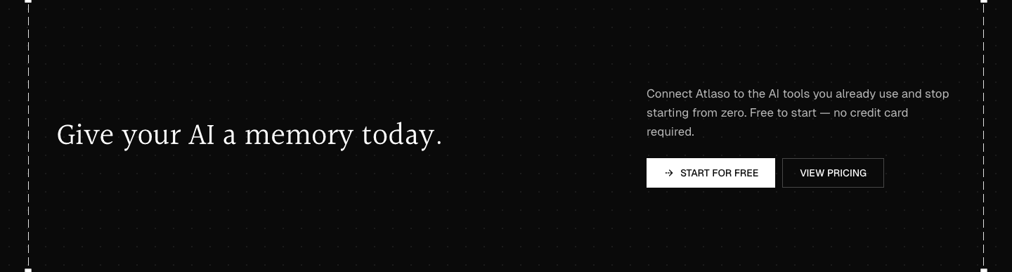

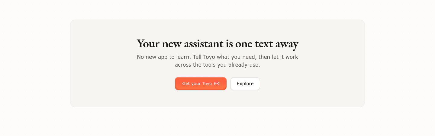
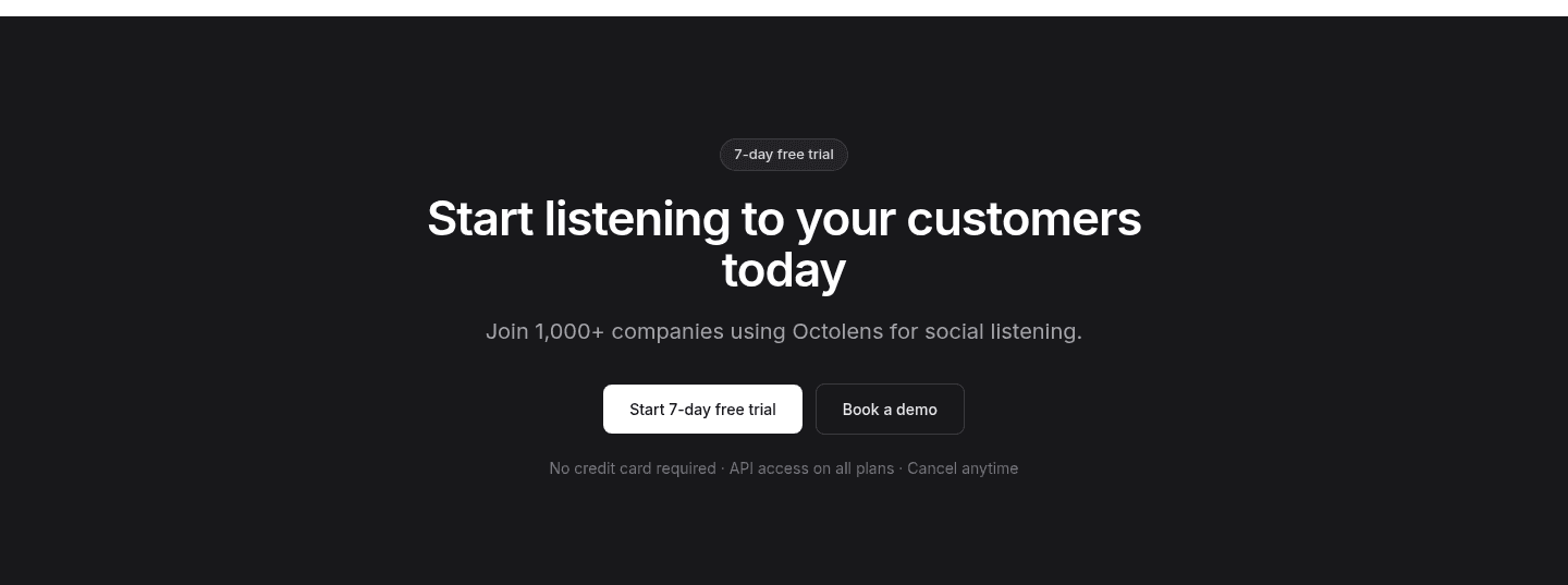
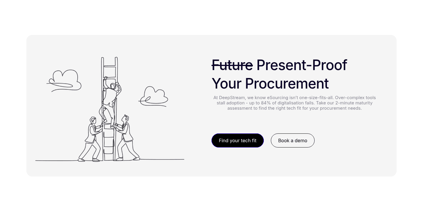
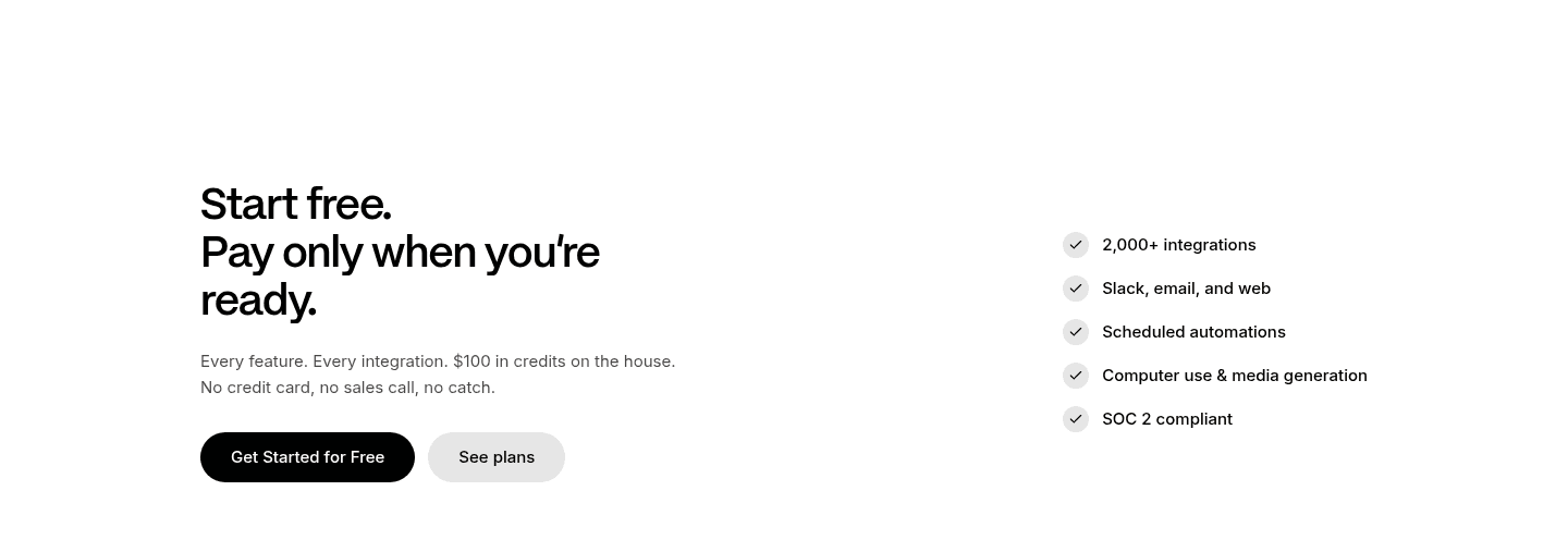
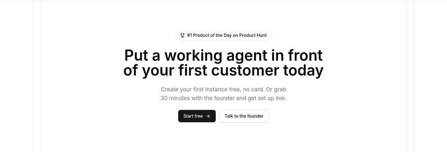
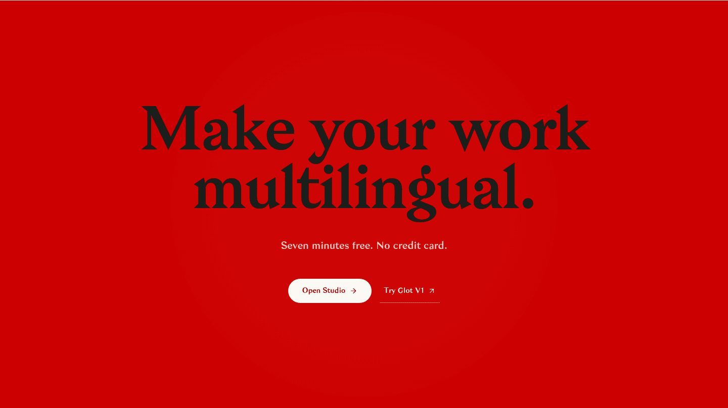


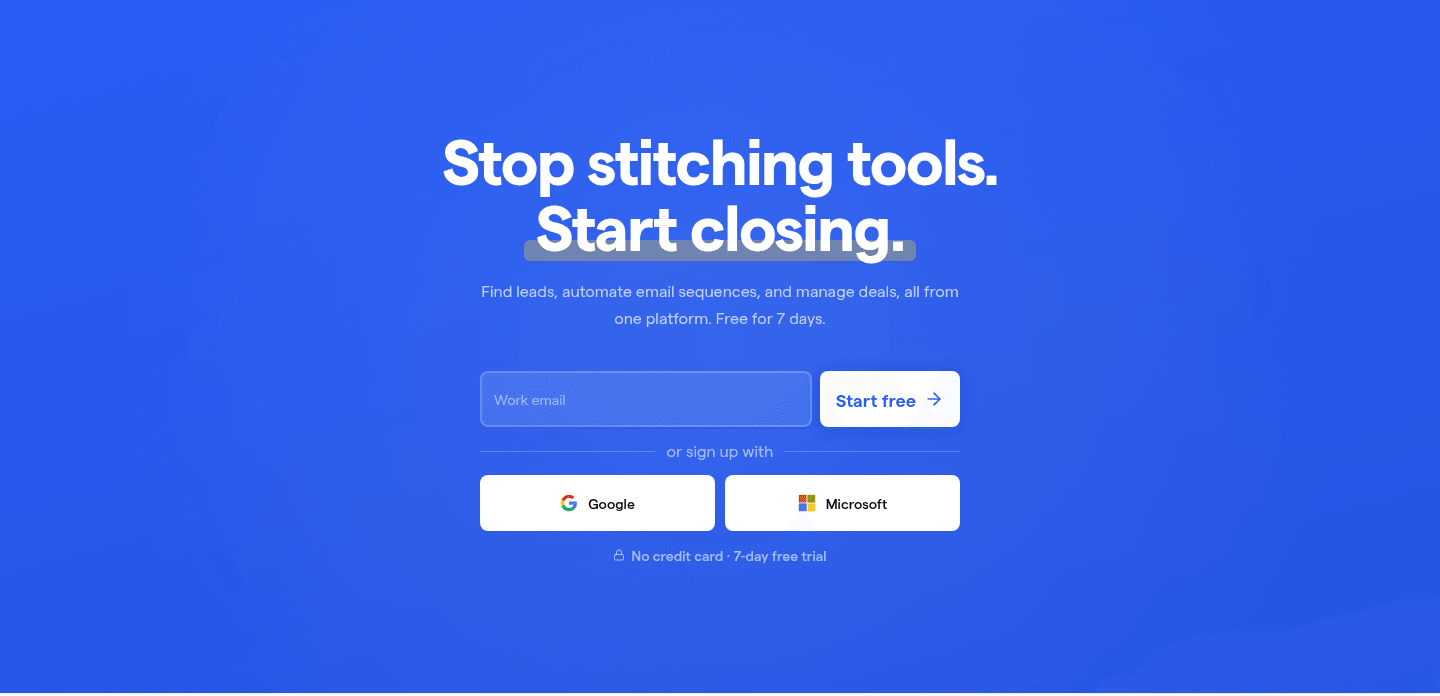


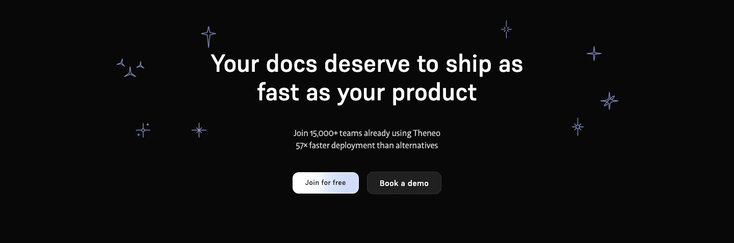

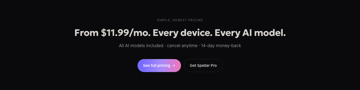
A secondary path is the lighter link or outlined button next to the main call to action. The primary button says "do this now". The secondary path says "if you are not ready for that, go here instead".
The best CTAs aim the second path at a real reason to hesitate:
Visitors do not all arrive at the same point. One is ready to start a trial. One wants the price first. One wants a walkthrough before trusting the product at all. A single button serves only the first. The other two had real interest but no next step that fit them.
The second path gives them one. They book the demo, open the pricing or read the docs, and stay on the site instead of leaving to "come back later".
The examples below keep a clear order between the two buttons. Texau pairs a filled "See the MCP catalog" with a lighter "Read the API docs" link, so the ready developer and the researching one each get their door. Agent 37 Cloud sets a solid black "Start free" above a muted "Talk to the founder". One action is obviously first, and the second is obviously optional.
A secondary path also pairs well with reassuring microcopy on the primary button, which clears the last doubt for the visitor who does pick the main action.
100/100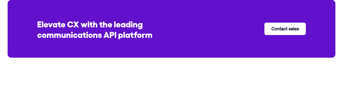
The usual failure is a single button, often a heavy one like "Contact sales", with nothing for the visitor who is not ready to talk to anyone yet. The second is a path that leads nowhere useful: a vague "Learn more" that lands on a page with no next step of its own.

Curated by
Gabriel Amzallag , Founder, Web Anatomy
5 years CRO + SEO at Qonto (2021–2025). After advising 15+ SaaS on their websites (Payfit, Pigment…), the same patterns kept breaking, so I decided to build the source of truth on what works on the web: the intelligence layer every tool, builder, and team uses to ship sites that perform.
The common questions about the lighter path beside the button, with answers drawn from 190 scored examples.
Only when the two compete. Keep one clear order: the primary action is filled and bold, the second path is lighter, outlined or a plain text link. Perfai Security keeps a gradient 'Start free' clearly ahead of an outlined 'Book a demo'. The visitor still sees one obvious first choice, with a fallback for the rest.
Usually two: one strong primary and one lighter secondary. That covers the ready buyer and the undecided one. Three or four equal buttons turn a clear decision into a menu, and a visitor facing four options often picks none.