Navbar|
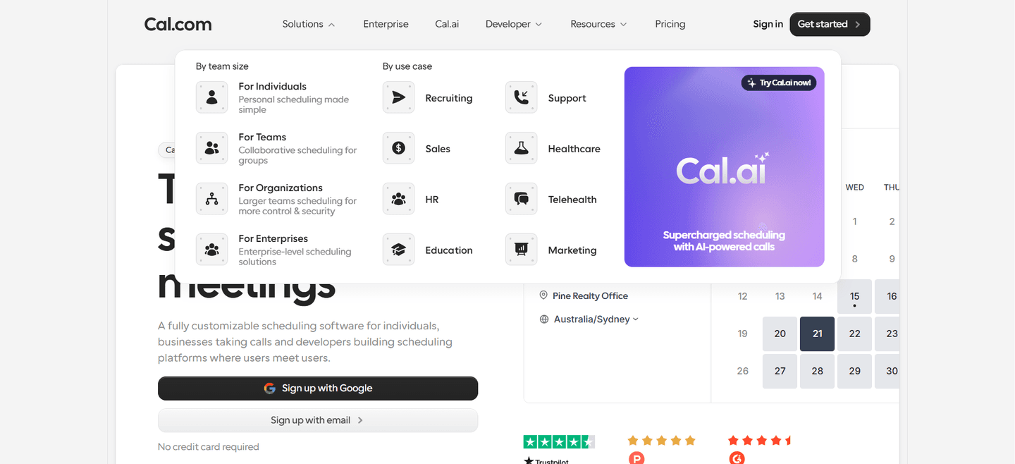
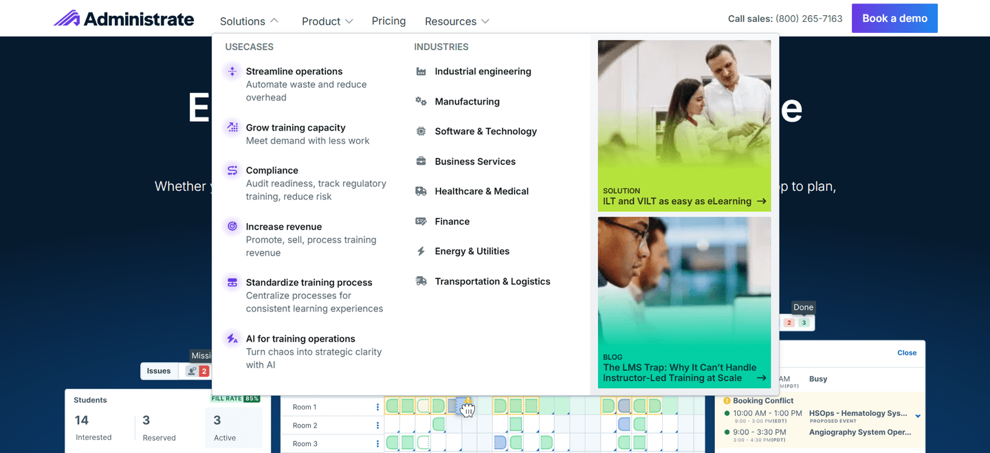
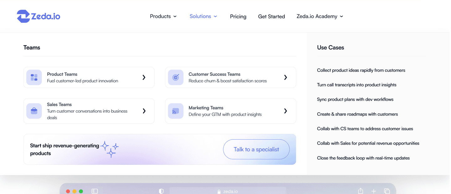
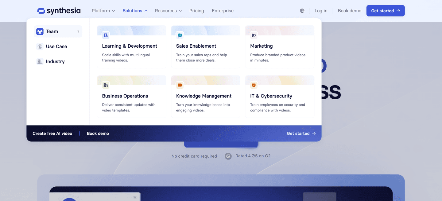
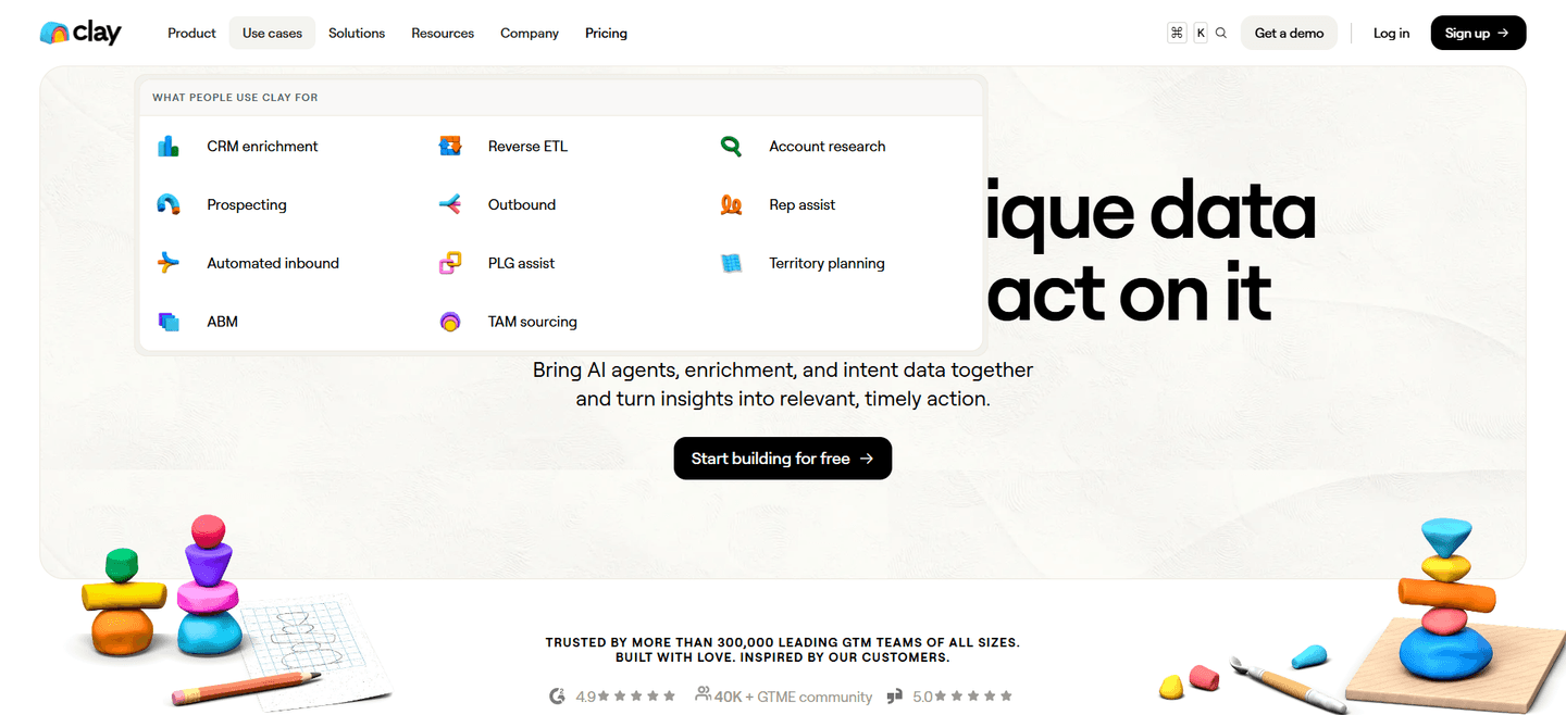
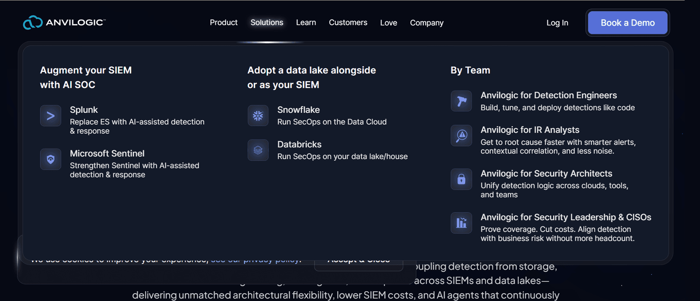
Use-case tabs let a visitor self-route by the job they came to do, so the right page is one confident click away instead of buried in a flat menu.
Key takeaways
Showing 1–28 of 36 examples
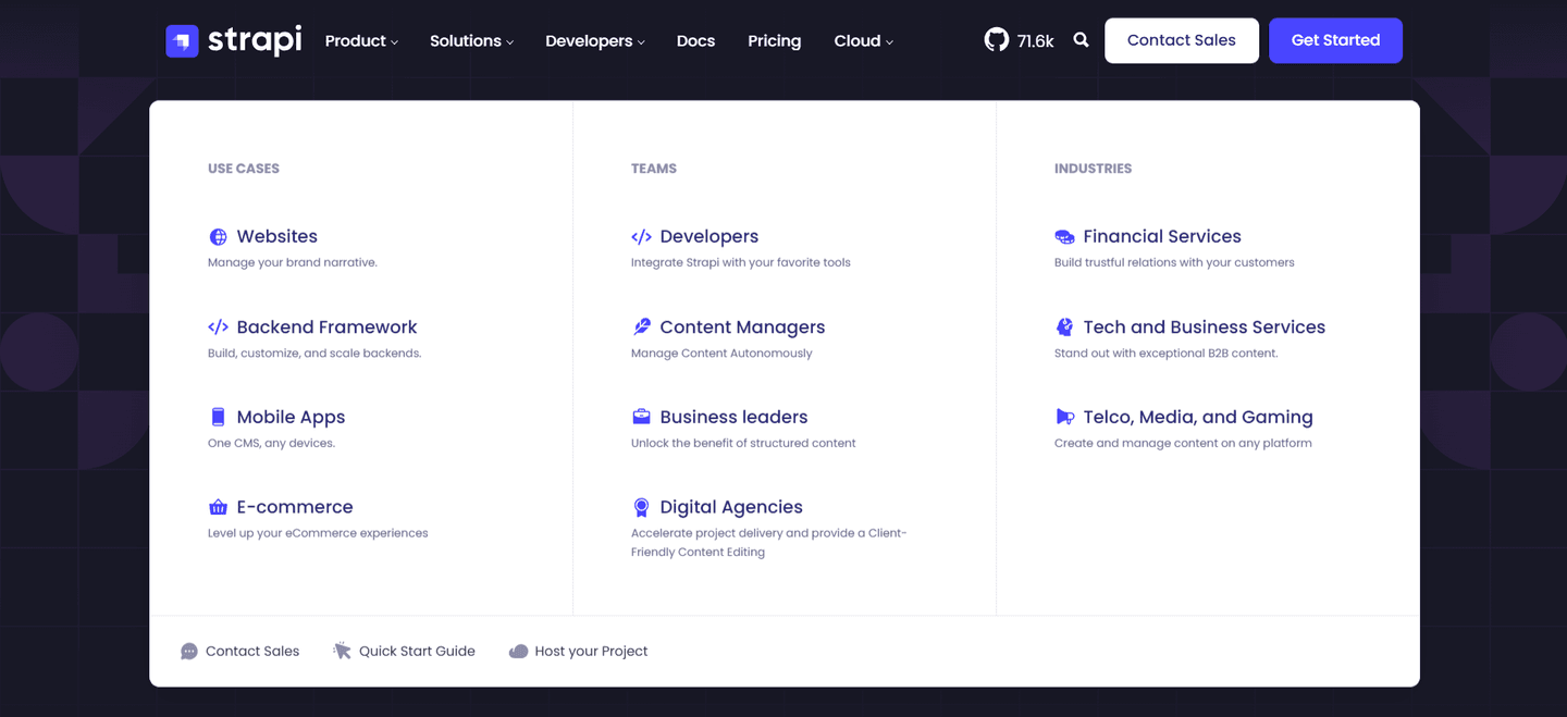
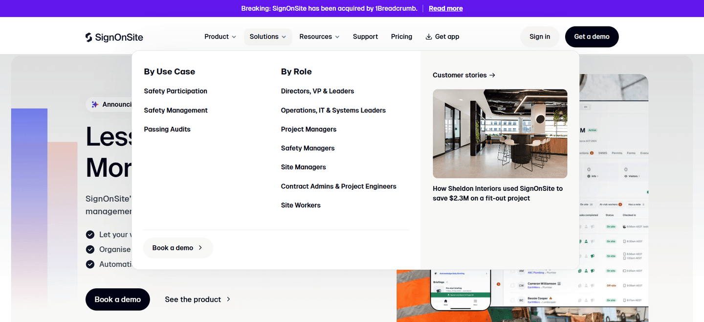
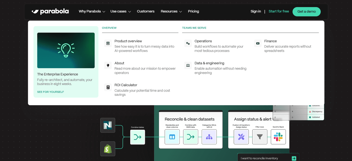
Browse every navbar pattern by UX best practice.
Every navbar is scored across 7 conversion best practices. Copy the navigation structure, not the design. See what converts and why.
Hand-picked from {companies} companies and analyzed by our AI conversion agent. Not a random dump of navigation bars. Every entry earns its spot.
Found a navbar you admire? Run yours through the same scoring engine. See where you stand on the same best practices, and what to fix first.
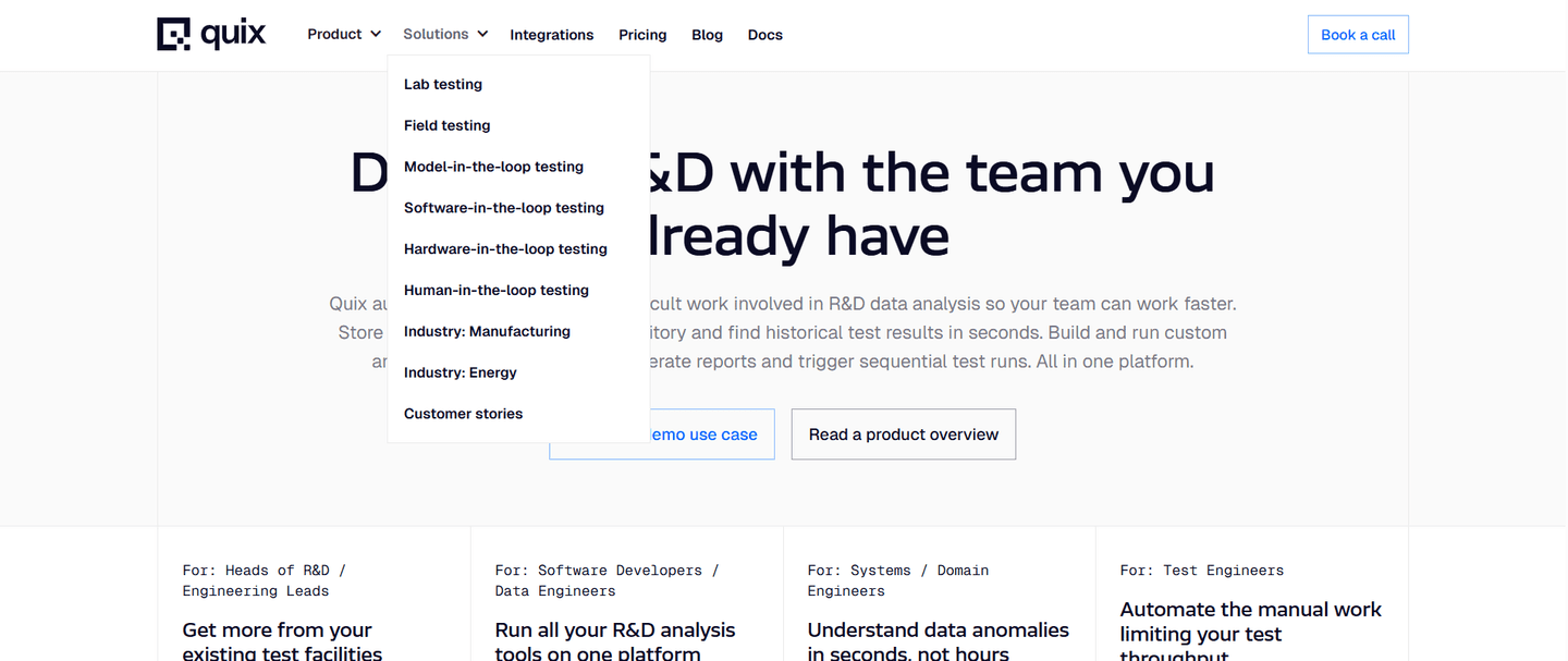
Use-case tabs are the decision to organize the top navigation's Solutions or Products dropdown around the jobs a visitor came to do, rather than around the product's internal feature list. Instead of one flat menu, the dropdown opens into columns a visitor can scan and self-select from, so someone who came to "improve conversion" or "run identity checks" reaches the matching page in one confident click.
The strongest navbars express it in one of a few forms, often several at once:
Most visitors arrive with a job in mind, not a feature name in mind. A menu built around internal product structure forces them to translate their problem into the company's vocabulary before they can navigate, and every act of translation is a chance to give up. A menu built around use cases lets them recognize their own situation in the labels, so the path is obvious and the click is confident.
Self-routing also does quiet qualification work. By the time a visitor picks "Sales enablement" or "Compliance," they have told the page what they care about, and the destination can speak to exactly that. The menu stops being a directory and starts being a triage step that sends each visitor to the argument most likely to convert them.
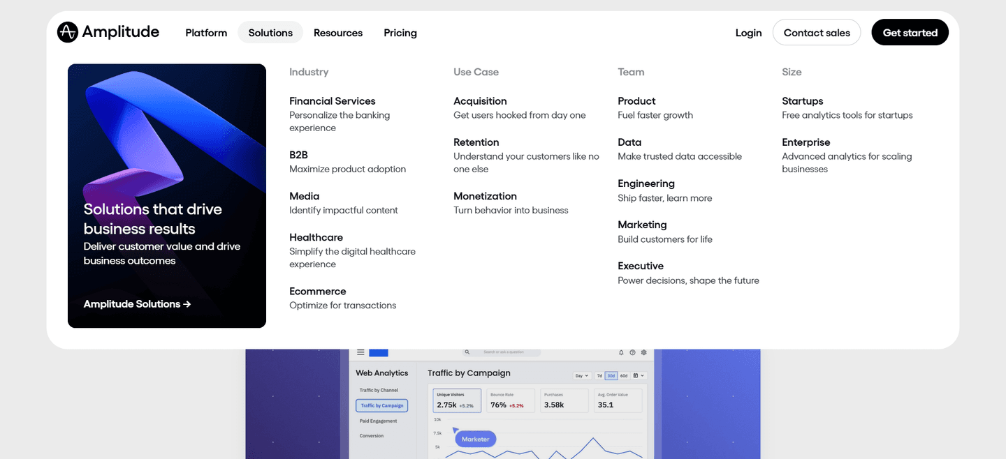
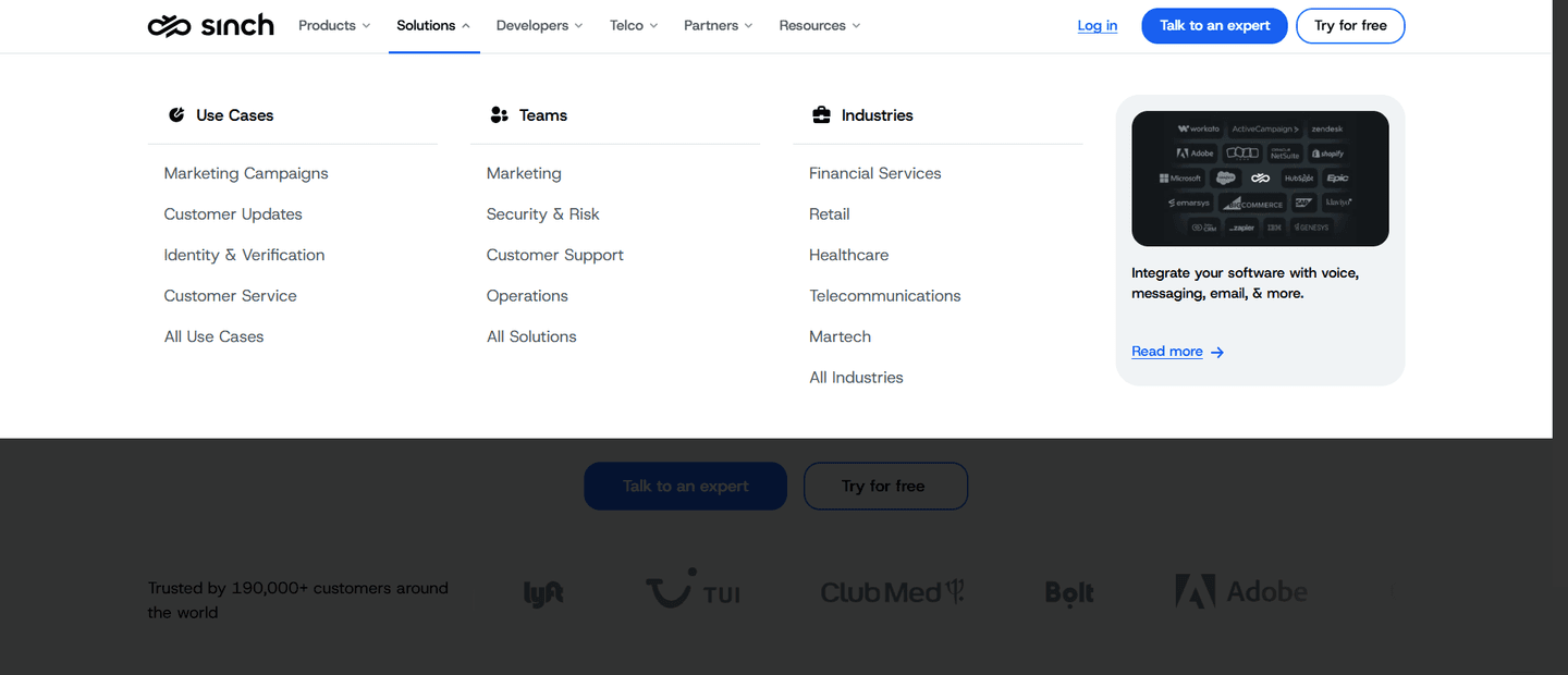
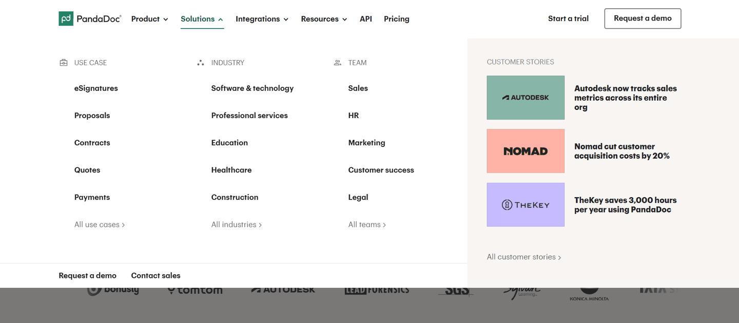
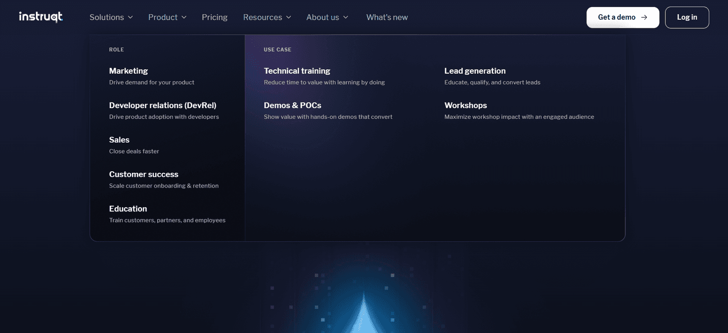
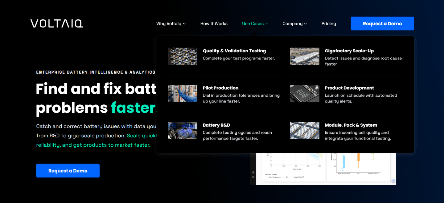
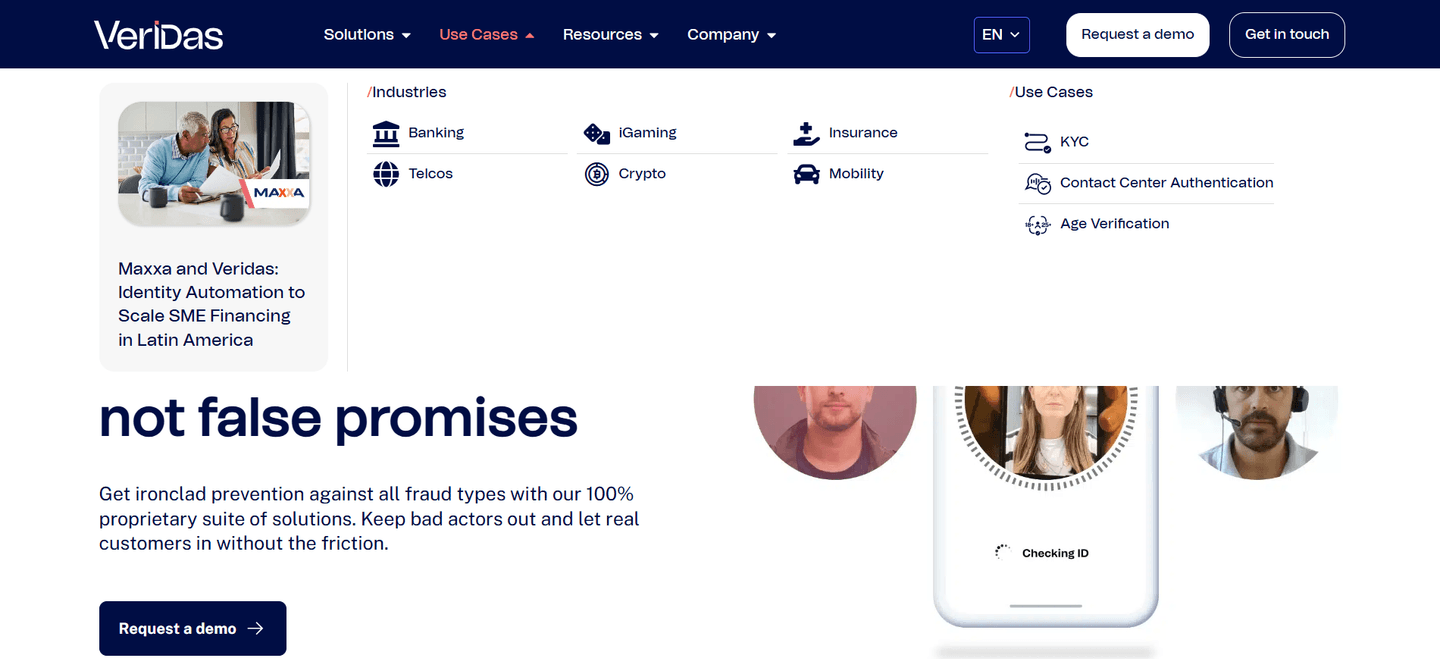
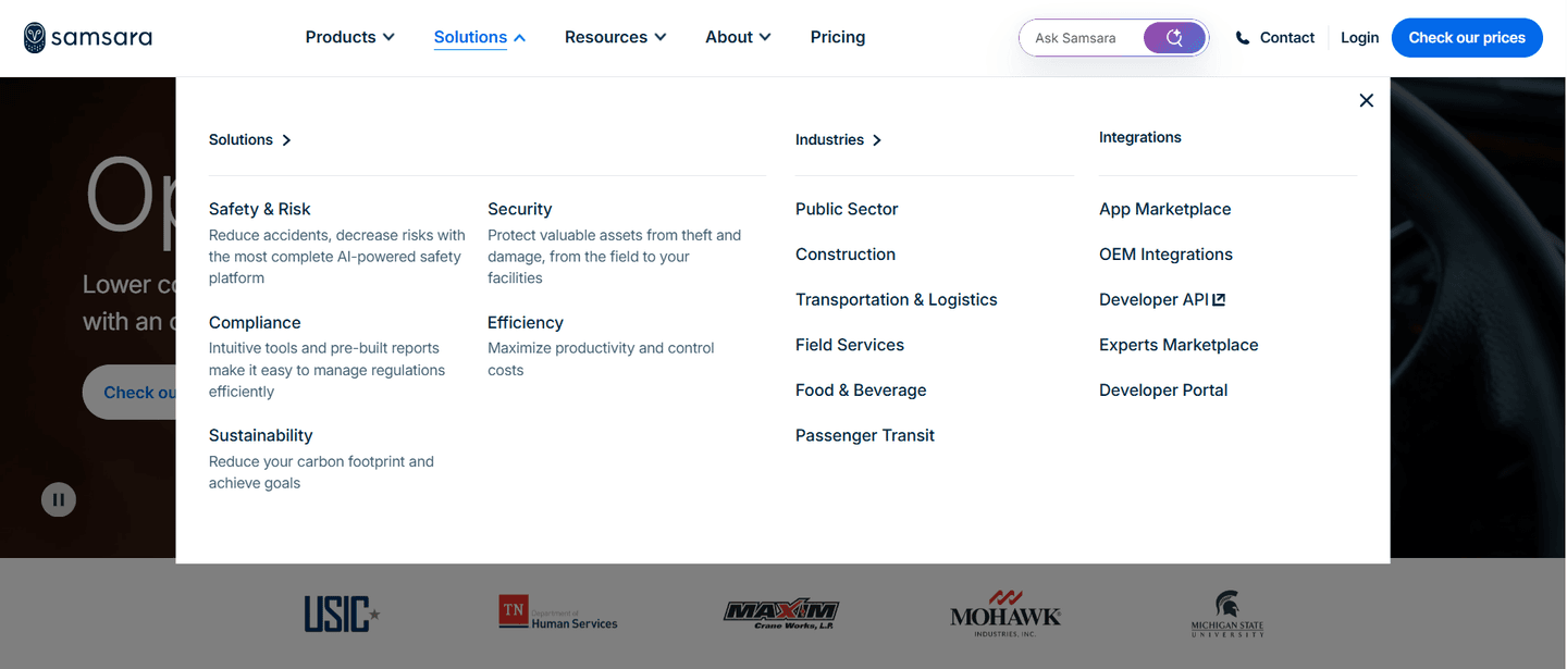
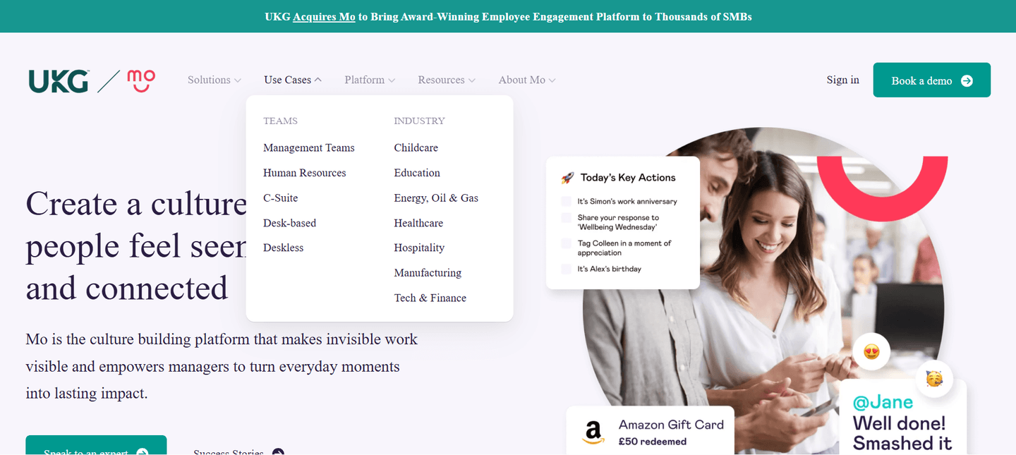
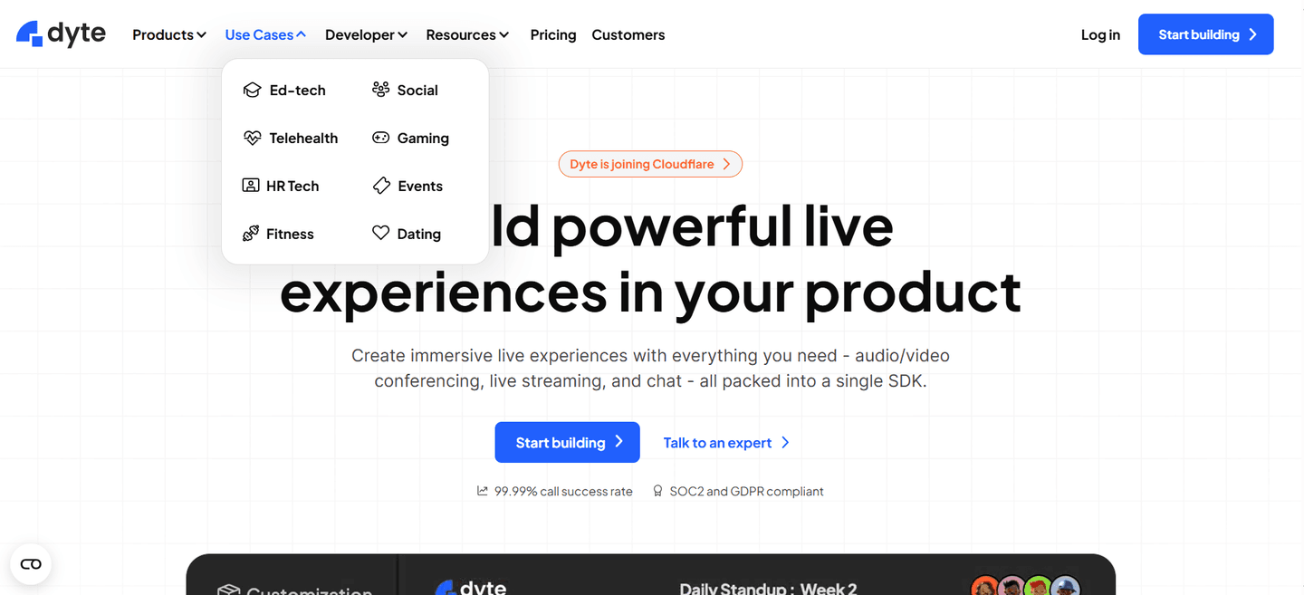
Across the scored navbars below that route by use case, the discipline that separates the strong menus is naming the job, not the feature. Amplitude fans its Solutions menu into Industry, Use Case, Team, and Size columns, and each use-case link (Acquisition, Retention, Monetization) carries a one-line outcome so the choice reads as a result, not a module. PandaDoc splits its Solutions menu into clean Use Case, Industry, and Team columns, letting a buyer self-route by job (eSignatures, Proposals, Contracts) or by role. Sinch, Instruqt, and Voltaiq each headline a Use Cases column with concrete jobs, from Marketing Campaigns and Identity and Verification to Technical training and Validation Testing, so the label matches the words a visitor would use for their own problem.
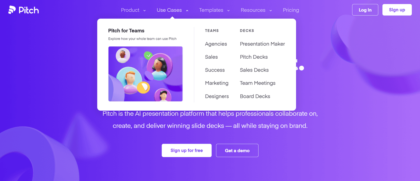
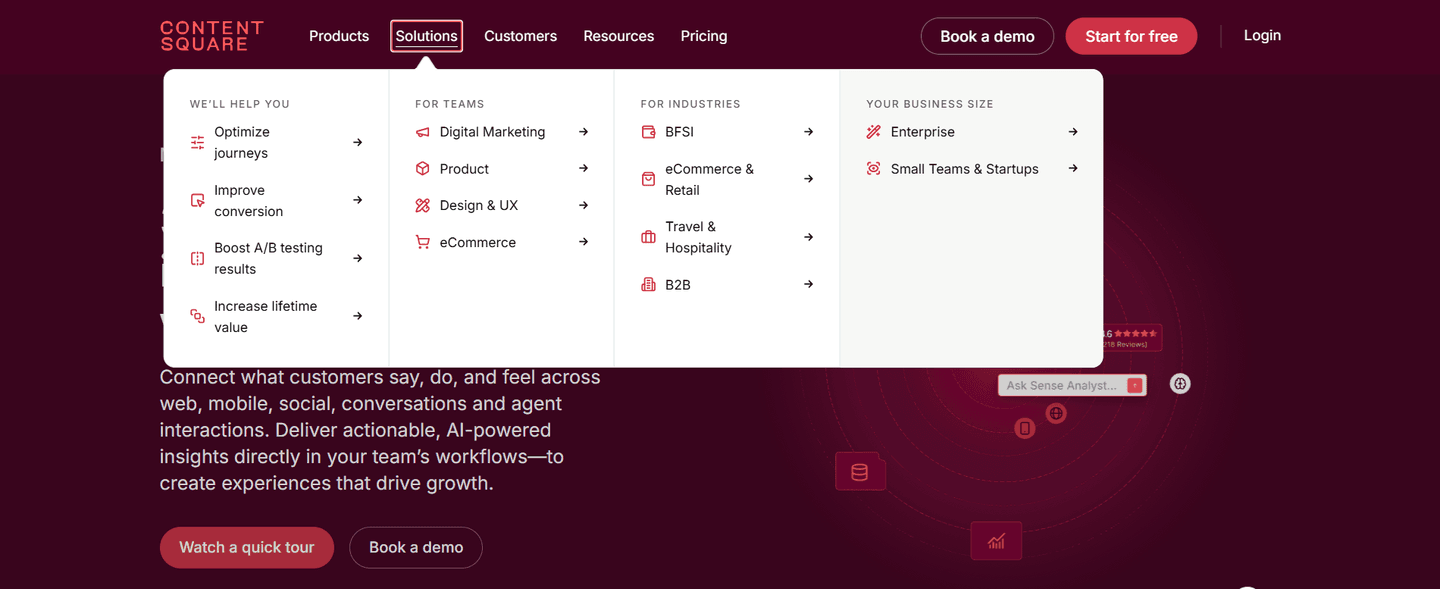
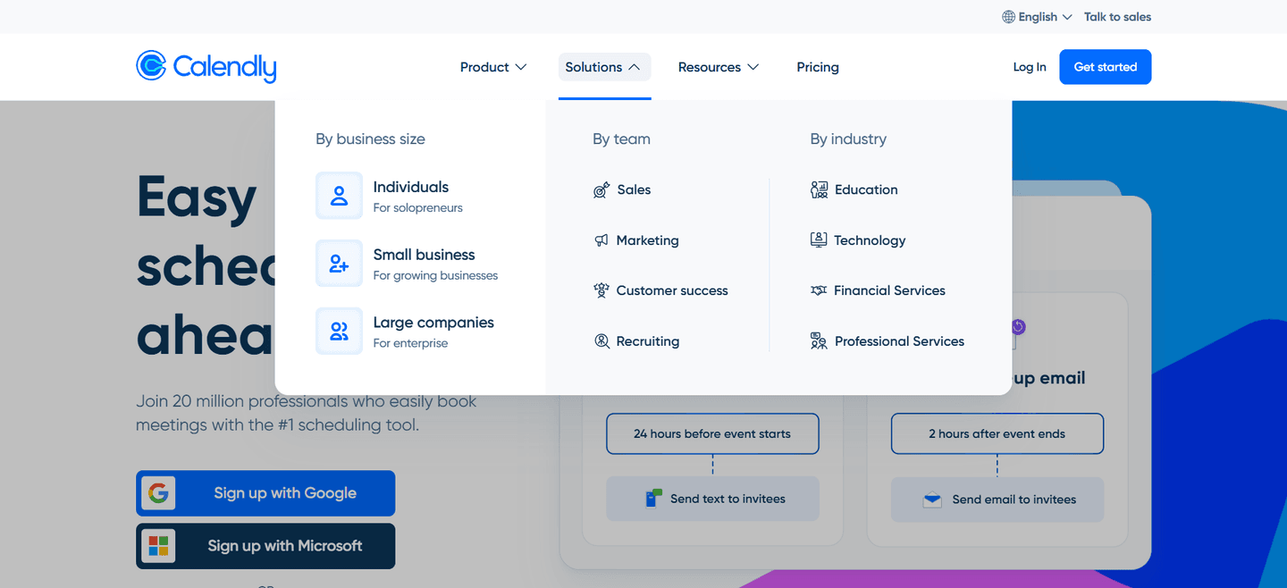
The best menus also make the choice outcome-led. Contentsquare frames its entries as goals (Optimize journeys, Improve conversion, Increase lifetime value) rather than product areas, and Voltaiq pairs each use-case card with a thumbnail and a benefit line so the menu scans in a glance. And they rarely make a visitor choose on a single axis: the same dropdowns run persona and industry columns in parallel, so a Marketing lead, a Healthcare buyer, and someone chasing a specific job all find a way in.
Use-case tabs rarely carry a navbar alone. The strongest sit in a bar that also keeps pricing and a primary action in reach, alongside the other navbar patterns in the benchmark library.
100/100 0/100
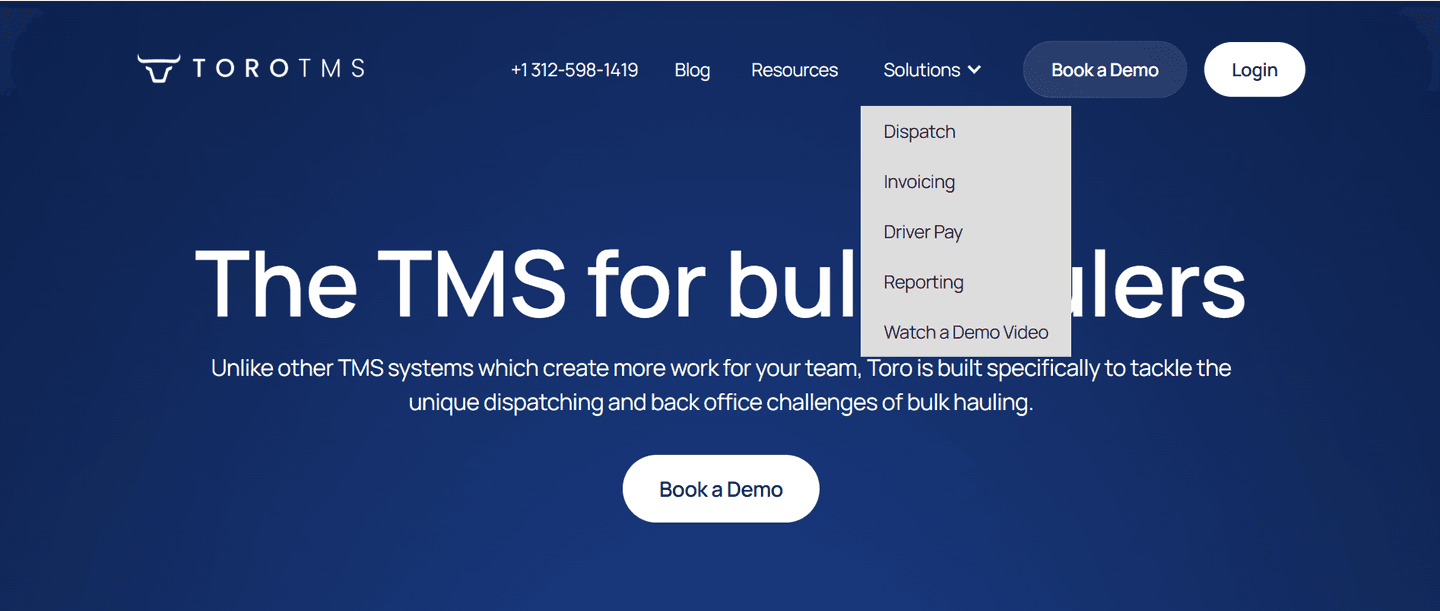
0/100The usual failure is a Solutions menu that lists features in the company's own language (module names, product lines, internal team labels) and leaves the visitor to translate. The second is a flat, undifferentiated dump of links with no column headers and no outcome lines, which is as hard to navigate as no menu at all. The third is over-loading: so many columns, cards, and rows that the scan slows to a crawl and the visitor bounces back to the homepage. Name the jobs buyers actually come for, group them under clear headers, give the ambiguous ones a one-line outcome, and let persona and industry columns absorb the rest.

Curated by
Gabriel Amzallag , Founder, Web Anatomy
5 years CRO + SEO at Qonto (2021–2025). After advising 15+ SaaS on their websites (Payfit, Pigment…), the same patterns kept breaking, so I decided to build the source of truth on what works on the web: the intelligence layer every tool, builder, and team uses to ship sites that perform.
Paste your URL. Get a scored analysis of your navigation, including whether visitors can self-route by use case. Free, no signup.
The common questions about splitting the Solutions menu by use case, with answers drawn from 36 scored examples.
They are the columns inside the top navigation's Solutions or Products dropdown that are organized around the jobs a visitor wants to do, rather than around the product's feature list. Instead of one flat menu, the dropdown opens into scannable columns like Use Cases, Teams, and Industries, so a visitor picks the path that matches their intent and lands on the matching page in one click.
Most visitors arrive with a job in mind, not a feature name in mind. A menu organized by internal product structure forces them to translate their problem into your vocabulary before they can navigate. A menu organized by use case lets them recognize their own situation in the labels, so the choice is obvious and the click is confident. Self-routing also pre-qualifies the visitor: by the time they land, they have already told the page what they care about.
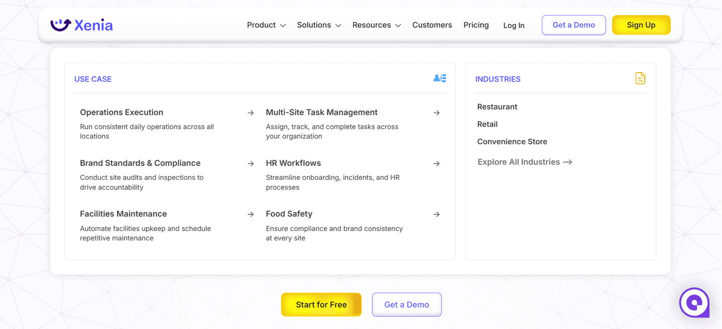
They answer different questions and the strongest navbars run them side by side. Use-case columns answer 'what are you trying to do' (eSignatures, KYC checks, sales enablement). Persona or team columns answer 'who are you' (Marketing, Sales, Engineering, Executives). Industry columns answer 'what market are you in' (Retail, Healthcare, Financial Services). Offering parallel columns lets each visitor self-select on whichever axis feels most natural.
A short outcome line helps when the label alone is ambiguous. Links like 'Improve conversion' or 'Increase lifetime value' already carry meaning, but a one-line result under a terse label removes the guesswork and lets a visitor confirm the path before committing the click. The tradeoff is density: too much copy slows the scan, so keep each line to a single benefit.
Enough to cover the real jobs buyers come for, few enough to scan in a couple of seconds. A long undifferentiated list is as hard to navigate as no menu at all. Group the paths under clear column headers, lead with the most common jobs, and let persona or industry columns absorb the segments that do not fit a use-case frame.