Best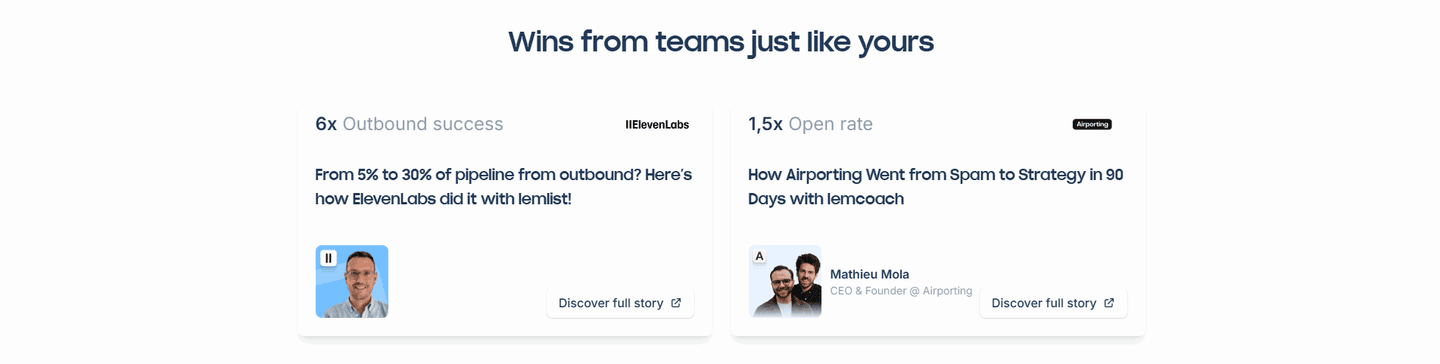
Testimonial|
A quantified-results testimonial opens with a real, verifiable figure, a metric, a before-and-after, time saved, or a revenue result, so a buyer weighs proof they can check instead of vague praise.
Key takeaways
Showing 1–21 of 88 examples

Browse every testimonials pattern by UX best practice.
Every testimonial section is scored across 6 conversion best practices. Copy the best practice stack, not just the layout. See what builds trust and what falls flat.
Hand-picked from 350+ companies and analyzed by our AI conversion agent. Not a random dump of quote cards. Every entry earns its spot.
Found a testimonial section you admire? Run yours through the same scoring engine. See where you stand on the same best practices, and what to fix first.
A quantified-results testimonial opens with a hard, verifiable number rather than vague praise. Instead of a line like great product, easy to use, the card leads with a figure a buyer can weigh against their own situation. The point is proof a skeptic can check. Praise asks a visitor to trust a stranger's opinion, while a number gives them something concrete to react to.
The best testimonial sections lead with a few kinds of figure, often more than one at once:
A number is verifiable in a way an adjective never is. When a card leads with 30 percent lower lead cost or a deck score moving from 64 to 87, a skeptical buyer has a concrete figure to weigh rather than a feeling to take on faith. The figure also lets the buyer do the math on their own situation, picturing the same result for themselves. That projection is the whole job of a testimonial, and a vague quote cannot do it.
The number does a second job too. Set large and first, it keeps the card scannable for the visitor who is skimming, so the payoff registers before they read a word of the quote. The proof is caught in a glance and confirmed in the read. That is the difference between a testimonial a visitor glides past and one that stops them, because a hard result is harder to ignore than praise. It pairs naturally with a before and after story, where the number marks the two ends of the change.
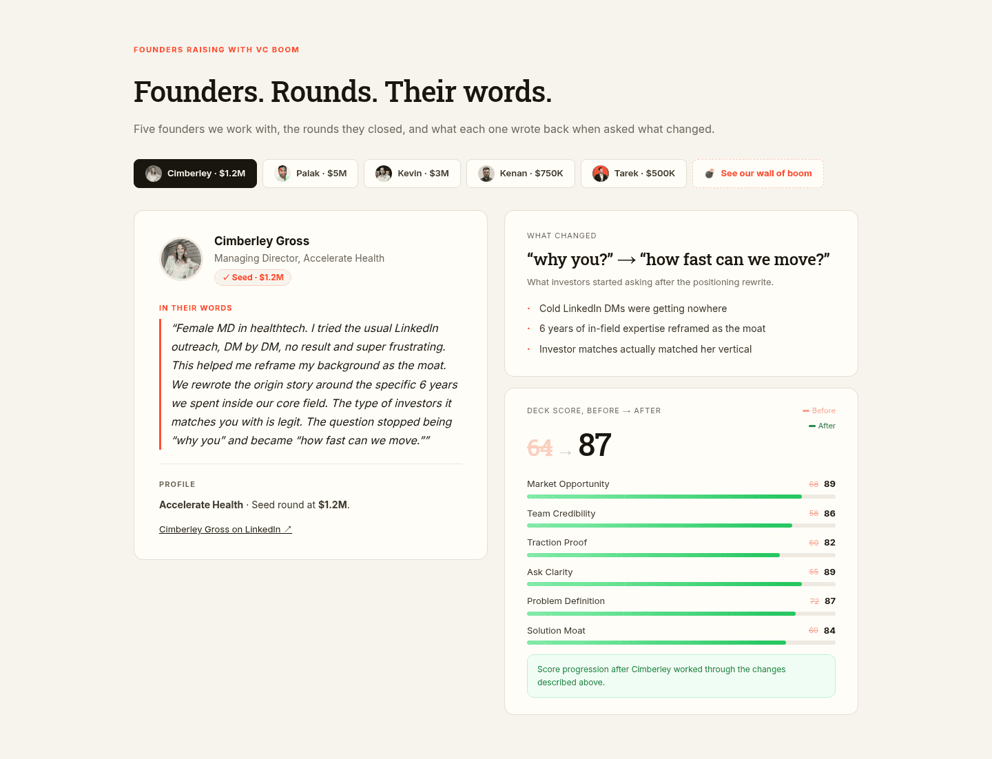
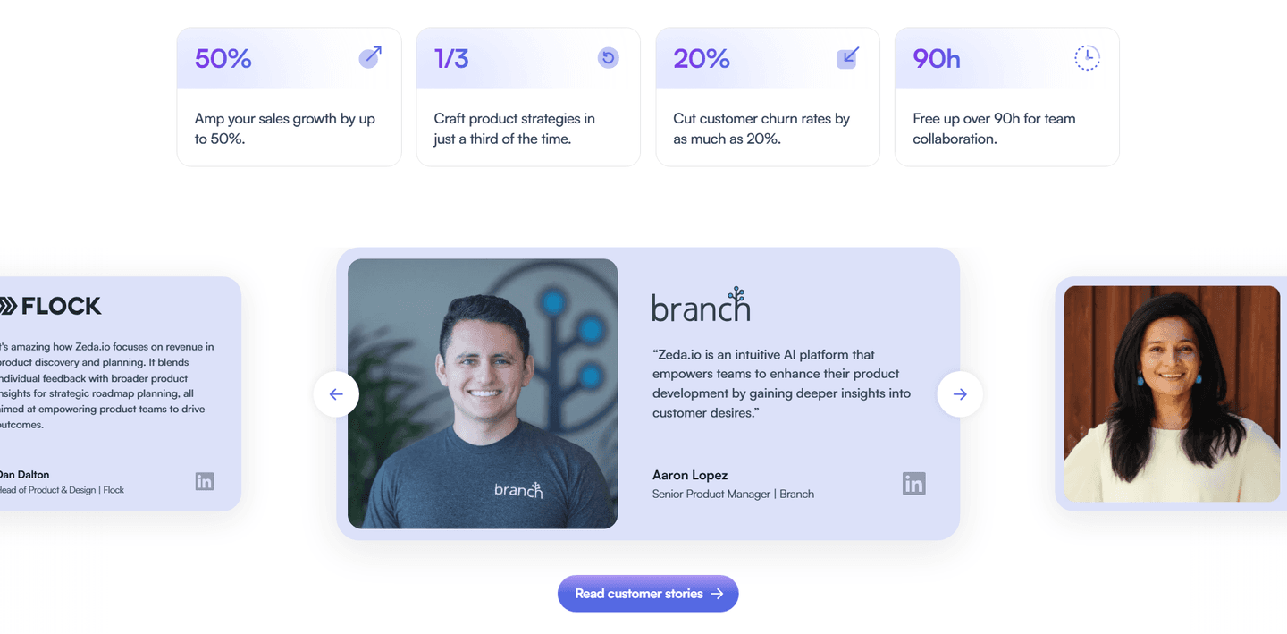
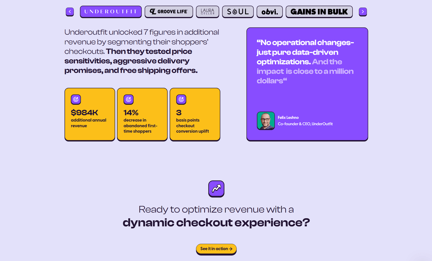
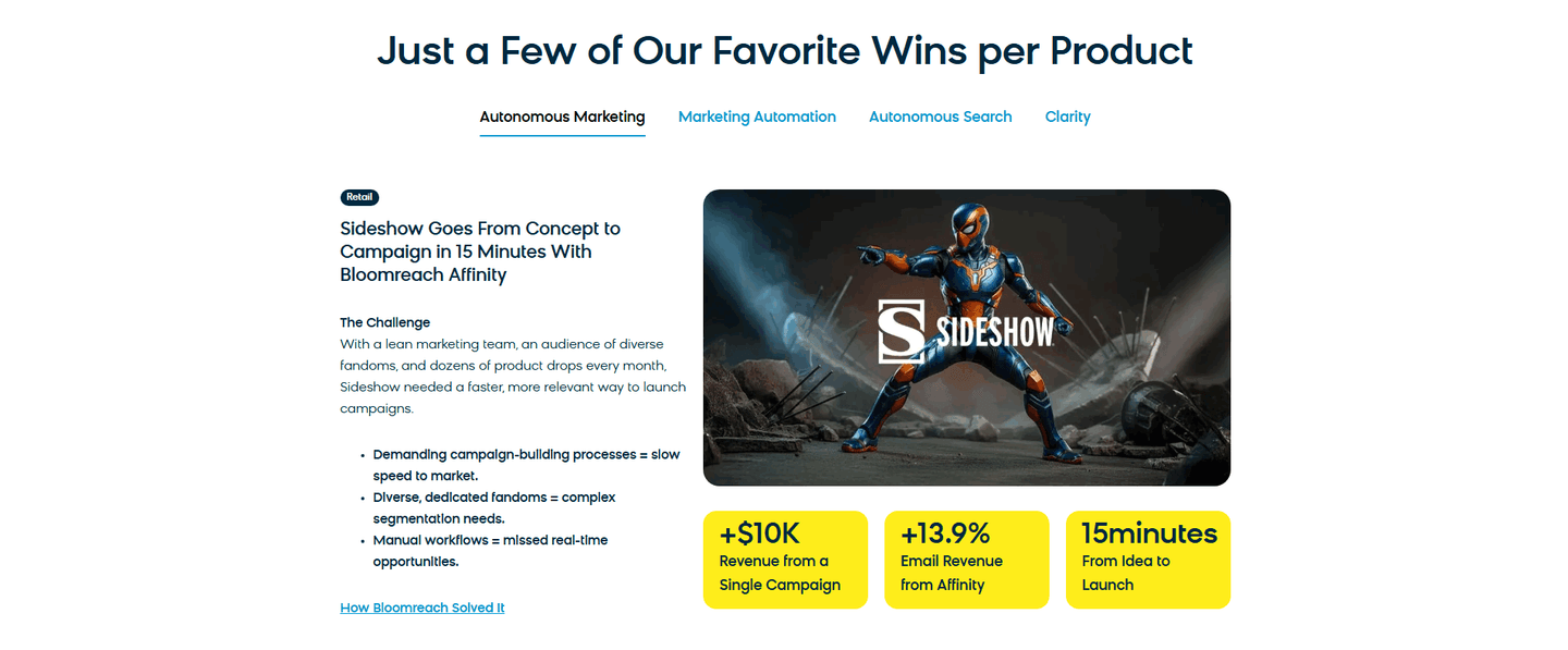
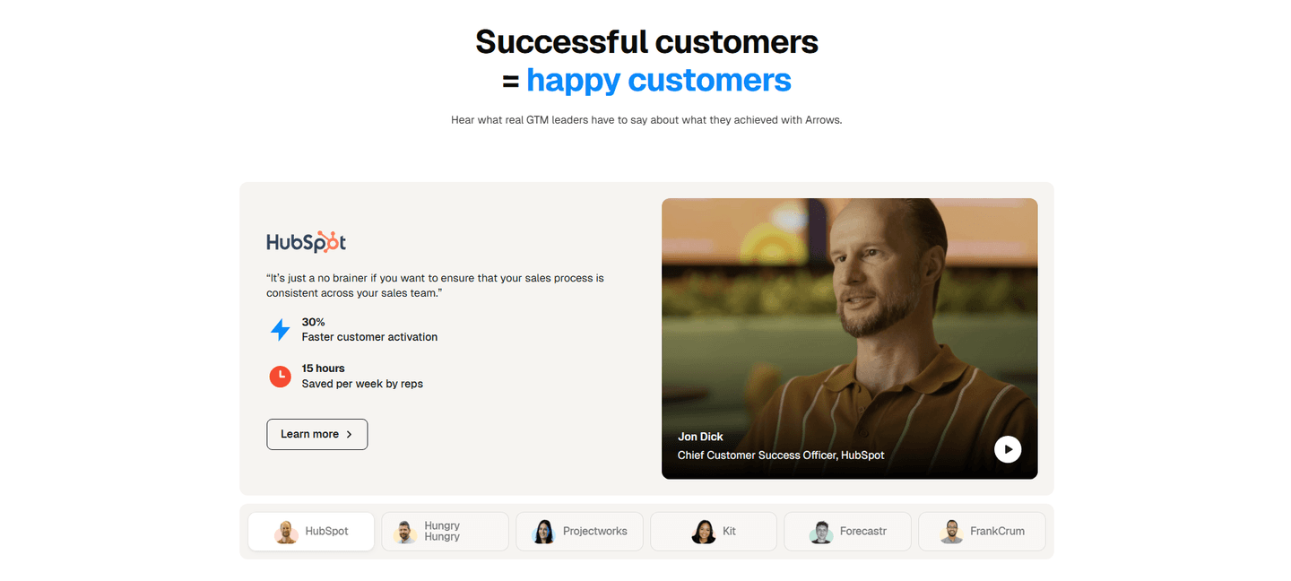
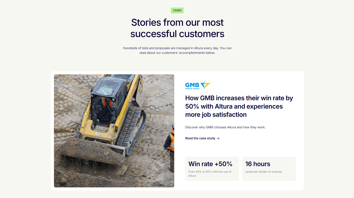
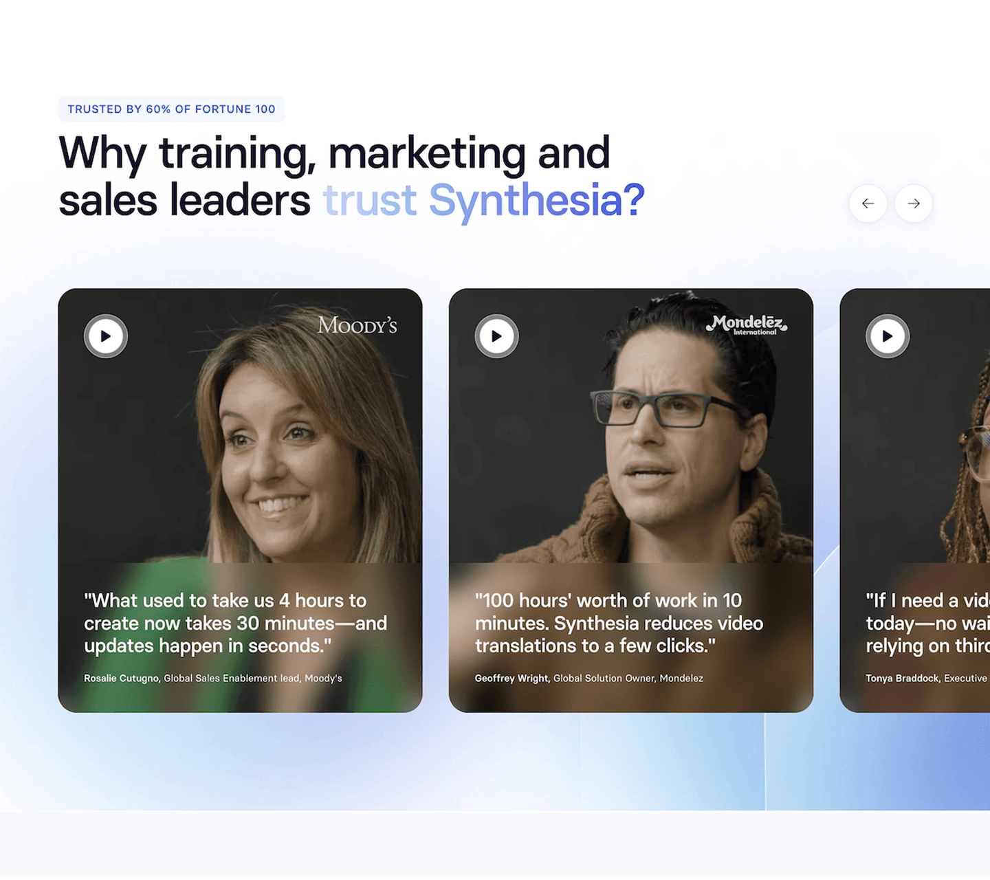
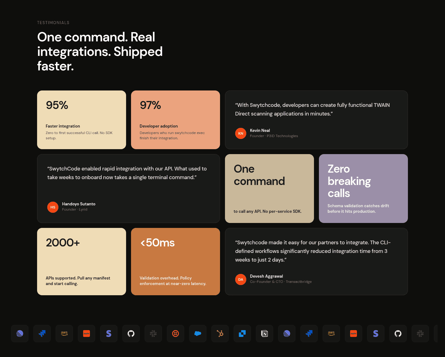
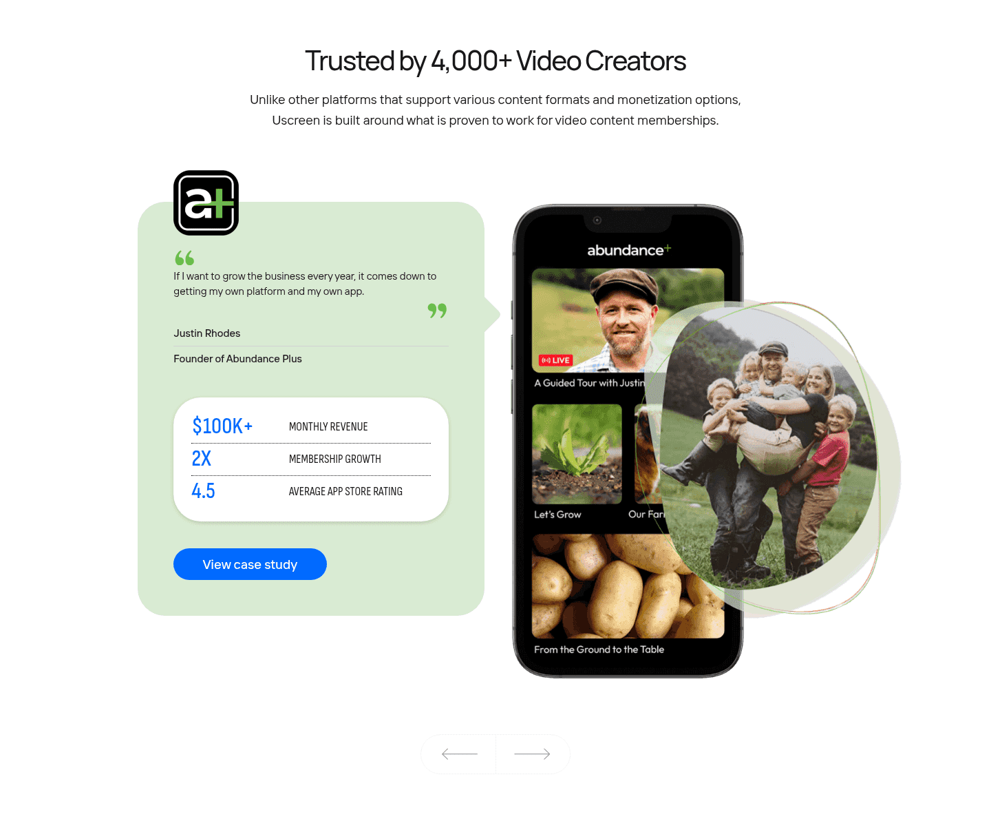
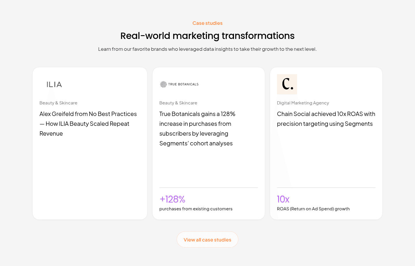
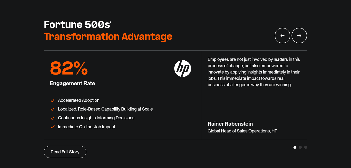
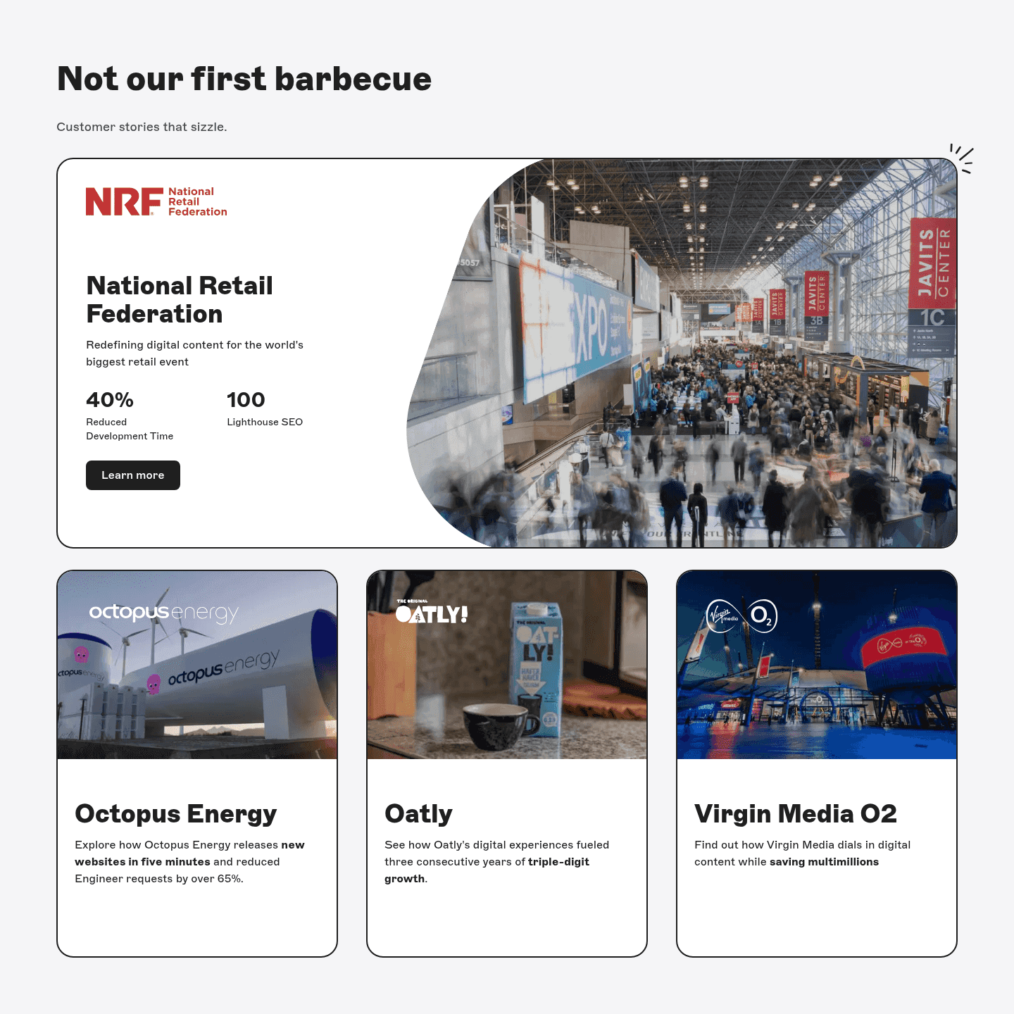
Across the benchmark examples below, the strongest sections lead with the customer's own figure and make it the largest thing on the card. Lemlist headlines each card with a hard metric like 6x outbound, 5 to 30 percent of pipeline, or a 1.5x open rate, with the bold callout set as the eye-catch above each story. Blend B2B opens every card with a number like 35 percent growth and 800 percent ROI or a 100 percent increase in conversion rate, and makes that metric the biggest text in the card. Pretty Damn Quick runs three hard metric cards, $984K added revenue, 14 percent fewer abandoned first-time shoppers, and a 3 basis point conversion uplift, so the impact is undeniable. Arrows pulls 30 percent faster customer activation and 15 hours saved per week beside a quote from Jon Dick, Chief Customer Success Officer at HubSpot. Altura leads with a win rate up from 40 to 60 percent plus 16 hours saved per tender, tied to a named customer. Zeda opens a row of cards with 50 percent sales growth, 20 percent lower churn, and 90 hours freed up, each set in large bold color type, while Storyblok headlines cards with 40 percent reduced development time and 65 percent fewer engineer requests.
The best sections do not stop at the number. They pair it with highlighted key phrases so the figure jumps off the card, back it with a full customer story so a skeptic can verify the depth behind the metric, and spread the wins across named roles and titles so a buyer sees the result holds for someone like them.
100/100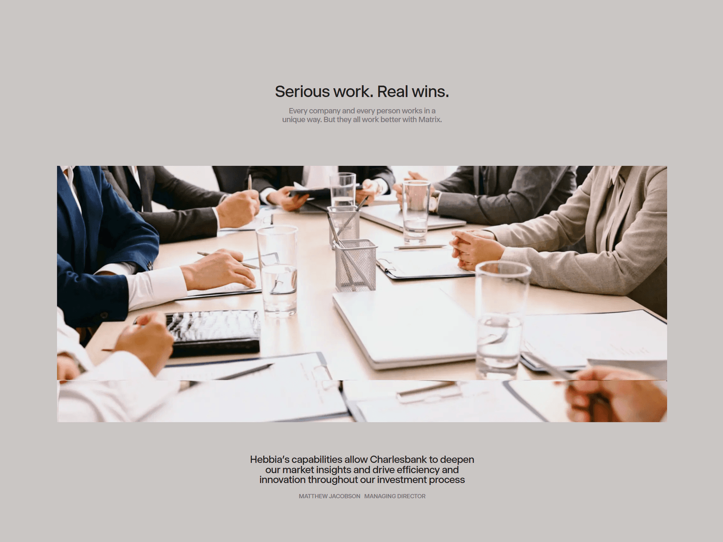 0/100
0/100The usual failure is a number with no owner: a floating statistic no named person or company stands behind, which reads like a marketing claim rather than proof. The second is burying the figure in prose, where the result is so small or so wrapped in a sentence that a skimmer never catches it, so the card converts no better than a vague quote. The third is a soft, unverifiable number, a saved tons of time or grew a lot that only pretends to be quantified. Lead with the customer's real figure, set it large and first, and attribute it to a named person at a named company so the result is owned and a buyer can weigh it.

Curated by
Gabriel Amzallag , Founder, Web Anatomy
5 years CRO + SEO at Qonto (2021–2025). After advising 15+ SaaS on their websites (Payfit, Pigment…), the same patterns kept breaking, so I decided to build the source of truth on what works on the web: the intelligence layer every tool, builder, and team uses to ship sites that perform.
Paste your URL. Get a scored analysis of your testimonial section, including whether your quotes lead with a hard result or lean on vague praise. Free, no signup.
The common questions about leading testimonials with a hard number, with answers drawn from 88 benchmark examples.
It is a testimonial that opens with a hard, verifiable number instead of vague praise. Rather than a line like great product, easy to use, the card leads with a figure a buyer can weigh: a metric, a before-and-after, time saved, or a revenue result. The forms it takes vary and often combine. A percentage or multiplier can headline the card, a before-and-after figure can show the change, a time-saved number can put the payoff in hours, and a dollar result can name the revenue the customer gained.
Praise asks a visitor to trust a stranger's opinion. A number gives them something to weigh against their own situation. When Pretty Damn Quick leads with $984K added revenue or Blend B2B opens a card with 800% ROI, a skeptical buyer has a concrete figure to react to instead of an adjective. The number is verifiable in a way great product never is, and it lets the buyer picture the same outcome for themselves, which is the whole job of the testimonial.
First, and in the largest type. The best sections make the figure the eye-catch, not a detail buried in a sentence. Lemlist headlines each card with a bold metric like 6x outbound or 5 to 30 percent of pipeline. Zeda sets outcomes like 50 percent sales growth and 90 hours freed up in large color type so the result is the first thing the eye lands on. Blend B2B makes the headline metric the biggest text on every card. The rule is simple: a skimmer should catch the payoff before they read a single word of the quote.
Yes. A floating statistic is easy to dismiss, so the strongest sections tie each figure to a named person and company. Arrows pulls 30 percent faster customer activation and 15 hours saved per week beside a quote from Jon Dick, Chief Customer Success Officer at HubSpot. Altura shows a win rate moving from 40 to 60 percent tied to a named customer, GMB. The number carries weight because a real person at a real company owns it, not because the page asserts it.
The ones that map to a result the buyer cares about: revenue, cost, time, or a conversion rate. A before-and-after is especially strong because it shows the distance traveled, like VC Boom moving a pitch deck score from 64 to 87, or Altura going from a 40 to a 60 percent win rate. Time saved reads instantly, as with Arrows freeing 15 hours a week. Revenue closes the loop, as with Pretty Damn Quick's $984K. Pick the metric a buyer would use to judge the purchase, and lead with it.