Best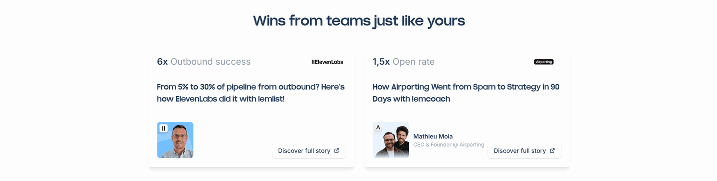
Testimonial|
Highlighting the key phrase inside a testimonial lets a visitor catch the proof in a second, even when they only skim the quote.
Key takeaways
Showing 1–21 of 47 examples
Browse every testimonials pattern by UX best practice.
Every testimonial section is scored across 6 conversion best practices. Copy the best practice stack, not just the layout. See what builds trust and what falls flat.
Hand-picked from 350+ companies and analyzed by our AI conversion agent. Not a random dump of quote cards. Every entry earns its spot.
Found a testimonial section you admire? Run yours through the same scoring engine. See where you stand on the same best practices, and what to fix first.
Keyword highlighting is the choice to pull the strongest part of a testimonial out of the sentence and into bold or colored type, so a visitor reads the payoff first. Most people skim a quote rather than read it. A highlight gives the eye a place to land, and that place is the single most convincing line: a number, a result, or a sharp phrase.
The best testimonial sections use one of a few forms, sometimes two together:
A visitor decides whether a testimonial is worth their attention in a fraction of a second, and most decide to skim. A full paragraph of praise loses that moment: the proof is in there, but it never registers because nothing pulls the eye to it. A highlight wins the moment by making the most persuasive phrase the first thing read.
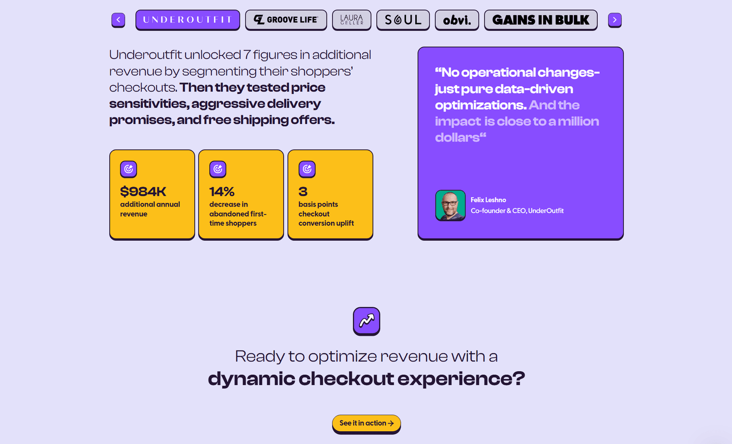
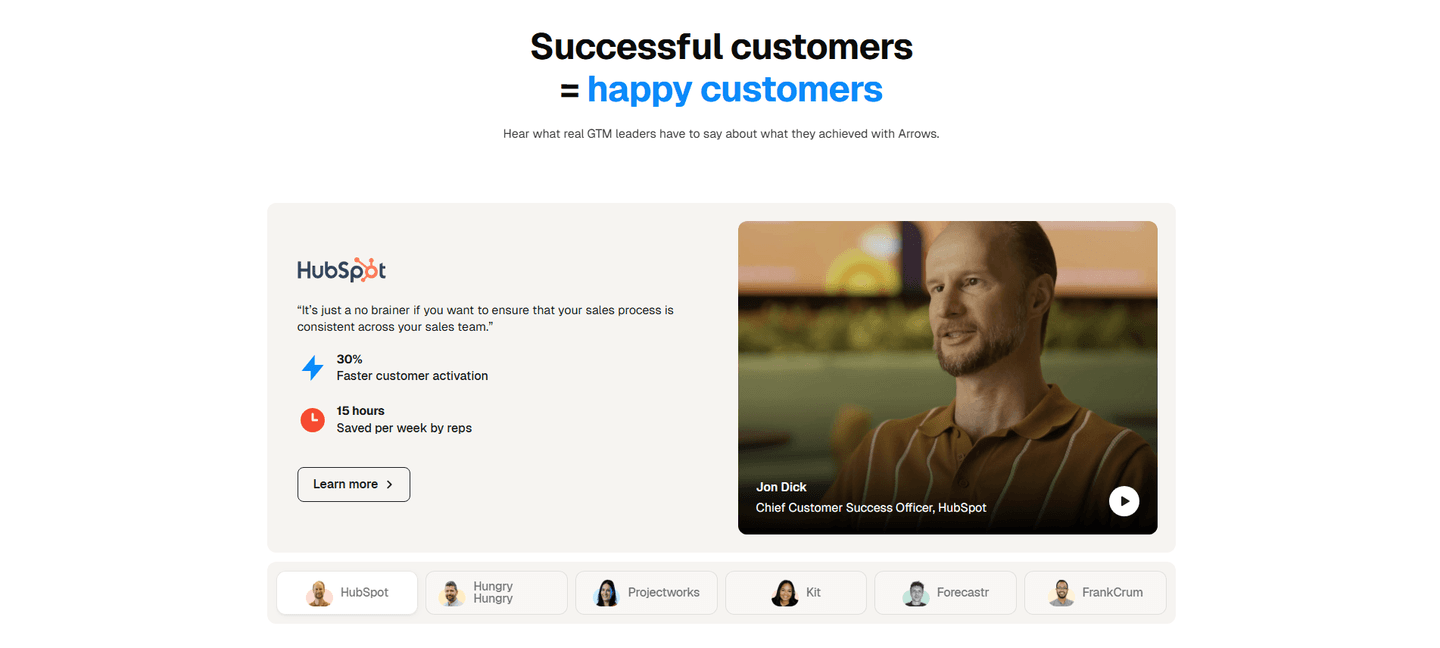
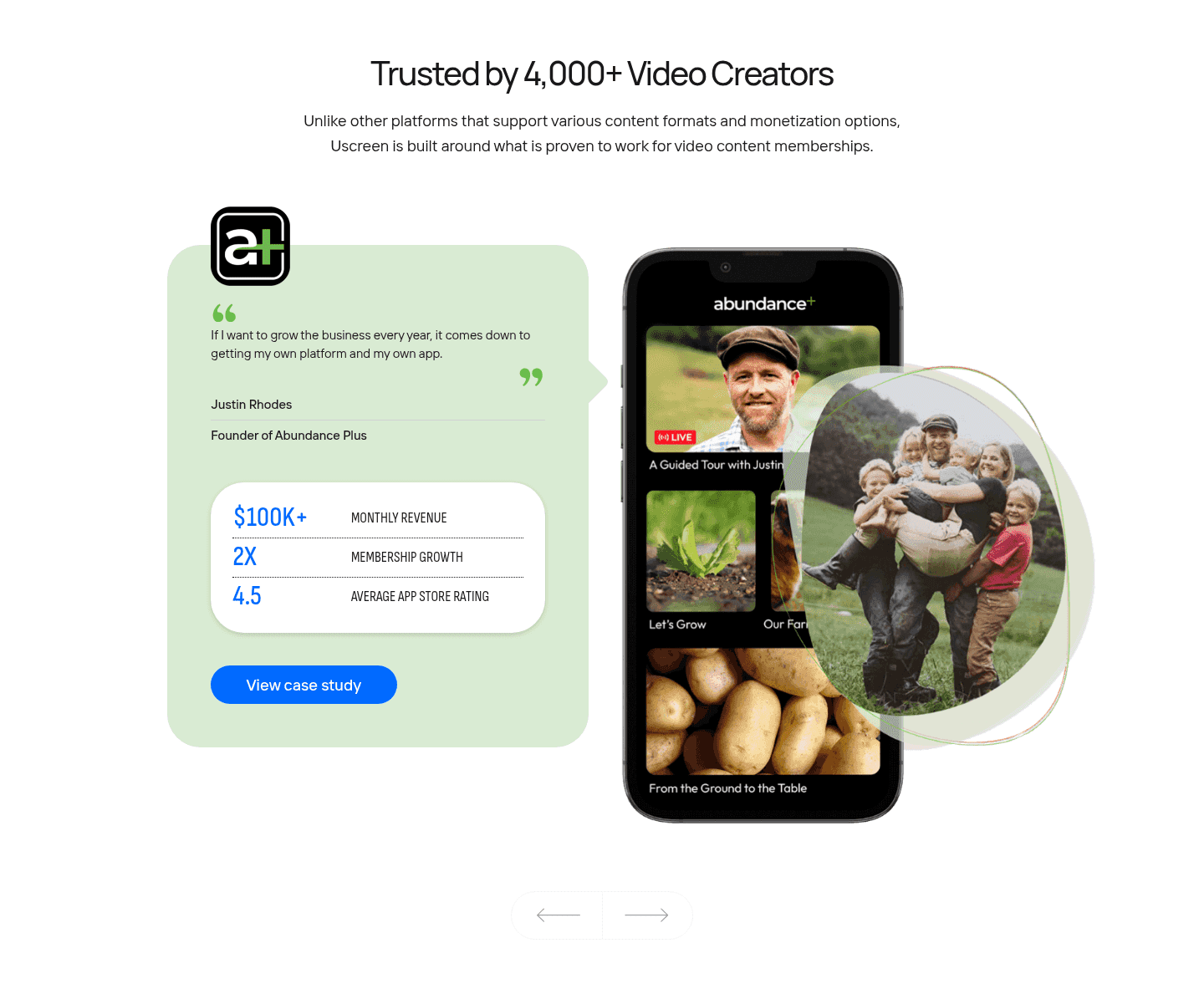
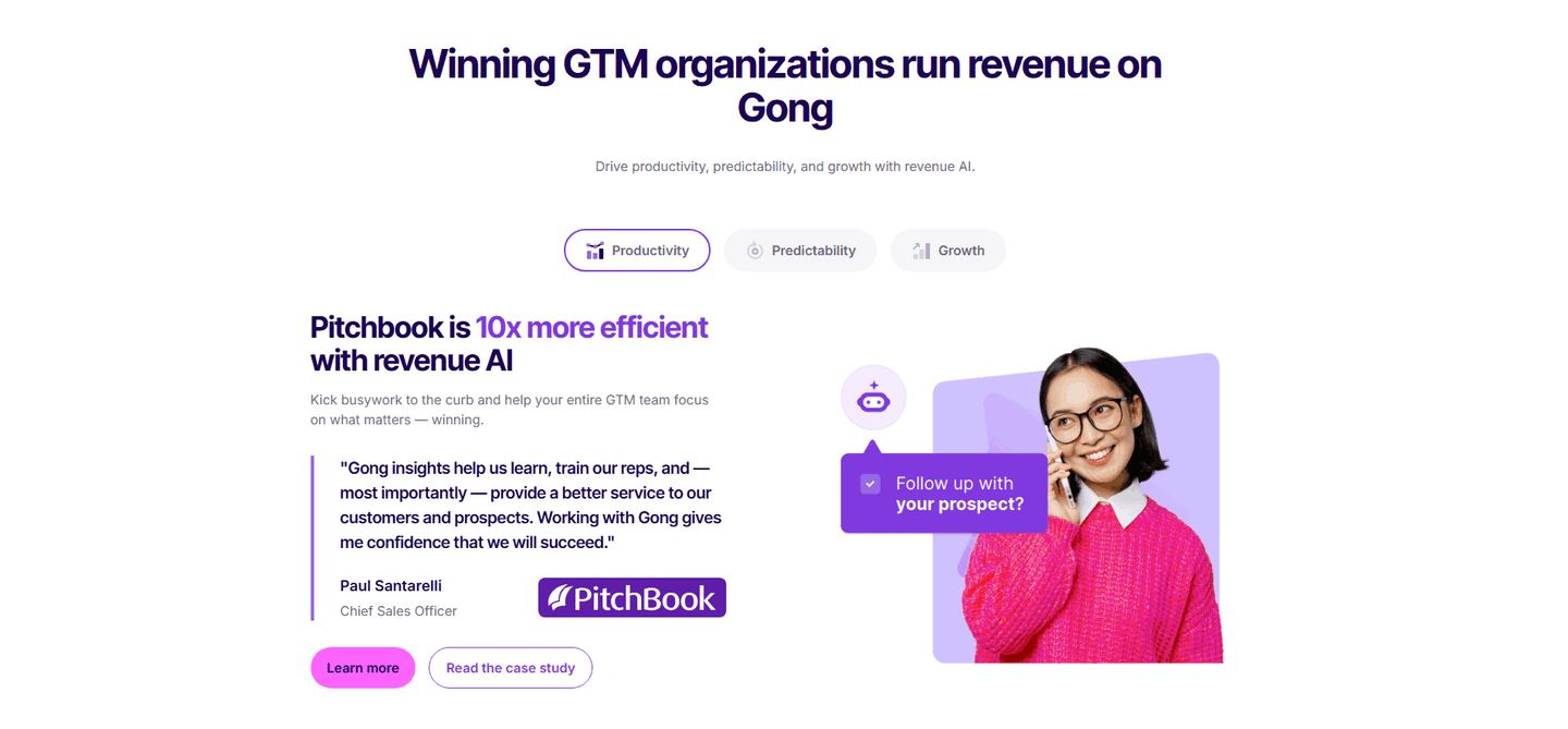
The phrase you highlight is the message. Choosing a real number or a concrete result over generic praise means the part that survives a skim is also the part that convinces. Surfe paints its key phrases in pink and pairs them with pill metric badges, and Equals uses yellow highlights on the punchiest lines, so the proof is caught whether the visitor reads or scans.
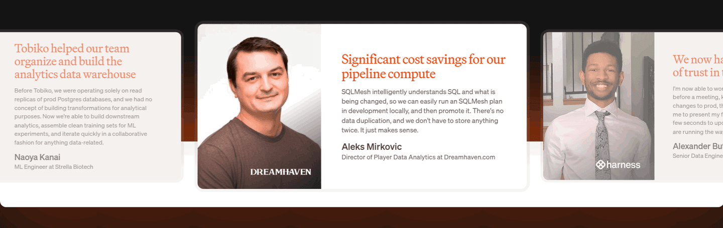
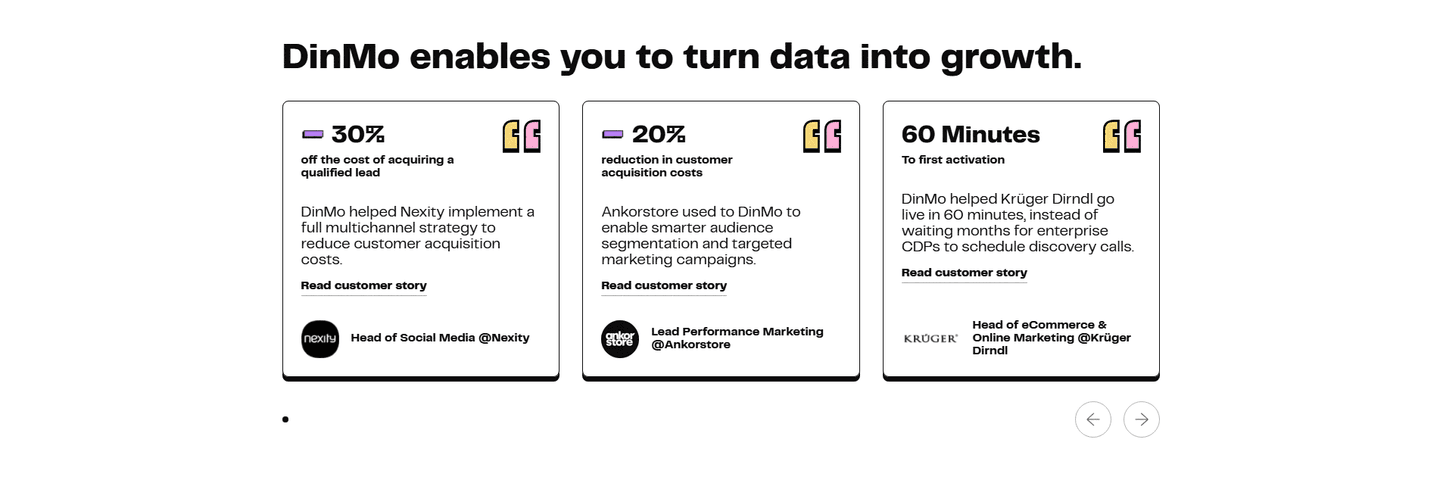
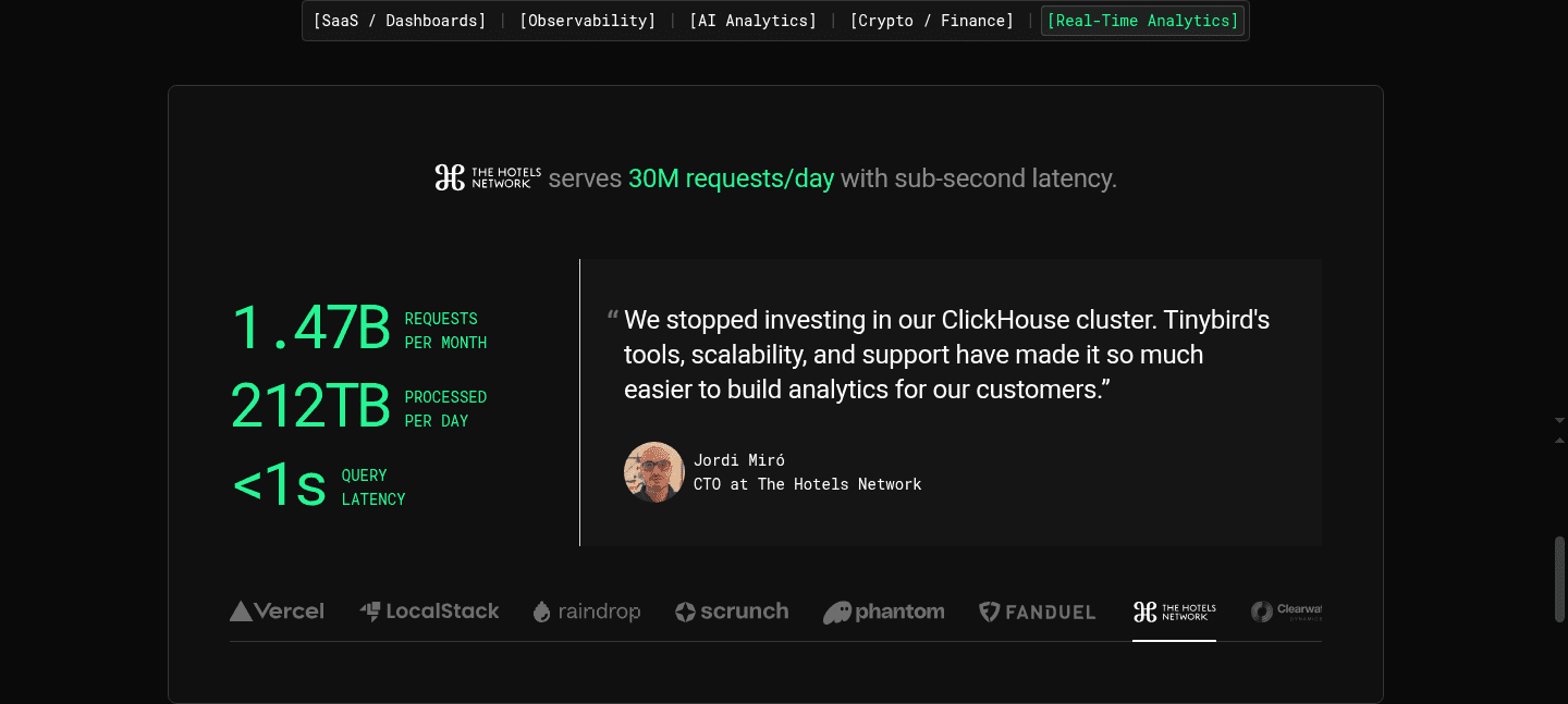
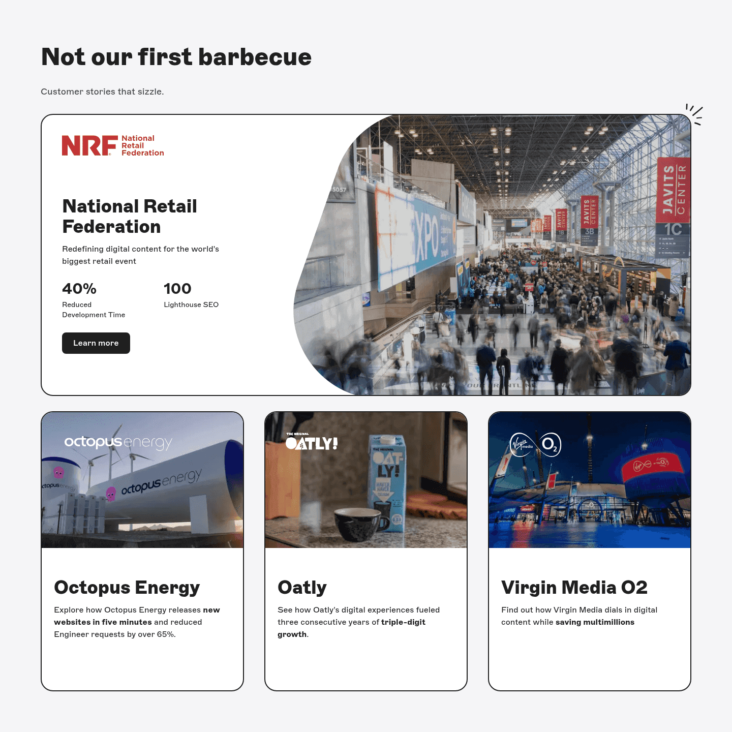
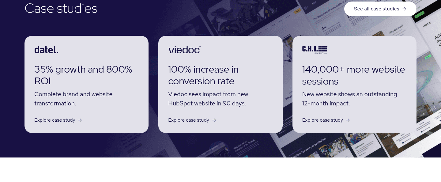
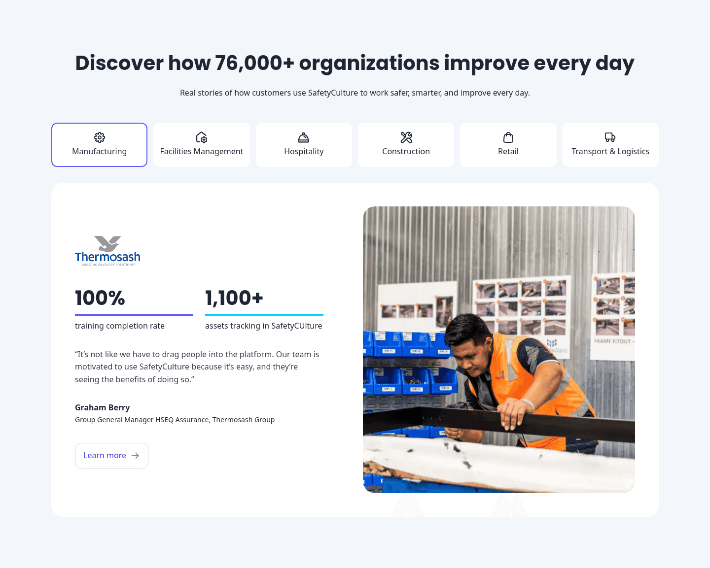
Across the benchmark examples below, the testimonials that perform share one discipline: one standout per card. Lemlist headlines each story with a hard metric so the figure reads before the sentence does. DinMo leads every card with a bold number at the top, and Tinybird draws the eye to a green-highlighted figure that carries the whole quote. The pattern is restraint. The strongest cards emphasize a single phrase, keep the rest of the quote in normal type so the contrast holds, and choose a specific number or a decisive result over a vague adjective.
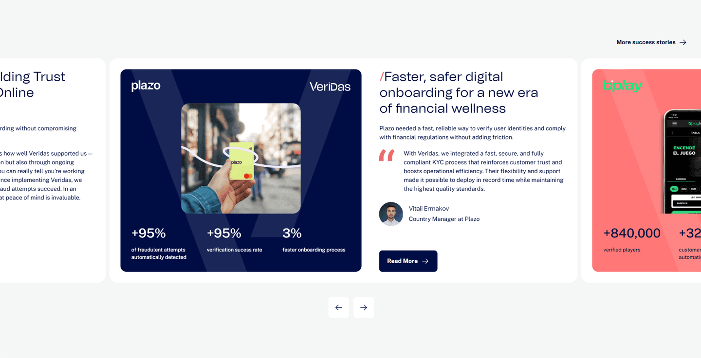
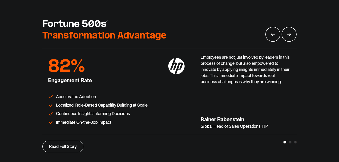
Highlighting rarely carries a testimonial alone. The strongest pair it with a before and after customer story so the highlighted result has a journey behind it, or with a video testimonial for a face the visitor can trust. Veridas does both, attaching a named customer and a challenge-then-result arc to its highlighted stats.
100/100 0/100
0/100The usual failure is highlighting everything, where half the sentence is bold or colored and the contrast collapses, so nothing stands out at all. The second failure is highlighting the wrong thing: emphasizing a generic adjective like "amazing" instead of the number or the concrete result that would actually convince a skeptic. The third is a highlight that is technically present but visually weak, a faint color or a barely heavier weight that the eye skips right over. Pick one phrase per quote, make it the most specific line you have, and give it enough contrast that a skimmer cannot miss it.

Curated by
Gabriel Amzallag , Founder, Web Anatomy
5 years CRO + SEO at Qonto (2021–2025). After advising 15+ SaaS on their websites (Payfit, Pigment…), the same patterns kept breaking, so I decided to build the source of truth on what works on the web: the intelligence layer every tool, builder, and team uses to ship sites that perform.
Paste your URL. Get a scored analysis of your testimonial section, including whether the proof is scannable for someone who skims. Free, no signup.
The common questions about highlighting the key phrase in customer quotes, with answers drawn from 47 benchmark examples.
It means setting the most persuasive part of a quote, usually a number or a short result phrase, in bold or colored type so it stands out from the rest of the sentence. A visitor who only skims the testimonial still reads the payoff. The most common forms are a bold metric inside the quote, a colored highlight on a few decisive words, or a separate stat tile that pulls the result out of the prose entirely.
Most visitors skim rather than read. A full paragraph of praise is easy to skip, so the proof inside it never registers. Highlighting the key phrase gives the eye a place to land, and that phrase is chosen to be the most convincing line in the quote: a real number, a concrete outcome, or a sharp claim. The visitor gets the proof in a glance and can read the surrounding sentence only if they want the context.
The single most persuasive element, not several. A hard metric like a percentage lift or a time saved is the strongest candidate because it is specific and verifiable. When there is no number, a few decisive words work: the phrase that captures the transformation or the standout result. The rest of the quote stays in normal type so the highlight keeps its contrast.
A number when one exists, because it is concrete and hard to dismiss. A phrase when the win is qualitative. Many of the strongest testimonial sections do both: a bold metric in the quote plus a separate stat tile that repeats the figure, so the result is impossible to miss whether the visitor reads or skims. The goal is one clear standout per card, not a quote peppered with emphasis.
Yes. When half the sentence is bold or colored, nothing stands out and the contrast is lost. Highlighting works because the emphasized phrase is the exception, not the rule. One standout per quote keeps the eye moving to the payoff. More than that and the card reads as noise, which defeats the point of making the proof scannable.