Pricing|
Laying plans out side by side is table stakes for a pricing section; these 70 examples show how the strongest ones make the tiers genuinely easy to compare and quick to choose between.
Key takeaways
Showing 22–42 of 70 examples
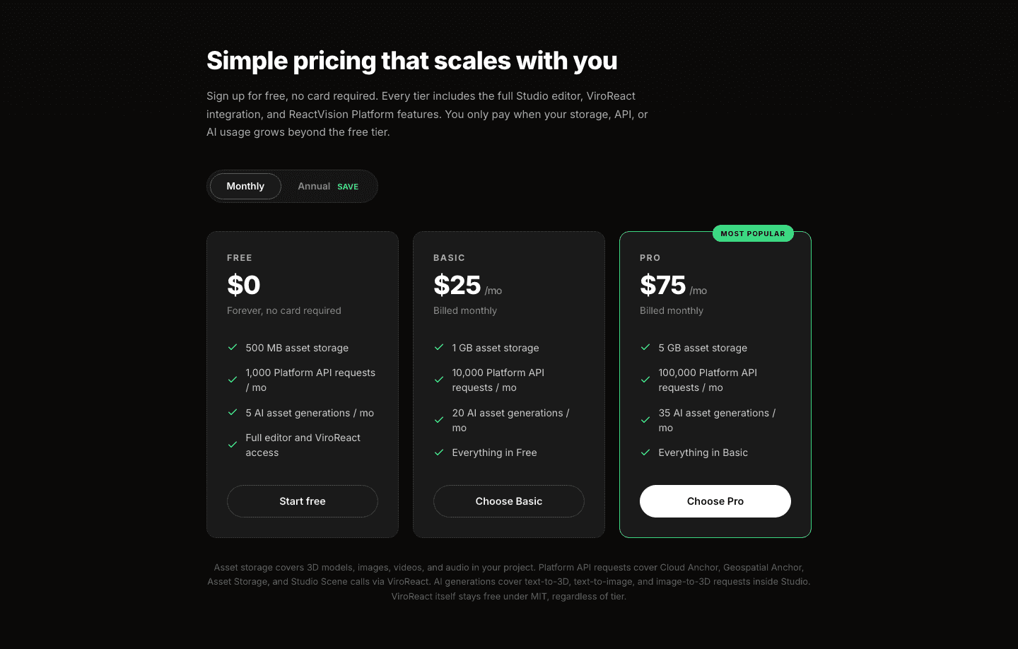
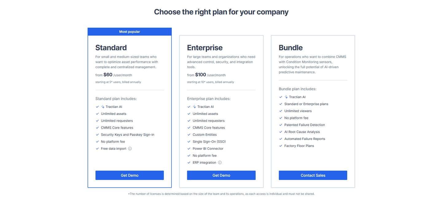
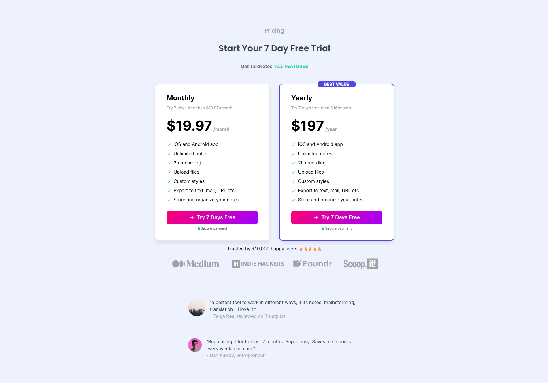
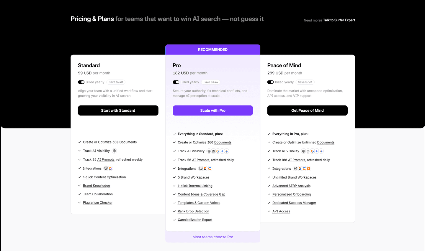
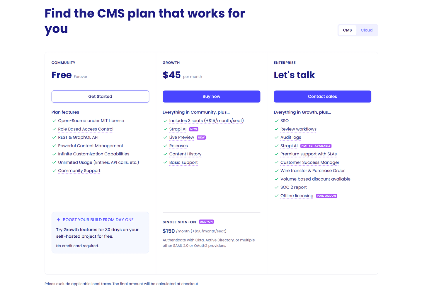
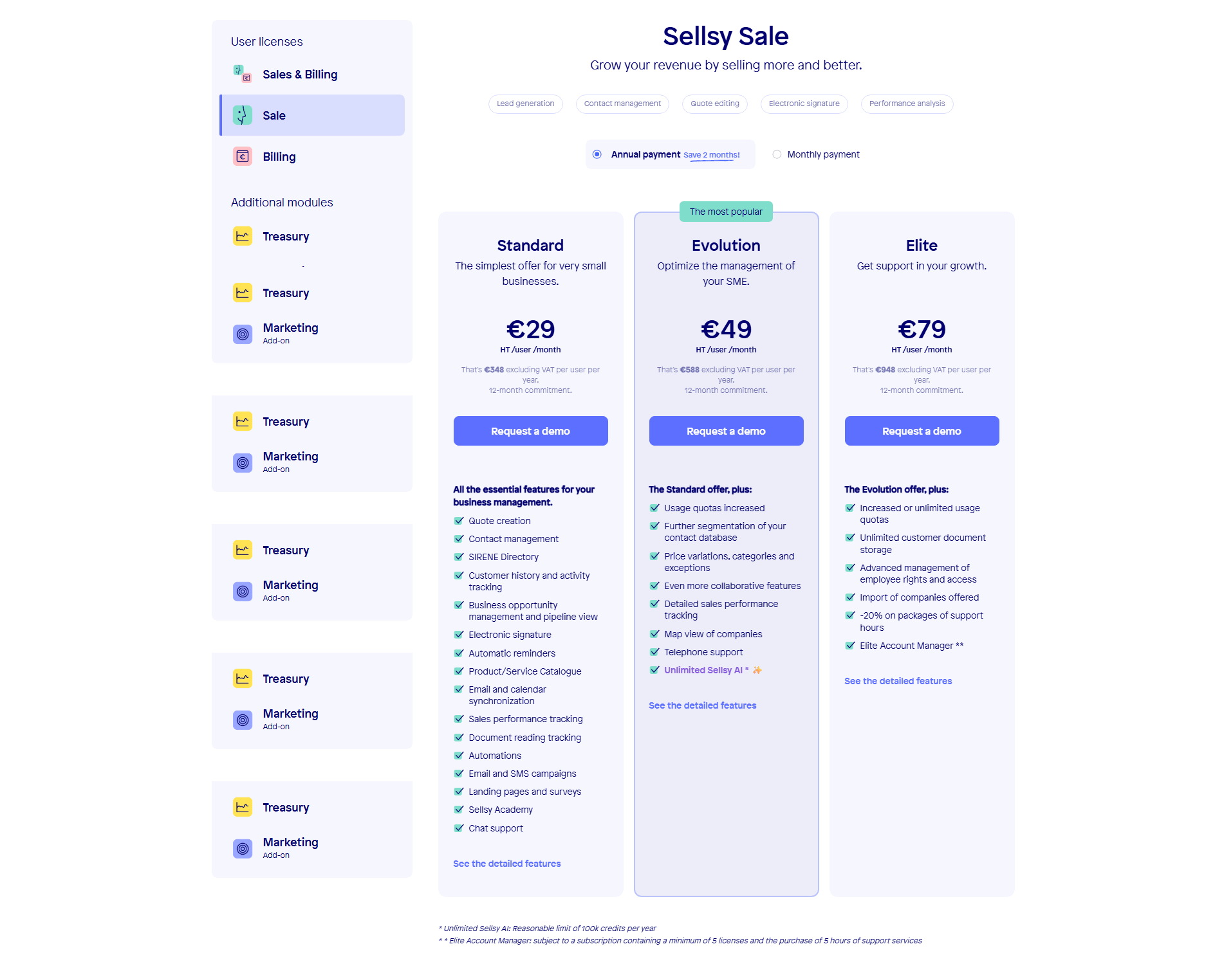
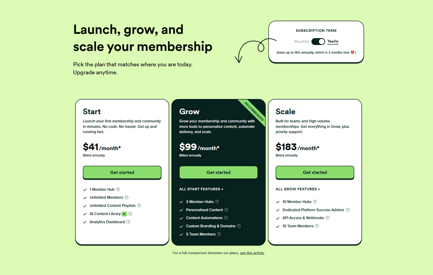
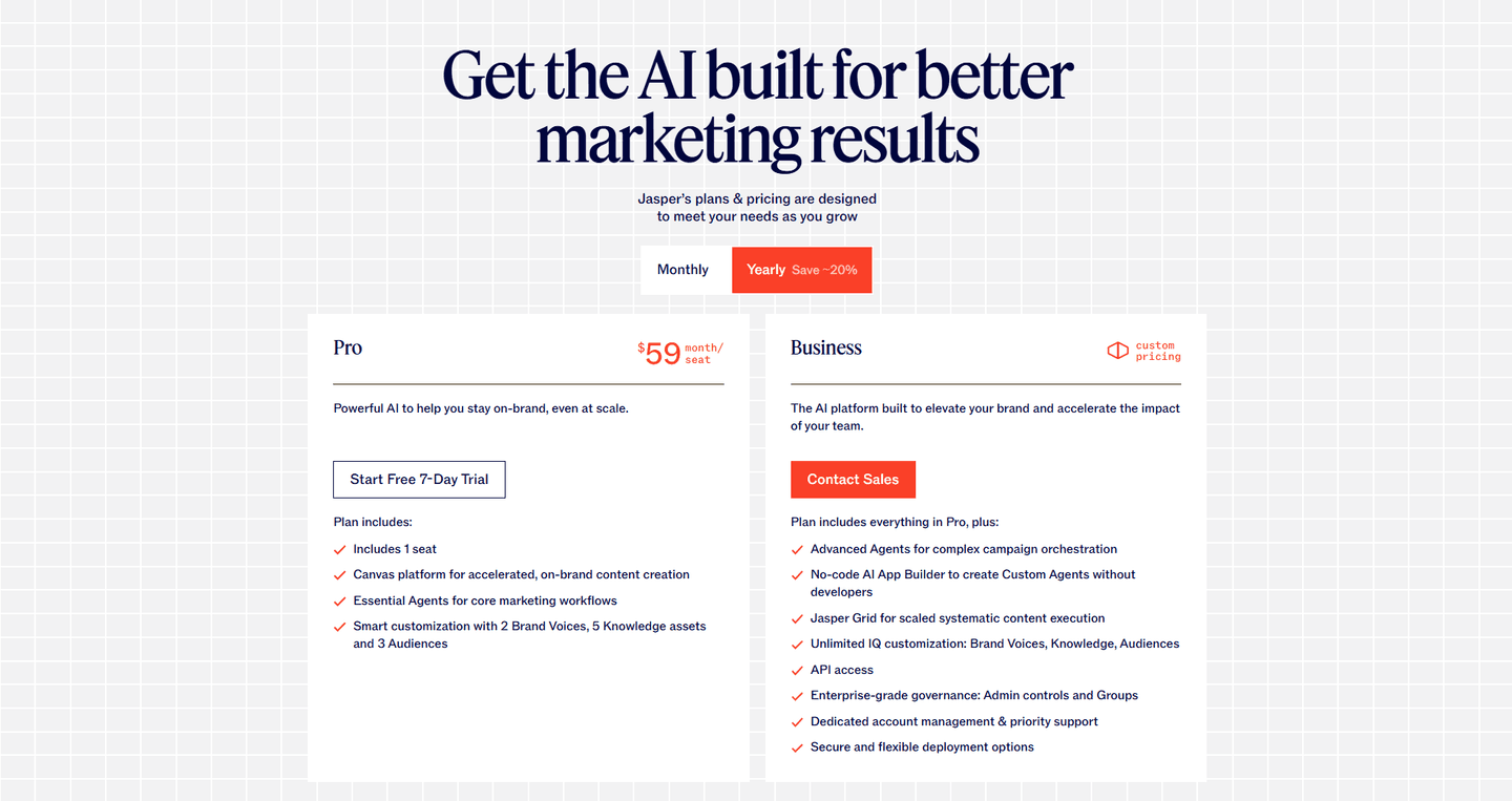
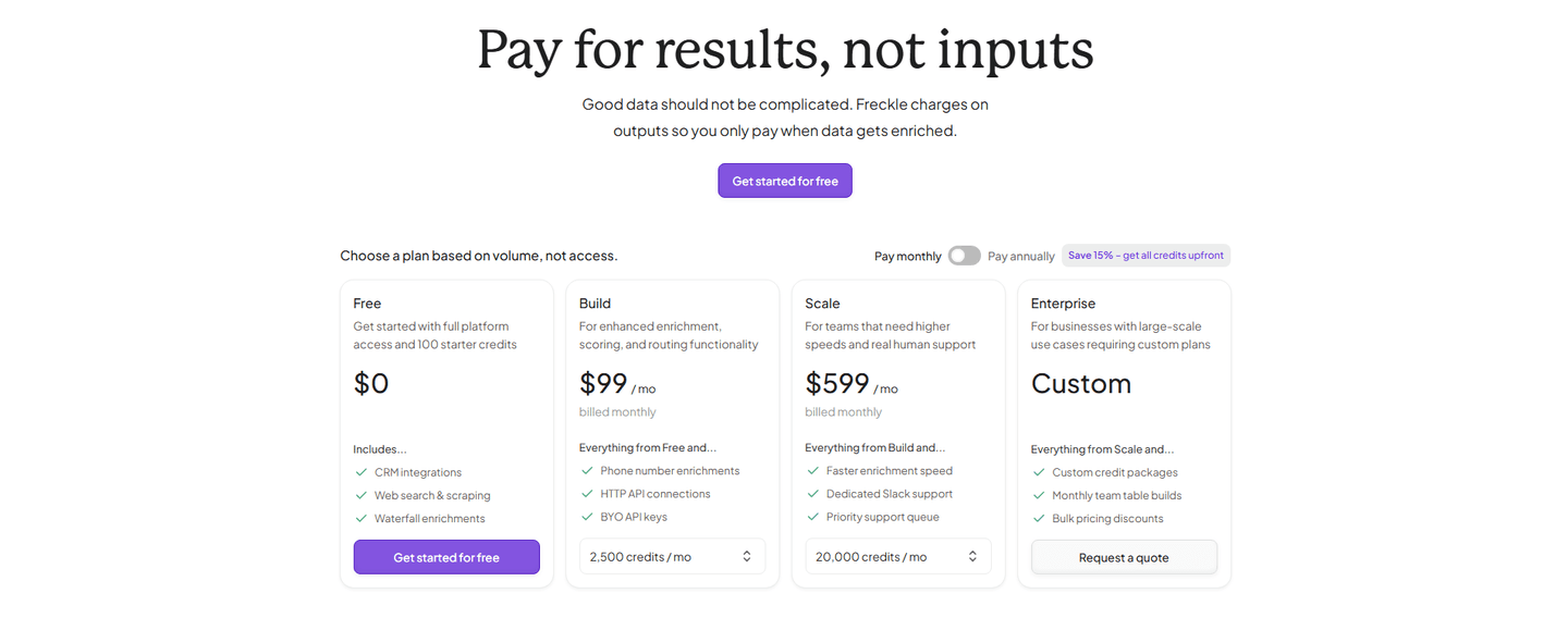
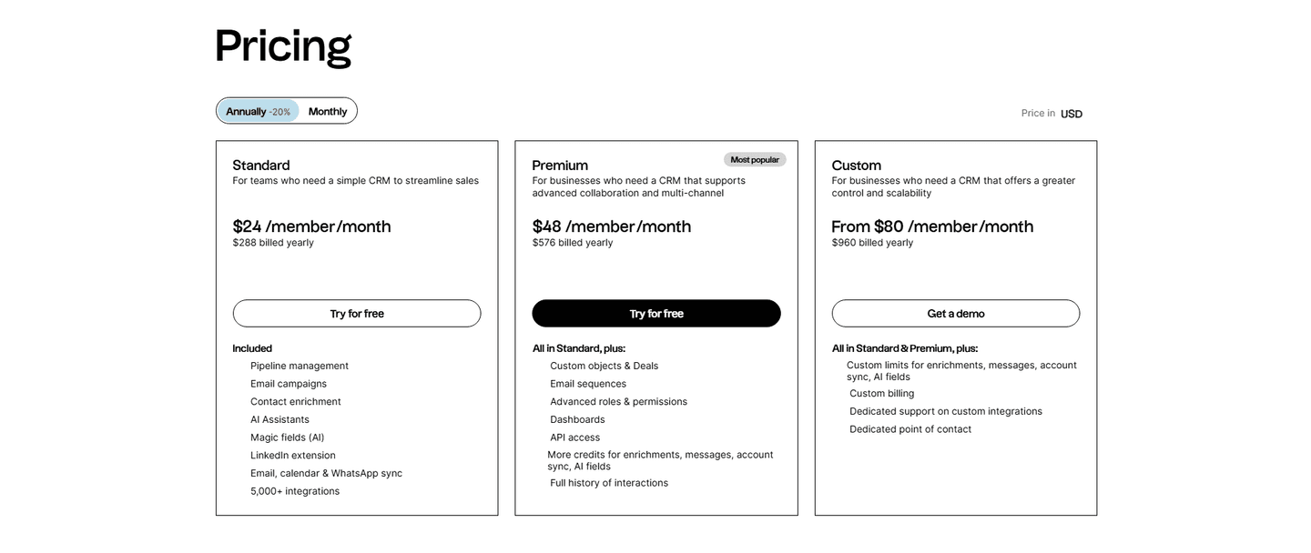
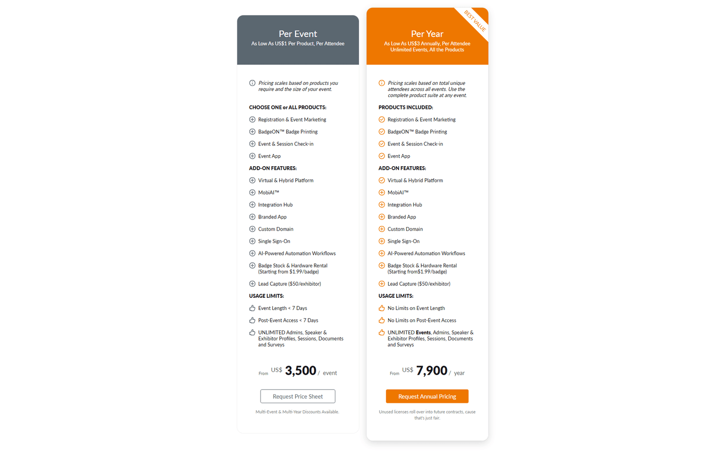
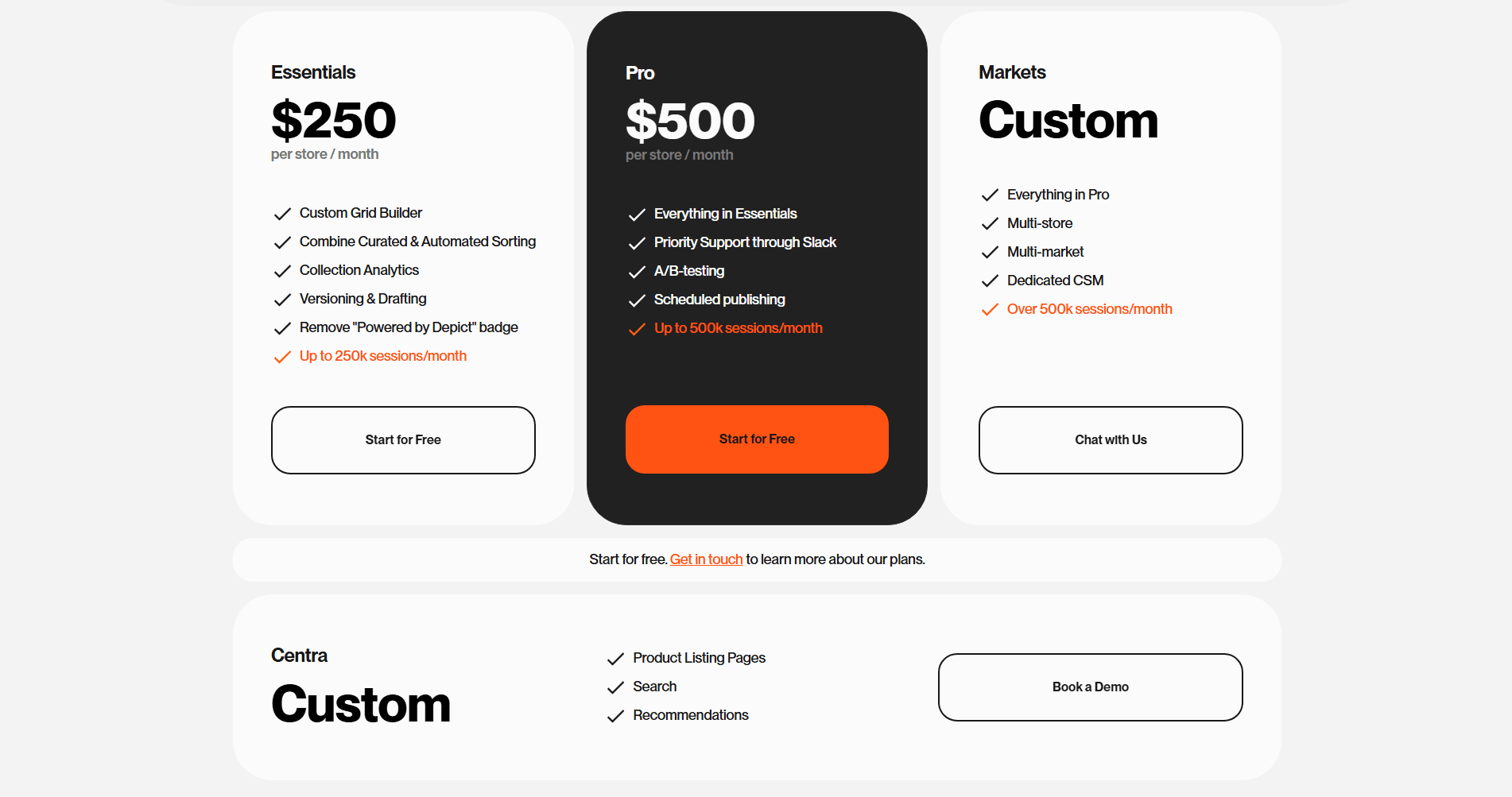
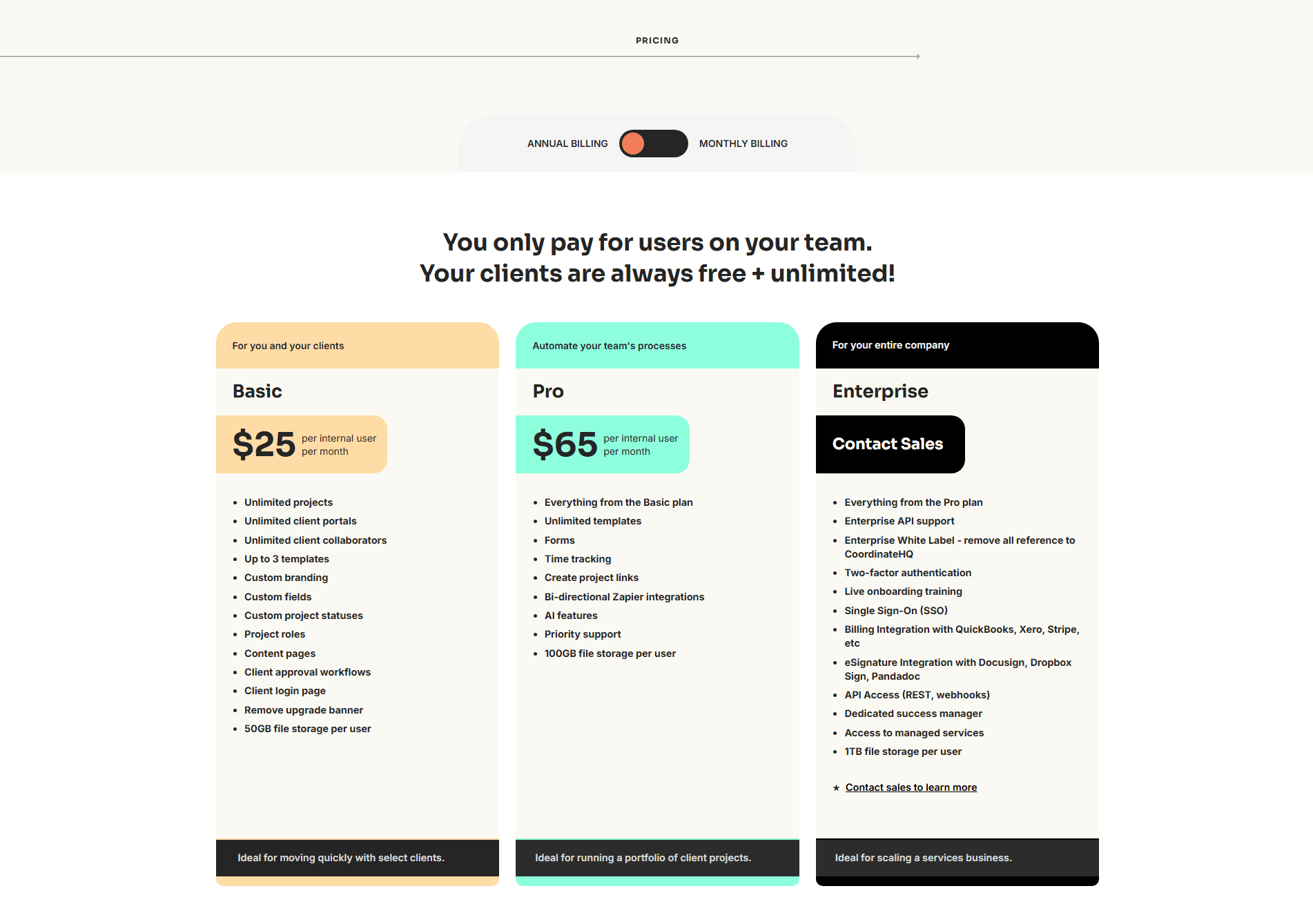
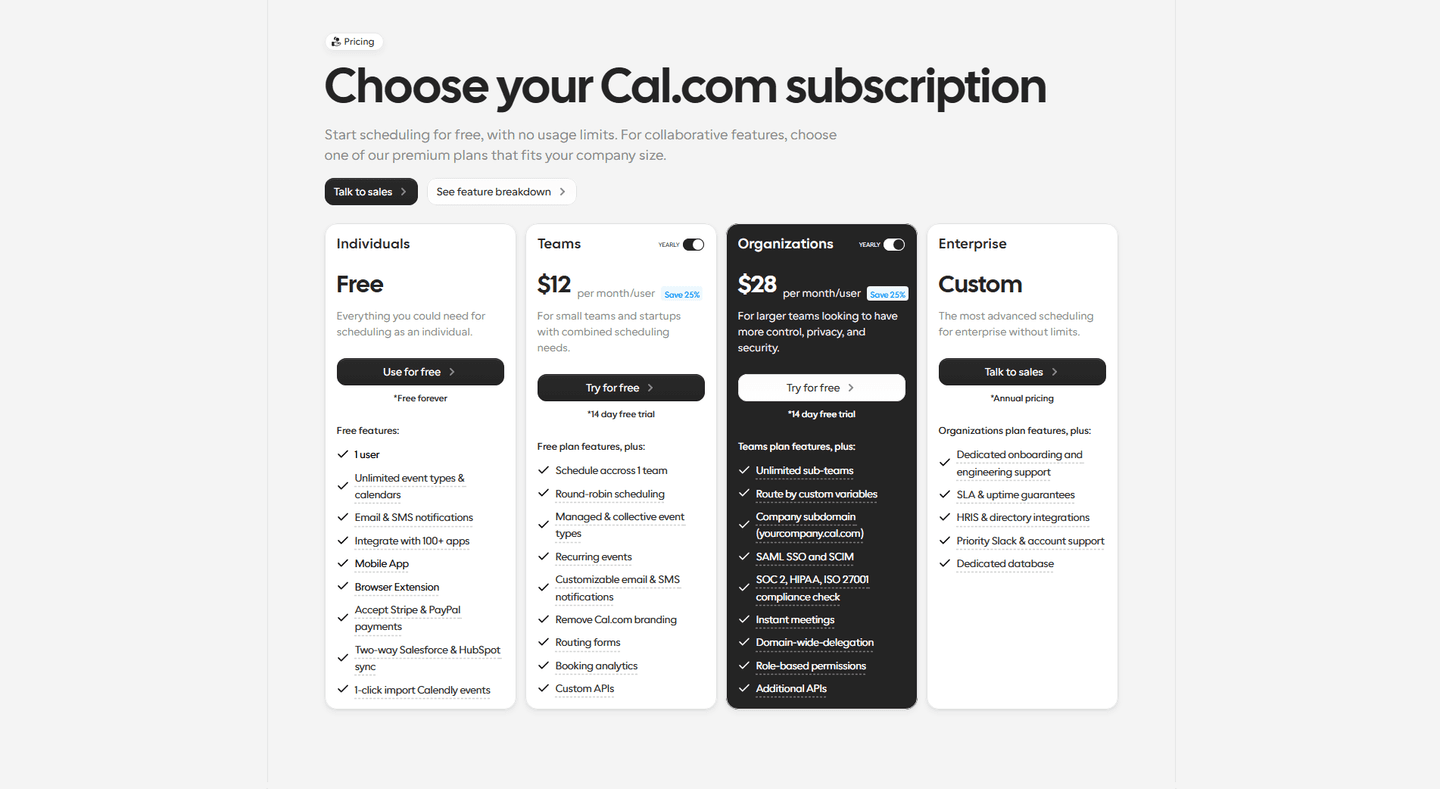
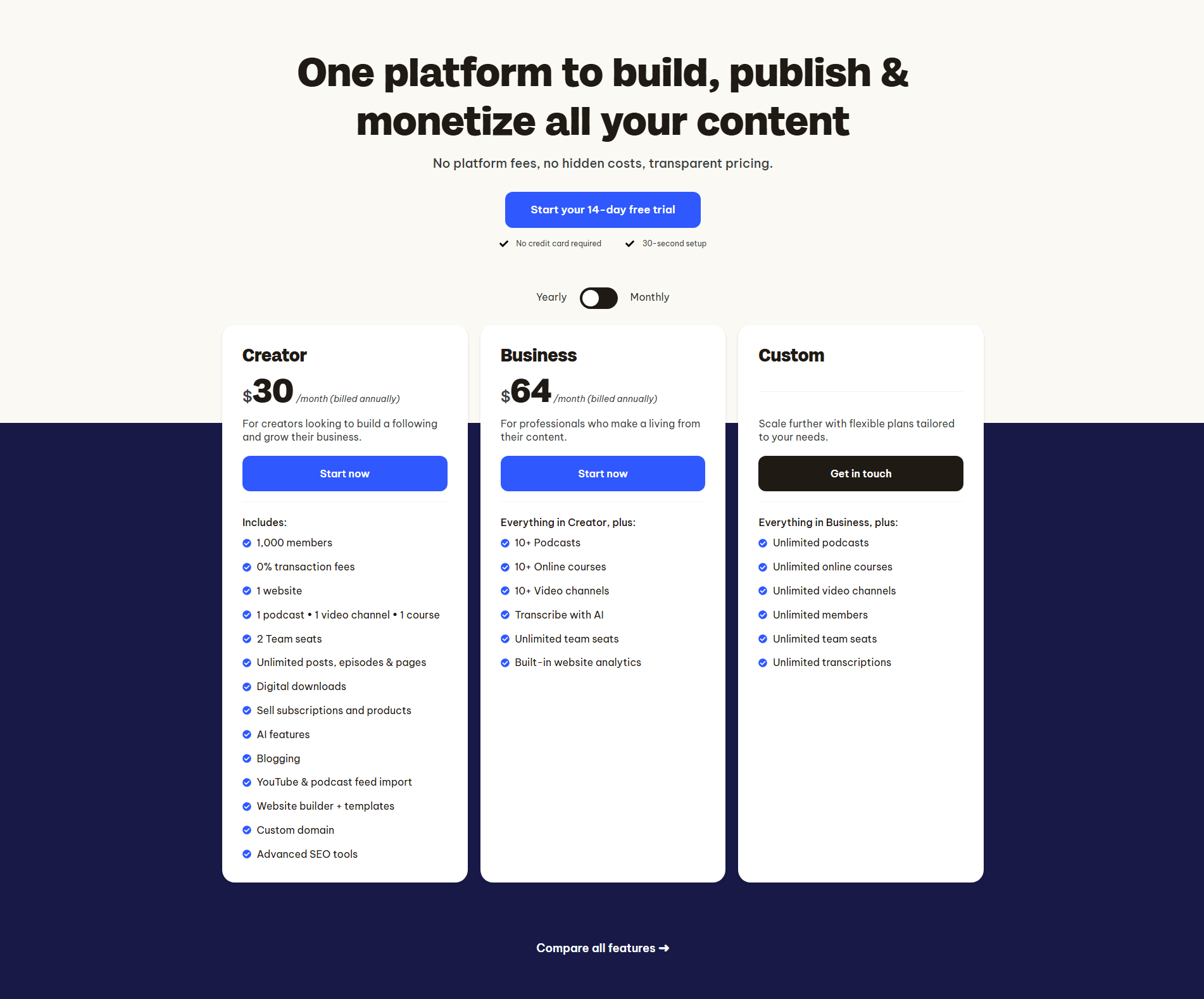
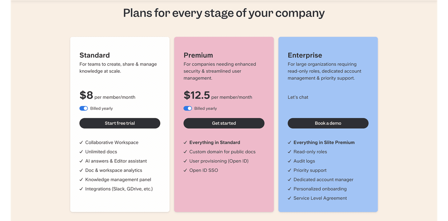
Browse every pricing pattern by UX best practice, or jump to an industry view.
Every pricing section is scored across 8 conversion best practices. Copy the best practice stack, not the layout. See what converts and why.
Hand-picked from 350+ companies and analyzed by our AI conversion agent. Not a random dump of pricing tables. Every entry earns its spot.
Found a pricing table you admire? Run yours through the same scoring engine. See where you stand on the same best practices, and what to fix first.
An easy-to-compare pricing section lays every plan out side by side so a visitor can read across the cards and see exactly what changes from one tier to the next. The point is not just to list prices, it is to make the differences between plans obvious enough that a buyer can self-select in seconds instead of studying a wall of near-identical feature lists.
A few concrete moves make a pricing section genuinely easy to compare, and the strongest examples use several at once:
A pricing section is where a visitor stops reading and starts deciding. If the plans are hard to tell apart, that decision stalls: the buyer cannot see which tier is meant for them, so they hesitate, open a competitor tab, or leave to think about it. Laying the plans out side by side, with the differences pulled to the surface, turns a comparison the buyer would otherwise do in their head into one the page has already done for them.
Almost every SaaS pricing section puts its plans side by side, so this is the baseline a pricing section is measured against, not a rare edge. The gap between a forgettable pricing section and a strong one is not whether the tiers sit next to each other, it is whether a buyer can actually tell them apart and knows which one to pick.
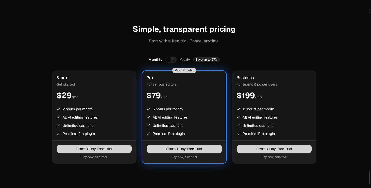
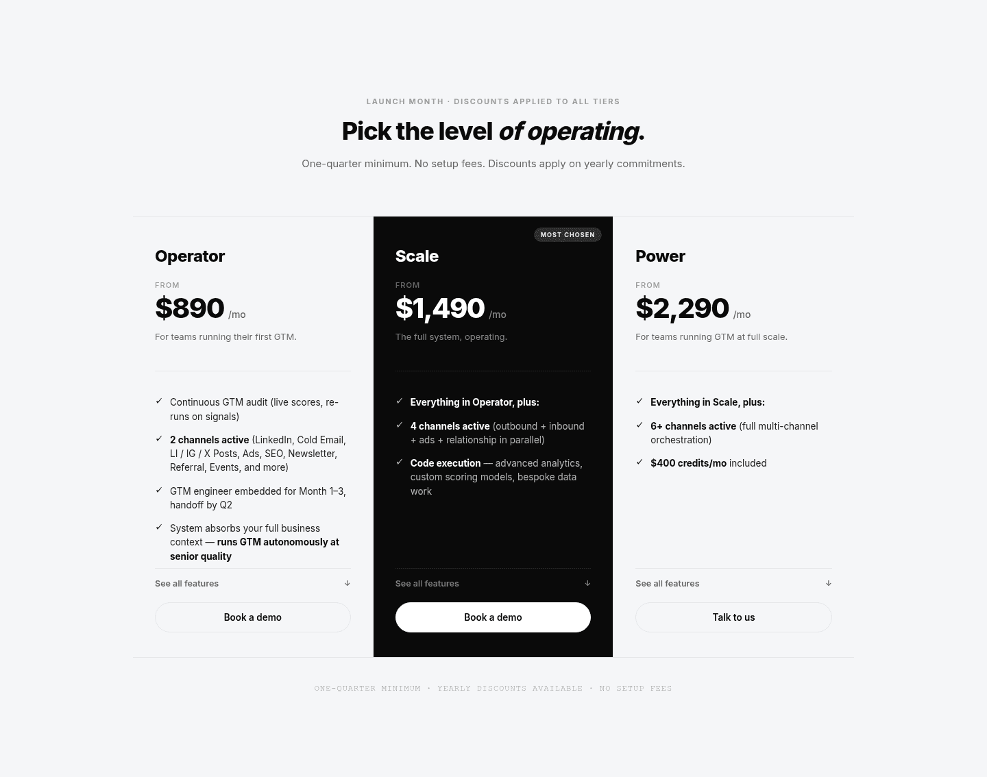
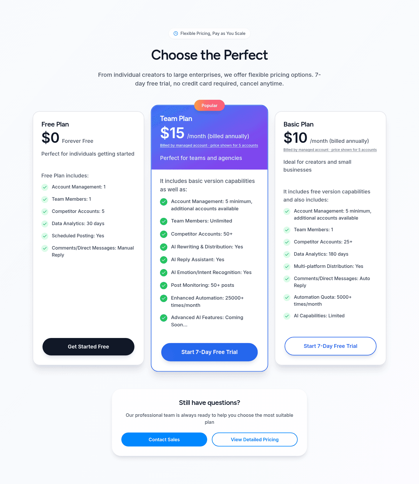
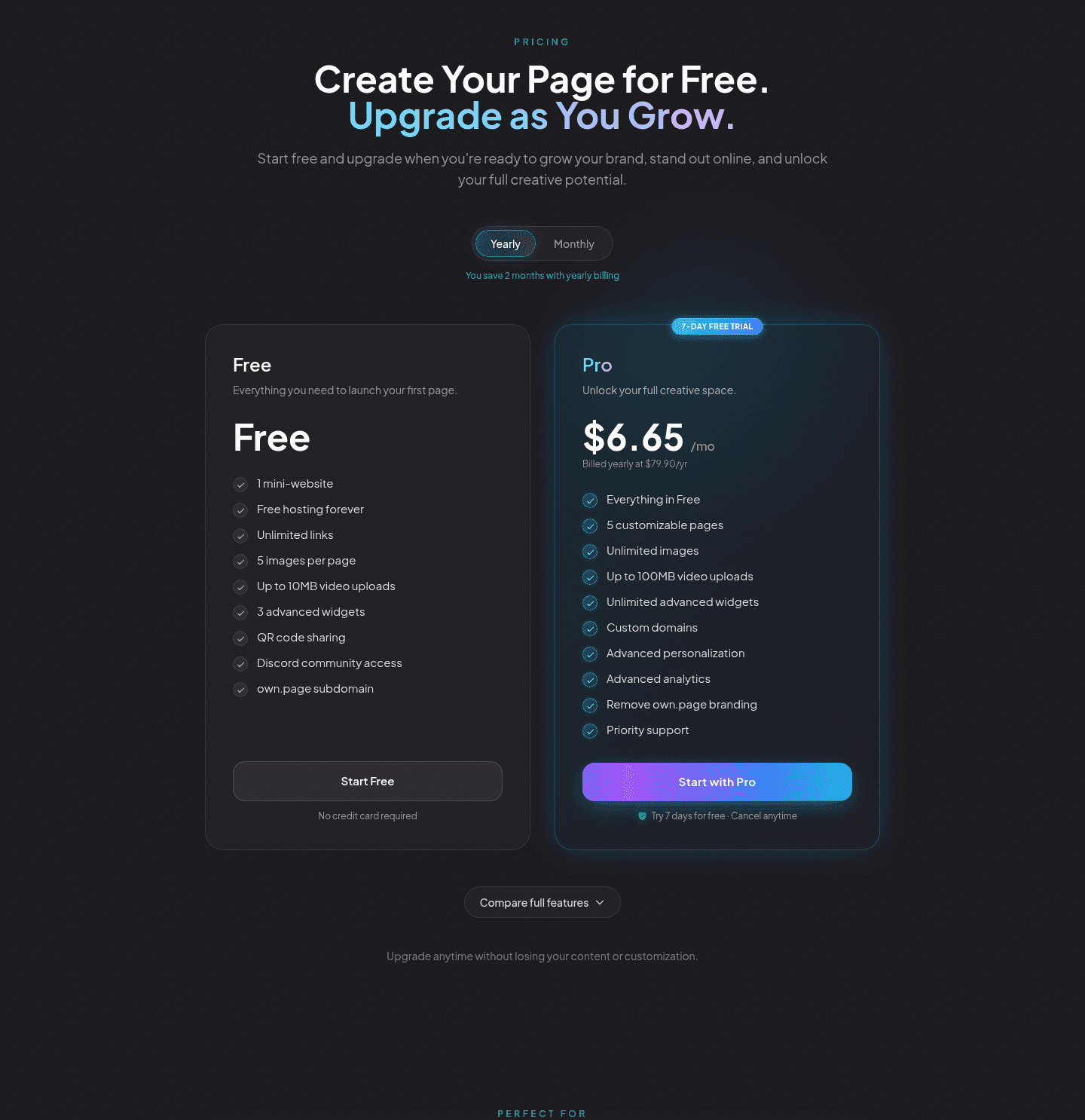
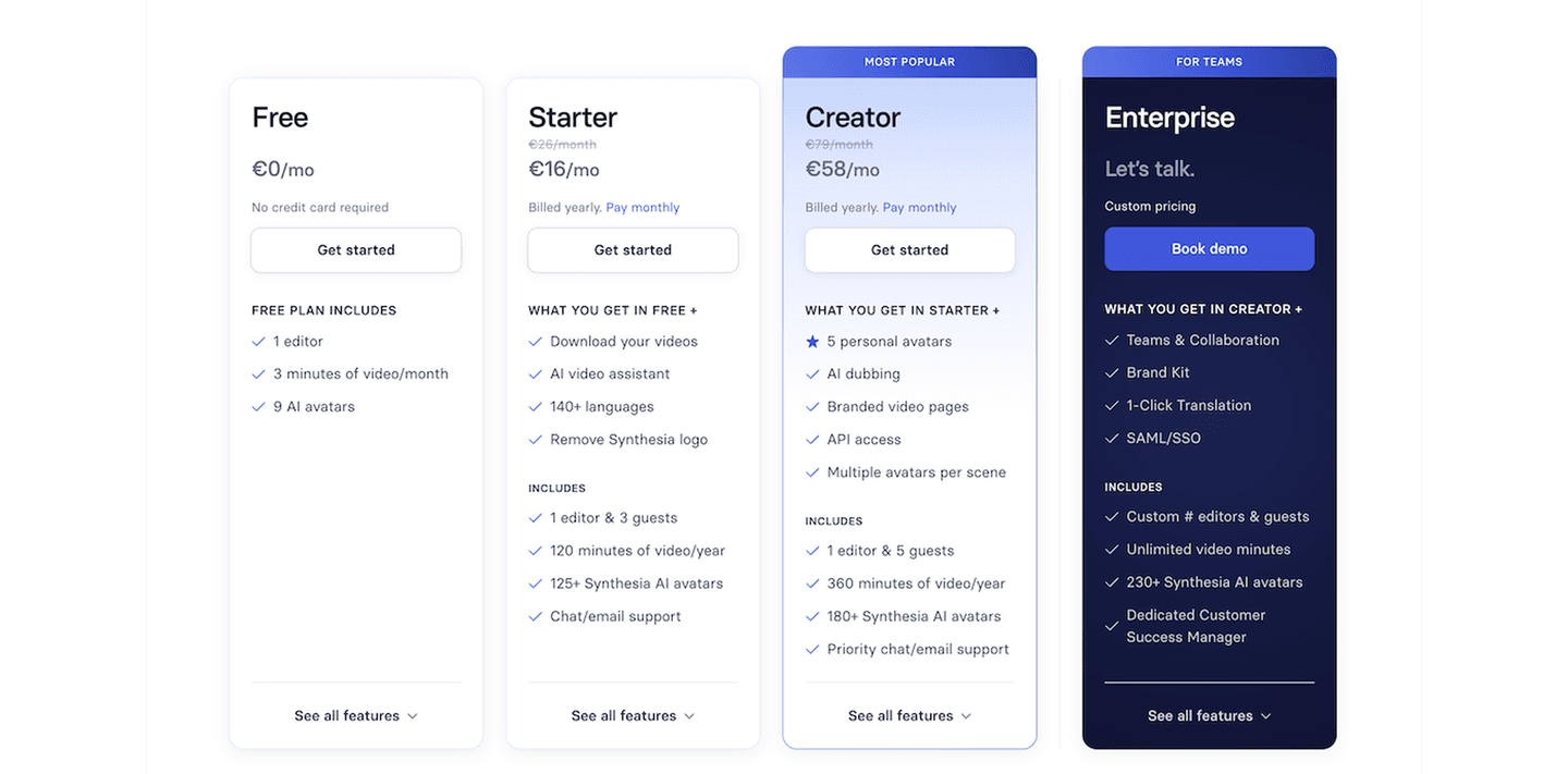
Across the scored examples below, the pricing sections that are easiest to compare share one discipline: they reduce the number of things the eye has to track. Octolens keeps it to three clear tiers, each with a one-line description and a target-brand label, so the choice reads as Pro, Scale, or Enterprise before any feature enters the picture. PhotoRoom and PandaDoc use Everything in the previous plan plus the extras stacking, which turns the upgrade path into a short list of additions instead of four full feature lists the buyer has to diff. Raycast, Clay, and Alchemy each lift one card and badge it, so the undecided buyer is handed a default rather than left to weigh every tier equally. And where usage changes the price, the clearest sections spell the math out on the card, the way Alchemy's usage slider and CompanyCam's team-size stepper recalculate the plan in front of the buyer.
Easy comparison rarely does the work alone. It reads best next to value-based plan names that signal a progression rather than generic tier numbers, and a recommended-plan badge that anchors attention on the tier most buyers should pick, so the visitor compares, reads the ladder, and lands on a sensible default.
67/100 11/100
The usual failure is a set of cards that look identical: four plans, four long feature lists in the same order, and no visual cue for which one to choose. The buyer has to compare line by line, and most will not. The second is misaligned rows, where a feature sits third on one card and seventh on the next, so reading across becomes a hunt. The third is leaving every tier equal, with no highlighted or recommended plan, which quietly pushes the decision back onto the visitor at the exact moment they wanted the page to make it easy. Keep the tiers few, line the rows up, and flag the plan most buyers should pick.

Curated by
Gabriel Amzallag , Founder, Web Anatomy
5 years CRO + SEO at Qonto (2021–2025). After advising 15+ SaaS on their websites (Payfit, Pigment…), the same patterns kept breaking, so I decided to build the source of truth on what works on the web: the intelligence layer every tool, builder, and team uses to ship sites that perform.
Paste your URL. Get a scored analysis of your pricing section, including whether your plans are genuinely easy to compare. Free, no signup.
The common questions about making pricing plans easy to compare, with answers drawn from 70 scored examples.
It comes down to a few things working together: a small number of named tiers, each with a one-line description of who it fits; feature rows that line up in the same order across every card; a highlighted or recommended plan that gives the undecided a default; and a consistent price and billing format on all tiers. Octolens keeps it to three labeled tiers, and PhotoRoom stacks its plans as Everything in the previous one plus the extras, so the buyer reads the differences instead of re-reading the whole list.
The pricing section is where a visitor switches from reading to deciding. If the plans are hard to tell apart, the decision stalls and the buyer leaves to think about it. Laying the tiers out next to each other, with the differences pulled to the surface, does the comparing for the buyer so they can pick the plan that fits in seconds rather than studying four near-identical lists.
Most of the easiest-to-compare examples land on three or four. Octolens, Raycast, and Sleek Analytics use three; PhotoRoom, PandaDoc, and CompanyCam use four. Beyond that the eye struggles to hold the plans in view at once, which is why sections with five or six tiers lean harder on a highlighted plan and clear names to keep the choice manageable. The number matters less than whether a buyer can tell the tiers apart at a glance.
Almost always. A highlighted plan gives the undecided buyer a default, which is the fastest way to unstick a comparison. Raycast elevates its center Pro card, Clay puts a Recommended badge on Growth, PandaDoc runs a MOST POPULAR ribbon on Business, and Alchemy flags its middle card Most flexible. The badge is not a trick; it is the page answering the question most buyers arrive with, which is simply which one should I pick.
Three things, usually. Cards that look identical, with the same long feature list on every plan and no cue for which to choose, so the buyer has to compare line by line. Misaligned feature rows, where the same feature sits in a different position on each card, so reading across becomes a hunt. And treating every tier as equal, with no recommended plan, which hands the decision back to the visitor. The fix is fewer tiers, aligned rows, and one clearly flagged plan.