Contact|
Confirmation clarity removes the guesswork after submit by telling a visitor the next step, when to expect a reply, and what a booked call will cover, before they decide the form is worth filling.
Key takeaways
Showing 22–26 of 26 examples
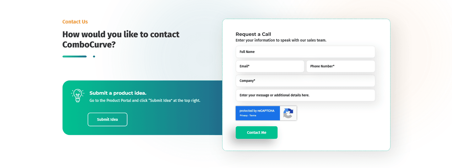
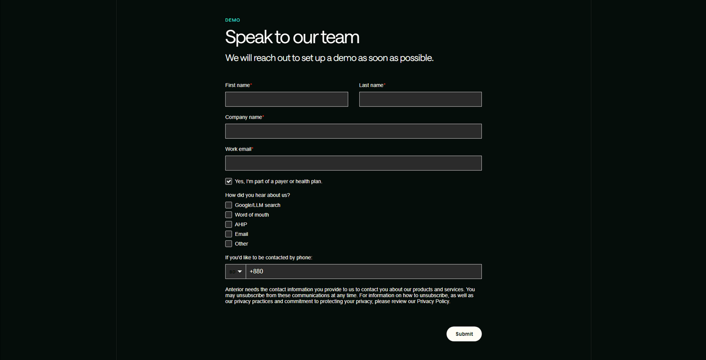
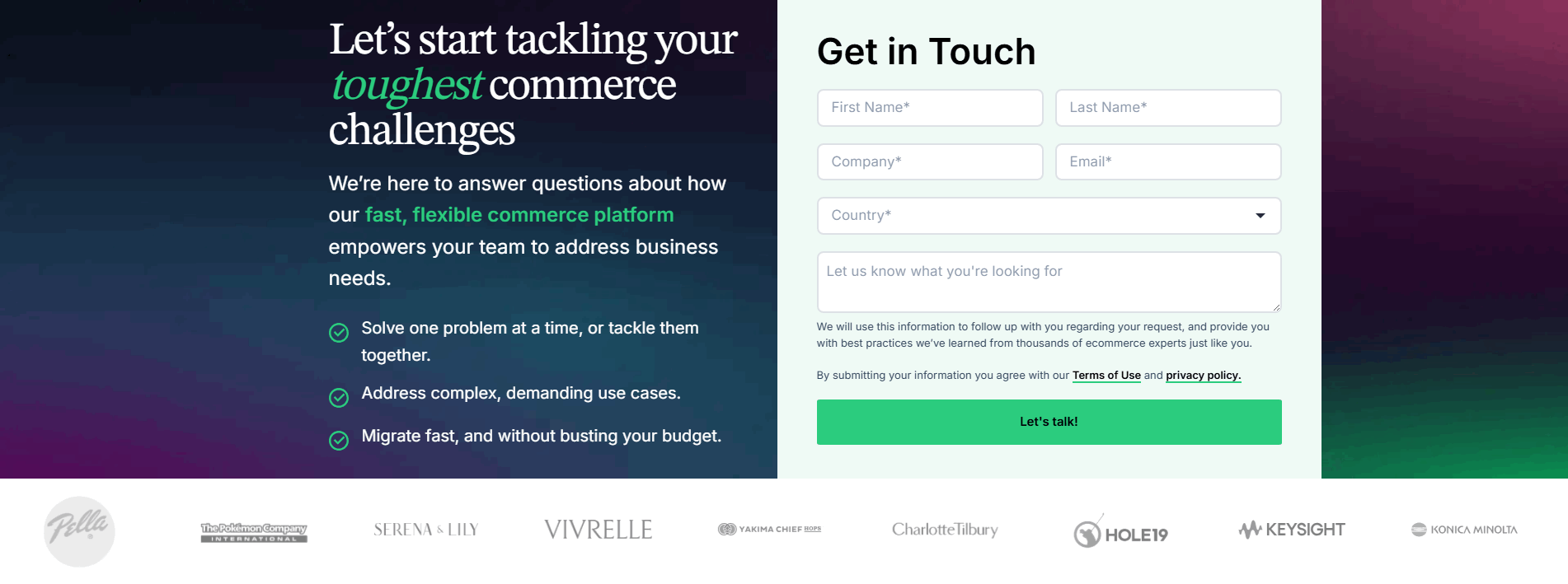
Browse every contact pattern by UX best practice.
Every contact section is scored across 5 conversion best practices. Copy the best practice stack, not the layout. See what converts and why.
Hand-picked from 350+ companies and analyzed by our AI conversion agent. Not a random dump of contact forms. Every entry earns its spot.
Built a contact section? Run yours through the same scoring engine. See where you stand on the same best practices, and what to fix first.
Confirmation clarity is the decision to tell a visitor what happens after they submit, instead of leaving them to guess. A form without it ends in silence: the visitor hands over their details, the page reloads, and nothing says whether it worked, when a reply is coming, or what a booked call is even for. A form with it turns that dead moment into a promise. The submit button stops being a leap and starts being a step the visitor can see the far side of.
The pattern takes a few concrete forms:
A contact form asks a visitor to give up their details and then wait. That wait is the riskiest moment in the whole interaction, because the visitor has already paid the cost of filling the fields and has received nothing back yet. If the page says nothing about what comes next, the silence does the talking, and silence reads as doubt: maybe it did not send, maybe no one is watching the inbox, maybe the call is a hard sell.
Naming the next step removes the doubt at the exact point it forms. A stated reply window tells the visitor the team is attentive, not automated. A booking that shows the meeting length and agenda tells them the call is worth the calendar hold. The clarity costs a single line of copy and buys back the confidence a blank submit button quietly drains.
Just under half of the scored contact sections below make the next step explicit, so the discipline is common without being universal, and that gap is the opportunity. The versions that work are specific rather than reassuring in the abstract. Wiz sets expectations by listing what the 30-minute demo covers, from visibility to attack vectors to critical risks, so the visitor knows the call before they book it. Cybersmart previews exactly what the booked call covers, from the platform walkthrough to first-client onboarding. Cal.com goes as far as promising "no fluff" and a demo tailored to the visitor's tech stack. The pattern is not "add a thank-you page," it is "tell the visitor what they are signing up for while the form is still blank, then deliver on it."
Confirmation clarity rarely stands alone. It pairs naturally with a short first ask that gets the visitor to submit and with trust signals in the form that make handing over details feel safe, so it is worth reading how the same pages handle all three together.
50/100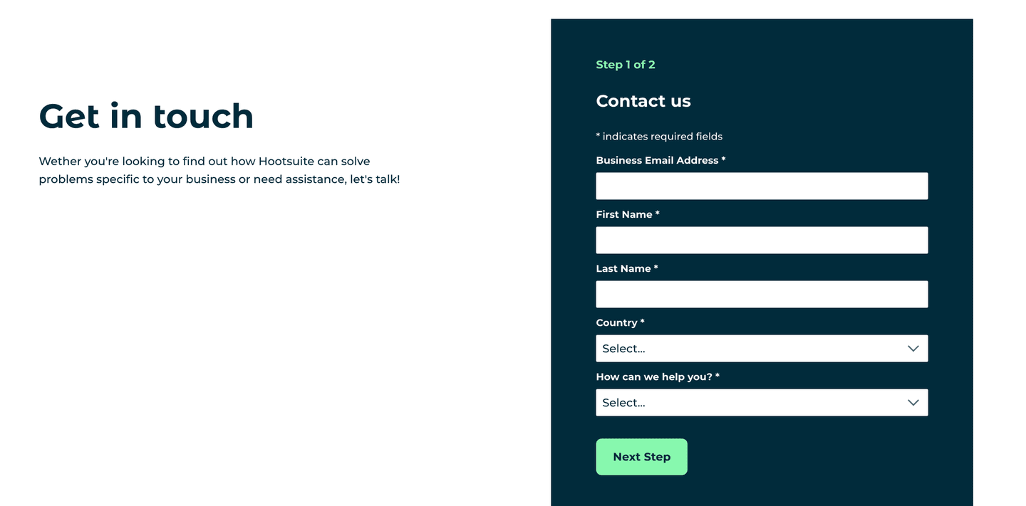 0/100
0/100The first failure is the void: a form that submits into silence, with no confirmation state and no next-step copy, so the visitor cannot tell whether it worked or whether anyone is coming. The second is the vague promise, a "we'll be in touch" with no window attached, which is barely better than saying nothing because the visitor still cannot plan around it. The third is a booking with no context, an embedded calendar that never states the meeting length or what the call will cover, so the visitor hesitates to hold time for a conversation they cannot picture. Name the next step, attach a real reply window, and tell the visitor what a booked call is actually for.

Curated by
Gabriel Amzallag , Founder, Web Anatomy
5 years CRO + SEO at Qonto (2021–2025). After advising 15+ SaaS on their websites (Payfit, Pigment…), the same patterns kept breaking, so I decided to build the source of truth on what works on the web: the intelligence layer every tool, builder, and team uses to ship sites that perform.
Paste your URL. Get a scored analysis of your contact section, including whether a visitor can tell what happens after they submit. Free, no signup.
The common questions about telling a visitor what happens after they submit, with answers drawn from 26 scored examples.
It is the copy and state that tell a visitor what happens after they submit, so the form does not feel like a message sent into a void. The most common forms are a plain next-step line such as 'we will reach out to set up a demo', a response-time promise like 'we respond within 24 hours', a booking widget that states the meeting length and what the call will cover, and a confirmation or redirect state that names what follows the submit.
A contact form asks a visitor to give up their details and then wait. Without a stated next step, the wait is silent, and silence reads as uncertainty: did it work, when will someone reply, what will the call even be about. Naming what happens next turns that dead moment into a promise the visitor can hold the team to, which makes hitting submit feel safe instead of like a gamble.
Whatever is actually true and specific. The strongest versions state one of three things: a reply window (Benchify prints 'We respond within 24 hours' in the form header, Passive promises a reply usually within one business day, Tobiko Cloud states within two working days), the next action (Symmetrical says an expert will contact you for a short no-obligation call, Elastic Path notes it will follow up regarding your request), or what a booked call covers (Cal.com spells out that the call will discuss your use cases and give a demo tailored to your tech stack).
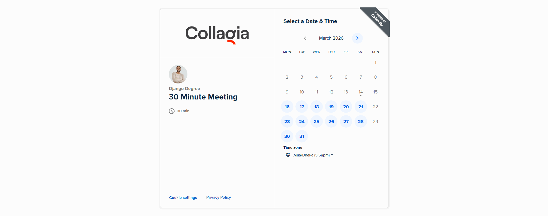
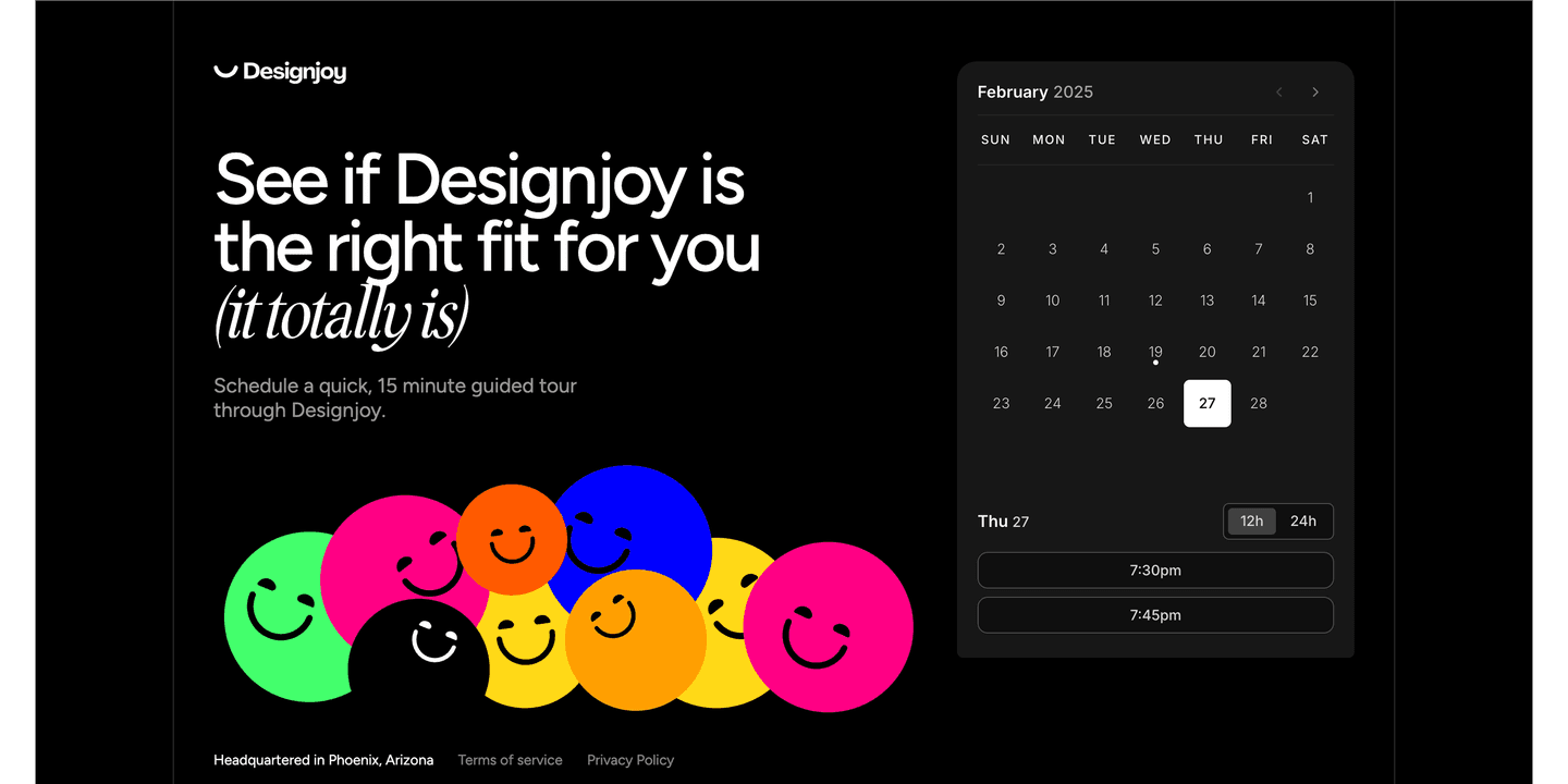
A calendar booking makes the next step concrete by design: the visitor picks a real slot instead of waiting on a reply. The best bookings go further and pre-state the details. Tigerhall shows the meeting location (Zoom) and duration (45 mins) before the prospect books. Scout spells out that web conferencing details are provided upon confirmation and names a fixed 30-minute length. Collagia labels the slot a 30 Minute Meeting with the time zone shown, so nothing about the next step is left to guess.
A confirmation state helps, but the clarity works best before submit, not only after. A visitor decides whether to fill the form based on what they can see while the fields are still blank, so the strongest contact sections set the expectation up front: a step indicator like PandaDoc's 'Fill out the form, Book a time slot, Attend a demo', a header response-time promise, or a line that names what the call covers. The post-submit confirmation then delivers on a promise the visitor already read.