Testimonial|
A case-study-depth testimonial pairs a real, named customer with the challenge they faced, what they did, and a measured result, so a buyer can verify the claim instead of taking a one-line quote on faith.
Key takeaways
Showing 43–63 of 69 examples
Browse every testimonials pattern by UX best practice.
Every testimonial section is scored across 6 conversion best practices. Copy the best practice stack, not just the layout. See what builds trust and what falls flat.
Hand-picked from 350+ companies and analyzed by our AI conversion agent. Not a random dump of quote cards. Every entry earns its spot.
Found a testimonial section you admire? Run yours through the same scoring engine. See where you stand on the same best practices, and what to fix first.
Case-study depth is the choice to back a testimonial with a real customer story rather than a single line of praise. A named person from a named company is tied to a concrete before-and-after: the problem they started with, what they did, and a measured result a buyer can check. The point is verification. A short quote asks a visitor to trust a stranger's opinion, while a story gives them something to weigh.
The best testimonial sections build that depth from a few forms, usually more than one at once:
A considered purchase is a skeptical one. A buyer weighing a real commitment does not take praise on faith, they look for evidence that someone like them got a real outcome. A one-line quote gives them nothing to check. A case-study-depth testimonial gives them a named person, a named company, and a measured result, which together read like proof rather than opinion.
The depth also does two jobs at once. The hard number keeps the card scannable for the visitor who is skimming, while the linked case study waits for the buyer who needs to be convinced. Nobody is forced to read the whole story, but the story is there the moment a skeptic wants it. That is the difference between a quote a visitor glides past and one they actually stop to trust.
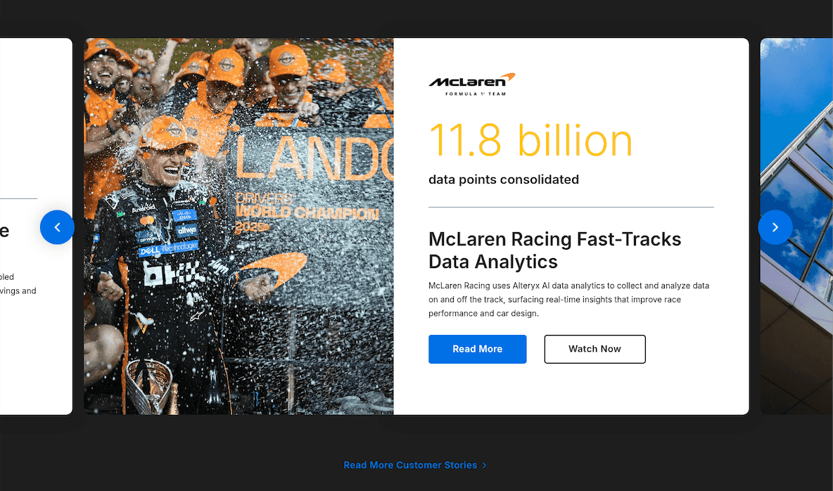
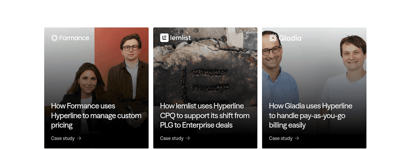
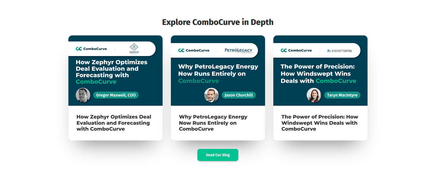
Across the benchmark examples below, the strongest sections lead with the result and keep the full story one click away. Lemlist headlines each card with a hard metric like 6x outbound or 5 to 30 percent of pipeline, frames it as a before-and-after such as from spam to strategy in 90 days, and adds a Discover full story link plus a play icon for the video. Bloomreach pops the outcome in a bold stat card, then structures the story with The Challenge bullets and a How Bloomreach Solved It link, so the depth is genuine and not implied. Pretty Damn Quick runs the full case arc for Underoutfit, walking through the challenge, the tactics tested, and a close to seven-figure revenue result anchored by a quote from the Co-founder and CEO. Arrows pairs a video testimonial from Jon Dick, Chief Customer Success Officer at HubSpot, with pulled-out stats of 30 percent faster customer activation and 15 hours saved per week. VC Boom shows per-category score bars moving from 64 to 87 and ties each win to a named managing director with a LinkedIn link, while Tobiko Cloud writes each card as a mini case study with a clear before-and-after arc. Altura keeps it simple and verifiable, showing a win rate up from 40 to 60 percent beside a Read the case study link.
Depth works best when the result is easy to catch and the arc is clear. The strongest sections pair the case study with highlighted key phrases so the metric jumps out, with a before and after story so the change is concrete, or with a video testimonial so the customer tells it in their own voice.
67/100 0/100
0/100The usual failure is depth that is only implied: a Read case study link that leads nowhere real, or a card that promises a story it never tells. The second is burying the result, where the metric is so small or so buried in prose that a skimmer never catches the payoff the story exists to prove. The third is a story with no number, all narrative and no measured outcome, so a buyer has nothing concrete to weigh their own decision against. Lead with the customer's real result, lay out the challenge and the outcome so the arc is clear, and make sure the link actually opens the full case a skeptic can verify.

Curated by
Gabriel Amzallag , Founder, Web Anatomy
5 years CRO + SEO at Qonto (2021–2025). After advising 15+ SaaS on their websites (Payfit, Pigment…), the same patterns kept breaking, so I decided to build the source of truth on what works on the web: the intelligence layer every tool, builder, and team uses to ship sites that perform.
Paste your URL. Get a scored analysis of your testimonial section, including whether your quotes carry a real story and a measured result. Free, no signup.
The common questions about backing testimonials with a full customer story, with answers drawn from 69 benchmark examples.
It is a testimonial that carries the weight of a real customer story instead of a single line of praise. A named person from a named company is tied to a concrete before-and-after: the problem they started with, what they did, and a measured result. The forms it takes vary and often combine. A hard metric can headline the card, a Challenge-then-result structure can lay out the story, and a Read the full story or Learn more link can open the complete case for buyers who want the detail behind the number.
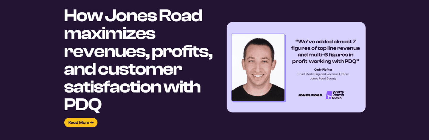
A one-line quote asks a visitor to trust a stranger's opinion. A case-study-depth testimonial gives them something to check. When Pretty Damn Quick walks through Underoutfit's challenge, the tactics tested, and a close to seven-figure revenue result, a skeptical buyer can follow the logic rather than take the praise on faith. The named person, the named company, and the measured outcome together make the claim hard to dismiss, because it reads like evidence a buyer could go and verify.
They lead with the number and let the depth sit one click away. Lemlist headlines each card with a hard metric like 6x outbound or 5 to 30 percent of pipeline, then offers a Discover full story link for anyone who wants the full case. Bloomreach pops the outcome in a bold stat card, then structures the story with The Challenge bullets and a How Bloomreach Solved It link. The result stays scannable for the skimmer, and the depth is there for the buyer who needs to be convinced.
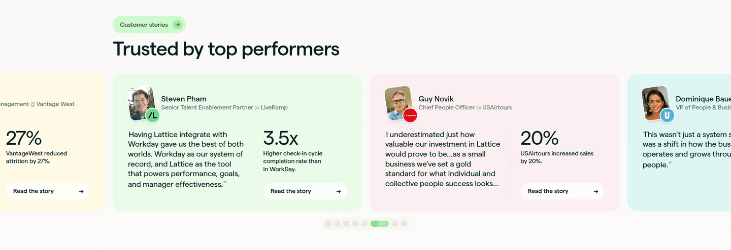
Yes, and they should be the customer's own numbers, attributed to the customer. Arrows pulls 30 percent faster customer activation and 15 hours saved per week beside a quote from Jon Dick, Chief Customer Success Officer at HubSpot, so the outcome is concrete and owned by a named person. A measured before-and-after, like Altura moving a customer's win rate from 40 to 60 percent, is far more persuasive than an adjective. The number is what a buyer weighs their own decision against.
When the purchase is considered and the buyer is skeptical, which is most of B2B. A short quote is fine for a low-stakes signup, but a buyer weighing a real commitment wants to see that someone like them got a real outcome. That is when the challenge, the tactics, and the measured result earn their space. If a page can show even two or three customers who each faced a familiar problem and came out ahead, it gives a hesitant buyer the evidence they need to move.