
Resources|
An email gate for downloads trades a guide, report, or template for a visitor's email address, and it only works when the asset looks worth handing one over.
Key takeaways
Showing 1–12 of 12 examples

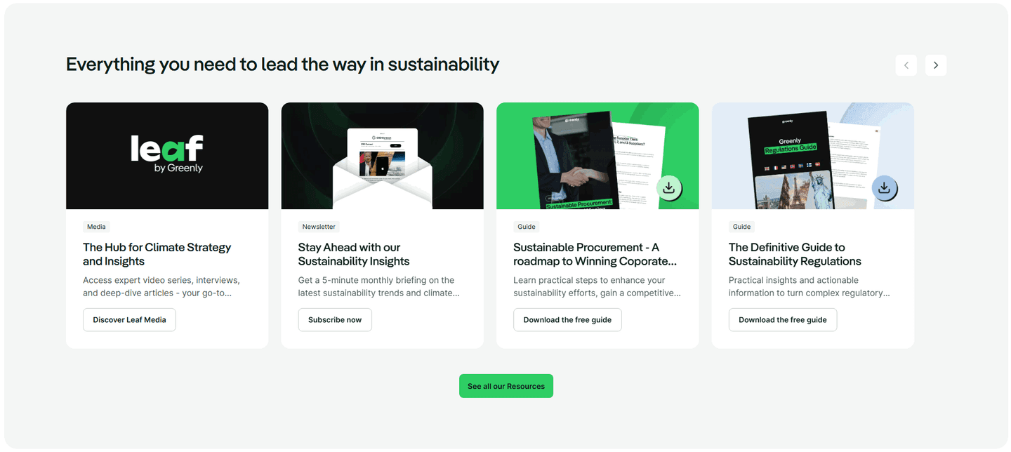


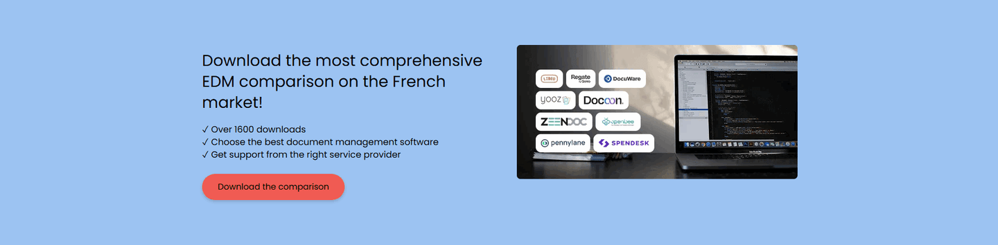
Browse every resources pattern by UX best practice.
Every resources section is scored across 5 conversion best practices. Copy the best practice stack, not the layout. See what converts and why.
Hand-picked from 650+ companies and analyzed by our AI conversion agent. Not a random dump of content blocks. Every entry earns its spot.
Built a resources section? Run yours through the same scoring engine. See where you stand on the same best practices, and what to fix first.
An email gate for downloads is the moment a visitor browsing the resource library reaches for a guide, report, or template and finds a short form standing between them and the file. The download says "this is useful." The form says "tell us who you are first." When the asset clearly earns that ask, the reader fills it in and the company gains a contact. When it does not, the reader closes the tab.
The best resources sections use one of a few forms, sized to the value behind the gate:
A real resource costs time and expertise to produce, and a reader who wants it enough to type an email is telling you something a page view never could. The gate converts that intent into a named contact the team can reach later, while the visitor leaves with a guide or report they can actually use. Both sides get something, which is the whole point of the trade.
The exchange only holds when the value is visible up front. A gate in front of a vague, unlabelled file reads as a toll and gets abandoned. A gate in front of a specific, clearly previewed asset reads as a fair swap, and the reader pays it willingly because they can already see what they are getting.
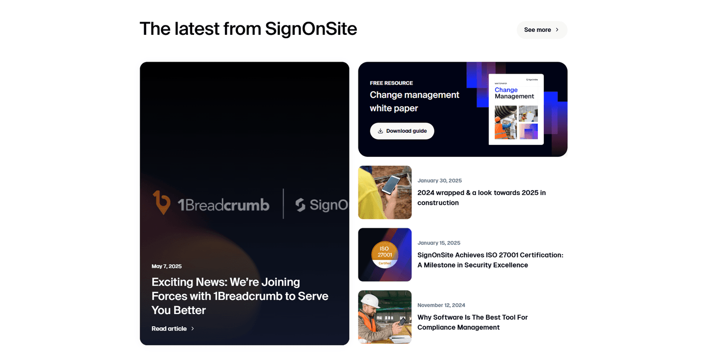
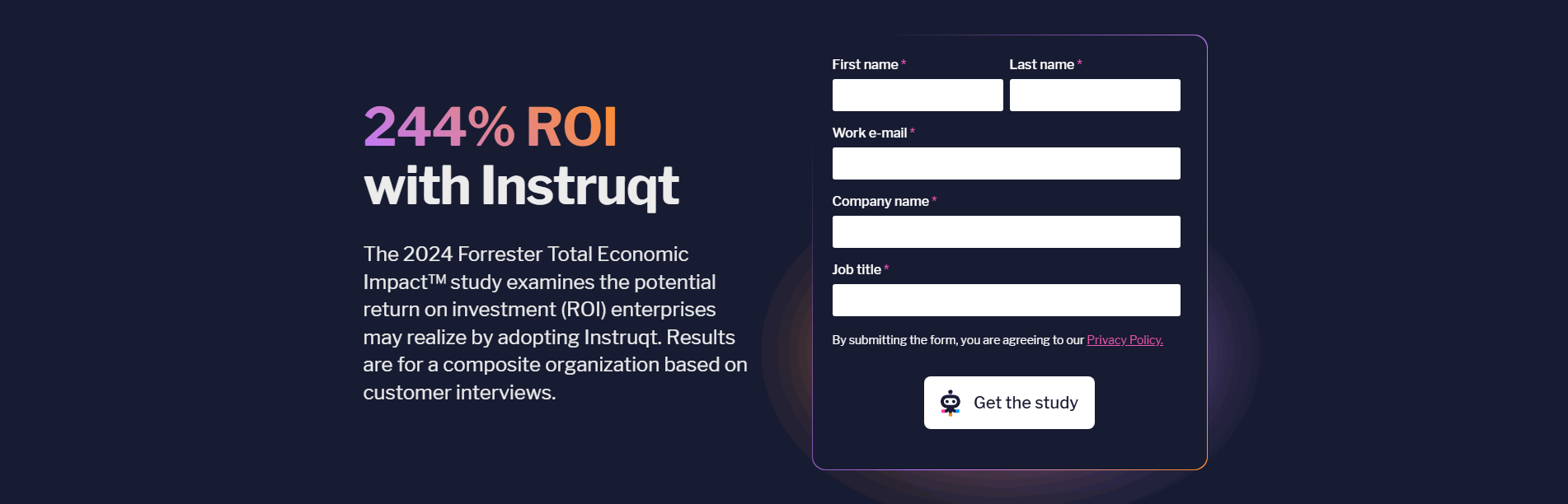
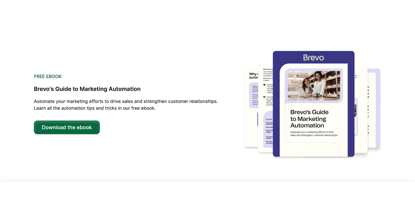
Across the scored examples below, the resources sections that earn the email do three things. They preview the asset before the ask, with a real cover mockup, a specific title, and a line about the payoff, so the visitor can judge the trade before committing. Brevo labels its guide a FREE EBOOK next to a polished mockup, and Contentsquare names its 2026 Digital Experience Benchmarks Report and tells the reader exactly what they will learn. They match the form to the value: a light guide asks for an email and little else, while Instruqt asks for work email, company, and job title because it is gating a Forrester ROI study a serious buyer expects to register for. And they keep the topic tight to the product, so the resource reads as expertise rather than a random magnet. SignOnSite gates a change-management white paper that reinforces its safety-compliance authority, and Veridas puts its Identity Fraud Report front and centre, opening on a hard statistic that makes the download feel like a data source worth having.
A gate rides on the rest of the section doing its job. The visual hierarchy of the resources section has to make the featured asset the obvious focal point, and the authority the resource signals has to justify handing over an address in the first place.
100/100 0/100
0/100The most common failure is gating something thin. When the asset behind the form is a two-page PDF the visitor could have skimmed inline, the email starts to feel like a toll, and most readers leave rather than pay it. The second failure is asking for too much: a long form in front of a light checklist collects fewer addresses than a single field would, and every extra box the visitor cannot see the reason for chips away at the trade. The third is the silent bait and switch, where the promised guide never reaches the inbox, or arrives wrapped in a sales sequence the page never mentioned. The fix is the same each time: preview the value honestly, ask for only what the follow-up truly needs, and deliver exactly what was promised.

Curated by
Gabriel Amzallag , Founder, Web Anatomy
5 years CRO + SEO at Qonto (2021–2025). After advising 15+ SaaS on their websites (Payfit, Pigment…), the same patterns kept breaking, so I decided to build the source of truth on what works on the web: the intelligence layer every tool, builder, and team uses to ship sites that perform.
Paste your URL. Get a scored analysis of your resources section, including whether the asset behind the gate earns the address you ask for. Free, no signup.
The common questions about gating a resource behind an email, with answers drawn from 12 scored examples.
It is a resource in the content library, a guide, template, report, or whitepaper, that a visitor can only download after entering their email address. The reader gets something useful, and the company gets a contact it can follow up with. The most common forms are a single email field in front of an ebook, a short lead form for a heavier report, a report-access gate, and a webinar or event registration.
A substantial resource costs real time to produce, and a reader who wants it enough to hand over an email is signalling genuine interest. The gate turns anonymous traffic into named contacts a sales or marketing team can reach later, while the visitor walks away with a guide or report they can use now. It only pays off when the asset is worth the address.
The visitor needs to see what they are getting before they give anything up. A specific title, a cover mockup, and a line about the payoff let them judge the trade. Honesty matters too: label the asset clearly, ask only for what the follow-up truly needs, and deliver exactly what was promised. When the preview is vague or the form is long, the email starts to feel like a toll rather than an exchange.
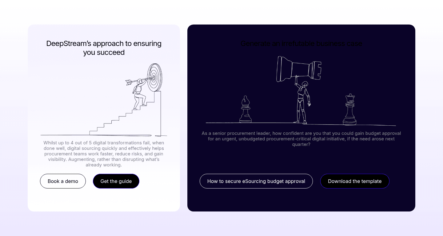
As few as the asset justifies. A light guide or ebook should ask for an email and little else, because every extra field costs sign-ups. A heavier asset, like an analyst report or an ROI study, can reasonably ask for work email, company, and job title, since a serious buyer expects to trade a few details for research of that depth. Match the ask to the value.
Gate the assets that carry real, original value: a benchmark report, a definitive guide, a comparison study, a template a buyer would otherwise build themselves. Leave articles, short posts, and light reference content open so they can be found, read, and linked. Gating something thin backfires, because the visitor can tell it was not worth the address and leaves with a worse impression than if it had been free.