
Resources|
A resources section builds authority when it leads with original data, expert insight, and flagship reports instead of generic filler.
Key takeaways
Showing 1–21 of 81 examples
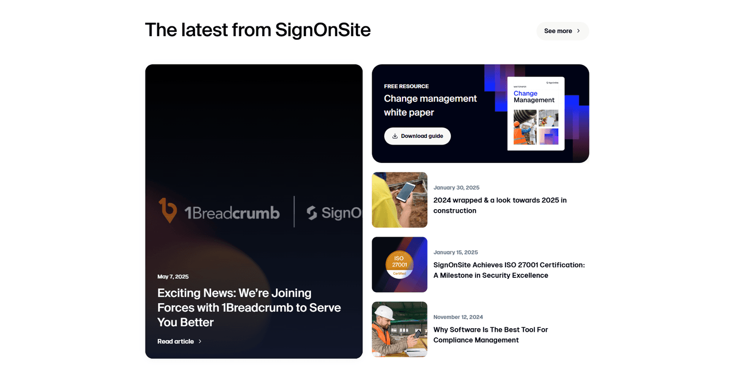
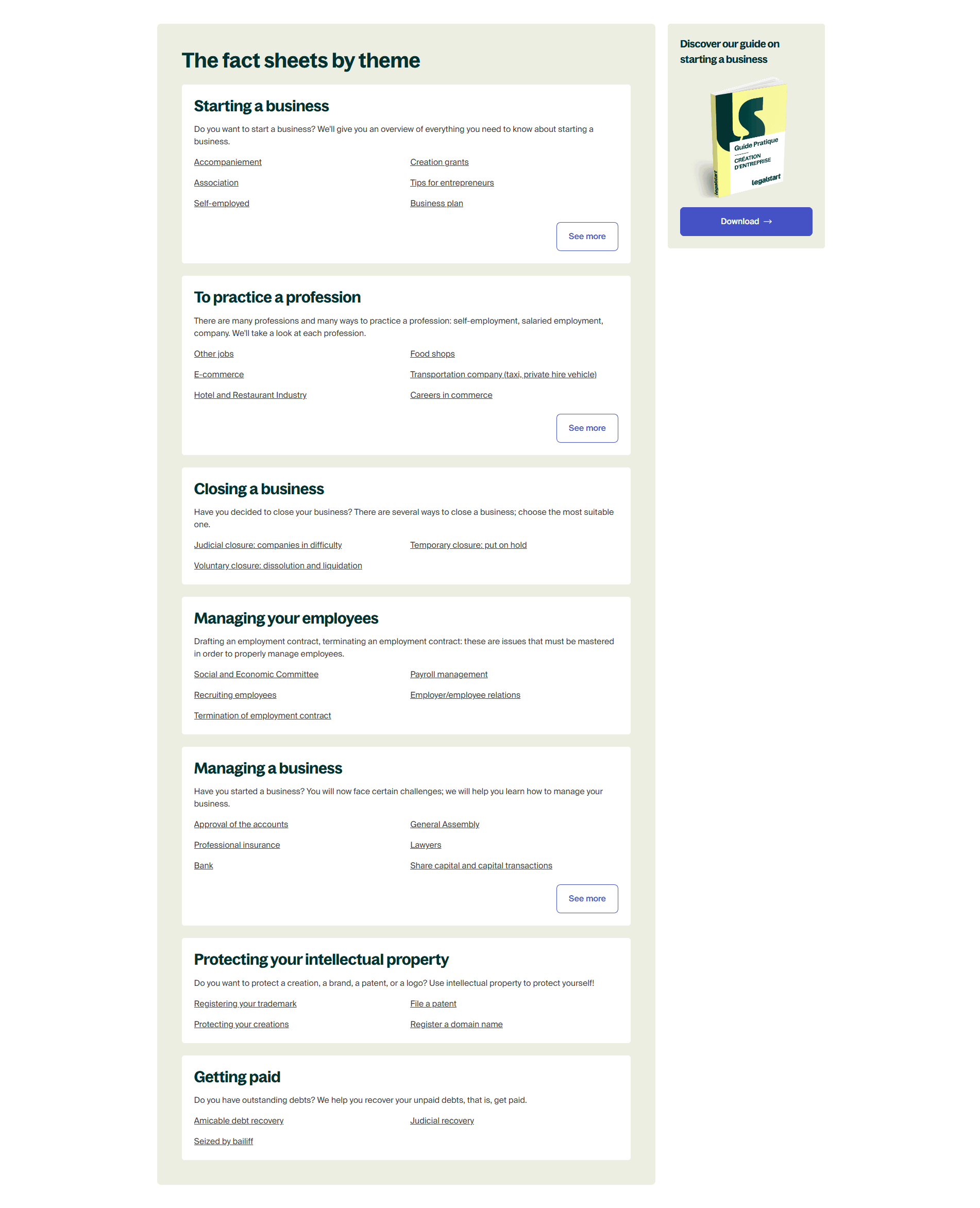
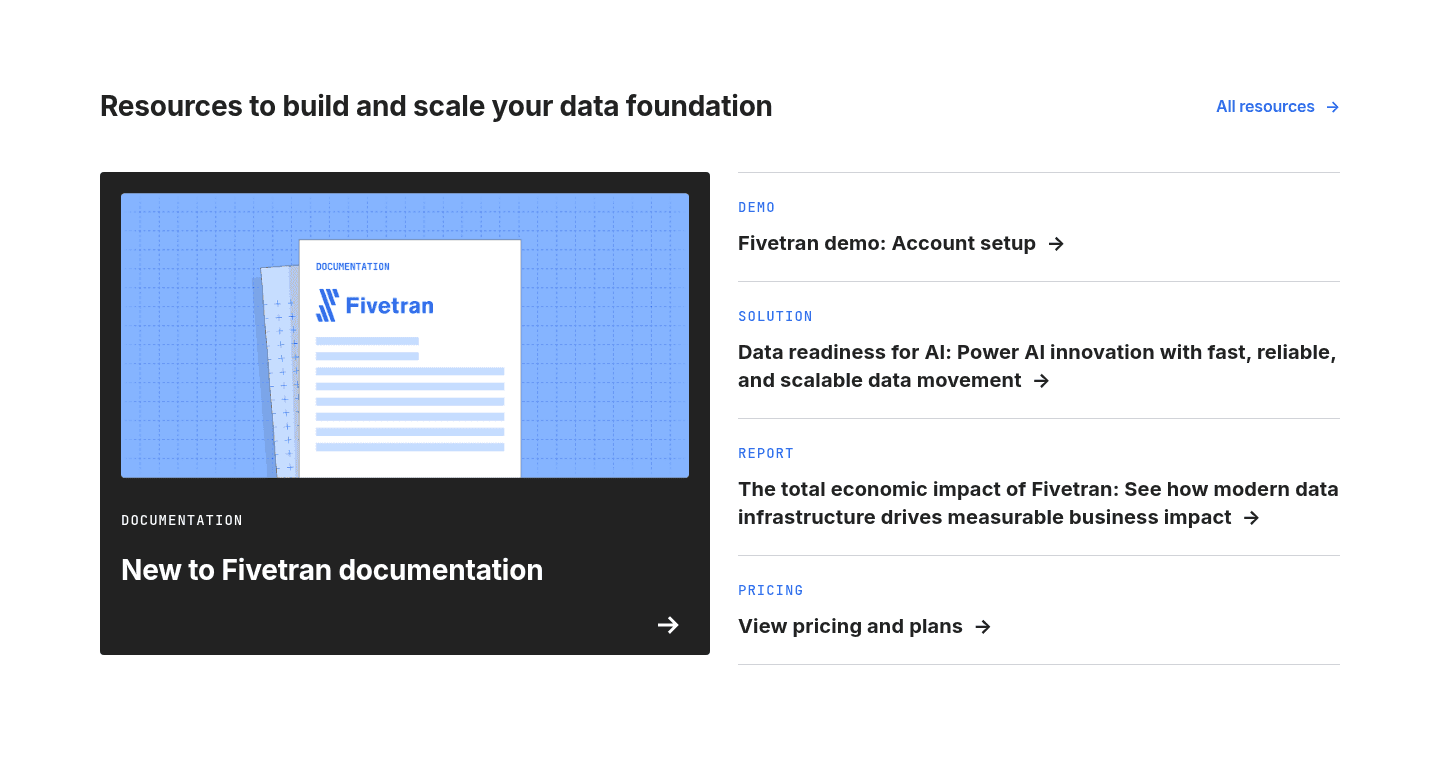
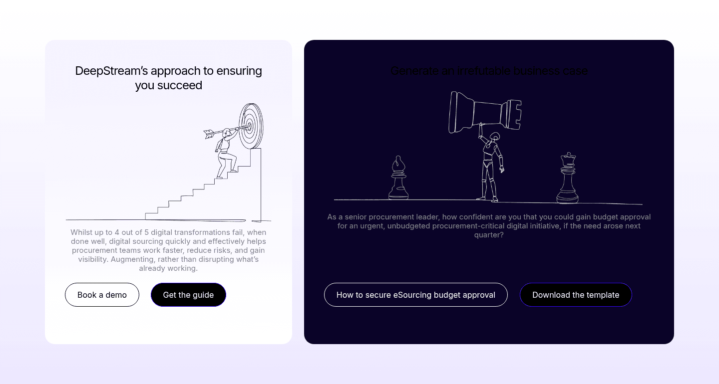

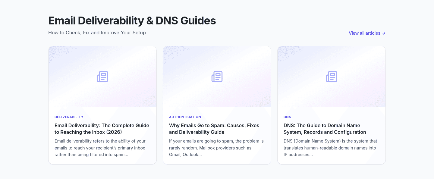
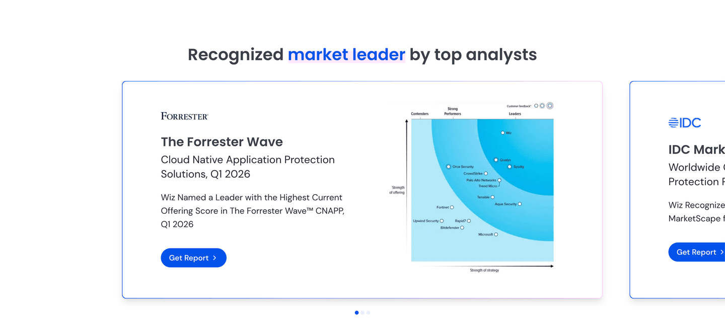

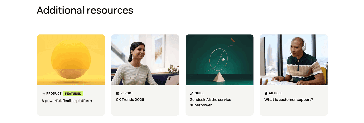
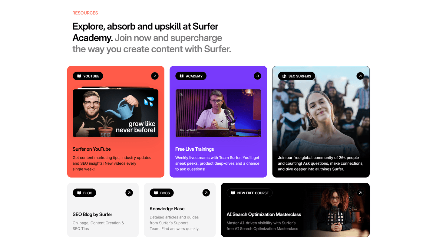
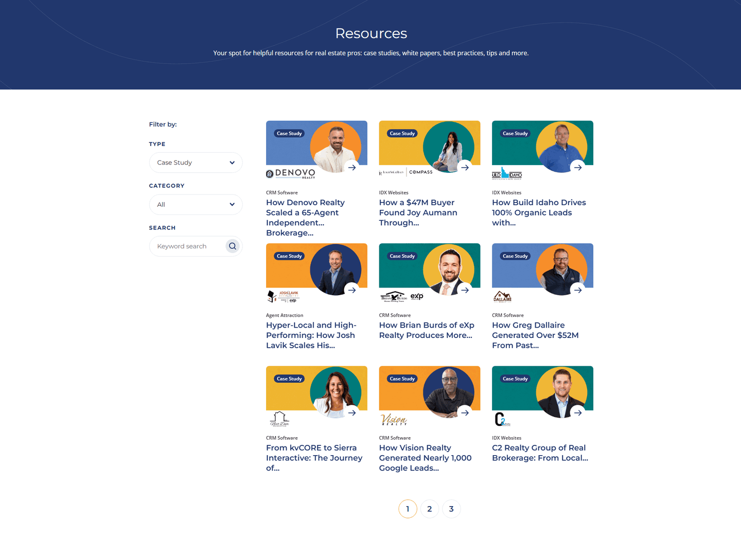
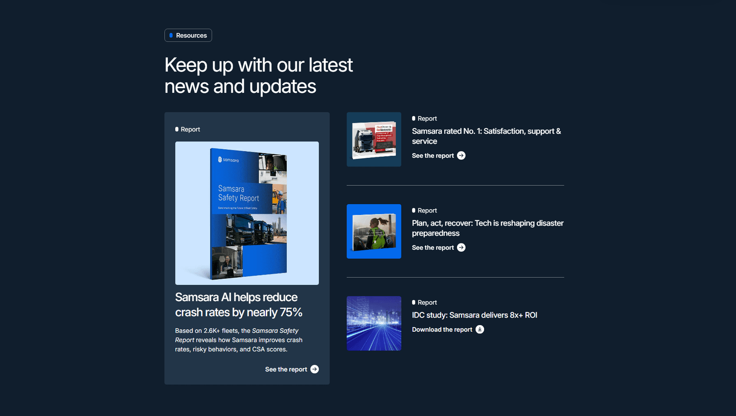
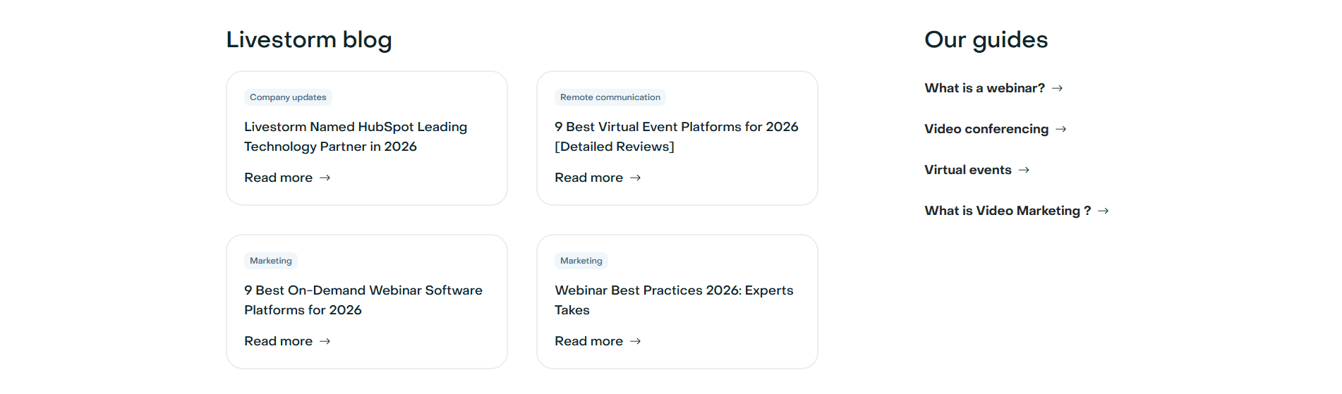

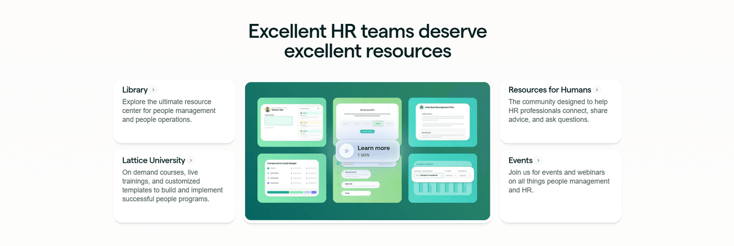
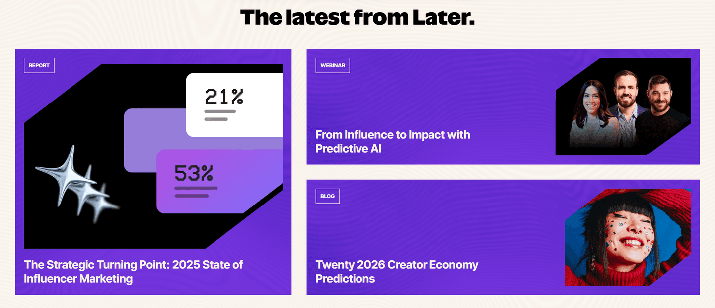
Browse every resources pattern by UX best practice.
Every resources section is scored across 5 conversion best practices. Copy the best practice stack, not the layout. See what converts and why.
Hand-picked from 650+ companies and analyzed by our AI conversion agent. Not a random dump of content blocks. Every entry earns its spot.
Built a resources section? Run yours through the same scoring engine. See where you stand on the same best practices, and what to fix first.
An authority-building resources section is a content hub that leads with material only this company could produce. The point is not to have a blog. The point is to show buyers, before any sales conversation, that the brand is a source other people learn from. A borrowed article makes the company a follower. An original report, a proprietary data set, or a piece of analyst recognition makes it the reference.
The best sections use one of a few forms, sometimes layered together:
Authority is the objection a resources section is built to answer. A buyer comparing tools rarely doubts that a product works. They doubt whether the company behind it actually understands the problem. Original research, proprietary data, and expert content answer that doubt with evidence instead of adjectives, and they do it in the buyer's own language, on the topics the product is about.
The effect compounds because this content is quotable. A flagship report gets cited, linked, and pulled into AI answers, which sends the brand's own framing out into the market. A generic blog post about "5 tips" does none of that. The section that publishes something worth citing earns credibility every time someone repeats it.
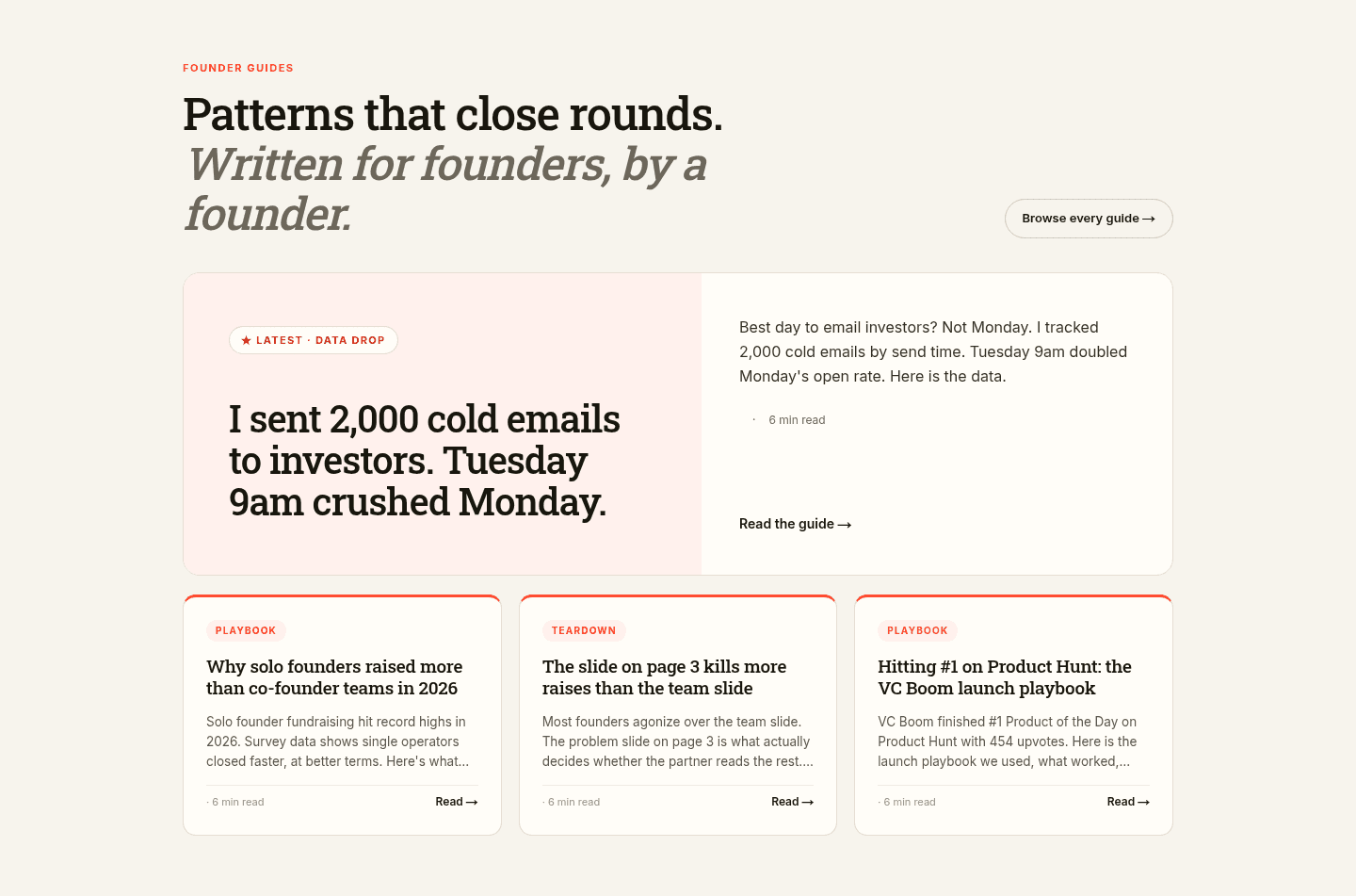
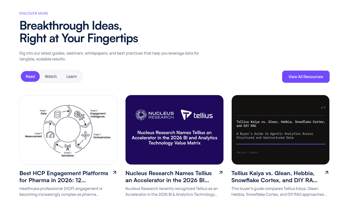
The disciplined version curates rather than dumps. Across the scored examples below, the strongest sections give one flagship asset the largest tile and let the rest fall into a smaller, ordered grid, so a visitor's eye lands on the piece that does the authority work first. They keep every topic tied to the product: Veridas writes about identity fraud, Legalstart publishes practical legal guides, Samsara reports on fleet safety, and nothing feels off-theme. And they route the strongest asset somewhere real, whether that is a report download, an analyst PDF, or a gated premium guide.
Curation is the throughline across the whole resources section library, where the same discipline separates a credible hub from a wall of links. The best sections also earn their authority twice: original data doubles as proof, the way Bloomreach turns a case study result into a hard number and Arrows lets a "HubSpot chooses Arrows" post carry both expertise and social proof.
100/100 0/100
0/100The usual failure is filler: a grid of generic, borrowed, or thin posts that could sit on any competitor's page and prove nothing about this company. The second failure is a flat hierarchy, where a dozen equal tiles hide the one original asset that would have built credibility. The third is drift, where topics wander away from the product until the section reads as a content team justifying its budget rather than an expert speaking to a buyer. Lead with one thing only this company could publish, give it the largest tile, and keep every topic on the problem the product solves.

Curated by
Gabriel Amzallag , Founder, Web Anatomy
5 years CRO + SEO at Qonto (2021–2025). After advising 15+ SaaS on their websites (Payfit, Pigment…), the same patterns kept breaking, so I decided to build the source of truth on what works on the web: the intelligence layer every tool, builder, and team uses to ship sites that perform.
Paste your URL. Get a scored analysis of your resources section, including whether it positions you as a source worth citing. Free, no signup.
The common questions about turning a resources section into a credibility signal, with answers drawn from 81 scored examples.
The content itself. A resources section builds authority when it publishes things only this company could publish: original research, proprietary data, a flagship report, or a genuine point of view. A grid of borrowed blog posts positions the brand as a follower. An original Identity Fraud Report or a proprietary logistics index positions it as the source other people cite.
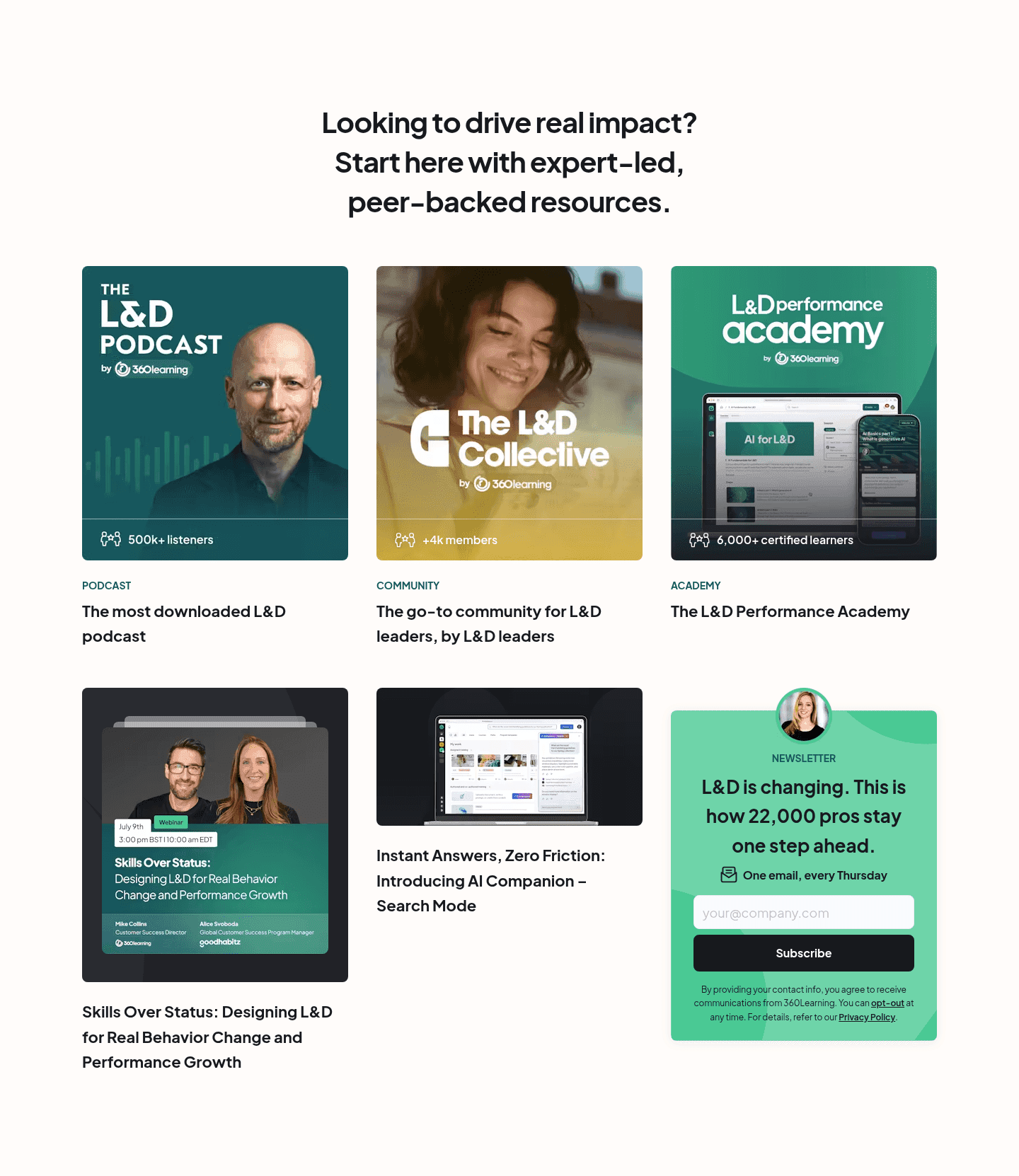
The common ones are a flagship original report given hero treatment, a proprietary data point pulled to the front, third-party analyst recognition like a Forrester Wave or IDC MarketScape, owned media such as a podcast or academy, and a themed library of expert guides. The strongest sections lead with one of these rather than spreading attention across a flat, undifferentiated grid.
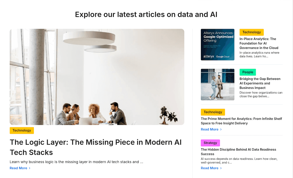
A generic blog feed shows whatever was published last, in date order, with no priority. An authority-building resources section curates. It gives one flagship asset the largest tile, keeps every topic tied to what the product does, and leads with proof a reader cannot get elsewhere. The difference is editorial intent, not the number of articles.
It depends on the asset and the audience. A deep original report or a premium comparison guide justifies an email gate, because the download signals real intent and the content is worth the exchange. Lighter articles and evergreen guides usually stay open so they can rank and be shared. Many strong sections do both: an open library with one gated flagship.
Enough to prove depth without burying the priority item. One large featured asset beside two or three secondary cards is the most common shape, with a link into the full library for readers who want more. Showing a dozen equal tiles flattens the hierarchy and hides the one piece that does the authority work.