Resources|
A clear visual hierarchy turns a resource hub into something a visitor can scan in seconds, leading with one featured item and grouping the rest so the content that matters is found first.
Key takeaways
Showing 1–21 of 34 examples
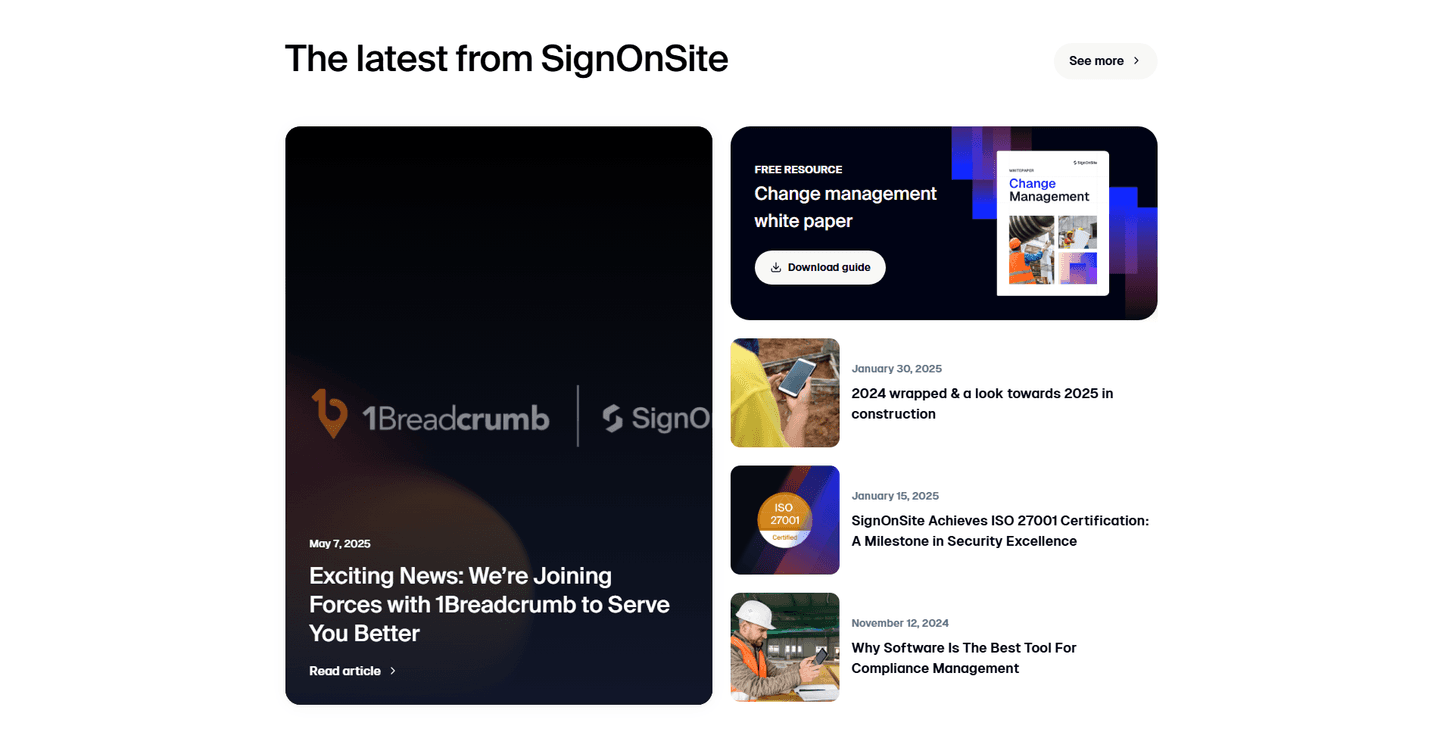
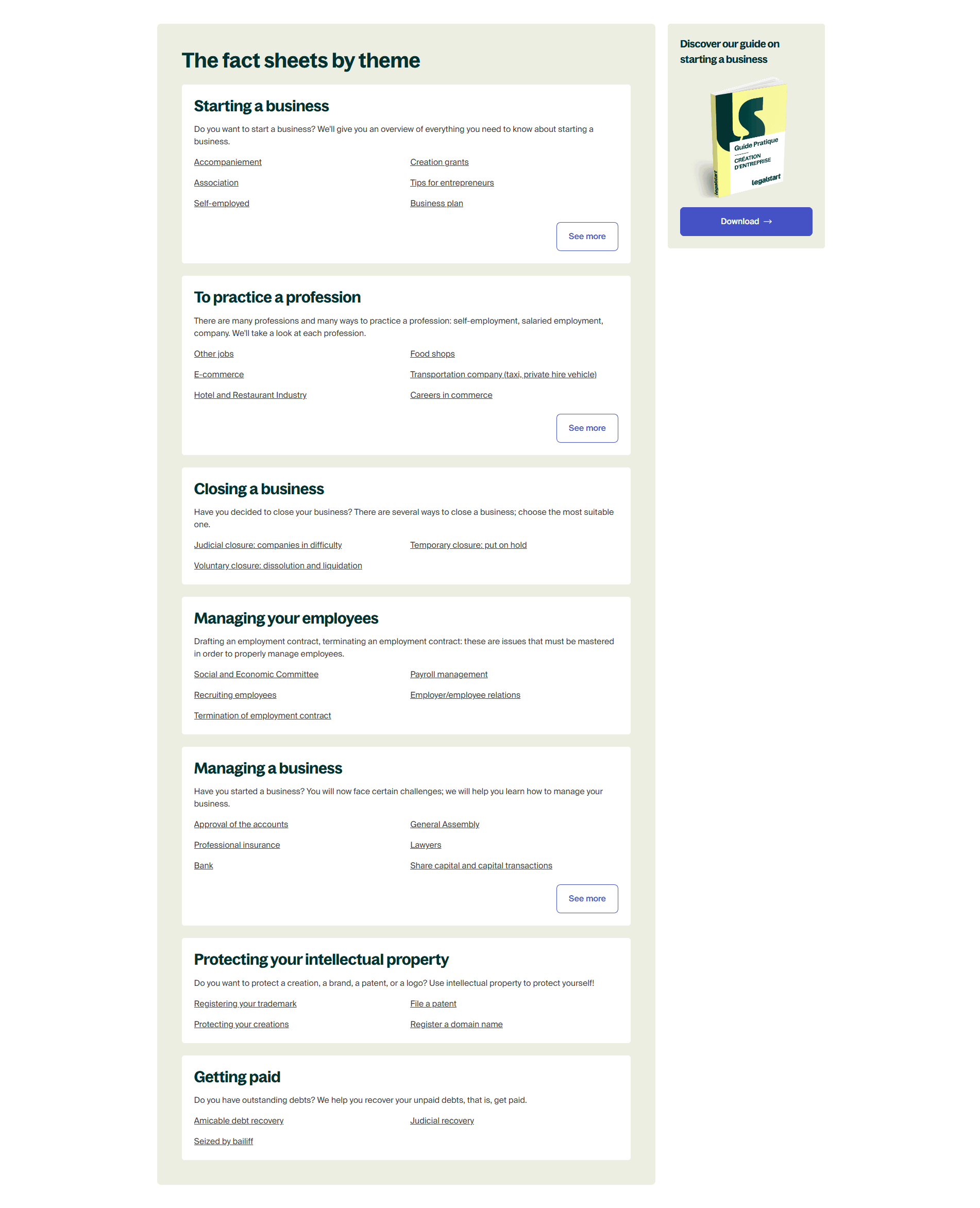
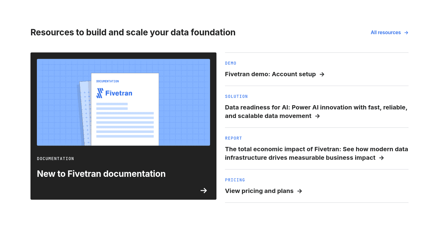
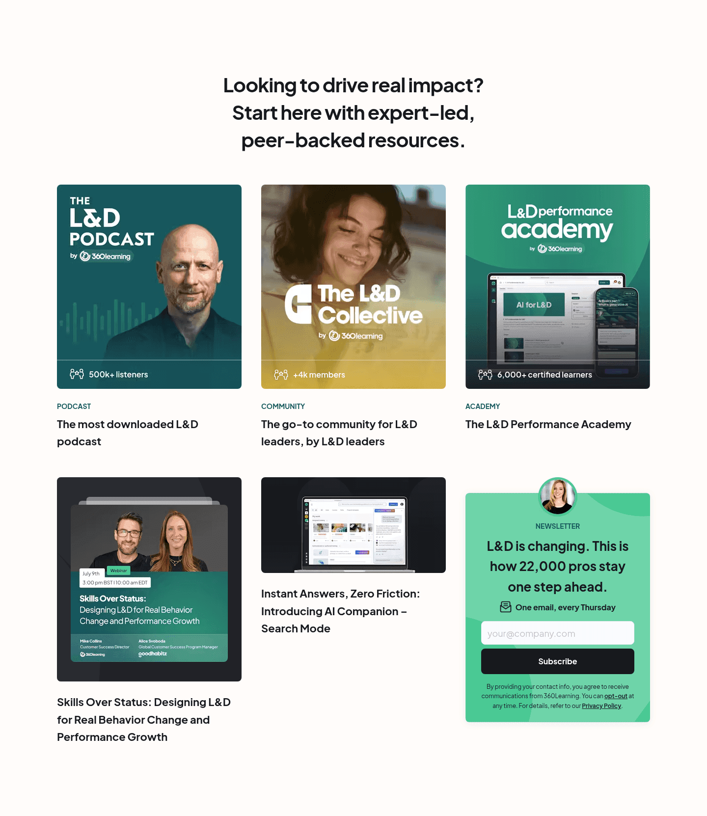
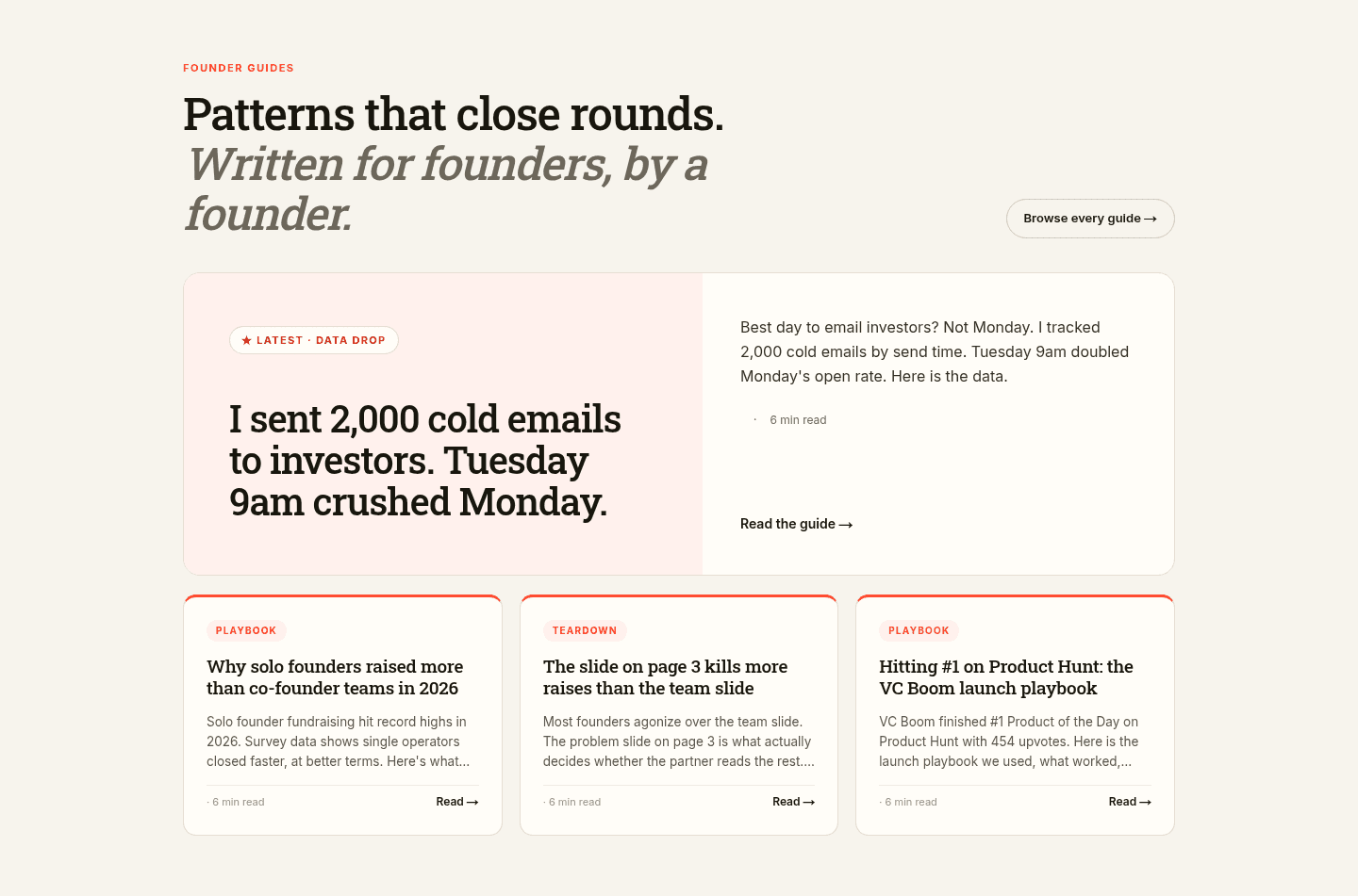
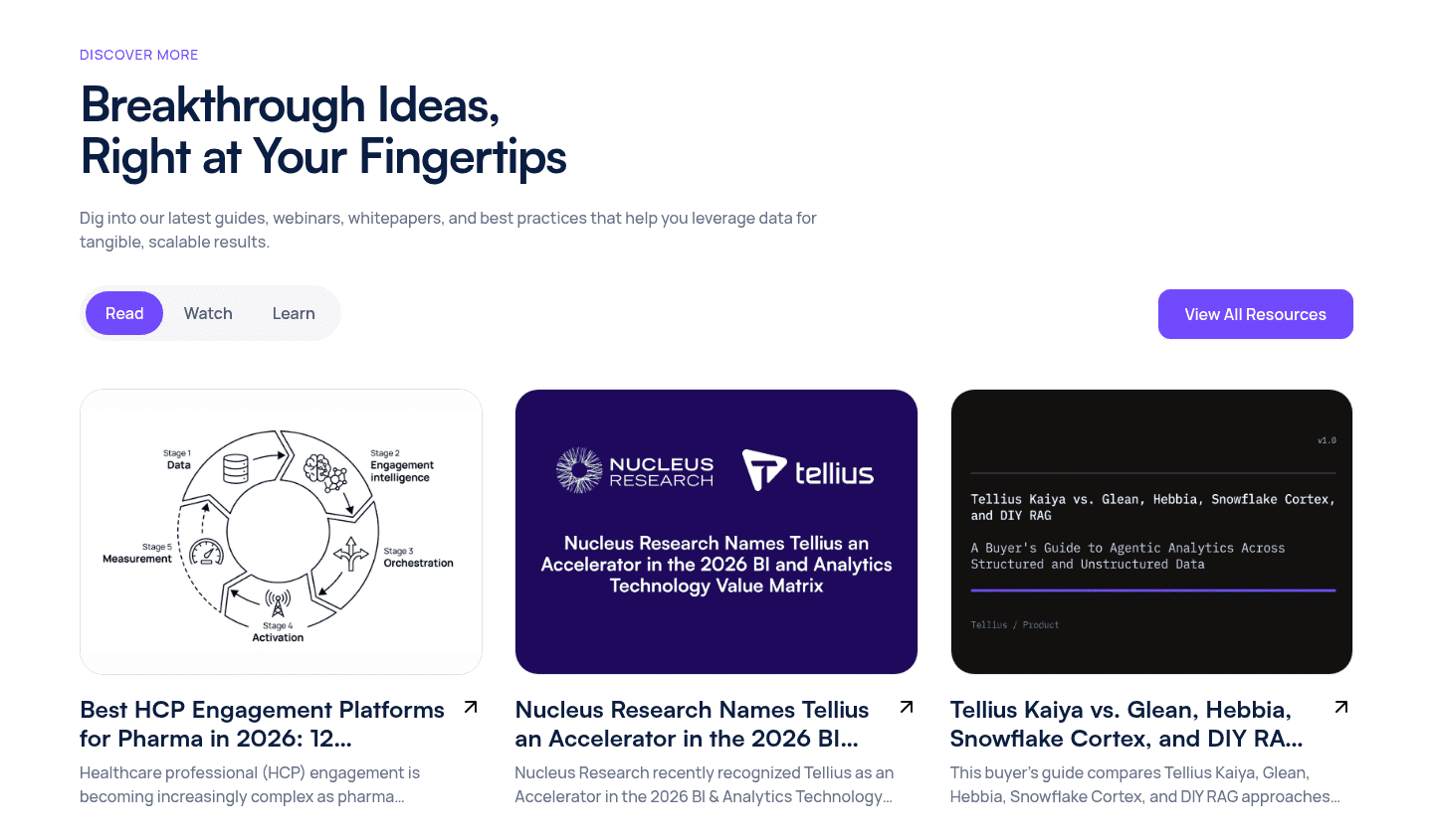

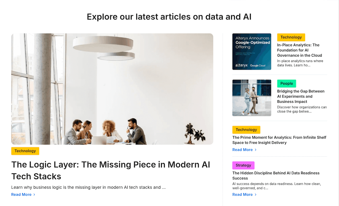

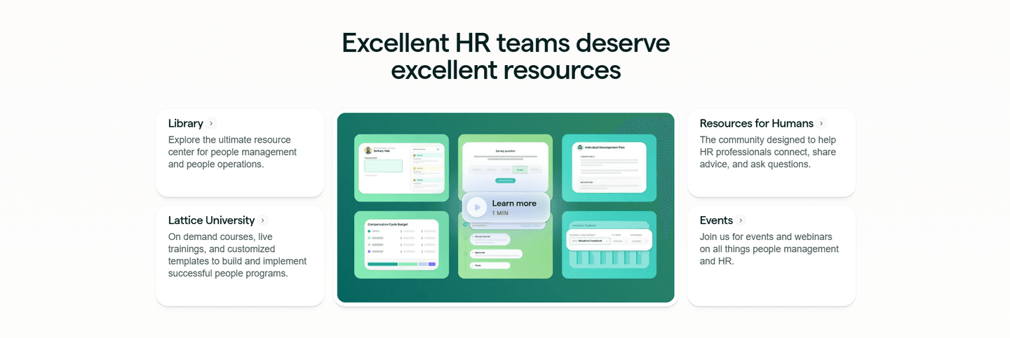
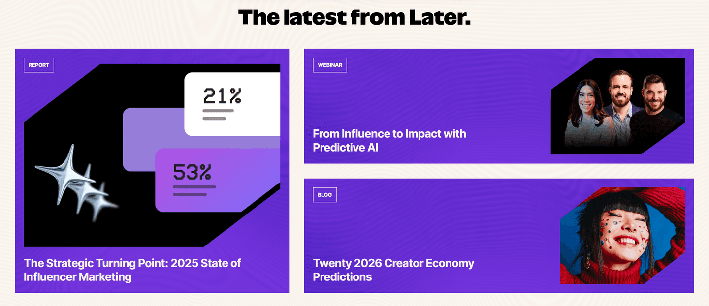
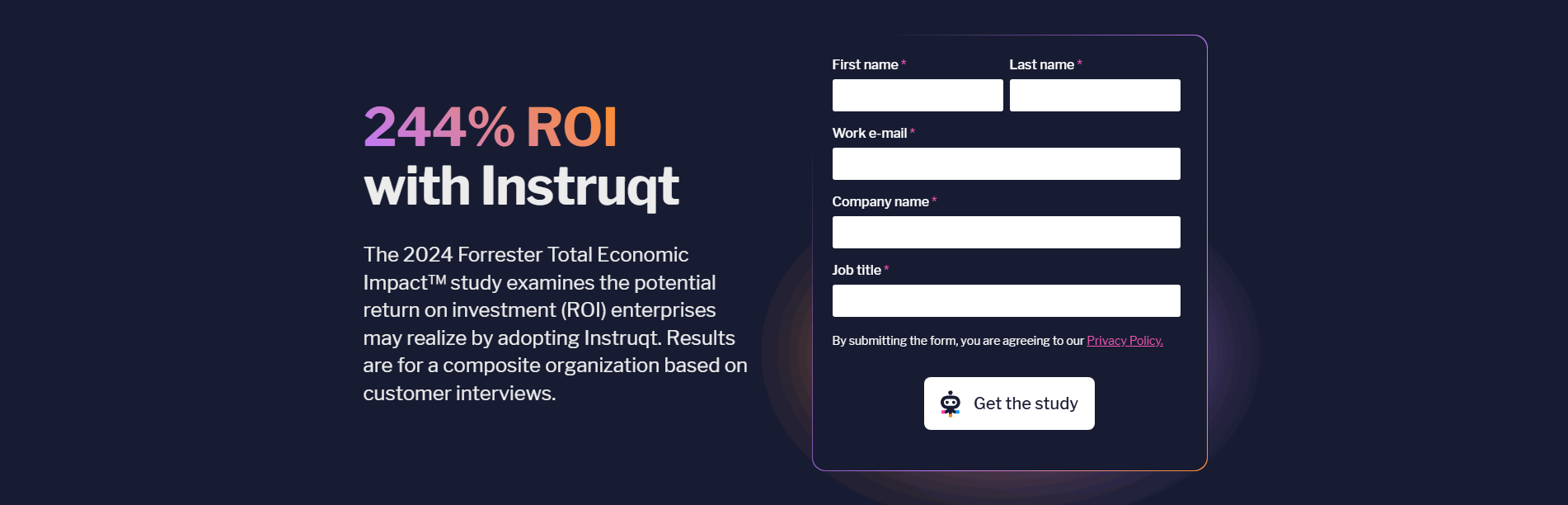
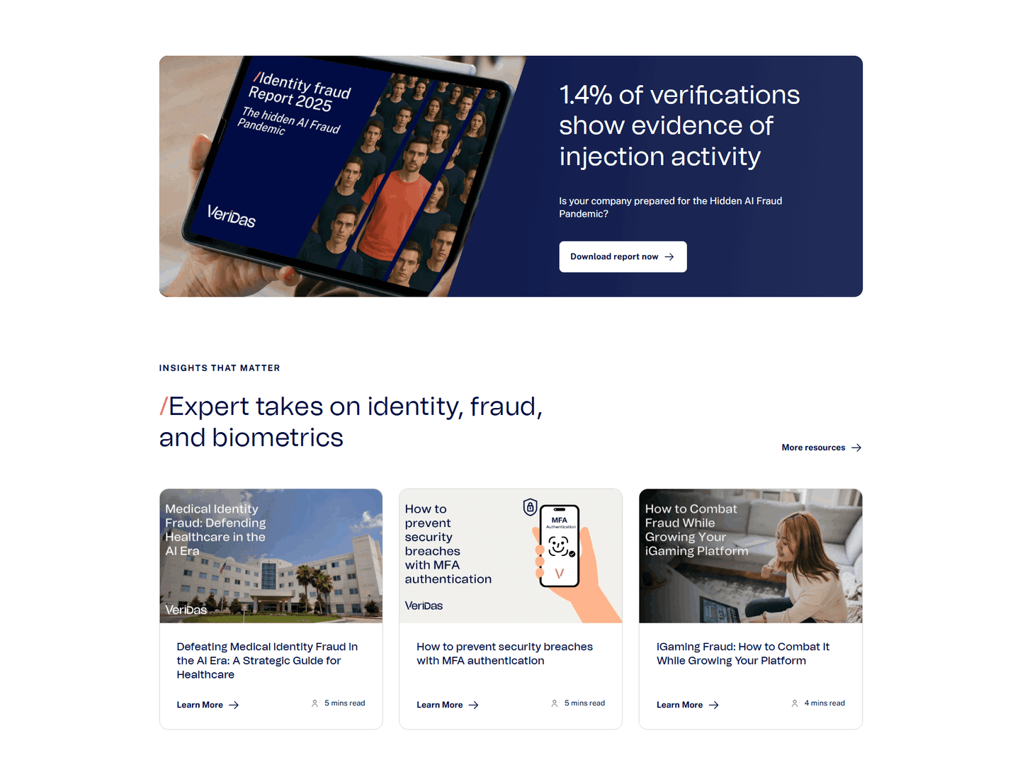
Browse every resources pattern by UX best practice.
Every resources section is scored across 5 conversion best practices. Copy the best practice stack, not the layout. See what converts and why.
Hand-picked from 650+ companies and analyzed by our AI conversion agent. Not a random dump of content blocks. Every entry earns its spot.
Built a resources section? Run yours through the same scoring engine. See where you stand on the same best practices, and what to fix first.
Visual hierarchy is the order the eye travels through a content hub. A resource section usually holds far more than a visitor will ever read: guides, reports, posts, webinars, downloads. Hierarchy decides which of them gets the first look, which get grouped, and which wait quietly until someone goes searching. Done well, the layout answers "where do I start?" before the visitor has to ask it.
The best resource sections build that order from one of four forms, often two together:
A visitor arrives at a resource hub with a rough goal and very little patience. Presented with a flat grid of identical tiles, they have to read every one to find the relevant piece, and most will not. The hub that ranks its items visually does that reading for them: the featured card earns the first glance, the labels route the skimmer to the format they want, and the long tail of content stays organized without demanding attention.
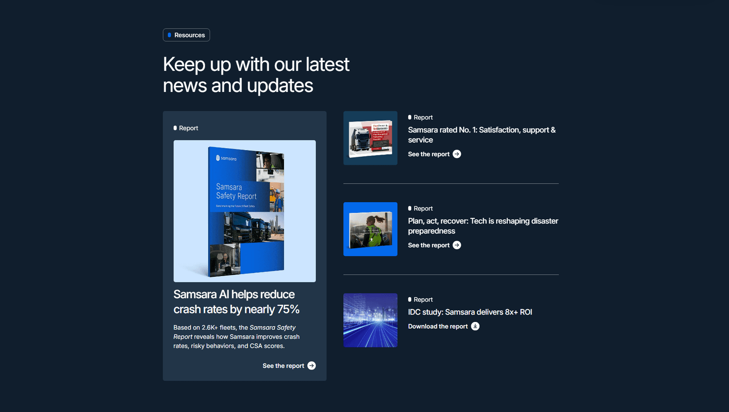
Hierarchy also protects the pieces that matter most. The flagship report or the highest-intent download only pays off if a visitor actually sees it. Give it a larger card or a column of its own and it leads the page. Bury it in a uniform grid and it competes with everything around it, which usually means it loses.
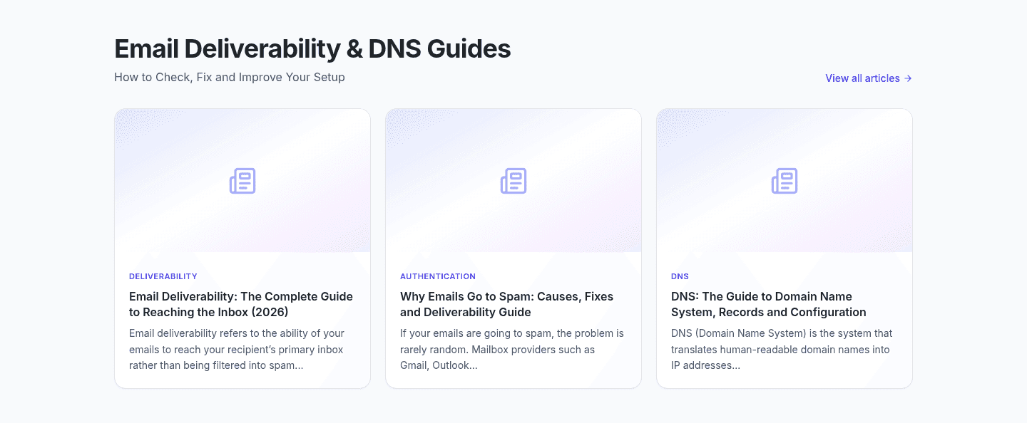
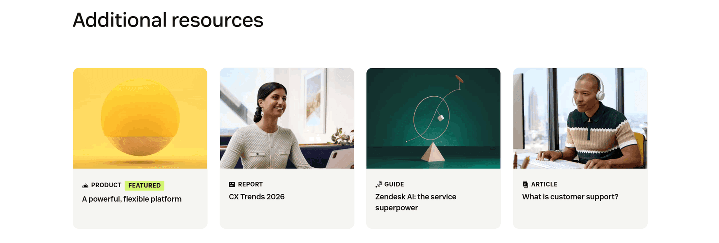
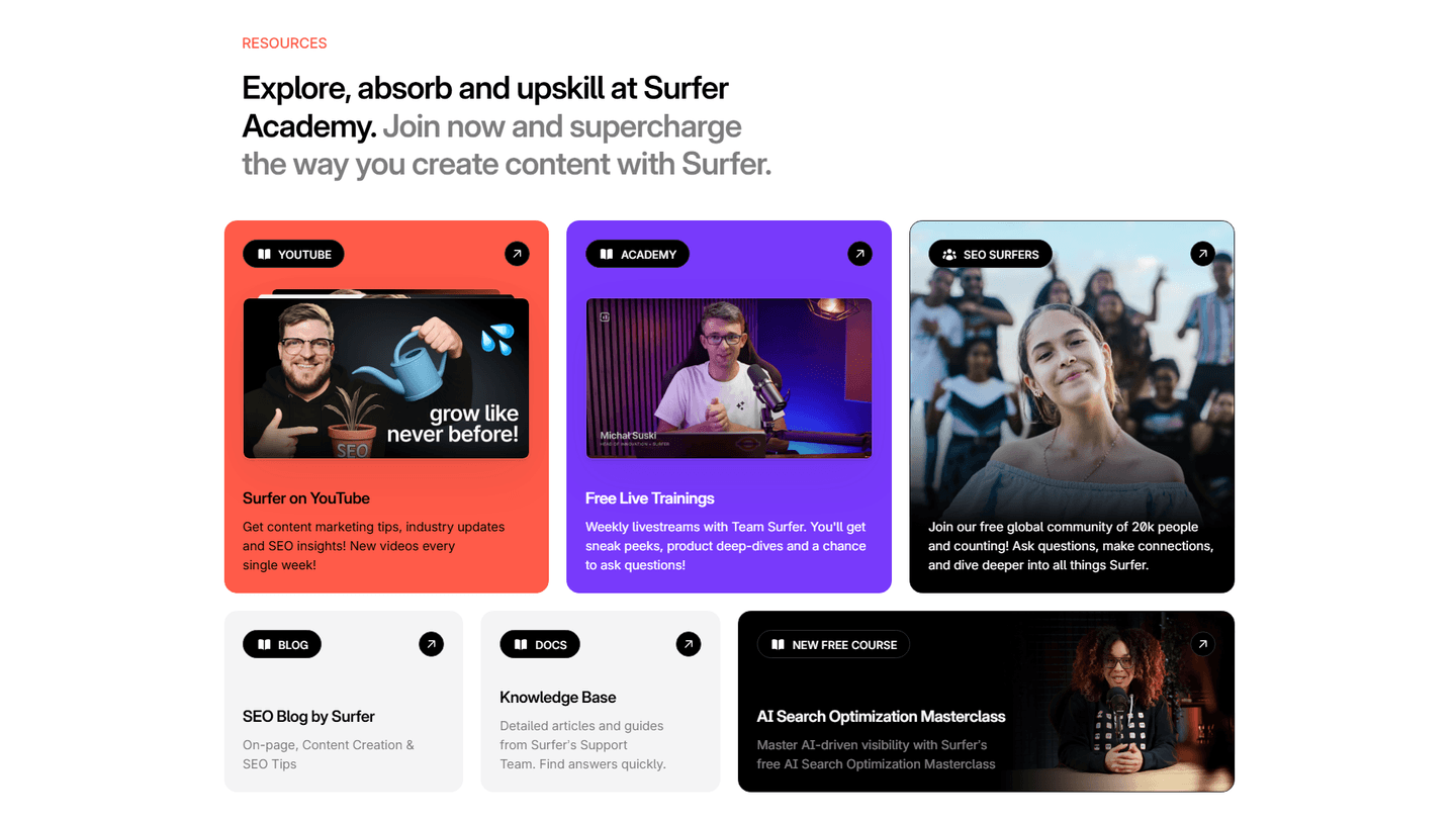
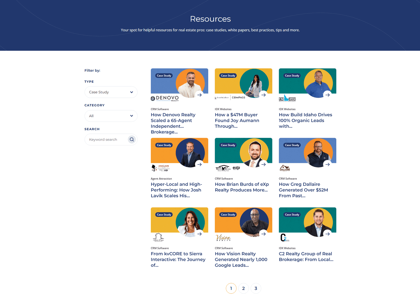
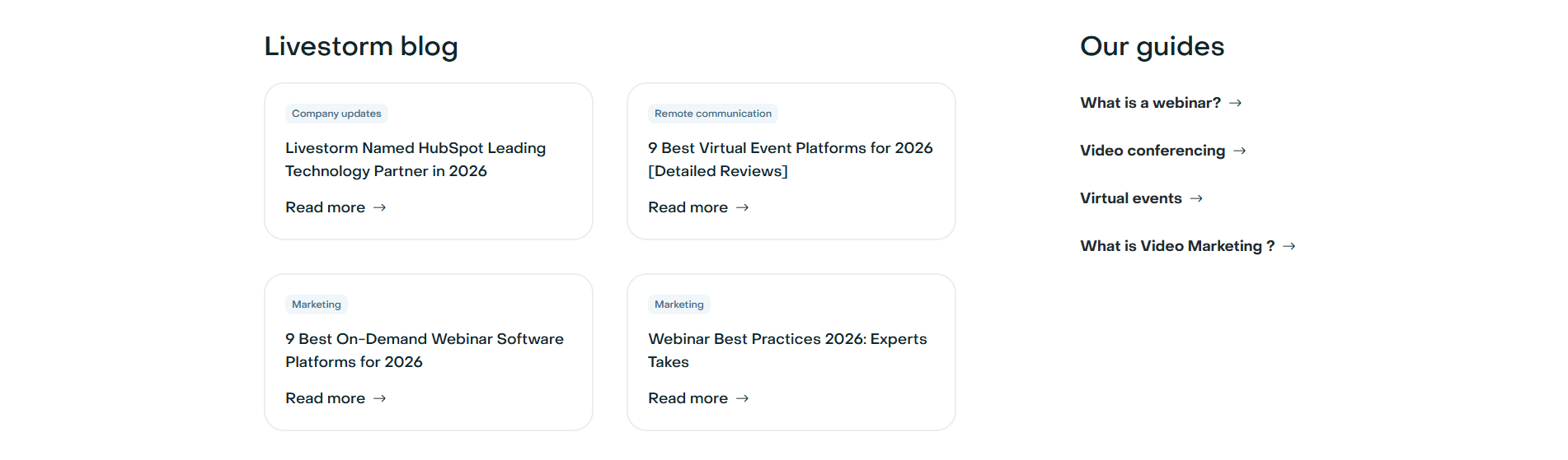
Roughly two in five of the scored resource sections in our library organize the hub with a clear visual hierarchy. Across the scored examples below, the discipline is the same: one thing leads, everything else is grouped. The strongest hubs pick a single featured item rather than three co-equal ones, so the priority never blurs. They label cards by type or theme, the way Zendesk and mailX by mailwarm do, so a skimmer can jump straight to a report or a guide. And they give the visitor a way to narrow the set, whether that is Sierra Interactive's type and category filters or a simple See all link that keeps the full library one click away.
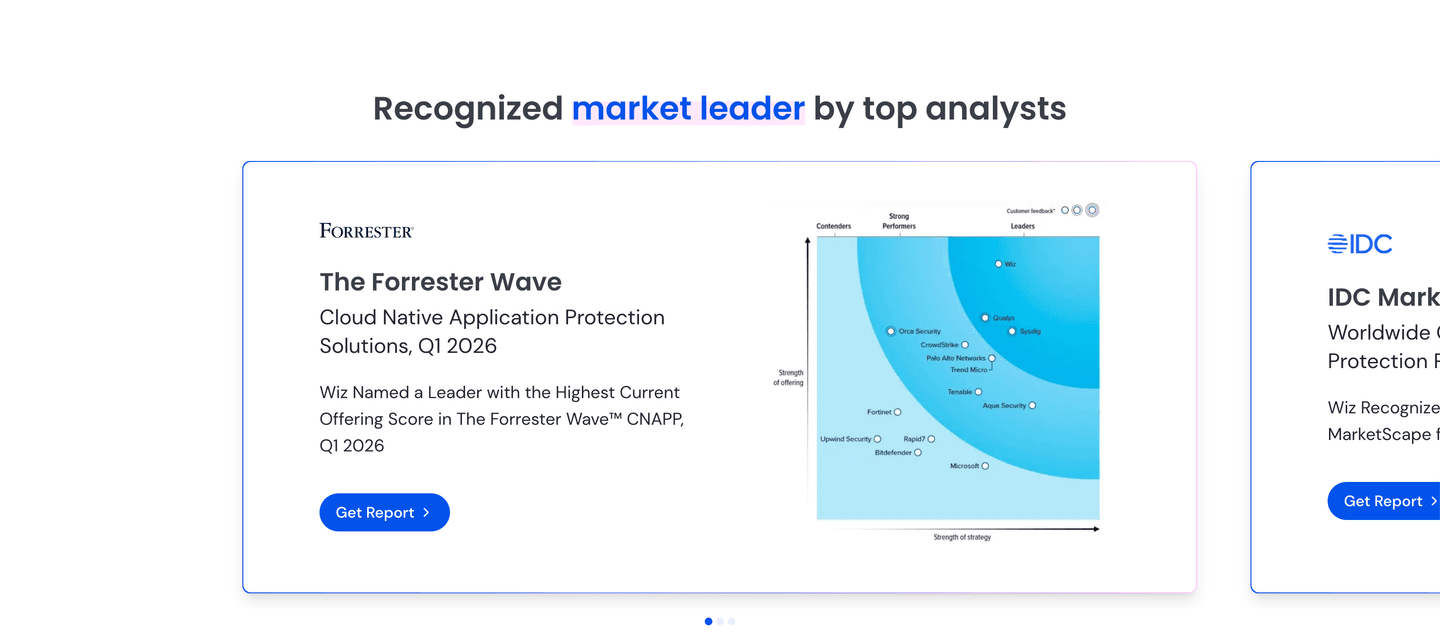
A scannable hub and a credible one tend to travel together: the same featured slot that organizes the page is often where the strongest original research and analyst proof earns its place. Layout and authority reinforce each other, but they are separate jobs, and the best hubs get both right.
100/100 0/100
0/100The usual failure is the flat grid: a wall of equal-sized tiles where nothing is featured, nothing is labeled, and the visitor has to read all of it to find any of it. The second is a featured slot that carries three or four items at once, which cancels the point of featuring anything. The third is a hub with no way in, no filters, no type tabs, no search, so the moment the visitor's target is not on the first row, they are stuck. Lead with one item, label the rest, and give people a path to narrow the set.

Curated by
Gabriel Amzallag , Founder, Web Anatomy
5 years CRO + SEO at Qonto (2021–2025). After advising 15+ SaaS on their websites (Payfit, Pigment…), the same patterns kept breaking, so I decided to build the source of truth on what works on the web: the intelligence layer every tool, builder, and team uses to ship sites that perform.
Paste your URL. Get a scored analysis of your resources section, including whether the layout leads the eye or leaves it lost. Free, no signup.
The common questions about laying out a resource hub for scannability, with answers drawn from 34 scored examples.
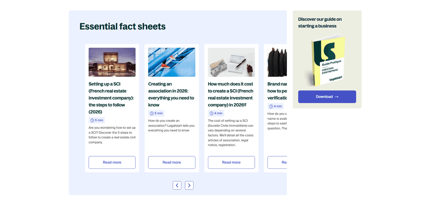
It is the way a content hub ranks its items visually so a visitor knows where to look first. The most common forms are a dominant featured item that sits larger than the rest, category or content-type labels on every card, filters or format tabs that sort the library before scanning, and a standout card that deliberately breaks the grid to spotlight one priority piece.
A resource hub often holds dozens of guides, reports, and posts. Presented as a flat grid of equal tiles, everything competes and nothing wins, so a visitor scans, stalls, and leaves. A clear hierarchy makes the decision for them: the featured item earns the first look, labels let them jump to the format they want, and the rest of the grid stays quietly organized underneath.
One item is visibly larger or set apart from the others. Cards carry content-type or category labels like Report, Guide, or Podcast. There is a way to sort or filter, whether tabs, a type filter, or a search box. And every card has a clear link deeper into the content, so scanning turns into clicking.
The featured slot is the one piece of content the hub wants a visitor to see first, so it should hold the strongest asset: the flagship report, the newest story, or the highest-intent download. Give it a larger card or a dedicated column beside the smaller grid, and keep only one featured item so the priority stays unambiguous.
They limit how much sits above the scroll, group the rest under clear labels, and give visitors a way to narrow the set. Filters, format tabs, and a See all link keep the visible surface small while the full library stays one click away, so the hub feels organized rather than overwhelming.