Problem|
A quantified-pain problem section puts a real number on the cost of the current setup, in hours lost, dollars wasted, or a failure rate, so the pain feels concrete instead of vague before the visitor decides.
Key takeaways
Showing 22–27 of 27 examples


Browse every problem pattern by UX best practice.
Every problem section is scored across 5 conversion best practices. Copy the best practice stack, not the layout. See what converts and why.
Hand-picked from 650+ companies and analyzed by our AI conversion agent. Real problem sections on live landing pages. Every entry earns its spot.
Found a problem section you admire? Run yours through the same scoring engine. See where you stand on the same best practices, and what to fix first.
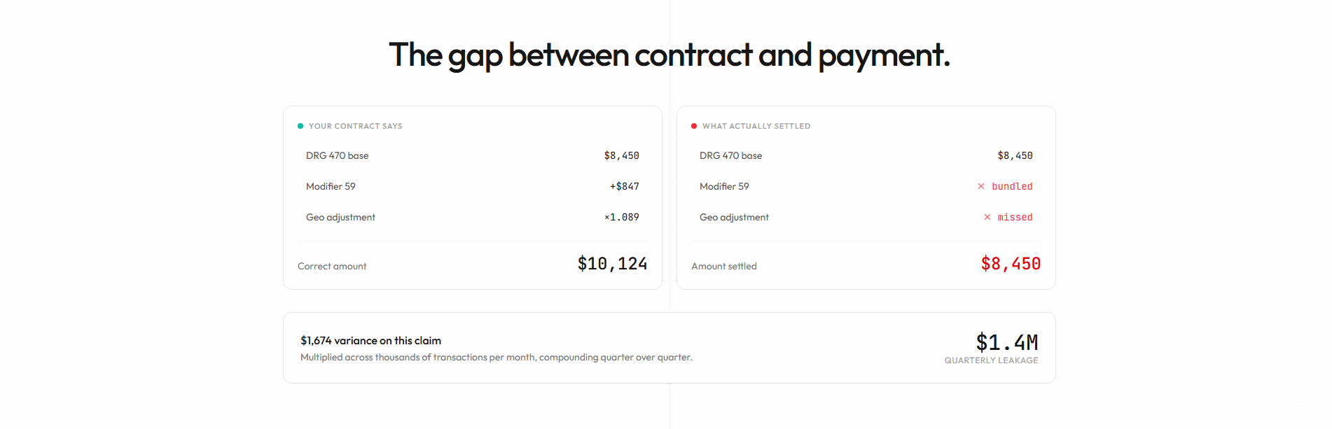
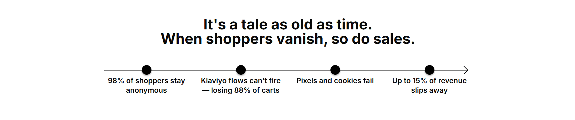
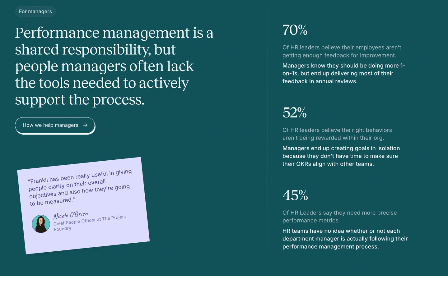
A quantified-pain problem section is the decision to put a real number on the pain instead of describing it. A plain problem section says the current setup is slow, scattered, or wasteful. A quantified-pain section counts it: the hours lost, the money leaking, the share of work that fails. That figure is what turns a nod of recognition into something the reader cannot argue with, because a measured cost reads as a fact rather than a marketing line.
The best problem sections put a number on the pain in one of a few ways, often more than one at once:
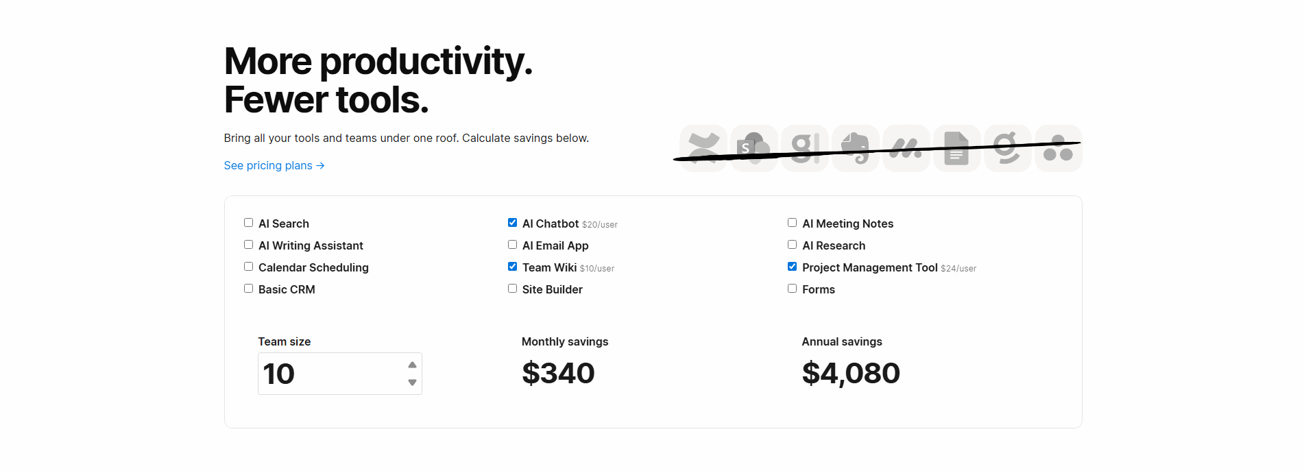
A number does two things a description cannot. It makes the cost feel concrete, because a specific figure reads as something measured rather than something written, and it gives the reader a way to self-check. When Payaca says a team loses fifteen hours a week to copying data, the reader silently maps that onto their own week and either confirms it or quietly fears it is worse. Either way, the pain stops being an adjective and becomes a quantity.
An aggregate stat does extra work. A figure like Deep's 84% of programmes failing, or Bulkmark's 97% of saved items never reopened, tells the reader the problem is not a personal failing but a pattern other people share. That lowers the quiet shame that keeps people sitting with a broken setup, and it borrows the credibility of scale: if most people hit this wall, hitting it is not the reader's fault, and looking for a fix is reasonable.
Across the scored examples below, the pattern that lands is a number the reader can actually check. The strongest sections attach a figure to a specific setup the reader lives with, rather than a generic claim, and they keep the figure believable enough to trust. UserEvidence grounds its 67% of buyers ruling out a vendor in a cited Evidence Gap Report, so the stat reads as research instead of a boast. Nautis stacks four numbers so the pain is priced from every angle at once, and Voltaiq scales its 80% scrap rate up to the industry cost, billions, so a battery maker feels the weight of it. The move is the same each time: a hard figure the reader can picture, tied to their own situation.
This angle rarely stands alone. The number is what makes problem sections that price the cost of doing nothing land, and it sharpens the mess in problem sections that set up a before and after. You can see the full range in the problem section gallery.
40/100 10/100
The usual failure is a number that is round, vague, or unearned: "save hours every week," "10x faster," "cut costs by half," with nothing behind it. A figure the reader cannot trace reads as marketing, and it does less than an honest description would. The second failure is a stat with no setup attached, a percentage floating free of any situation the reader recognizes, so there is nothing to map it onto. The best examples avoid both by keeping the number specific, grounded, and tied to a setup the reader already lives with, the way Nautis, Payaca, and UserEvidence do.

Curated by
Gabriel Amzallag , Founder, Web Anatomy
5 years CRO + SEO at Qonto (2021–2025). After advising 15+ SaaS on their websites (Payfit, Pigment…), the same patterns kept breaking, so I decided to build the source of truth on what works on the web: the intelligence layer every tool, builder, and team uses to ship sites that perform.
Paste your URL. Get a scored analysis of your problem section, including whether it prices the pain with a number the visitor can check. Free, no signup.
The common questions about putting a number on the pain in a problem section, with answers drawn from 27 scored examples.
It is a problem section that puts a real number on the pain instead of describing it in adjectives. Rather than saying the current setup is slow or wasteful, it counts the cost: the hours lost each week, the dollars spent every month, the percentage of work that fails. The number turns a vague complaint into a figure the reader can measure and check against their own experience, which is much harder to wave off than 'you are wasting time and money'.
A number does two things a description cannot. It makes the cost feel concrete, because a specific figure reads as a fact someone measured rather than a claim someone wrote. And it lets the reader self-check: when a section says a team loses fifteen hours a week to copying data, the reader silently maps it onto their own week and either confirms it or worries it is worse. An aggregate stat also proves the problem is widespread, not a personal failing, which lowers the shame that keeps people from acting.
The most persuasive figures are the ones the reader can picture and verify: a monthly bill, a count of hours or tools, a share of time lost, a failure or drop-off rate. A stat carries more weight when it is grounded, either sourced from a named report or drawn from the reader's own math, so it reads as evidence rather than a round marketing number. Vague multipliers like '10x faster' or 'save hours' do the opposite, because there is nothing to check.
A pain list names what is wrong. Quantified pain measures it. Saying 'our tools do not talk to each other' states a fact; saying that gap costs a team fifteen hours every week attaches a meter the reader can read. The number also gives the pain a scale, so a frustration the reader had filed as minor suddenly has a price tag, and the price is usually bigger than they assumed.
It can, if the figure is the whole section and nothing points to a way out. The best examples raise the stakes with a real number and then signal that the cost is fixable, or aim the number at a specific setup the reader recognizes so it feels like empathy rather than a scare tactic. A grounded, believable figure reassures; an inflated or unsourced one reads as marketing and does the opposite of building trust.