Pricing Table|
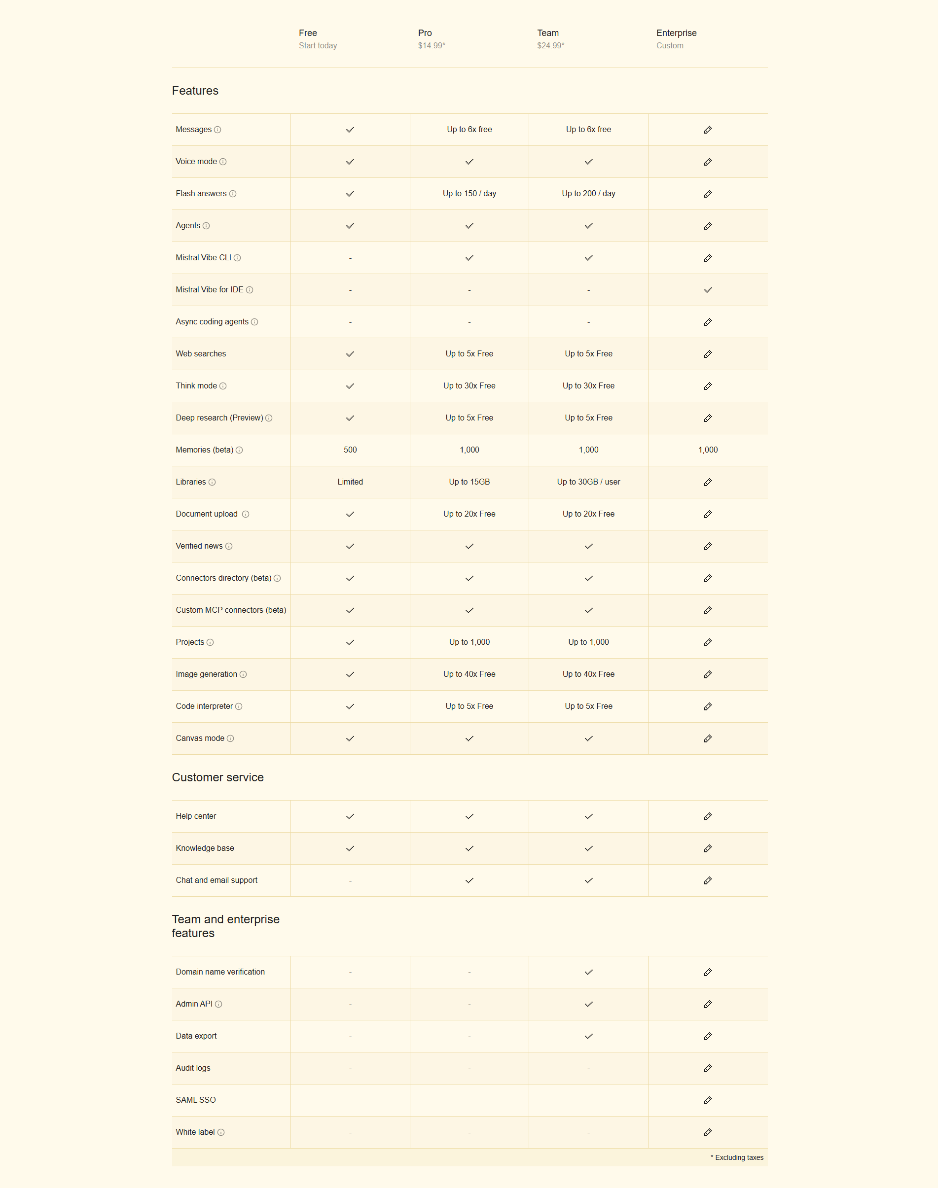
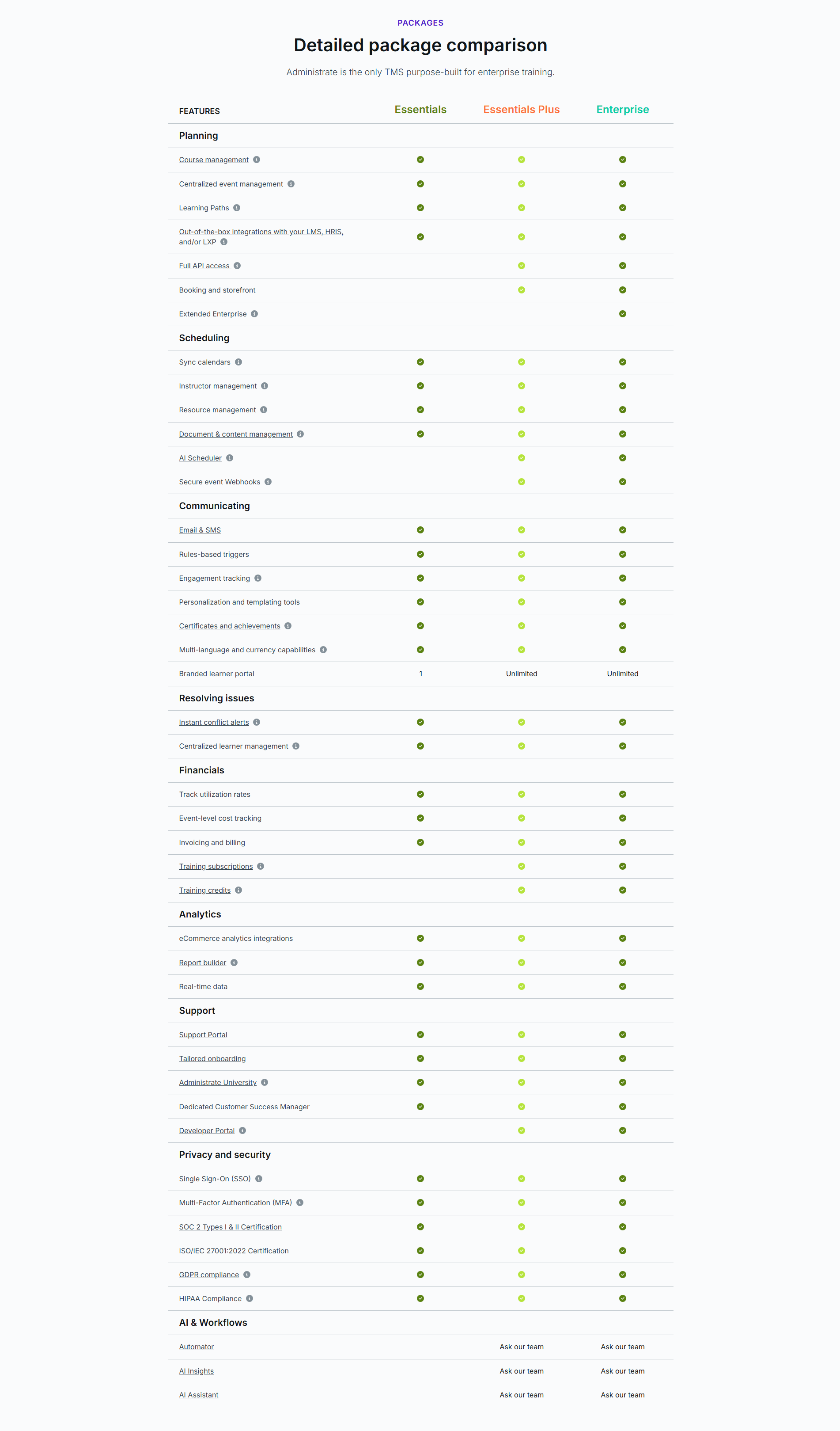
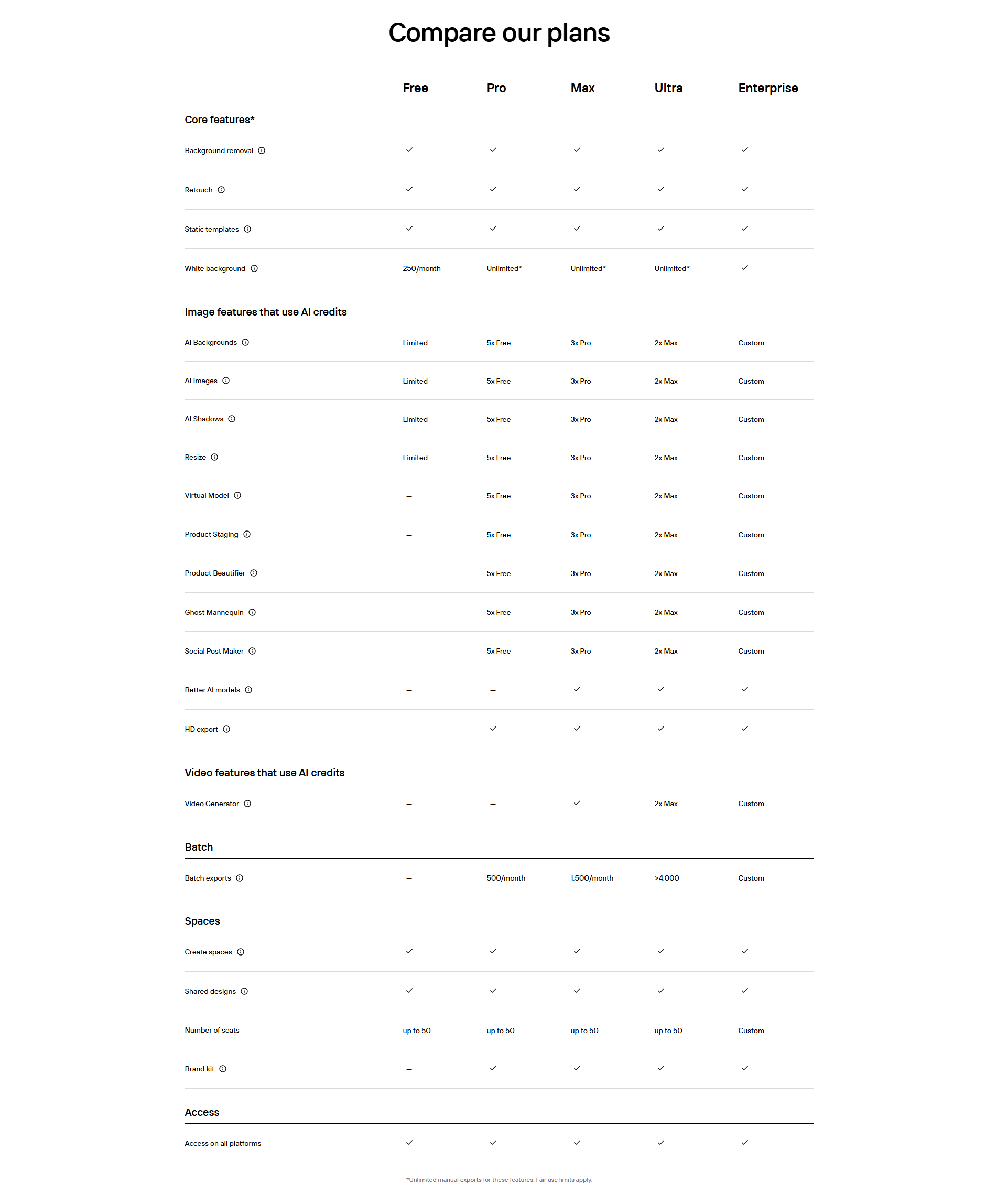
A small info icon next to a feature name lets a visitor find out what a line item means on hover, so a term they do not recognize never stalls the decision or sends them away to search for it.
Key takeaways
Showing 1–11 of 11 examples
Browse every pricing table pattern by UX best practice.
Every pricing table is scored across 6 conversion best practices. Copy the best practice stack, not the design. See what converts and why.
Hand-picked from 650+ companies and analyzed by our AI conversion agent. Not a random dump of pricing pages. Every entry earns its spot.
Found a pricing table you admire? Run yours through the same scoring engine. See where you stand on the same best practices, and what to fix first.
Tooltip explanations are the small info icons, usually a lowercase i in a circle, that sit beside a feature name in a pricing table. Hover or tap one and a short pop-up appears with a plain-language definition of that row. The point is placement: the help lives exactly where the question comes up, so a visitor who does not recognize a term gets the answer in place instead of leaving the table to go look it up.
The pattern shows up in a few consistent forms:
A pricing table asks a visitor to compare plans on rows the company wrote for itself. Every table carries at least a few terms only the product team fully understands, and each one is a small trap: hit a row you cannot read, and you either guess wrong or stop comparing. Both outcomes lose the visitor at the exact page where they were closest to buying.
A tooltip removes the trap without slowing anyone down. The visitor who already knows the row skims past the icon and keeps going. The visitor who does not know it gets a one-line answer at the moment the question appears, then carries on in the same table. The help is there for the people who need it and invisible to the people who do not, which is why the pattern raises clarity without adding noise.
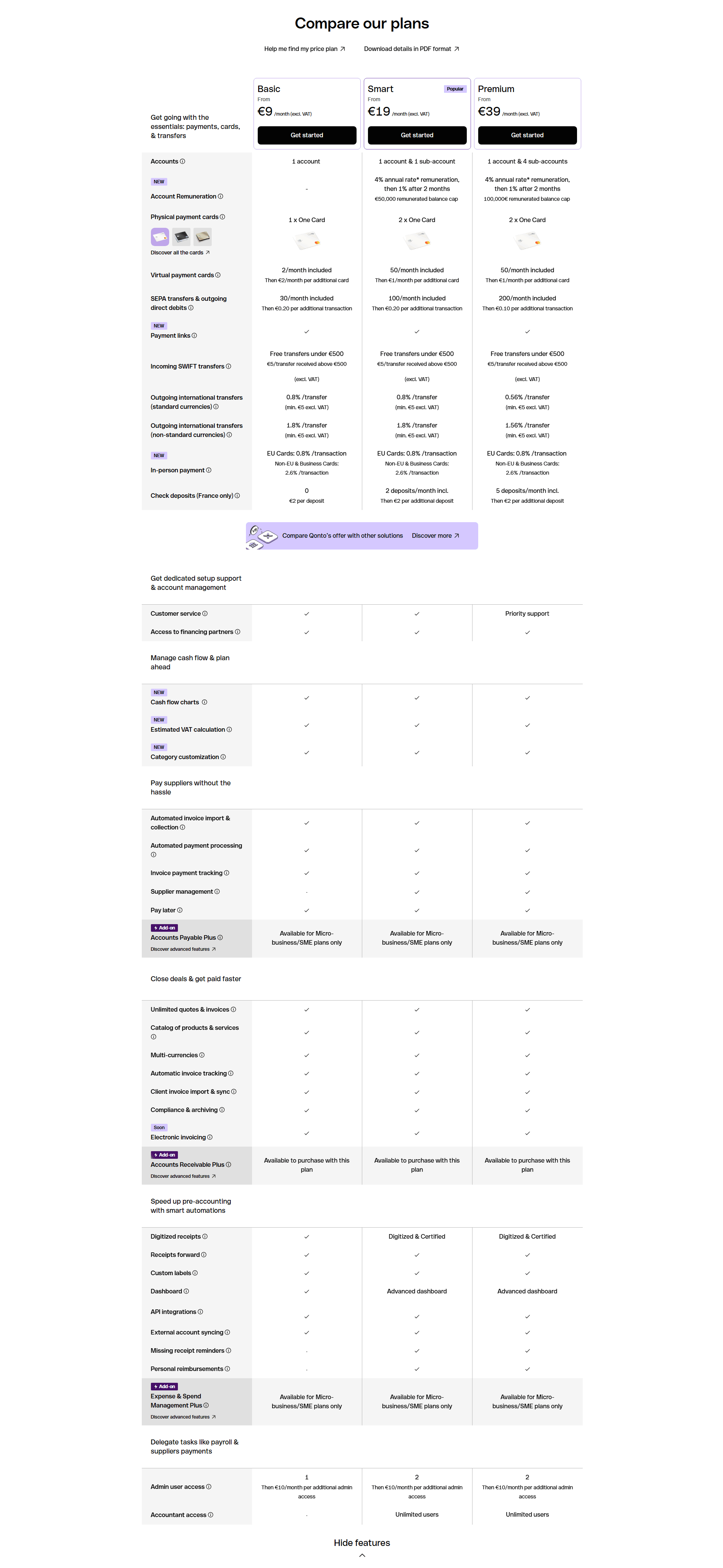
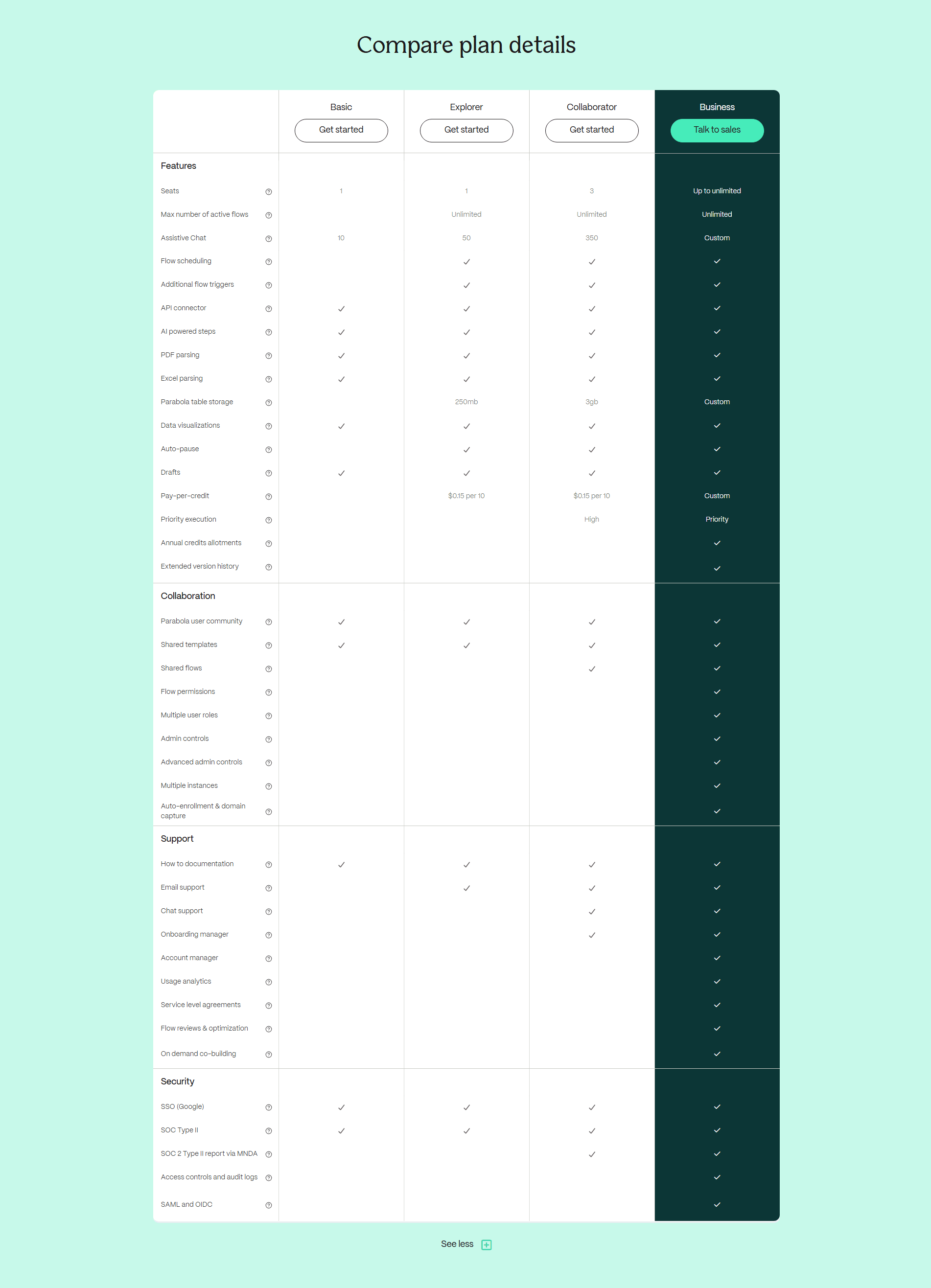
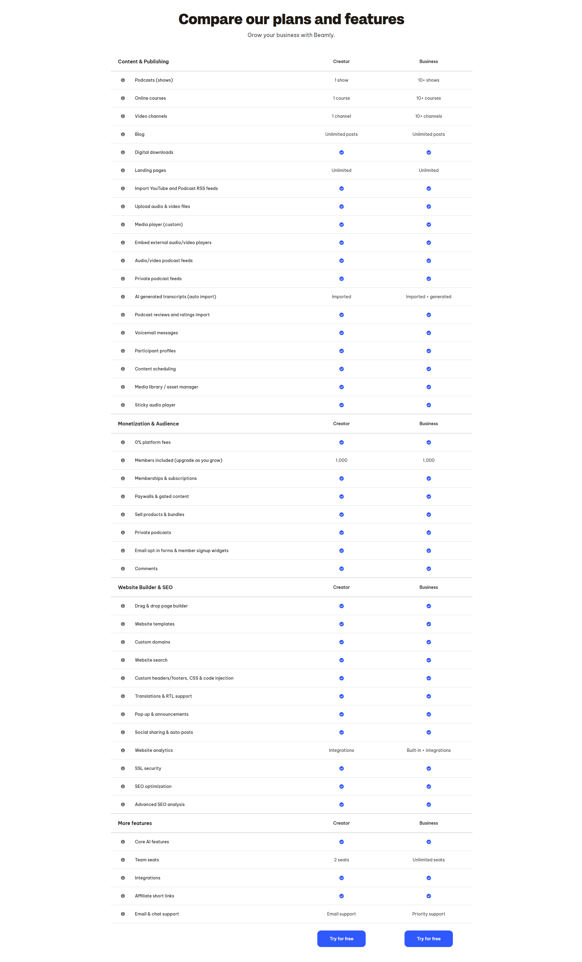
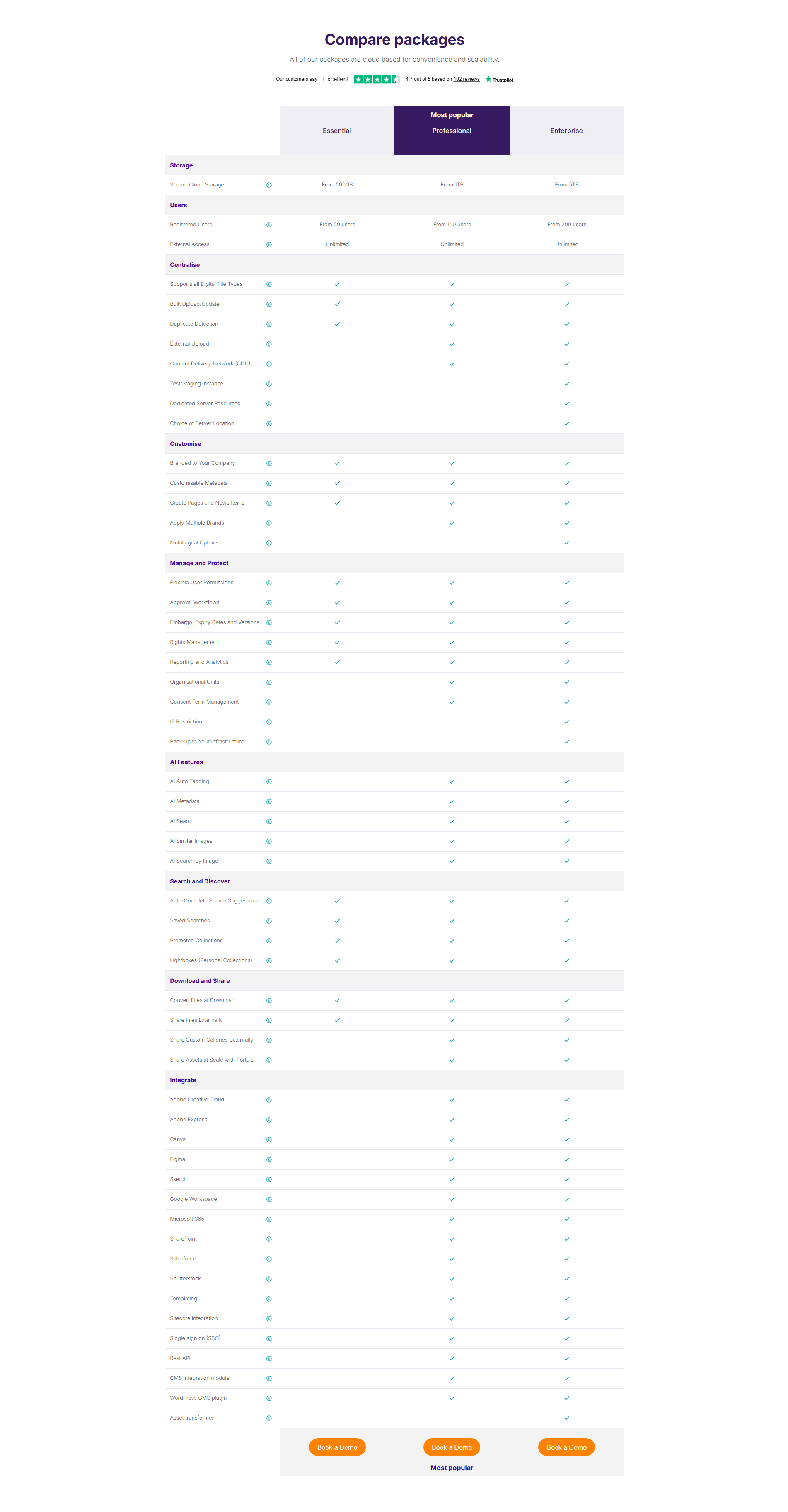
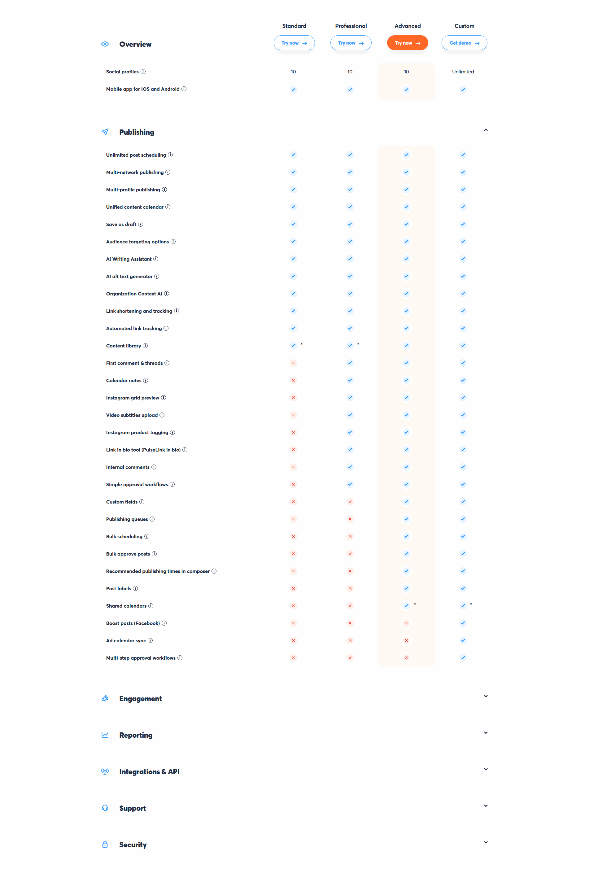
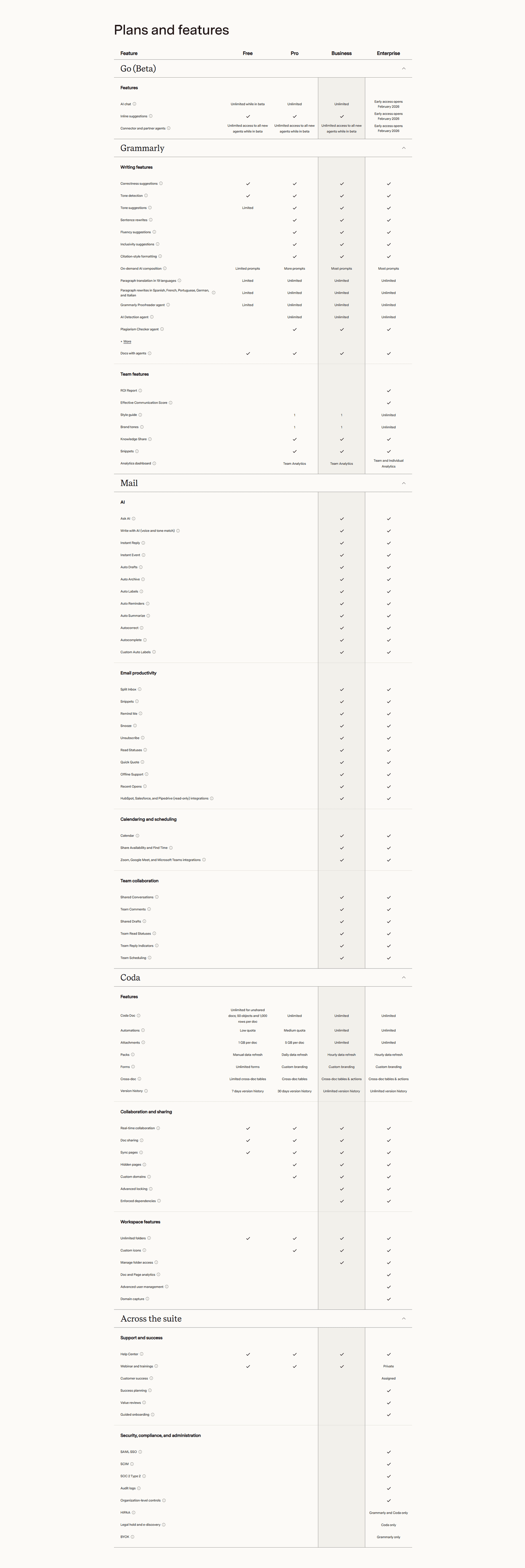
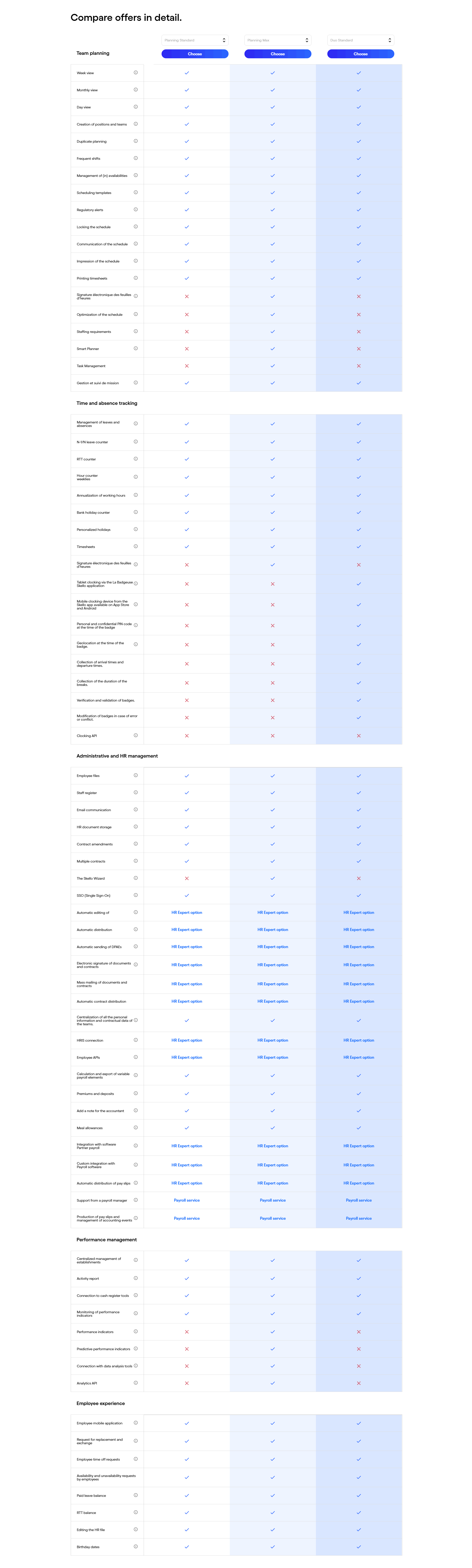
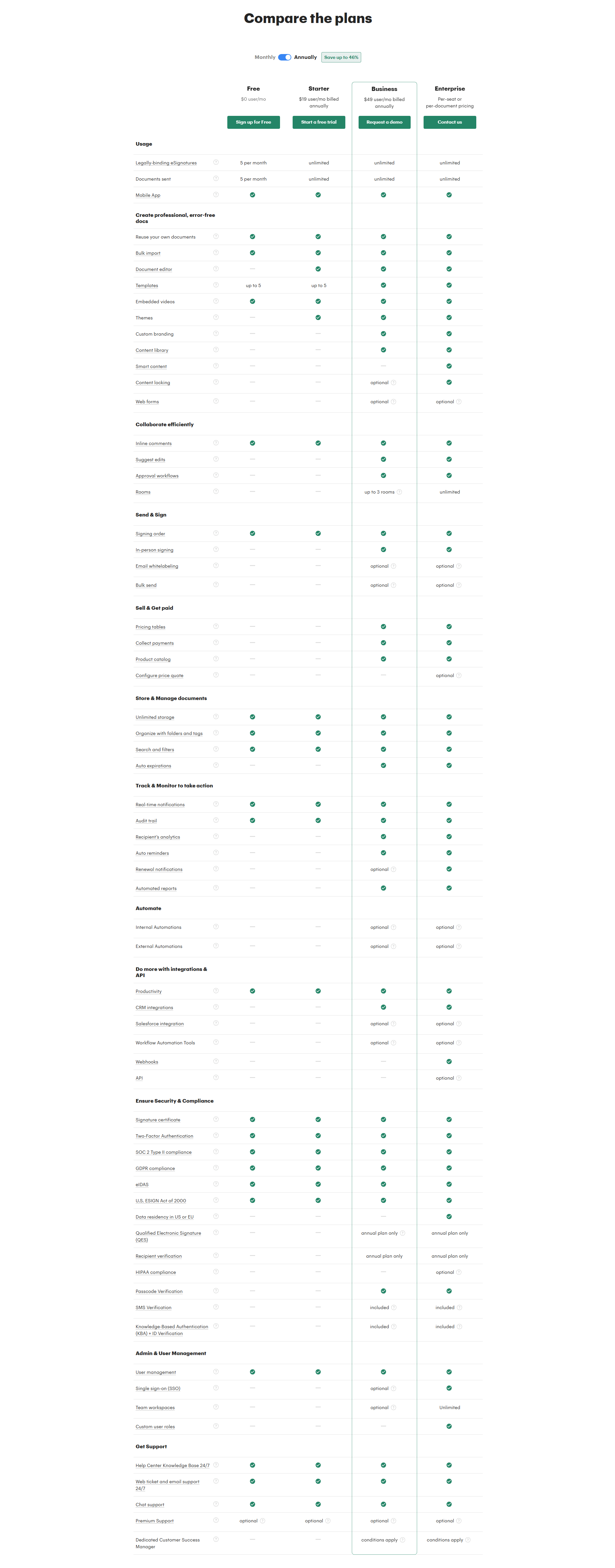
Across the scored examples below, the disciplined version puts an info icon next to the feature name on the rows that genuinely raise a question, then answers each in a short, plain sentence. Agorapulse sits an icon beside every feature name so a visitor can clarify what a capability means without leaving the table, and Beamly does the same across a list that runs past sixty rows, keeping the explanations on hover so the grid stays readable. Superhuman opens a tooltip on each row to explain what the capability does, and PandaDoc uses the icon to define terms a buyer would otherwise have to search for.
The strongest tables aim the icon at real ambiguity rather than every cell. Qonto places it beside the rows about fees and limits, where a number needs its unit spelled out, while Mistral AI attaches it to feature names a first-time reader would not recognize and PhotoRoom puts it next to its product-specific capabilities so the terms are defined the moment they appear. The tooltip never carries the table alone: it works because the rest of the table is already clear, which is why the best pricing pages pair it with a table that highlights the differences between plans and a call to action under every column so a resolved question turns straight into a click.
100/100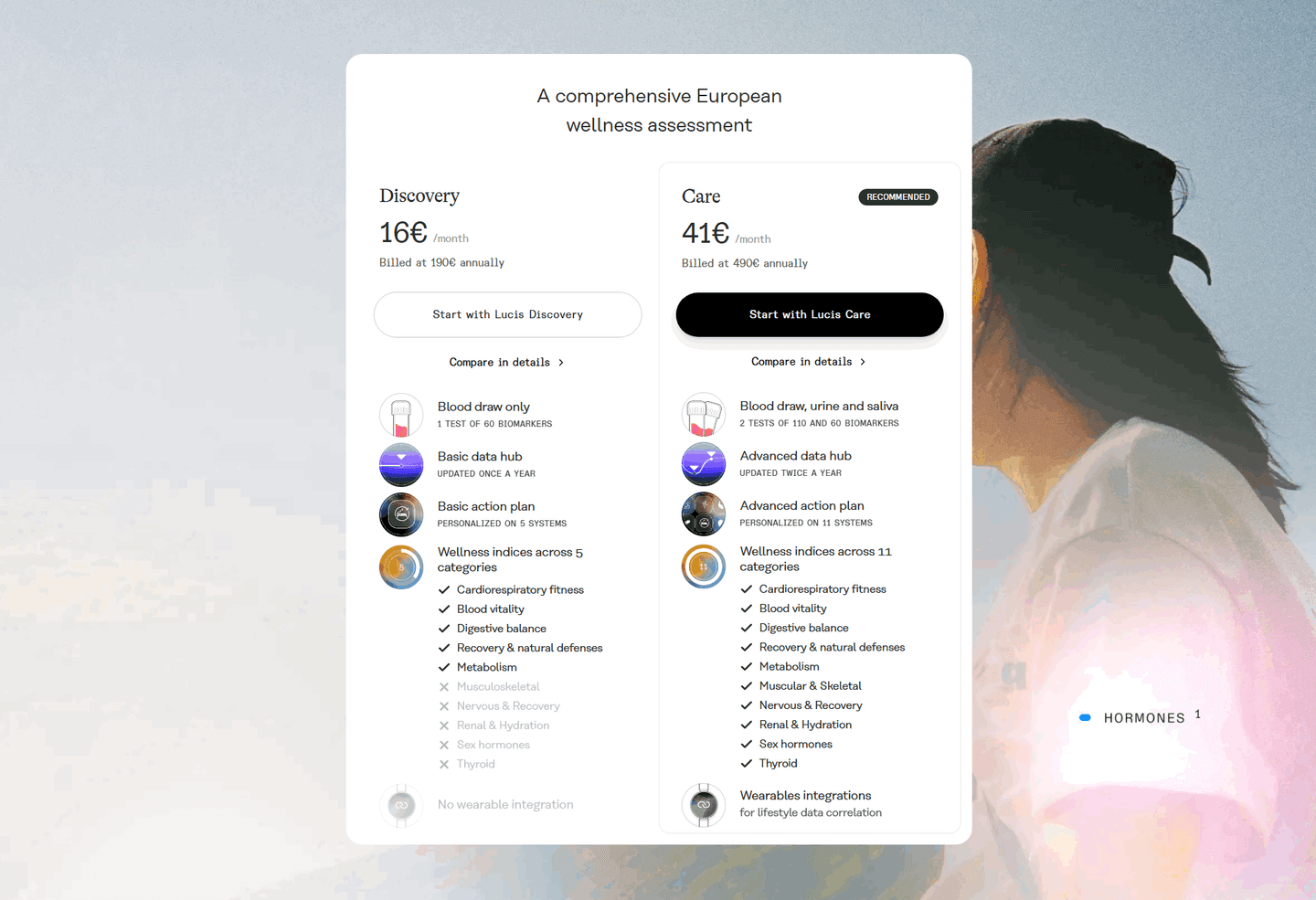 0/100
0/100The first failure is the empty or lazy tooltip, where the icon opens a pop-up that just repeats the feature name or adds a line of marketing, so the visitor who clicked for help leaves no wiser. The second is a tooltip on every cell, which trains people to ignore the icon and hides the few rows that truly needed one. The third is help that only works on hover, so a visitor on a phone taps the icon and nothing usable happens. Put the icon on the rows that raise a real question, write the answer in plain words, and make sure it opens on tap as well as hover.

Curated by
Gabriel Amzallag , Founder, Web Anatomy
5 years CRO + SEO at Qonto (2021–2025). After advising 15+ SaaS on their websites (Payfit, Pigment…), the same patterns kept breaking, so I decided to build the source of truth on what works on the web: the intelligence layer every tool, builder, and team uses to ship sites that perform.
Paste your URL. Get a scored analysis of your pricing section, including whether visitors can understand every feature row. Free, no signup.
The common questions about adding info-icon tooltips to pricing feature rows, with answers drawn from 11 scored examples.
They are small info icons, usually a lowercase i in a circle, placed next to a feature name in a pricing table. Hovering or tapping one opens a short pop-up that explains what the feature is or what its limit means. The explanation appears in place, so the visitor never has to leave the table or open a separate page to understand a row.
A pricing comparison is full of terms only the product team fully understands: an unfamiliar feature name, a metered limit, a piece of jargon. When a visitor hits a row they cannot read, they either guess or give up, and both cost the sale. A tooltip answers the question at the exact moment it comes up, so an unclear line item becomes a reason to keep comparing instead of a reason to leave.
The ones a first-time visitor cannot decode on their own: a feature named after an internal concept, a term of art like a specific compliance mark, or a number whose unit is not obvious. Rows that are already plain, like a seat count or a clear yes-or-no feature, do not need one. The best tables reserve the icon for the rows that genuinely raise a question, so its presence signals real help.
In one or two short sentences, in plain language, aimed at someone seeing the product for the first time. It should define the term or state what the limit covers, not repeat the feature name or add marketing. The goal is that a visitor closes the tooltip understanding the row, so the definition has to do real work in a few words.
Done well, they do the opposite. A tooltip keeps the full explanation hidden until it is asked for, so the table stays scannable for the many visitors who already understand the rows, while the detail stays one hover away for those who do not. The clutter comes from cramming definitions into the cells themselves. The icon lets the table hold a long feature list and still read cleanly.