Pricing Table|
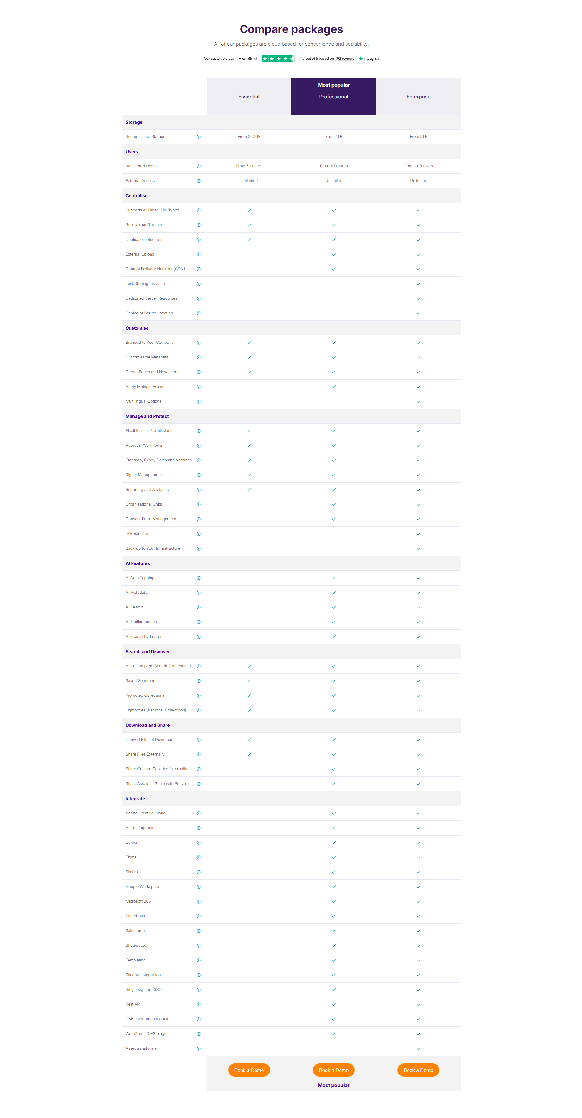
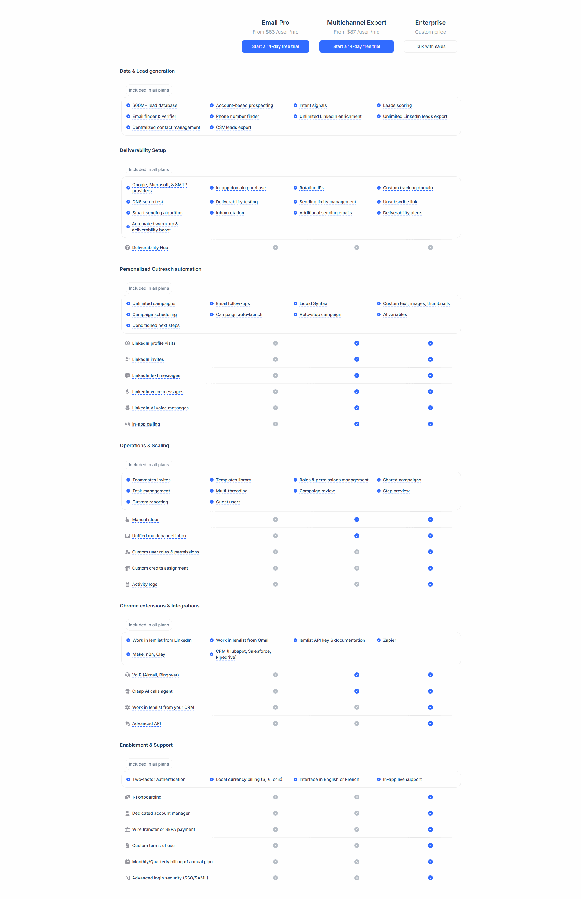
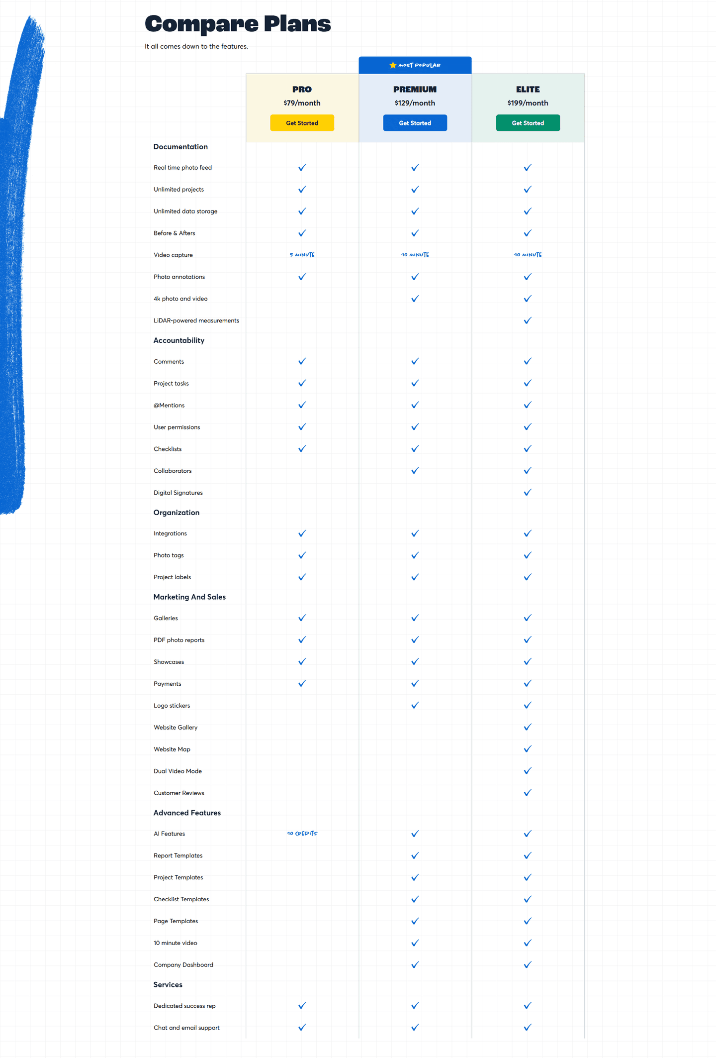
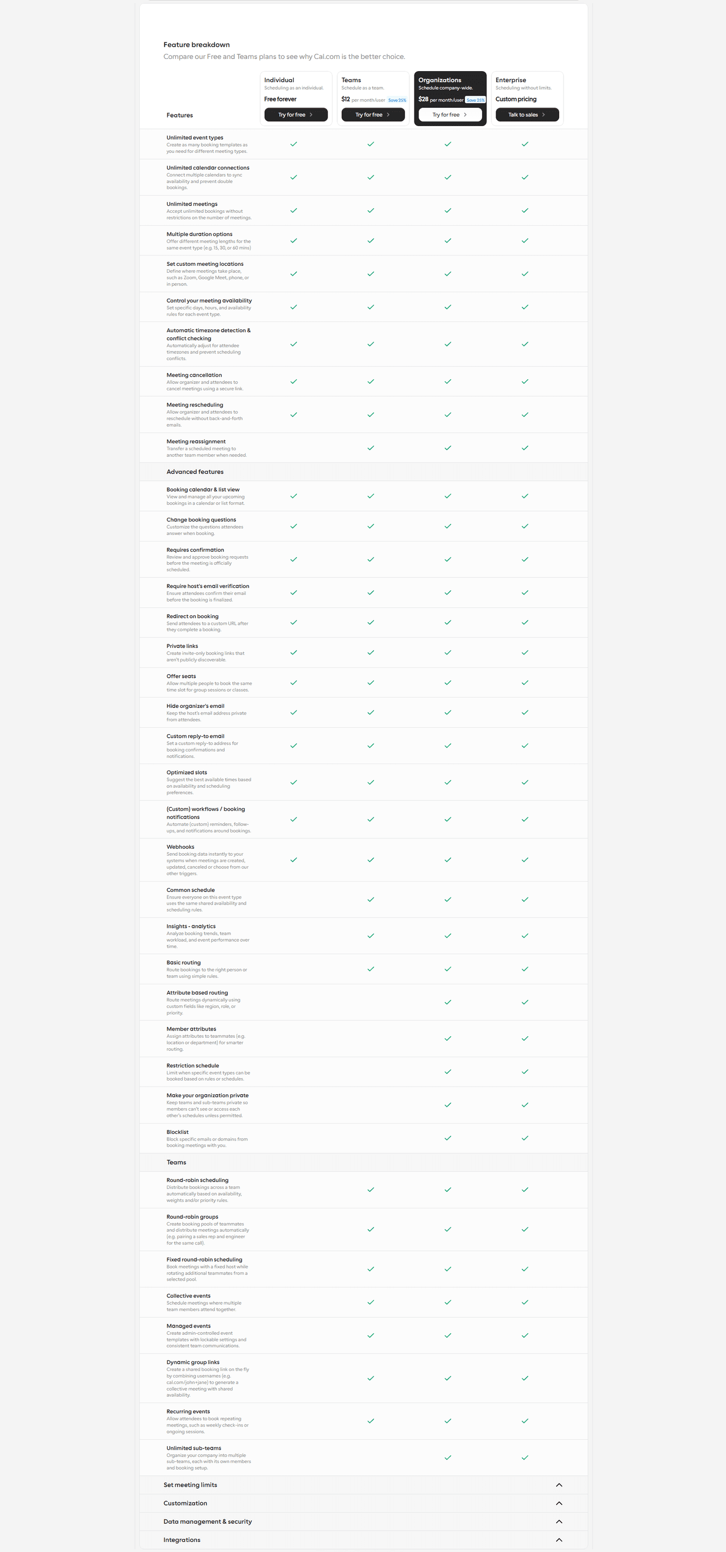
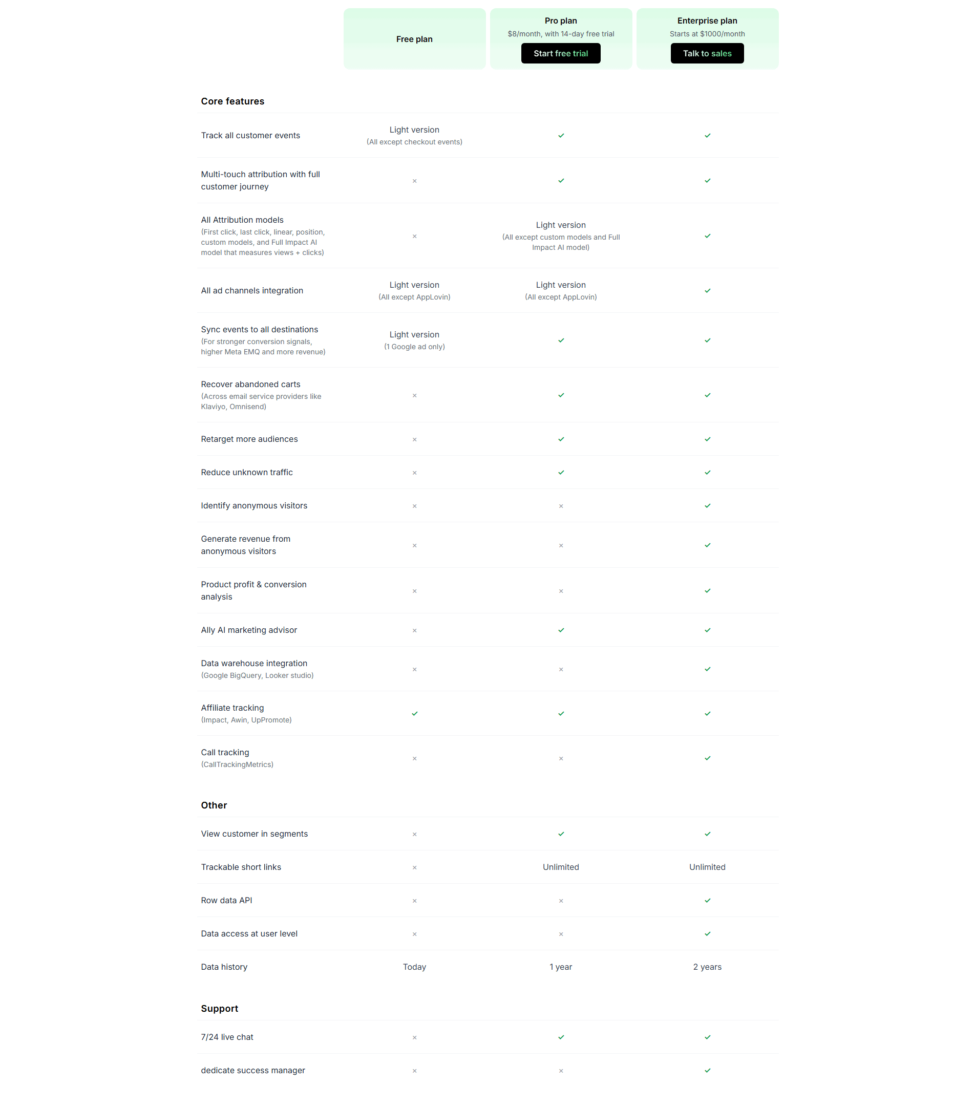
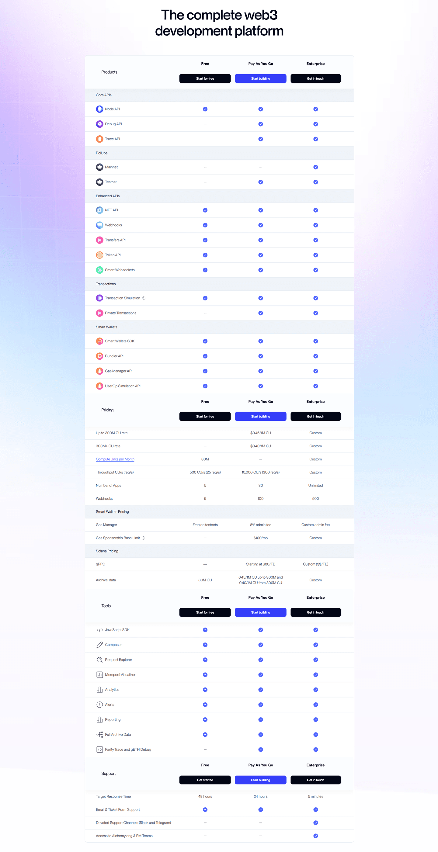
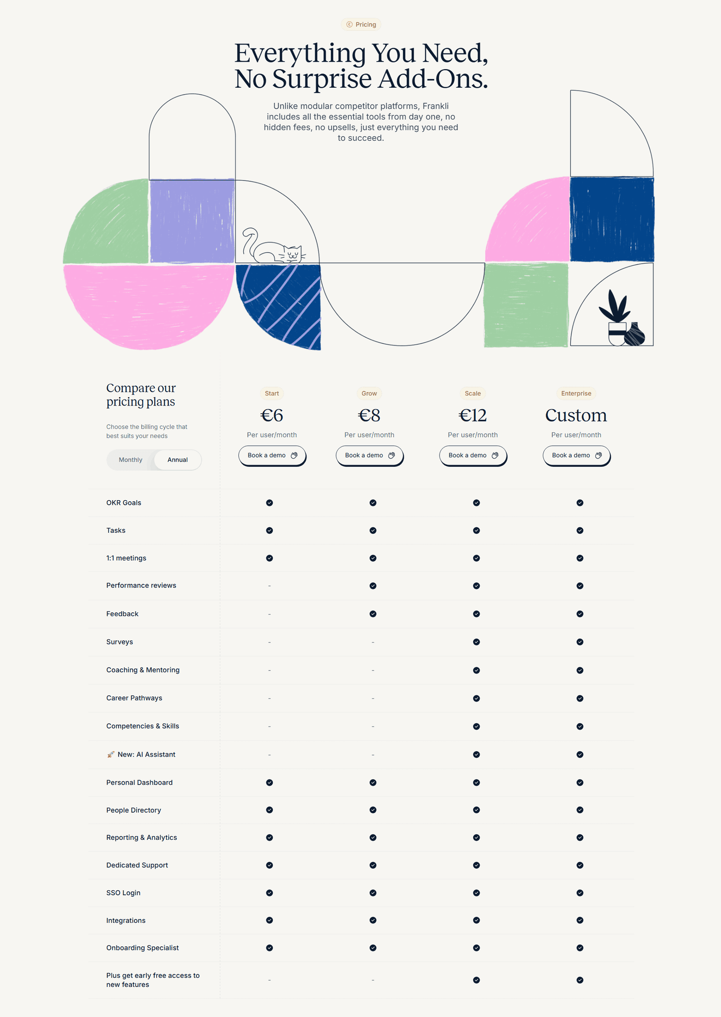
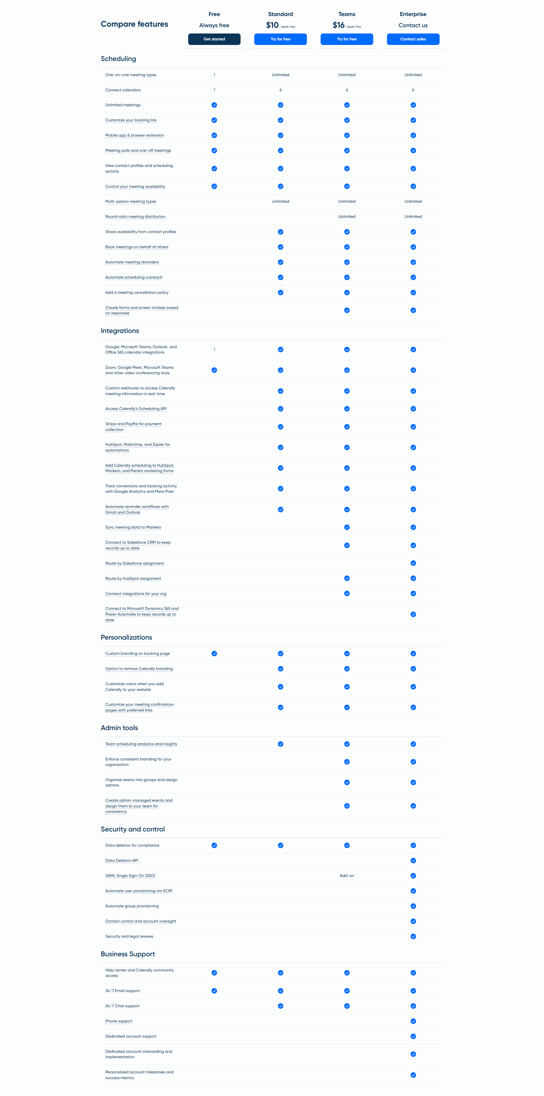
A call-to-action button in each plan column lets a visitor act the moment the comparison clicks, without scrolling back to the top of the table to find a button.
Key takeaways
Showing 1–19 of 19 examples
Browse every pricing table pattern by UX best practice.
Every pricing table is scored across 6 conversion best practices. Copy the best practice stack, not the design. See what converts and why.
Hand-picked from 650+ companies and analyzed by our AI conversion agent. Not a random dump of pricing pages. Every entry earns its spot.
Found a pricing table you admire? Run yours through the same scoring engine. See where you stand on the same best practices, and what to fix first.
A pricing comparison table lays every plan side by side so a visitor can weigh the differences row by row. A CTA row adds a call-to-action button to each plan column, so a visitor can act on the plan they just settled on without hunting back up the page for a button. The table says "here is what each tier gives you." The CTA row answers "and here is how to start," in the exact column the visitor is reading.
The button shows up in one of three places, sometimes more than one:
A comparison table is where a visitor does the hard work of deciding. By the time the right plan clicks, they have often scrolled well past the plan headers and prices at the top. If the only button is back at the top, the decision and the action are separated by a scroll, and a scroll is where intent leaks away. A button in the column the visitor is reading closes that gap: the moment the comparison resolves, the next step is already under the cursor.
The placement also keeps the price and the action tied together. When the CTA sits in the header beside the price, or in a footer that repeats the price, the visitor commits to a plan and a number at once, with no second trip up the page to confirm which column they were on.
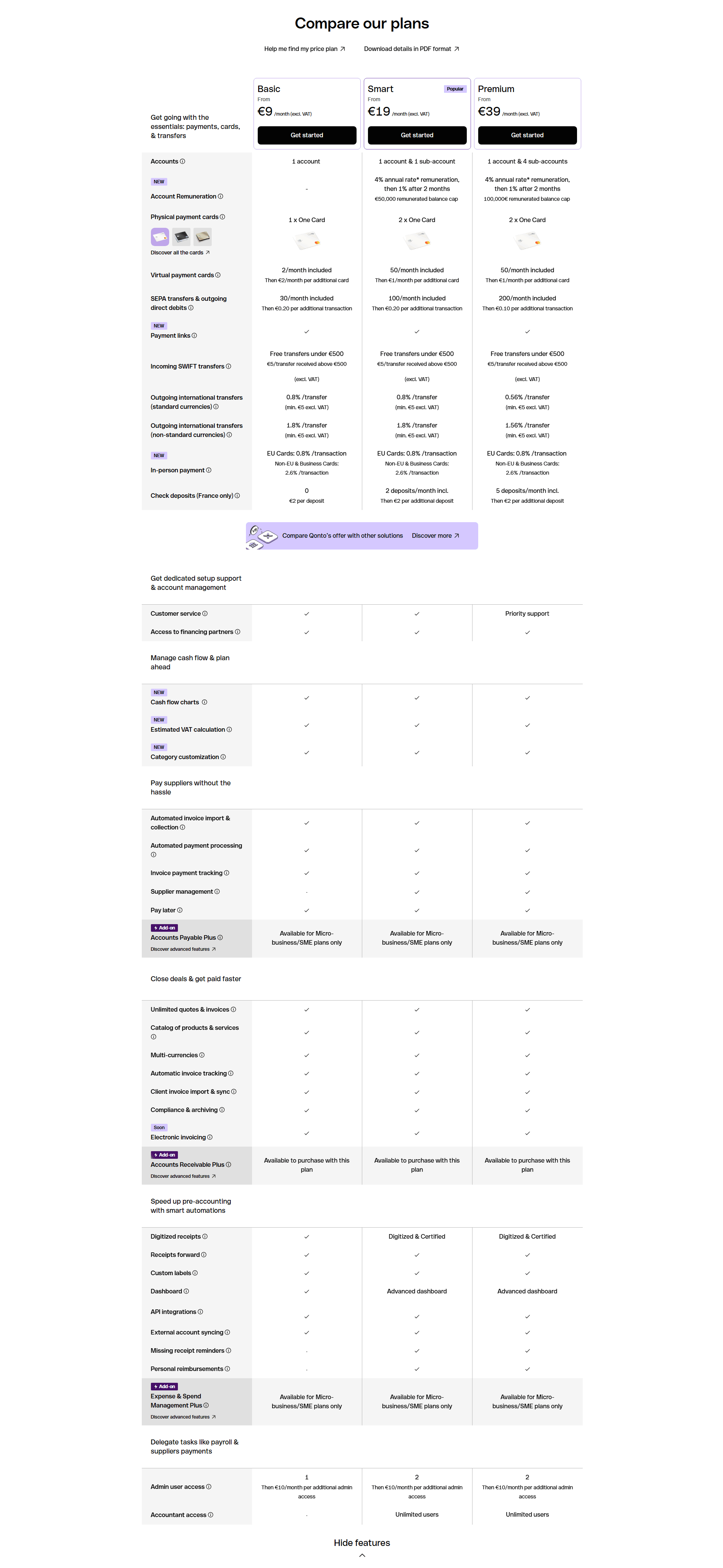
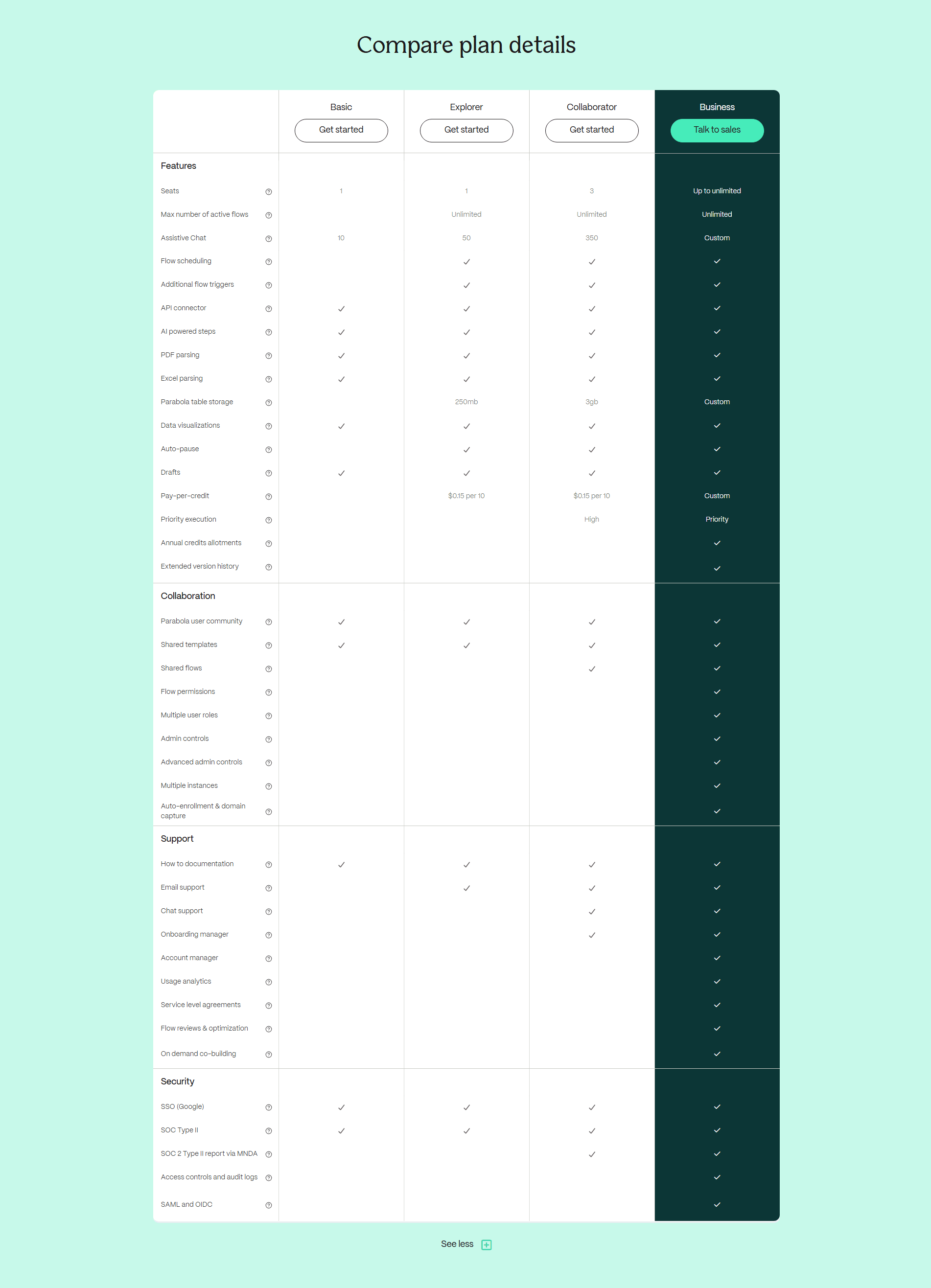
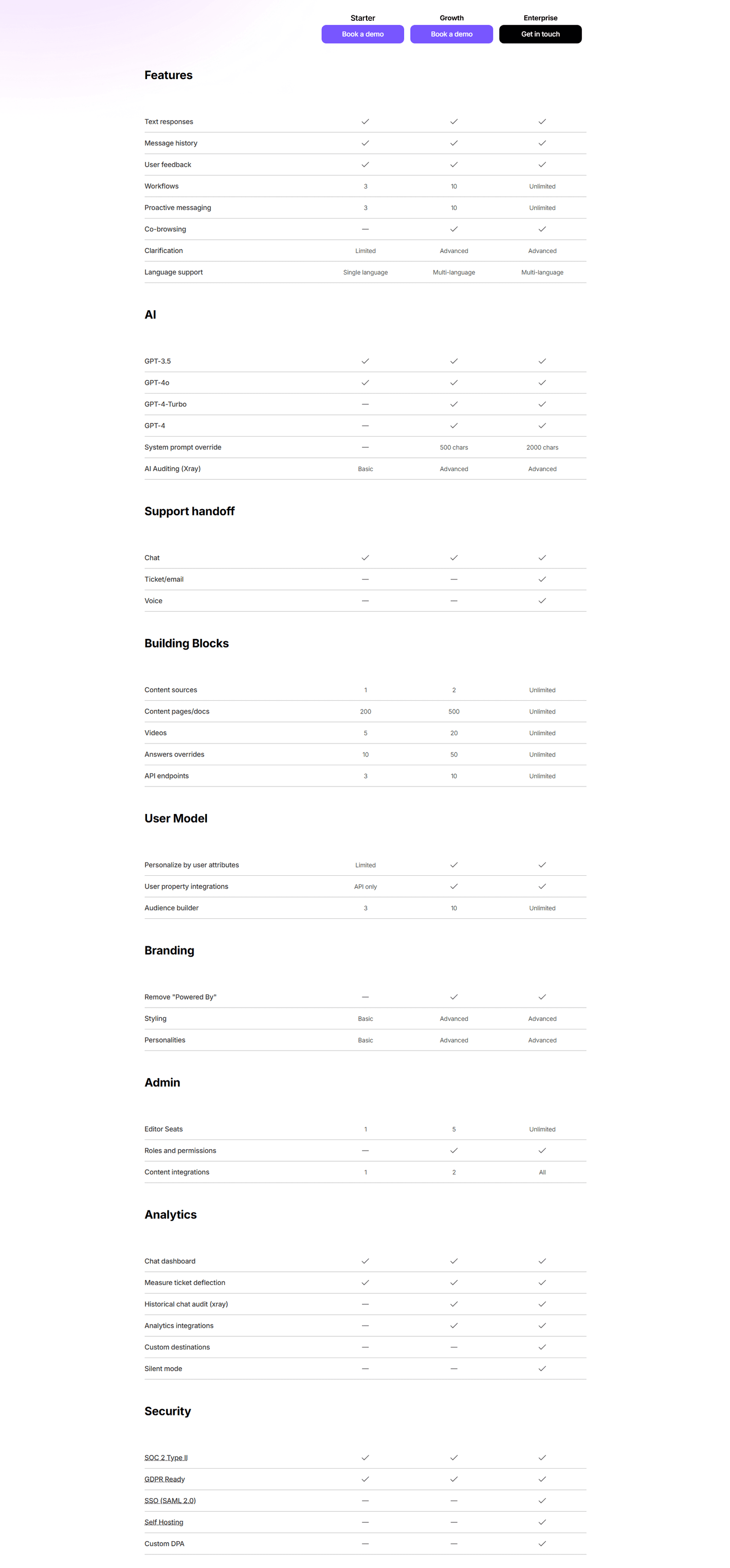
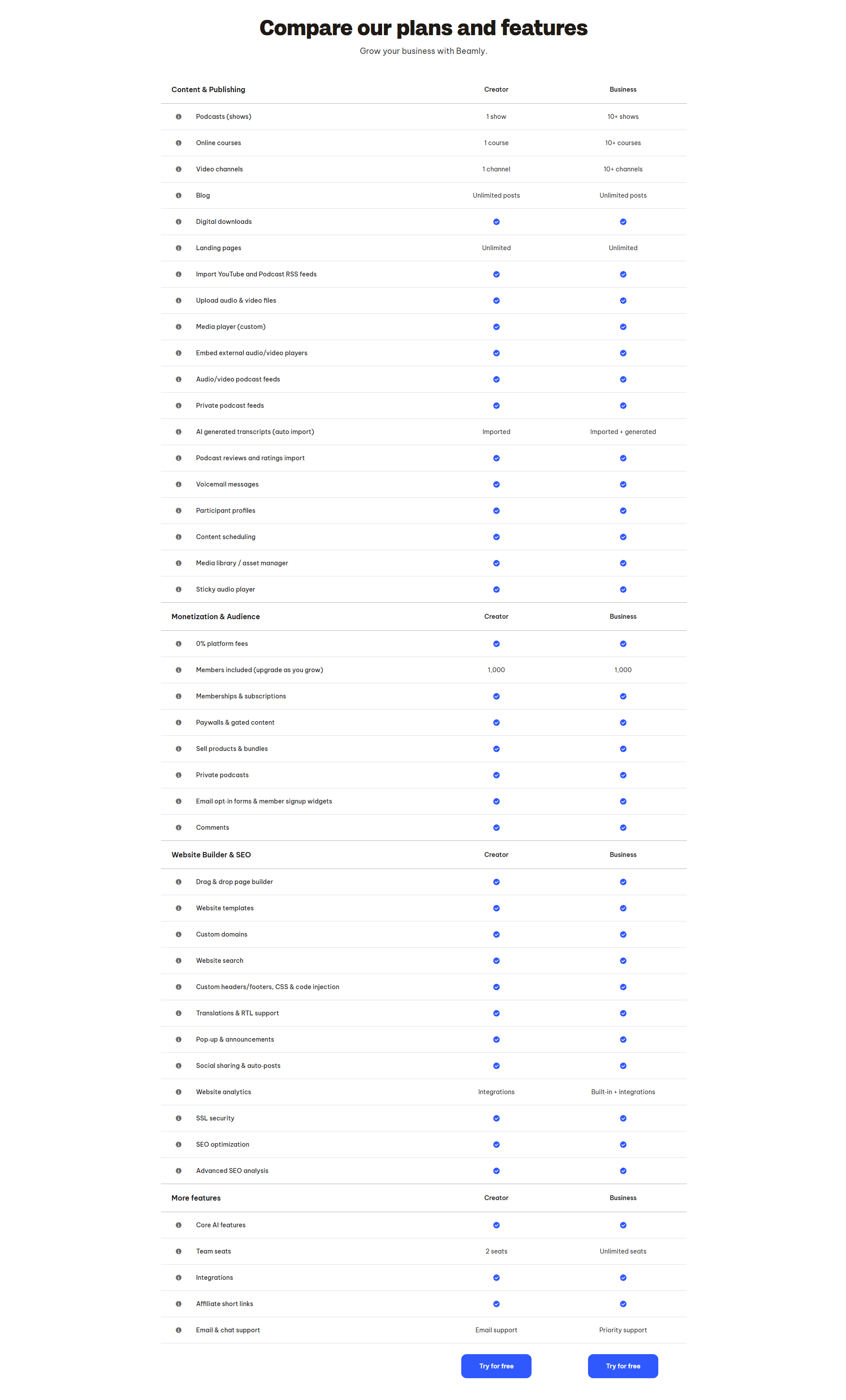
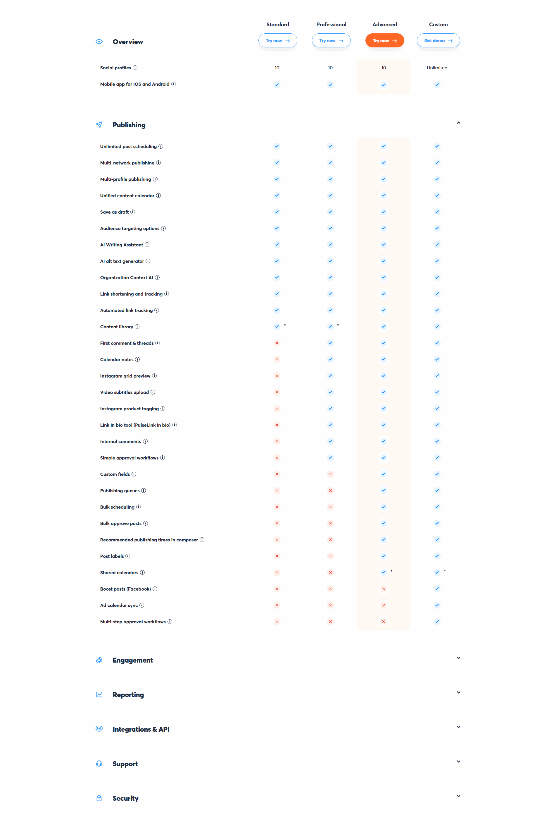
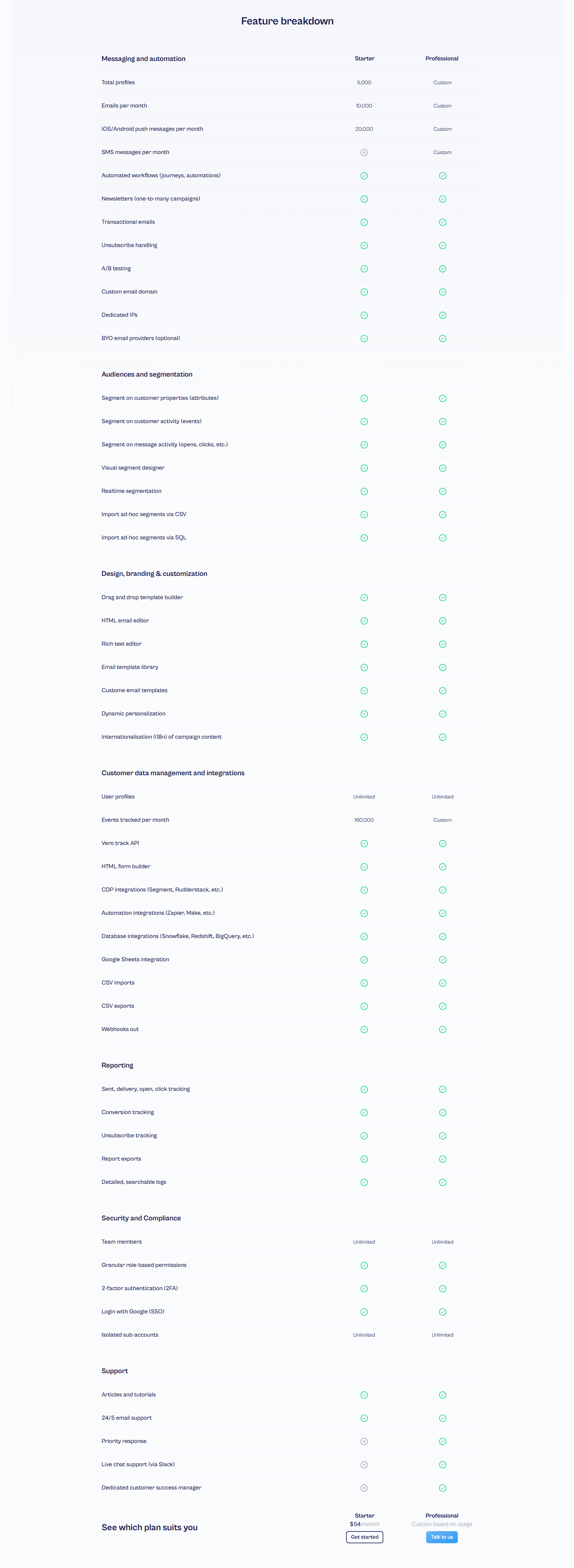
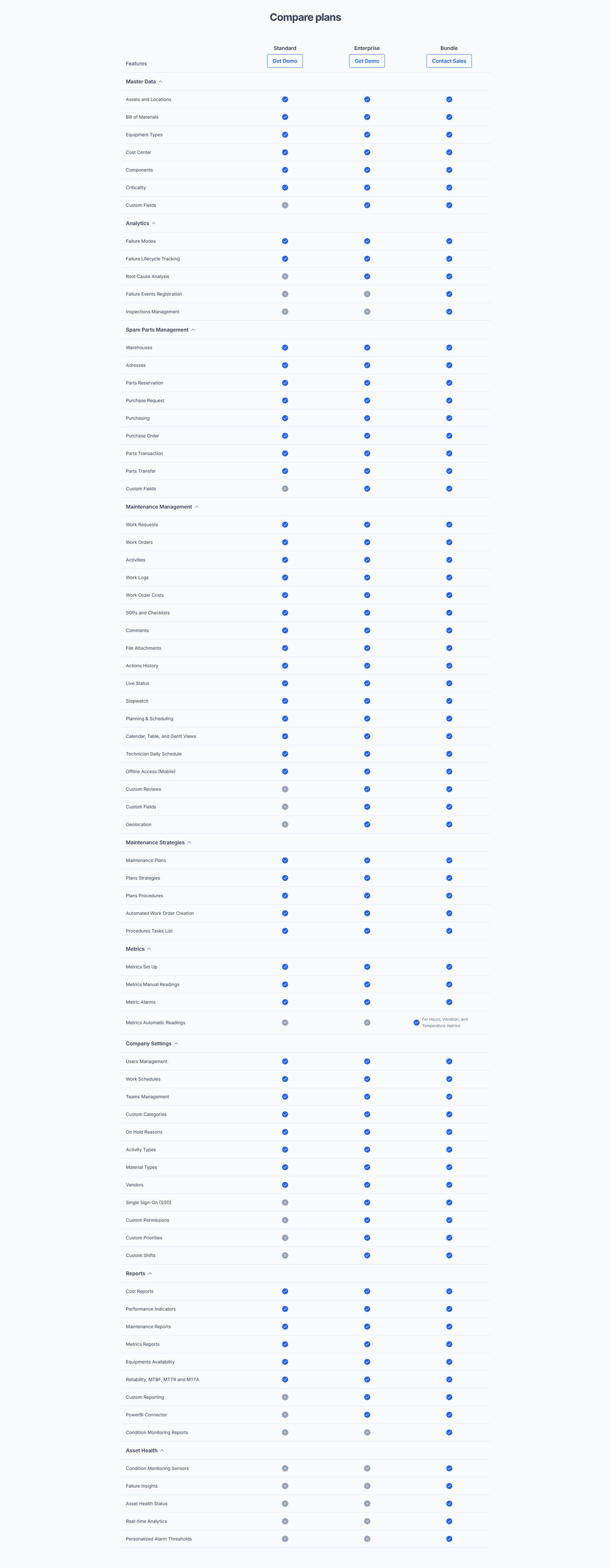
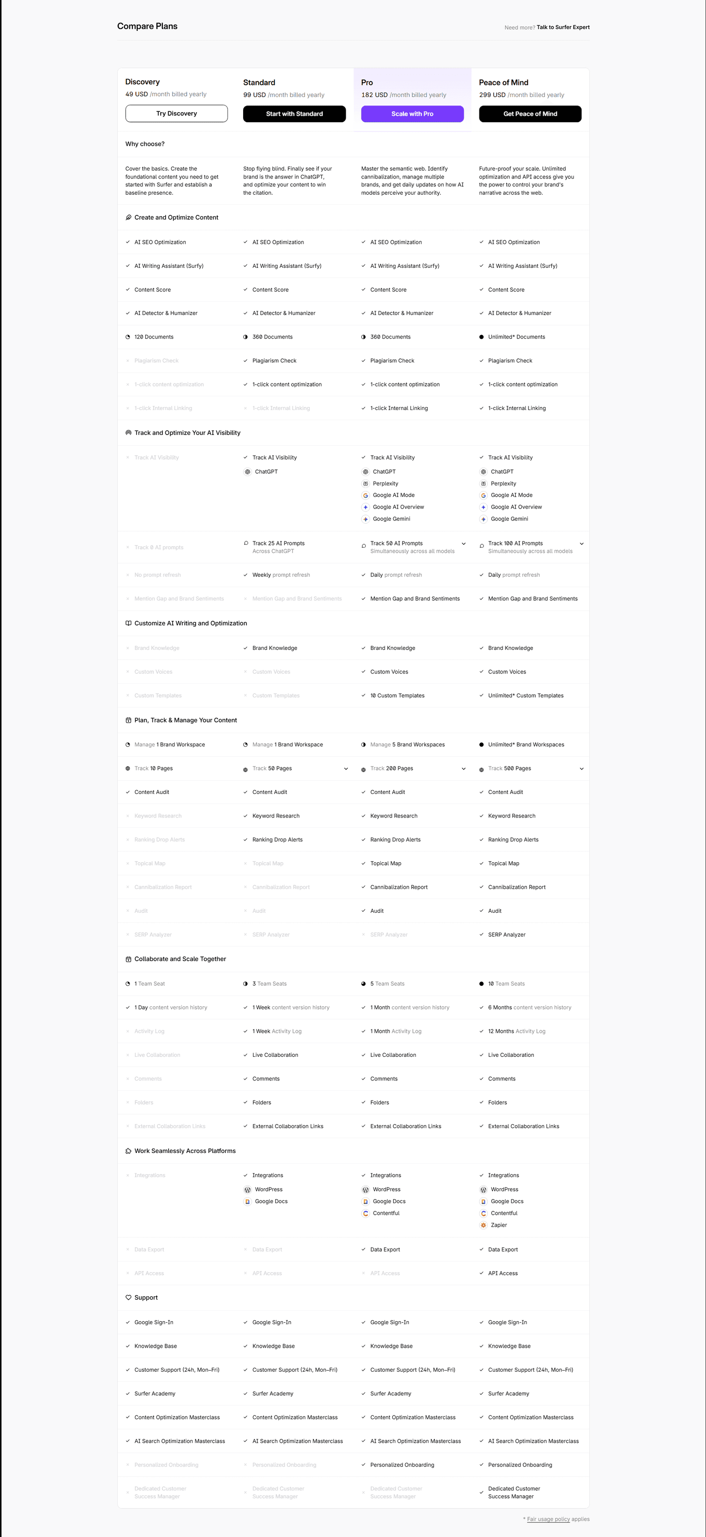
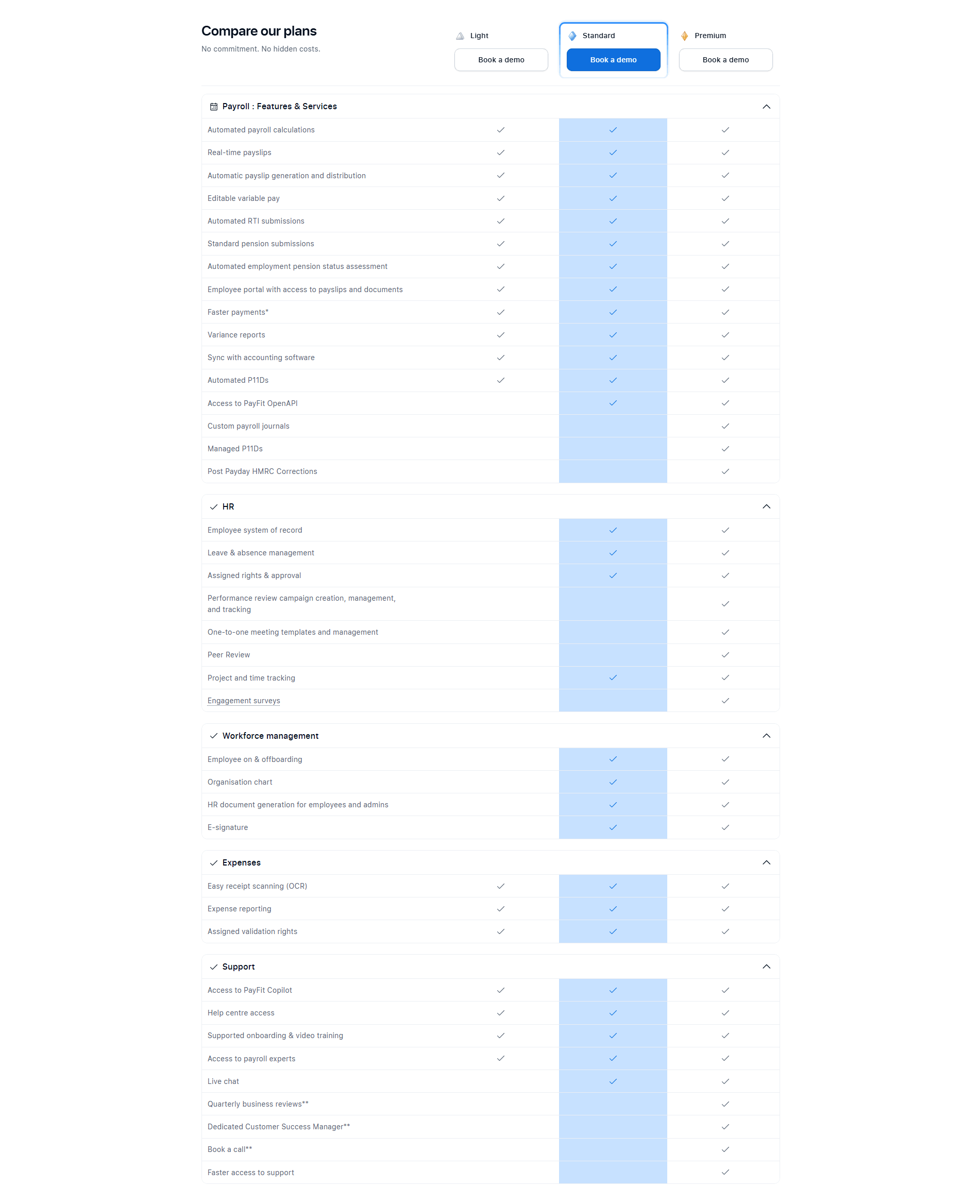
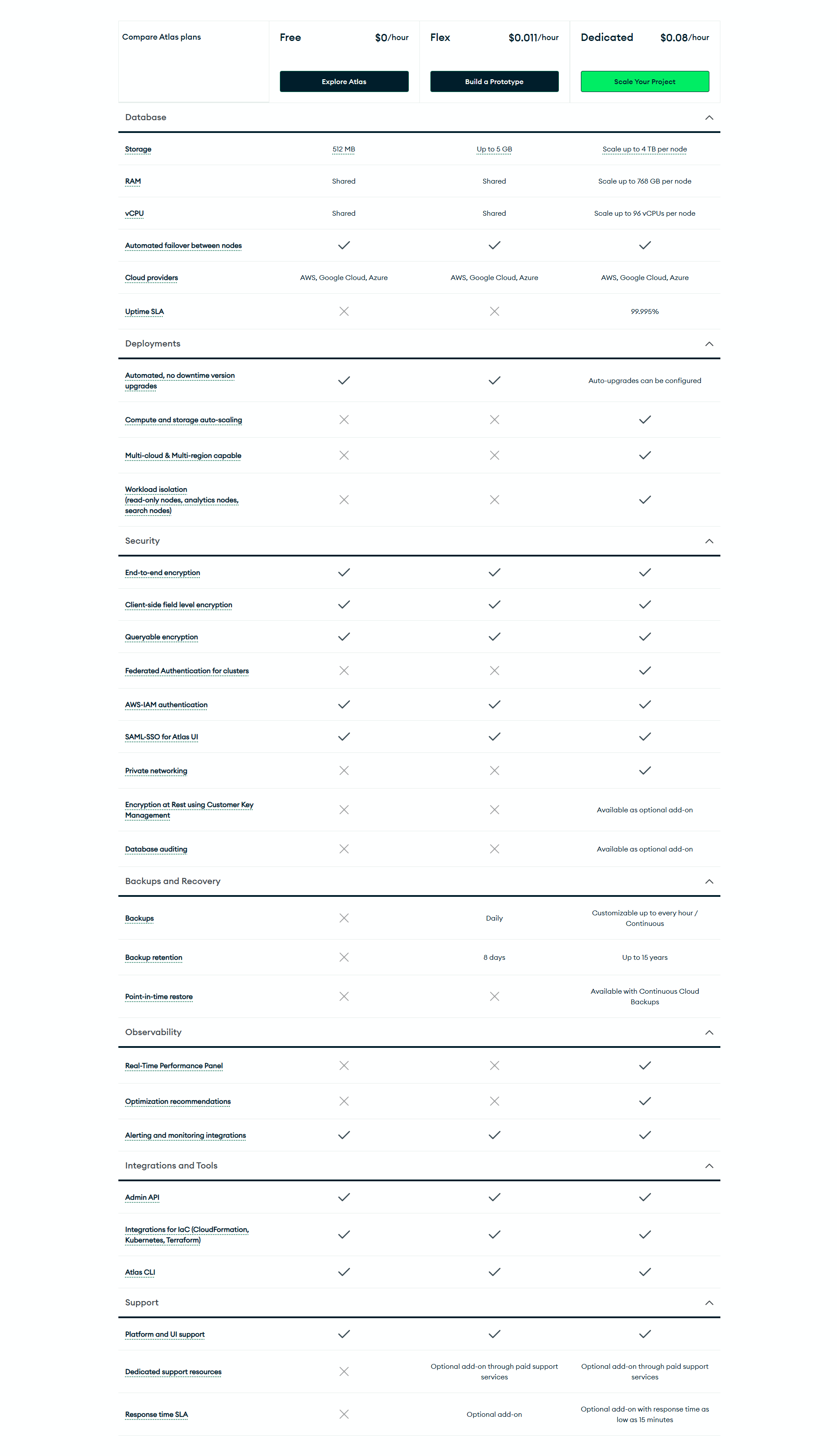
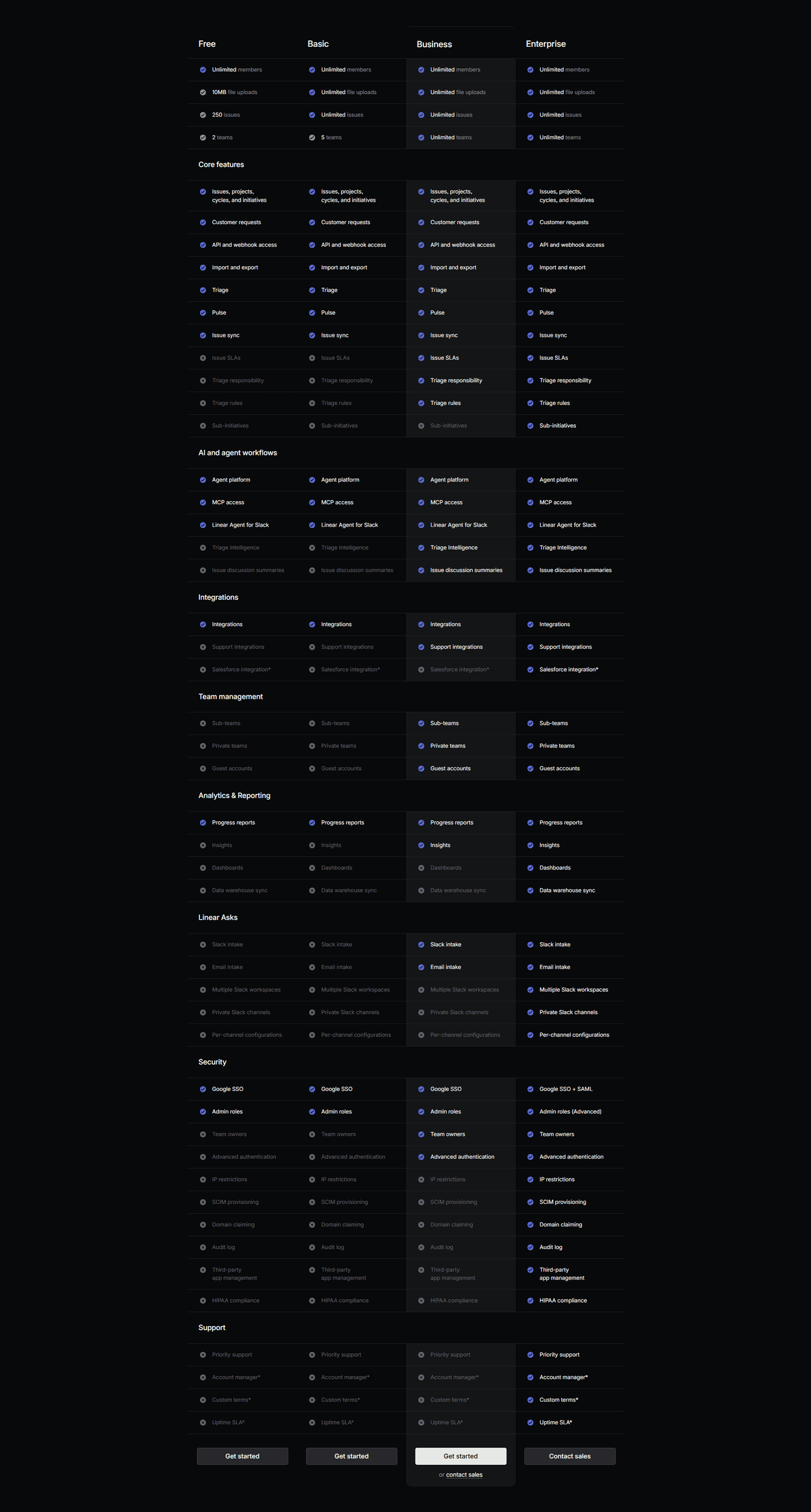
Most pricing comparison tables in the benchmark keep a call-to-action inside the plan columns rather than parking a single button above the table. Across the examples below, the disciplined version ties each button to one specific plan and one specific price. Qonto and Calendly place the CTA directly under the price in each header, so cost and action read as one unit. Surfer SEO goes a step further and writes the button label to the plan, with Try Discovery, Start with Standard, and Grow with Pro, so the action names the tier instead of a generic "Get started." For long tables, Beamly and Linear repeat the buttons in a footer under every column, and PayFit restates them mid-table, so the action is never more than a short scroll away. The recommended plan usually carries a filled, higher-contrast button, as Agorapulse and PayFit do, to steer the eye without hiding the other options.
100/100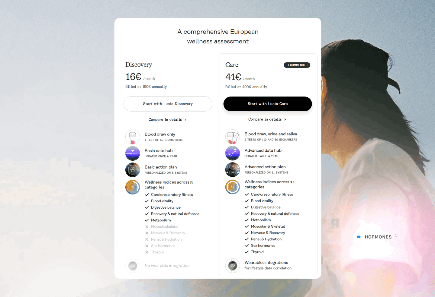 0/100
0/100The usual failure is a single button stranded at the top of the table, so a visitor who decides at row forty has to scroll back up to act. The second is a CTA row that repeats the same generic label in every column, which drops the one cue that would tie the button to the plan and its price. The third is a button that looks identical in every column with nothing to mark the recommended tier, leaving the visitor to do the ranking the table should have done for them. Keep a way to act inside each column, tie it to that plan's price, and make the recommended plan's button the one that stands out.

Curated by
Gabriel Amzallag , Founder, Web Anatomy
5 years CRO + SEO at Qonto (2021–2025). After advising 15+ SaaS on their websites (Payfit, Pigment…), the same patterns kept breaking, so I decided to build the source of truth on what works on the web: the intelligence layer every tool, builder, and team uses to ship sites that perform.
Paste your URL. Get a scored analysis of your pricing section, including whether a visitor can act from the plan they just picked. Free, no signup.
The common questions about placing a call-to-action in every plan column, with answers drawn from 19 scored examples.
It is a call-to-action button placed inside each plan column of a pricing comparison table, rather than a single button parked above the table. The button can sit in the column header next to the price, in a footer row under each column, or repeat at several points down a long table. The point is that a visitor can act on the plan they just settled on without scrolling back to the top.
A comparison table is where a visitor does the work of deciding, and by the time the right plan clicks they have often scrolled well past the prices at the top. If the only button is back up there, the decision and the action are separated by a scroll. A button in the column being read closes that gap: the moment the comparison resolves, the next step is already in reach.
The two common places are the column header, next to the price, and a footer row under each column. Header buttons tie the action to the price the moment a visitor lands on the table. Footer buttons meet the visitor where the reading ends, right after they have compared the rows. For a long table, the strongest approach is both, plus a repeat mid-table so the action is never far away.
Yes. The recommended plan usually carries a filled, higher-contrast button while the other columns use a lighter outline style. This steers the eye toward the plan most buyers should pick without hiding the alternatives. Writing the label to the plan, such as Start with Standard or Grow with Pro, adds another cue that ties the action to the tier.
It is the majority approach among the pricing comparison tables in the benchmark. Most keep a call-to-action inside the plan columns rather than relying on one button above the table. The examples below show the range, from a single button pinned in each header to a full row of buttons repeated at the bottom of a long feature matrix.