Pricing Table|
A pricing table that highlights the differences between plans lets a visitor see what each tier unlocks in one glance, instead of reading every row to work it out.
Key takeaways
Showing 1–21 of 32 examples
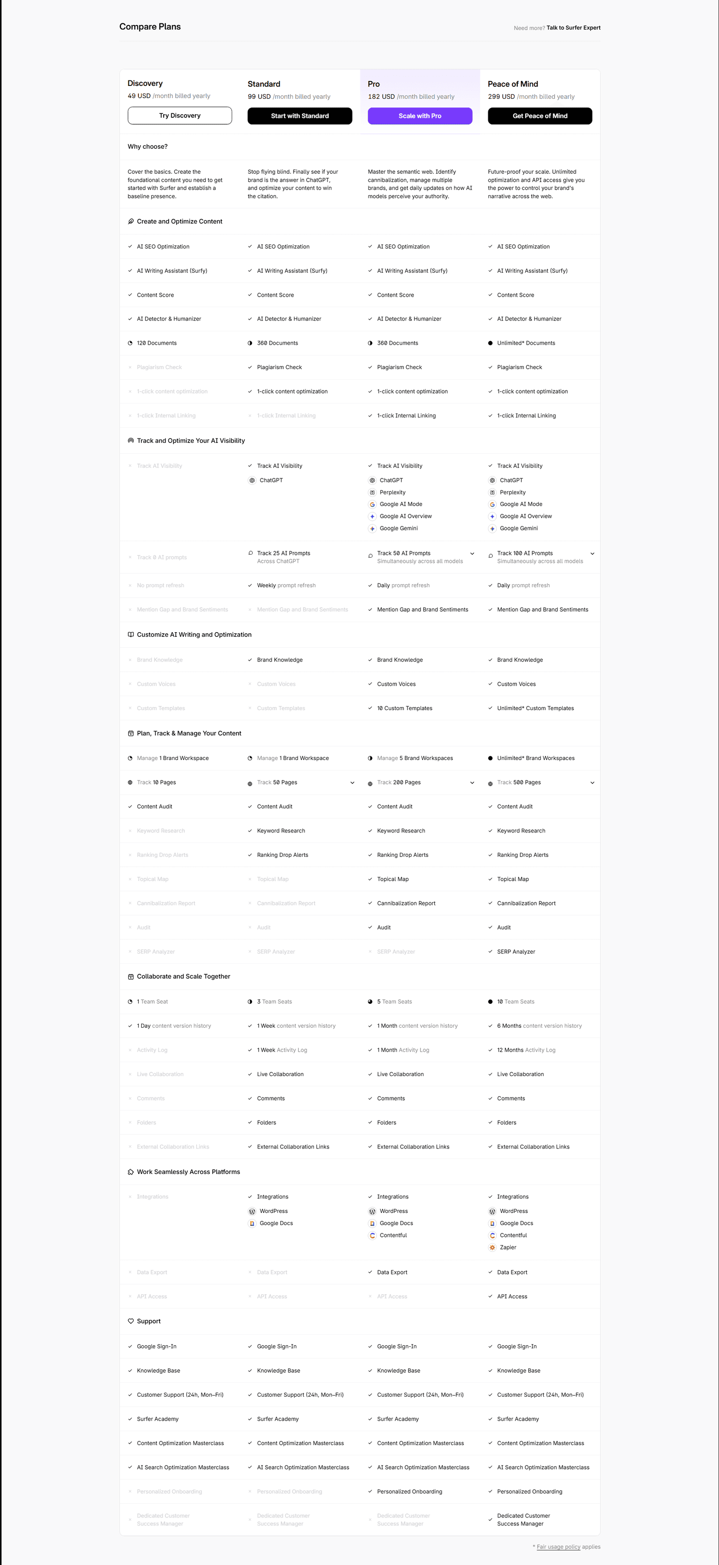
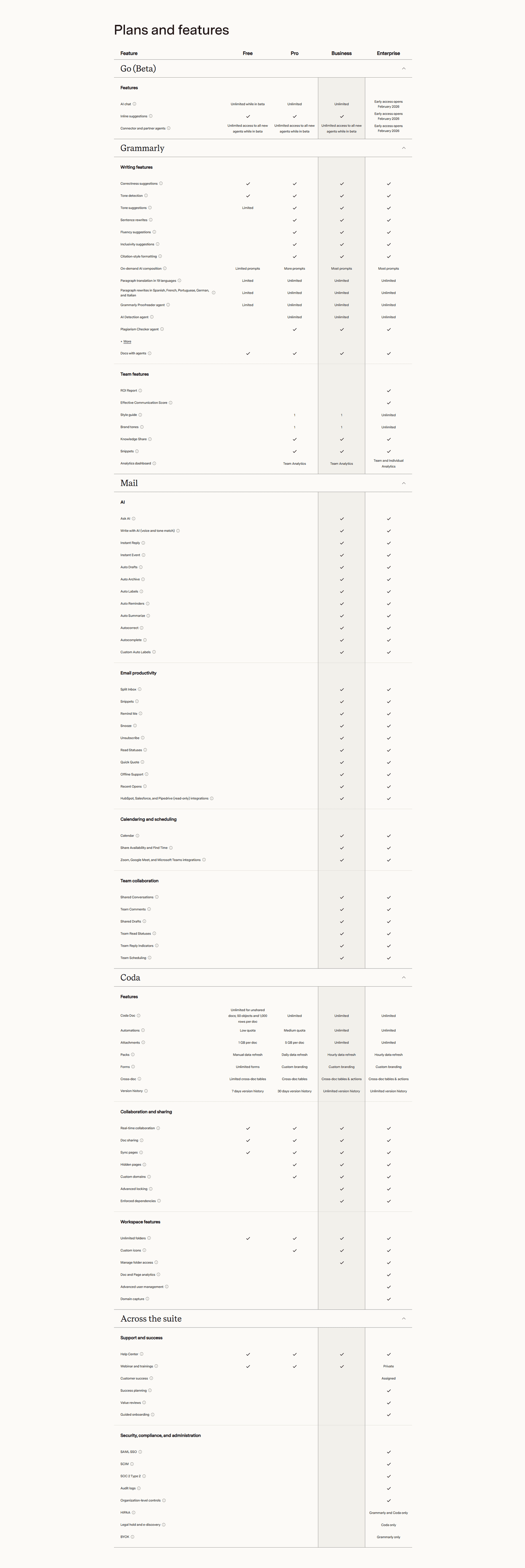
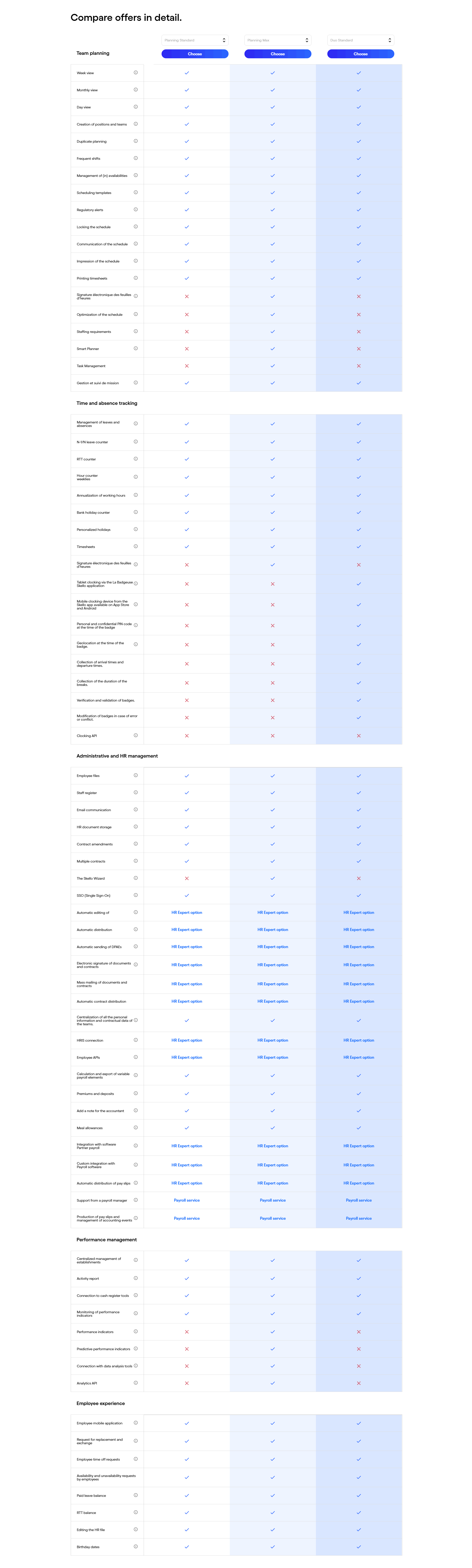
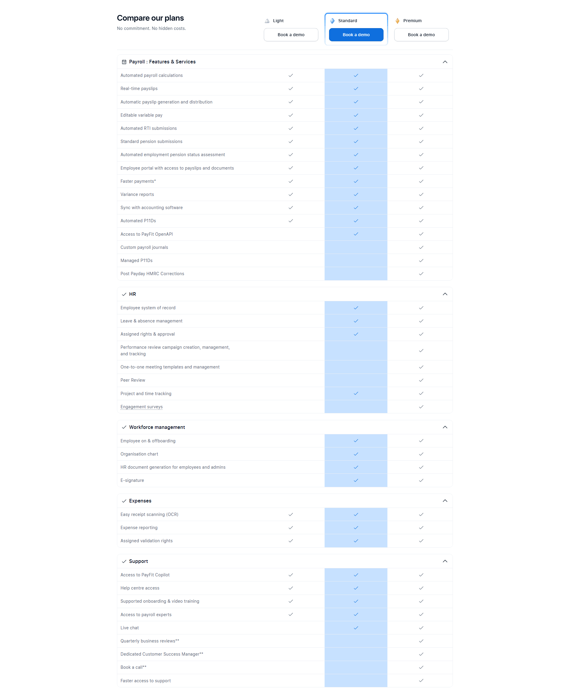
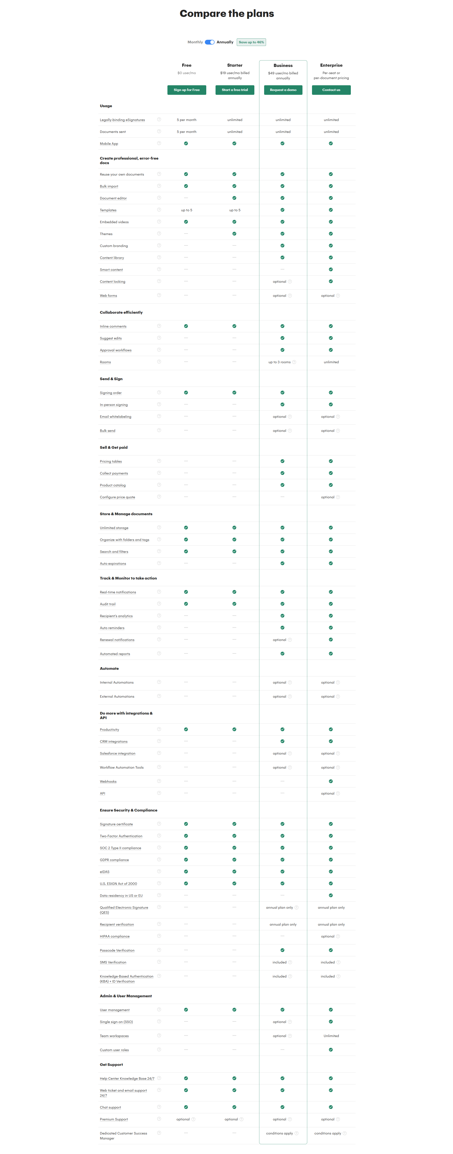
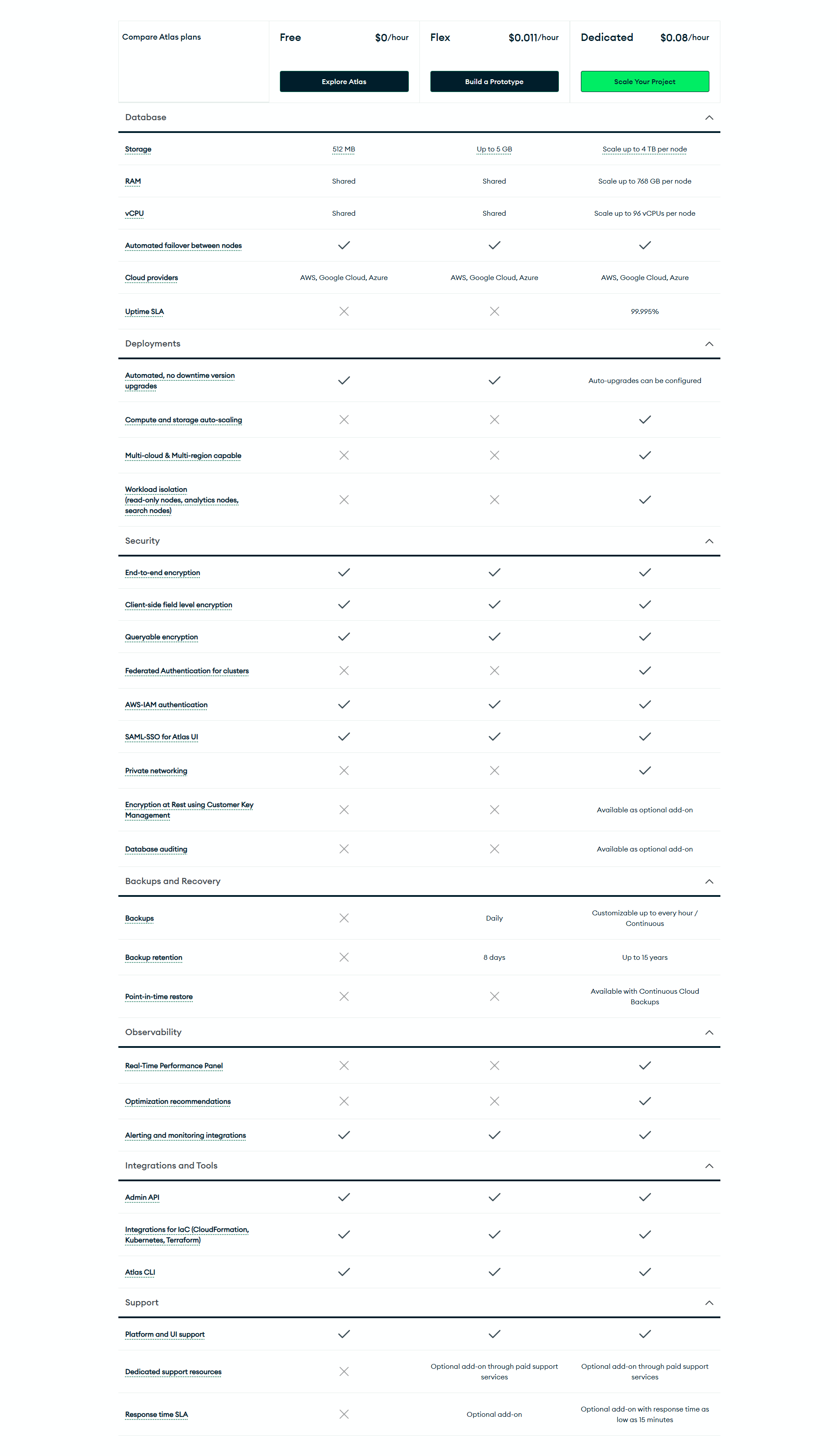
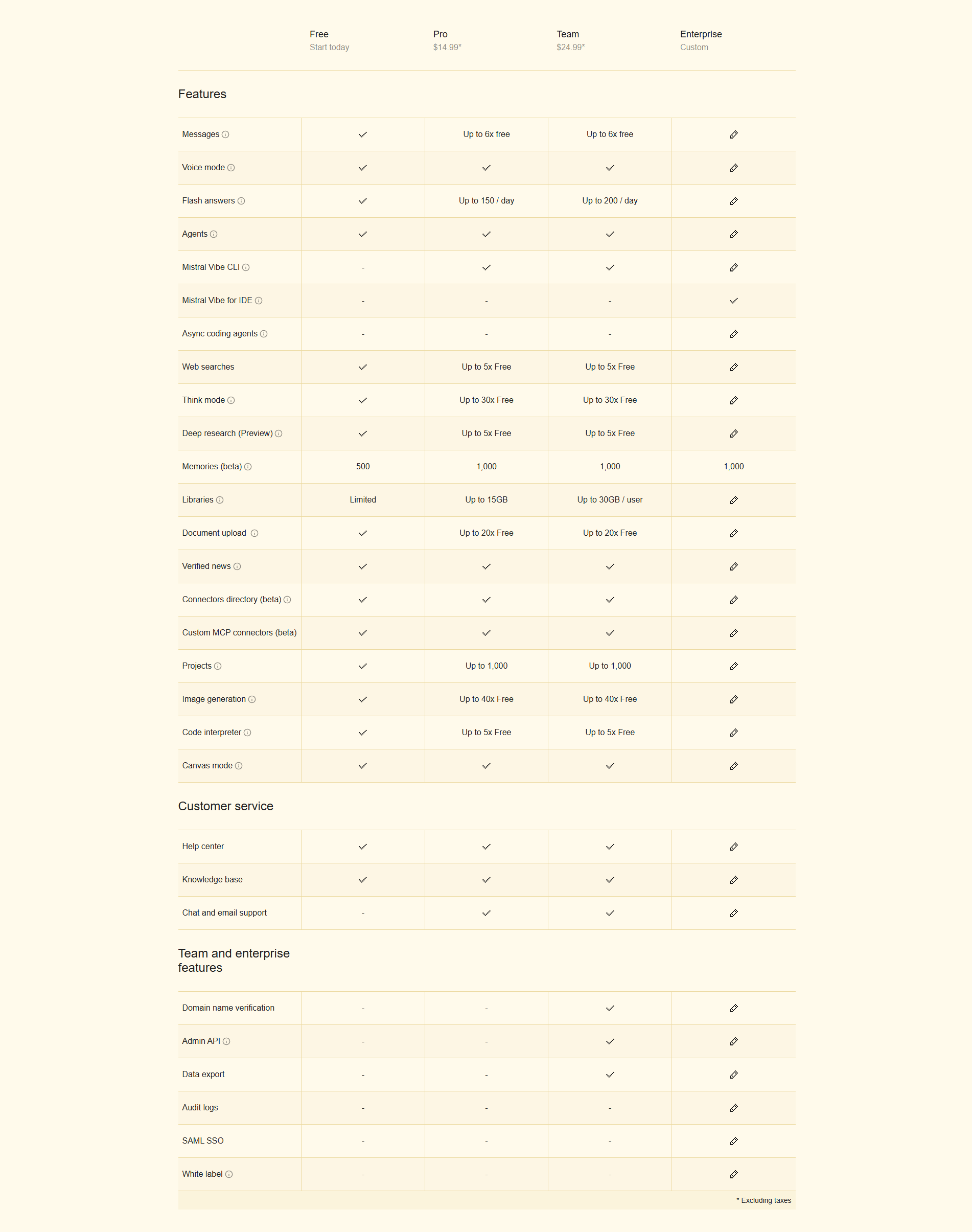
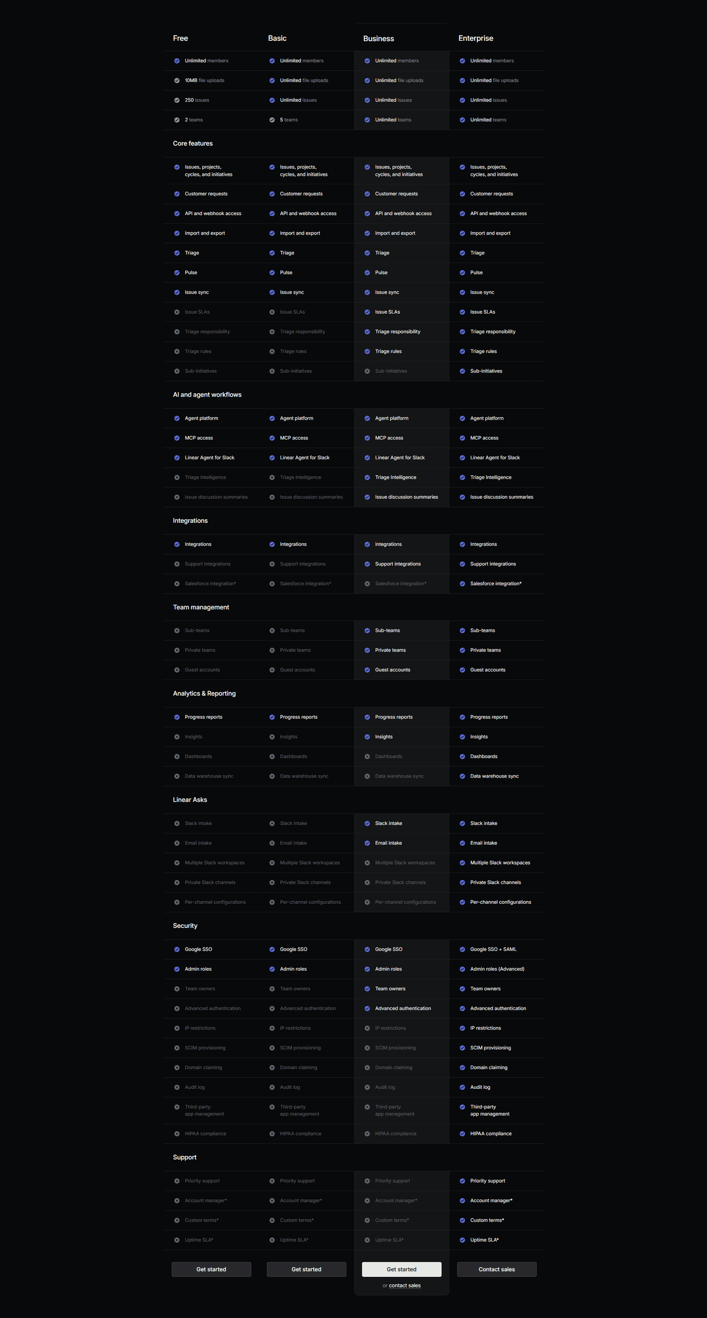
Browse every pricing table pattern by UX best practice.
Every pricing table is scored across 6 conversion best practices. Copy the best practice stack, not the design. See what converts and why.
Hand-picked from 650+ companies and analyzed by our AI conversion agent. Not a random dump of pricing pages. Every entry earns its spot.
Found a pricing table you admire? Run yours through the same scoring engine. See where you stand on the same best practices, and what to fix first.
Highlighting plan differences is the decision to build a pricing table around the gaps between tiers, not just the list of what each tier includes. A visitor does not open the pricing page to admire a feature list. They open it to answer one question: which plan do I need, and what am I giving up if I pick the cheaper one? A table that highlights differences answers that at a glance.
The best pricing tables use a few forms, usually several together:
Almost every pricing comparison table in the benchmark does some version of this, and the reason is simple. The pricing page is where a warm visitor decides, and the decision is a comparison, not a read. When every column looks alike, the visitor has to compute the difference row by row, and the effort itself talks them out of buying. When the differences are marked, the table does the comparing for them.
There is a second effect. A clearly marked difference is also the reason to upgrade. When a buyer can see that the middle plan is the one that unlocks the feature they came for, the price stops being an abstract number and becomes the cost of a specific thing they want. The table that highlights where plans diverge is the table that shows, on the exact row, why a higher tier is worth it.
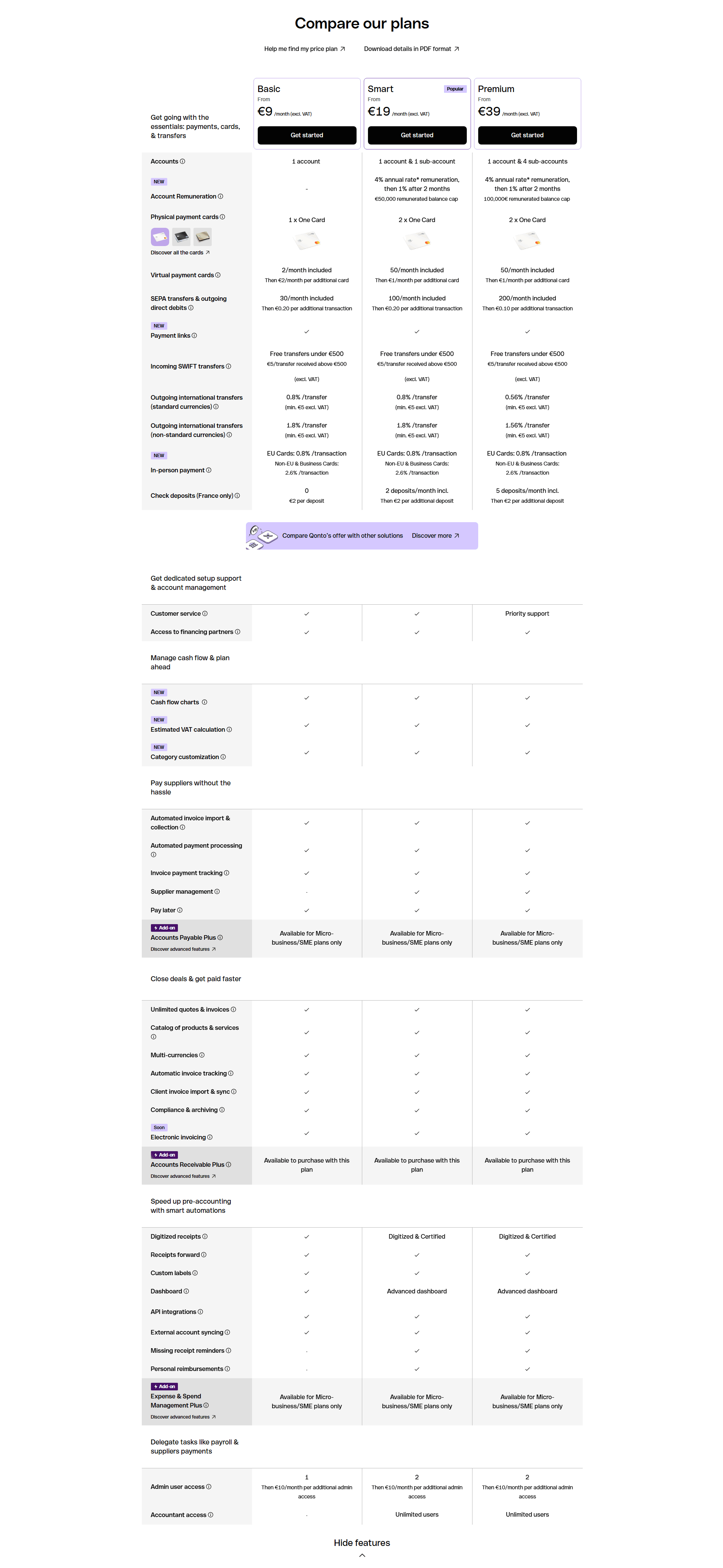
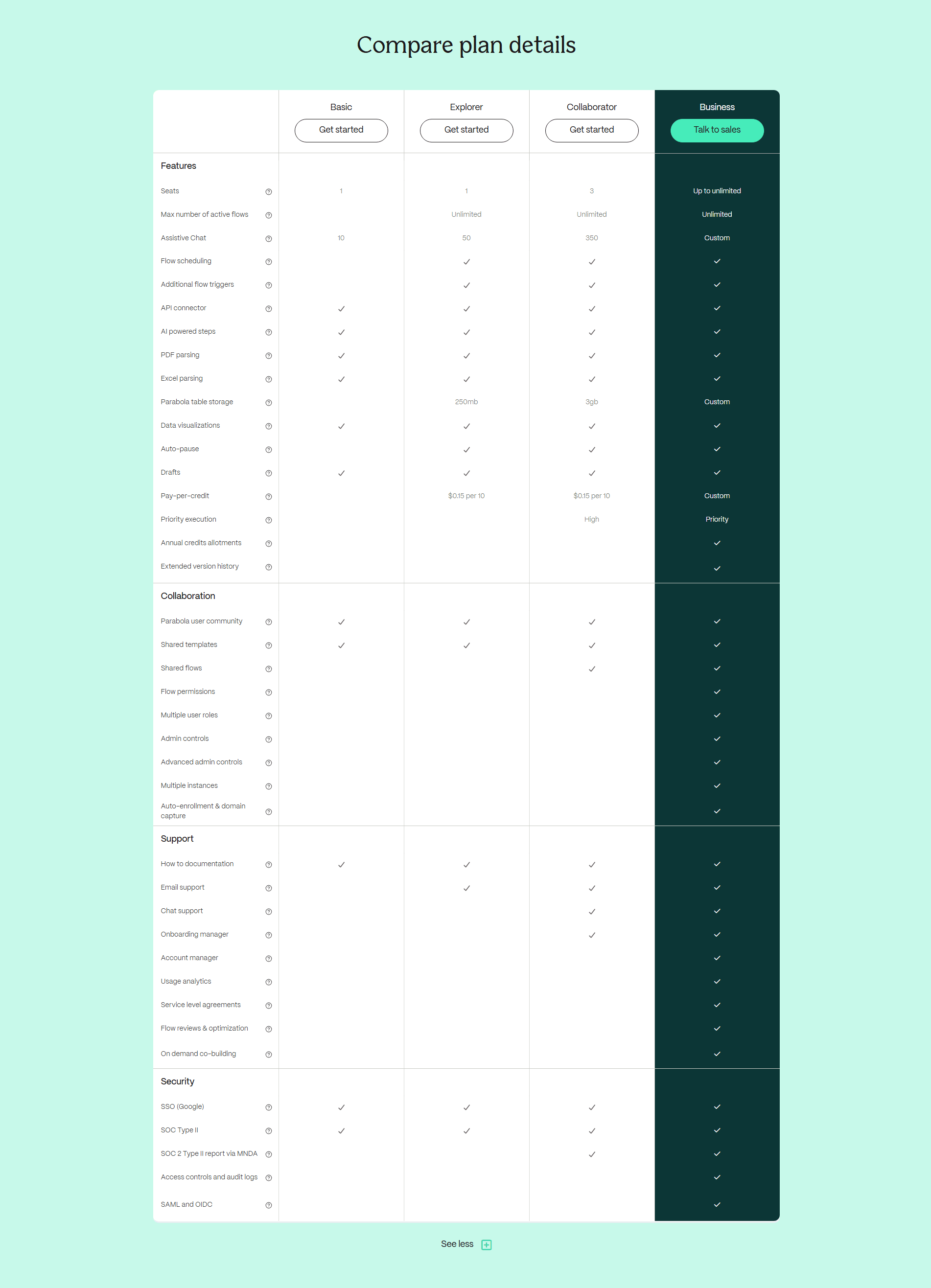
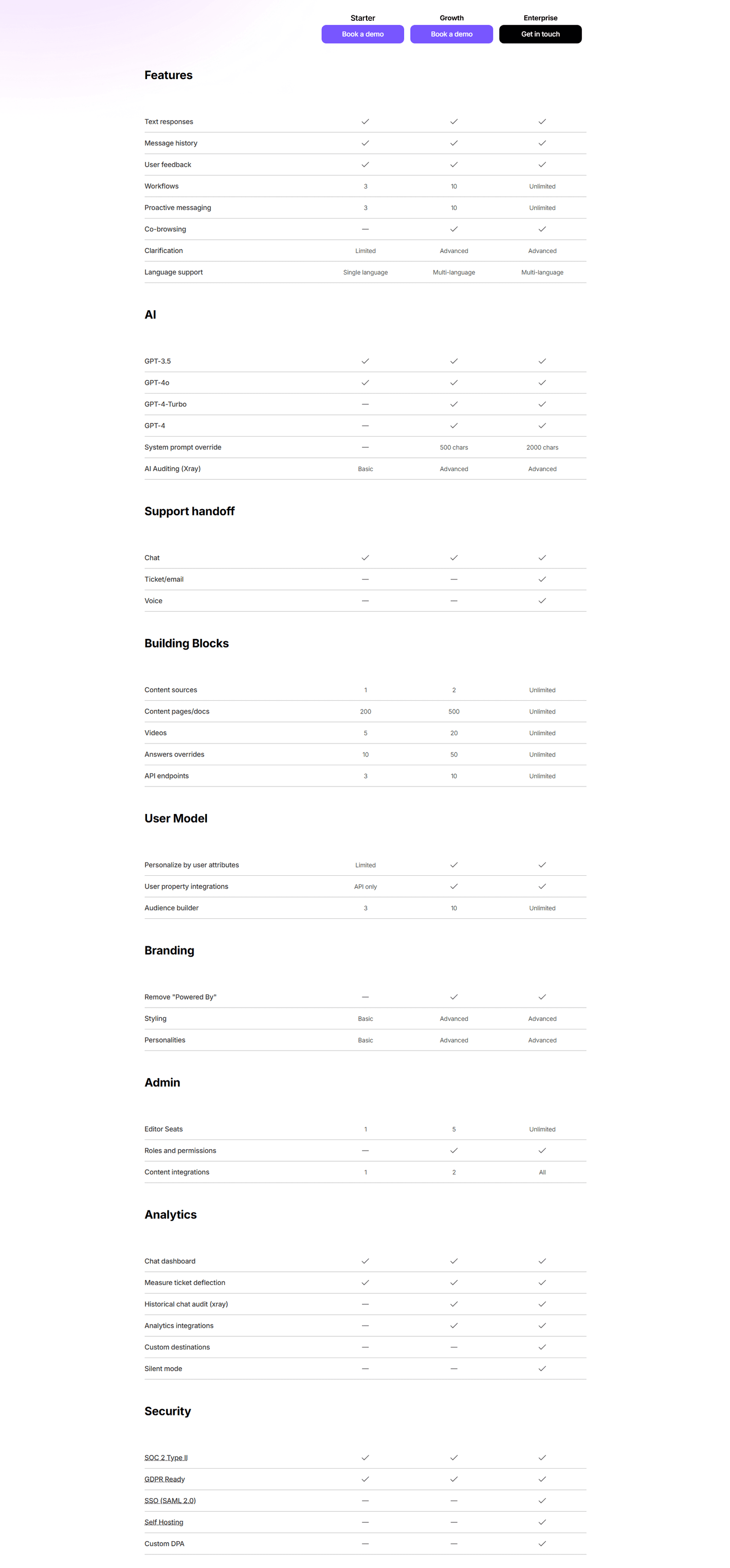
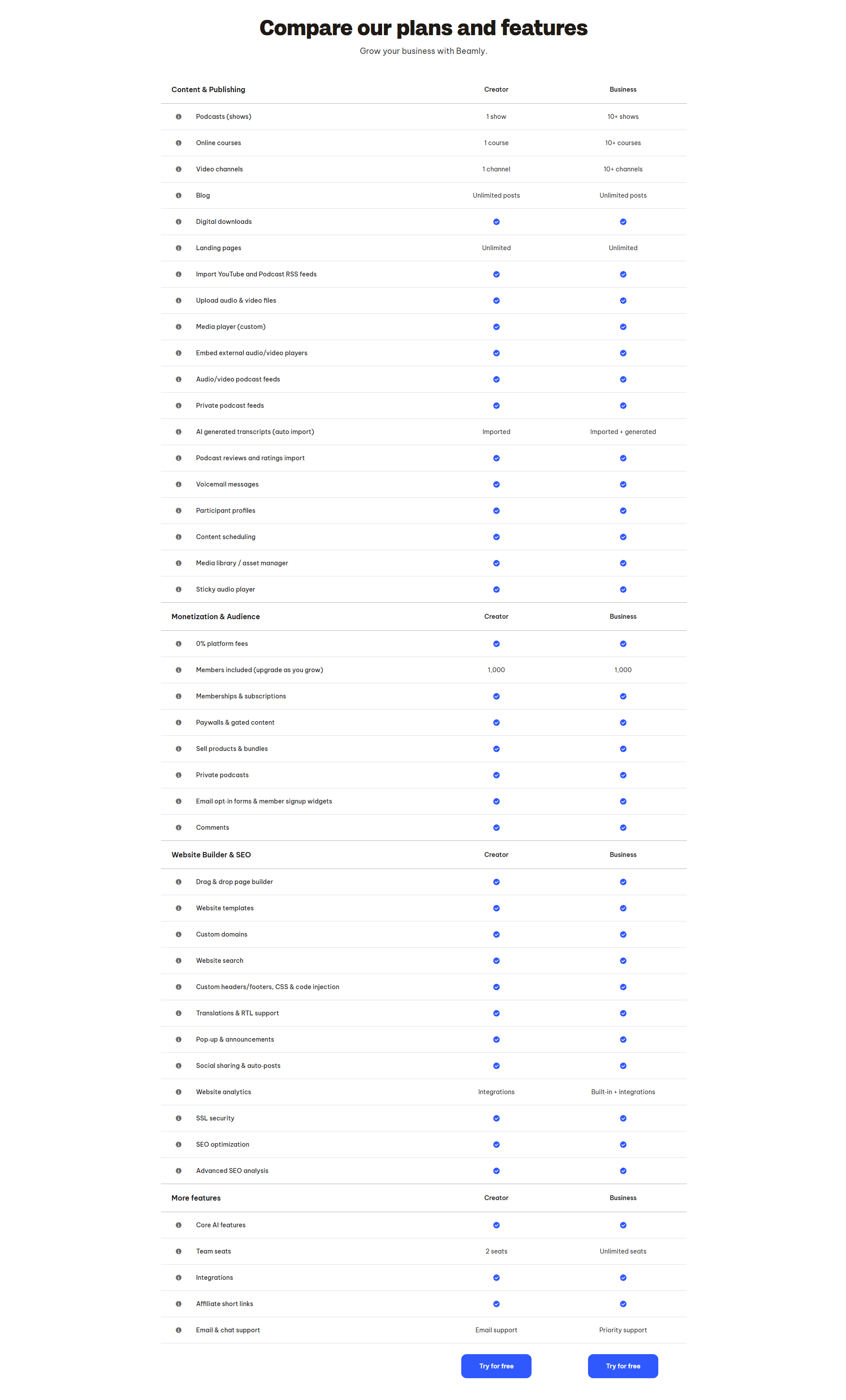
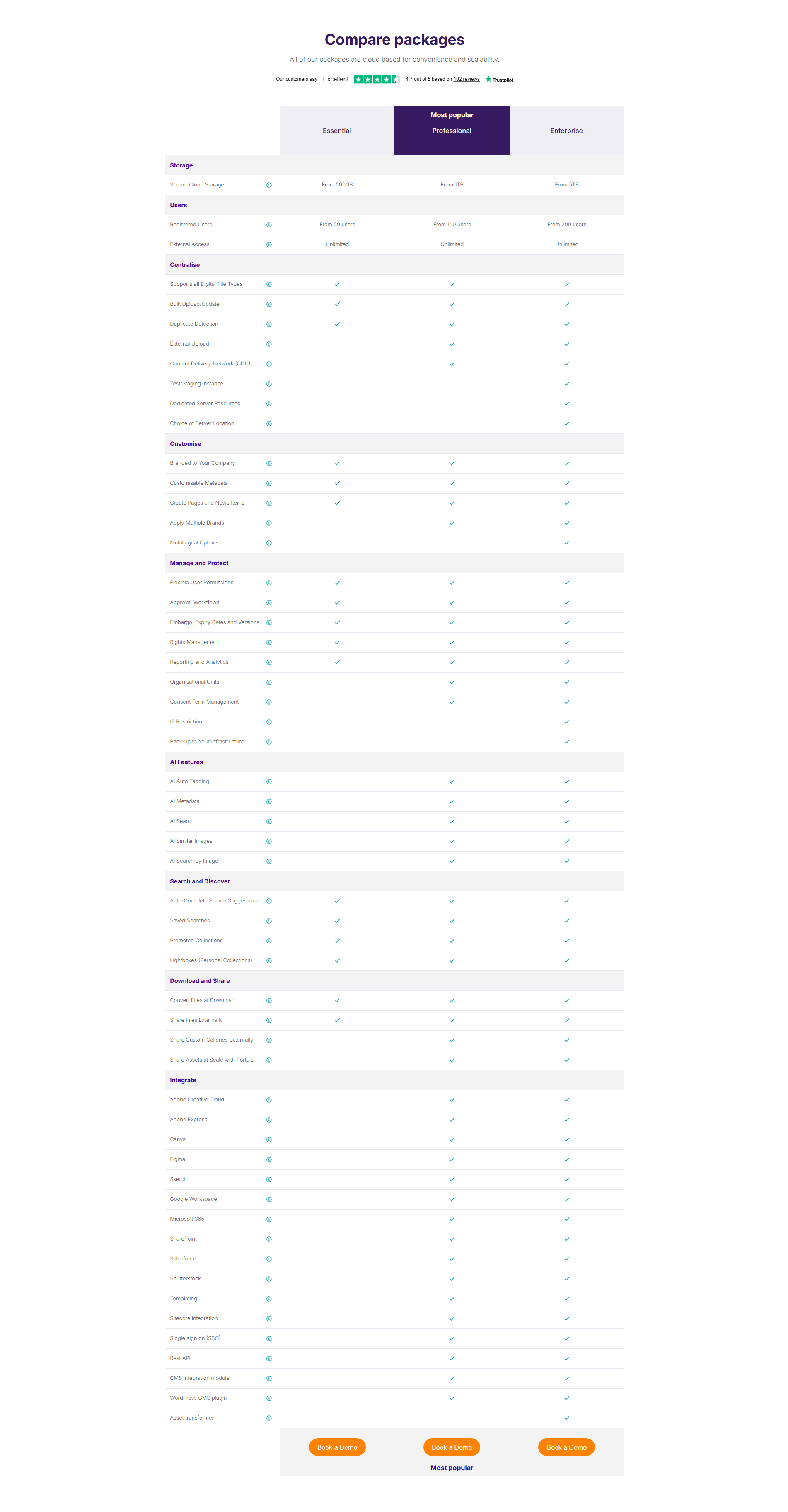
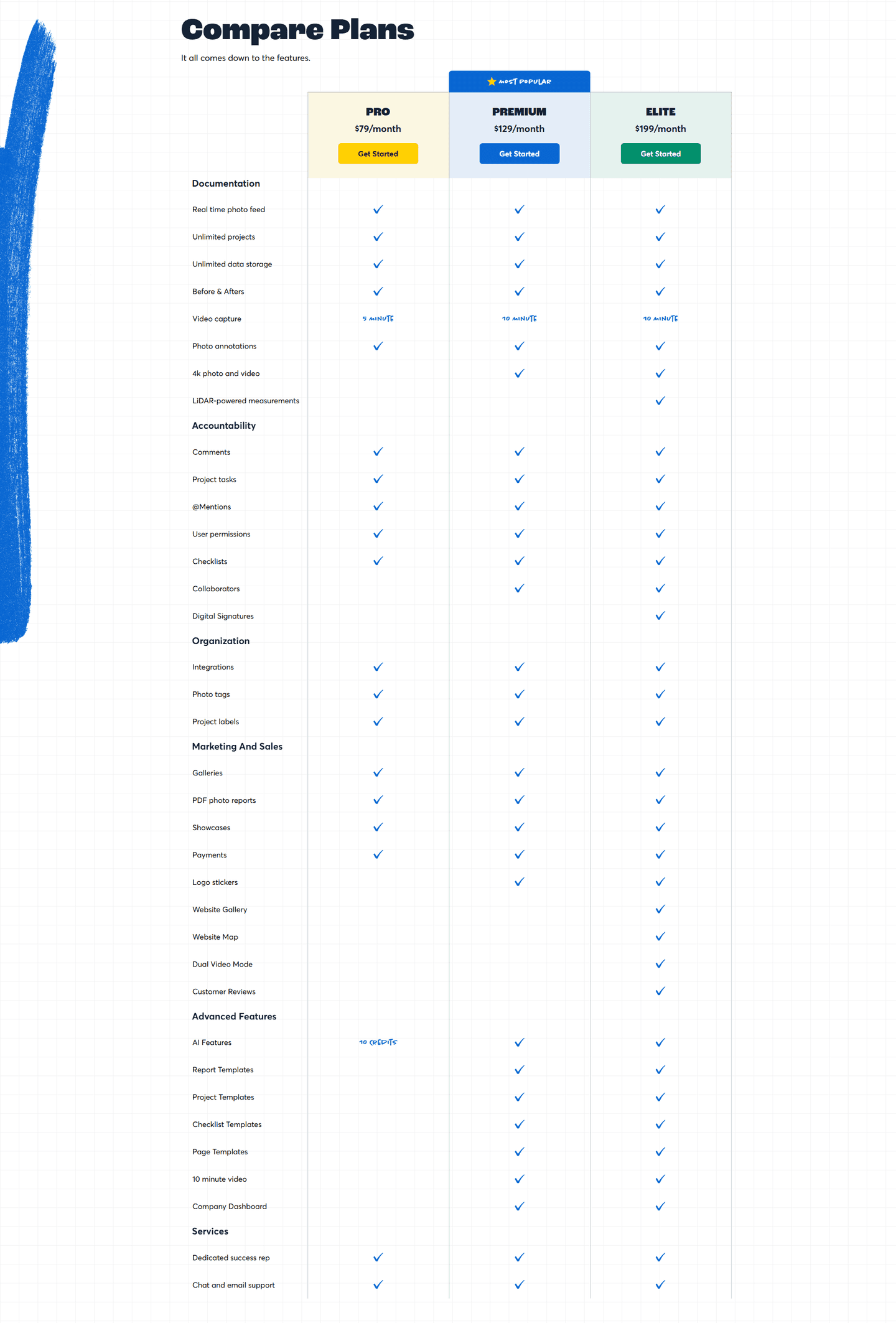
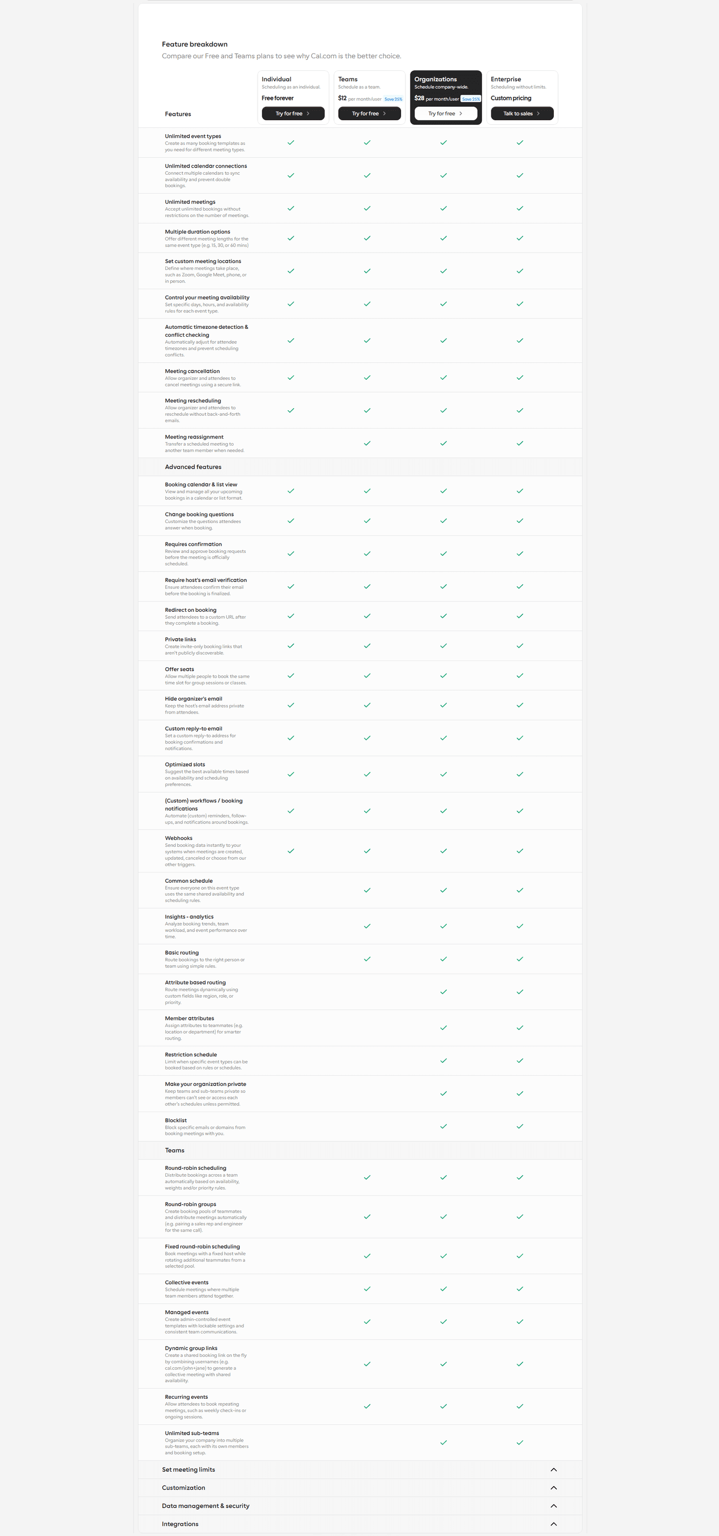
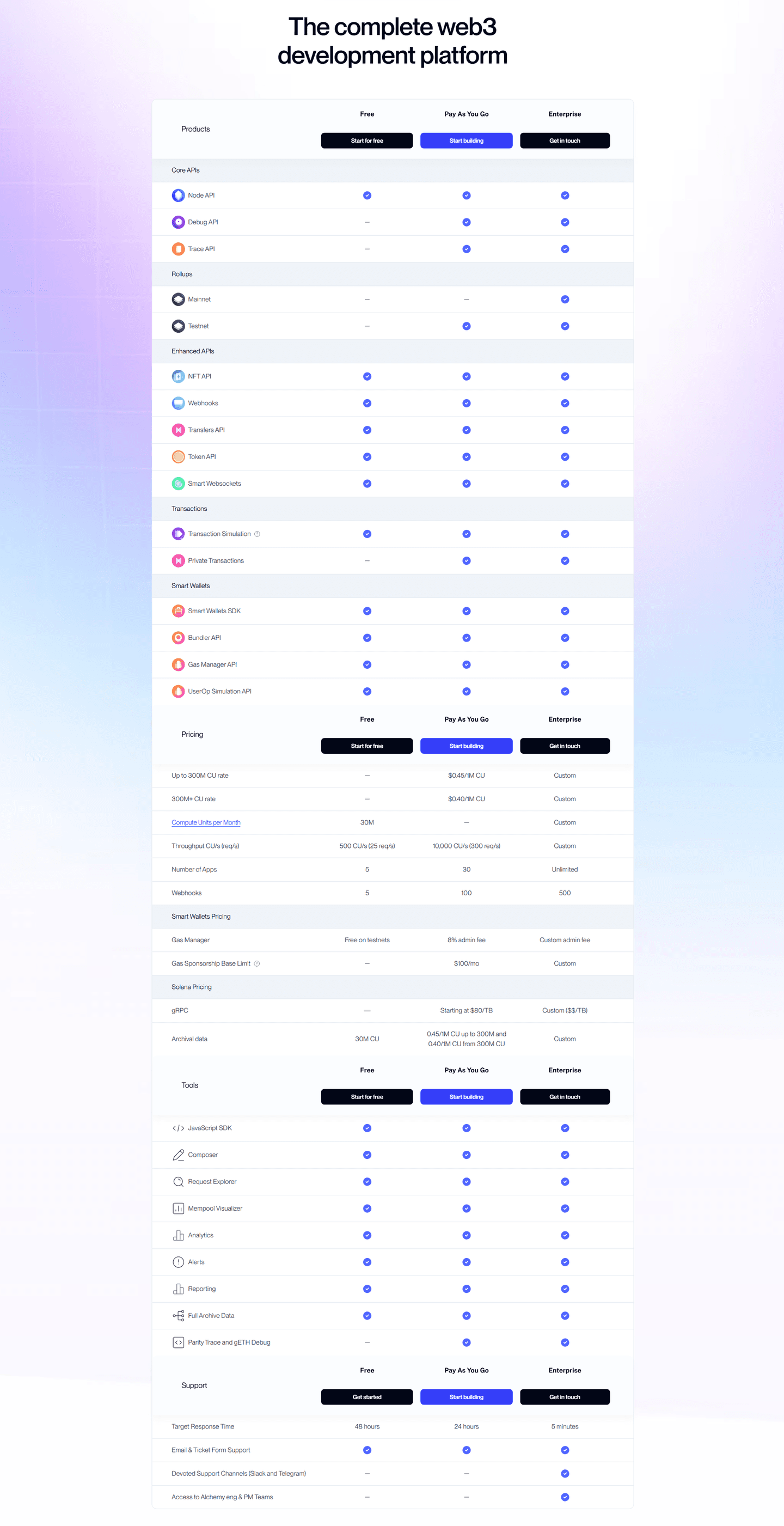
Across the scored examples below, the pattern that works is contrast with a point of view. Asset Bank spotlights its "Most popular" Professional column and lets check-or-blank cells mark what each tier adds. Qonto mixes checkmarks with hard numbers, cards included and transfer counts, so the compare is precise rather than vague, and tags the Smart plan as popular. CommandBar leans on tiered values, Basic versus Advanced and Limited versus Unlimited, to guide the upgrade decision at the row level. Beamly does the same with "1 show" against "10+ shows" and "2 seats" against "Unlimited seats", spotlighting the upgrade reason per line.
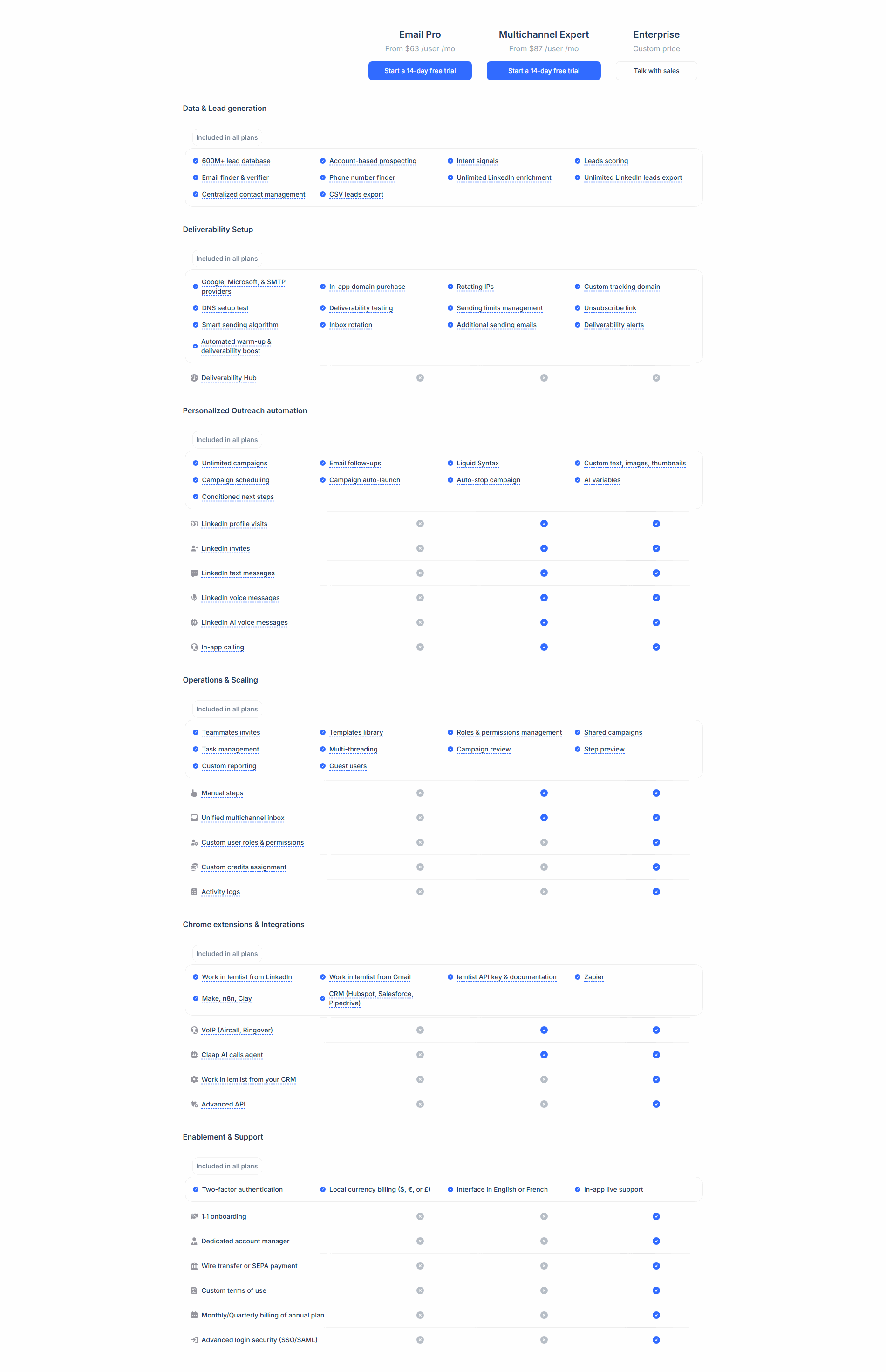
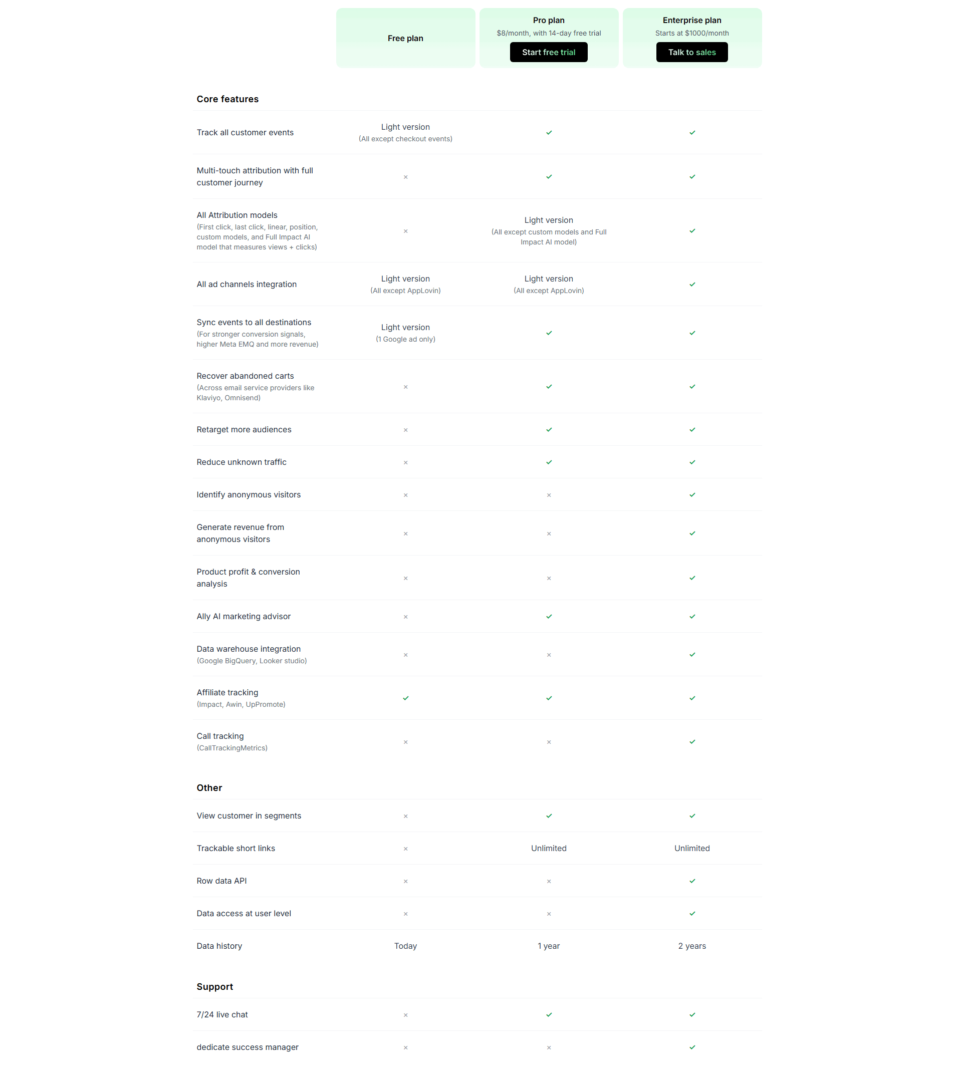
The most disciplined tables also know when to concede parity. Lemlist separates its "Included in all plans" baseline from the rows where plans actually diverge, and Oxlo.ai keeps its shared, all-green capability rows so the columns where it wins stay credible. A table that pretends every row is a difference wins nothing; the one that marks the few rows that matter wins the decision. Once the comparison lands, the button under each column has to catch it, which is why the strongest pricing tables pair this with a clean call to action under every plan and the reassurance of social proof near the price.
100/100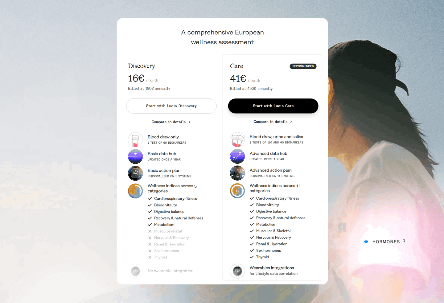 0/100
0/100The first failure is the all-checkmark table, where nearly every row is checked in every column. It looks generous and says nothing: with no visible gap, there is no visible reason to move up a tier. The second is the vague check, a single mark standing in for "up to 5" versus "unlimited", which hides the exact number the buyer needed to see. The third is a table with no spotlighted column, which leaves the visitor to work out the recommended plan alone, and many will not finish the math. Mark the differences, put real values where a check is too coarse, and give one column a default so the common choice is easy.

Curated by
Gabriel Amzallag , Founder, Web Anatomy
5 years CRO + SEO at Qonto (2021–2025). After advising 15+ SaaS on their websites (Payfit, Pigment…), the same patterns kept breaking, so I decided to build the source of truth on what works on the web: the intelligence layer every tool, builder, and team uses to ship sites that perform.
Paste your URL. Get a scored analysis of your pricing section, including whether a visitor can see what each plan unlocks. Free, no signup.
The common questions about pricing tables that make plan differences obvious, with answers drawn from 32 scored examples.
It means the table is built so the gaps between plans stand out, not just the features each plan has. The common forms are checkmarks against blank cells or Xs, tiered values like '5 seats' versus 'Unlimited', a recommended column shaded or badged to anchor the choice, and color that marks the rows where plans diverge. The point is that a visitor can see what an upgrade actually buys them without reading every line.
A visitor on the pricing page is trying to answer one question: which plan is right for me, and what do I give up on the cheaper one? A table where every plan looks similar forces them to compute the answer row by row, and many will not. A table that spotlights where the plans differ answers the question for them, so the decision is fast and the reason to move up a tier is visible instead of buried.
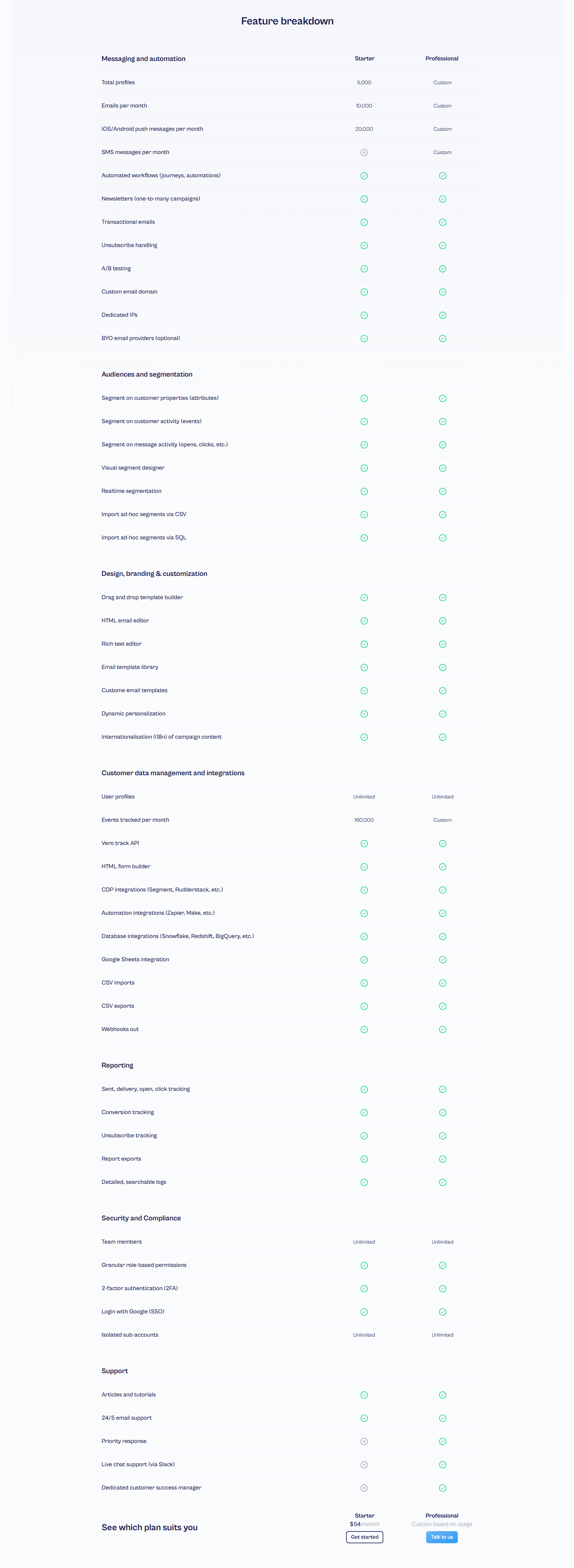
Both, depending on the row. A checkmark against a blank cell is enough for a feature you either get or you do not. But for anything measured, a bare checkmark hides the gap: '5,000 profiles' versus 'Unlimited', or '1 show' versus '10+ shows', tells the story a checkmark cannot. The strongest tables mix the two, using values on the rows where the number is the whole point.
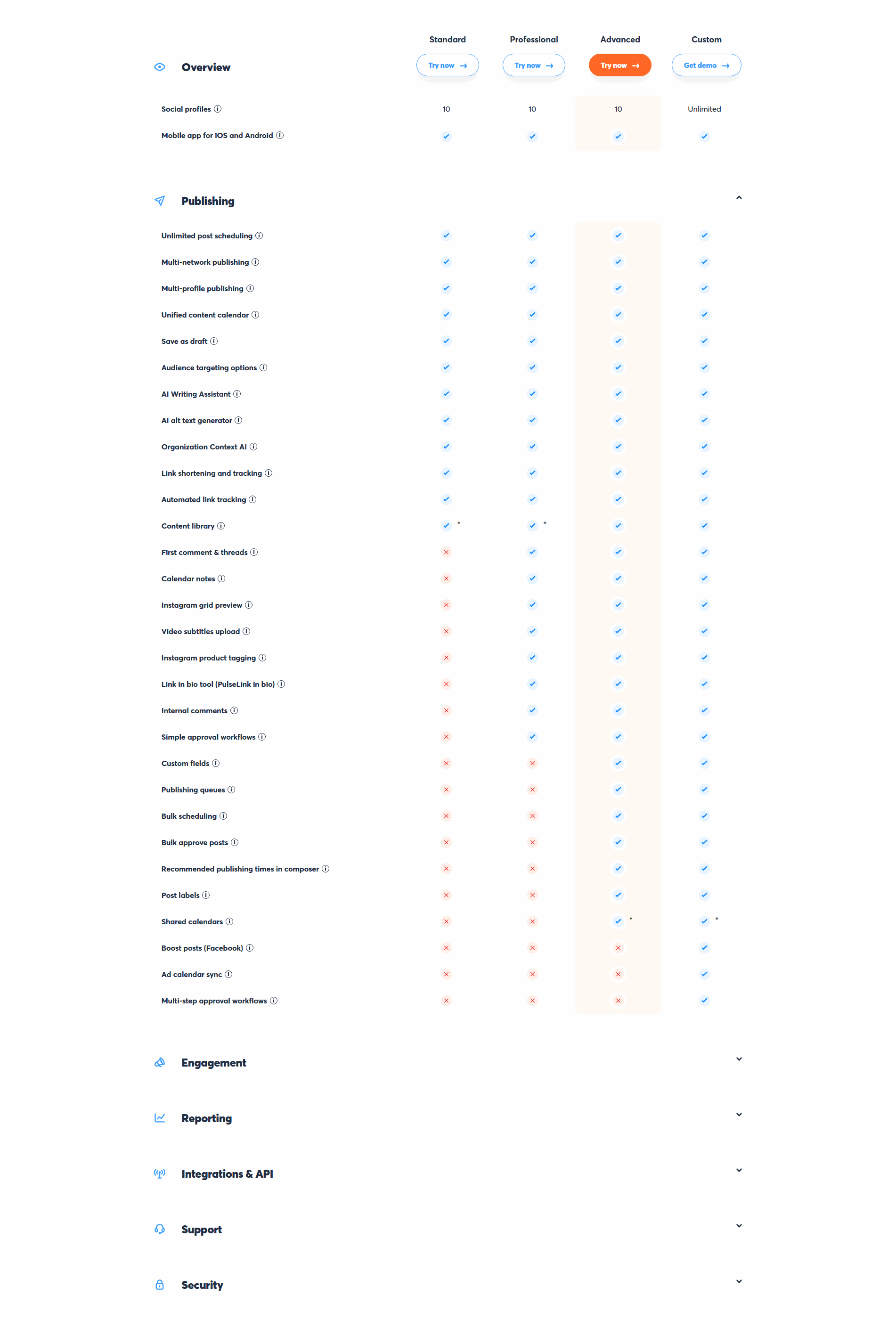
Give one column a light visual lift: a tinted or bordered background, a 'Most popular' tag, a filled primary button while the others stay outlined. That is enough to set a default the eye lands on, while the other plans stay fully readable for the people they suit. The goal is to guide the common choice, not to bury the rest.
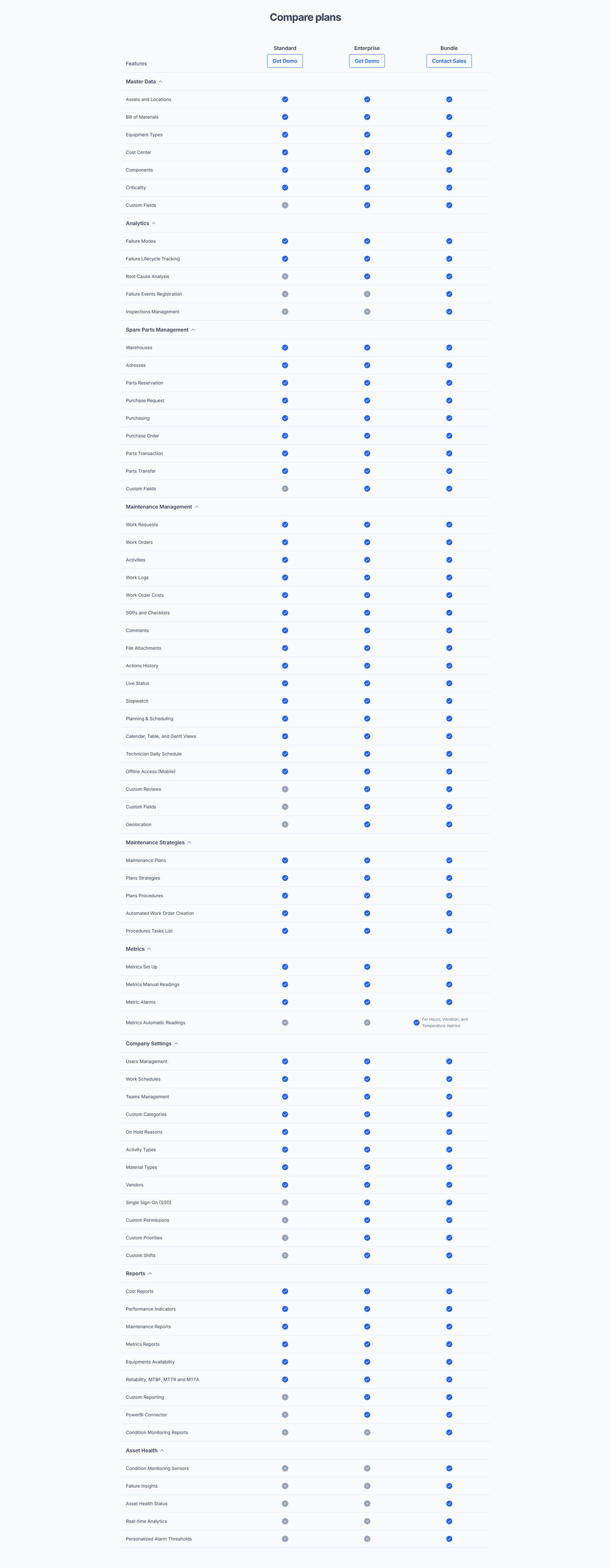
Most of the tables in the library run three or four plans. Beyond that, the differences get harder to hold in view and the table starts to feel like homework. When there are many features, the fix is grouping rows into labeled categories, not adding more columns. Keep the columns few and let the highlighted differences carry the comparison.