Features|
Spotlighting one flagship capability, a single headline and one large product visual, lets the value land before a visitor has to sort through a list, so the feature that sells the product gets full attention.
Key takeaways
Showing 64–84 of 126 examples
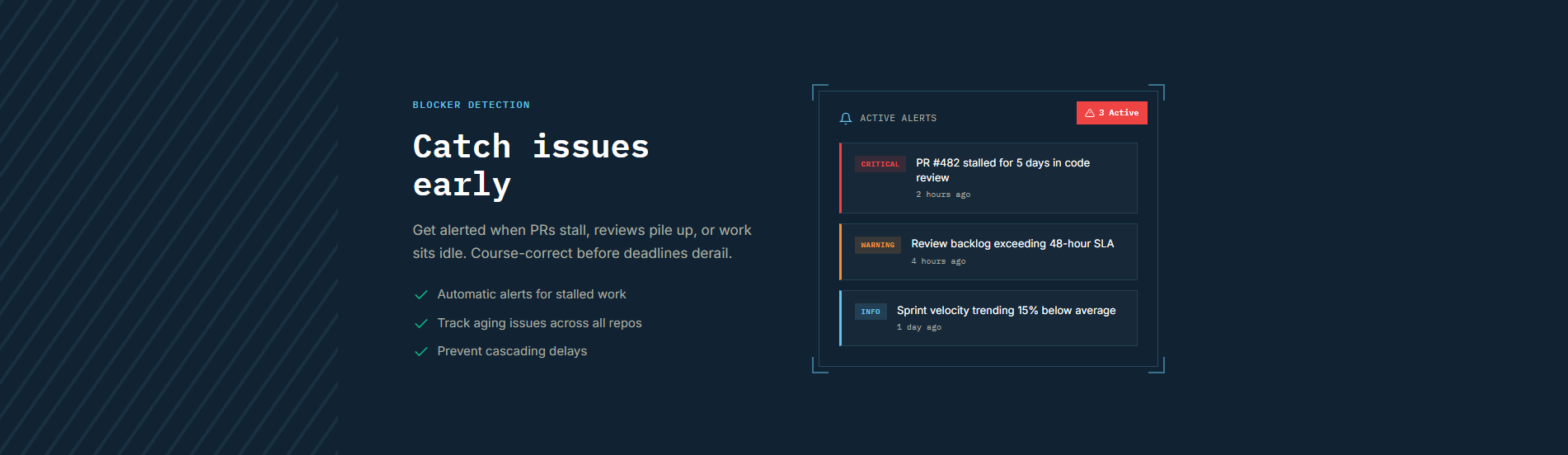
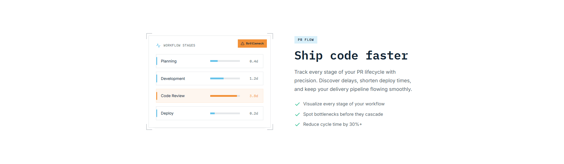
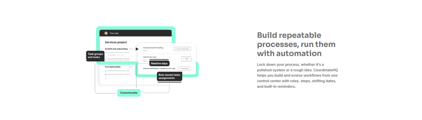
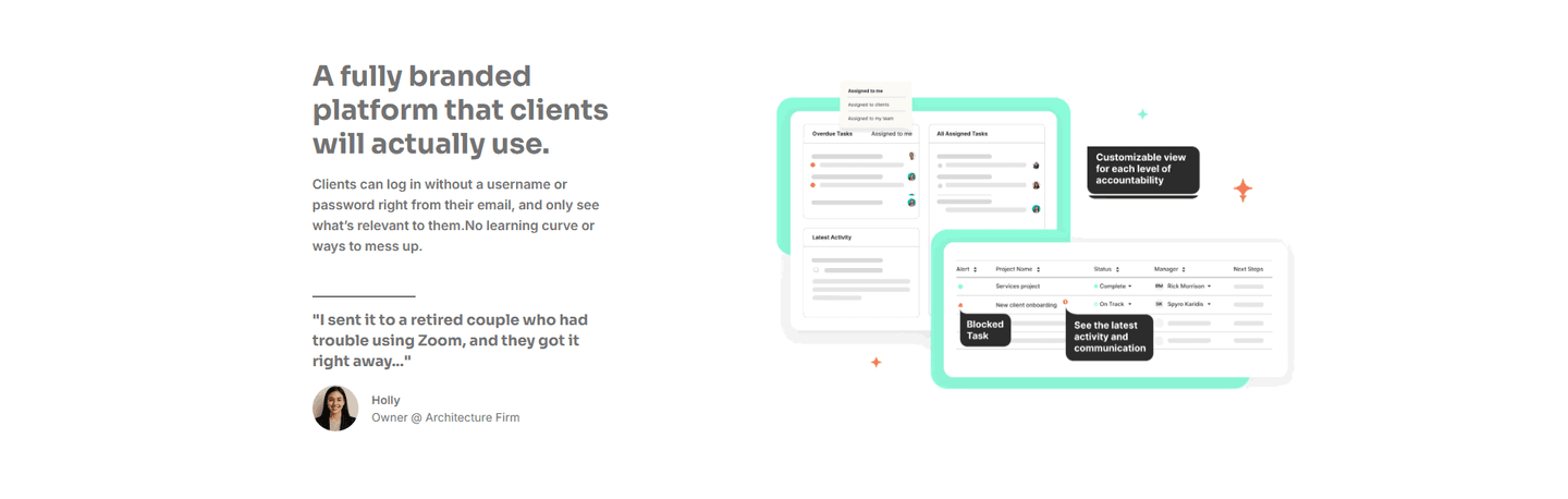
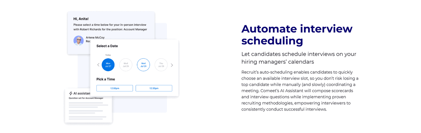
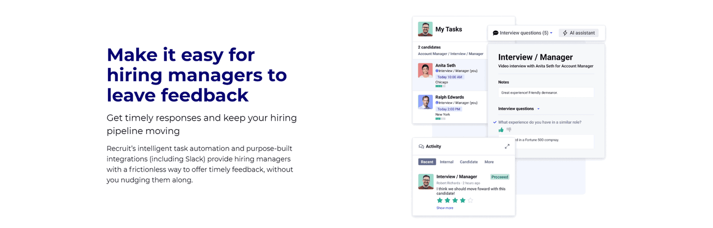
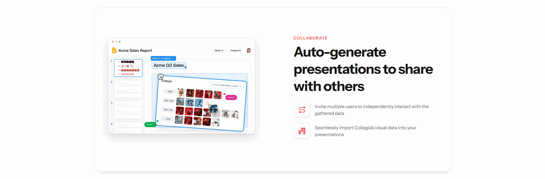
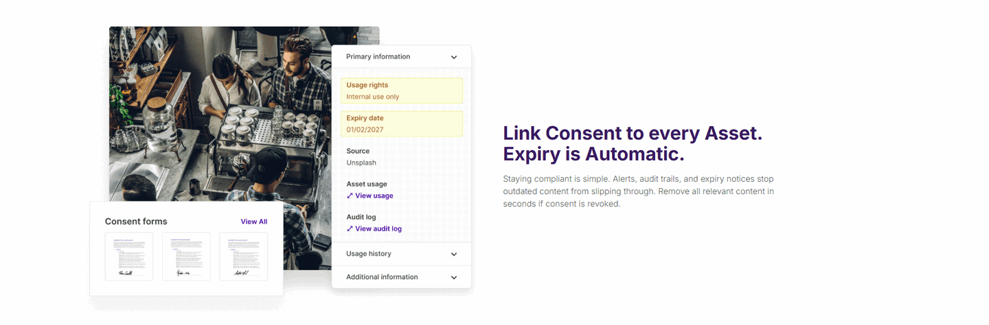

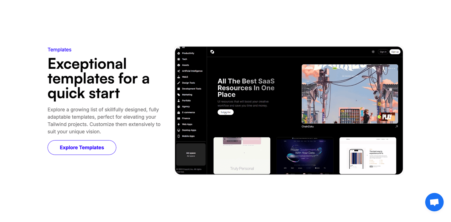
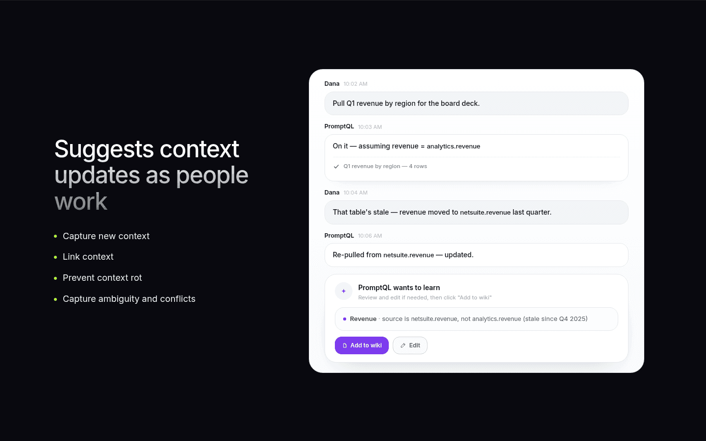
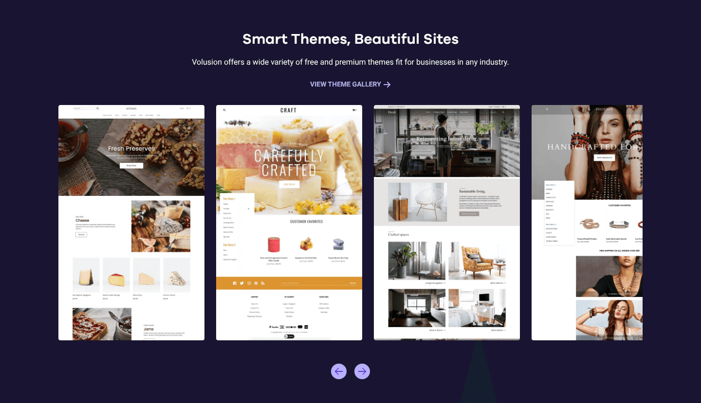

Browse every features pattern by UX best practice.
Every features section is scored across 6 conversion best practices. Copy the best practice stack, not the layout. See what converts and why.
Hand-picked from 650+ companies and analyzed by our AI conversion agent. Not a random dump of feature grids. Every entry earns its spot.
Found a features section you admire? Run yours through the same scoring engine. See where you stand on the same best practices, and what to fix first.
A single feature spotlight builds the features section around one dominant capability instead of a grid of cards. It is the opposite of a multi-card layout. A single headline names the outcome, one large product visual shows that capability working, and any supporting detail sits beneath as a short list or a deeper link. The section does not ask the visitor to sort through options; it puts the one feature that sells the product front and center and proves it with the real interface.
The best single feature spotlights take one of a few forms:
A grid of feature cards makes every visitor do the sorting: read each tile, then decide which one is the reason to care. A spotlight does that work up front. When one capability is the wedge that sells the product, giving it the whole section means the value lands in a single read instead of competing with four other tiles for attention. The visitor does not have to guess which feature matters most, because the page has already decided.
Focus also makes the proof stronger. A grid can only afford a small icon per card, so most cards assert rather than show. A spotlight has room for one large, real product visual, and that visual is what turns a claim into evidence. TaxGPT can show its actual Clients dashboard behind the demo overlay precisely because it is not splitting the space five ways, so a visitor sees the real output before deciding to try it.
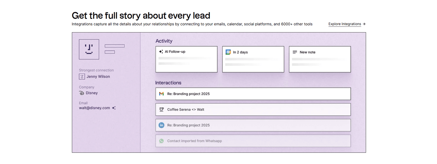
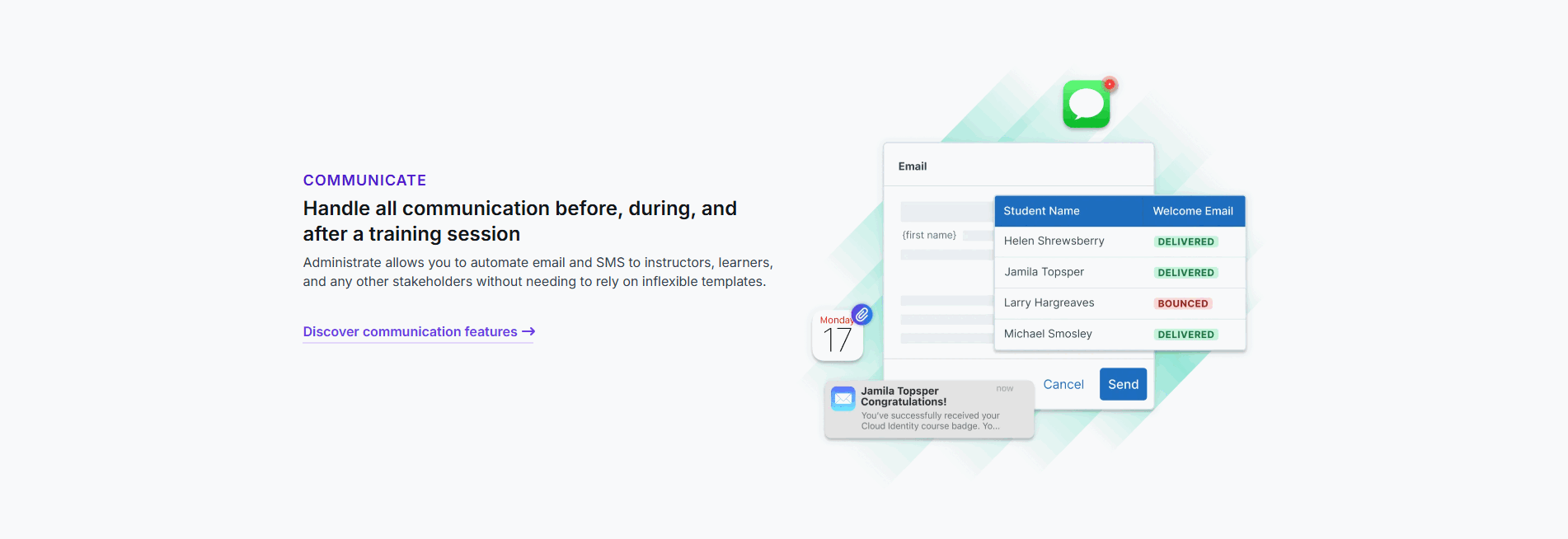
Across the examples below, the spotlights that work share a discipline. The headline leads with the outcome, not the mechanism: Linear opens with Understand progress at scale over the raw feature name, and Administrate promises every training session on the calendar in minutes without fear of double booking. The visual is the real product doing the job, the way Linear renders an actual Weekly Pulse status card and cycle-time chart rather than an abstract graphic, and Benchify shows a concrete result with an error prevented and a correct amount. And when supporting detail appears, it stays subordinate: TaxGPT lists secondary features in a side column and Spellar distills its claims into three checkmarks, so the one feature never loses the floor.
The spotlight often overlaps with a demo video in the features section, since the single large visual is sometimes a short clip rather than a static screenshot, and it is the mirror image of grouping the features by persona, which splits the section instead of concentrating it. The wider features section gallery shows how the spotlight sits alongside the other ways a features section earns a click.
50/100 10/100
The usual failure is spotlighting a feature that is not actually the reason people buy, so the whole section rests on a capability the visitor does not care about. The second is backing the headline with a stock icon or an abstract mockup instead of the real product, which wastes the one advantage a spotlight has: room to show real output. The third is letting the supporting detail take over, a checklist or a second visual that grows until the section is a crowded grid again and the flagship feature loses its focus. Pick the capability that closes the sale, prove it with the real interface, and keep everything else subordinate to it.

Curated by
Gabriel Amzallag , Founder, Web Anatomy
5 years CRO + SEO at Qonto (2021–2025). After advising 15+ SaaS on their websites (Payfit, Pigment…), the same patterns kept breaking, so I decided to build the source of truth on what works on the web: the intelligence layer every tool, builder, and team uses to ship sites that perform.
Paste your URL. Get a scored analysis of your features section, including whether you give the flagship capability the focus it deserves. Free, no signup.
The common questions about spotlighting one feature in a features section, with answers drawn from 126 examples.
It is a features section built around one dominant capability instead of a grid of cards. A single headline names the outcome, one large product visual shows it working, and any supporting detail sits beneath as a short list or a deeper link. Bugherd, for example, gives its whole section to point-and-click feedback pinned to the exact element, with the real pinned comment shown on a live page.
A grid asks the visitor to read every card and work out which one matters. A spotlight makes that call for them. When one capability is the wedge that sells the product, giving it the whole section means the value lands in one read instead of competing with four other tiles. Benchify spends its section on pre-payment verification alone, so the single claim, verify every transaction before money moves, has nothing to fight for attention.
When one capability is the real reason people buy. If the product wins on a flagship feature, a grid dilutes it by giving equal weight to things that matter less. Administrate spotlights its AI Scheduler that flags a booking conflict automatically, because avoiding a double booking is the outcome that closes the sale. Products with many equal capabilities are better served by a grouped or multi-card layout.
The real product UI. A spotlight lives or dies on whether the visitor sees the actual output, not a stock icon. Linear shows the real Weekly Pulse status card and cycle-time chart, TaxGPT shows the real Clients dashboard behind its demo overlay, and Spellar shows a working Sales discovery template with real fields. The headline promises the outcome; the product screenshot proves it.
Yes, as long as the one feature stays dominant. The strongest examples add a subordinate layer without breaking focus: Spellar caps its spotlight with a three-checkmark distillation, TaxGPT lists supporting features in a right column, and Administrate adds an Explore AI Scheduler link for buyers who want to dig in. The rule is that the supporting detail serves the flagship, it never competes with it.