Features|
A demo video in the features section lets visitors watch the product work in seconds, so the value lands faster than any paragraph could explain it.
Key takeaways
Showing 1–21 of 21 examples

Every features section is scored across 6 conversion best practices. Copy the best practice stack, not the layout. See what converts and why.
Hand-picked from 350+ companies and analyzed by our AI conversion agent. Not a random dump of feature grids. Every entry earns its spot.
Found a features section you admire? Run yours through the same scoring engine. See where you stand on the same best practices, and what to fix first.
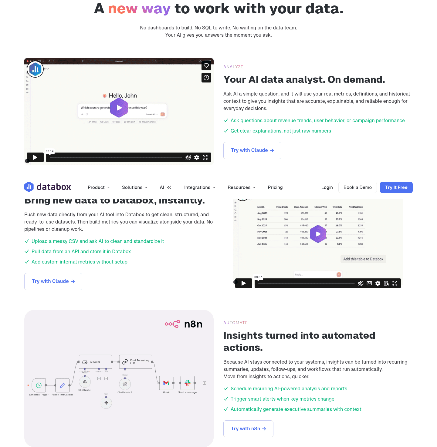
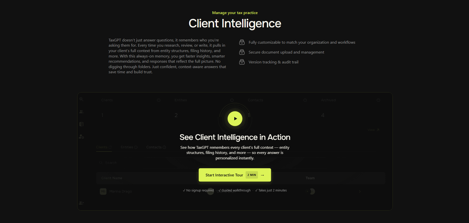
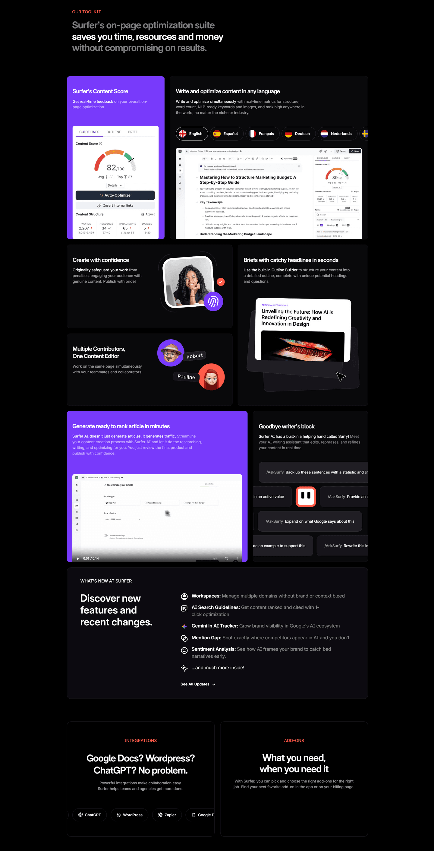
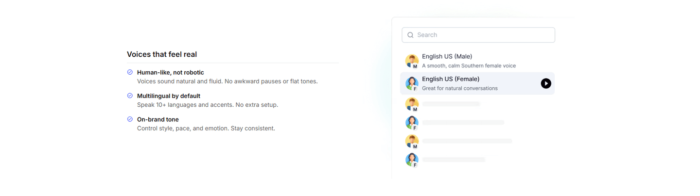
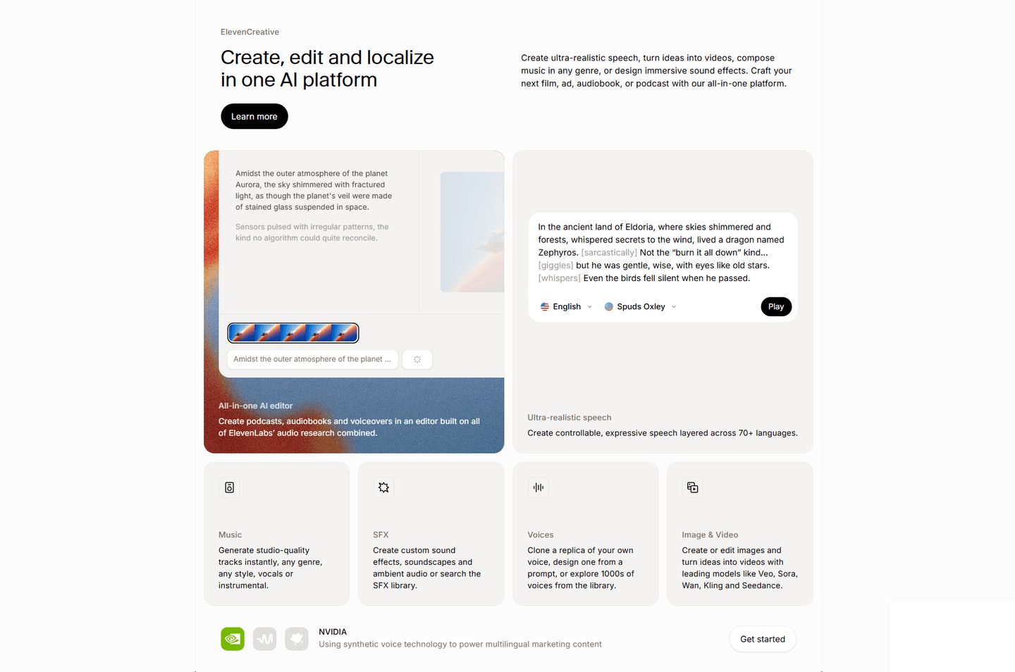
A demo video teaser is a short, playable look at the product placed inside the features section, so a visitor can watch the thing work instead of reading a list of what it does. The features copy says "here is what it can do." The demo says "here it is, doing it." When both share the screen, the capability stops being a claim and becomes something the visitor has already watched happen.
The best features sections use one of a few forms:
Reading about a feature asks the visitor to imagine it working. Watching a short demo removes that step. In a few seconds the real interface completes a real task, and the question of whether the product actually delivers is answered before doubt has time to form. A list of capabilities is a promise; a clip of the product doing the work is evidence.
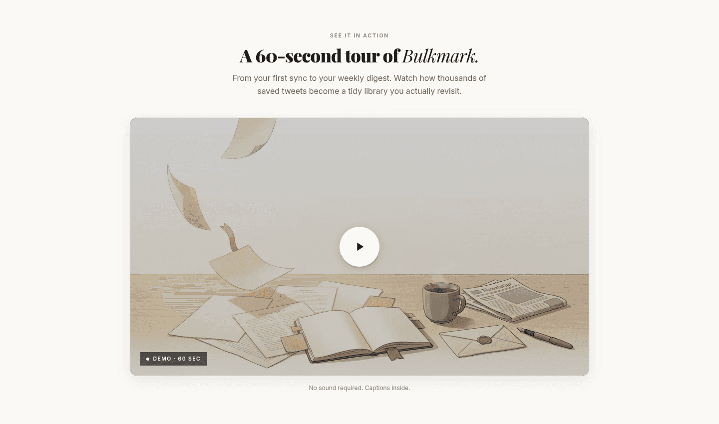
The format also lowers the cost of finding out. A demo that names its length, a 60-second clip or a two-minute tour, tells the visitor exactly how much attention it asks for, which makes pressing play an easy yes. And because the clip shows the genuine product rather than an abstract animation, what the visitor sees is the same thing they would get, which is far more persuasive than a polished metaphor.
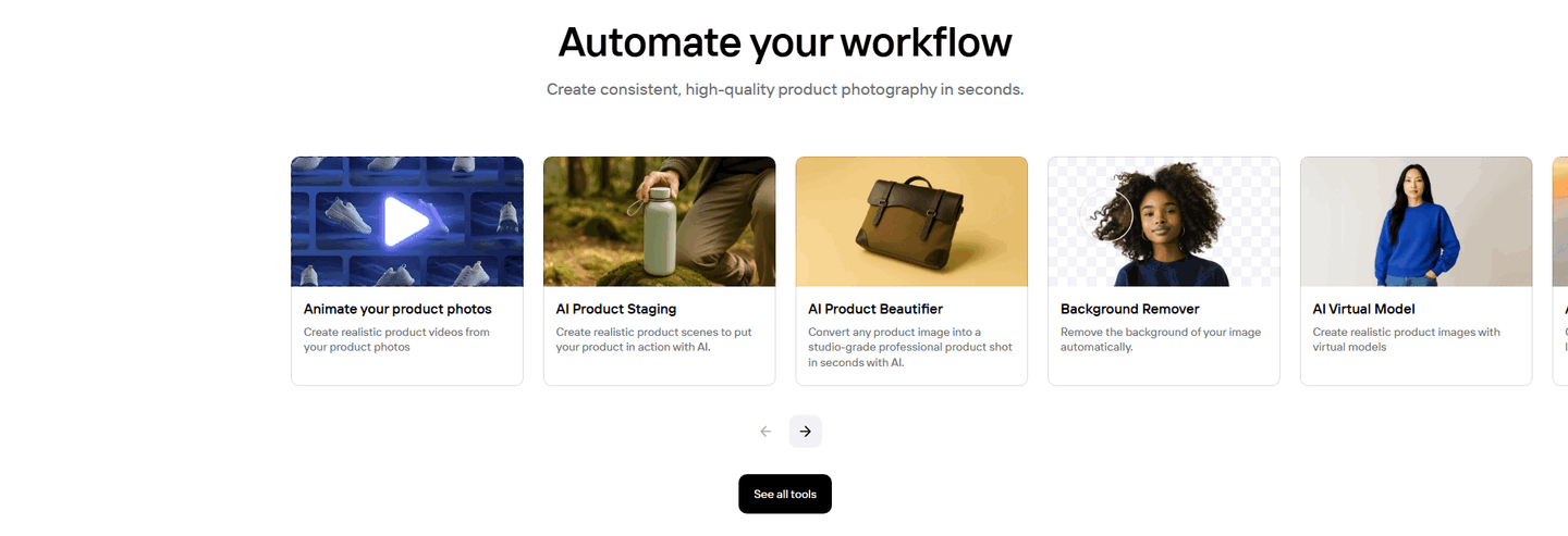
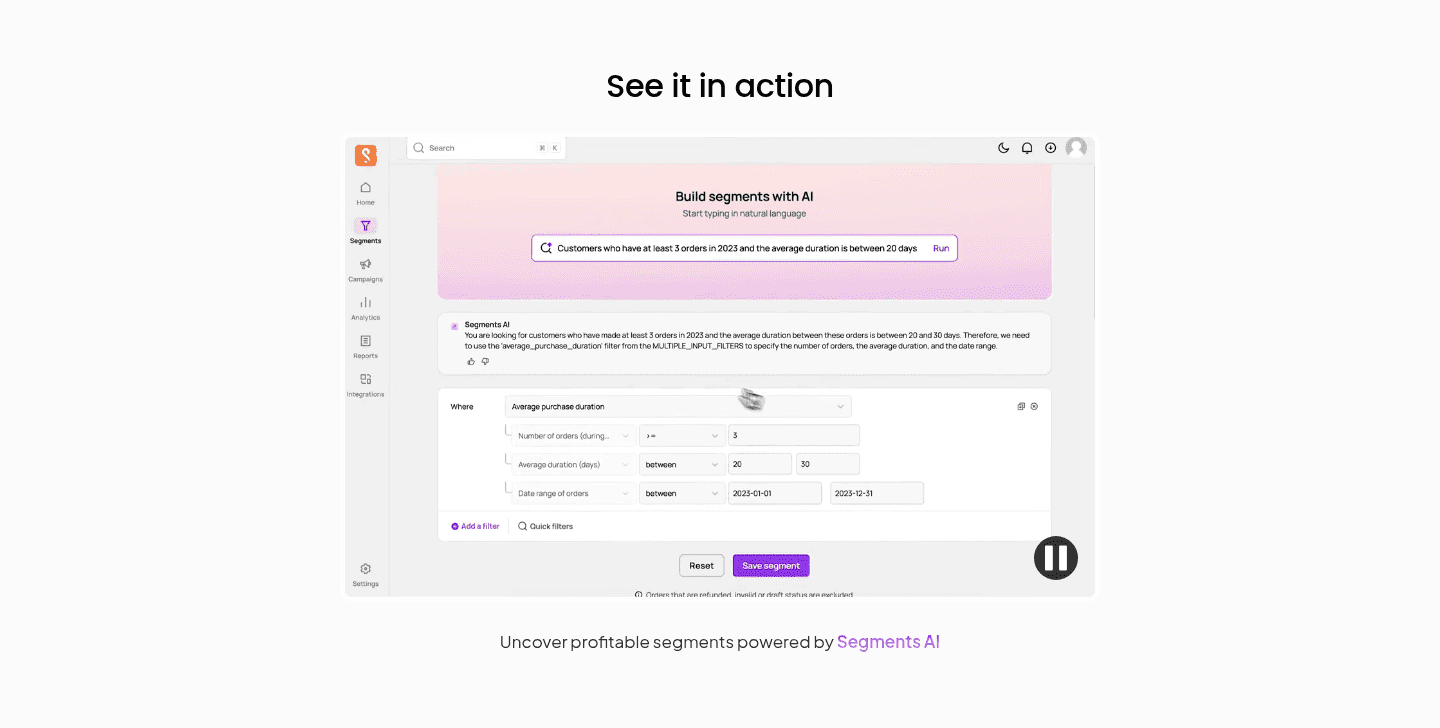
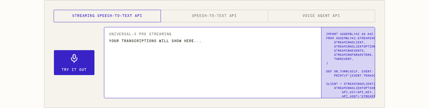
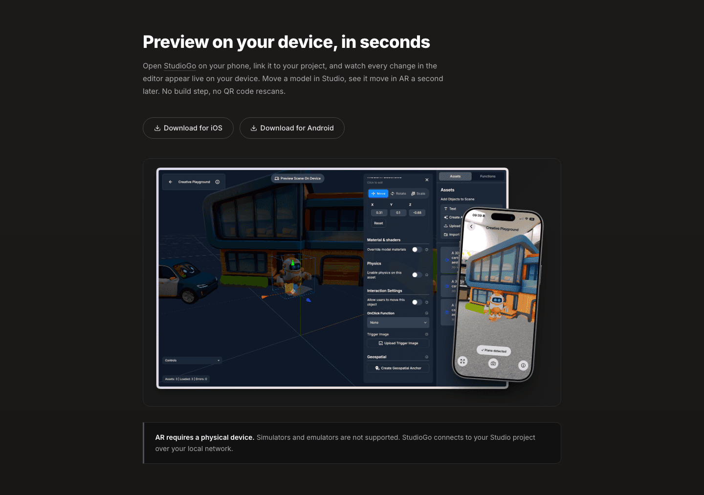
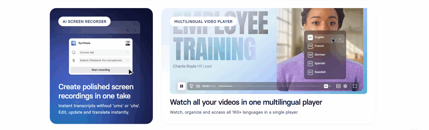
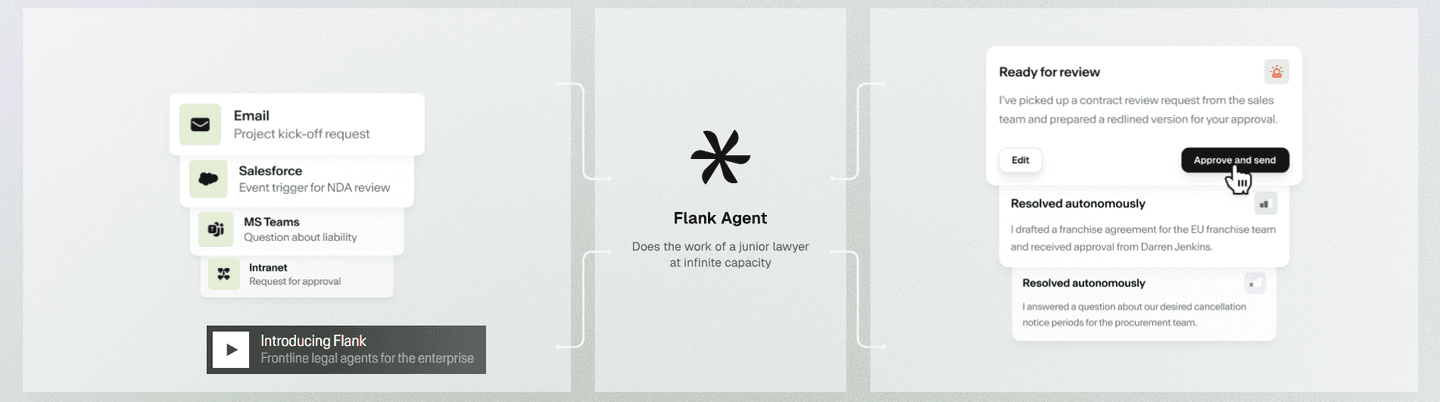
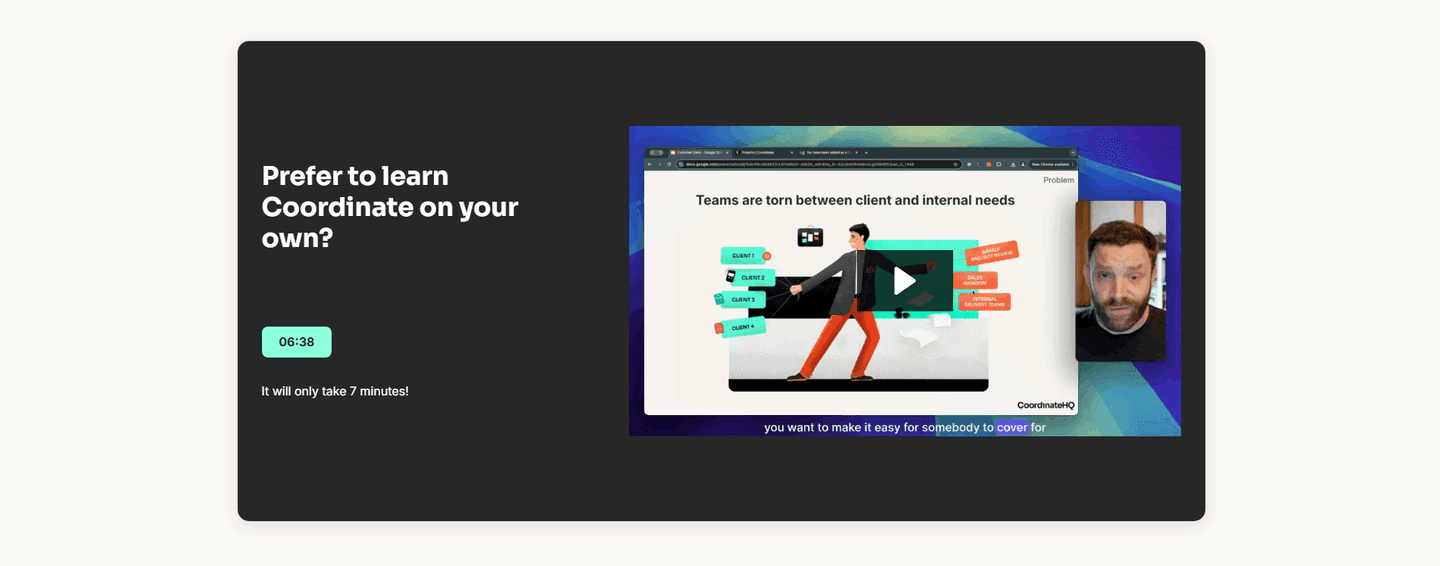
Across the examples below, the demos that work share a discipline. They show the real product, not a decorative animation: Coordinate plays an actual screen recording of its interface, and TaxGPT sits its demo overlay on top of the genuine Clients dashboard, so the visitor sees the true output before trying it. They make the time cost explicit, with duration badges and "no signup required" microcopy that remove the usual reasons to skip a video. And they lead with the outcome the clip proves rather than the feature name, the way Surfer SEO frames its demo around generating a ready-to-rank article. Bulkmark even notes "no sound required, captions inside," so the demo still lands with audio off.
A demo rarely carries a features section alone. The strongest pair it with clear copy that states the payoff in words, and with a still image that shows the concrete result on screen even before the visitor presses play. The wider features section gallery shows how those parts fit together.
83/100 0/100
0/100The usual failure is a demo that hides what it costs to watch: no length label, no captions, an autoplay clip that needs sound, so the visitor scrolls past rather than gamble their attention. The second failure is showing a glossy abstract animation instead of the real interface, which reads as marketing and proves nothing. The third is burying the play button away from the benefit it supports, so the claim and the evidence never meet. Show the real product, name the time it takes, and place the demo right next to the outcome it proves.

Curated by
Gabriel Amzallag , Founder, Web Anatomy
5 years CRO + SEO at Qonto (2021–2025). After advising 15+ SaaS on their websites (Payfit, Pigment…), the same patterns kept breaking, so I decided to build the source of truth on what works on the web: the intelligence layer every tool, builder, and team uses to ship sites that perform.
Paste your URL. Get a scored analysis of your features section, including whether you let visitors see the product in action. Free, no signup.
The common questions about embedding a product demo in the features section, with answers drawn from 21 examples.
It is a short product demo, either a playable video or an animated walkthrough, placed inside the features area so visitors can watch the product in action rather than only reading about it. It usually shows the real interface doing one concrete task, with a clear play button and often a duration label like a 60-second clip.
Copy describes what a product can do. A short demo shows it happening, which is harder to doubt and faster to understand. Watching the real interface complete a task in a few seconds answers the does this actually work question before a visitor has to imagine it, and it carries proof that a list of features cannot.
Short enough that watching feels low cost. The strongest examples make the time commitment explicit, with labels like a 60-second demo or a two-minute tour, so the visitor knows exactly what they are signing up for. A clip that shows one clear outcome beats a long walkthrough that tries to cover everything.
The real product. A teaser that shows the actual interface completing a task reads as proof, while a slick abstract animation reads as marketing. The best features sections play a real screen recording or product capture, sometimes with captions so it works with the sound off, because that is what convinces a skeptic.
Next to the headline and the benefit it proves, so the claim and the evidence share the screen. Pairing a benefit-led header with a playable demo right beside it, ideally over the real product UI, lets the visitor read the promise and watch it happen in the same glance.