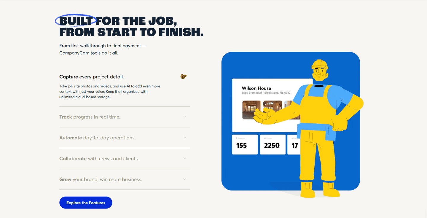
Features|
Secondary features add depth to a features section, and the best pages surface them without stealing focus from the capability that closes the sale.
Key takeaways
Showing 43–63 of 143 examples
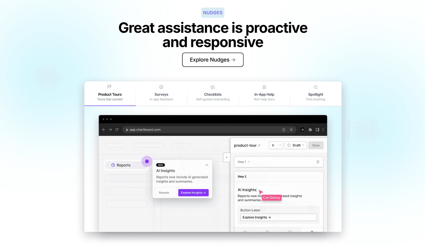
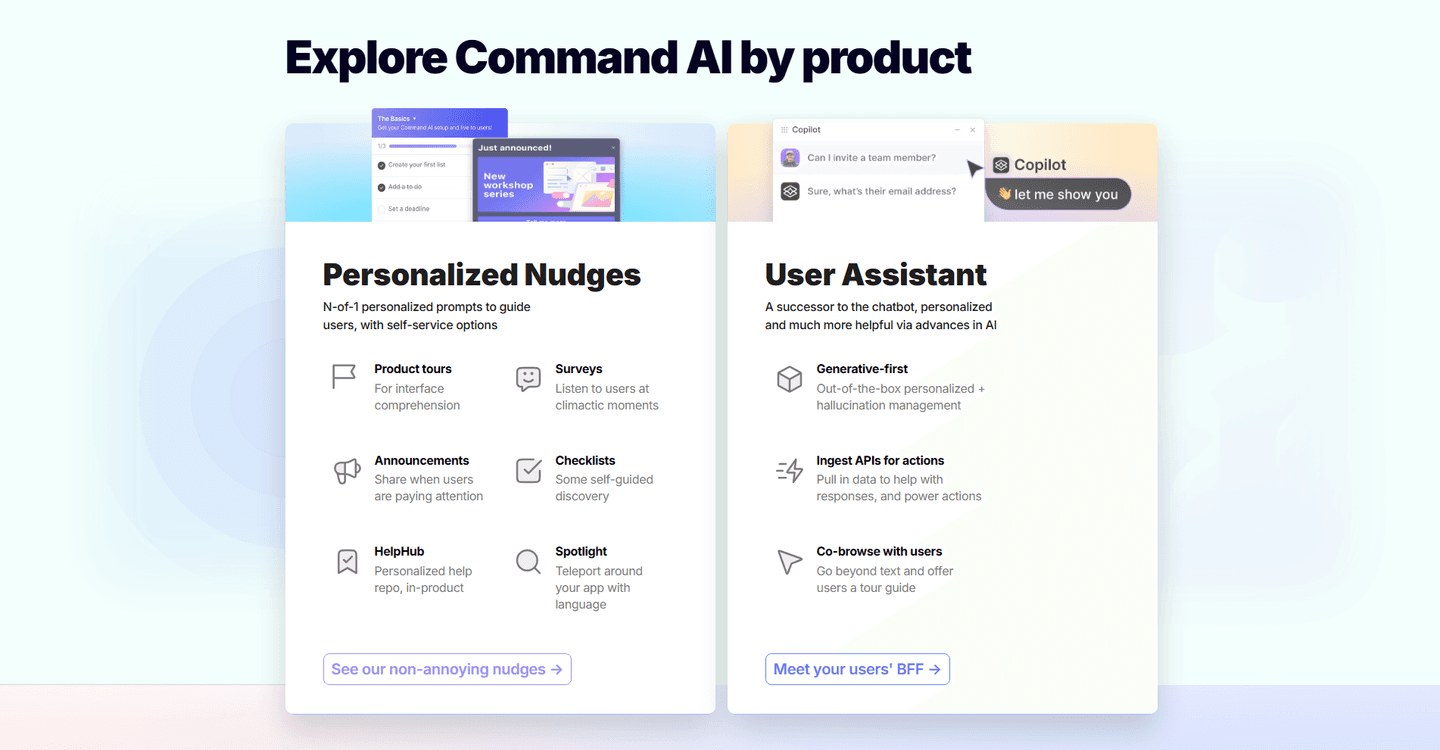
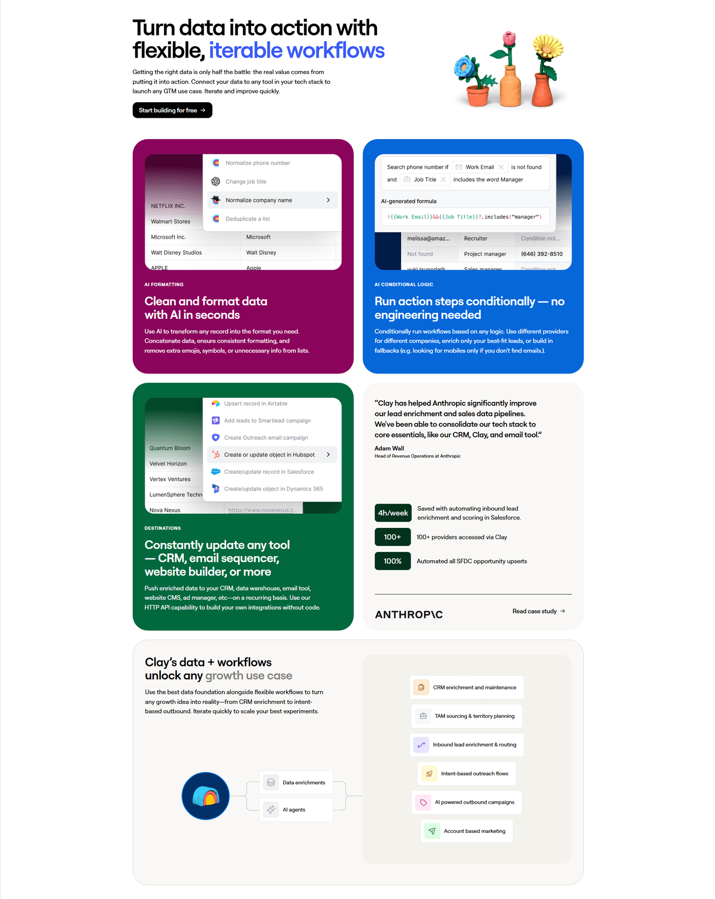
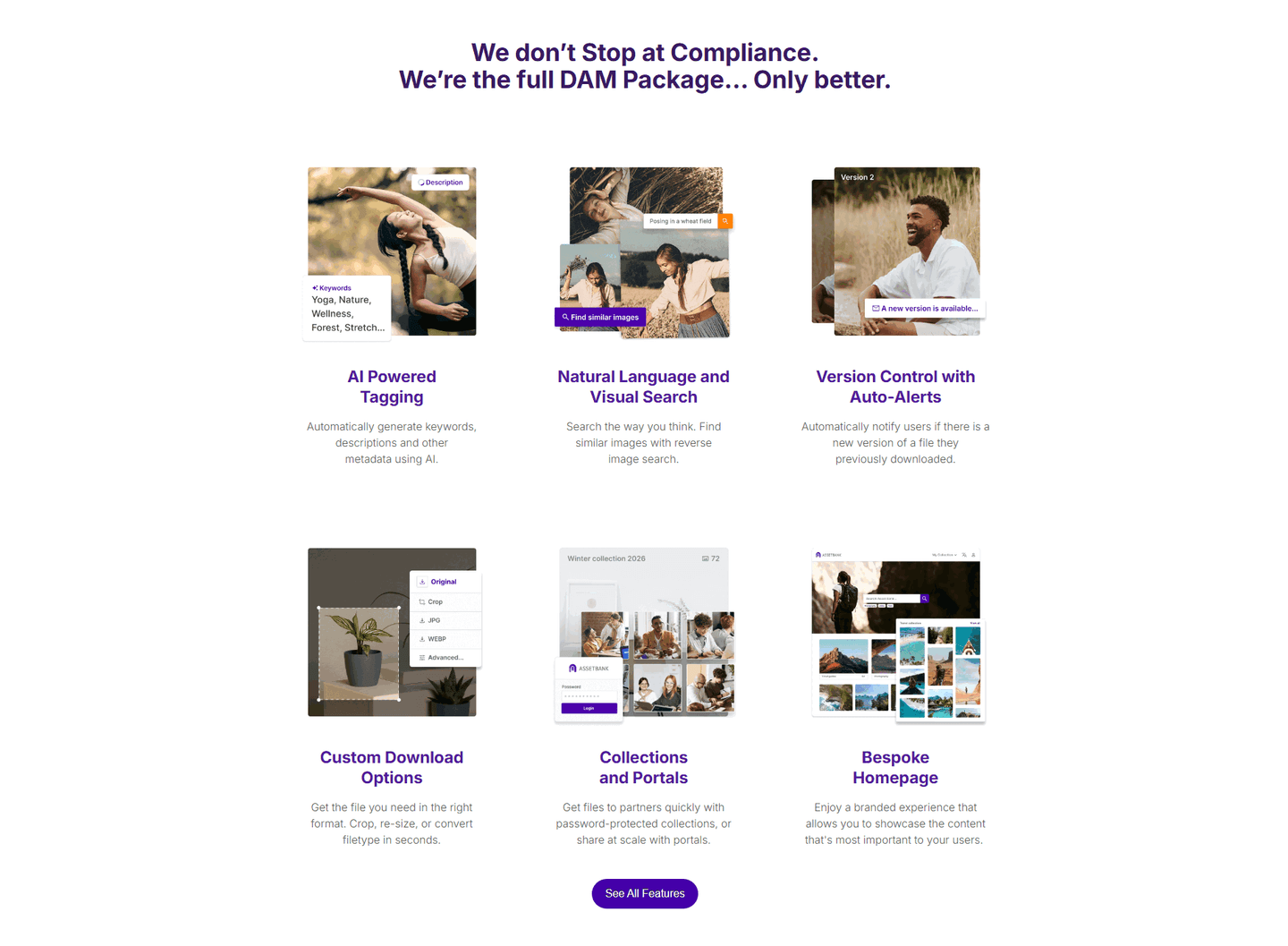
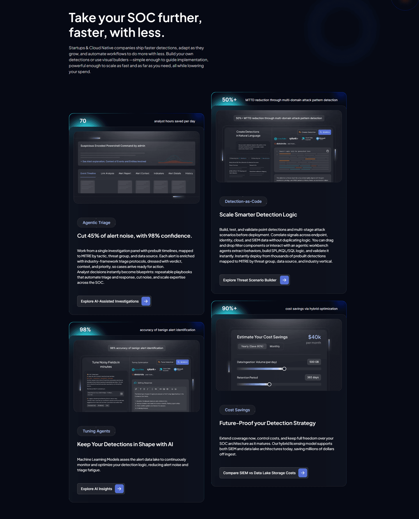
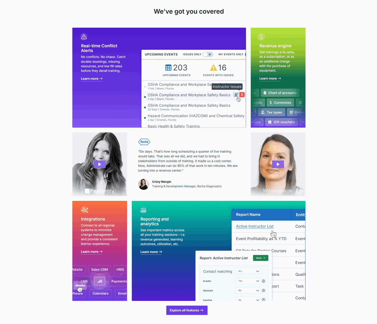
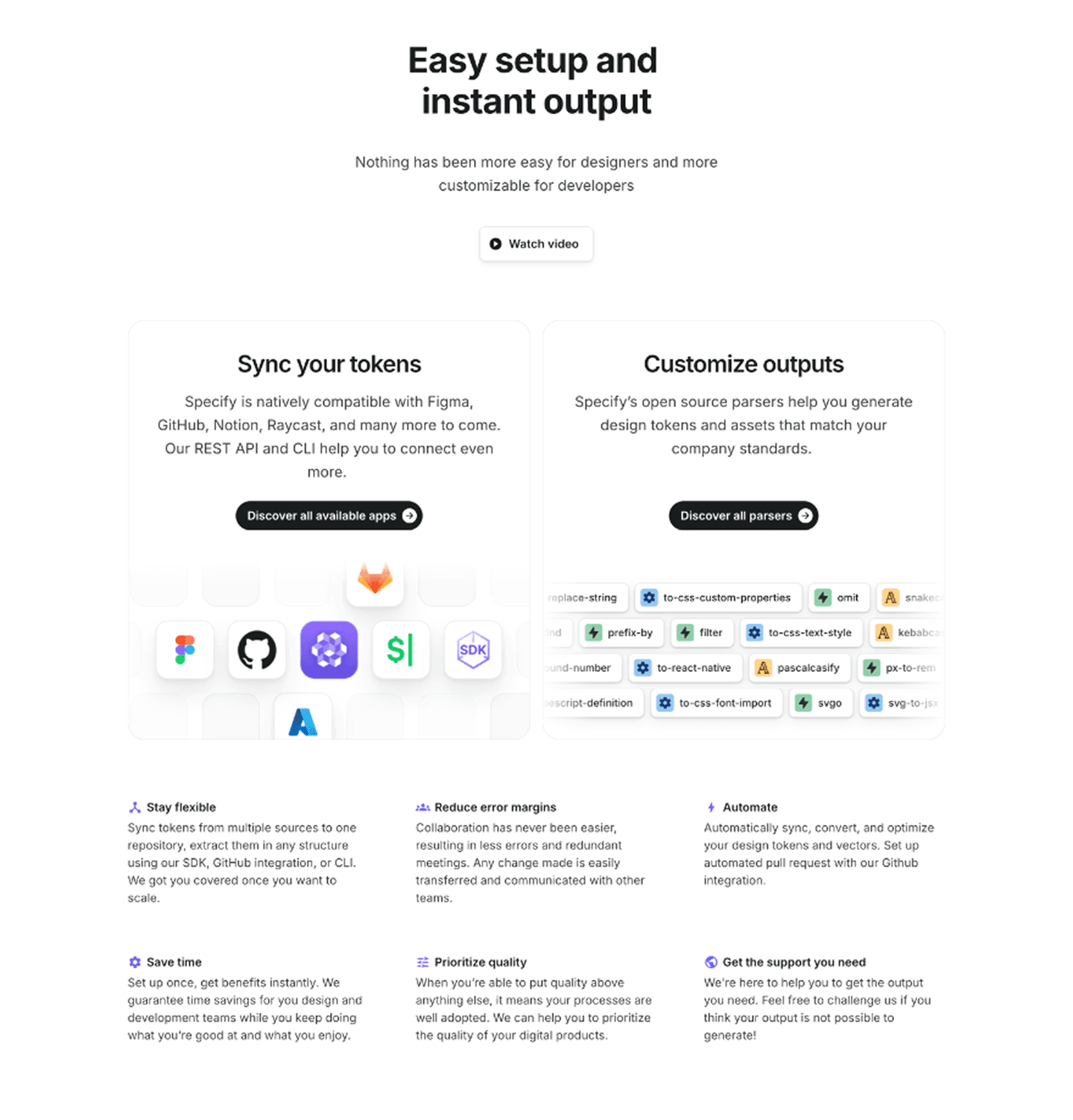
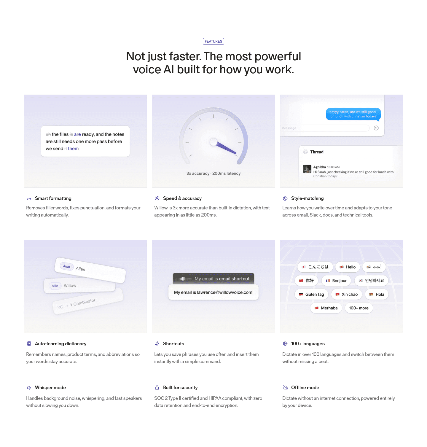
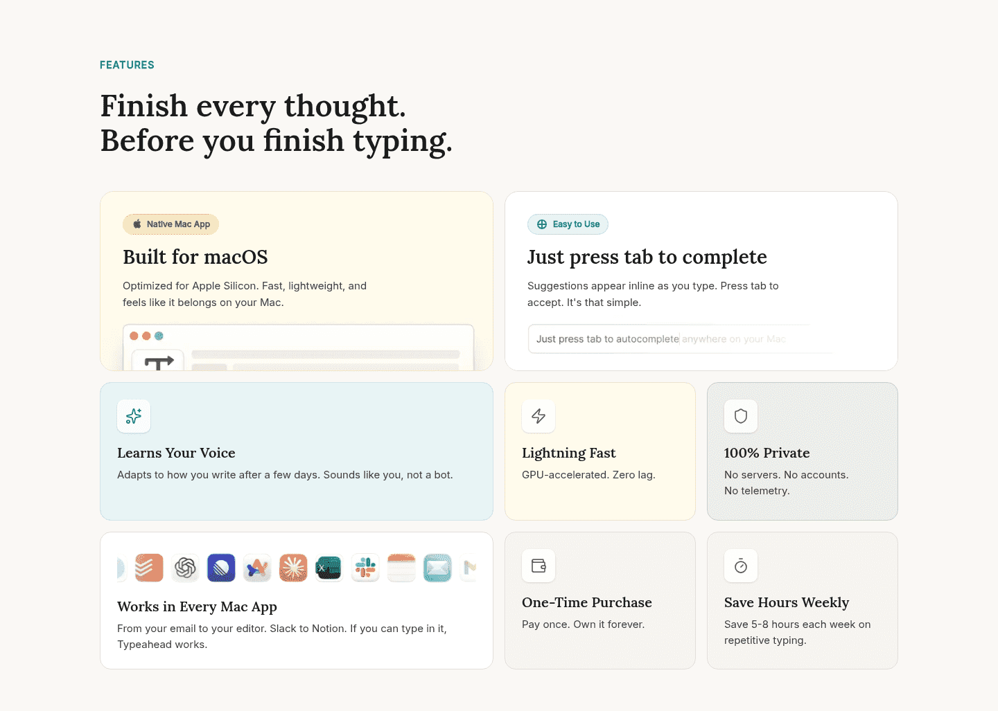
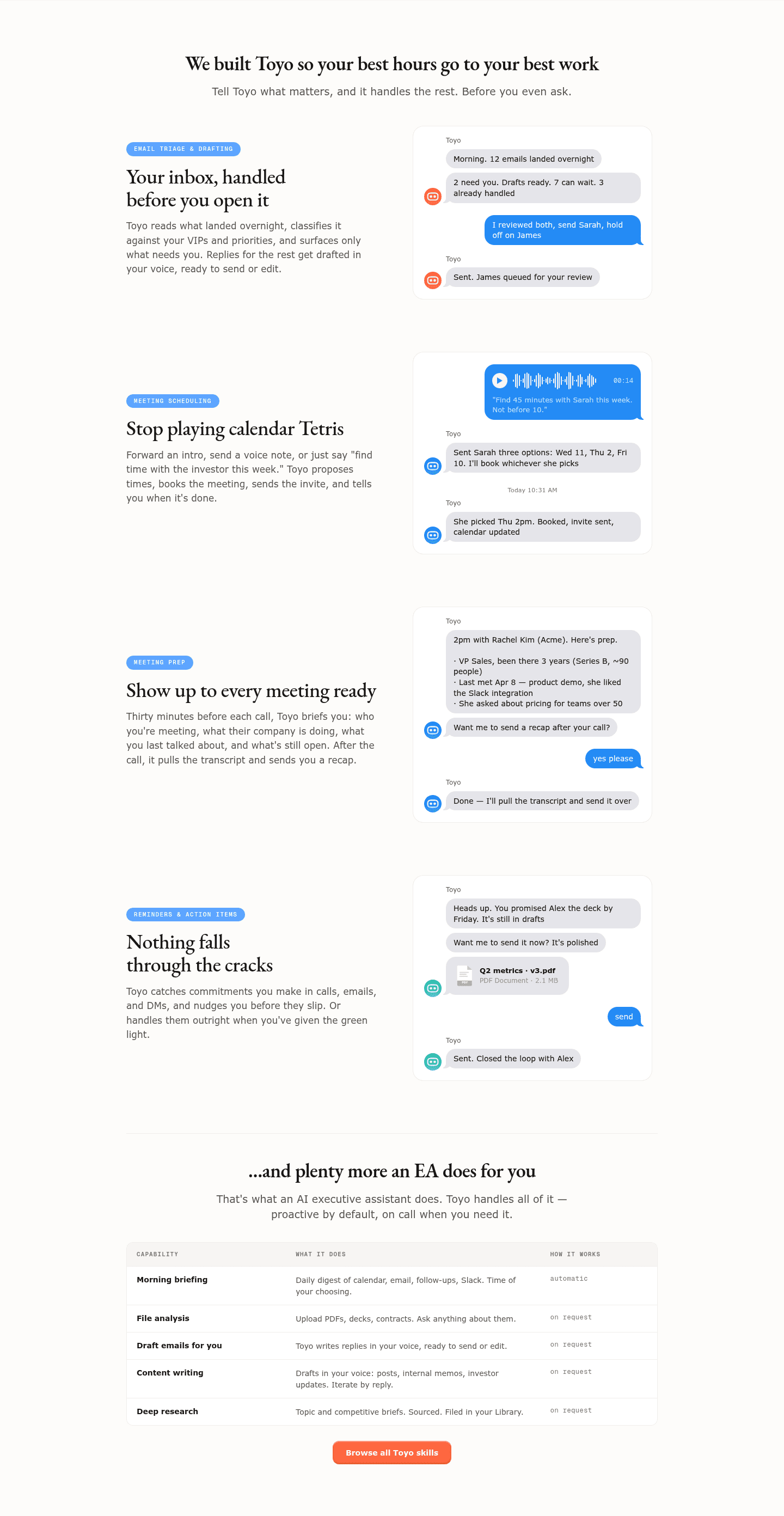

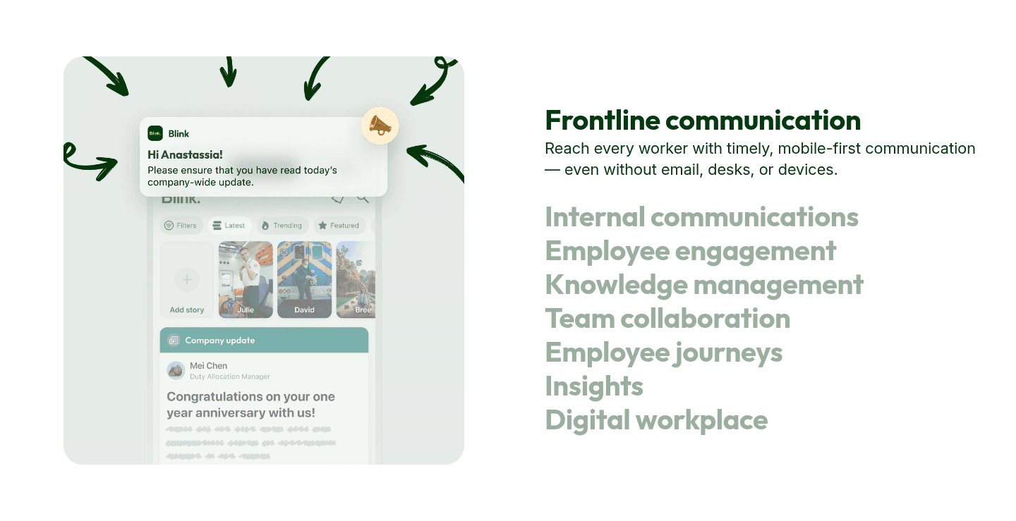


Browse every features pattern by UX best practice.
Every features section is scored across 6 conversion best practices. Copy the best practice stack, not the layout. See what converts and why.
Hand-picked from 350+ companies and analyzed by our AI conversion agent. Not a random dump of feature grids. Every entry earns its spot.
Found a features section you admire? Run yours through the same scoring engine. See where you stand on the same best practices, and what to fix first.
Secondary features are the supporting capabilities a features section keeps within reach without handing them the spotlight. Every product does more than its headline feature, and buyers want to see that breadth before they trust the tool. The discipline is showing it without letting a dozen capabilities compete with the one that actually closes the sale.
The best features sections lean on a handful of containers to do that:
A buyer evaluating a tool is asking two questions at the same time. What is the one thing this does best, and does it cover the rest of my job? A section that presents every feature at equal weight answers the first badly, because nothing leads. A section that shows only the hero feature answers the second badly, because the product looks thin.
Containing secondary features resolves the tension. The lead capability keeps the visual weight and wins the glance, while the accordion, tab, pill, or grouped list quietly confirms there is more underneath. Depth becomes something a visitor can reach for when they want it, instead of a wall they have to wade through before they understand what the product is for.
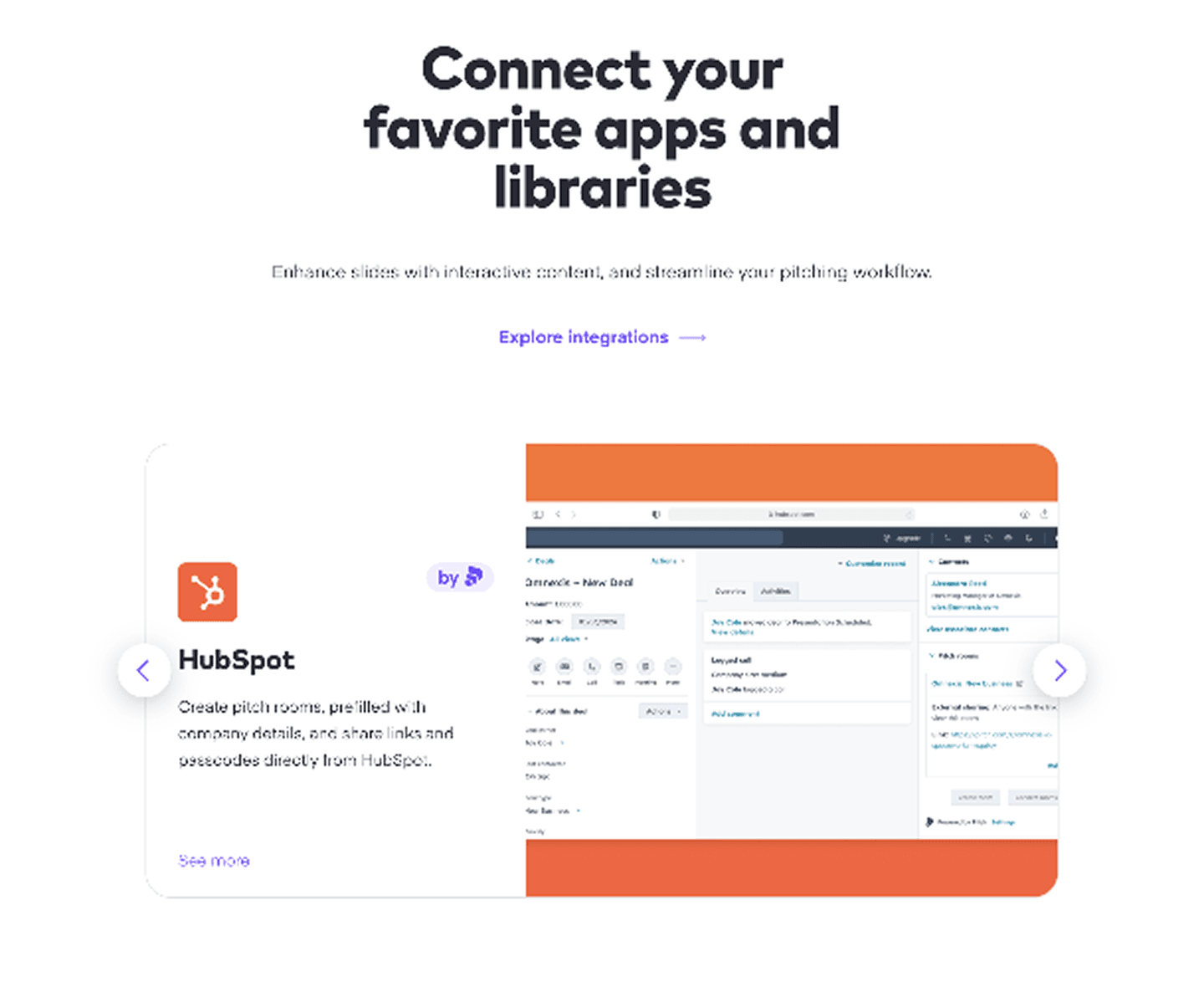
Across the scored examples below, the pattern that performs is restraint paired with a clear path deeper. Linear numbers its sub-features (Pulse, Insights, Dashboards) under one Monitor theme, so several capabilities read as one coherent story rather than a list. Surfer SEO tucks its supporting capabilities into a "what's new" block with a link to all updates, keeping them present without crowding the headline. Asana and Uscreen let a per-card integration or logo wall stand in for a long capability list, and Ramp gives each of its supporting modules its own "learn more" link so the depth is browsable rather than dumped.
A features section rarely rests on depth alone. The strongest pair it with a single feature spotlight that anchors the glance, then rely on internal links into deeper feature pages so every secondary capability has somewhere to lead instead of a paragraph to fill.
67/100 10/100
The usual failure is the flat wall: a grid where the headline feature and eight supporting ones all carry the same size, color, and weight, so a visitor cannot tell what to read first. The second is depth with no exit, a long expandable list or a pile of pills that names capabilities but never links anywhere, leaving curious buyers with nowhere to go. Lead with one feature, contain the rest in an accordion, tabs, or pills, and give each secondary capability a path deeper rather than a sentence that competes for the screen.

Curated by
Gabriel Amzallag , Founder, Web Anatomy
5 years CRO + SEO at Qonto (2021–2025). After advising 15+ SaaS on their websites (Payfit, Pigment…), the same patterns kept breaking, so I decided to build the source of truth on what works on the web: the intelligence layer every tool, builder, and team uses to ship sites that perform.
Paste your URL. Get a scored analysis of your features section, including whether your supporting capabilities add depth or just noise. Free, no signup.
The common questions about layering supporting capabilities into a features section, with answers drawn from 143 scored examples.
Secondary features are the lower-priority capabilities a features section keeps available without giving them the spotlight. They are the supporting tools that add credibility and breadth, listed underneath or beside the one or two features doing the main selling. The point is to signal depth, so the product reads as complete, without letting every capability compete for the same attention.
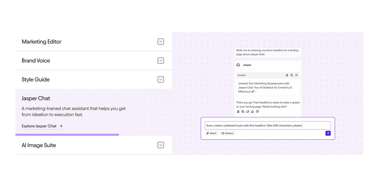
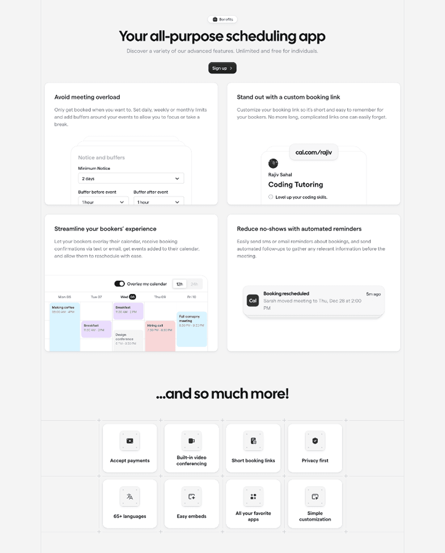
The reliable moves are containment and progressive disclosure. Accordions and tabs collapse supporting capabilities so only the active one is on screen. Capability pills or chips list extra functions in a compact strip. Numbered sub-features group several related tools under a single theme. Integration and logo walls stand in for a long list of connectors. Each pattern shows that the depth exists while keeping the lead feature legible.
Buyers evaluating a tool want two things at once: a clear headline capability and reassurance that the product covers the rest of the job. A section that dumps every feature at equal weight satisfies neither, because nothing leads. A section that hides everything but one feature looks thin. Surfacing secondary features in a contained, scannable way answers the depth question without diluting the headline promise.
Below or beside the lead feature, inside a container that keeps them from competing. Common placements are a collapsed accordion under the main copy, a row of tabs above the product visual, a strip of capability pills beneath the headline, or a small grid of supporting cards after the hero feature. The test is that the primary capability still owns the section at a glance.
Enough to prove the product is complete, arranged so a visitor is never asked to read all of them. One or two features lead, and the rest are available on demand through an accordion, tabs, pills, or a link to a deeper feature page. The goal is depth a buyer can dig into, not a wall of equal-weight bullets that forces a choice about where to look.