Features|
Grouping the features by persona, role, or use case lets each visitor jump straight to the block built for them, so the value lands before they have to translate a generic list.
Key takeaways
Showing 22–31 of 31 examples


Browse every features pattern by UX best practice.
Every features section is scored across 6 conversion best practices. Copy the best practice stack, not the layout. See what converts and why.
Hand-picked from 350+ companies and analyzed by our AI conversion agent. Not a random dump of feature grids. Every entry earns its spot.
Found a features section you admire? Run yours through the same scoring engine. See where you stand on the same best practices, and what to fix first.
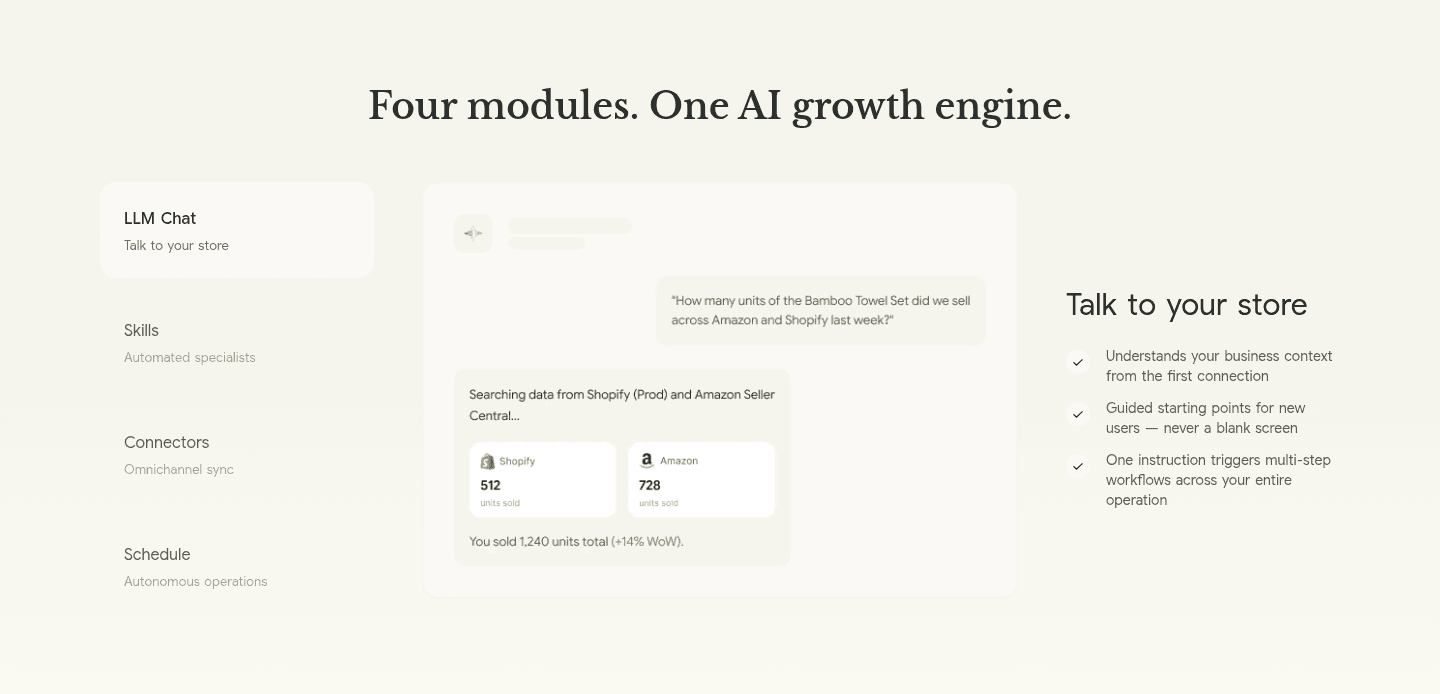
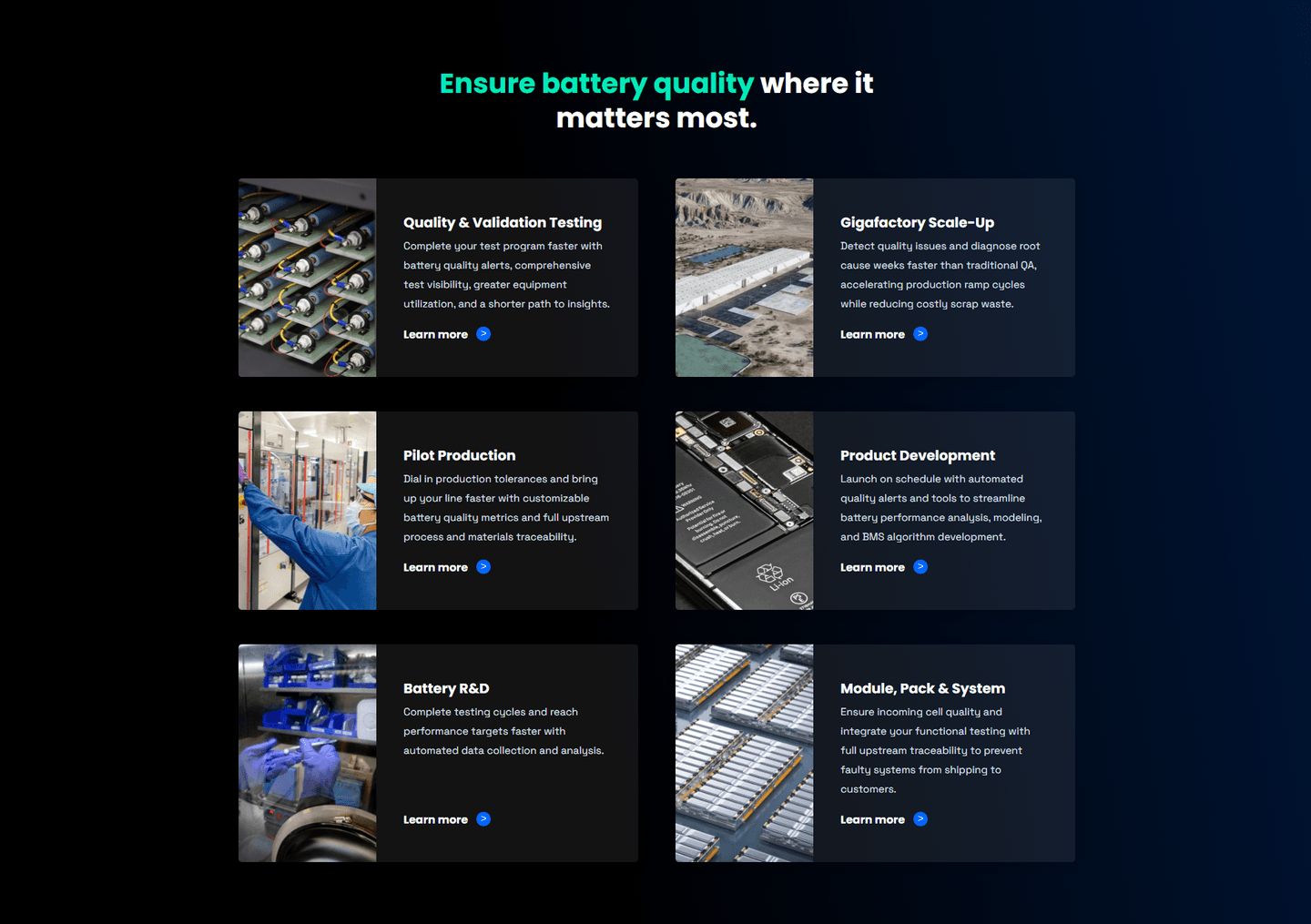
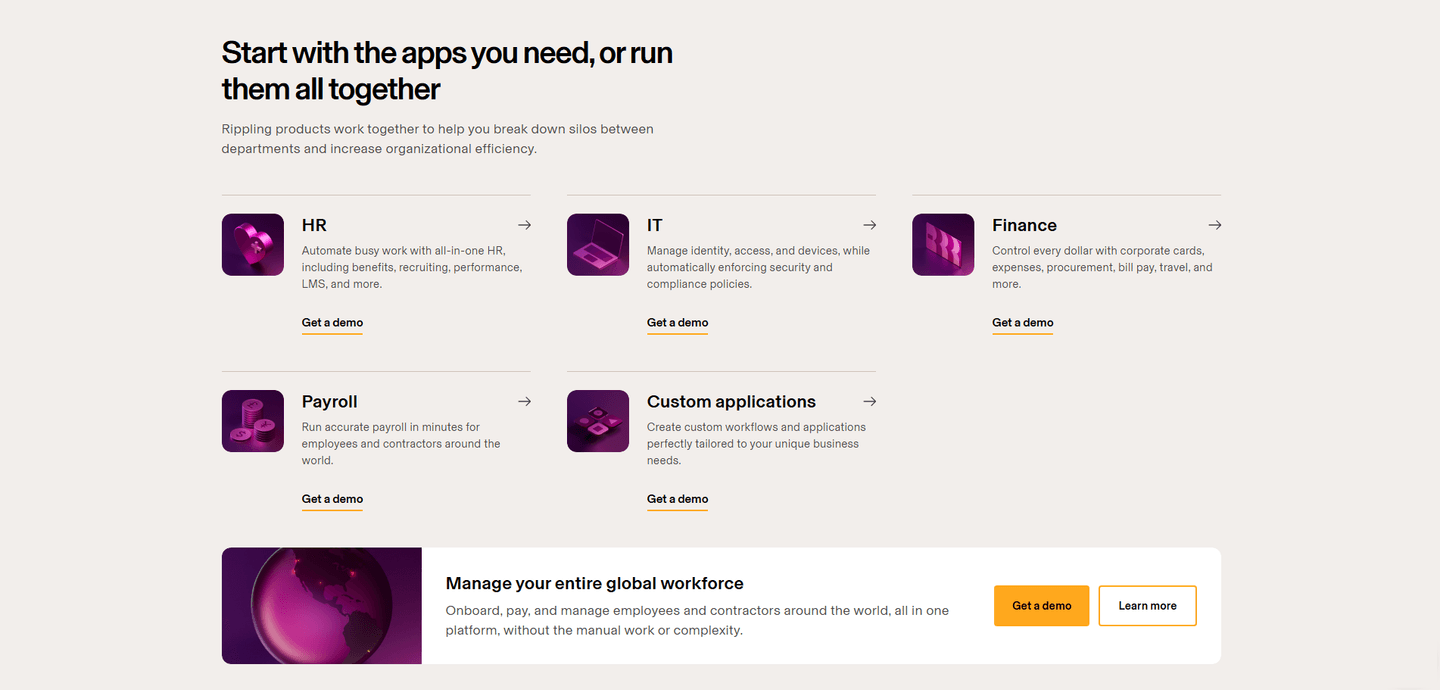
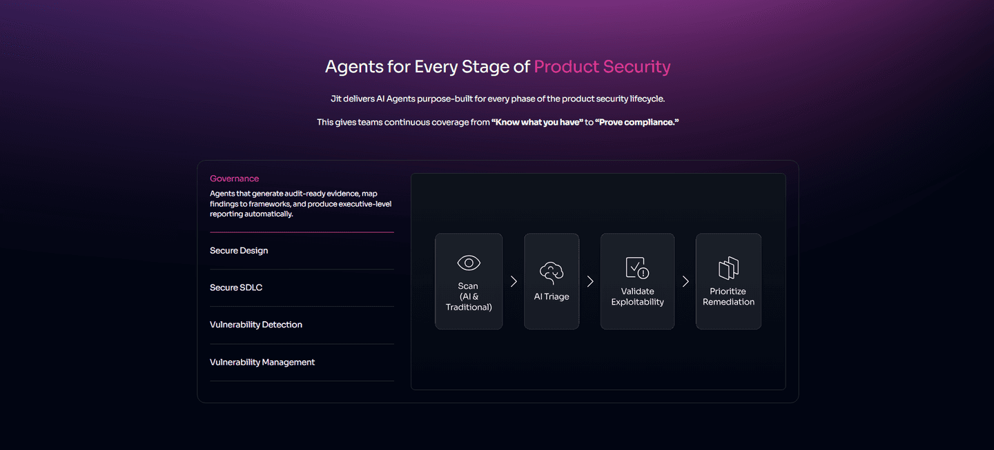
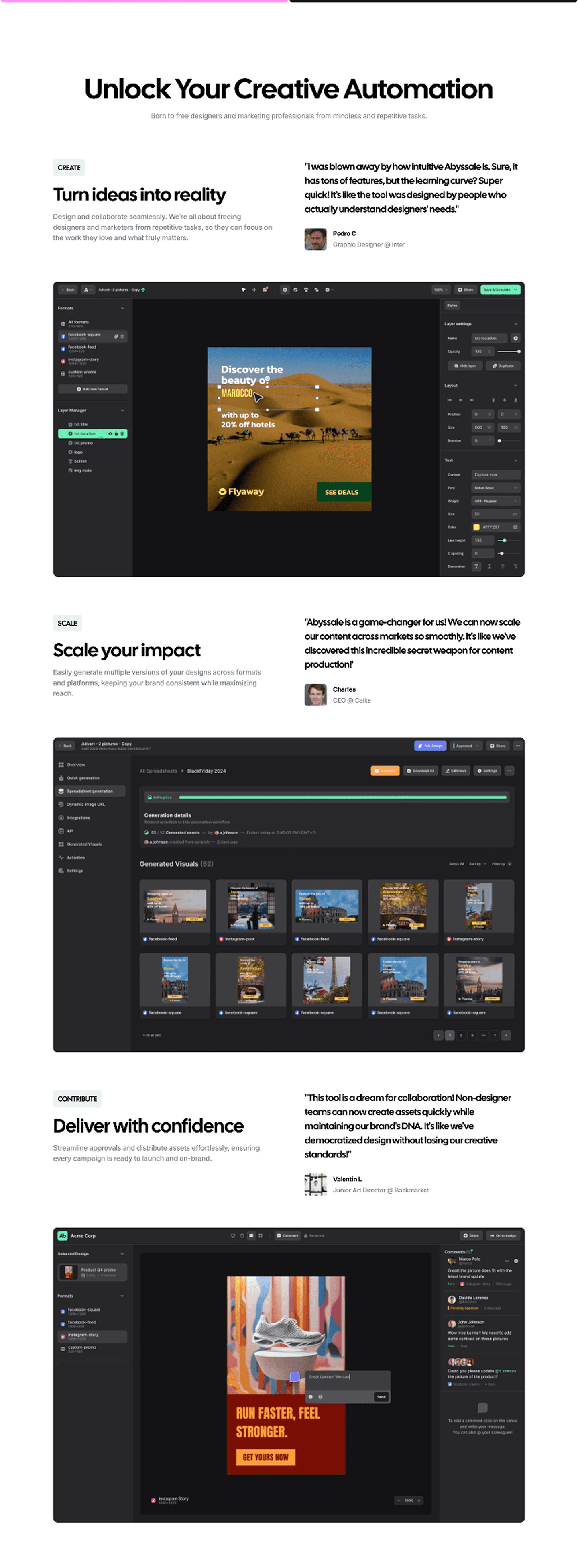
Persona grouping organizes the features section around who each capability is for, not only what it does. A flat list asks every visitor to read everything and work out which parts apply to them. A grouped section does that sorting up front: it splits the features into labeled blocks, a persona, a role, a use case, or a job to be done, so a visitor recognizes their own block and reads only that. The capability is the same; what changes is that the page hands each visitor the slice built for them.
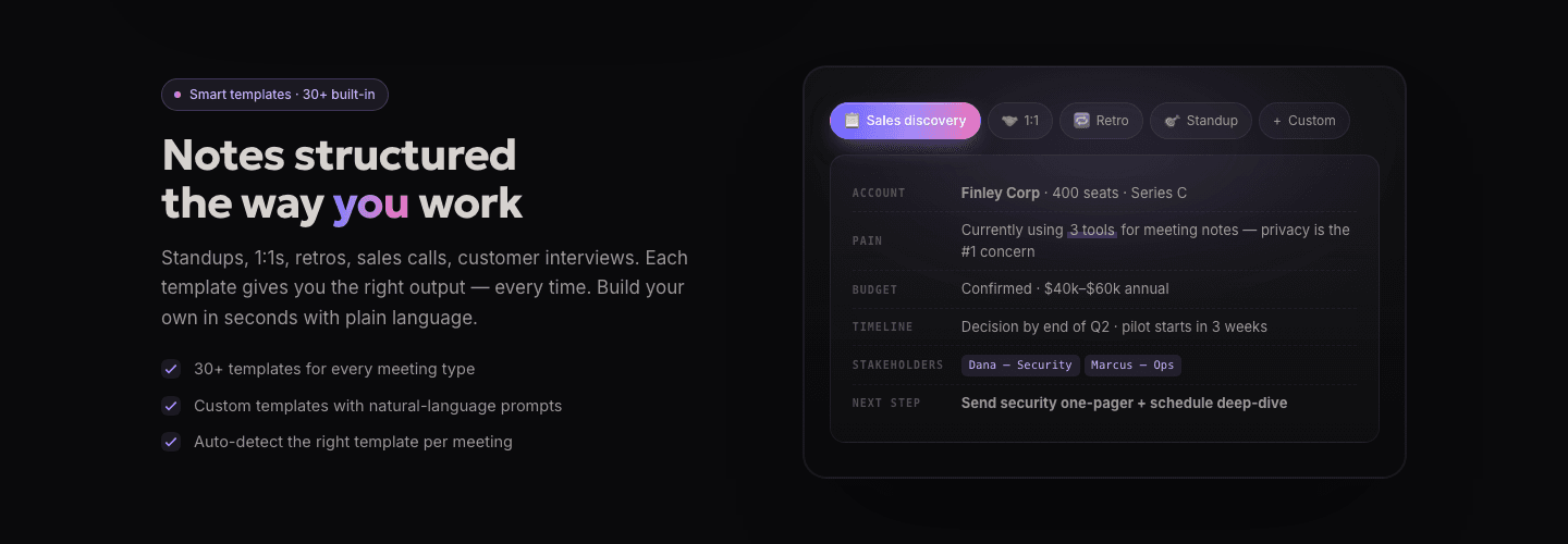
The best features sections group in one of a few forms:
A generic feature list makes every visitor do the translation: read each capability, then decide whether it matters for their job. Persona grouping removes that step. A label like For Product Managers or Fleet Telematics tells a visitor where to look before they read a word, so the relevant value reaches them faster and the rest stops competing for attention. The page feels built for them rather than for everyone at once.
Grouping also signals range without burying anyone. When Swytchcode CLI labels its cards Onboarding, Payments, Engineering, Sales, and Reporting, a single visitor sees their own job covered and, at the same time, sees that the product serves four other teams too. One tool reads as broad and specific at once, which a flat list of features can rarely pull off.
Across the examples below, the grouping that works shares a discipline. The labels name a real audience or job, not a vague tier: Novu Connect tabs by Onboarding/Activation, Self-Service Support, Billing, and Developer Experience, so each label matches a job a visitor actually has. Each group is backed by real product UI rather than an icon, the way Samsara shows live camera feeds under its hardware tab and Supaboard embeds a real dashboard under each block, so the relevant audience sees proof, not just a promise. And the strongest sections give each group its own way deeper: Benchling routes every workflow tab to a Learn more page, and CommandBar gives each product column its own link, so a visitor who has found their block can go further without wading through the others.
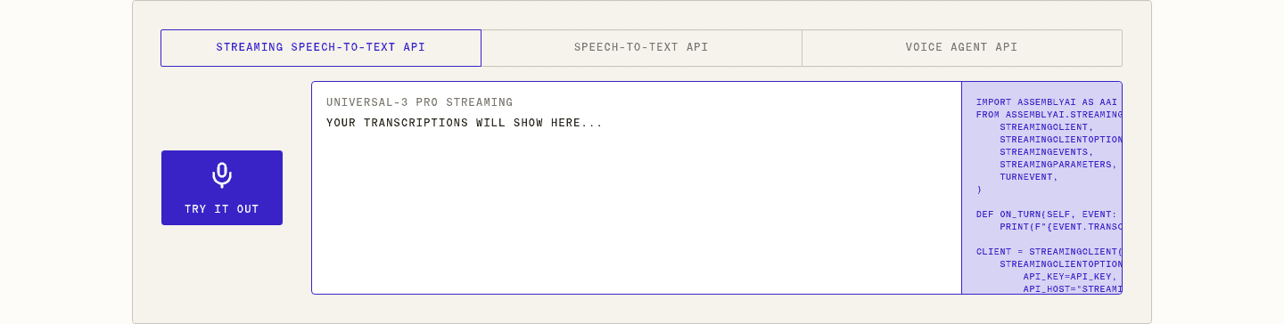
The forms overlap with a demo video in the features section, since a grouped tab often opens onto a short clip of that exact workflow. The wider features section gallery shows how grouping sits alongside the other ways a features section earns a click.
50/100 0/100
0/100The usual failure is grouping by vague tier instead of by audience: labels like Basic, Pro, and Advanced tell a visitor nothing about whether a block is for them, so the sorting work lands back on the reader. The second is too many groups, a strip of eight or ten tabs that no one scans, which buries the relevant block as thoroughly as a flat list would. The third is grouping by internal feature category rather than by who it serves, so the section reflects the org chart instead of the visitor's job. Name a real persona or task, keep the set short enough to scan, and back each group with the product doing that group's work.

Curated by
Gabriel Amzallag , Founder, Web Anatomy
5 years CRO + SEO at Qonto (2021–2025). After advising 15+ SaaS on their websites (Payfit, Pigment…), the same patterns kept breaking, so I decided to build the source of truth on what works on the web: the intelligence layer every tool, builder, and team uses to ship sites that perform.
Paste your URL. Get a scored analysis of your features section, including whether you group capabilities so each visitor finds their own. Free, no signup.
The common questions about grouping a features section by persona, with answers drawn from 31 examples.
It is a features section organized around who each capability is for, rather than a single flat list. The features are split into labeled blocks, by persona, role, use case, or job to be done, so a visitor recognizes the block built for them and reads only that. Benchify, for example, splits its section into cards for Payers, Providers, and PBMs so each buyer self-selects.
A flat list asks every visitor to read every feature and work out which parts apply to their job. Grouping does that sorting up front. A label like For Product Managers or Fleet Telematics tells a visitor where to look before they read a word, so the relevant value reaches them faster and the section feels built for them rather than for everyone at once.
Use whichever split matches how buyers describe their own job. Some products group by role, the way Tycoon AI lists an AI CTO, Head of Content, and AI CMO; others group by workflow, the way Vesper tabs by Know when to buy, Verify any price, and Justify decisions. The test is the same: each label should name something a visitor already identifies with, so they know which block is theirs.
Few enough to scan in one pass. The strongest examples stay around three to five groups, like Samsara's four use-case tabs or Benchify's three persona cards. A strip of eight or ten tabs buries the relevant block as thoroughly as a flat list, because no one reads to the end to find their own.
Real product behind each group. The best sections back every block with the actual interface doing that group's work, the way Samsara shows live camera feeds under its hardware tab and Benchling routes each workflow to its own deeper page. A label tells a visitor where to look; the product under it is what proves the claim.