Features|
Pain-to-outcome features copy names the frustration a visitor already feels and ties it straight to the result the product delivers, instead of listing feature names.
Key takeaways
Showing 22–42 of 101 examples

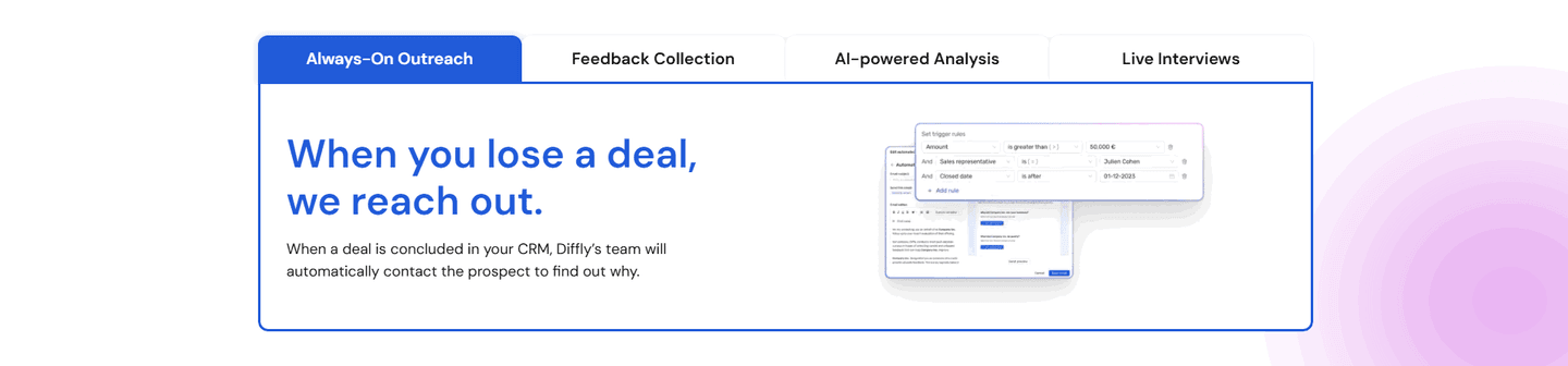
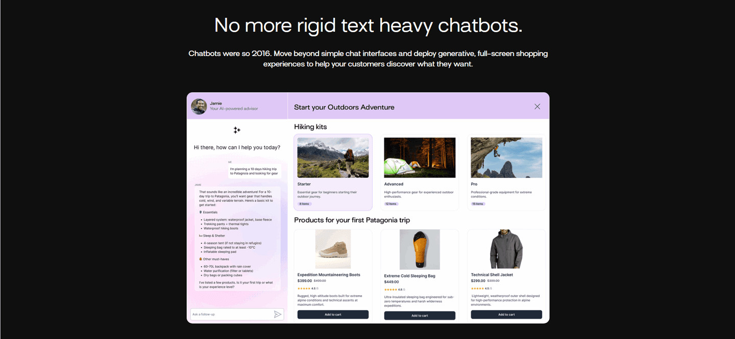
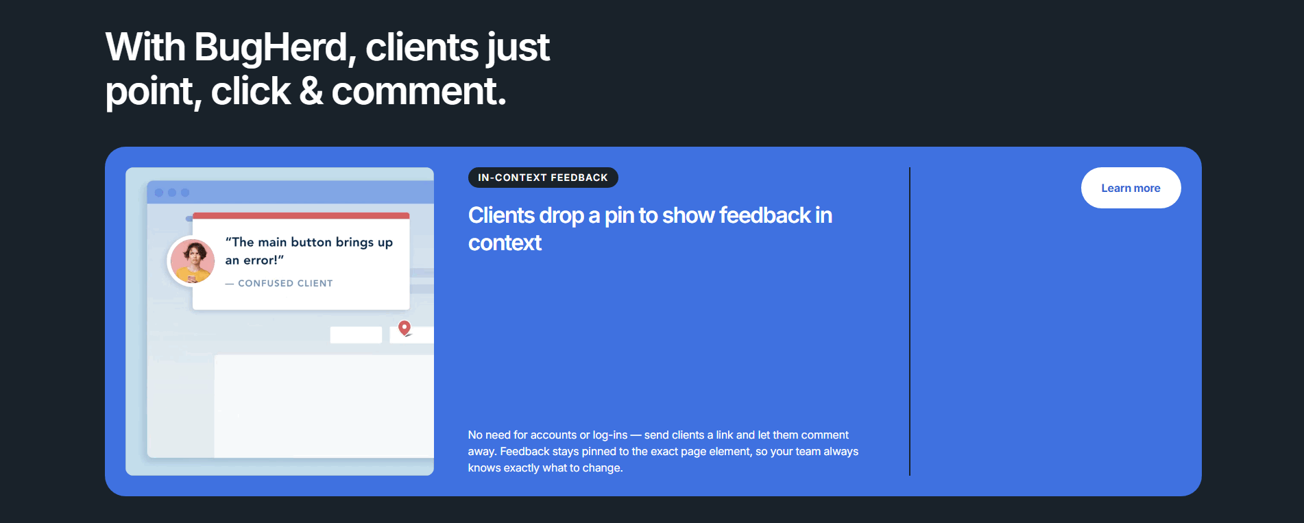
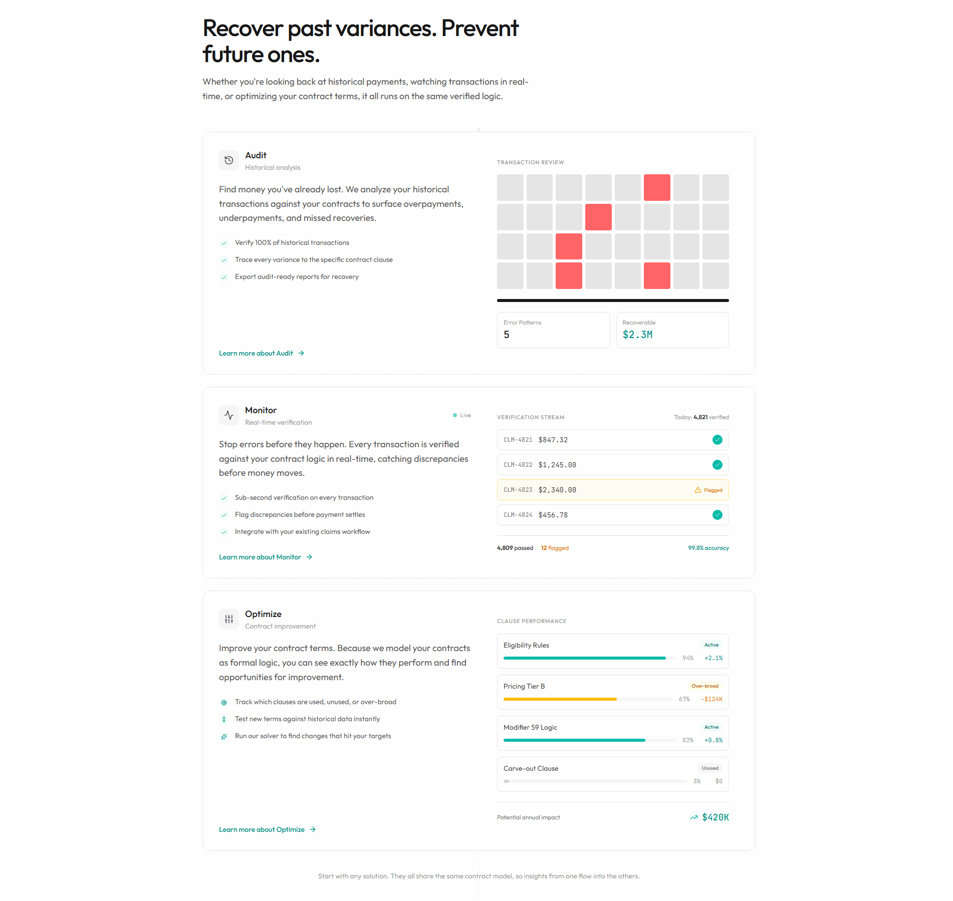
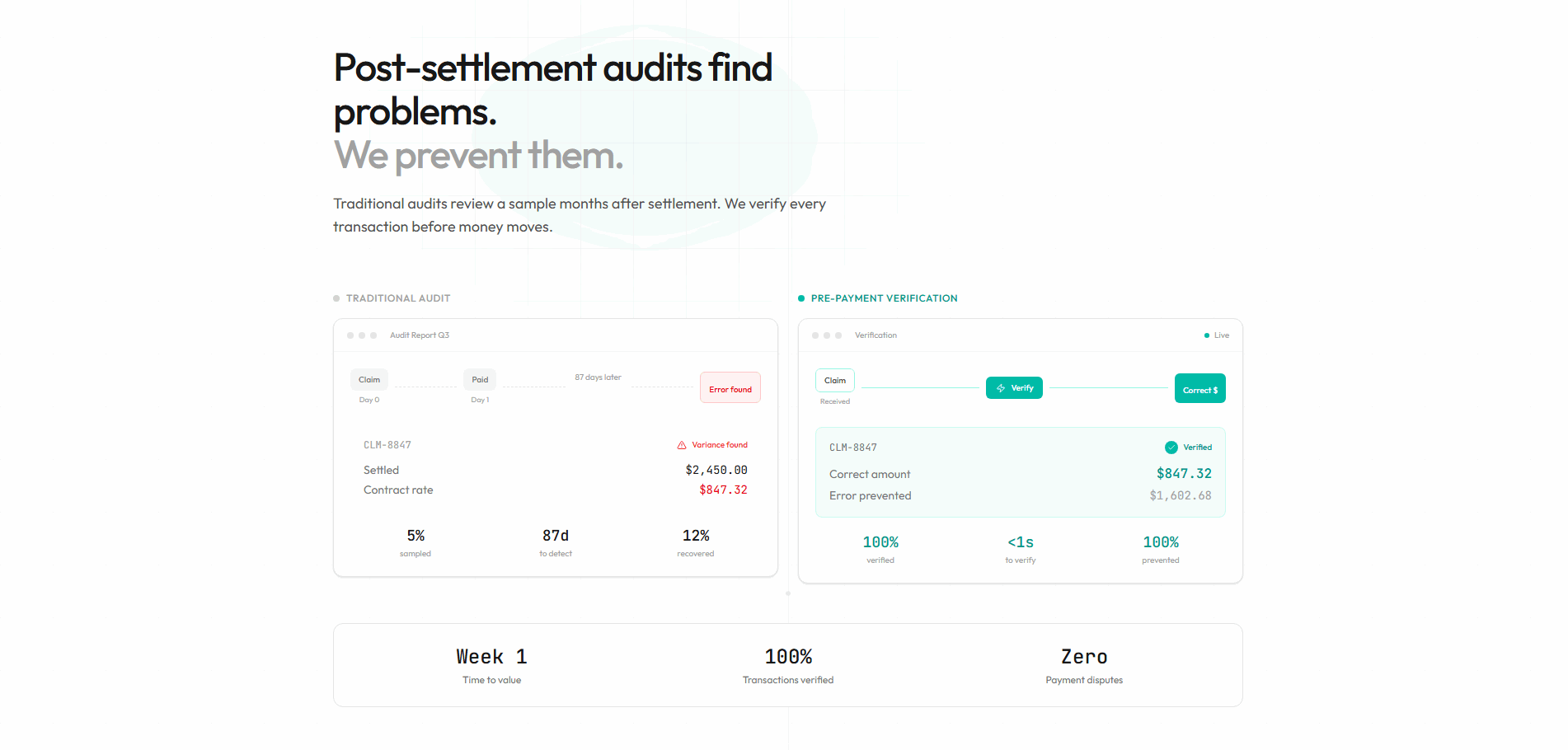
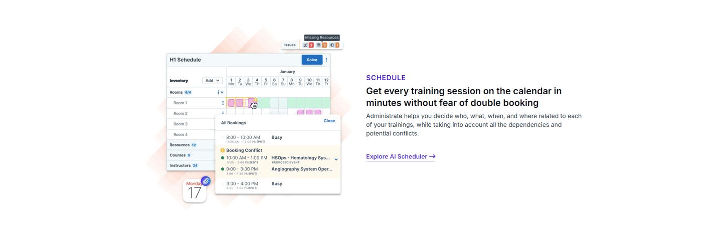
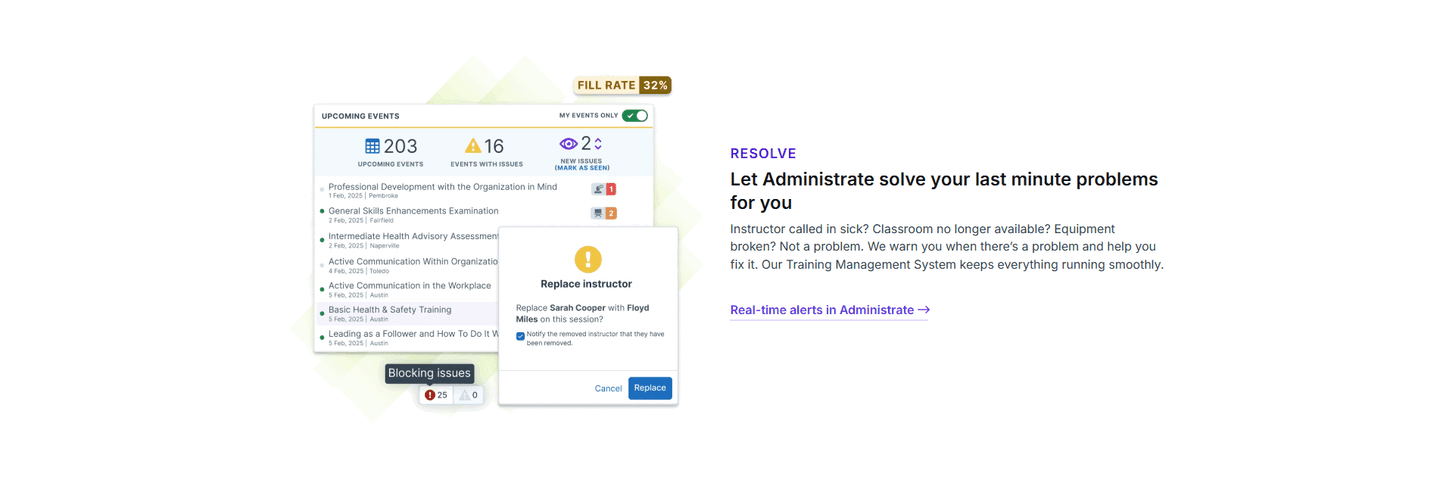
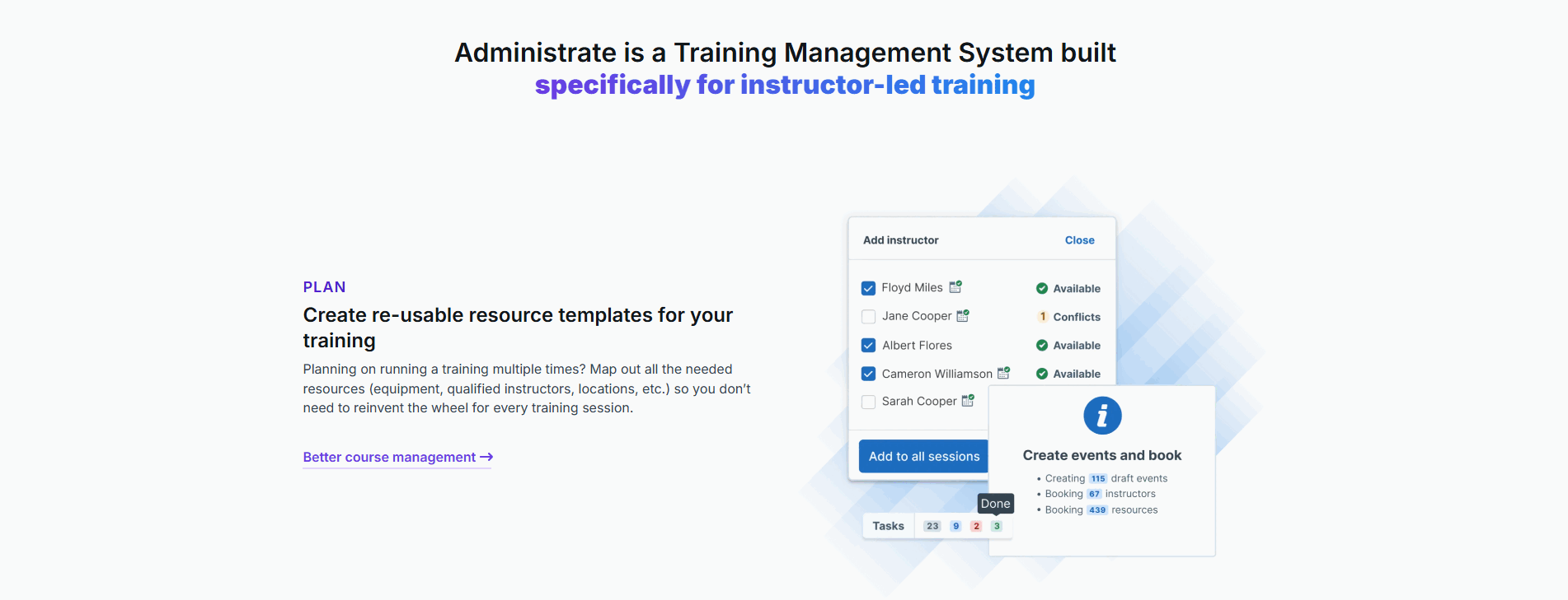
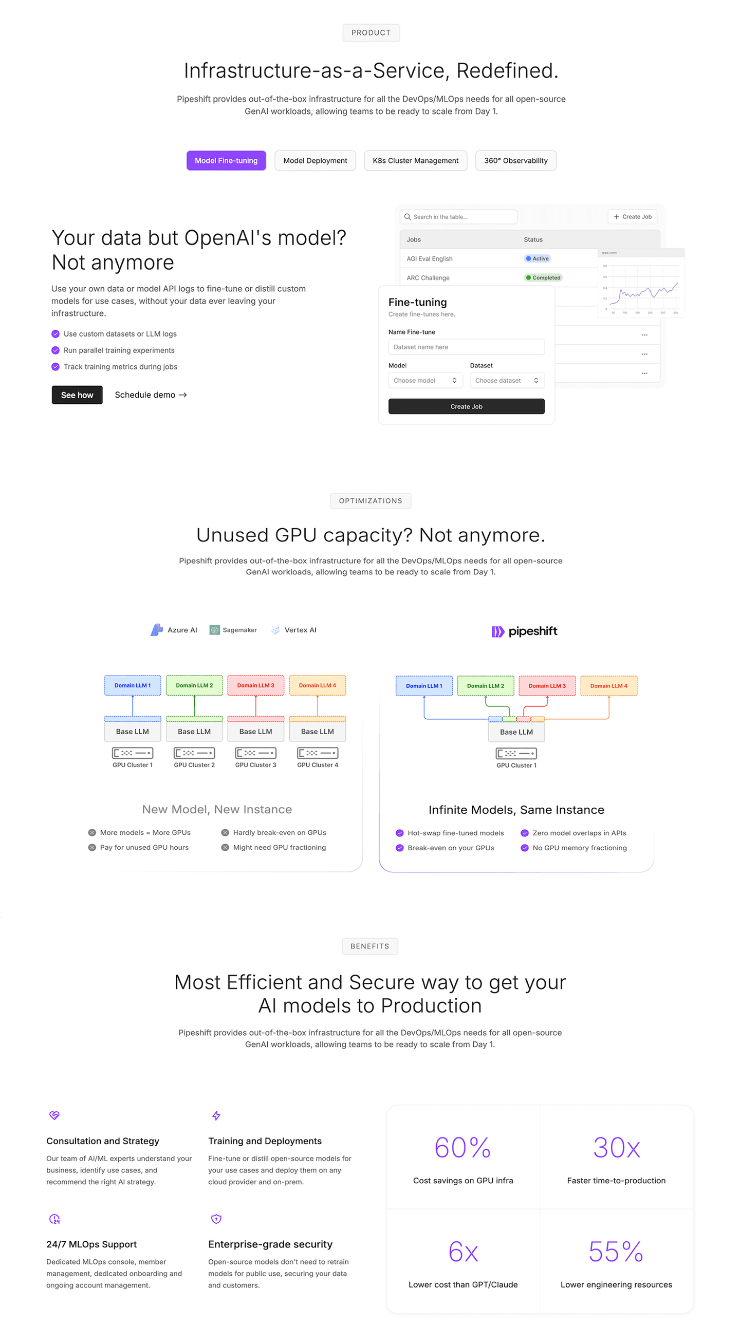
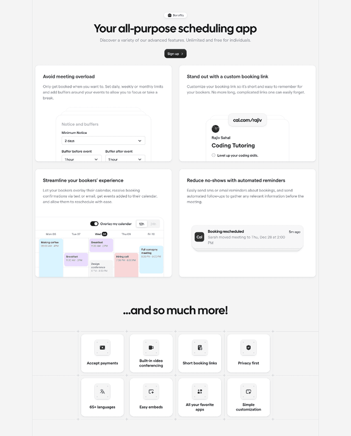
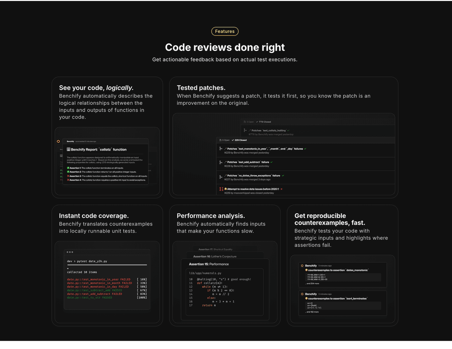
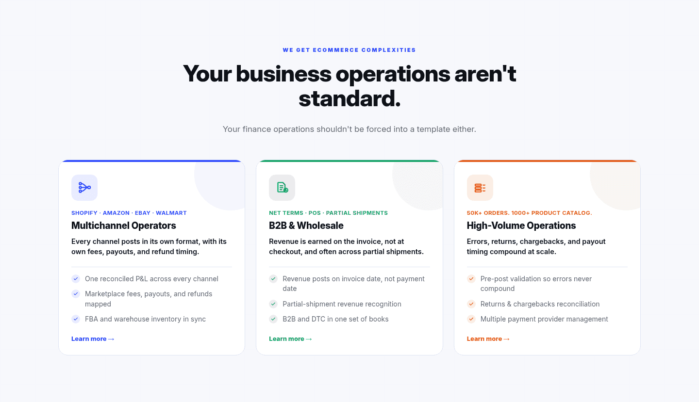
Browse every features pattern by UX best practice.
Every features section is scored across 6 conversion best practices. Copy the best practice stack, not the layout. See what converts and why.
Hand-picked from 350+ companies and analyzed by our AI conversion agent. Not a random dump of feature grids. Every entry earns its spot.
Found a features section you admire? Run yours through the same scoring engine. See where you stand on the same best practices, and what to fix first.
Pain-to-outcome mapping is the decision to lead a features block with the visitor's frustration and the result that removes it, instead of the feature name. A feature name is a fact about the product. A pain-to-outcome line is a fact about the visitor's day: it says "we know what this costs you," and then it shows the cost disappearing. When copy names the problem first, the feature stops being something the visitor has to evaluate and becomes something they already wanted.
The best features sections use one of four forms, often two together:
A feature name asks the visitor to do the translation. They have to read the capability, picture their own situation, and guess whether the two connect. Most visitors will not do that work, so a wall of feature names converts the people who were already sold and loses everyone still deciding. Copy that names the pain does the translation for them, and recognition arrives before evaluation.
Recognition is what earns the next paragraph. When a visitor sees their exact frustration described in plain words, they infer that the product was built by people who understand the problem, and the outcome sitting next to it reads as a promise the page already knows how to keep. The pain gives the outcome something to push against. Without it, even a strong benefit floats free, a nice claim with nothing to measure it by.
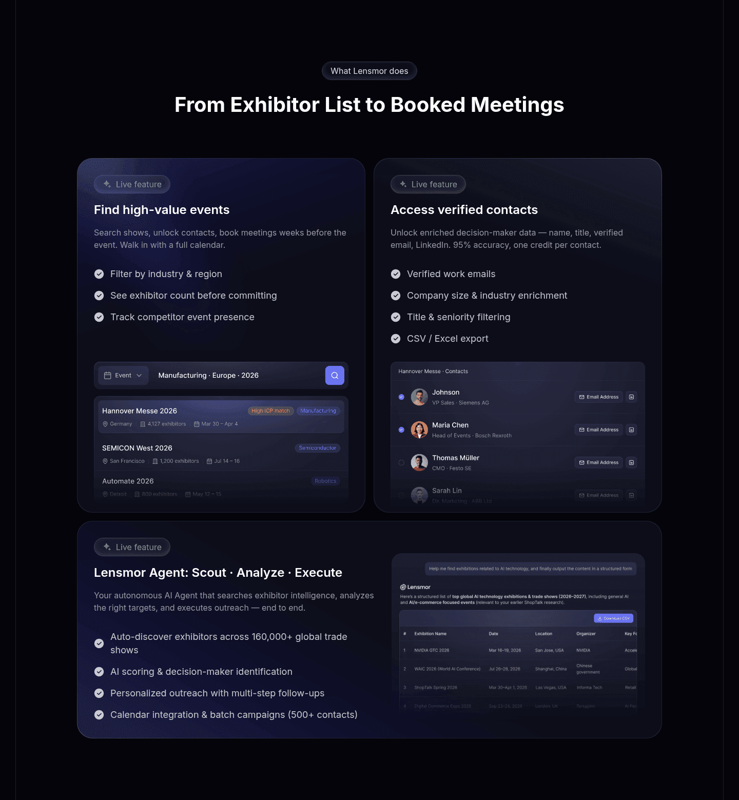
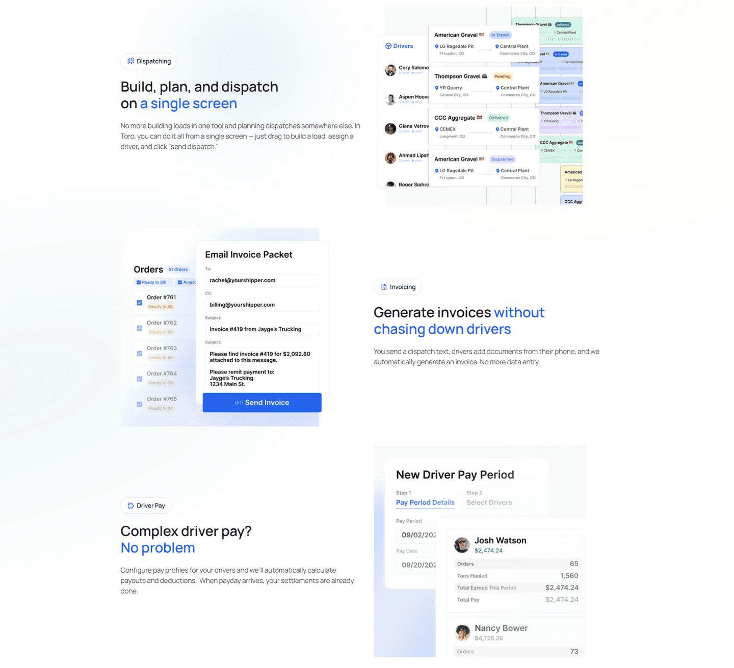
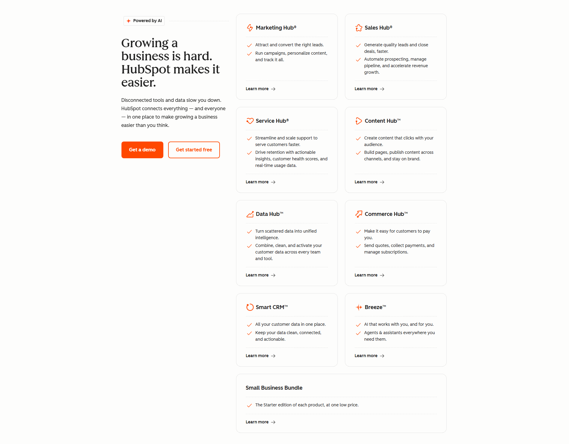
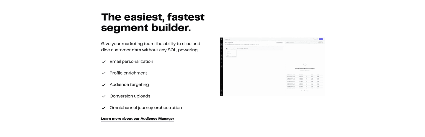
Roughly a third of the scored features sections in our library map pain to outcome rather than list capabilities. Across the scored examples below, the discipline that separates the strong ones is specificity on both ends. They name a pain precise enough that the right visitor flinches, then they close it with a result concrete enough to picture. HubSpot sets up its grid with "Disconnected tools slow you down." DinMo ties the no-SQL frustration straight to a self-serve segment builder for marketing teams. SignOnSite, the best-in-class example below, does not stop at the contrast: it struck 40 minutes down to 6 on inductions, so the outcome is a number, not an adjective.
Pain-to-outcome mapping rarely carries a features section alone. The strongest pair it with a before-and-after contrast that quantifies the shift, or give the primary result room to breathe as a single-feature spotlight rather than crowding four pains into one grid.
67/100 10/100
The usual failure is naming a pain so generic that no one actually feels it, so the copy reads as filler and buys no recognition. The second is stating the pain but never closing it: the visitor is handed a problem and left without proof of the fix. The third is mapping to a vague benefit like "save time" instead of a specific, visible result, which is why the disciplined examples pin the outcome to a real product view or a real number. Name a pain your buyer would say out loud, then show the exact thing that ends it.

Curated by
Gabriel Amzallag , Founder, Web Anatomy
5 years CRO + SEO at Qonto (2021–2025). After advising 15+ SaaS on their websites (Payfit, Pigment…), the same patterns kept breaking, so I decided to build the source of truth on what works on the web: the intelligence layer every tool, builder, and team uses to ship sites that perform.
Paste your URL. Get a scored analysis of your features section, including whether your copy maps frustration to outcome or just lists capabilities. Free, no signup.
The common questions about mapping frustration to outcome in a features section, with answers drawn from 101 scored examples.
It is the choice to lead each feature block with the visitor's frustration and the result that removes it, rather than the feature name. Instead of 'Automated workflows', the copy reads like 'Stop chasing people for sign-off' paired with the product doing the sign-off itself. The pattern usually takes one of a few forms: a headline that states the chore then the fix, a before-and-after contrast, a short list of what the visitor no longer has to do, or a product visual showing the finished outcome.
A feature name asks the visitor to do the translation work: read the capability, imagine their situation, and guess whether it helps. Copy that names the pain first does that work for them, so recognition happens before evaluation. When a visitor sees their own frustration described accurately, they trust that the product was built for their problem, and the outcome next to it reads as a promise the page already understands how to keep.
Four are common. A pain-then-fix headline, like SignOnSite contrasting chasing site managers for signatures against workers completing safety forms on their phones. A relief list of what disappears, like Databox MCP's 'No dashboards to build, no SQL to write, no cleanup work'. A before-and-after contrast that quantifies the shift, as DevStats does with a slow cycle time beside a faster one. And a concrete product view that shows the result, so the outcome is visible rather than claimed.
They overlap, and the strongest features sections use both. Benefit-led copy leads with the upside ('Publish faster'). Pain-to-outcome mapping adds the other half of the arc: it names the specific frustration the upside removes ('Publish without waiting on engineering'), so the benefit lands against a problem the visitor recognizes. Benefit-led copy tells them the destination; pain-to-outcome mapping reminds them why they wanted to leave.
The first is naming a generic pain no one actually feels, so the copy reads as filler instead of recognition. The second is stating the pain but never closing it with a concrete outcome, which leaves the visitor with a problem and no proof of the fix. The third is mapping to a vague benefit ('save time') instead of a specific, visible result, which is why the best examples pin the outcome to a real product view or a real number.