Features|
Presenting several peer features together, as a grid, a zigzag, or a set of tabs, lets a scanner find the one capability that hooks them and shows the product does more than one thing, which is why 307 of the best SaaS pages lead with breadth rather than a single feature.
Key takeaways
Showing 148–168 of 307 examples
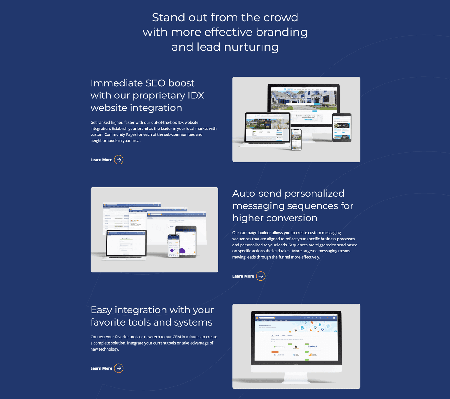
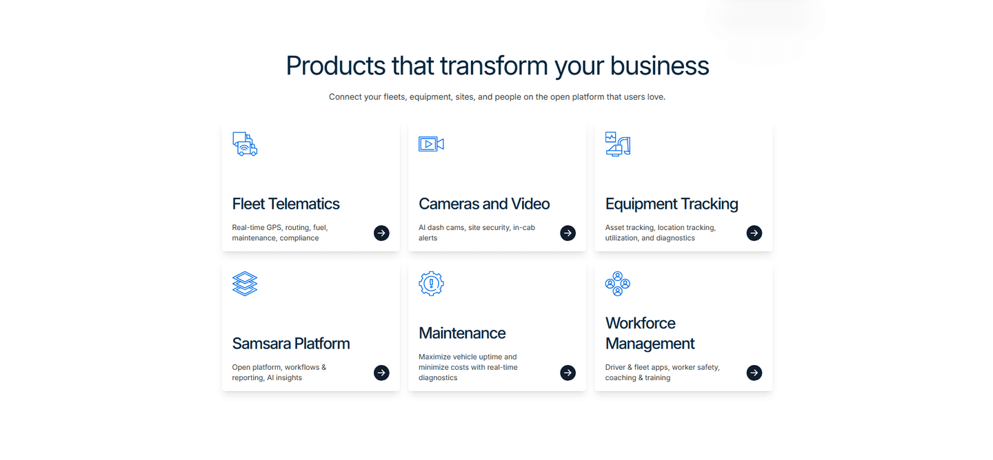
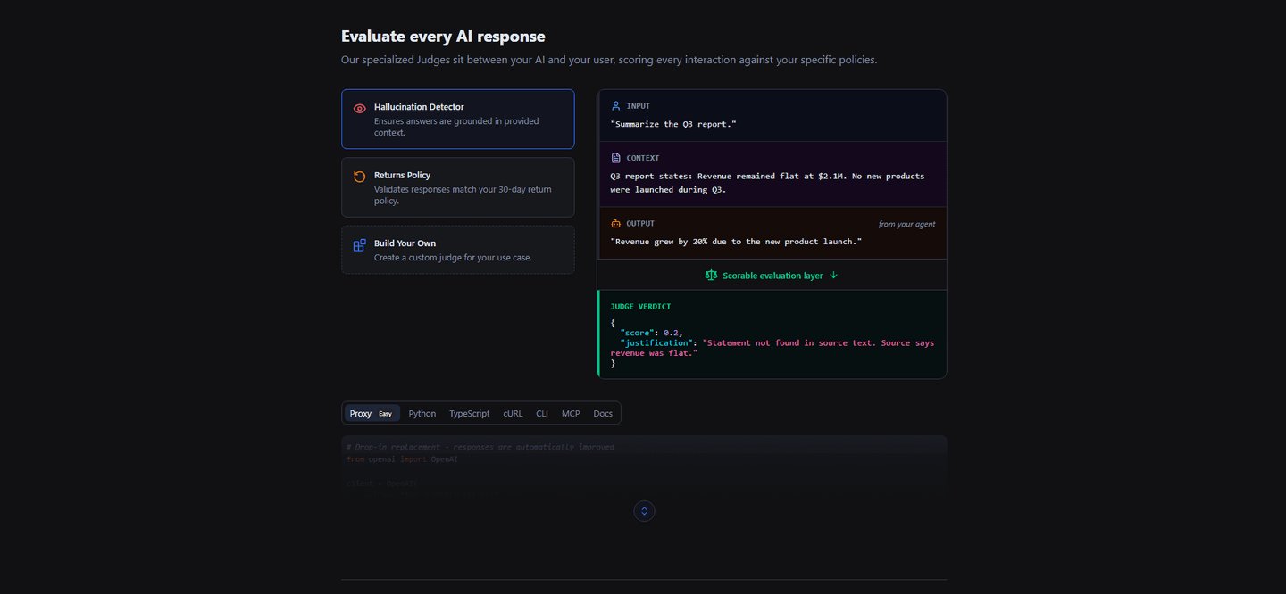
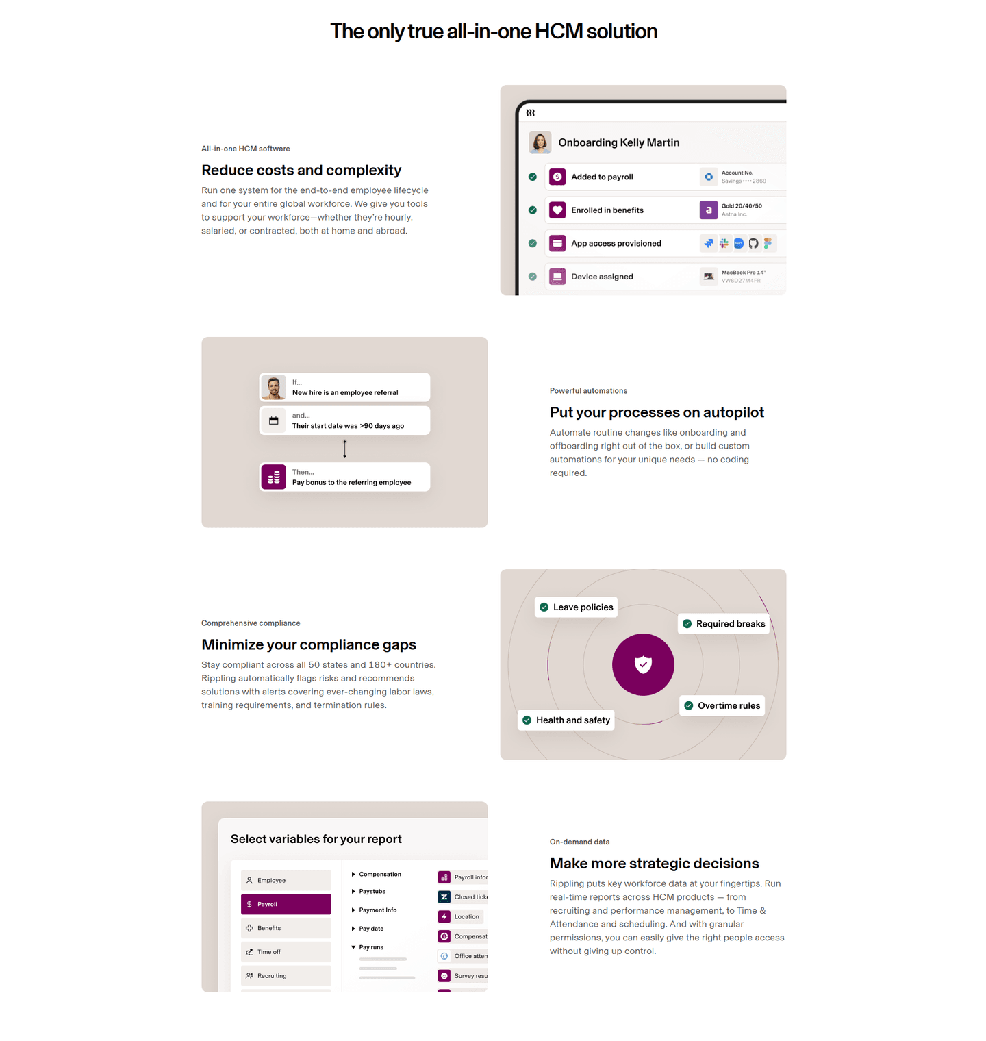
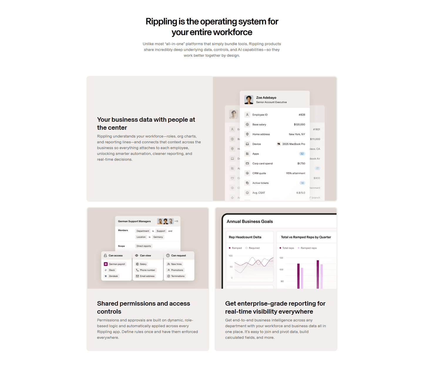
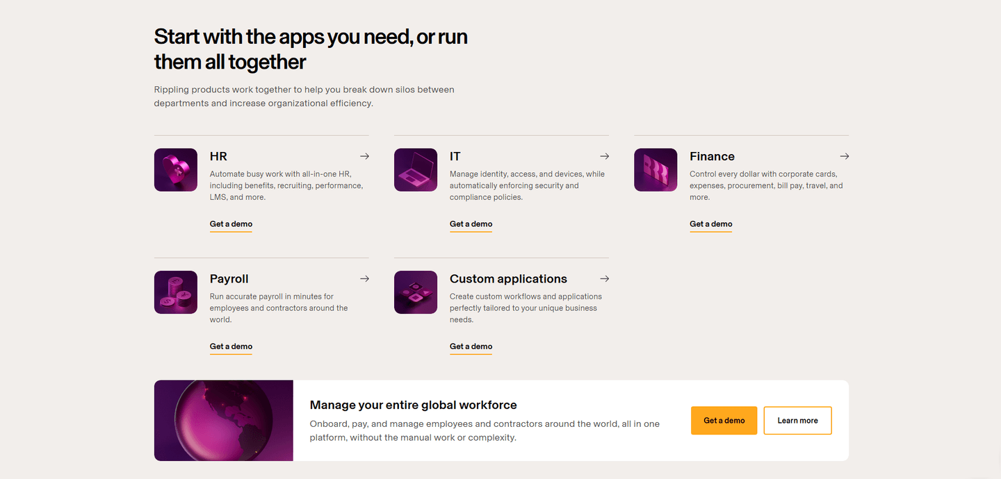
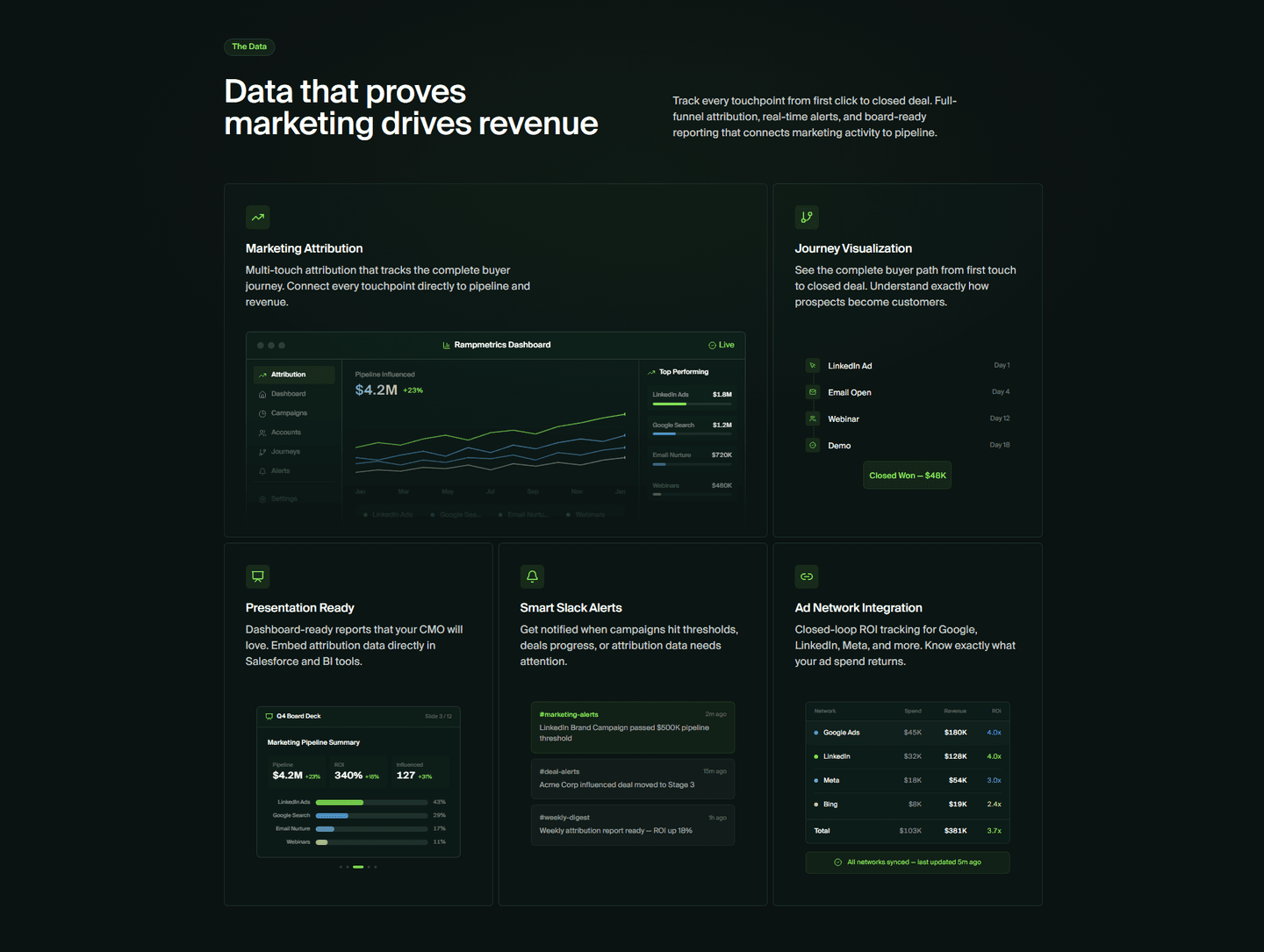
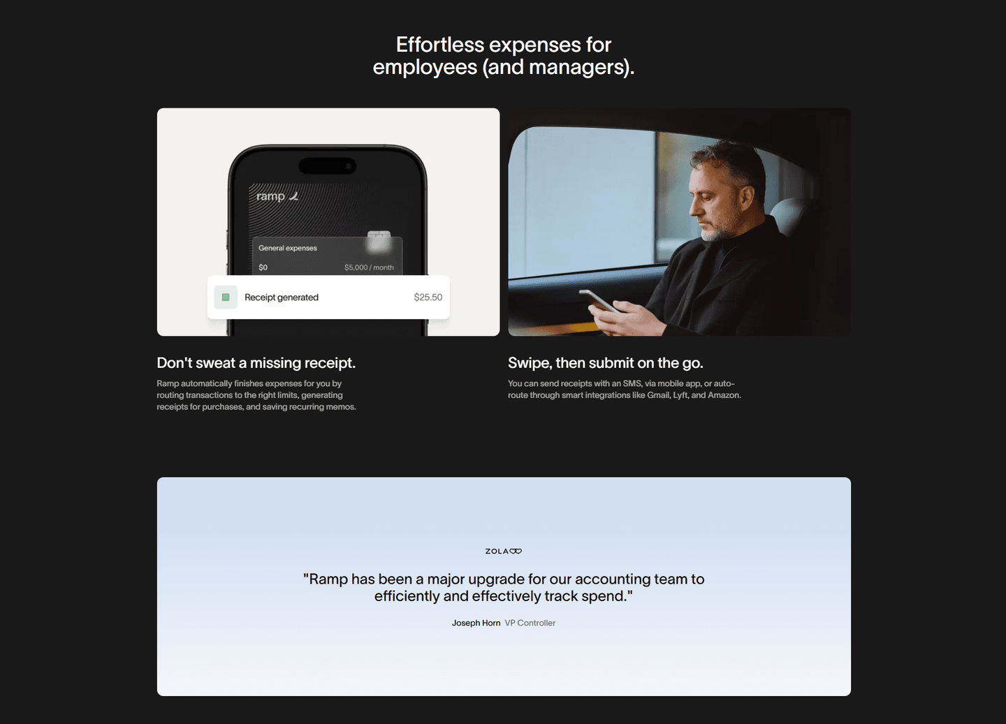
Browse every features pattern by UX best practice.
Every features section is scored across 6 conversion best practices. Copy the best practice stack, not the layout. See what converts and why.
Hand-picked from 650+ companies and analyzed by our AI conversion agent. Not a random dump of feature grids. Every entry earns its spot.
Found a features section you admire? Run yours through the same scoring engine. See where you stand on the same best practices, and what to fix first.
A multiple-capabilities features section presents several peer features together under one heading, rather than spotlighting a single capability. It is the opposite of a single-feature hero block: instead of going deep on one thing, it lays out the range so a visitor sees that the product does more than one job. The capabilities all carry roughly equal weight, and the layout hands each one enough room to register in a scan without any single feature crowding out the rest.
The best features sections present the set in one of a few forms:
A single-feature spotlight is sharp but narrow. It proves the product does one thing well and leaves everything else unsaid, which is a risk when a visitor is weighing whether the tool covers their whole job. Showing several features together answers that question in the layout itself: the product visibly does more than one thing, and the range is legible before a word is read. When Beehiiv frames its grid with MORE THAN JUST NEWSLETTERS, the four cards underneath turn that claim into something a visitor can check.
It also lets scanners self-serve. Different buyers are hooked by different capabilities, and a feature lineup lets each one find their own without reading the rest. AssemblyAI's six cards mean a speech-to-text buyer and a voice-agent buyer both see their capability on the same screen, so neither has to guess whether the platform reaches their use case.
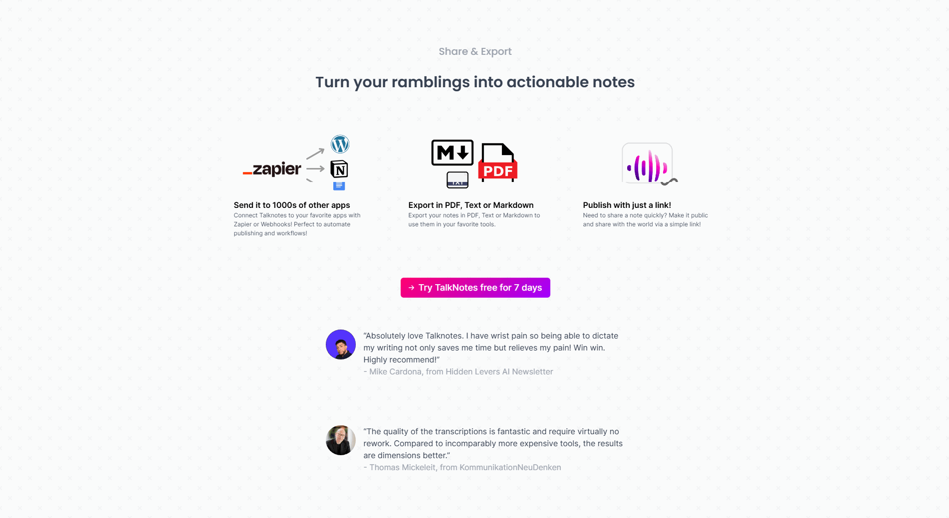
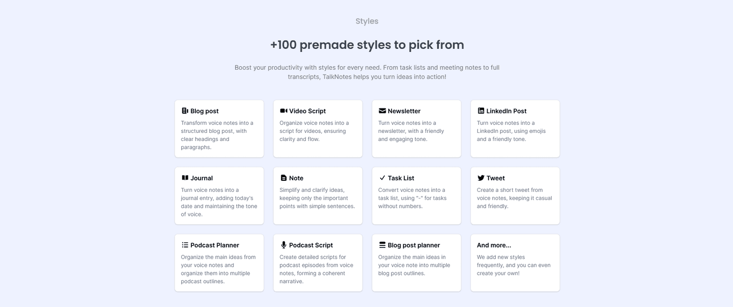
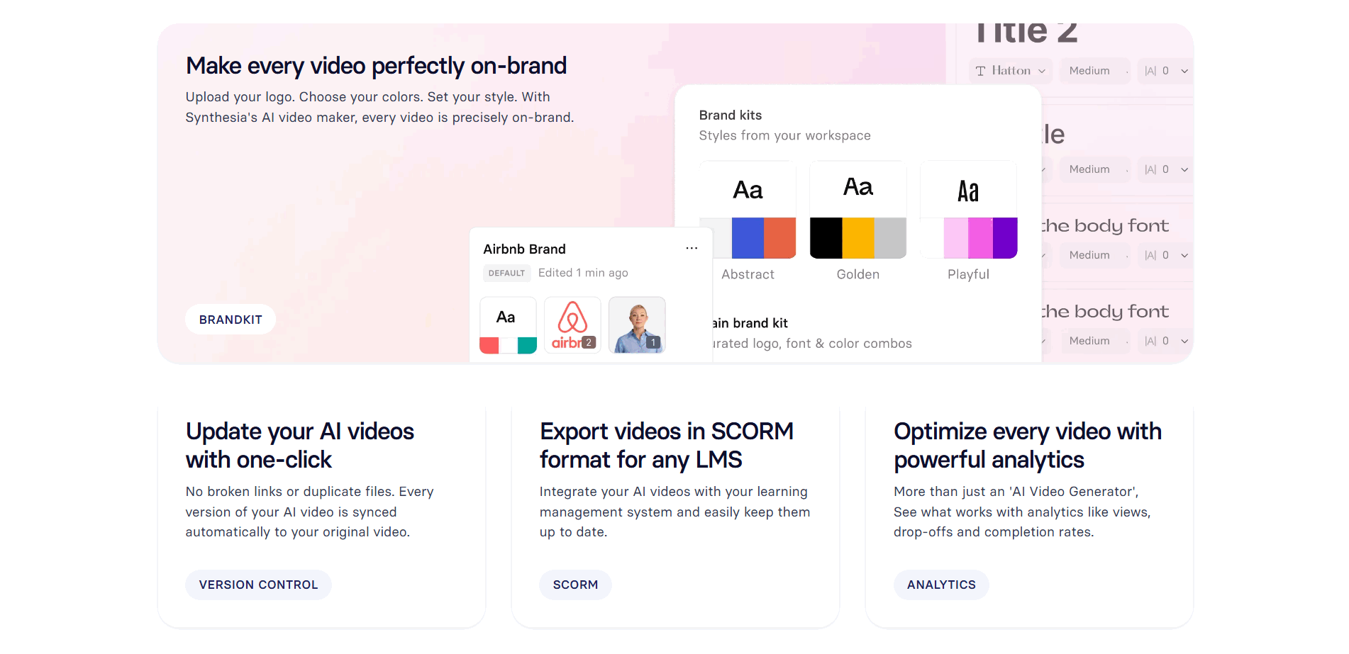
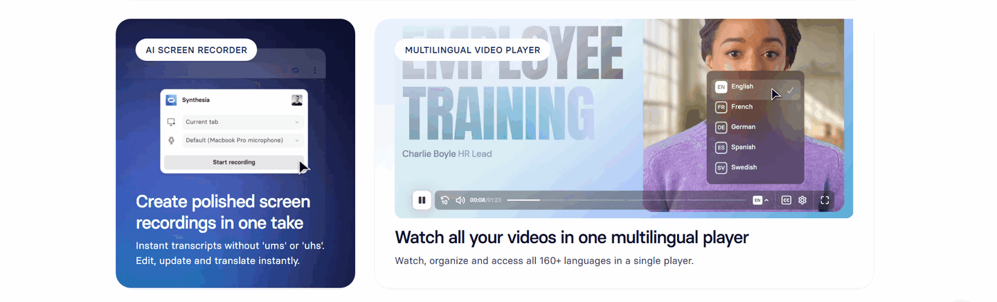
Across the examples below, the sections that work share a discipline. Each feature leads with a benefit, not a label: Perk writes Seamlessly book and manage trips rather than a module name, and Webflow heads its items Make content work harder instead of naming the CMS. Each one is backed by real product rather than an icon, the way Weld drops a real dbt editor under its transformation row and Beehiiv shows a $3,540.00 earnings wallet under Monetize, so breadth never reads as an empty feature dump. And the strongest sets stay scannable: SafetyCulture holds nine cards together only because every card shares the same icon, headline, and two-line benefit, while Abyssale mixes larger and smaller bento cards so the headline features stay dominant and the supporting ones sit quietly beneath.
The layout overlaps with how you group those features by persona, since a grid often doubles as a set of audience-labeled cards, and with a demo video in the features section, since one card in the set frequently opens onto a short clip. The wider features section gallery shows how a broad feature lineup sits alongside the other ways a features section earns a click.
50/100 10/100
The usual failure is breadth without hierarchy: a wall of ten identical bullets that buries every feature equally, so a scanner leaves without a single capability standing out. The second is labeling by feature name instead of benefit, a grid of nouns like Analytics and Integrations that names the tool but never says what it does for the reader. The third is showing icons where product should be, so a visitor gets a claim under each card but no proof it works. Lead every feature with an outcome, keep the set short enough to scan in one pass, and back each one with the real UI doing that job.

Curated by
Gabriel Amzallag , Founder, Web Anatomy
5 years CRO + SEO at Qonto (2021–2025). After advising 15+ SaaS on their websites (Payfit, Pigment…), the same patterns kept breaking, so I decided to build the source of truth on what works on the web: the intelligence layer every tool, builder, and team uses to ship sites that perform.
Paste your URL. Get a scored analysis of your features section, including whether you present several capabilities so each visitor finds their own. Free, no signup.
The common questions about presenting several features together, with answers drawn from 307 examples.
It is a features section that presents several peer capabilities together under one heading, rather than spotlighting a single feature. The set can take the form of a card grid, a zigzag of stacked rows, a tab strip, or a carousel. SafetyCulture, for example, lays out nine feature cards (AI, Inspections, Training, Asset management, and more) so a visitor sees the whole suite at once and finds the part that matters to them.
A single-feature spotlight is sharp but narrow: it tells a visitor the product does one thing well and leaves the rest unsaid. Showing several peer features communicates platform breadth, so a visitor sees the product does more than one job. It also lets scanners self-serve, since different buyers are hooked by different capabilities. AssemblyAI headlines its grid Everything you need to build with Voice AI and then proves it with six cards, so the section reads as a complete toolchain rather than one API.
Use whichever layout lets a visitor scan the set fast. A card grid works when several capabilities carry equal weight, the way Beehiiv uses four cards for Create, Publish, Grow, and Monetize. A zigzag of stacked rows works when each feature needs a real screenshot, the way Weld pairs each headline with connector and editor UI. Tabs work when the features map to a lifecycle, the way Semgrep tabs across Detection, Noise Filtering, Remediation, and Prevention. The test is the same: the whole set should be graspable in one pass.
Enough to signal range, few enough to scan. Sets of three to six read cleanly, like Supaboard's three blocks or Tendem's six use-case cards. Larger grids can still work when each card is tight and scannable, the way SafetyCulture holds nine cards together with a consistent icon, headline, and two-line benefit. The failure mode is not the count but the clutter: a wall of undifferentiated bullets buries every feature equally.
Benefit-led titles and real product behind each one. The strongest sections lead every card with the outcome, the way Perk writes Seamlessly book and manage trips instead of a feature name, and back it with actual UI, the way Beehiiv shows a $3,540.00 earnings wallet under its Monetize card. A label tells a visitor what the feature is; the product output under it is what proves the feature works.