Features|
Feature sections that link out to dedicated pages let a visitor dig into the capability that matters to them, instead of forcing every detail onto one long homepage.
Key takeaways
Showing 22–42 of 149 examples
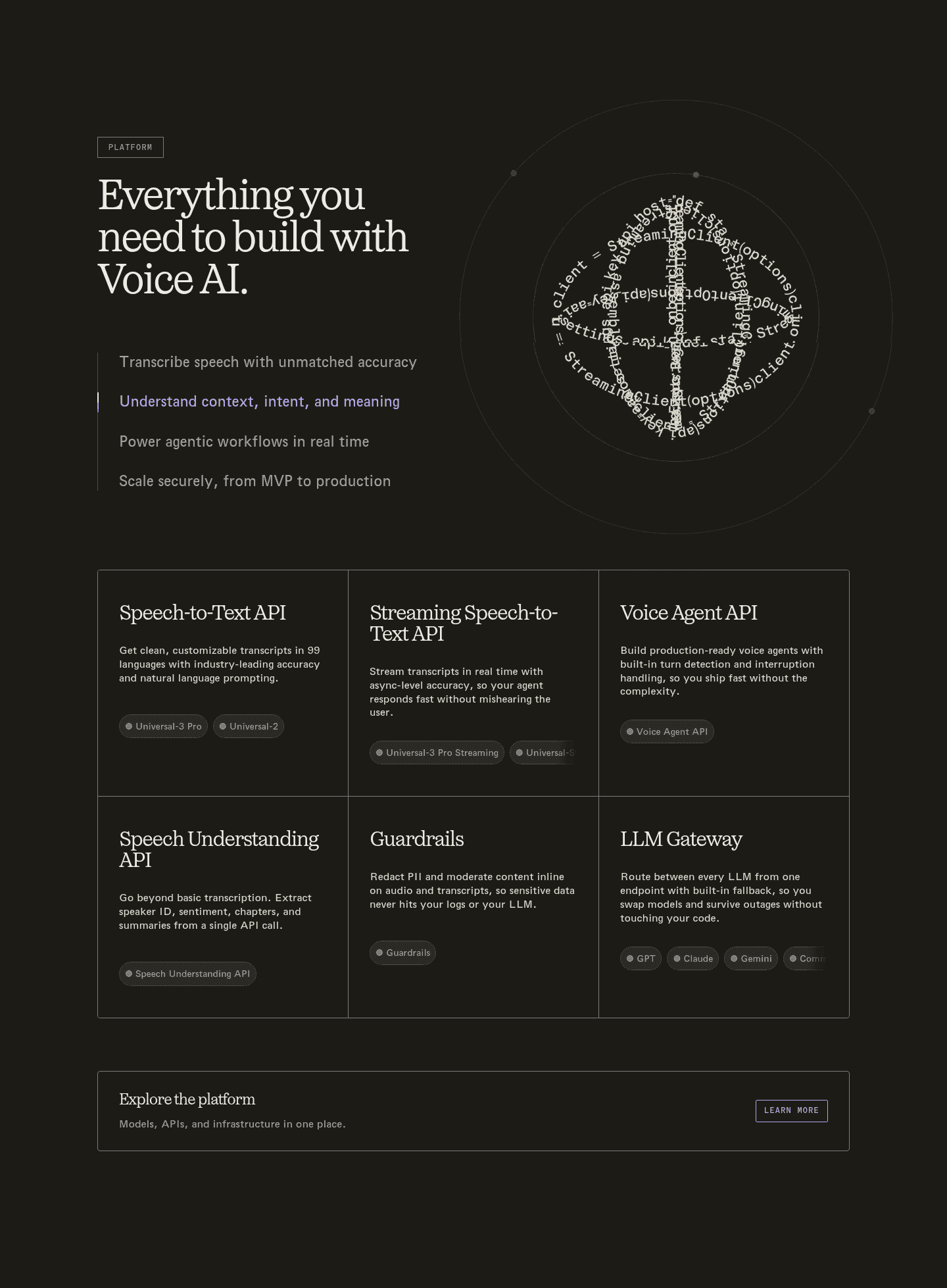
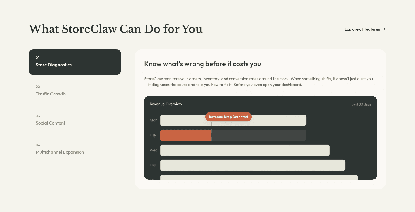
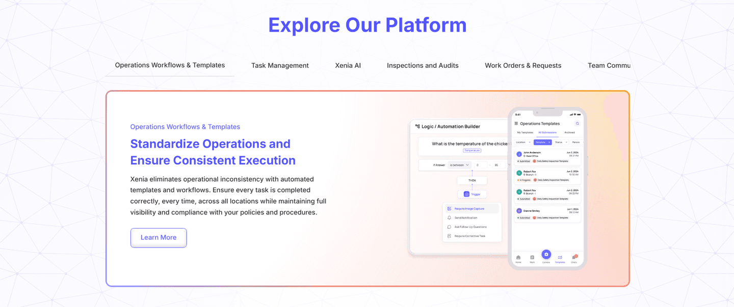
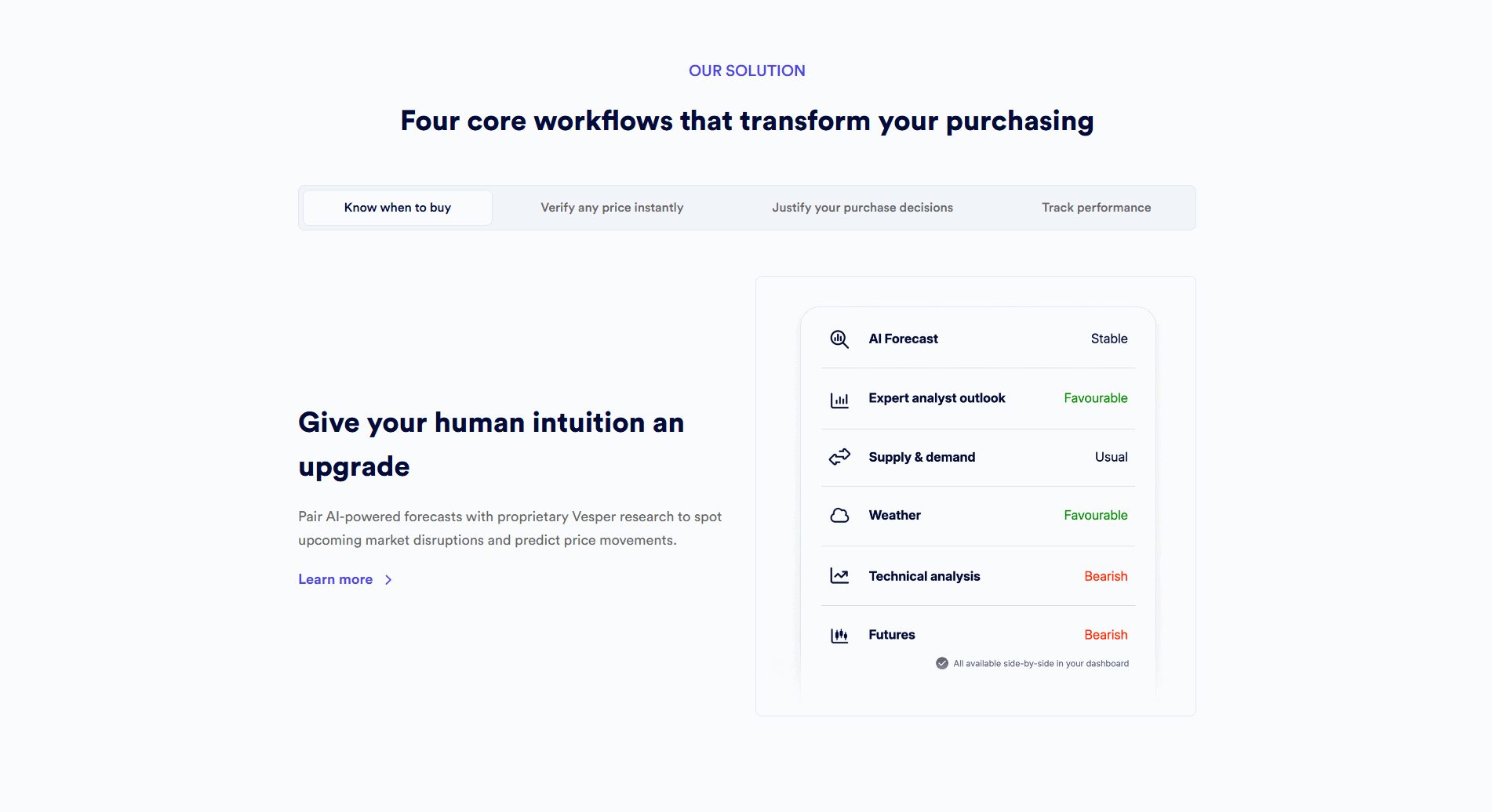
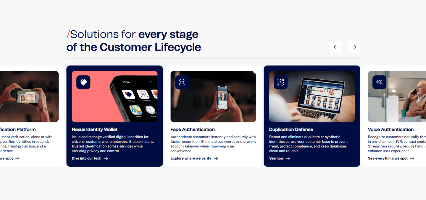
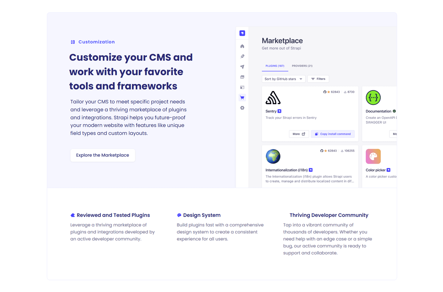
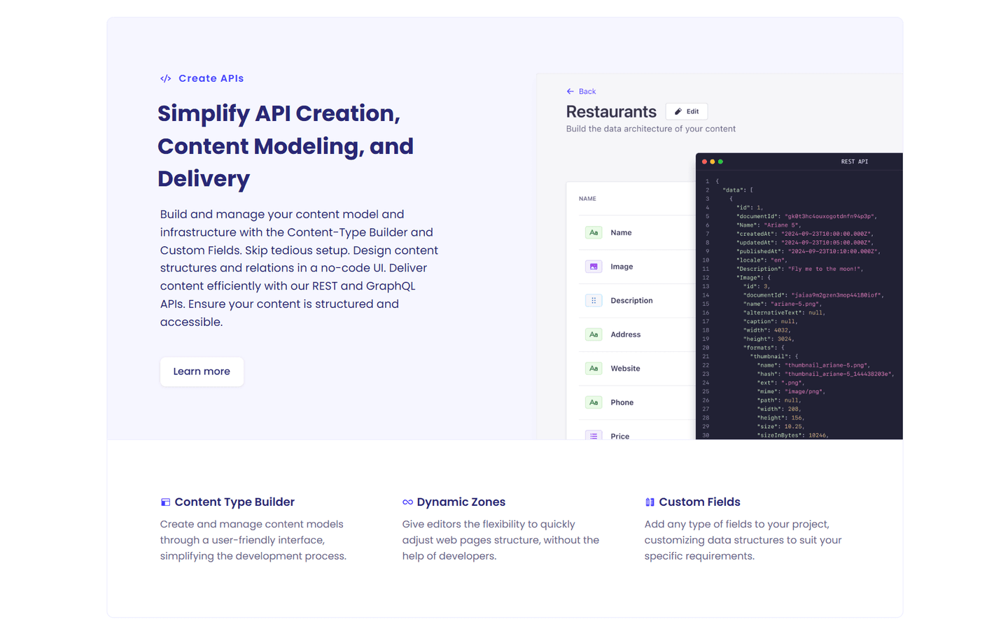
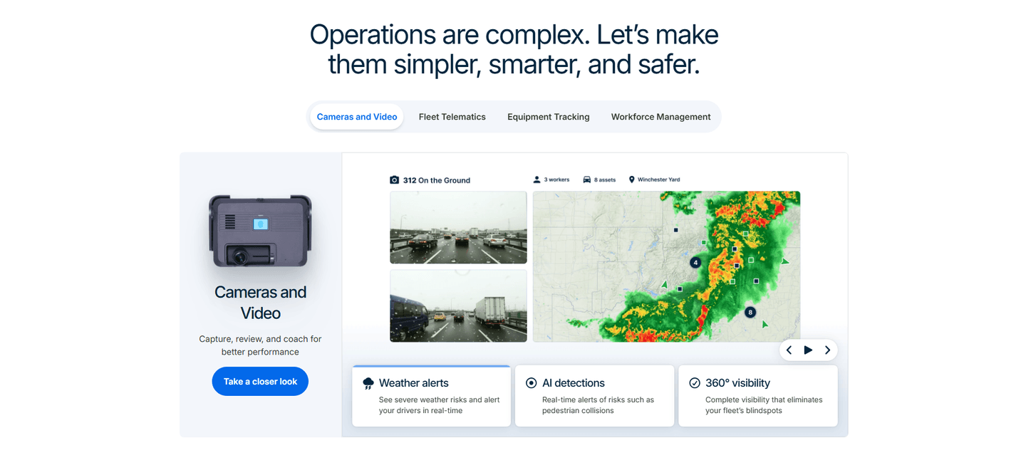
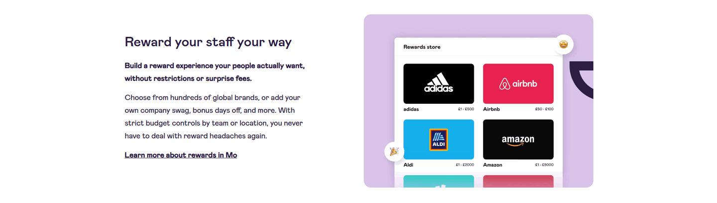
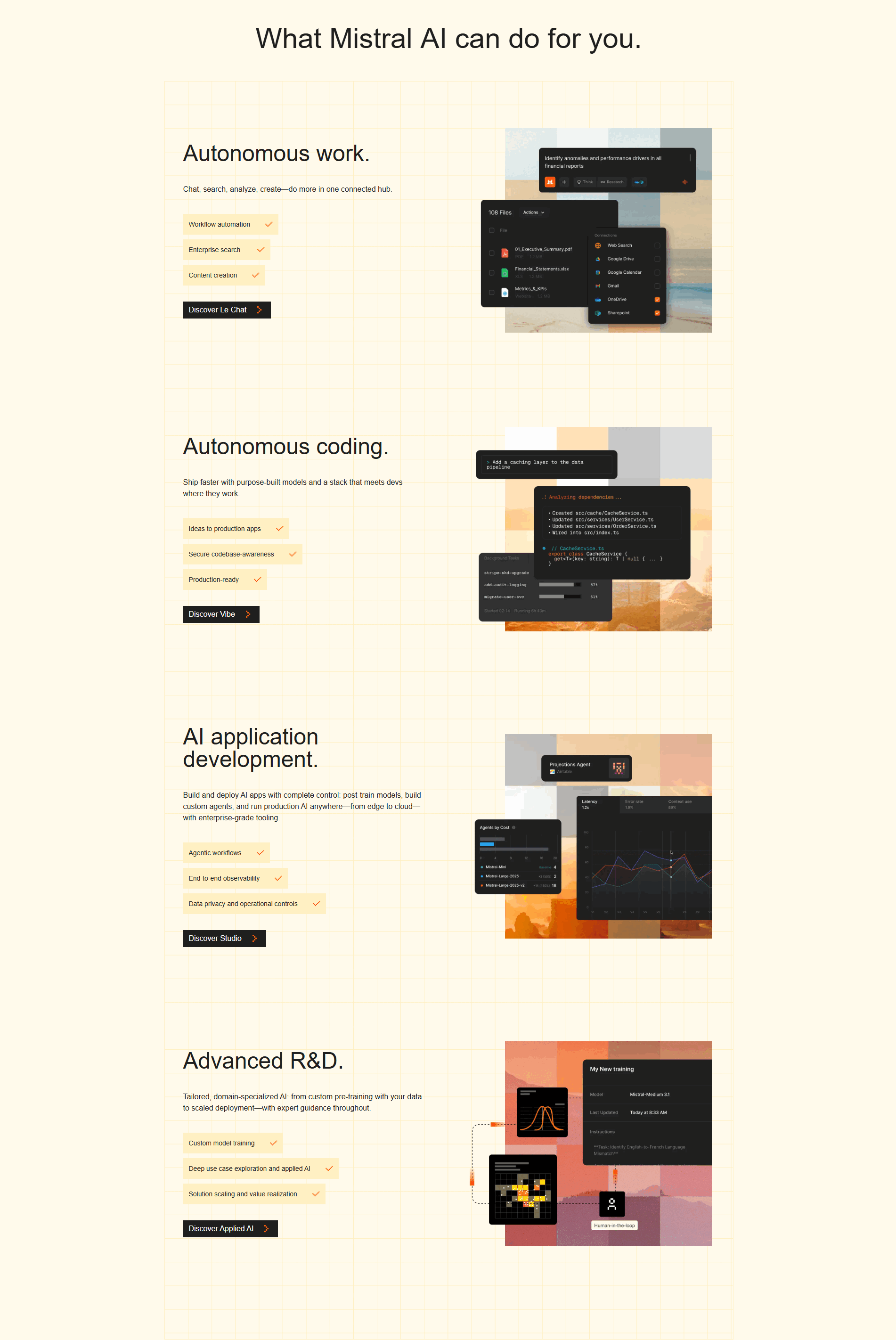
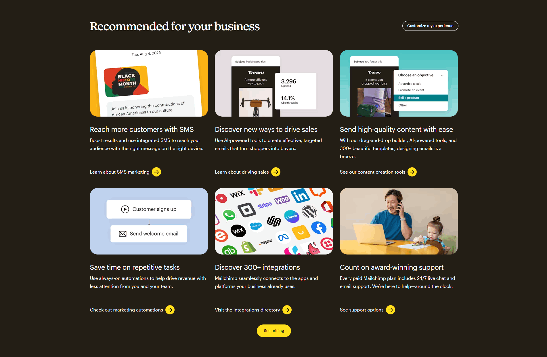
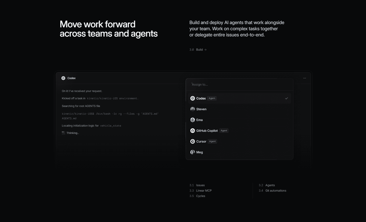
Browse every features pattern by UX best practice.
Every features section is scored across 6 conversion best practices. Copy the best practice stack, not the layout. See what converts and why.
Hand-picked from 350+ companies and analyzed by our AI conversion agent. Not a random dump of feature grids. Every entry earns its spot.
Found a features section you admire? Run yours through the same scoring engine. See where you stand on the same best practices, and what to fix first.
An internal-linking feature section does one job well: it names a capability, shows enough to make it credible, and then offers a door to a page dedicated to that capability. The homepage stays short and scannable. The visitor who cares about one specific capability gets a way to read the full story without the rest of the page paying for it.
The link takes one of a few concrete forms:
A homepage cannot be both complete and scannable at the same time. Try to explain every capability in full and the page turns into a wall no one reads. Cut the detail to keep it short and the serious buyer leaves with unanswered questions. Internal linking resolves the tension: the section carries the highlight, and the link carries the depth for the minority who want it.
There is a second payoff. Every one of those links is a real page the visitor and search engines can reach, which spreads authority across the site instead of trapping it on one long homepage. The feature that matters most to a given buyer becomes one click away, not one long scroll away.
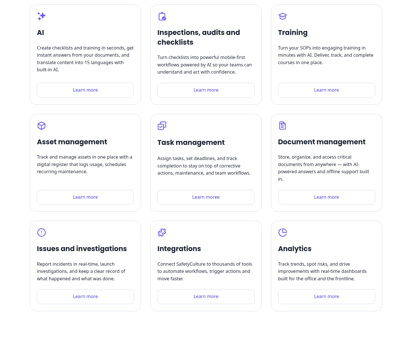
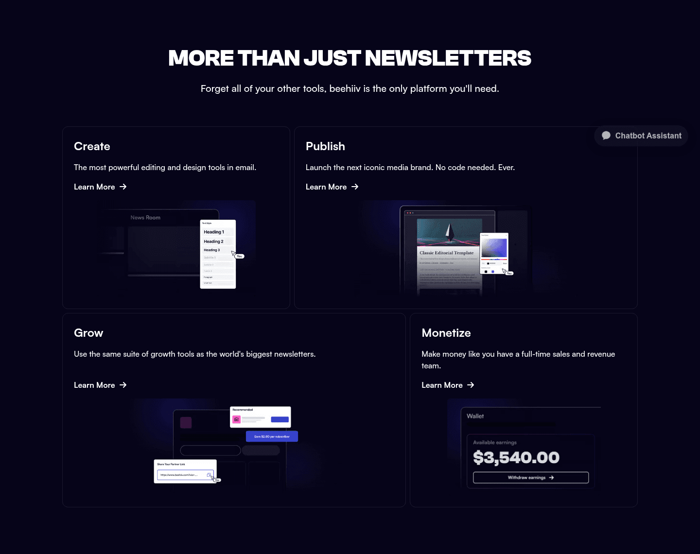
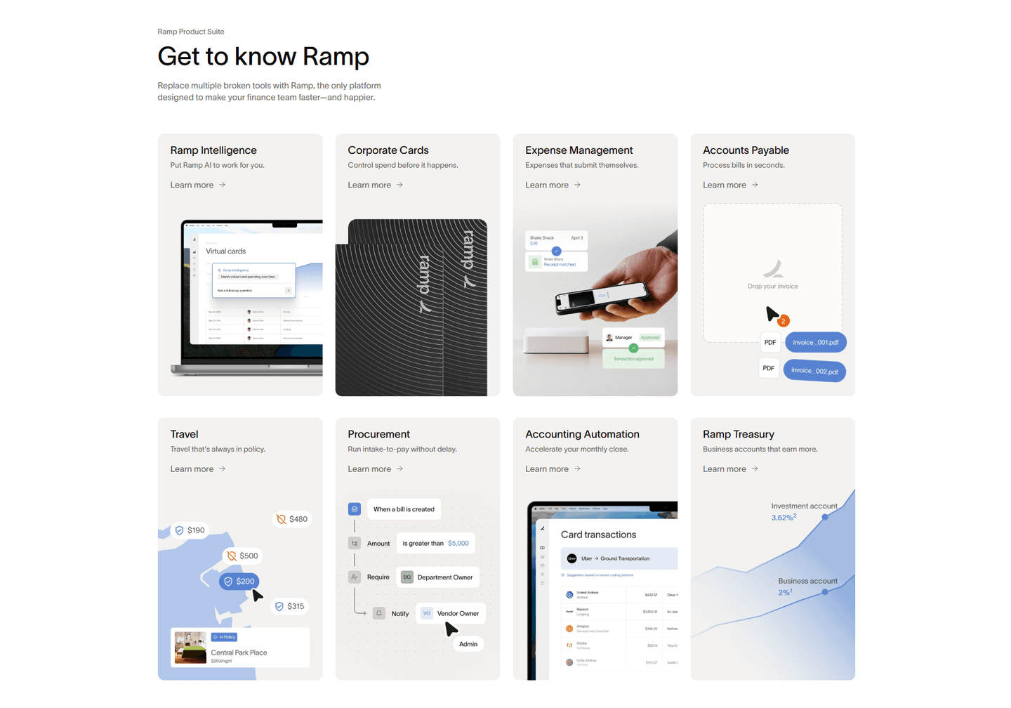
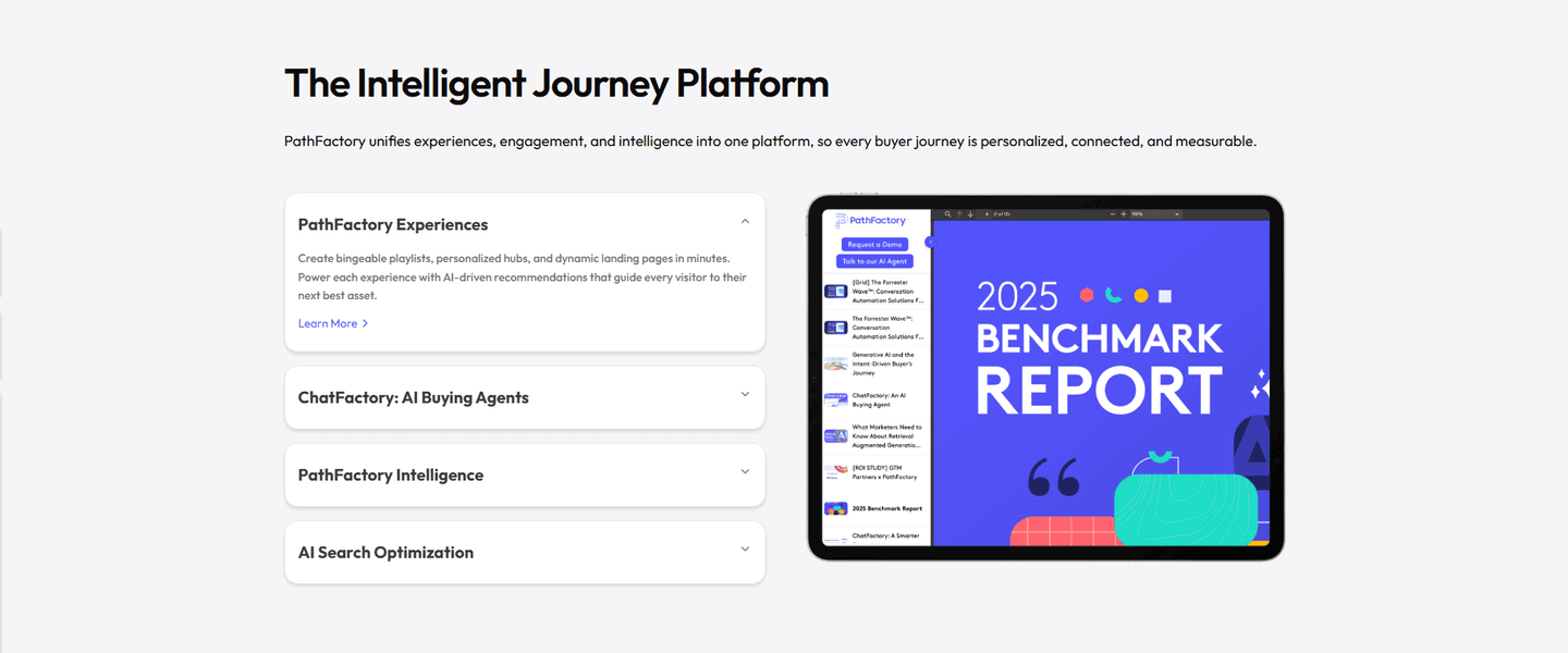
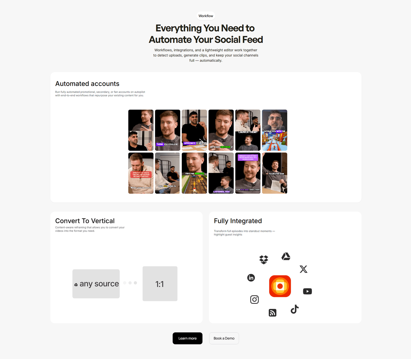
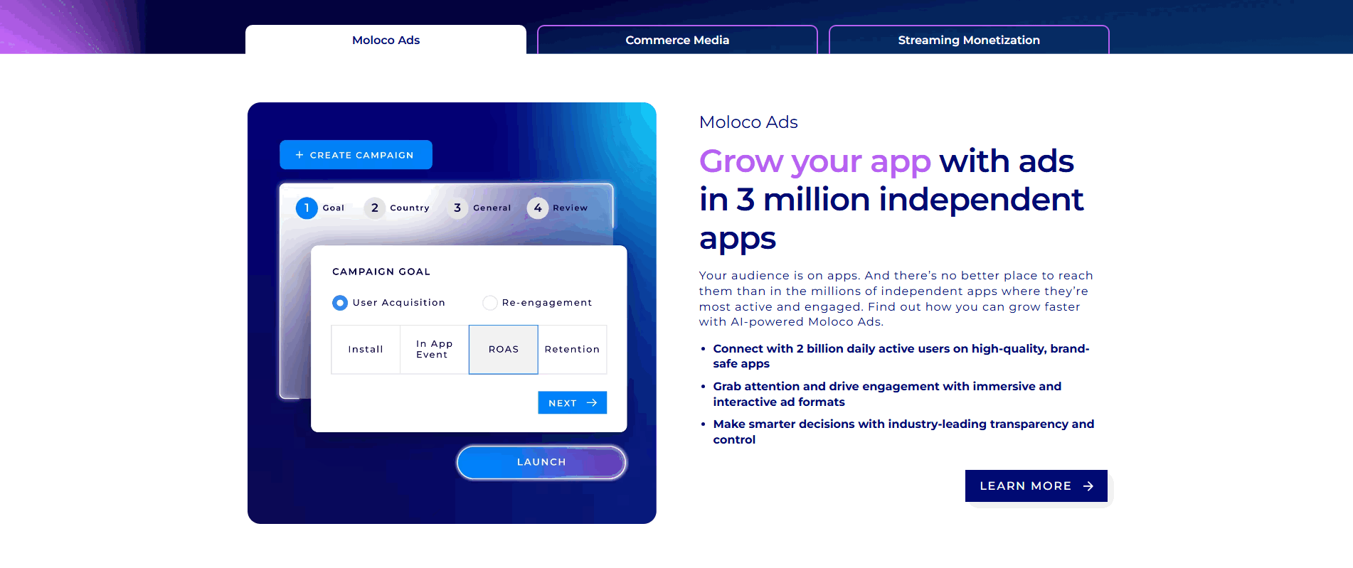
About half of the scored feature sections in our library link out to a deeper page. Across the examples below, the disciplined version follows a pattern. The link never replaces the proof: the card still leads with the outcome and shows real product UI, and the link sits underneath as an option, not a substitute. The label says where it goes, so "Explore all integrations" or "Discover the CMS" beats a bare "Learn more" that could lead anywhere. And the depth is matched to the section: a block that shows a handful of modules earns a single See all features button, while a block built from many cards gives each card its own door.
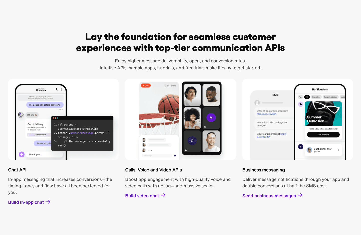
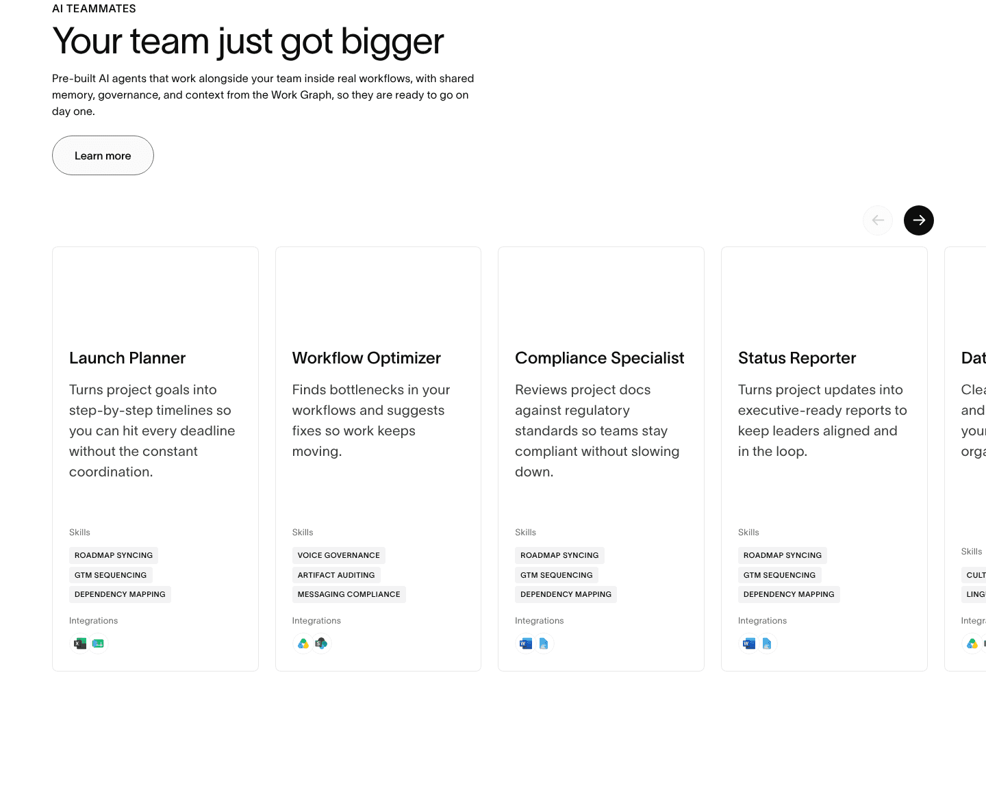
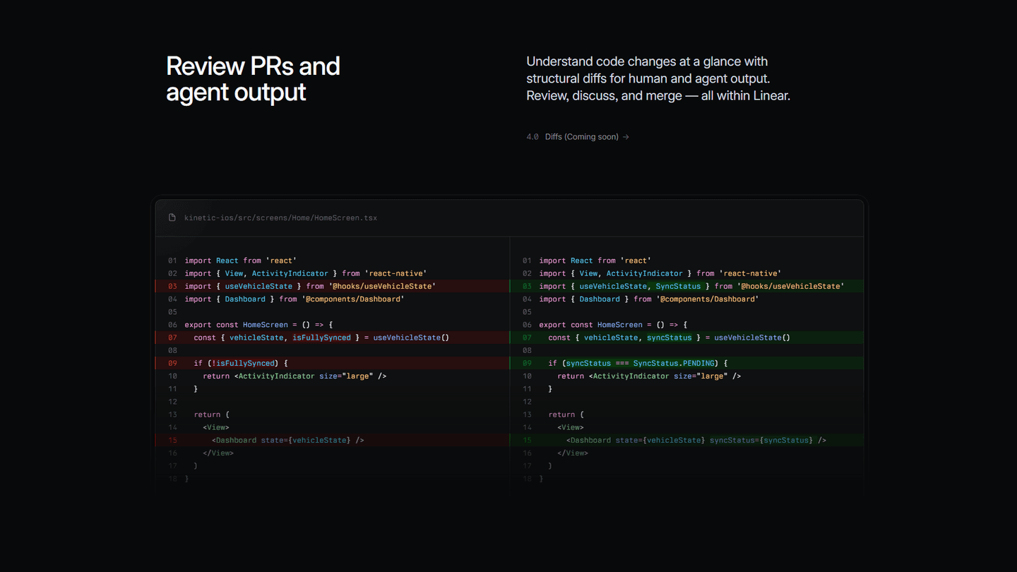
The strongest examples show the range. Linear routes a Monitor theme to its dedicated feature page, Ramp gives every one of its modules a Learn more link, and Sendbird labels each door by job with links like Build in-app chat and Build video chat. Internal linking rarely carries a section alone. It works best paired with feature sections that show multiple capabilities at once, or with feature sections grouped by persona so each link points a specific reader at their own page.
67/100 10/100
The usual failure is a link with no destination worth the click, a "Learn more" that lands on a thin page or loops back to the same section. The second is the opposite: burying the highlight so the section becomes nothing but a list of links, giving the visitor no reason to care before asking them to go deeper. The third is a vague label, "Learn more" repeated ten times tells the visitor nothing about which door is theirs, while a named link does the routing for them. Lead with the outcome, make each label say where it goes, and make sure the page behind it earns the click.

Curated by
Gabriel Amzallag , Founder, Web Anatomy
5 years CRO + SEO at Qonto (2021–2025). After advising 15+ SaaS on their websites (Payfit, Pigment…), the same patterns kept breaking, so I decided to build the source of truth on what works on the web: the intelligence layer every tool, builder, and team uses to ship sites that perform.
Paste your URL. Get a scored analysis of your feature section, including whether it routes curious visitors to the depth they want. Free, no signup.
The common questions about linking feature sections to deeper pages, with answers drawn from 149 scored examples.
It means each capability in the feature section offers a path to a page dedicated to that capability, instead of explaining everything on the homepage. The common forms are a Learn more link on each feature card, one section-wide See all features button, a named link like Discover the CMS or Explore integrations, and deep links to use-case or integration pages.
A homepage cannot be both complete and scannable at once. Explain every capability in full and the page becomes a wall no one reads. Cut the detail and the serious buyer leaves with questions. Linking resolves the tension: the section carries the highlight, and the link carries the depth for the minority who want it. Every link is also a real page a visitor and a search engine can reach.
Underneath the outcome and the product visual, as an option rather than a substitute. The card should still lead with the benefit and show real product UI, so a visitor who reads no further still understands the feature. The link is there for the reader who wants to go one level deeper, not a replacement for making the point on the card itself.
Match the depth to the section. A block that shows a handful of modules usually earns a single See all features button, while a block built from many cards gives each card its own door to a dedicated page. The test is whether the destination is worth the click. A link to a thin page that loops back on itself is worse than no link at all.
A label that says where it goes. Explore all integrations or Discover the CMS tells the visitor exactly which door is theirs, while a bare Learn more repeated ten times routes no one. Named, specific labels do the routing for the reader and set the right expectation for the page behind the link.