About|
A learn-more CTA gives the curious visitor somewhere to go next, a link out of the About section into a fuller company story instead of a dead end.
Key takeaways
Showing 1–8 of 8 examples

Browse every about pattern by UX best practice.
Every about section is scored across 4 conversion best practices. Copy the best practice stack, not the design. See what converts and why.
Hand-picked from 650+ companies and analyzed by our AI conversion agent. Not a random dump of homepages. Every entry earns its spot.
Found an about section you admire? Run yours through the same scoring engine. See where you stand on the same best practices, and what to fix first.
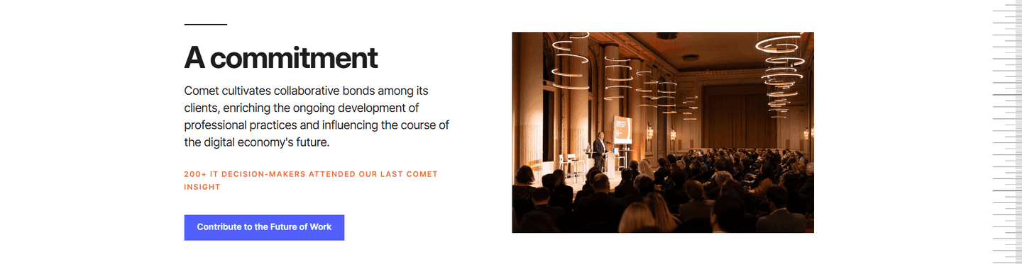
A learn-more CTA is the link that turns the About section from a closed paragraph into an opening. The section on the landing page can only say so much: a line on the mission, a photo of the team, a sentence on how the company started. The learn-more link catches the visitor who wants more than that and hands them a destination, instead of a dead end.
It shows up in a few forms:
Interest in a company is fragile. A visitor who reads the About section and feels a flicker of curiosity will not always go looking for more. If the next step is obvious and one click away, that curiosity turns into a deeper visit. If it means hunting through the navigation, most of it evaporates.
The learn-more link also lets the About section stay short. Instead of cramming the whole origin story, the mission, and the team onto the landing page, the section can lead with its single strongest note and send the people who want the rest somewhere built to hold it. The page stays clean, and the curious still get the full story.
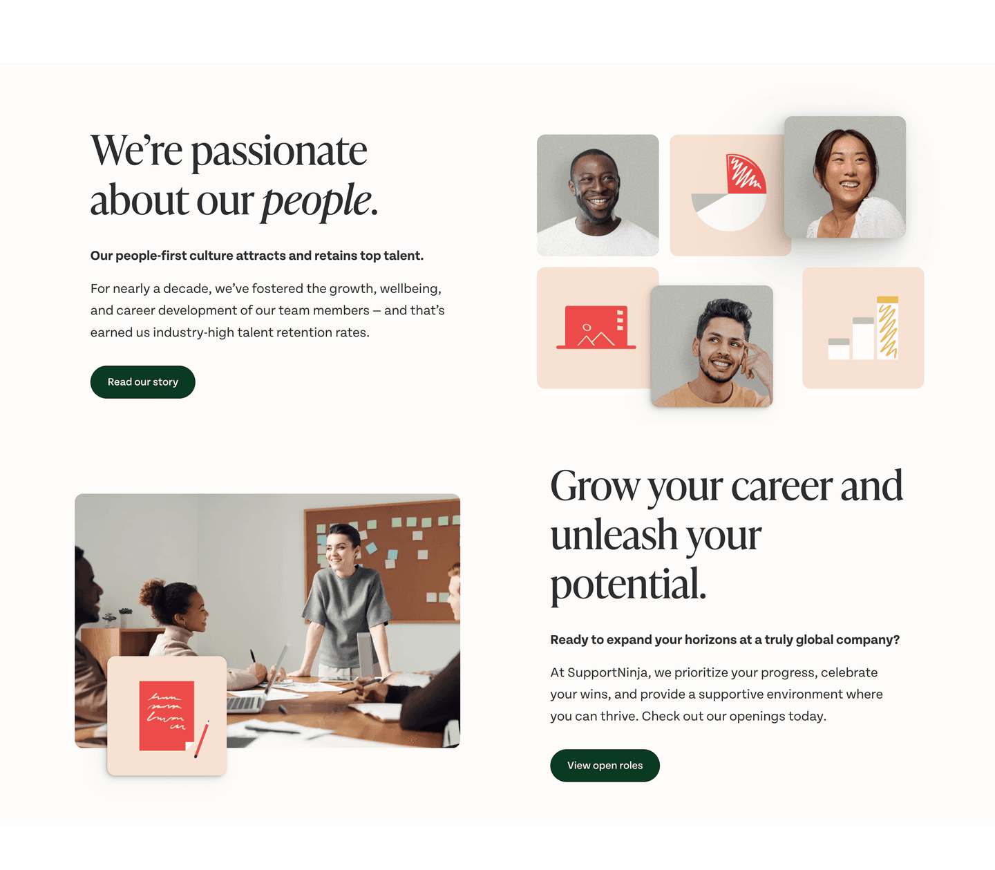
Just under half of the scored about sections in our library include a learn-more CTA. Across the examples below, the ones that work share a discipline: they name the destination. A link that says "Read our story," as SupportNinja and Bizzdesign do, tells the visitor exactly what waits on the other side, which makes the click feel worth it. A bare "Learn more" leaves them guessing.
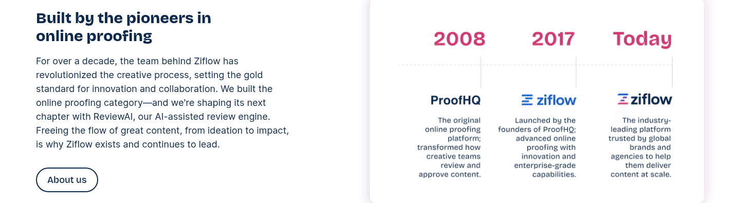
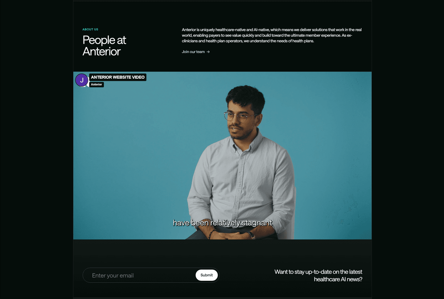
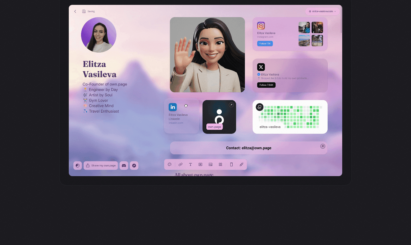
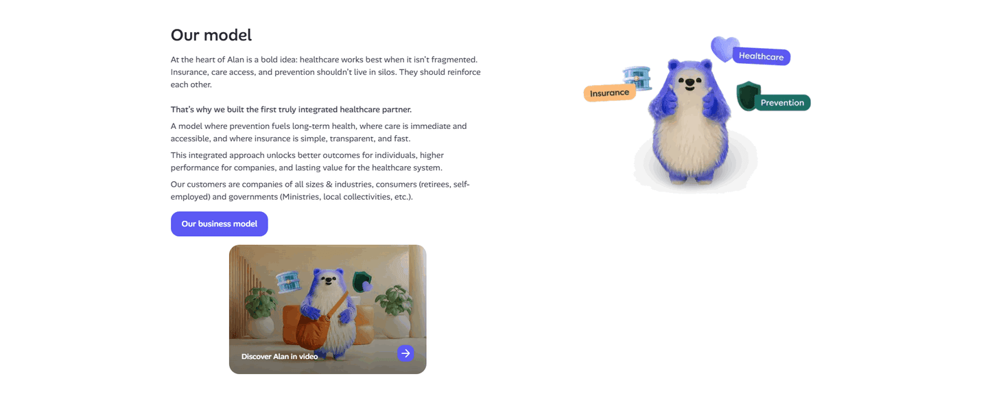
The strongest about sections also match the link to who is reading. SupportNinja pairs "Read our story" with "View open roles" so a buyer and a future hire each get their own path. Ziflow offers a simple "About us" button beside its origin timeline. Alan lets a visitor choose between a business-model page and a short "Discover Alan in video," so the story is available in the format the reader prefers. In each case the link is visible, specific, and lands on a page that pays off the promise.
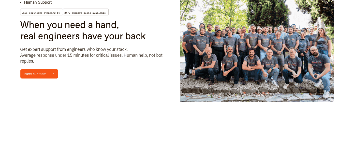
A learn-more link rarely carries the About section alone. It works best beside the human proof that earns the click, so pair it with real team photos in the about section and the culture signals that give a visitor a reason to want more.
100/100 0/100
0/100The usual failure is the vague label: a bare "Learn more" that could lead anywhere, so no one clicks. The second is the missing link entirely, an About section that tells half a story and then stops, leaving the interested visitor with nowhere to go. The third is overloading, where the section sprouts four or five links and the visitor, faced with too many choices, picks none. Lead with one clear next step, name where it goes, and make sure the page behind it delivers the fuller story the label promised.

Curated by
Gabriel Amzallag , Founder, Web Anatomy
5 years CRO + SEO at Qonto (2021–2025). After advising 15+ SaaS on their websites (Payfit, Pigment…), the same patterns kept breaking, so I decided to build the source of truth on what works on the web: the intelligence layer every tool, builder, and team uses to ship sites that perform.
Paste your URL. Get a scored analysis of your About section, including whether it links out to a fuller company story. Free, no signup.
The common questions about linking out to a fuller company story, with answers drawn from 8 scored examples.
It is a link inside the About section that sends an interested visitor to a fuller company story. The most common forms are an 'About us' or 'Read our story' button that opens a dedicated company page, a 'Join our team' link into careers, a mission or business-model page, and a short founder or company video that tells the story on camera.
The About section can only hold a few lines. Some visitors want more: the origin story, the people, the mission, the reason the company exists. A learn-more link catches that interest at the moment it appears and gives it a destination, instead of leaving the visitor to hunt through the navigation or leave. It keeps a curious reader on the site and moving toward a fuller picture of the company.
Match the destination to what the visitor is likely curious about. A buyer weighing trust wants the company story or mission, so 'Read our story' or 'Our business model' fits. A potential hire wants the team and open roles, so 'Join our team' or 'View open roles' fits. Some pages point to a short video, which lets a visitor learn about the company with less reading. The strongest about sections name the destination plainly so the visitor knows what they will get.
Usually one, sometimes two when they serve clearly different people. A single 'Read our story' link keeps the path obvious. A pair like 'Read our story' plus 'View open roles' works when the section speaks to both buyers and candidates, because each link has its own audience. Beyond two, the choices start to compete and the section loses its focus.
A clear label, a visible button, and a destination that pays off the promise. The link should describe where it goes, 'Read our story' rather than a bare 'Learn more', so the click feels earned. It should stand out enough to be seen without pulling attention from the section's main message. And the page it opens should deliver the deeper story the label implied, not a thin stub.