
Value Proposition|
A quantified value proposition puts a real number on each claim, a percentage, a timeframe, a dollar figure, so the promise is specific enough to believe and to compare.
Key takeaways
Showing 22–42 of 133 examples







_value_proposition.png&w=1440&q=75)


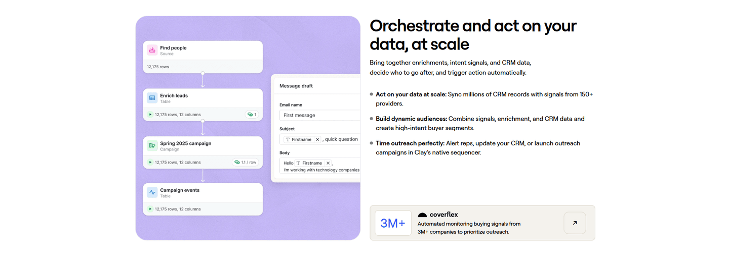
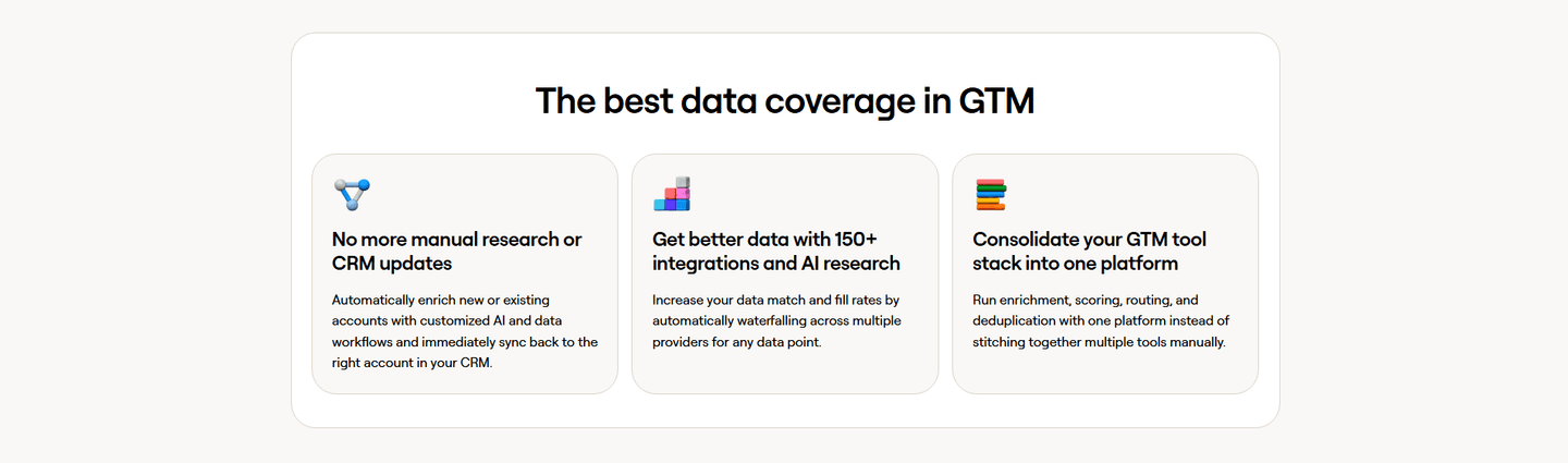
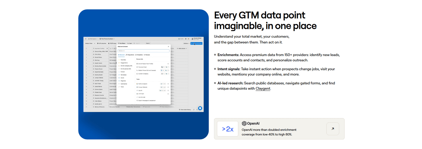

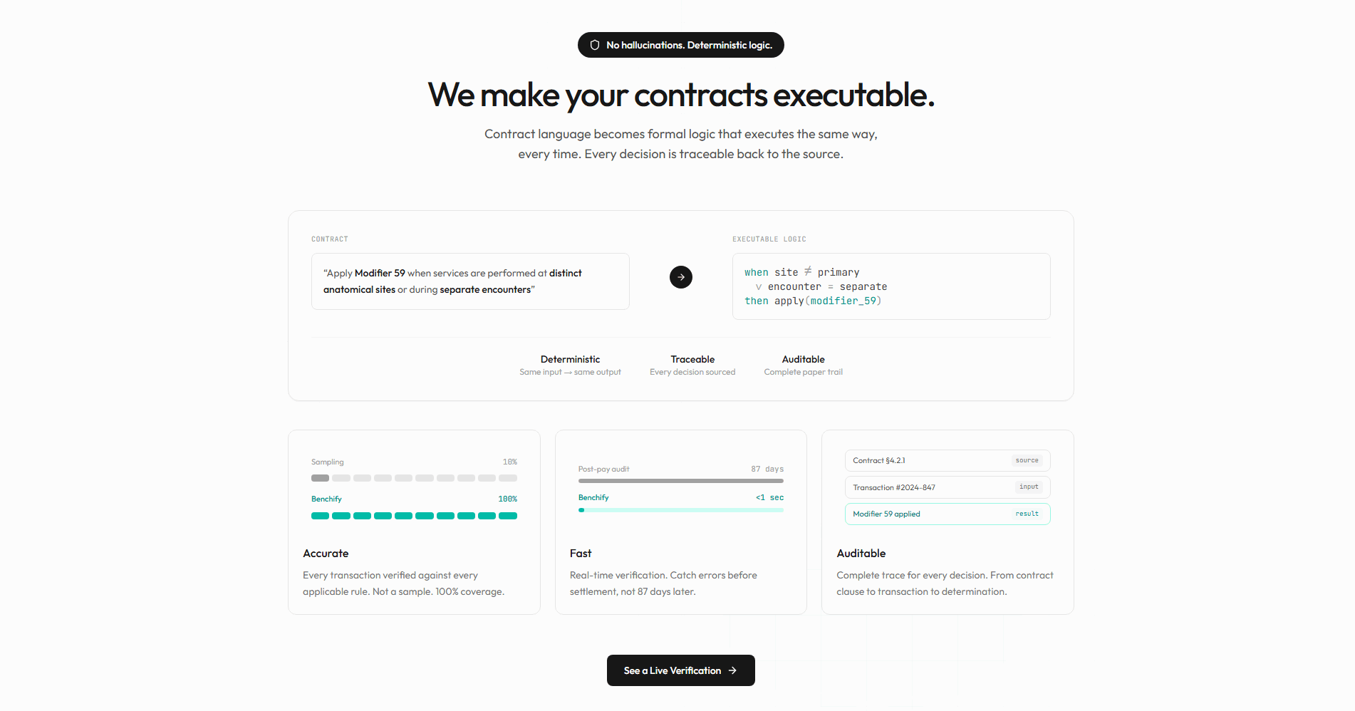

Browse every value proposition pattern by UX best practice.
Every value proposition section is scored across 6 conversion best practices. Copy the best practice stack, not the design. See what converts and why.
Hand-picked from 650+ companies and analyzed by our AI conversion agent. Not a random dump of homepages. Every entry earns its spot.
Found a value proposition you admire? Run yours through the same scoring engine. See where you stand on the same best practices, and what to fix first.
Outcome quantification is the habit of putting a real number on each value claim, so the promise is specific enough to believe and to compare. The section stops leaning on adjectives like fast, powerful, and easy, and starts naming the size of the result: how much faster, how many hours saved, how many dollars kept. The claim becomes something a visitor can hold the company to, not a slogan they read past.
The best value proposition sections use one of a few forms, one number per claim:
A value proposition has to earn belief from a visitor who has read a hundred pages that all claim to be fast, powerful, and easy. Those adjectives read as opinion, so the skeptic discounts them the moment they land. A number changes the register. It is falsifiable, it is memorable, and it can be measured against whatever the visitor puts up with today, which is the comparison that actually moves a decision.
A figure does a second job too. Printing a hard number is a small act of confidence: the company is inviting the reader to hold it to that number, and a claim that offers to be checked reads as more honest than one that only asserts. The section stops sounding like marketing and starts sounding like evidence.
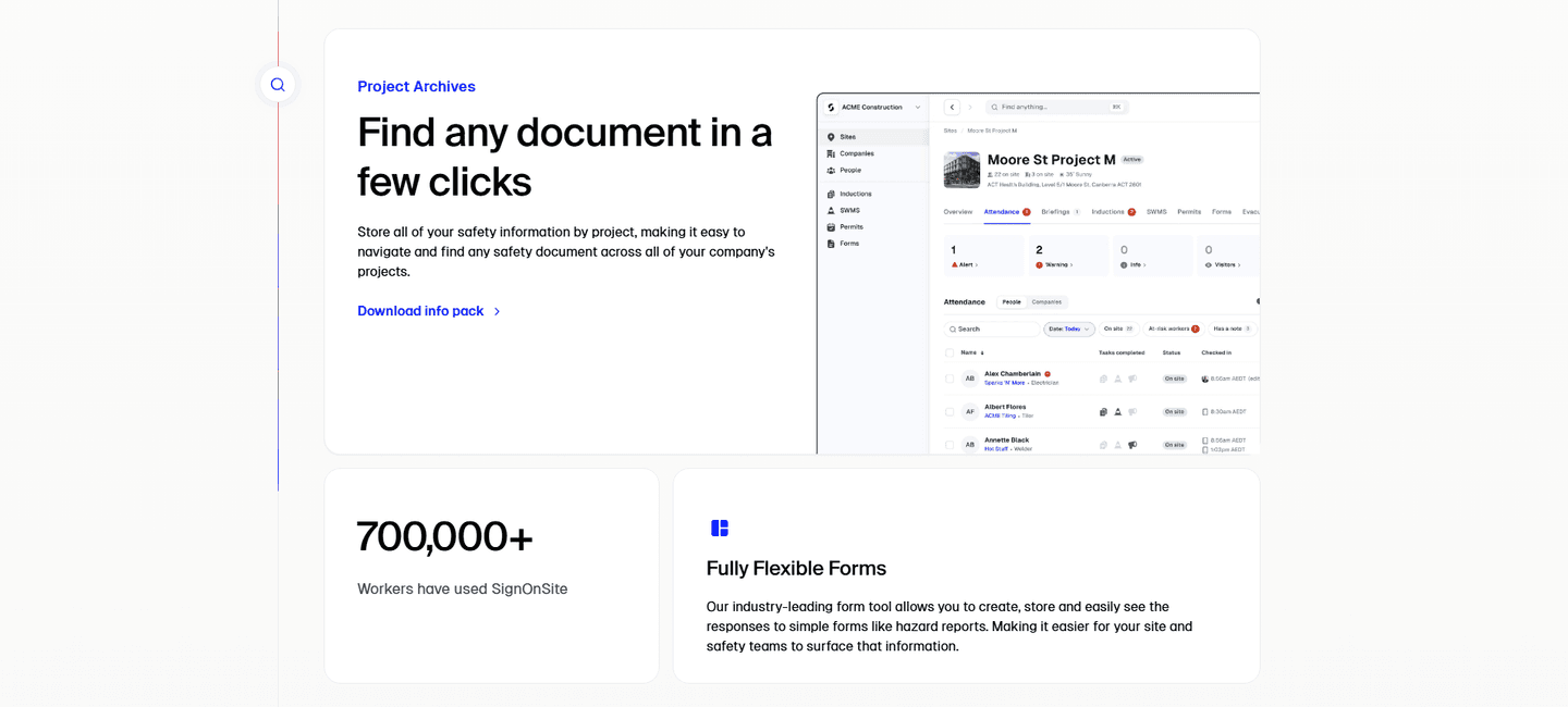
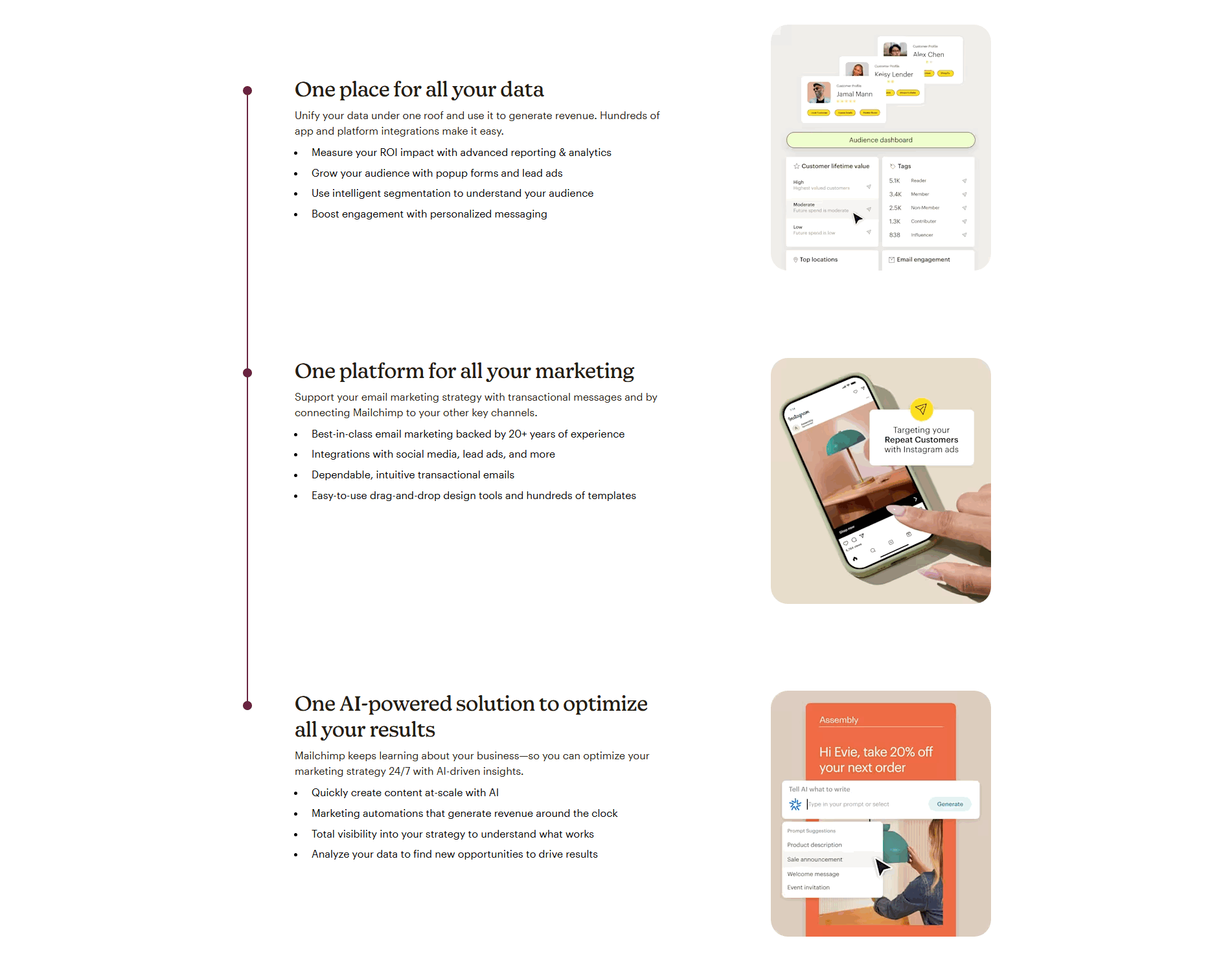
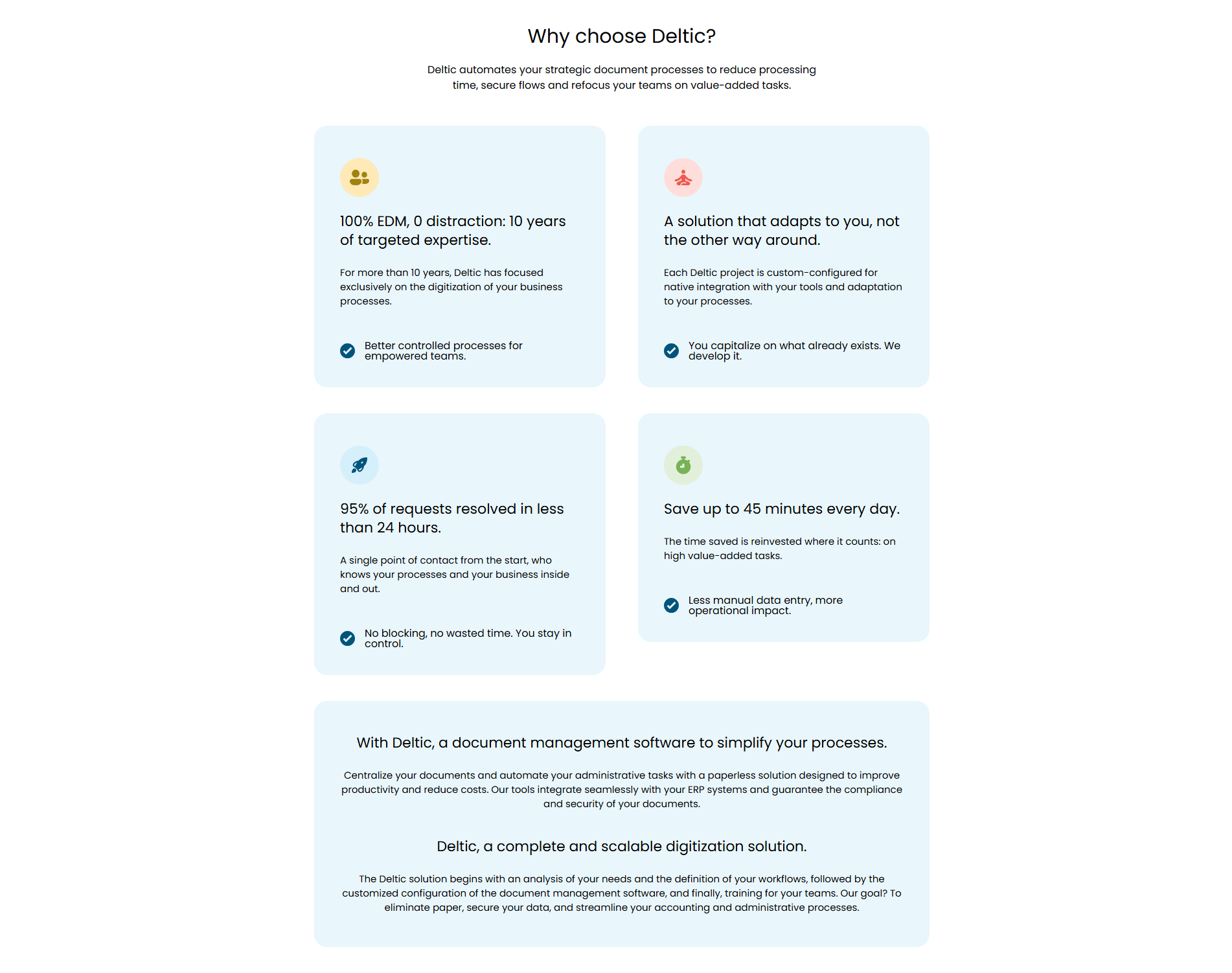
About half of the value proposition sections in our library put a real number on their claims, so the pattern is common enough to expect and disciplined enough to separate the strong pages from the vague ones. The version that works maps one figure to one claim. Dixa stamps each pillar with its own metric, a faster response time, a lower handling time, an hour and a half saved per agent a day, so no promise sits there unproven. Attribuly leads every growth lever with a number, a multiple on retargeting and a high percentage on attribution, and Cledara anchors its three cards with a percentage cut in software cost and the hours saved each month. Koyeb pins each column to a hard spec, a sub-hundred-millisecond latency and a wide count of locations, and Deltic opens each card with a distinct figure so the four benefits never blur into one.
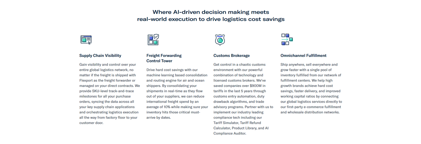
The strongest numbers come with an anchor. DinMo frames its speed as up and running in a day, not a year, which lands because it names the thing it beats, and Flexport quantifies its saving as an average cut in freight spend backed by the total it has saved customers in tariffs. Uscreen goes further and overlays the payoff on a real product shot, the monthly revenue and membership growth its creators reach, so the figure is proof and picture at once. A number lands harder when the claim it sits on is already sharp, so quantification pairs naturally with a value prop that also offers a deep-dive link into the detail and with a hero that leads on a clear outcome promise the section then backs with figures. The same discipline shows up when customer testimonials carry quantified results instead of adjectives.
83/100 0/100
0/100The usual failure is the adjective standing in for the number: a section that promises to be faster, simpler, and more powerful without ever saying by how much, so every claim reads as opinion. The second is a figure with no baseline, a percentage or a multiple floating on its own that invites the question faster than what and answers nothing. The third is the vanity number, a round figure the buyer never feels because it measures the vendor's activity rather than the buyer's outcome. Put one real number on each claim, give it an anchor so its size is clear, and pull it from a result the buyer actually cares about.

Curated by
Gabriel Amzallag , Founder, Web Anatomy
5 years CRO + SEO at Qonto (2021–2025). After advising 15+ SaaS on their websites (Payfit, Pigment…), the same patterns kept breaking, so I decided to build the source of truth on what works on the web: the intelligence layer every tool, builder, and team uses to ship sites that perform.
Paste your URL. Get a scored analysis of your value proposition, including whether each claim carries a real number a visitor can check. Free, no signup.
The common questions about putting real numbers on each value claim, with answers drawn from 133 scored examples.
It is the habit of attaching a concrete number to each value claim rather than a vague adjective. Instead of faster support the section says a specific percentage faster, instead of save time it says the hours saved per week, instead of cheaper it names the dollar figure. The number can be a percentage, a metric, a timeframe, or an amount of money, and it sits right on the claim it measures. Dixa stamps each of its pillars with a figure like a faster response time and a lower handling time, so every promise carries its own proof.
A number is specific and checkable, and an adjective is not. Words like powerful, fast, and easy read as opinion, so a skeptical visitor discounts them on sight. A figure changes the register: it is falsifiable, it is memorable, and it can be compared against what the visitor uses today. It also signals confidence, since a company that prints a hard number is inviting the reader to hold it to that number. The claim stops being a slogan and becomes a piece of evidence.
Numbers that describe the outcome for the buyer, not the vendor's activity. A percentage improvement, a timeframe to value, a dollar amount saved, and a volume the product handles all land because they map to something the buyer cares about. Attribuly leads each growth lever with a figure like a multiple on retargeting and a percentage on attribution, and Cledara anchors its cards with a percentage cut in software cost and the hours saved each month. The weak version counts internal activity the buyer does not feel, like features shipped or servers run.
One per claim is the pattern that works, so a three-pillar block carries three figures, each measuring its own pillar. What breaks is a single hero stat doing all the work while the rest of the section falls back to adjectives, or a wall of numbers so dense that none of them stand out. Deltic opens each of its cards with a distinct figure, a completion rate, a resolution time, minutes saved a day, so each claim earns its own proof without crowding the others.
A baseline and a source. A number floating on its own invites the question faster than what, so the strongest sections give it an anchor: a before and after, a comparison to the old way, or a named result. DinMo frames its speed as up and running in a day, not a year, which lands because it names the thing it beats. A figure tied to a real customer outcome or a visible product measure reads as evidence, while a round number with nothing behind it reads as a guess.
