Problem|
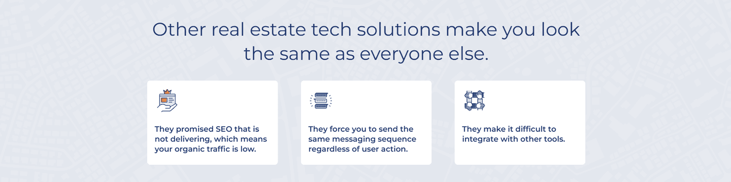
A cost-of-inaction problem section makes staying put feel expensive, pricing the wasted money, lost hours, and rising risk of the current setup before the visitor decides.
Key takeaways
Showing 22–37 of 37 examples


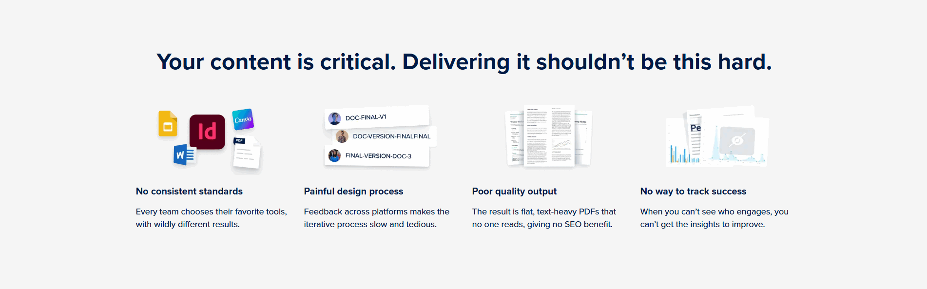
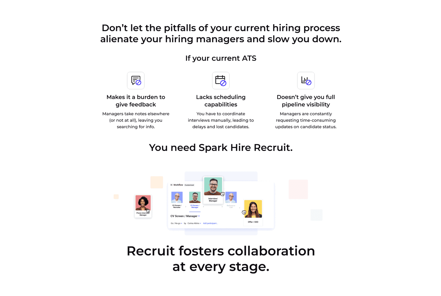
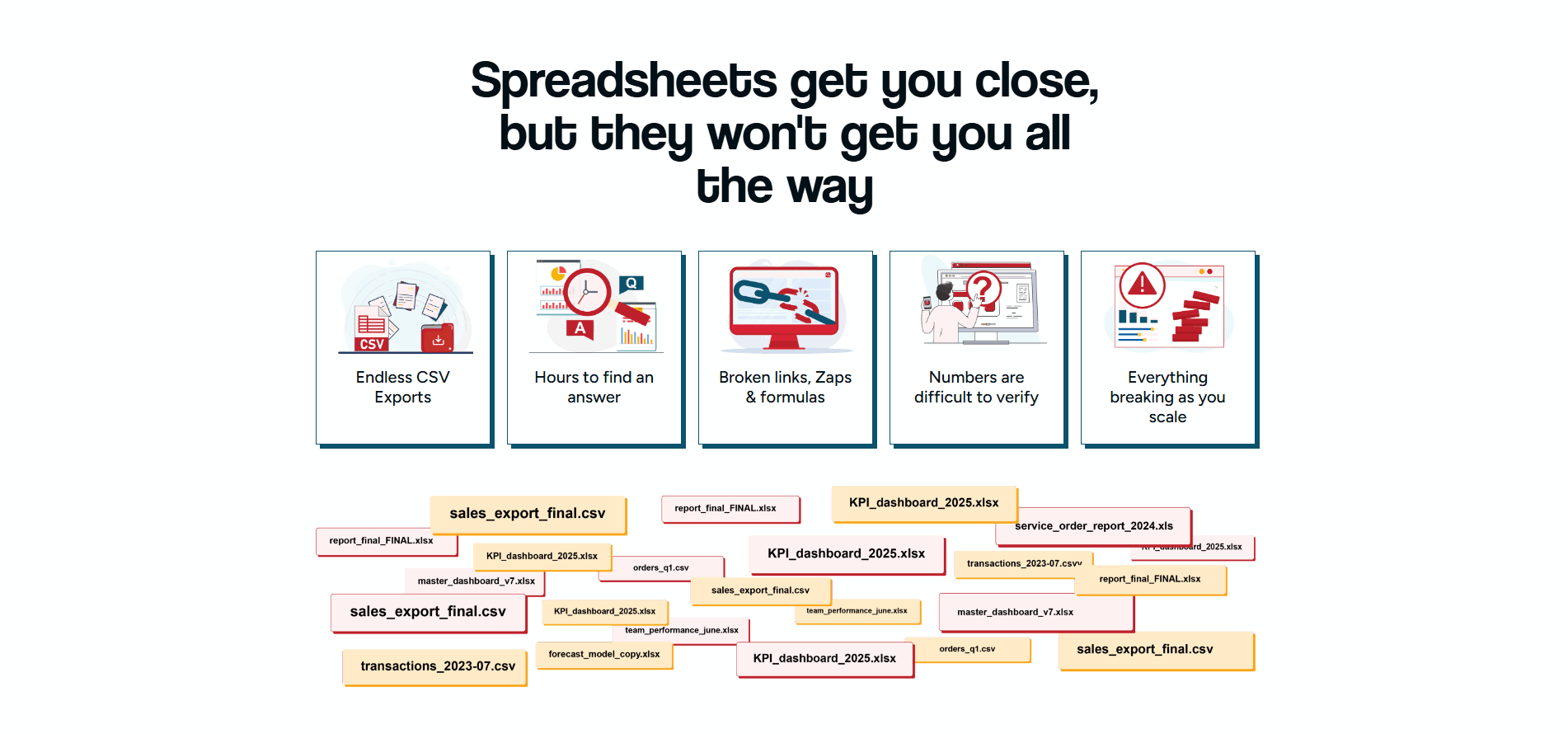
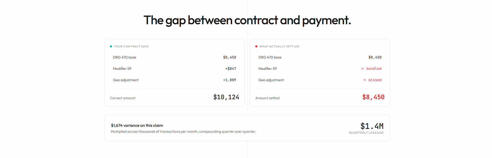
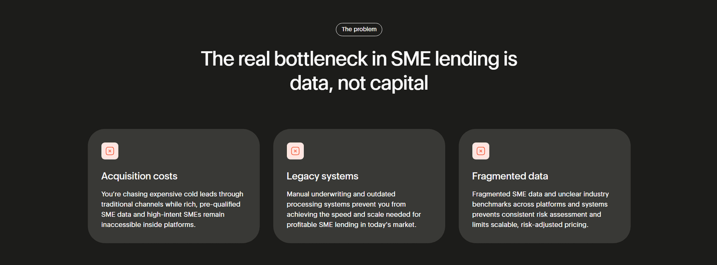
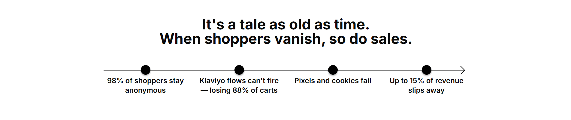
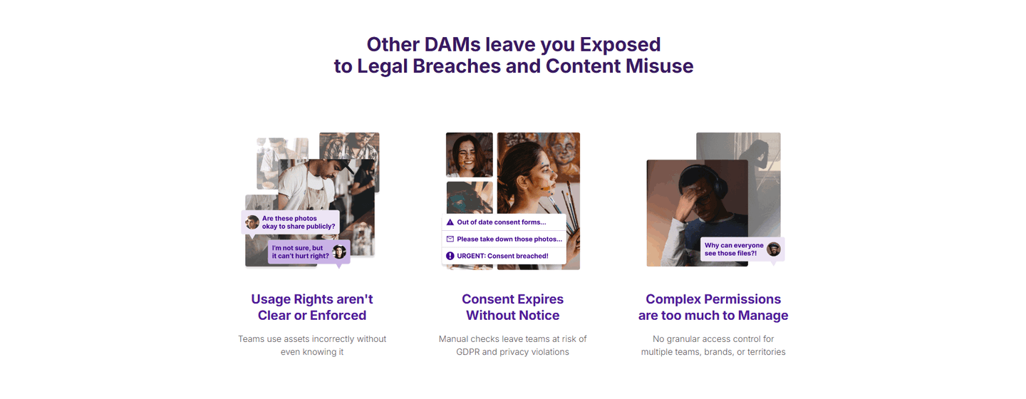

Browse every problem pattern by UX best practice.
Every problem section is scored across 5 conversion best practices. Copy the best practice stack, not the layout. See what converts and why.
Hand-picked from 650+ companies and analyzed by our AI conversion agent. Real problem sections on live landing pages. Every entry earns its spot.
Found a problem section you admire? Run yours through the same scoring engine. See where you stand on the same best practices, and what to fix first.
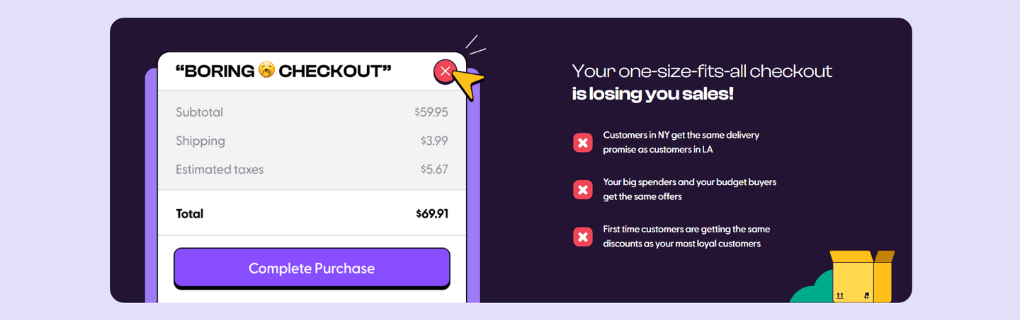
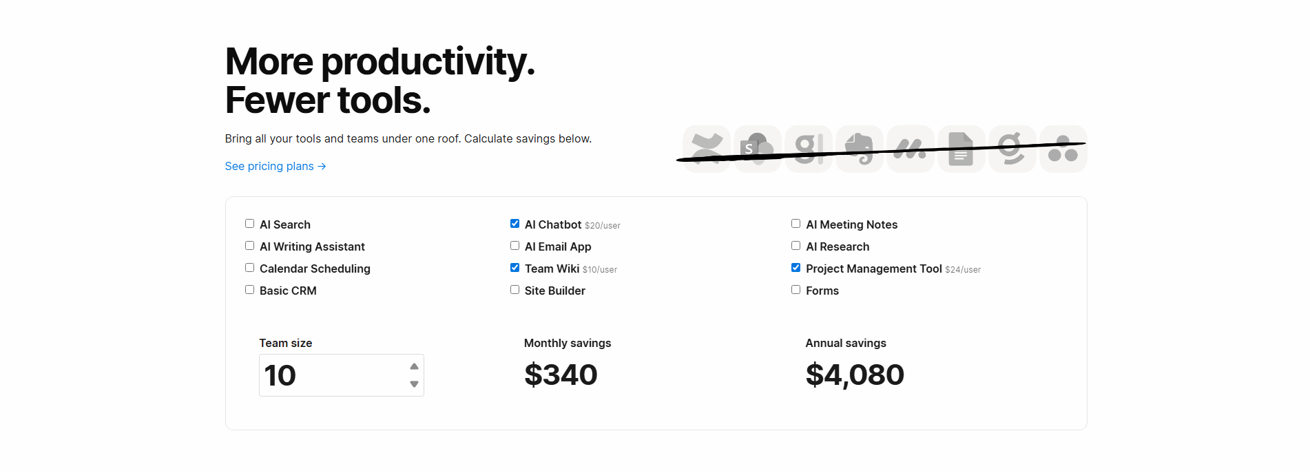
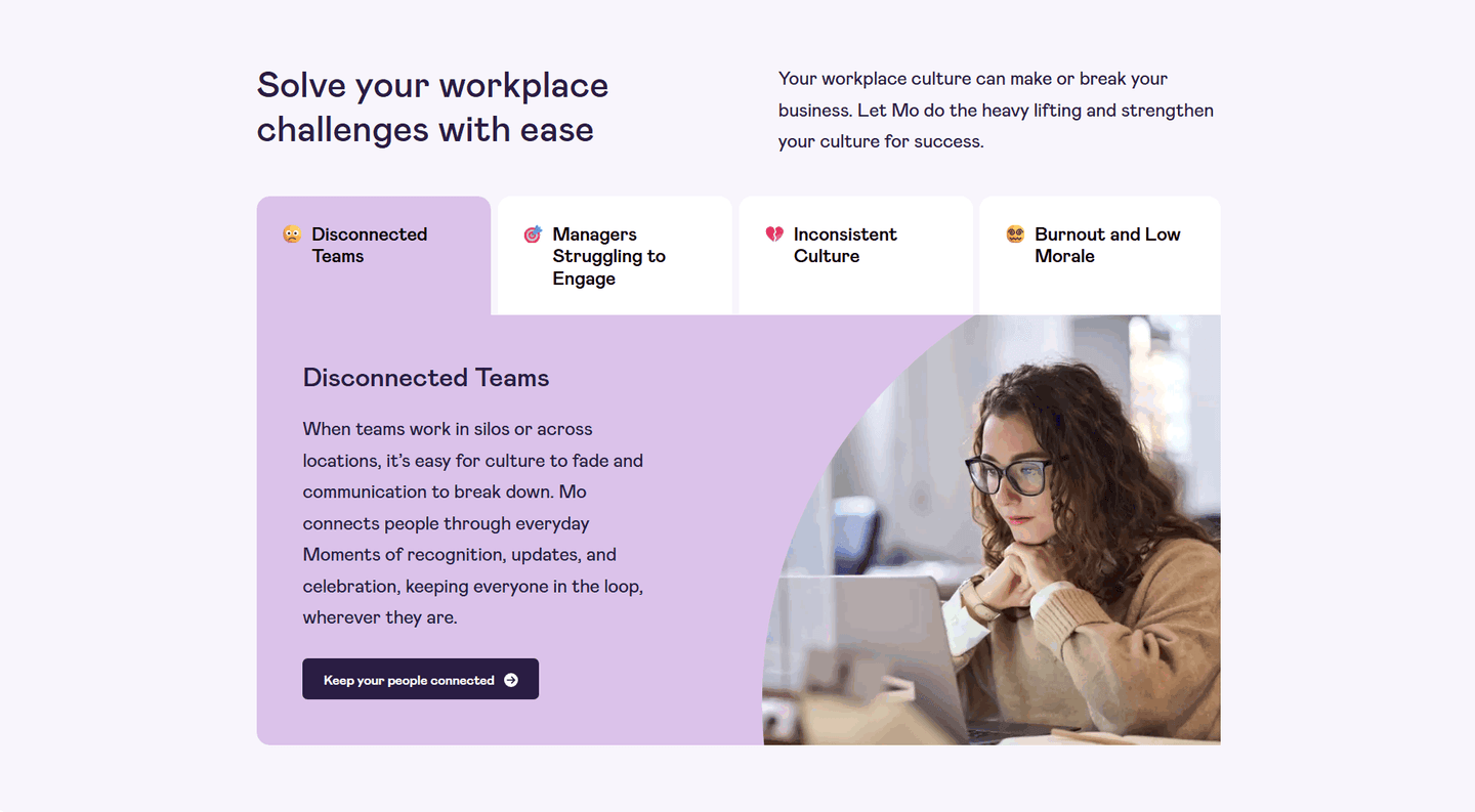
A cost-of-inaction problem section is the decision to price the visitor's current way of working instead of just naming what hurts. A plain problem section says "this is broken." A cost-of-inaction section says "and here is what leaving it broken keeps costing you," in money, hours, or risk. That second half is what turns a nod of recognition into a reason to act, because the reader can no longer treat the status quo as free.
The best problem sections put a price on the pain in one of a few ways, often more than one at once:
Most visitors treat their current setup as free. They already paid for it, they know how it works, and switching is effort. That inertia, not a competitor, is what usually wins. A cost-of-inaction section attacks the inertia directly by counting what the status quo quietly takes every week, so the safe-looking choice starts to look like the expensive one.
The move is a reframe of what the reader is comparing. Without this section, they weigh the cost of change against zero, and zero almost always wins. With it, they weigh the cost of change against a real, running loss they can now see. Membership does this bluntly for creators, framing the status quo as being one algorithm change away from losing an audience they spent time and money to build. The stakes stop being hypothetical.
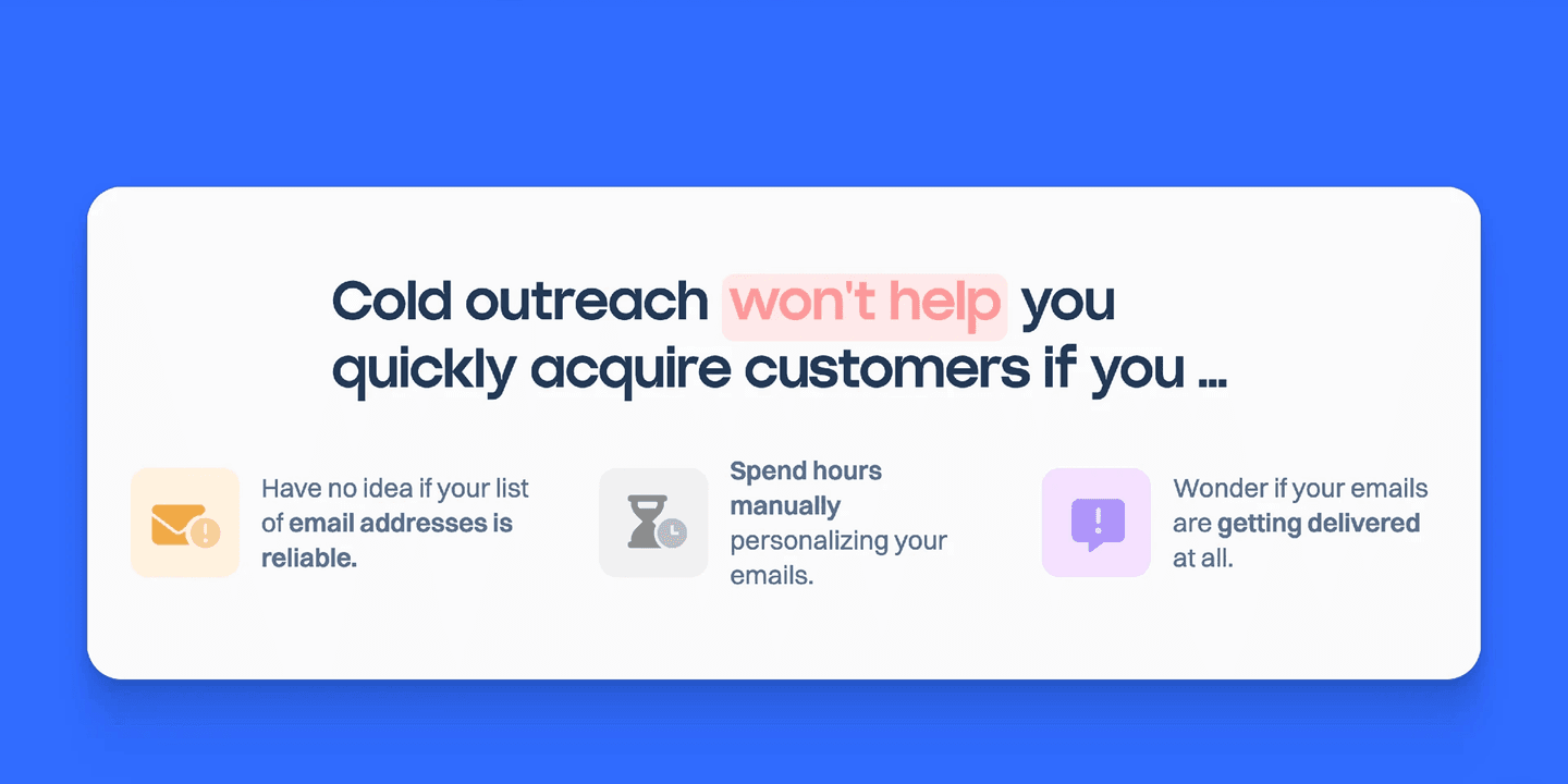
Nearly three-quarters of the problem sections in the library price the cost of inaction in some form, so the examples below are the disciplined end of a common move, not a rare one. Across them, the pattern that lands is specificity. The strongest sections attach a number the reader can check against their own week, name the exact setup causing the loss rather than a generic problem, and point the cost forward so it reads as something that keeps happening. A figure like Nautis's 40% of time lost, or Bulkmark's 97% of saved items never opened again, is far harder to dismiss than "you are wasting time."
You can see the range in the full problem section gallery, and the natural next step, where the feature section has to pay off the cost with a concrete fix.
40/100 10/100
The usual failure is a cost that is asserted but never priced: "you are losing time and money" with no number, no named setup, and nothing that says the loss is growing. It reads as generic and the reader moves on. The opposite failure is piling on the doom until the section only deflates, with no signal that any of it is fixable. The best examples avoid both by pairing a hard cost with a way out. Lokalise raises real pain and then defuses it in the same breath with a line that both problems are fixable, so the section motivates a move instead of leaving the reader stuck in the loss.

Curated by
Gabriel Amzallag , Founder, Web Anatomy
5 years CRO + SEO at Qonto (2021–2025). After advising 15+ SaaS on their websites (Payfit, Pigment…), the same patterns kept breaking, so I decided to build the source of truth on what works on the web: the intelligence layer every tool, builder, and team uses to ship sites that perform.
Paste your URL. Get a scored analysis of your problem section, including whether it puts a real cost on the visitor's status quo. Free, no signup.
The common questions about pricing the status quo in a problem section, with answers drawn from 37 scored examples.
It is a problem section that does more than name a pain. It puts a price on the visitor's current way of working, so keeping things the same reads as an ongoing cost rather than a safe default. The price can be money (a monthly spend, a leaking budget), time (hours lost every day), or risk (a growing chance something breaks). The point is to make doing nothing feel like a decision with a bill attached.
Most visitors treat their current setup as free, because they already paid for it and it mostly works. That inertia is what keeps them from switching. A cost-of-inaction section breaks the illusion by counting what the status quo quietly takes every week, so the safe-looking choice starts to look like the expensive one. The visitor stops weighing the effort of change against zero and starts weighing it against a real, running loss.
A concrete number the reader can check against their own experience, the specific setup that is causing the loss, and a sense that the cost compounds if nothing changes. The strongest versions pair a hard figure (a monthly bill, a percentage of time wasted, a rate of failure) with plain language that names the daily frustration. It also helps to point forward: the cost is not just what happened today, it is what keeps happening until the reader acts.
A pain list describes what is broken. A cost-of-inaction frame attaches a running meter to it. Listing 'our tools do not talk to each other' states a fact; saying that disconnected tools are costing the team hours every week, and more each month it drags on, turns the fact into a reason to move now. The difference is stakes and time: the pain is not static, it accrues.
Enough to make the cost land, not so much that the section only depresses. The best examples raise the stakes and then signal a way out, so the reader feels motivated rather than stuck. A single reassuring line that the problem is fixable, or a call to action attached to the pain, keeps the section pointed at change instead of leaving the visitor sitting in the loss.