Navbar|
A visible Pricing tab in the navbar sends deal-ready buyers straight to plans, the shortest path from interest to a real evaluation.
Key takeaways
Showing 43–63 of 95 examples

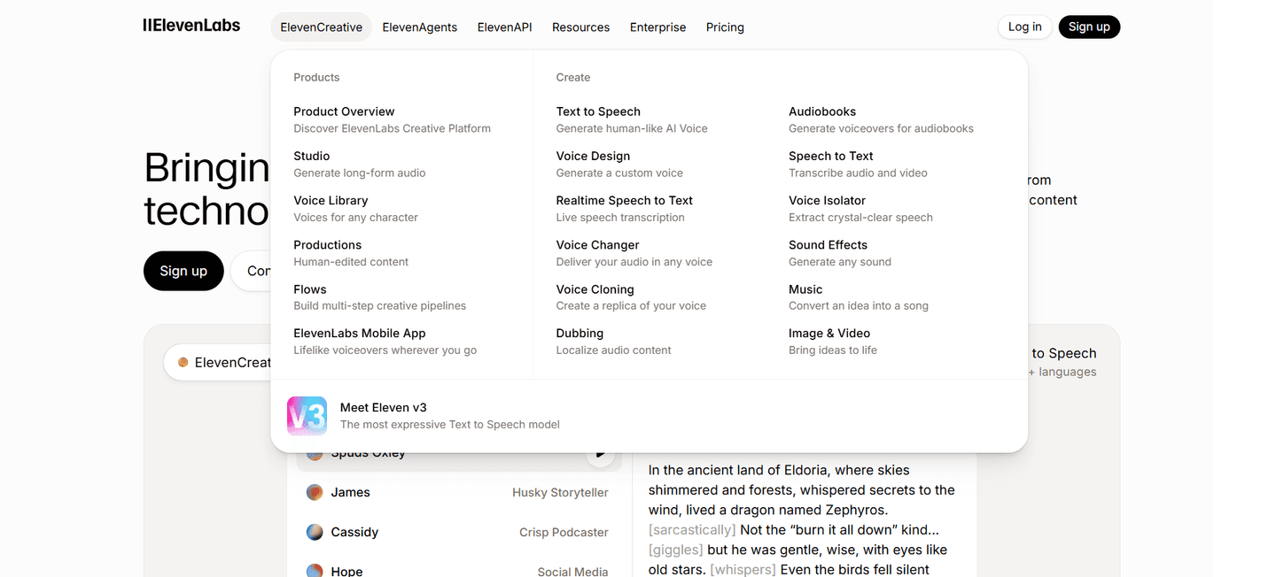
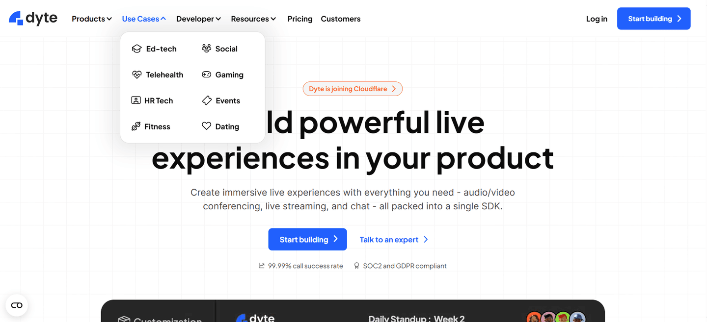
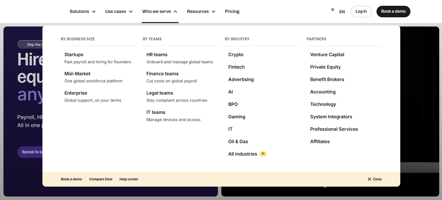
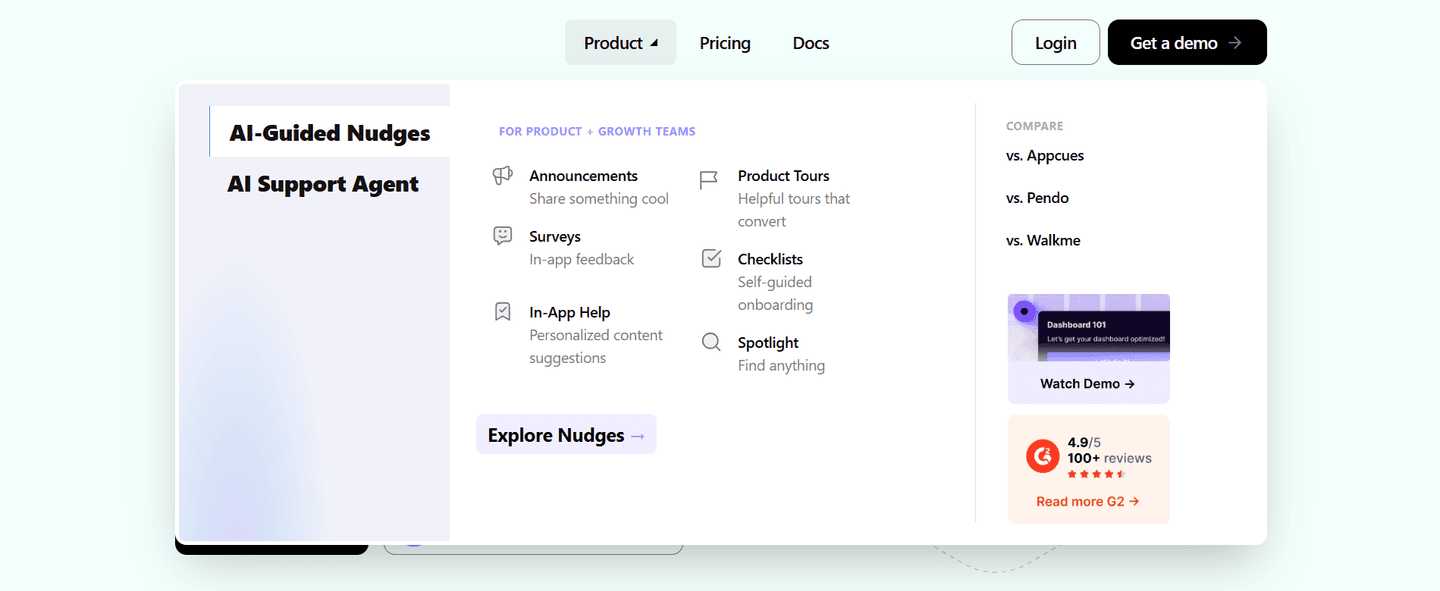
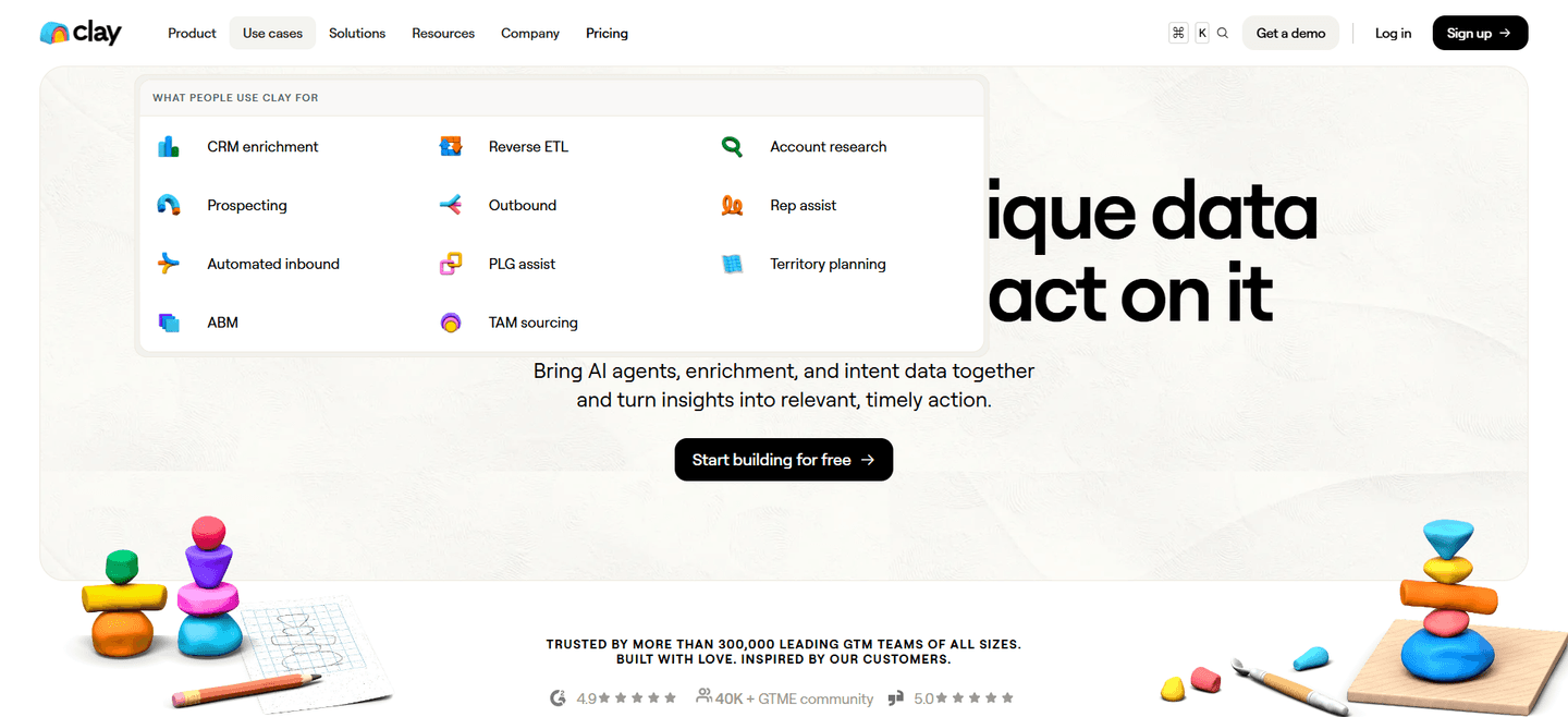
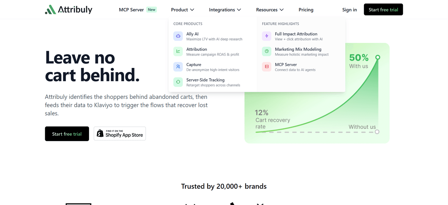
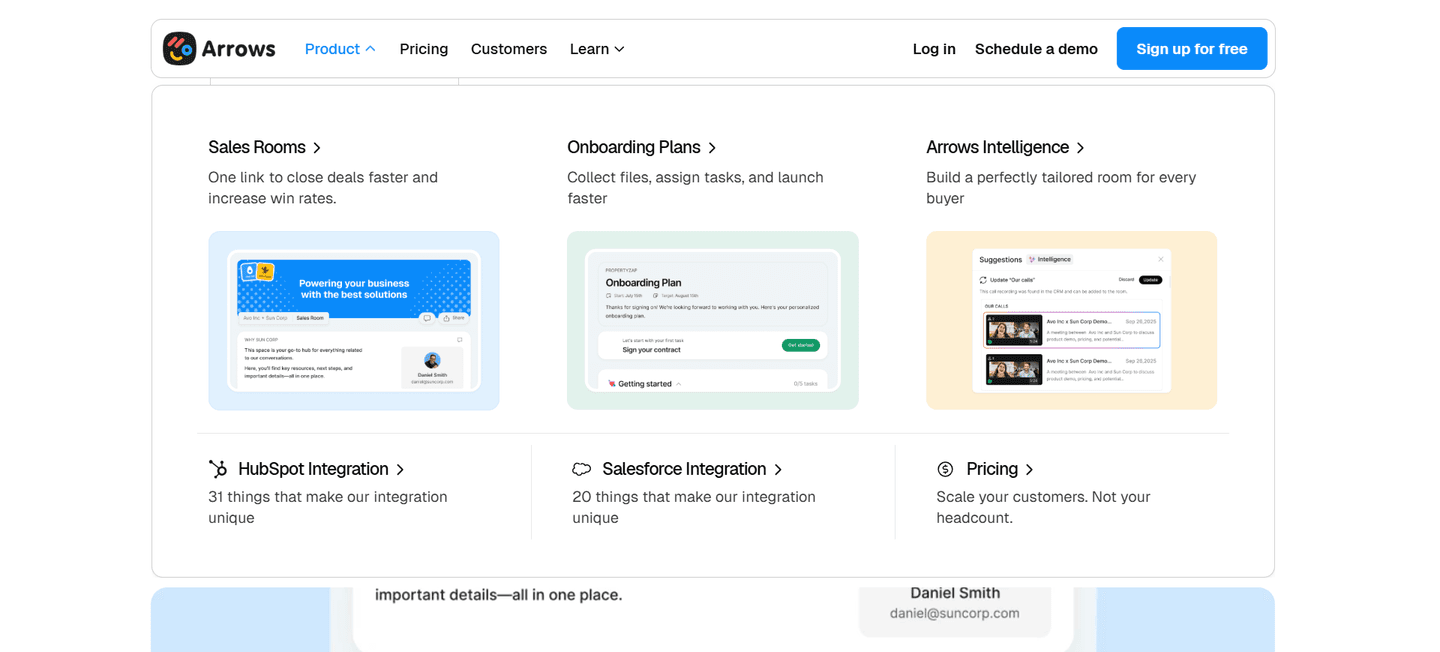
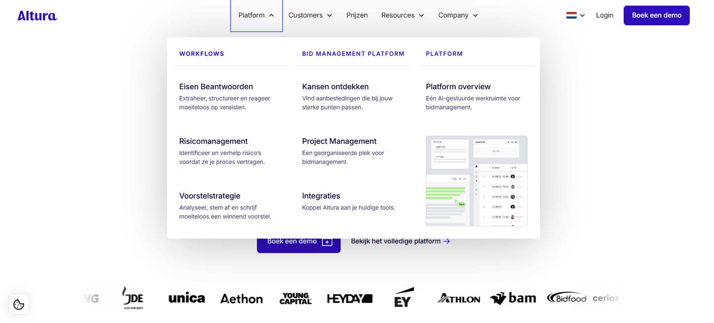
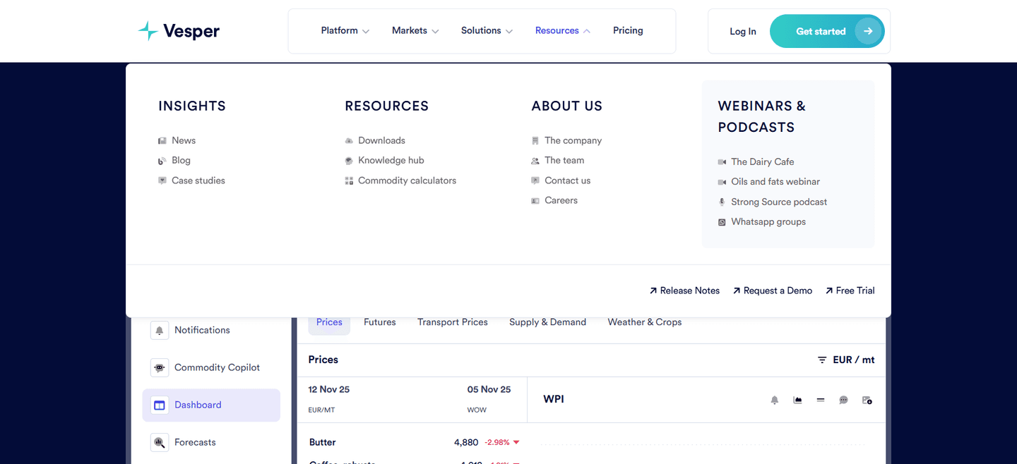
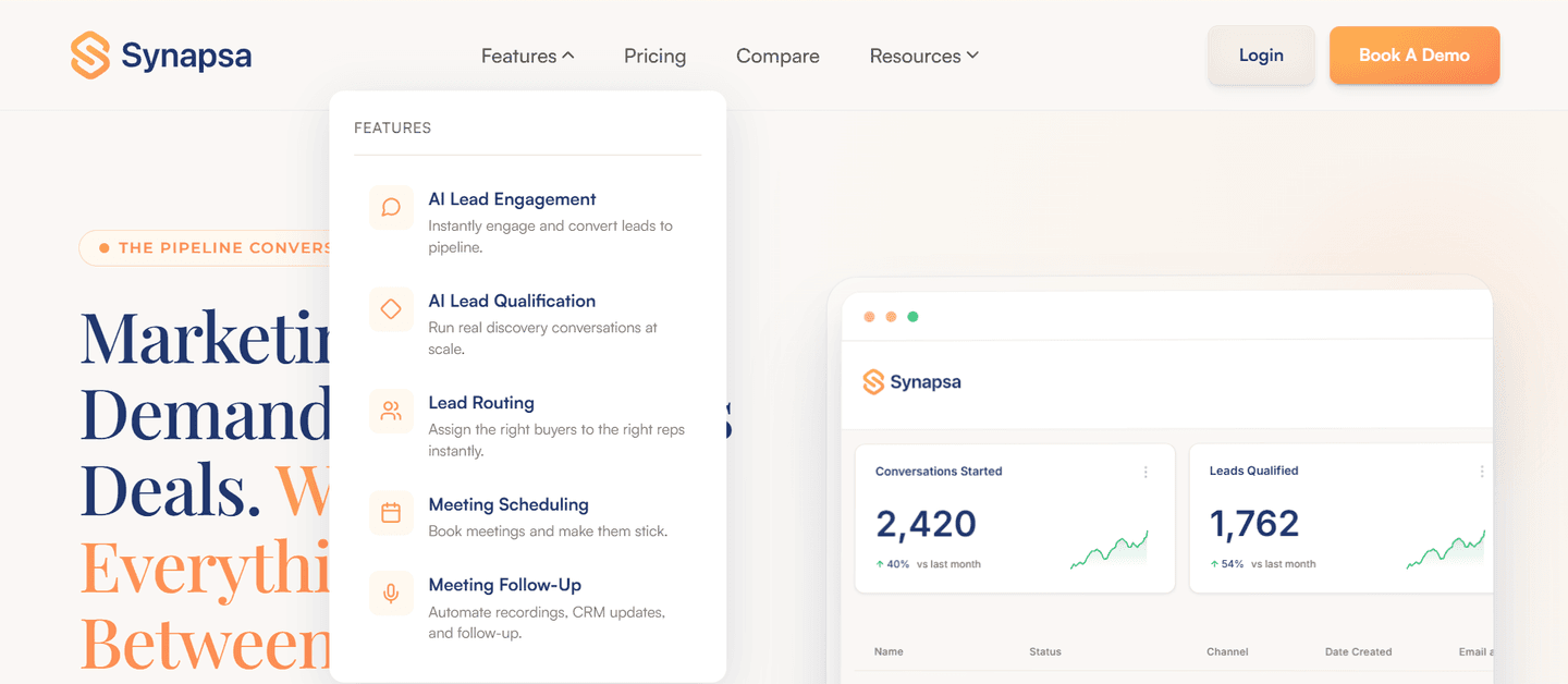

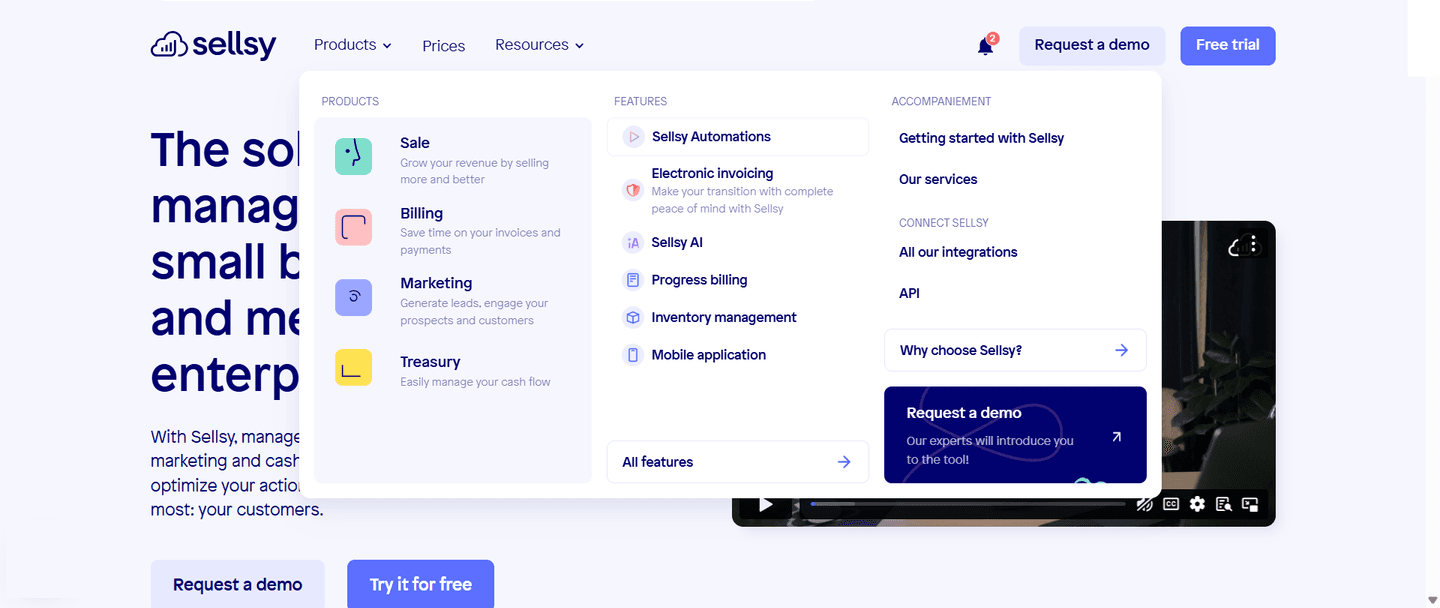
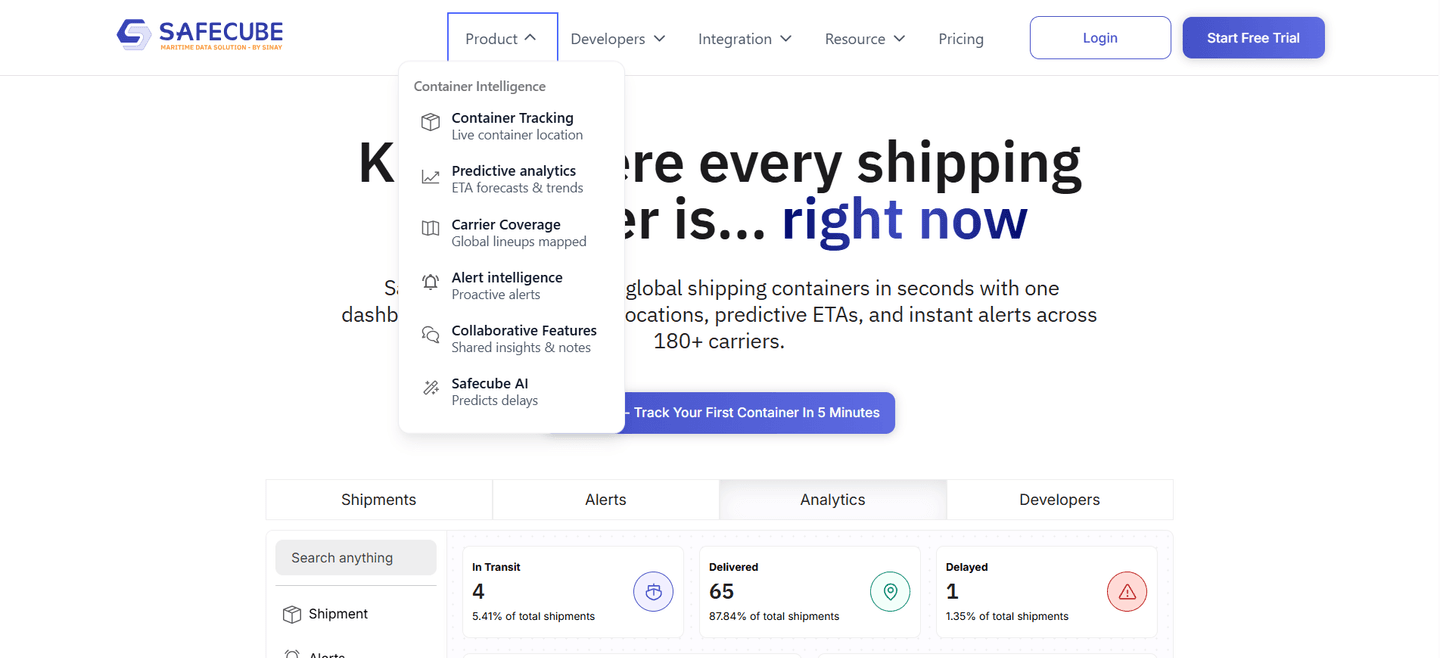
Browse every navbar pattern by UX best practice.
Every navbar is scored across 7 conversion best practices. Copy the navigation structure, not the design. See what converts and why.
Hand-picked from 650+ companies and analyzed by our AI conversion agent. Not a random dump of navigation bars. Every entry earns its spot.
Found a navbar you admire? Run yours through the same scoring engine. See where you stand on the same best practices, and what to fix first.
A navbar Pricing tab is the decision to name cost directly in the top navigation, as a flat top-level link a visitor sees the moment the page loads. It sits beside items like Product, Solutions, and Resources, and it answers the question every serious buyer eventually asks: what does this cost. Making it a first-class tab means a cost-checker never has to open a menu or scroll to find the answer.
The pattern takes a few concrete forms:
Cost is one of the first things a buyer wants to know, and the visitors who go looking for pricing early are among the most likely to convert. A visible Pricing tab meets that intent head on: it lets deal-ready people qualify themselves in seconds instead of digging through a dropdown. The tab does the routing work that the buyer would otherwise have to do manually.
Hiding pricing has the opposite effect. It reads as evasive, and it makes the exact audience closest to a decision work hardest to get an answer. A navbar that surfaces cost signals confidence in the offer, and confidence is persuasive on its own.
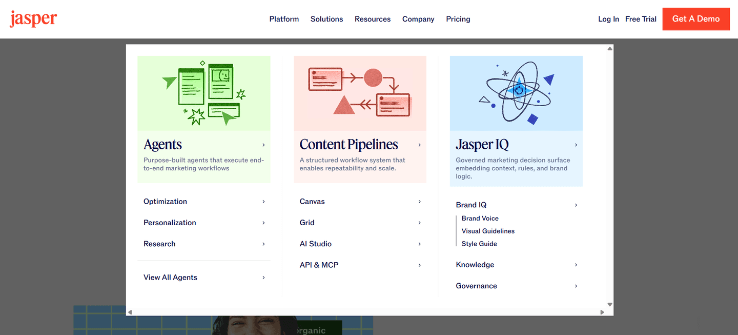
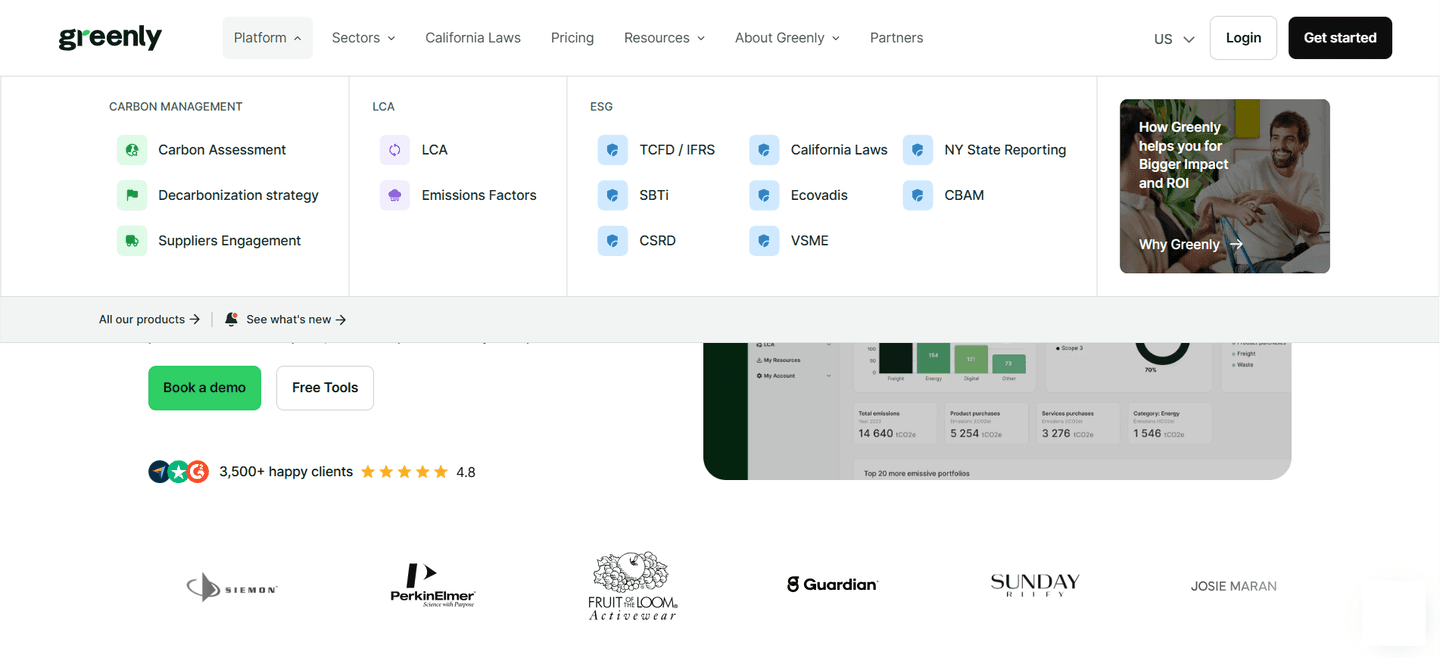
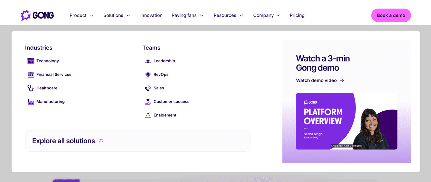
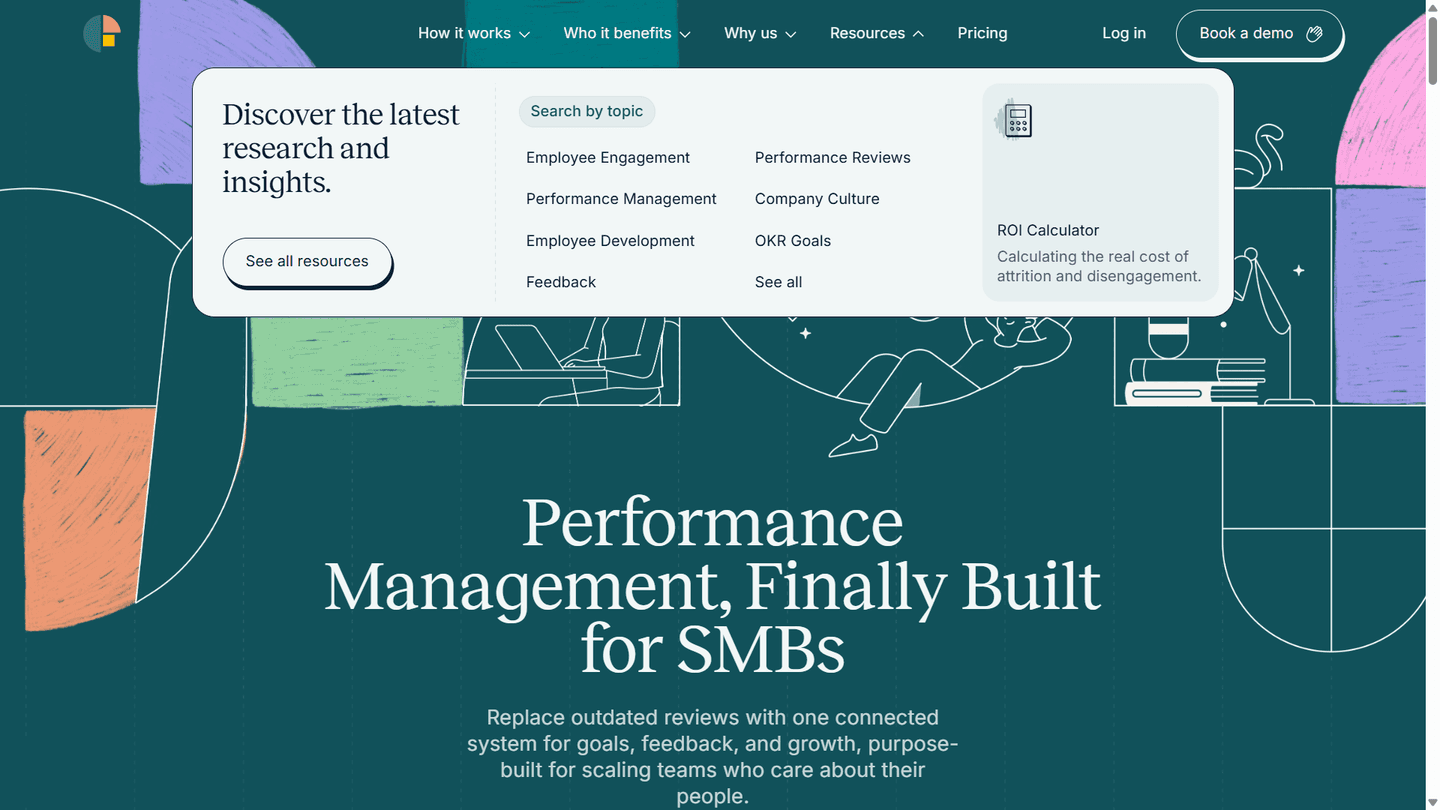
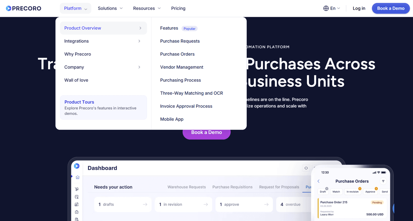
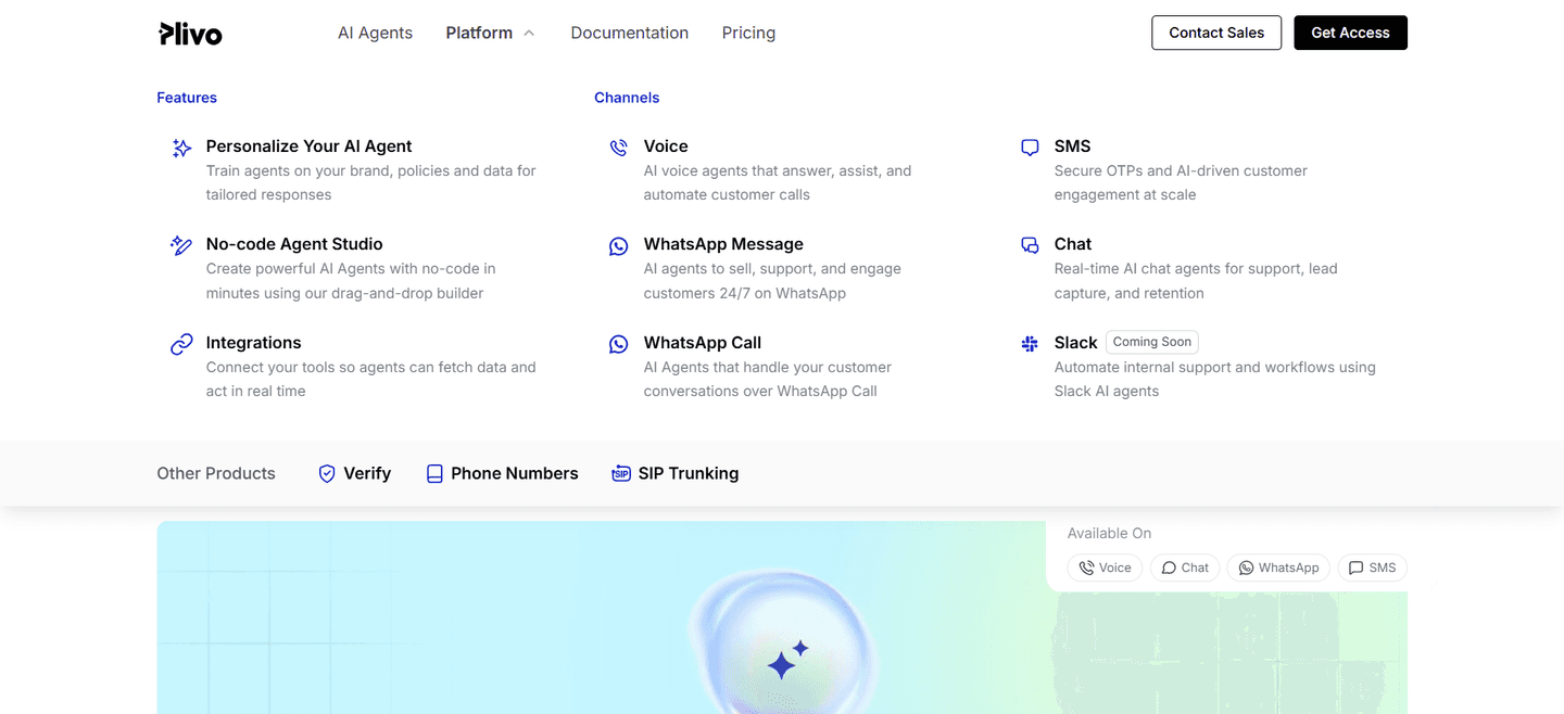
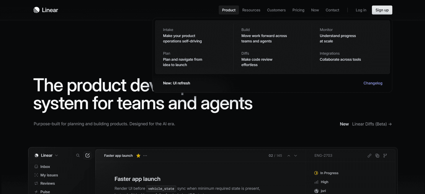
Roughly three in four of the scored navbars in our library surface a Pricing tab, and the examples below show the disciplined version. The strongest bars keep Pricing flat and top-level rather than burying it: Zendesk sits a Pricing tab right next to a green Try for free CTA, Amplitude places Pricing beside a Get started button with Login and Contact sales close by, and Notion drops a Pricing tab directly into the top nav alongside Product and Solutions. The move that repeats is pairing: cost and the primary action share the same corner, so a visitor can evaluate or sign up without moving their eyes. Parabola and Ahrefs go further and keep pricing one click away even while the rest of the nav fans into rich mega-menus.
A Pricing tab rarely works alone in the bar. The best navbars also let visitors self-select by job with use-case tabs in the navigation, and you can see the full range of bar patterns in the complete navbar gallery.
71/100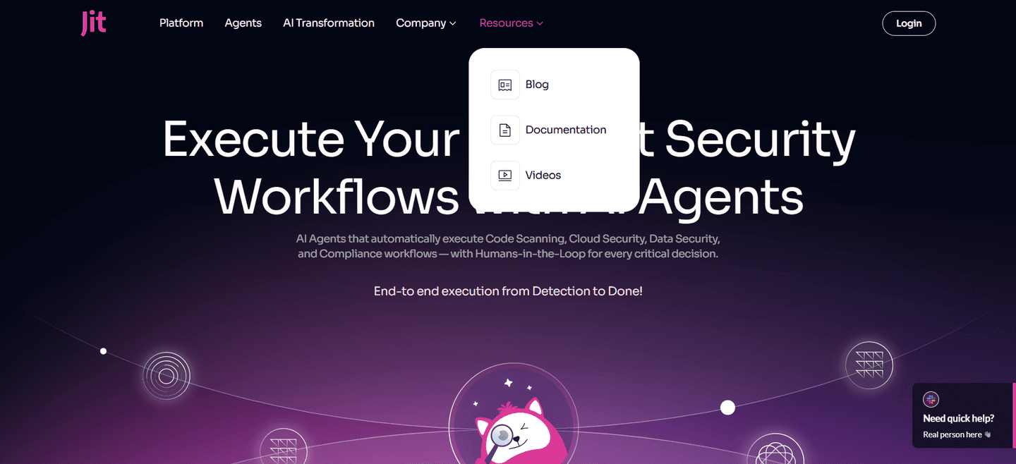 0/100
0/100The usual failure is burying pricing inside a Solutions or Product dropdown, so the one link buyers most want costs them a hover and a scan to find. The second is dropping pricing from the navbar entirely and routing every cost question through a demo request, which frustrates the evaluators closest to buying. The third is a clever or vague label that makes cost-checkers guess. Keep the tab flat, name it plainly, and place it where the primary action already lives.

Curated by
Gabriel Amzallag , Founder, Web Anatomy
5 years CRO + SEO at Qonto (2021–2025). After advising 15+ SaaS on their websites (Payfit, Pigment…), the same patterns kept breaking, so I decided to build the source of truth on what works on the web: the intelligence layer every tool, builder, and team uses to ship sites that perform.
Paste your URL. Get a scored analysis of your navbar, including whether cost-checkers can reach your plans without hunting. Free, no signup.
The common questions about surfacing pricing in the top navigation, with answers drawn from 95 scored examples.
It is a top-level Pricing link placed directly in the main navigation bar, alongside items like Product, Solutions, and Resources. The point is that a visitor who wants to know what a product costs can reach the pricing page in a single click, without opening a dropdown or scrolling the page to find a buried link.
Cost is one of the first questions a serious buyer asks, and buyers who check pricing early are among the most likely to convert. A visible Pricing tab respects that intent: it lets deal-ready visitors qualify themselves in seconds instead of hunting through a menu. Hiding pricing tends to read as evasive, and it forces the exact people closest to buying to work harder than they should.
Either works as long as it is unambiguous. Most SaaS navbars use Pricing because it is the word buyers scan for; a few use Plans, which reads well when the offer is tiered. What matters is that the label names cost directly. Clever or vague labels make cost-checkers guess, which defeats the purpose of surfacing it at all.
As a flat top-level item in the main nav row, not tucked inside a Solutions or Product dropdown. The strongest bars place it near the primary call to action so the evaluate path and the sign-up path share the same corner of the screen. On mobile it should stay reachable in the collapsed menu without extra taps.
Sales-led products still benefit from a visible cost path. A Pricing tab that leads to a plan comparison or a clear Contact sales route is better than no signal at all, because it tells buyers where the budget conversation happens. What frustrates evaluators is a navbar that hides cost entirely and routes every question through a demo request.