Navbar|
Persona tabs split the navigation by audience, so each visitor self-selects into a path built for their role instead of scanning a flat list of links.
Key takeaways
Showing 43–47 of 47 examples

Browse every navbar pattern by UX best practice.
Every navbar is scored across 7 conversion best practices. Copy the navigation structure, not the design. See what converts and why.
Hand-picked from 650+ companies and analyzed by our AI conversion agent. Not a random dump of navigation bars. Every entry earns its spot.
Found a navbar you admire? Run yours through the same scoring engine. See where you stand on the same best practices, and what to fix first.
Persona tabs are the decision to organize the navigation around who the visitor is, rather than around the product's internal feature list. Instead of one flat row of links, the bar or its dropdown splits into audience paths a visitor can recognize themselves in, so an operations lead and a finance buyer each follow a route built for their role. The point is self-selection: the navbar does the sorting a visitor would otherwise have to do in their head.
The pattern takes a few concrete forms:
Most buyers arrive as a specific role with a specific problem. A menu built around product structure asks them to translate that problem into the company's vocabulary before they can move, and every extra step of translation is a chance to give up. Persona tabs remove that step by naming the visitor's own job in the navigation, so the click is obvious and confident.
Self-routing also does quiet qualification. By the time a visitor lands on the page they picked, they have already told the navbar which role they belong to, so the page can open with the value that role cares about instead of a generic pitch. A finance lead and an engineer want different proof, and a navbar that lets them separate themselves early makes every page after the click more relevant.
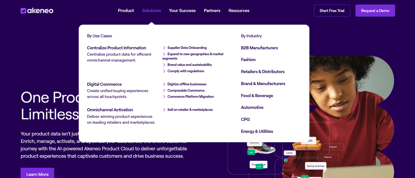
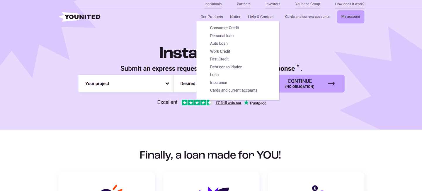
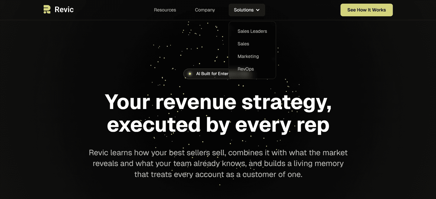
Fewer than half of the scored navbars in our library route by persona; most still fall back on a flat link list, which makes the audience segmentation a real point of difference. The examples below show the disciplined version. The strongest bars name the actual role rather than hiding it behind a vague label: Parabola splits its menu into a Teams we serve column for Operations, Data and engineering, and Finance, Amplitude routes by Team across Product, Growth, Engineering, Marketing, and Executive, and Deel's By Teams column targets HR, Finance, Legal, and IT with a one-line benefit each. SignOnSite and Instruqt go a step further and put a By Role column beside a use-case column, so a director and a project manager can each find their own way in. The move that repeats is specificity: a persona path works when the label names a job a real person holds and carries a cue that confirms the path is theirs.
Persona routing rarely stands alone in a good bar. The best navbars pair it with use-case tabs that let visitors self-route by the job they came to do and often anchor the dropdown with a featured highlight card that pulls a key story or offer into the menu. You can see the full range of bar patterns in the complete navbar gallery.
57/100 0/100
0/100The usual failure is a persona label so generic it names no one: a bare Teams or Enterprise tab tells a visitor nothing about whether the path is theirs. The second is offering personas with no value cue, so the visitor has to click each one blindly to find out what it holds. The third is too many overlapping segments, where a buyer cannot tell which role really fits and stalls on the choice. The fix is the same in every case: name a role a real person holds, give it one clear line of value, and keep the set short enough to scan.

Curated by
Gabriel Amzallag , Founder, Web Anatomy
5 years CRO + SEO at Qonto (2021–2025). After advising 15+ SaaS on their websites (Payfit, Pigment…), the same patterns kept breaking, so I decided to build the source of truth on what works on the web: the intelligence layer every tool, builder, and team uses to ship sites that perform.
Paste your URL. Get a scored analysis of your navbar, including whether each visitor can self-select into a path for their role. Free, no signup.
The common questions about splitting the navbar by audience, with answers drawn from 47 scored examples.
They are navigation paths organized around who the visitor is, rather than around the product's feature list. Instead of one flat row of links, the bar or its dropdown splits into audience columns like Teams we serve or Who we serve, with entries such as Operations, Finance, and Engineering. A visitor recognizes their own role in the labels and lands on the matching page in one click.
Most buyers arrive as a specific role with a specific problem, and a menu built around internal product structure forces them to translate that problem into the company's vocabulary first. Persona tabs remove that step: the visitor sees their own job named in the navigation and self-selects with confidence. Self-routing also pre-qualifies the visitor, because by the time they land the page already knows which role it is speaking to and can lead with the value that role cares about.
They answer different questions, and the strongest navbars run them side by side. Persona or team columns answer who are you (Marketing, Sales, Finance, Engineering). Use-case columns answer what are you trying to do (eSignatures, retention, lead generation). Industry columns answer what market are you in (Retail, Healthcare, Financial Services). Offering parallel columns lets each visitor self-select on whichever axis feels most natural instead of forcing one path on everyone.
Both work, and the choice depends on how many audiences the product serves. A handful of clearly distinct audiences can sit as top-level tabs in the bar, the way Later splits For enterprise brands, For social media managers, and For creators. A wider set is better housed in a Solutions or Who we serve dropdown, where a persona column can carry a short value line under each role without crowding the bar. What matters is that the role is visible and reachable in one obvious move.
Enough to cover the roles that actually buy, few enough to scan in a couple of seconds. Overlapping or near-identical segments make the choice harder, not easier, because the visitor has to work out which one is really theirs. Lead with the most common roles, give each a distinct value cue, and let use-case or industry columns absorb the visitors who do not think of themselves as a job title.