Navbar|
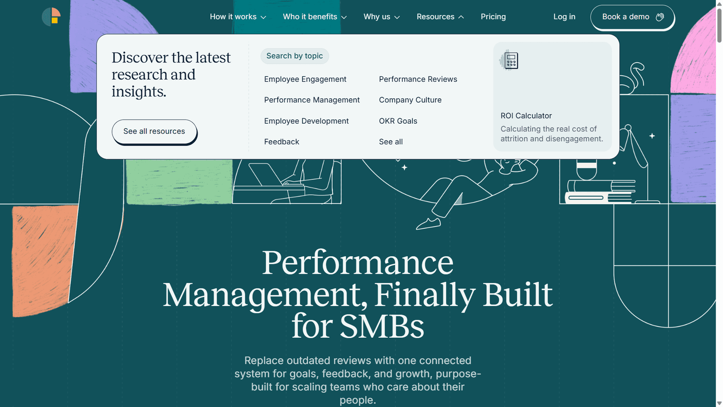
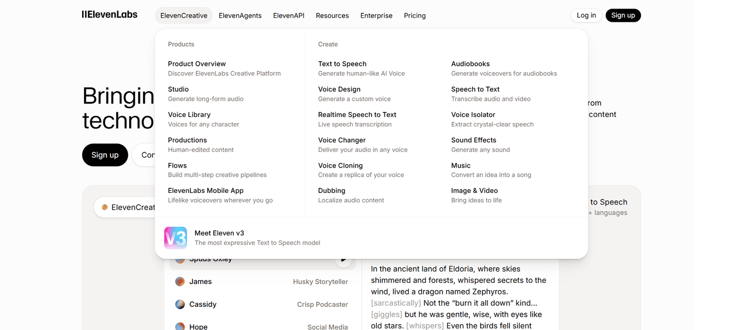
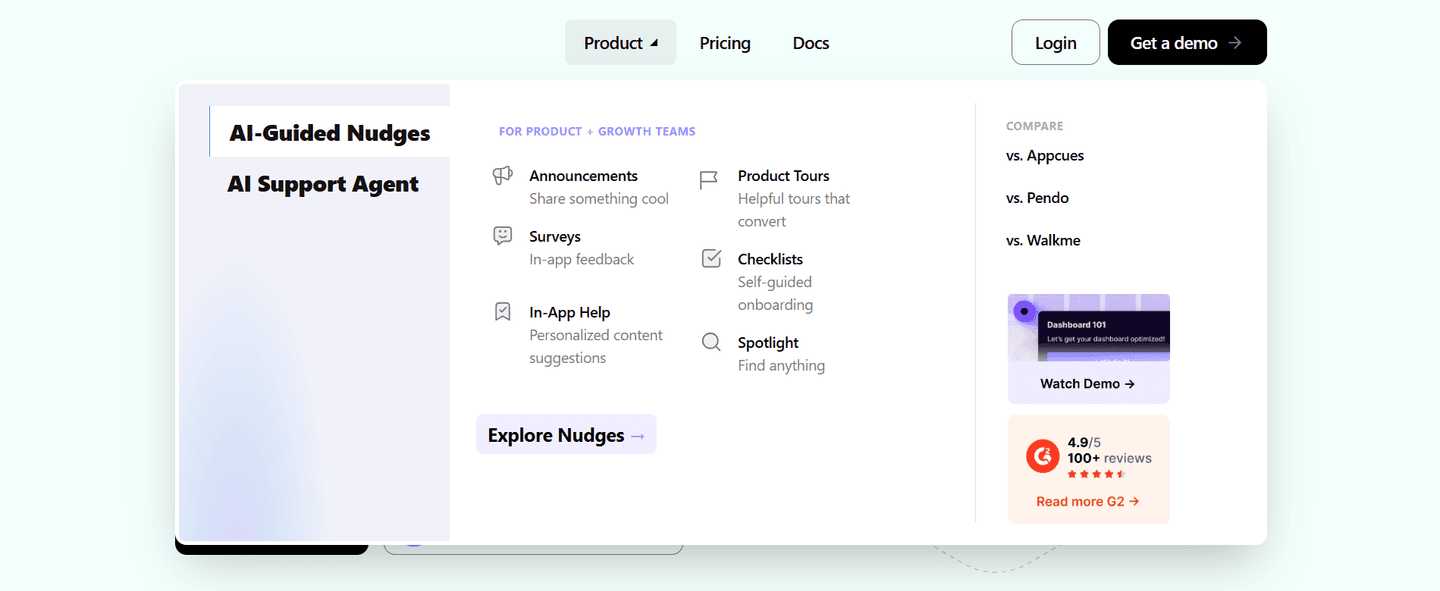
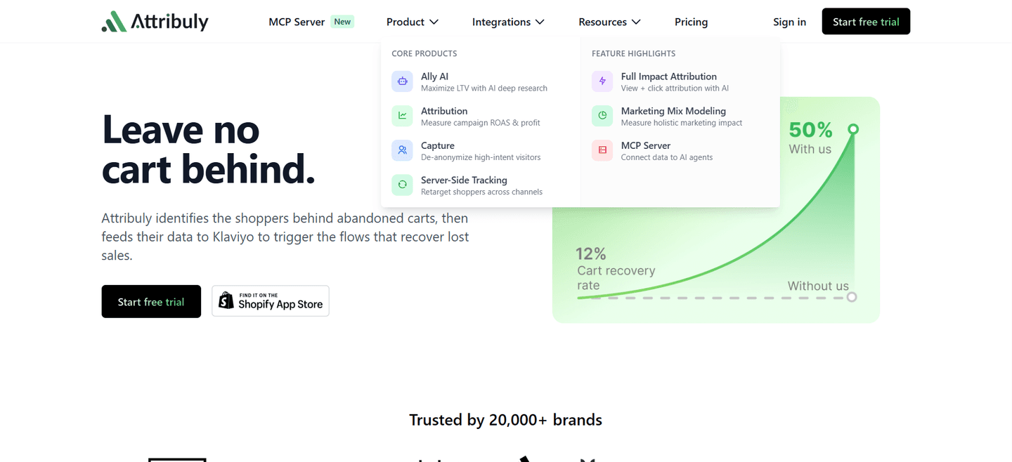
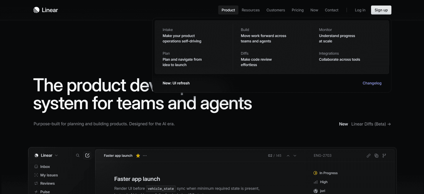
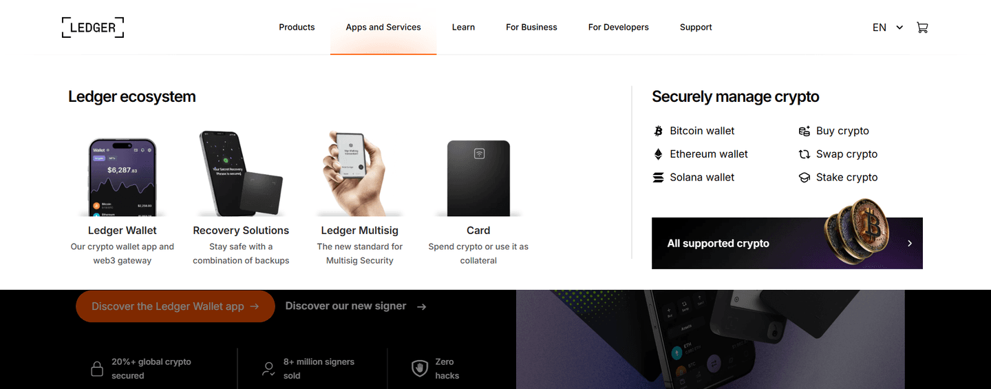
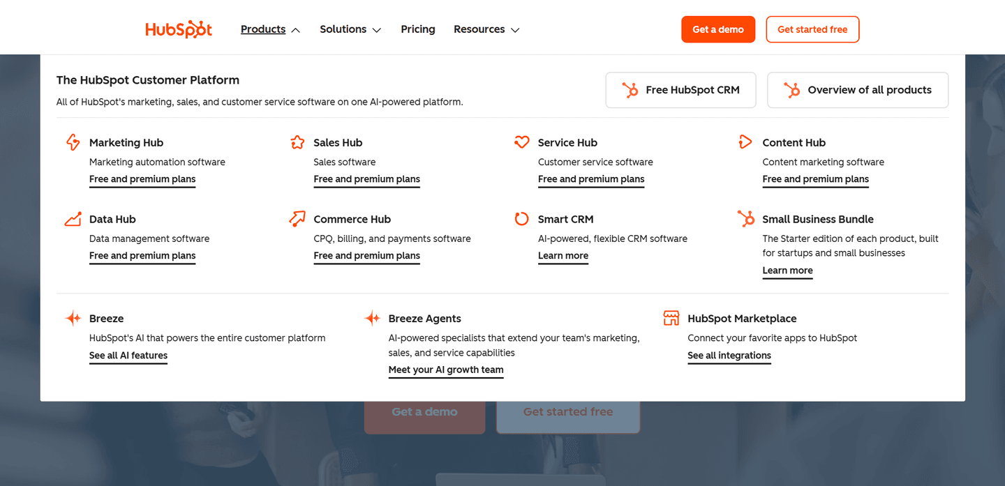
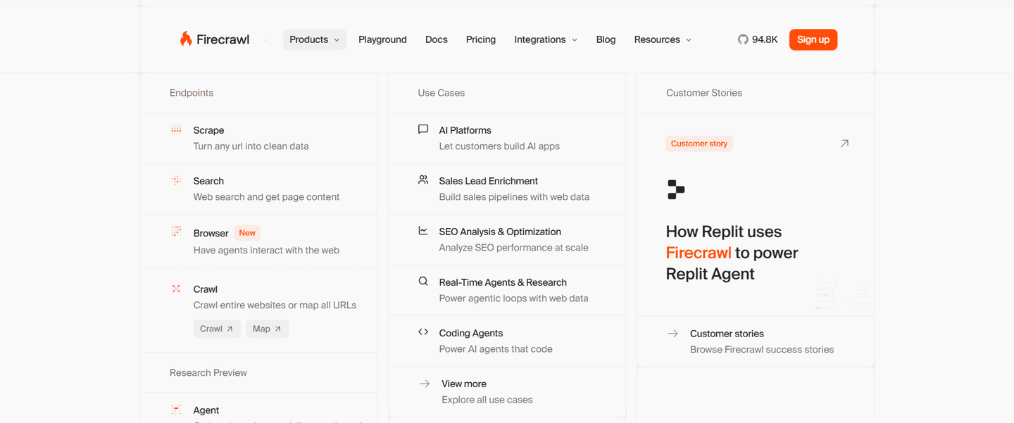
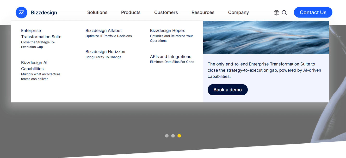
A featured card inside the open menu pushes the one thing the company most wants seen, so a flat dropdown becomes a surface that sells instead of a list that only routes.
Key takeaways
Showing 43–63 of 69 examples
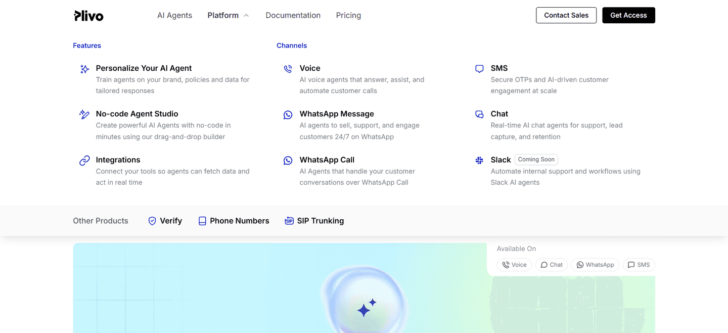
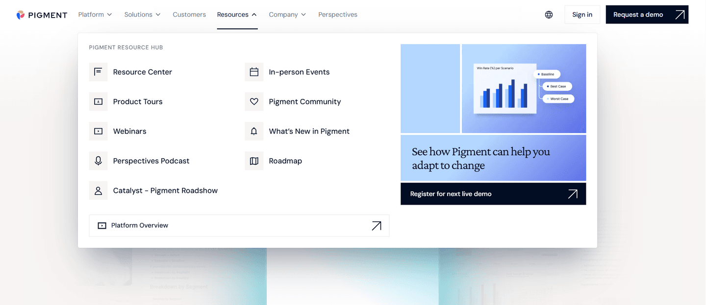
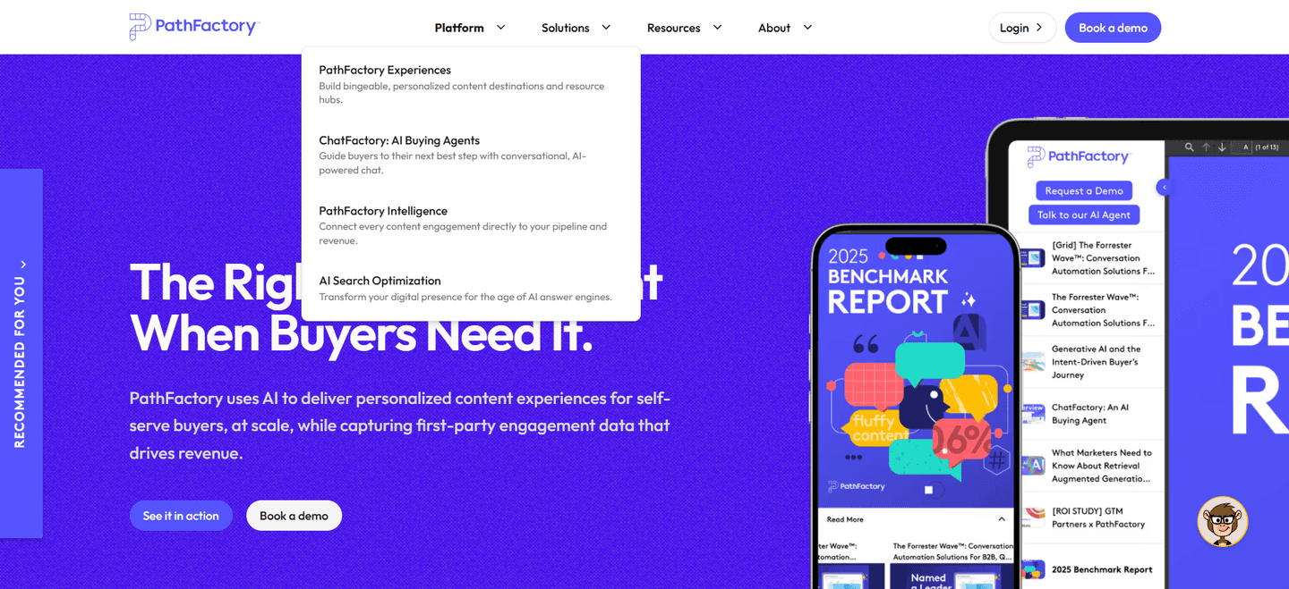
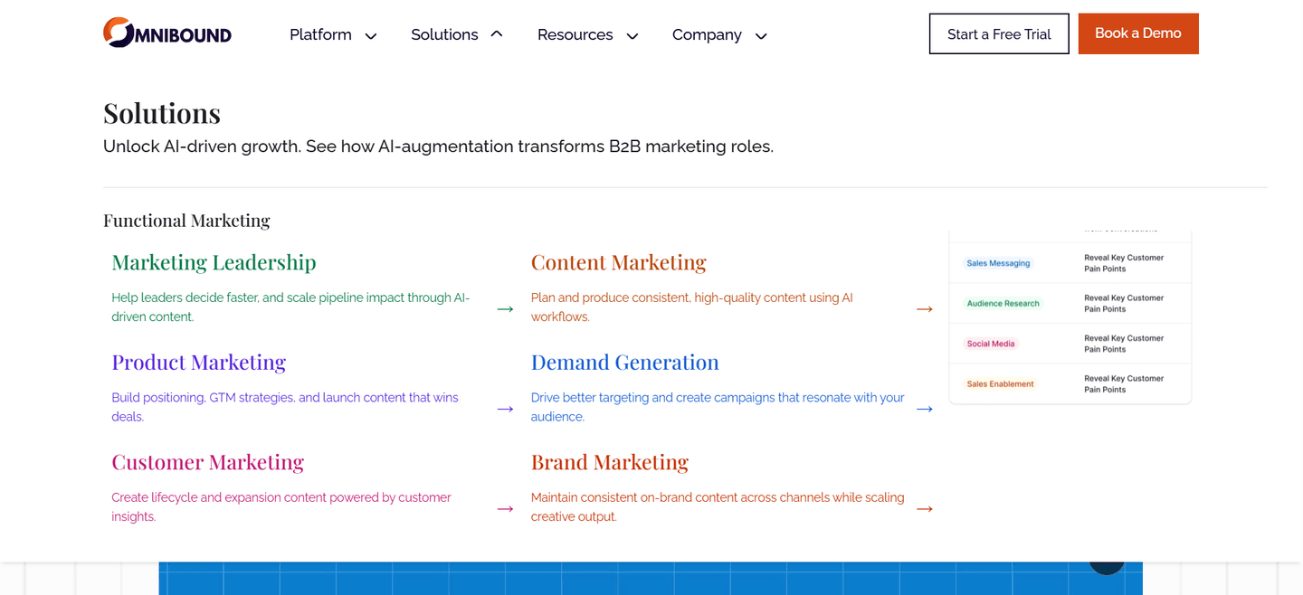
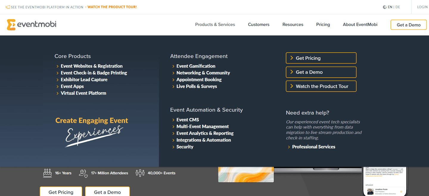
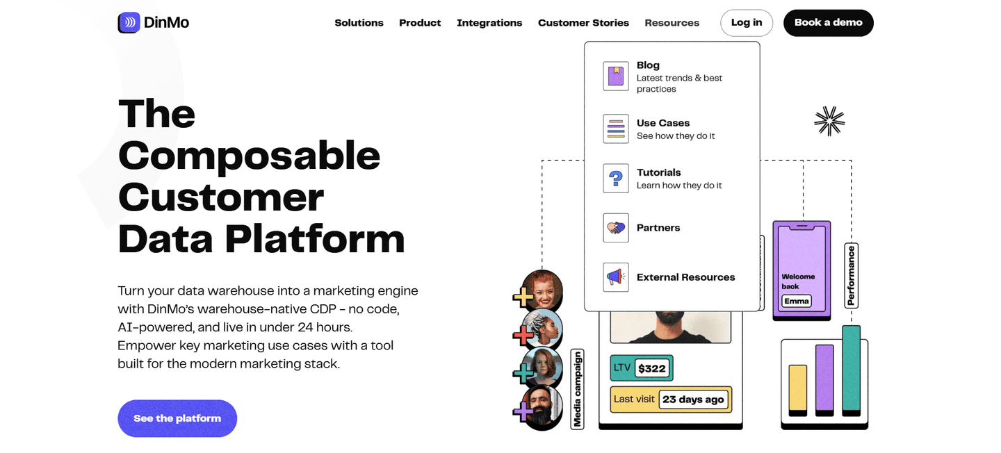
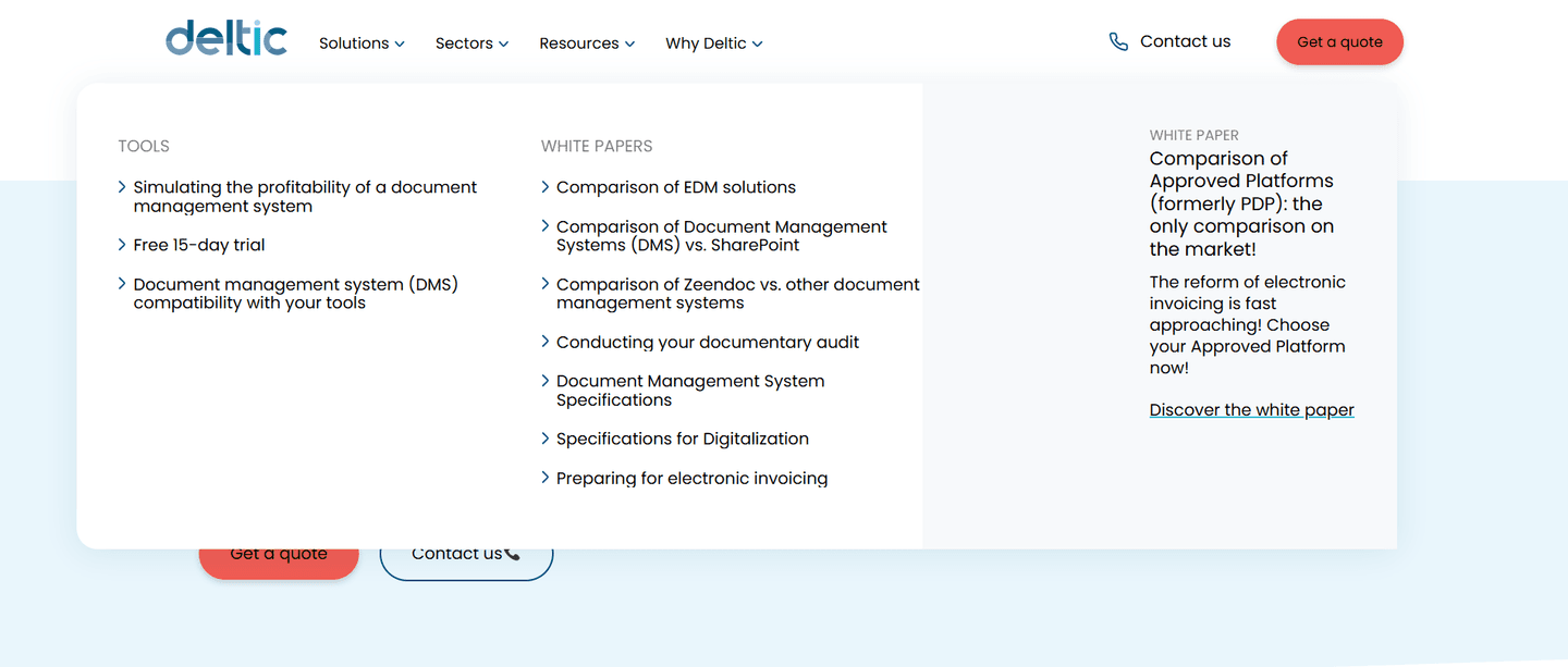
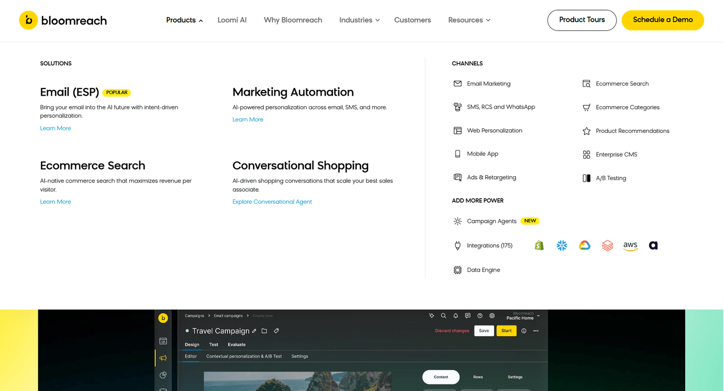
Browse every navbar pattern by UX best practice.
Every navbar is scored across 7 conversion best practices. Copy the navigation structure, not the design. See what converts and why.
Hand-picked from 650+ companies and analyzed by our AI conversion agent. Not a random dump of navigation bars. Every entry earns its spot.
Found a navbar you admire? Run yours through the same scoring engine. See where you stand on the same best practices, and what to fix first.
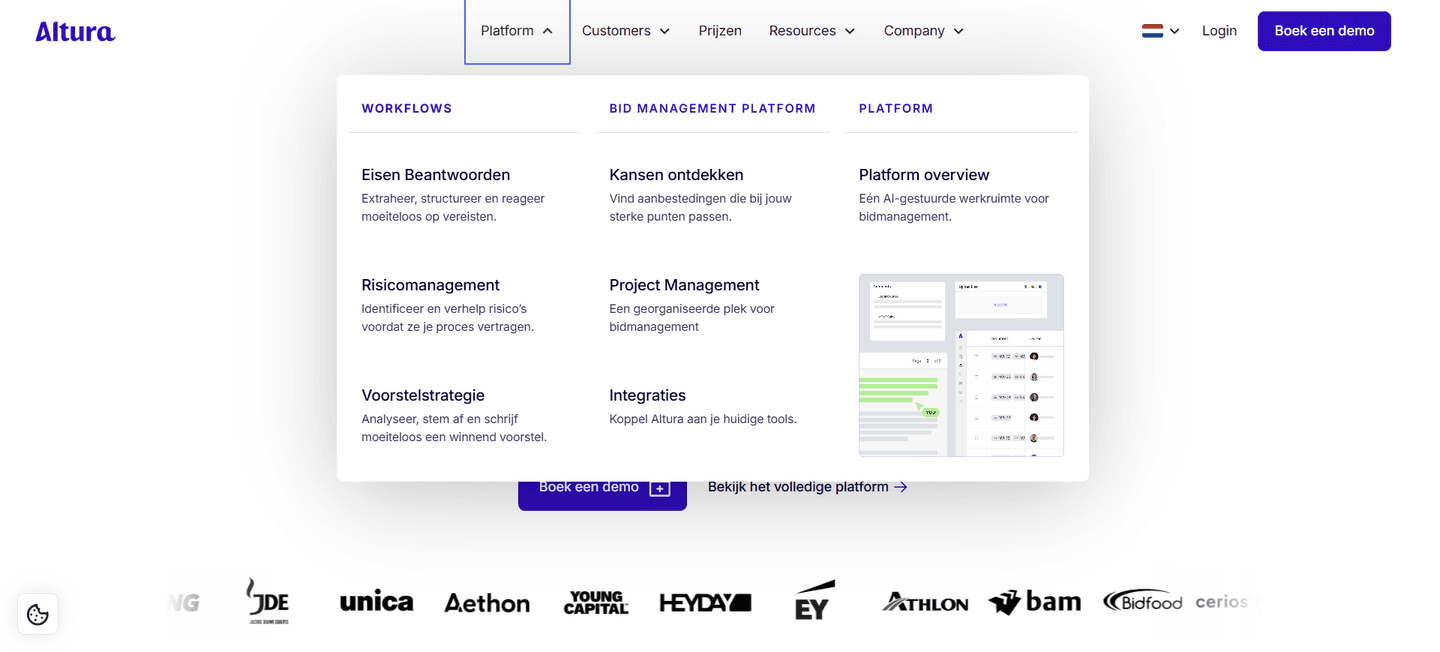
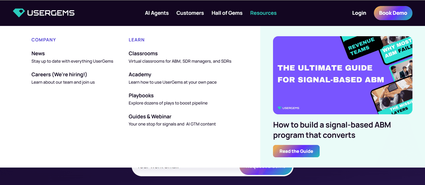
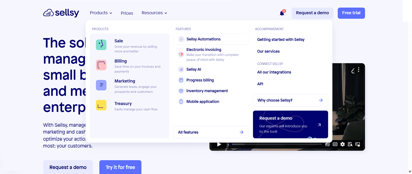
A mega-menu highlight is the decision to place a featured card inside the open navigation dropdown instead of leaving that dropdown as an even list of links. The card carries a visual, a short headline, and often its own action, and it does a different job from the links beside it: where the columns route a visitor to pages, the card merchandises one deliberate message while the menu is open.
Across the benchmark the card takes a few recognizable forms, often just one per menu:
A flat dropdown treats every link as equal, which is honest but wastes the most valuable moment a visitor gives the navigation: the second the menu is open and their attention is on it. A highlight card spends that moment on purpose. It picks one thing out of the list and gives it a visual, a headline, and a reason to click, so even a visitor who never picks a link leaves the menu having seen the company's best foot forward.
The card also changes what the menu can do. A customer result or an event card carries proof and urgency that a link label cannot, and a demo panel gives a self-serve visitor an action right there in the dropdown. The menu stops being a directory and becomes a small merchandising surface, which is why the pattern shows up in roughly two in three of the scored navbars rather than as a rare flourish.
The discipline that separates the strong highlight cards is featuring one thing, clearly. Parabola anchors its dropdown with a single Enterprise Experience card and a green visual, Amplitude leads its Solutions menu with a "Solutions that drive business results" card carrying art, and Pitch opens its menu with an illustrated Pitch for Teams card. None of them dilute the card with a second competing message, so the eye lands where they want it.
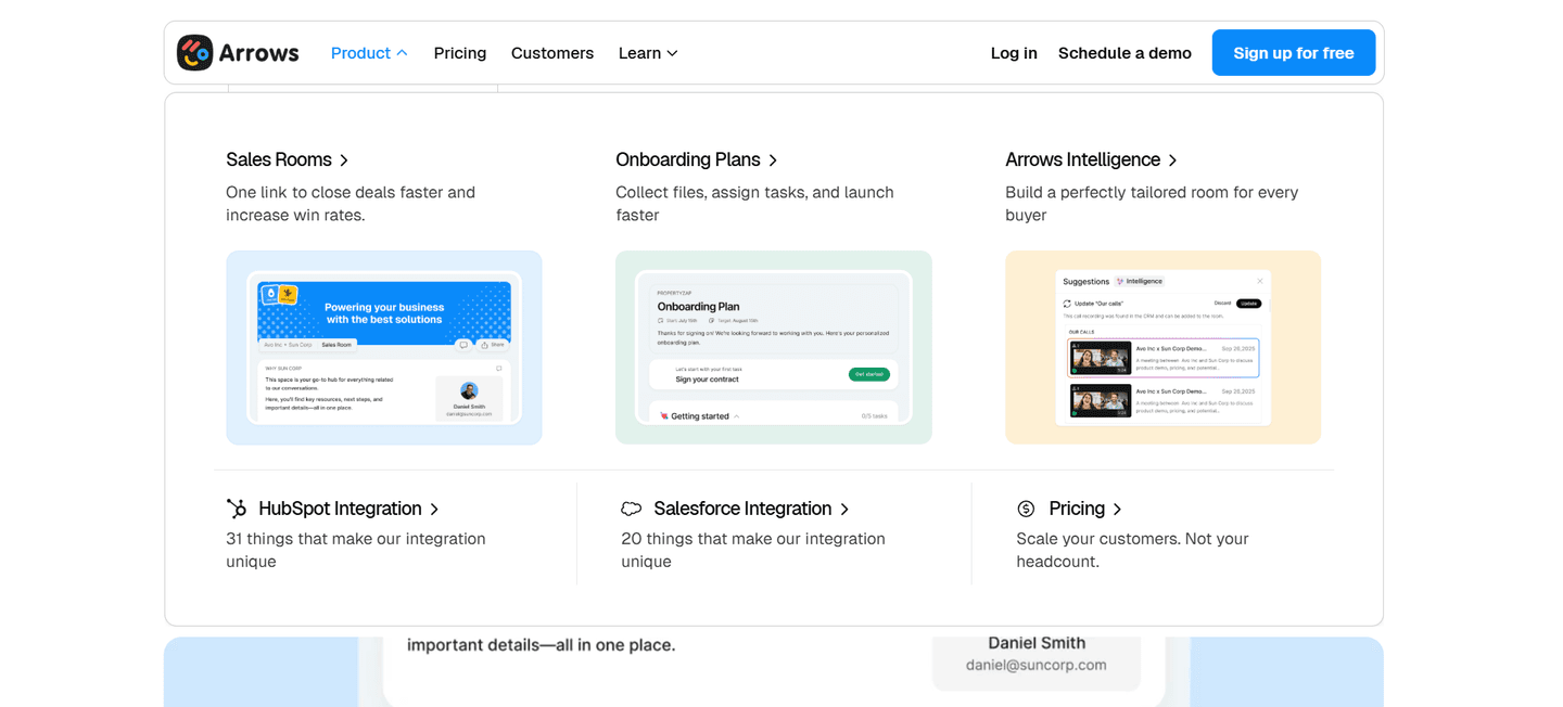
The best cards also earn the attention they take. Arrows spotlights its pillars with live preview cards so a buyer sees the tool before clicking, Administrate places featured solution and blog cards with images on the right of the dropdown, and Foleon anchors its menu with a Foleon for enterprise card and a product visual. When the card pushes an action, it commits to one: Zeda pairs its visual with a Talk to a specialist button, Membership features an event card with a Register Free action, and CompanyCam's panel pushes Sign up for a demo with a See CompanyCam in Action link. Proof-led cards do the same work with a name attached, which is why SignOnSite and PandaDoc put a real customer result inside the menu.
A highlight card rarely carries a navbar alone. The strongest sit beside the routing columns that let a visitor self-select, so the same menu both promotes one thing and lets everyone find their own path. See how the same dropdowns split Solutions by use case and how the pattern fits the wider navbar patterns in the benchmark library.
71/100 0/100
0/100The usual failure is featuring nothing: a mega-menu that opens into an even wall of links with no card, no visual, and no message, so the open-menu moment is spent purely on routing. The opposite failure is featuring everything, stacking three or four cards and a row of badges until the dropdown reads as a second homepage and the eye finds nowhere to rest. The third is a card with no visual, which collapses back into the link list it was meant to stand out from, and the fourth is a card that pushes an action but never says what for. Pick one thing worth the space, give it a real image, and let it carry a single clear action.

Curated by
Gabriel Amzallag , Founder, Web Anatomy
5 years CRO + SEO at Qonto (2021–2025). After advising 15+ SaaS on their websites (Payfit, Pigment…), the same patterns kept breaking, so I decided to build the source of truth on what works on the web: the intelligence layer every tool, builder, and team uses to ship sites that perform.
Paste your URL. Get a scored analysis of your navigation, including whether the menu features what matters most. Free, no signup.
The common questions about featuring a highlight card inside the navbar's mega-menu, with answers drawn from 69 scored examples.
It is a featured card placed inside the open navigation dropdown that promotes one specific thing rather than sitting in the plain list of links beside it. It usually carries a visual, a short headline, and often its own button. Where the rest of the menu routes a visitor to pages, the highlight card merchandises: it pushes the one product, story, event, or offer the company most wants seen while the menu is open.
A category or use-case column is navigation. It lists parallel paths (Use Cases, Teams, Industries) so a visitor self-routes by intent. A highlight card is promotion. It sits beside those columns and pushes a single featured thing with imagery and often a call to action. The strongest navbars run both at once: the columns let a visitor pick their own path, and the card makes sure one deliberate message lands even if they never click a link.
The one thing the company most wants a visitor to see at that moment. In the benchmark that is usually a flagship or new product (Cal.com features a Cal.ai card, Notion groups Notion Calendar and Notion Mail into a featured panel), a customer story with a result (PandaDoc runs a Customer Stories rail, SignOnSite features a customer-stories card), an event (the Zendesk Relate card pushes registration), or a demo (the See Wiz in action card repeats the demo CTA). The discipline is choosing one, not stacking several.
Almost always, because the image is what separates a highlight from another text link. A product screenshot, an illustration, a customer logo, or event art is what makes the eye stop inside a busy dropdown. Parabola anchors its menu with a green-visual Enterprise Experience card, Pitch uses an illustrated Pitch for Teams card, and Arrows shows live preview cards so a buyer sees the tool before clicking. Without a visual the card collapses back into the link list it was meant to stand out from.
Yes, and the strongest ones do. A card that ends in Register now, Try it, or Get a demo turns the dropdown from a directory into a place a visitor can act without ever reaching a landing page. CompanyCam pushes Sign up for a demo from inside the menu, Zeda pairs a visual with a Talk to a specialist button, and Membership features an event card with a Register Free action. The card should still feature one thing, so it carries one action, not a row of competing buttons.