Integrations|
A use case example turns the integrations section from a wall of logos into a demonstration of the exact workflow each connection unlocks.
Key takeaways
Showing 22–27 of 27 examples
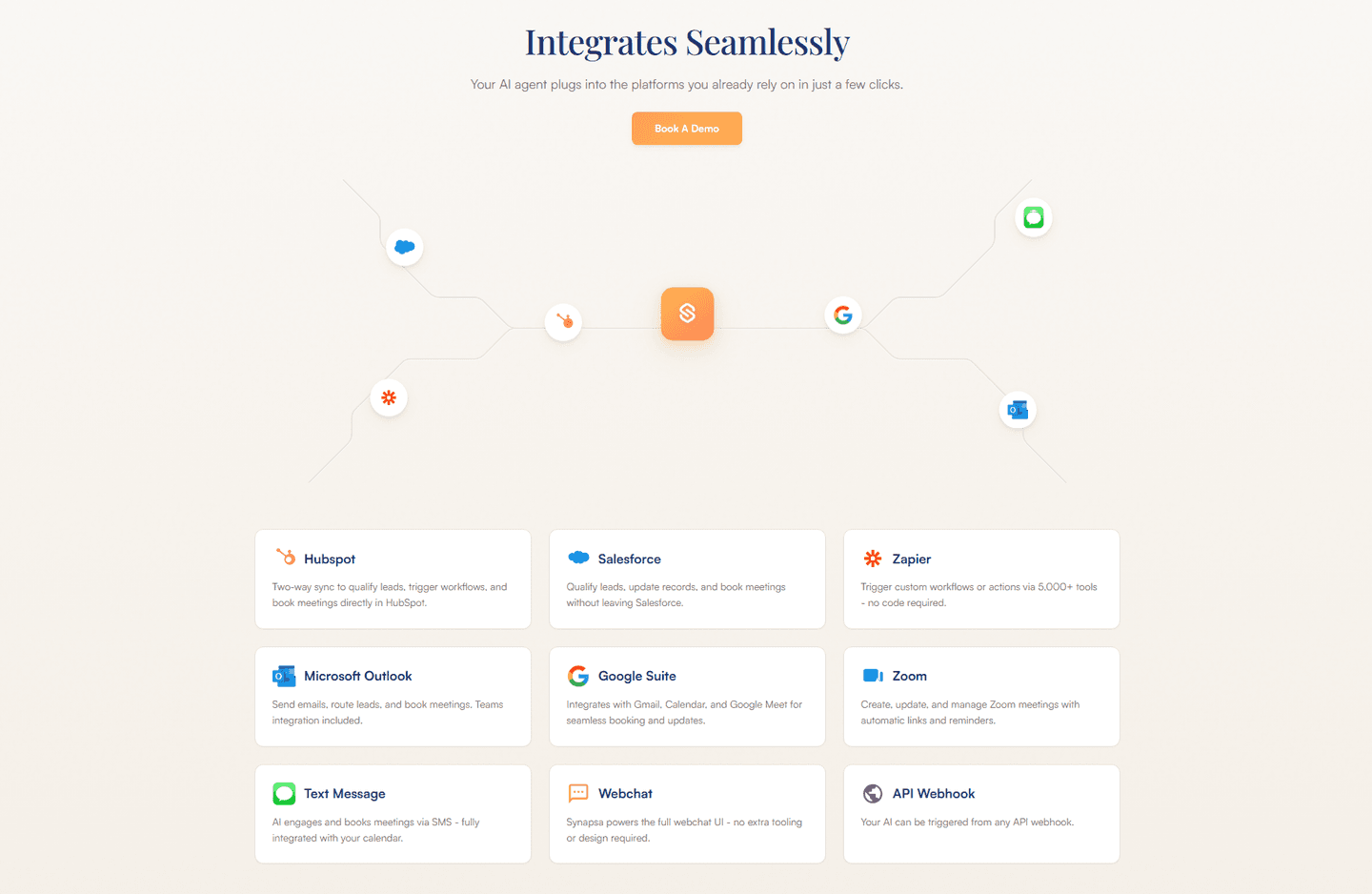
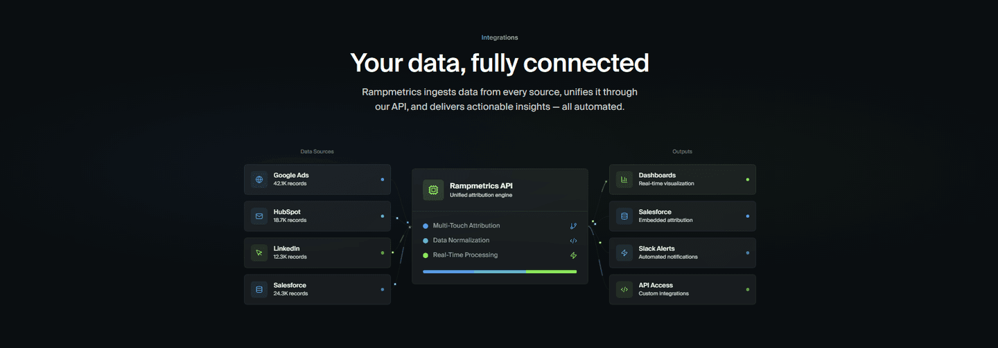
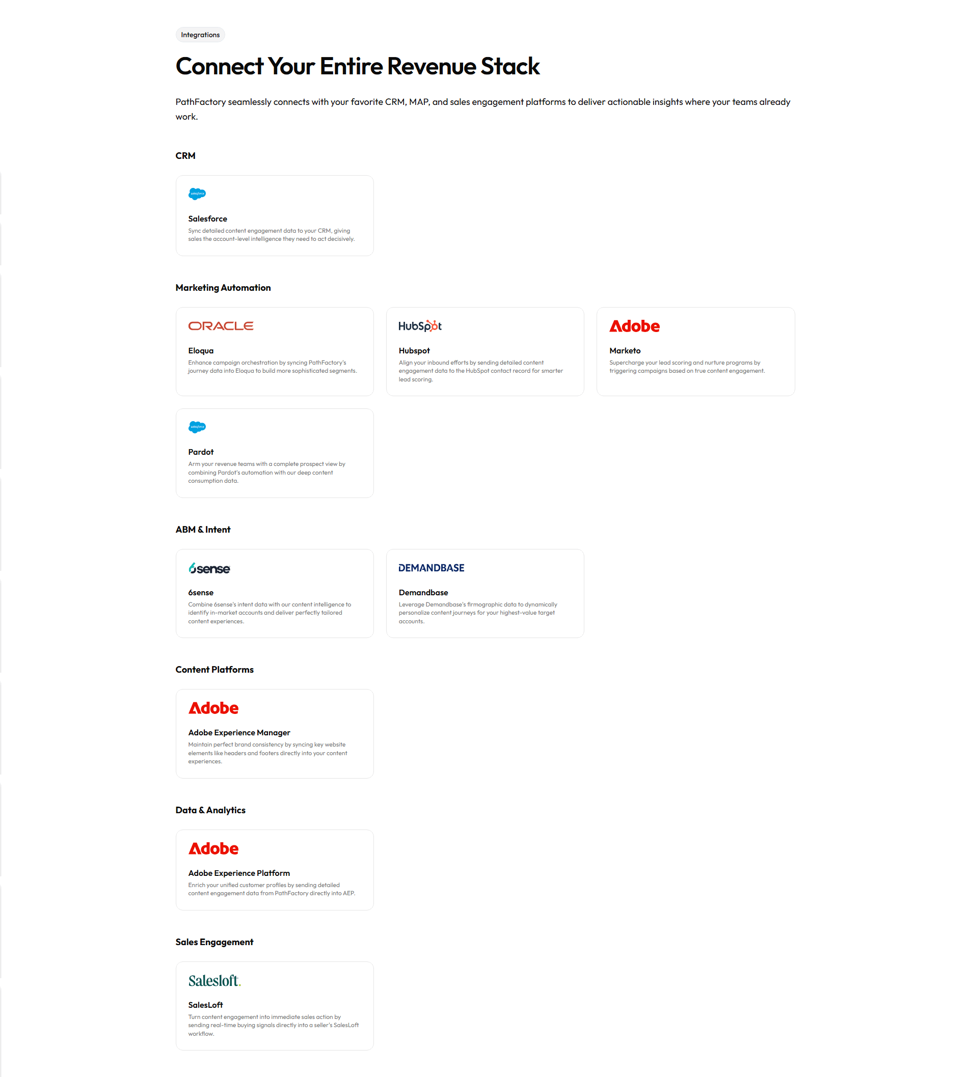

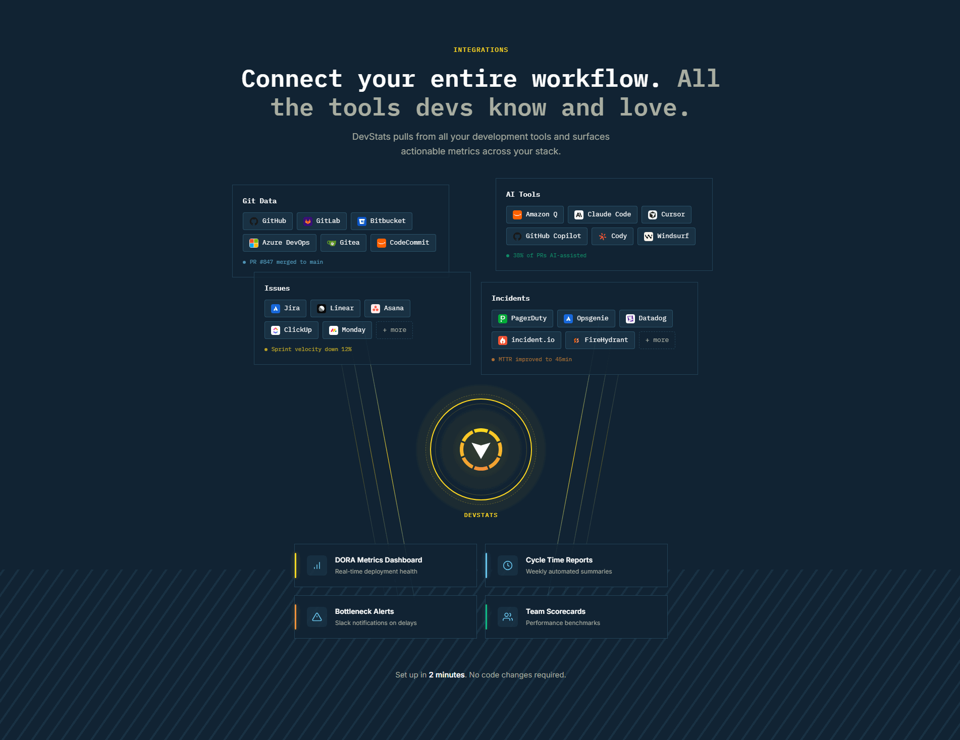
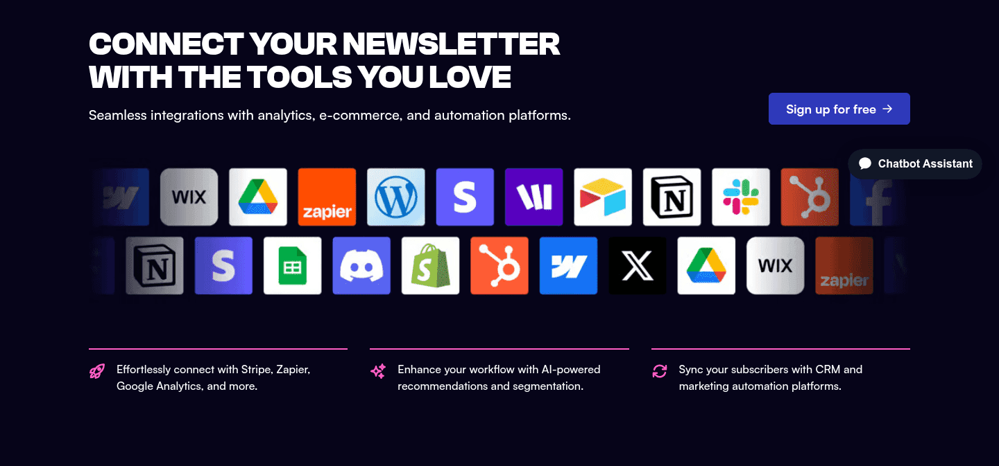
Browse every integrations pattern by UX best practice.
Every integrations section is scored across 4 conversion best practices. Copy the best practice stack, not the design. See what converts and why.
Hand-picked from 650+ companies and analyzed by our AI conversion agent. Not a random dump of homepages. Every entry earns its spot.
Found an integrations section you admire? Run yours through the same scoring engine. See where you stand on the same best practices, and what to fix first.
A use case example is the decision to show what a specific integration lets someone do, right next to the logo that names it. A logo grid confirms compatibility. A use case example confirms compatibility and then answers the question every buyer asks next: and then what. It replaces the buyer's guesswork with a demonstration of the actual workflow the connection unlocks.
The best integrations sections use one of four forms, often more than one together:
Logos borrow trust, but a logo alone still asks the buyer to do the interpreting. They see a familiar mark and have to imagine what connecting it would change. A use case example does that imagining for them. It names the object, the action, and the outcome, so the value is stated instead of assumed.
It also reaches a wider set of buyers. A logo grid speaks to the visitor who already knows exactly what they want to connect. A named workflow speaks to that visitor and to the one who recognizes their own daily task in the example before they have even scanned the logos. The concrete detail is what turns a compatibility check into a reason to move forward.
Across the scored examples below, the pattern that performs is pairing breadth with a concrete workflow. The strongest sections keep the recognizable logos and, where it applies, the ecosystem count, then attach a real job to them. Calendly pairs its logo grid with suite cards that describe specific setups. Replicas shows each connector as a workflow with a real UI mockup, so mentioning the product in a pull request comment or a channel feels tangible rather than abstract. Semgrep turns its logo constellation into concrete lines like pull request checks and ticket routing, so the developer sees the integration in their own pipeline.
The discipline is to be specific without losing the path to depth. Many of these sections also link to integrations pages that spell out a single connection in full, so a use case teaser on the landing page and a deeper directory that documents every connection do different jobs. When you want to see how these examples sit inside the wider pattern, the full integrations section gallery scores every one of them.
50/100 0/100
0/100The usual failure is a logo grid with no job attached: a wall of recognizable marks that proves compatibility and stops there, leaving the buyer to guess the value. The second is vague benefit language dressed up as a use case, where "streamline your workflow" or "connect your favorite tools" stands in for a real task and reads as filler. The fix is the same in both cases: name one concrete workflow, use a real verb and a real system, and let the specific example carry the section.

Curated by
Gabriel Amzallag , Founder, Web Anatomy
5 years CRO + SEO at Qonto (2021–2025). After advising 15+ SaaS on their websites (Payfit, Pigment…), the same patterns kept breaking, so I decided to build the source of truth on what works on the web: the intelligence layer every tool, builder, and team uses to ship sites that perform.
Paste your URL. Get a scored analysis of your integrations section, including whether it shows a real use case or just a logo grid. Free, no signup.
The common questions about showing what an integration enables, with answers drawn from 27 scored examples.
It is a short, concrete illustration of what a specific integration lets you do, shown alongside the logo. Instead of a bare grid of brand marks or a raw count, the section names a real workflow or outcome: sync contacts from the CRM, trigger a fix from a pull request comment, push survey data into analytics. The buyer sees the payoff, not just the compatibility.
A logo grid answers 'do you connect to my tools' but leaves 'and then what' unanswered. A use case answers both at once. Naming the workflow the connection enables turns an assumption into a demonstration, and it reaches the buyer who recognizes their own daily task in the example rather than a familiar logo they still have to interpret.
The common forms are a one-line workflow caption under each logo, a card that pairs a tool with the specific job it does, a flow diagram showing data move between apps into one place, and a product mockup of the resulting report or view. The strongest sections also keep the credibility of named logos and a path to the full catalog, so the concrete example does not come at the cost of breadth.
Specific enough that a buyer recognizes their own task. 'Works with Salesforce' is a compatibility claim; 'sync 60+ data points to opportunities and cases' is a use case. Name the object, the action, and the outcome. Vague benefit language like 'streamline your workflow' reads as filler, while a concrete verb and a real system read as something the product actually does.
No, they work together. A count signals the scale of the ecosystem and a use case proves the depth of any one connection. Many of the strongest sections lead with a count for breadth, then show one or two workflows so the number does not read as a shallow list. Pair the two rather than choosing between them.