Best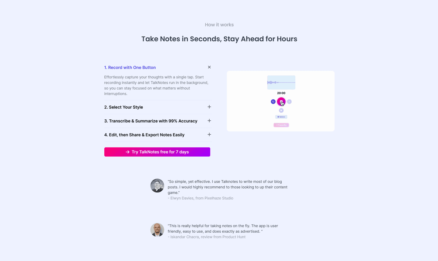
How It Works|
These onboarding-steps sections lower friction by making setup look fast and effortless, so a visitor reads the steps and thinks 'I can start right now.'
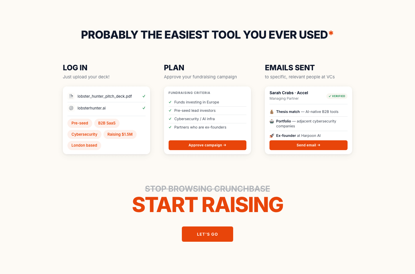
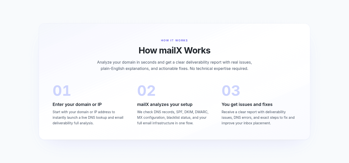
A fast-feeling onboarding-steps section breaks setup into a few short, dated steps so the visitor believes getting started will take minutes, not a long implementation, and that belief is what drives the click. The levers that move conversion are the count of steps, per-step time claims like connect in five minutes, an explicit promise such as get started in 3 simple steps, and effort language like no code or no IT involvement. These examples show how the best SaaS how-it-works sections turn perceived setup effort into a low number a visitor is willing to commit to.
Key takeaways
Showing 1–21 of 50 examples

Every how it works section is scored across 7 conversion best practices, from step clarity to timeline specificity. Copy the best practice stack, not the design. See what converts and why.
Hand-picked from 350+ companies and analyzed by our AI conversion agent. Not a random dump of pages. Every entry earns its spot.
Found a how it works section you admire? Run yours through the same scoring engine. See where you stand on the same best practices, and what to fix first.
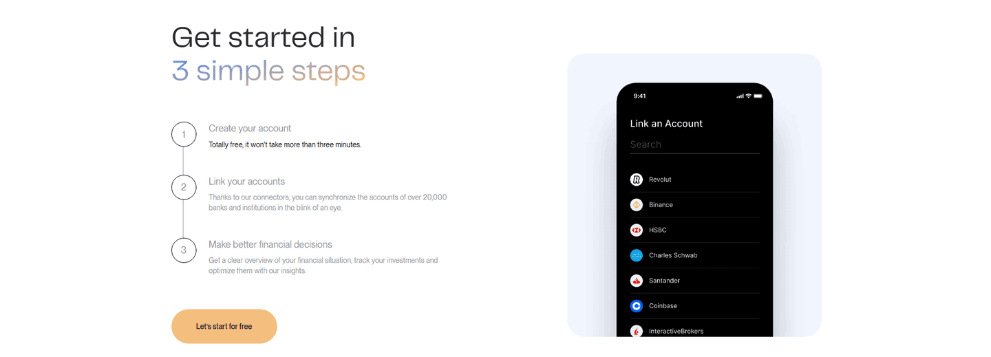
A fast-setup onboarding-steps section is the decision to present getting started as a short, timed sequence the visitor can picture finishing today. It is not about showing how the product looks. It is about answering the quiet question every buyer asks before signing up: how much work is this going to be, and how long until I see value?
The best versions lean on a few concrete levers, often more than one together:
Setup is where conversions quietly die. After the headline and the proof, the visitor's last private worry is the work between clicking and getting value, and a vague or heavy-looking process invites them to close the tab and "come back later." An onboarding-steps section that reads as fast removes that excuse by replacing an unknown amount of effort with a small, specific one.
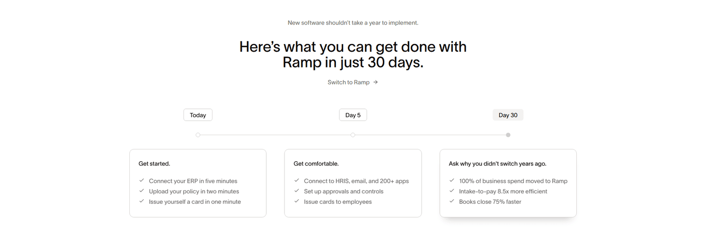
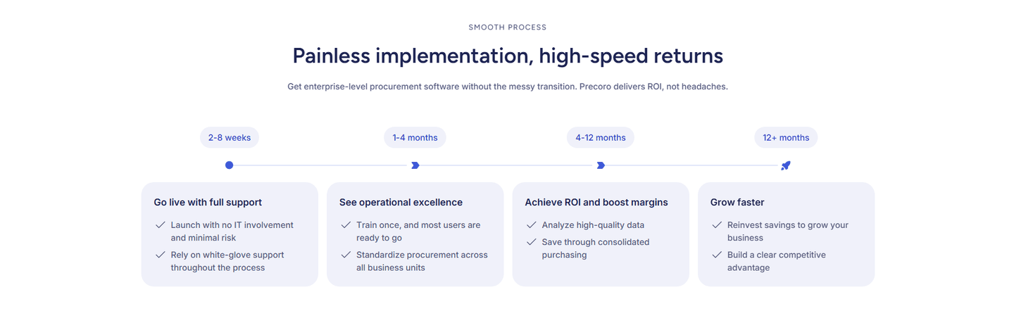
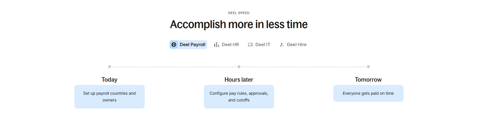
A precise timeframe does the heavy lifting. "Under 10 minutes" or "in five minutes" reframes the decision from "is this worth a big implementation" to "is this worth ten minutes," and ten minutes is an easy yes. Dated milestones go further: a Today, Day 5, Day 30 path tells the visitor not only that setup is fast but exactly when the payoff arrives, which turns a leap of faith into a plan.
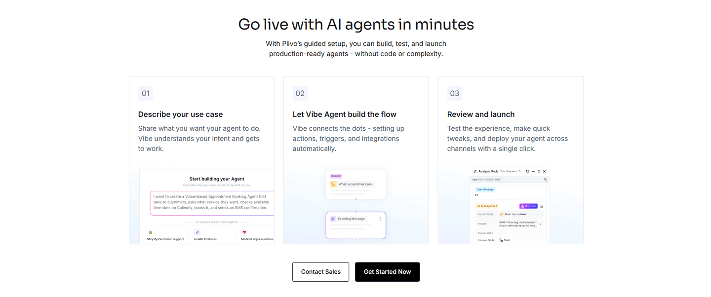
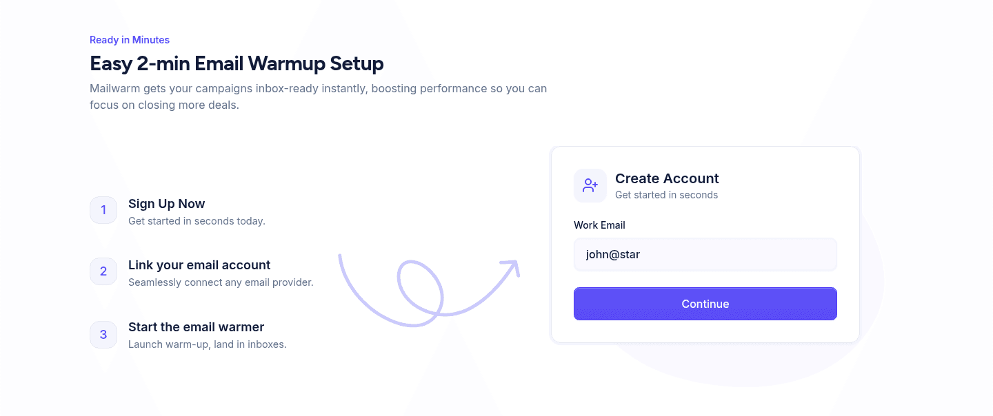
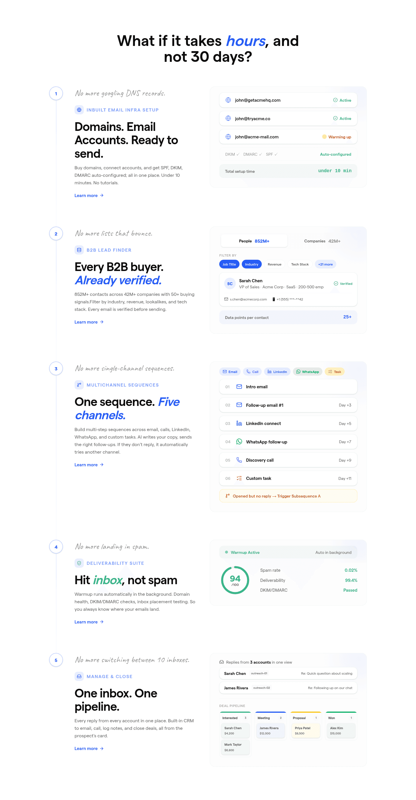
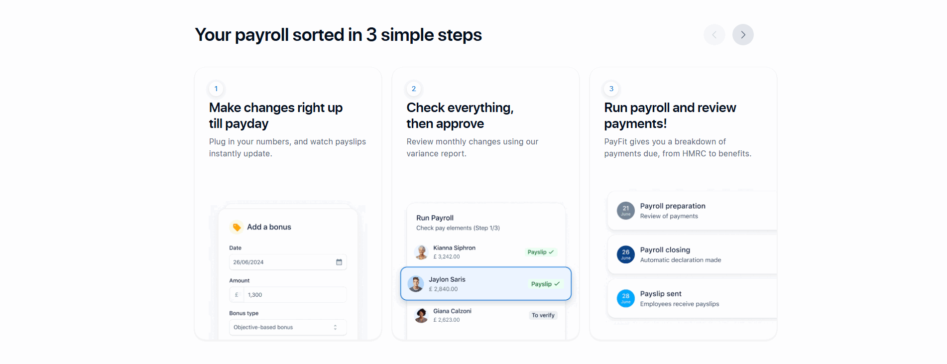
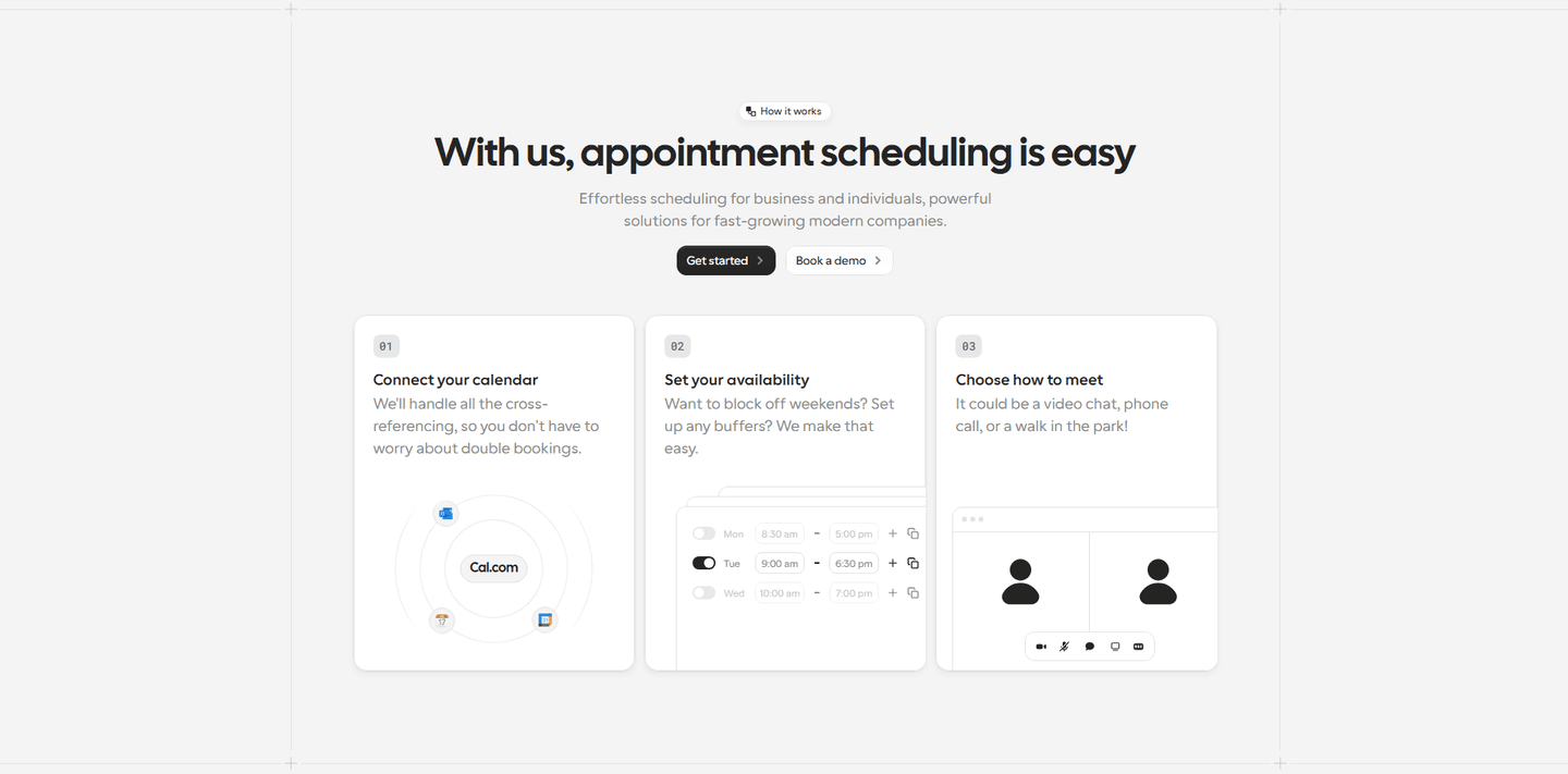
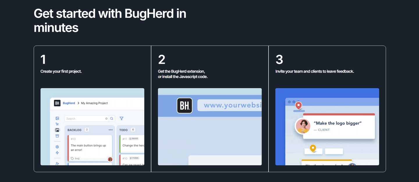
Across the scored examples below, the fast-setup sections share a discipline: they make the time commitment explicit and they keep the path short. Ramp opens on the effort objection ("new software shouldn't take a year to implement") and answers it with a Today, Day 5, Day 30 timeline and per-task minute claims like "connect ERP in five minutes." Finary's header, "Get started in 3 simple steps," frames the whole section as light, then its first step promises it "won't take more than three minutes." Saleshandy anchors with "What if it takes hours, and not 30 days" and an "under 10 minutes" setup; Mailwarm shrinks it further to an "easy 2-min setup." Plivo and Talknotes carry the same logic into AI products, promising to "go live with AI agents in minutes" and to "take notes in seconds." The common move is to name the number and keep the list to three or four single actions, so the section reads as fast at a glance.
To see the broader pattern, browse the full how-it-works section gallery, where these fast-setup sections sit alongside every other conversion best practice.
100/100 0/100
0/100The usual failure is a how-it-works section that explains the product but never names a timeframe, so the visitor still has no idea whether setup is ten minutes or ten weeks. The second is padding: a five or six step list with multi-part steps that makes the process look heavier than it is, the opposite of the intended effect. The third is hedging the speed claim into mush, where "quick and easy" replaces the specific "under 10 minutes" or "connect in five minutes" that the strongest sections commit to. Name a real number, keep the steps few and single-action, and let the effort language do its job.

Curated by
Gabriel Amzallag , Founder, Web Anatomy
5 years CRO + SEO at Qonto (2021–2025). After advising 15+ SaaS on their websites (Payfit, Pigment…), the same patterns kept breaking, so I decided to build the source of truth on what works on the web: the intelligence layer every tool, builder, and team uses to ship sites that perform.
Paste your URL. Get a scored analysis of your how-it-works section, including whether setup reads as fast and low-friction. Free, no signup.
The common questions about making onboarding steps feel fast and low-friction, with answers drawn from 50 scored examples.
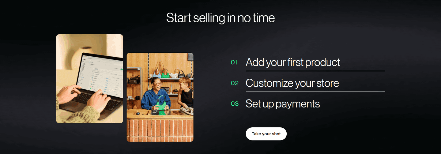
The strongest how-it-works sections make setup feel fast before a visitor commits. They break getting started into three or four short steps, attach a concrete timeframe like 'in minutes' or 'under 10 minutes', and lead with effort-cutting language. Finary's header 'Get started in 3 simple steps' with a step that 'won't take more than three minutes' is a clean version: the visitor reads it and believes they could be set up today.
Setup is the moment a visitor imagines the work between signing up and getting value, and a vague or heavy-looking process is where many leave. An onboarding-steps section that shows three short steps with minute-level timeframes shrinks that imagined work. When Saleshandy asks 'What if it takes hours, and not 30 days' and promises 'under 10 minutes' setup, it replaces a dreaded implementation with a number small enough to act on now.
Three is the most common and usually the right number, with four acceptable when each step is a single concrete action. Finary, Mailwarm, Shopify, and Cal.com all run three numbered steps. The point is not the exact count but that the list looks short and scannable. A section that reads as fast is one a visitor believes they can finish, so keep each step to one action and resist padding the list.
As specific as the product honestly allows, because a precise number is harder to dismiss than 'quick'. Ramp claims 'connect ERP in five minutes' and 'issue a card in one minute', Finary promises a step under three minutes, and Mailwarm advertises an 'easy 2-min setup'. Per-step minute claims and dated milestones like Ramp's Today, Day 5, Day 30 timeline make speed feel like a fact the visitor can plan around, not a marketing adjective.
A product tour shows what the product looks like; a fast-setup onboarding-steps section answers how little effort it takes to begin. Both can use the same screenshots, but the conversion job here is friction reduction. The copy leads with effort and time, like Plivo's 'go live with AI agents in minutes' and 'no code or complexity', so the steps argue that starting is easy, not just that the interface is nice.