
Value Proposition|
A visual-metaphor value proposition pairs each claim with an image that shows the benefit, a chart, a diagram, a product screenshot, or a distinct icon, so the point lands before the visitor reads a word.
Key takeaways
Showing 127–147 of 174 examples
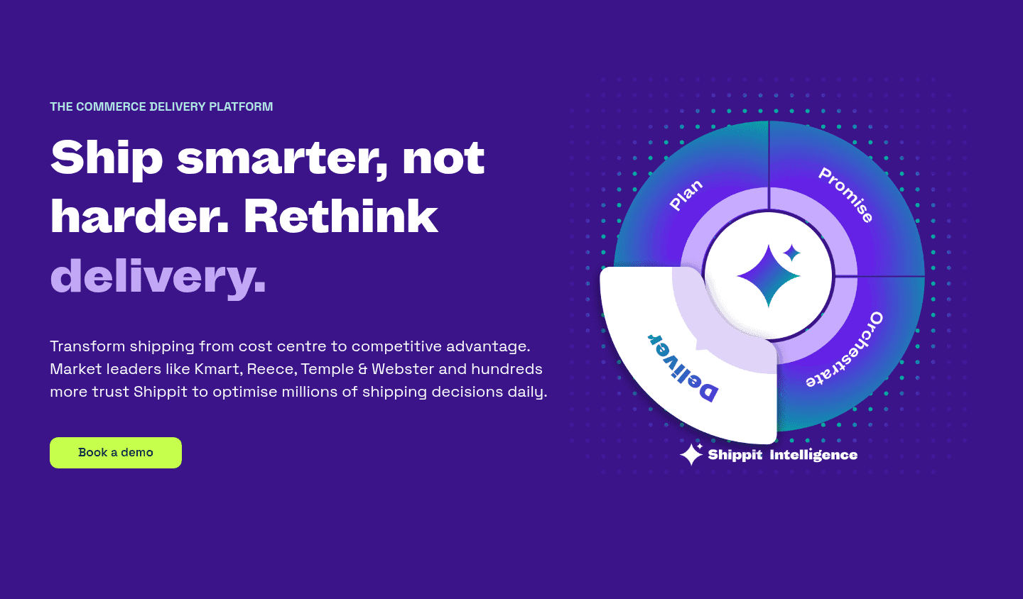
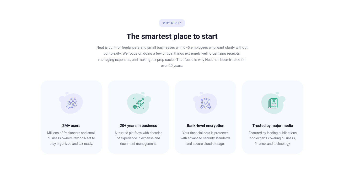
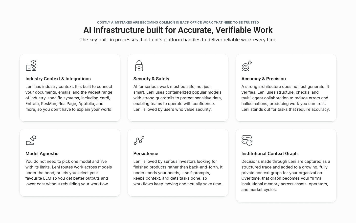
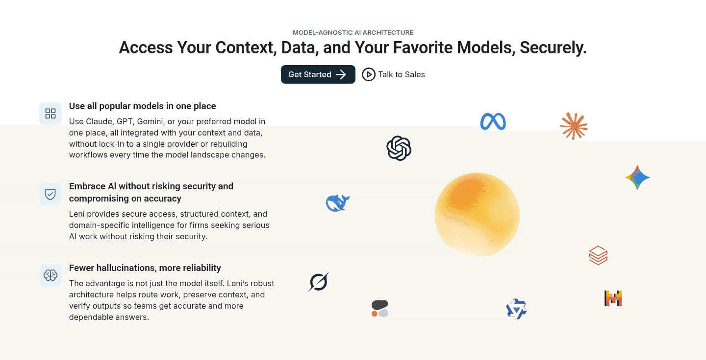
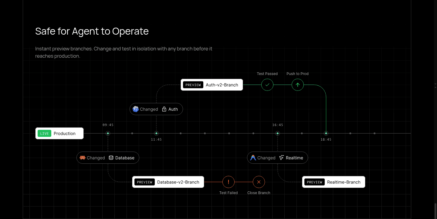
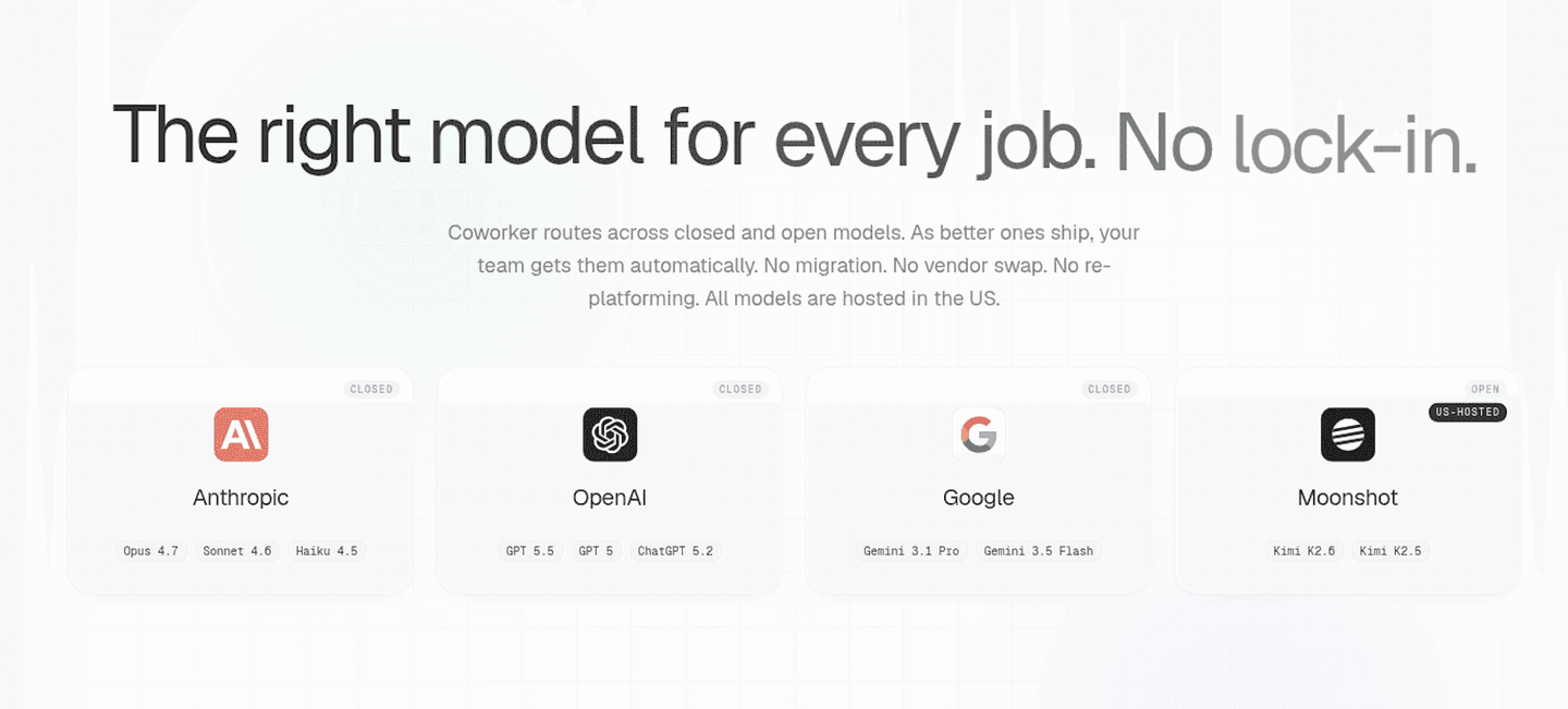
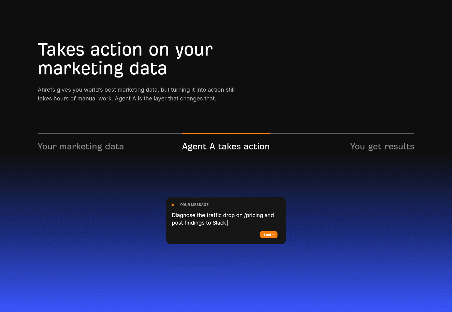
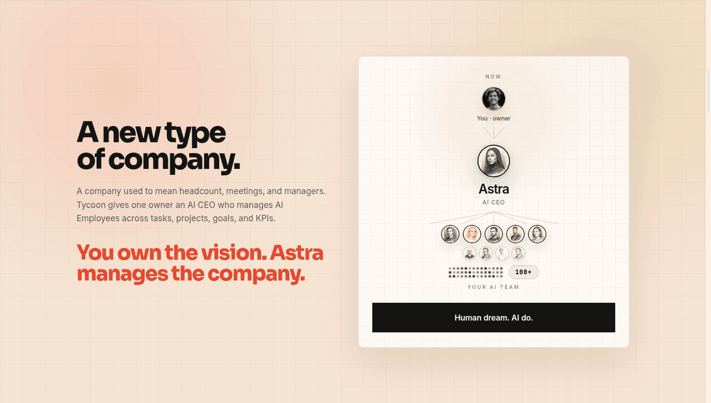

Browse every value proposition pattern by UX best practice.
Every value proposition section is scored across 6 conversion best practices. Copy the best practice stack, not the design. See what converts and why.
Hand-picked from 350+ companies and analyzed by our AI conversion agent. Not a random dump of homepages. Every entry earns its spot.
Found a value proposition you admire? Run yours through the same scoring engine. See where you stand on the same best practices, and what to fix first.
A visual metaphor in a value proposition is a purposeful image paired with each claim that shows the benefit, stated in a picture the eye can grasp before the reader parses a sentence. A section with only text asks the visitor to read every claim to understand it. A section with a visual metaphor lets the image do the first pass, so the point lands in a glance and the words become confirmation instead of work. The key word is purposeful: the visual has to carry the specific claim beside it, not sit next to it as decoration.
The best value proposition sections use the visual in one of a few forms:
Visitors scan a value proposition before they commit to reading it, and the eye processes an image far faster than a block of text. When the image actually carries the claim, the visitor gets the point in the first glance, before the paragraph has a chance to lose them. A wall of equally weighted text has no such shortcut, so the reader either does the work or leaves.
The visual also makes an abstract benefit believable. A claim like faster, cheaper, or global is easy to type and easy to discount. Koyeb backs each of its four claims with a matching diagram, a performance gauge, an autoscaling step chart, a latency world map, so the promise and its proof arrive at the same moment. The number stops being an assertion the visitor has to trust and becomes something the eye can verify on the page.
About 69% of the value proposition sections in our library pair their claims with a purposeful visual, so the pattern is common enough to expect and disciplined enough to separate the pages that show their value from the pages that only tell it. The version that works matches the visual to the claim. Attribuly's donuts show the exact lift each card promises, General Compute's side-by-side bar chart makes its throughput and power edge scannable, and Empromptu AI's Day 0 to Day 30 timeline turns a speed claim into a picture instead of an adjective. Where the value is the product itself, Theneo and Uscreen let real product UI stand in as the proof.
The visual lands hardest when the claim beside it is already sharp, so this pattern pairs naturally with a value prop that also names the mechanism behind each claim and puts a real number on each outcome. A chart of a vague benefit is still vague; a chart of a specific one is proof.
50/100 0/100
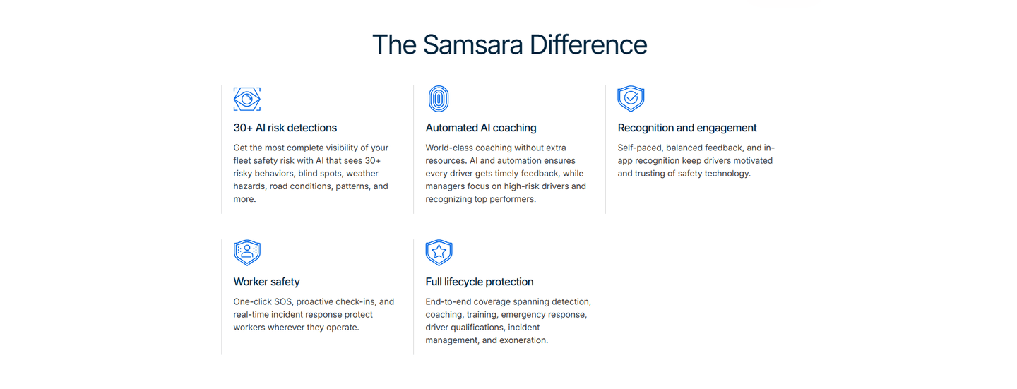
0/100The usual failure is decoration standing in for proof: a stock illustration, an abstract gradient blob, or a generic icon that could sit beside any claim and therefore shows none of them. The second is the visual that contradicts the scan, an image so busy or so unrelated that the eye has to stop and decode it, which is slower than reading the text it was meant to replace. The third is a grid of near-identical icons that adds color but no meaning, so the section looks visual without being clearer. The fix is the same in every case: make the picture do the work of the claim, so that removing the words would not remove the point.

Curated by
Gabriel Amzallag , Founder, Web Anatomy
5 years CRO + SEO at Qonto (2021–2025). After advising 15+ SaaS on their websites (Payfit, Pigment…), the same patterns kept breaking, so I decided to build the source of truth on what works on the web: the intelligence layer every tool, builder, and team uses to ship sites that perform.
Paste your URL. Get a scored analysis of your value proposition, including whether each claim is backed by a visual that shows it or by decoration. Free, no signup.
The common questions about pairing each value claim with a purposeful visual, with answers drawn from 174 scored examples.
It is a purposeful image paired with each claim that shows the benefit instead of decorating the page. A section with a visual metaphor gives the eye something to grasp before the reader parses a sentence, so the point lands faster and sticks longer. The visual usually takes one of four forms: a custom data visualization, an explanatory diagram, a real product screenshot, or a distinct icon per card. Attribuly does this with a custom data visual on every card, donuts, a channel journey graph, bar charts, and a funnel, so each card shows the lift it promises rather than restating it in text.
Visitors scan a value proposition before they read it, and an image is processed far faster than a paragraph. When the image actually carries the claim, the visitor understands the point in the first glance and the words become confirmation instead of work. It also makes an abstract benefit believable: General Compute turns hard-to-picture performance claims into a side-by-side bar chart and a comparison table, so the edge is something the eye can verify. Koyeb clarifies each of its four claims with a matching diagram, a performance gauge, an autoscaling step chart, a latency world map, so the promise and its proof arrive together.
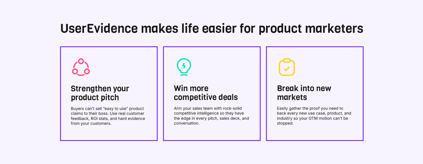
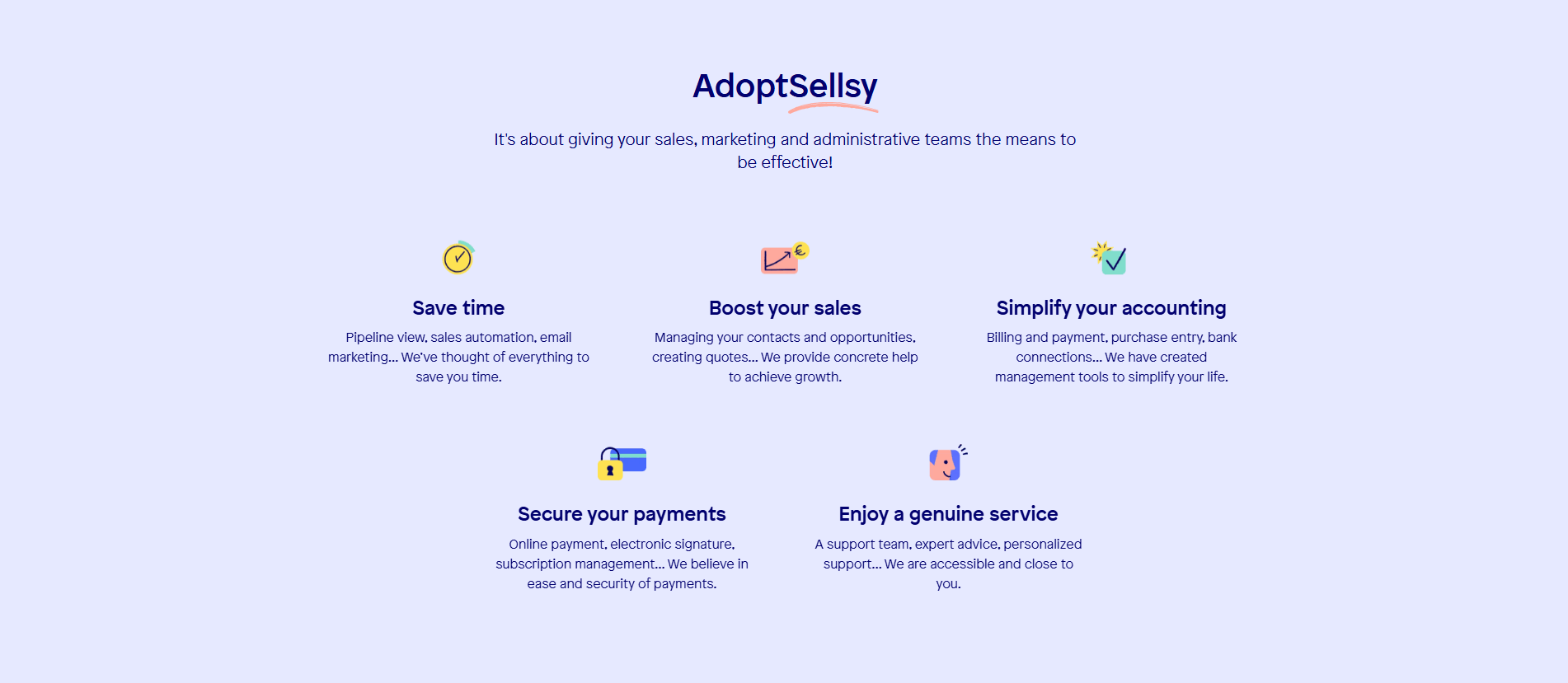
The strongest are the ones that explain, not the ones that decorate. A custom data visualization works when the claim is a number: Attribuly charts its lift and General Compute charts its edge. An explanatory diagram works when the value is a mechanism: Cledara visualizes management paired with payments, and DinMo shows a flow diagram of the data warehouse feeding out to named destinations. A distinct icon per card works when the section is a dense grid of benefits: Firma.dev gives each of six cards its own colored icon, and Appypie pairs a phone, database, lightning, rocket, shield, and money bag with its six props so the grid stays scannable.
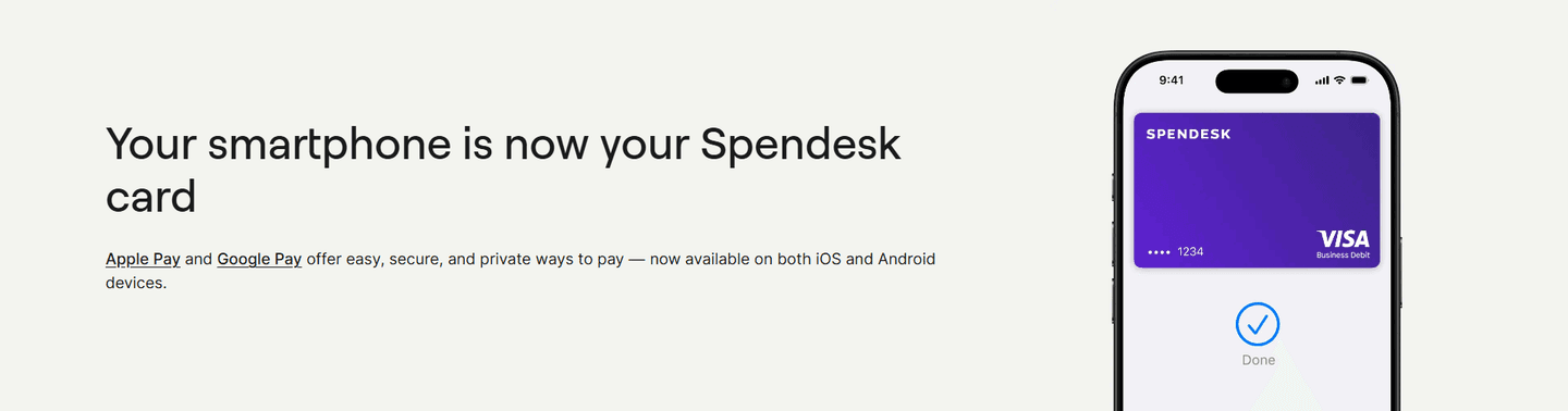
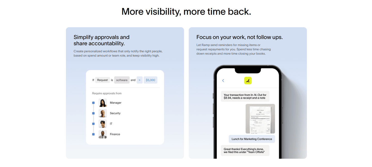
When the interface itself is the proof. An icon signals a category; a screenshot shows the thing working. Theneo uses a real customer's Doc Hub UI so the visual doubles as both the feature shot and the case-study proof. Uscreen pairs its props with real laptop and phone product UI as a metaphor for the unified content-and-community experience, and Deel backs its coverage claim with a currency selector UI and product entity badges. Reach for a screenshot when a buyer would believe the claim more after seeing the product than after seeing a symbol for it.
They make the visual answer the specific claim next to it rather than adding a generic illustration. The test is simple: if you removed the words, would the image still make the point? Attribuly's donuts show the exact lift, Koyeb's world map shows the global latency it claims, and Empromptu AI's Day 0 to Day 30 timeline shows the speed advantage instead of asserting it. A decorative visual fails that test, a purposeful one passes it, and the difference is whether the picture is doing work or filling space.