Value Proposition|
A multiple-propositions value proposition makes several distinct claims side by side, each standing on its own with its own proof, so a visitor who came for speed, for security, or for price all find the one reason that matters to them.
Key takeaways
Showing 1–21 of 275 examples









Browse every value proposition pattern by UX best practice.
Every value proposition section is scored across 6 conversion best practices. Copy the best practice stack, not the design. See what converts and why.
Hand-picked from 650+ companies and analyzed by our AI conversion agent. Not a random dump of homepages. Every entry earns its spot.
Found a value proposition you admire? Run yours through the same scoring engine. See where you stand on the same best practices, and what to fix first.
A multiple-propositions value proposition makes several distinct claims instead of one, each with its own headline and its own proof, laid out so a visitor can take them in at a glance. A single-claim section rests everything on one promise and hopes it is the one the visitor cares about. A multiple-proposition section covers several different reasons to buy in parallel, so the page speaks to more than one motive without making anyone read the whole thing.
The best value proposition sections present the set in one of a few forms:
A page meets one visitor at a time, but never the same visitor twice. One is there for speed, the next for security, the next for price. A section built on a single claim answers one of them and leaves the others wondering whether the product is really for them. Several distinct propositions let each visitor find the reason that matters to them, without hunting through copy aimed at someone else.
Distinct propositions also build a fuller case than one claim can carry. A single promise can be dismissed on sight, but a set of separate claims, each with its own proof, is harder to wave away, because dismissing the product now means dismissing several different reasons at once. Laid out as scannable cards or columns, they also match how people actually read a page, skimming for the one line that speaks to them and stopping there.
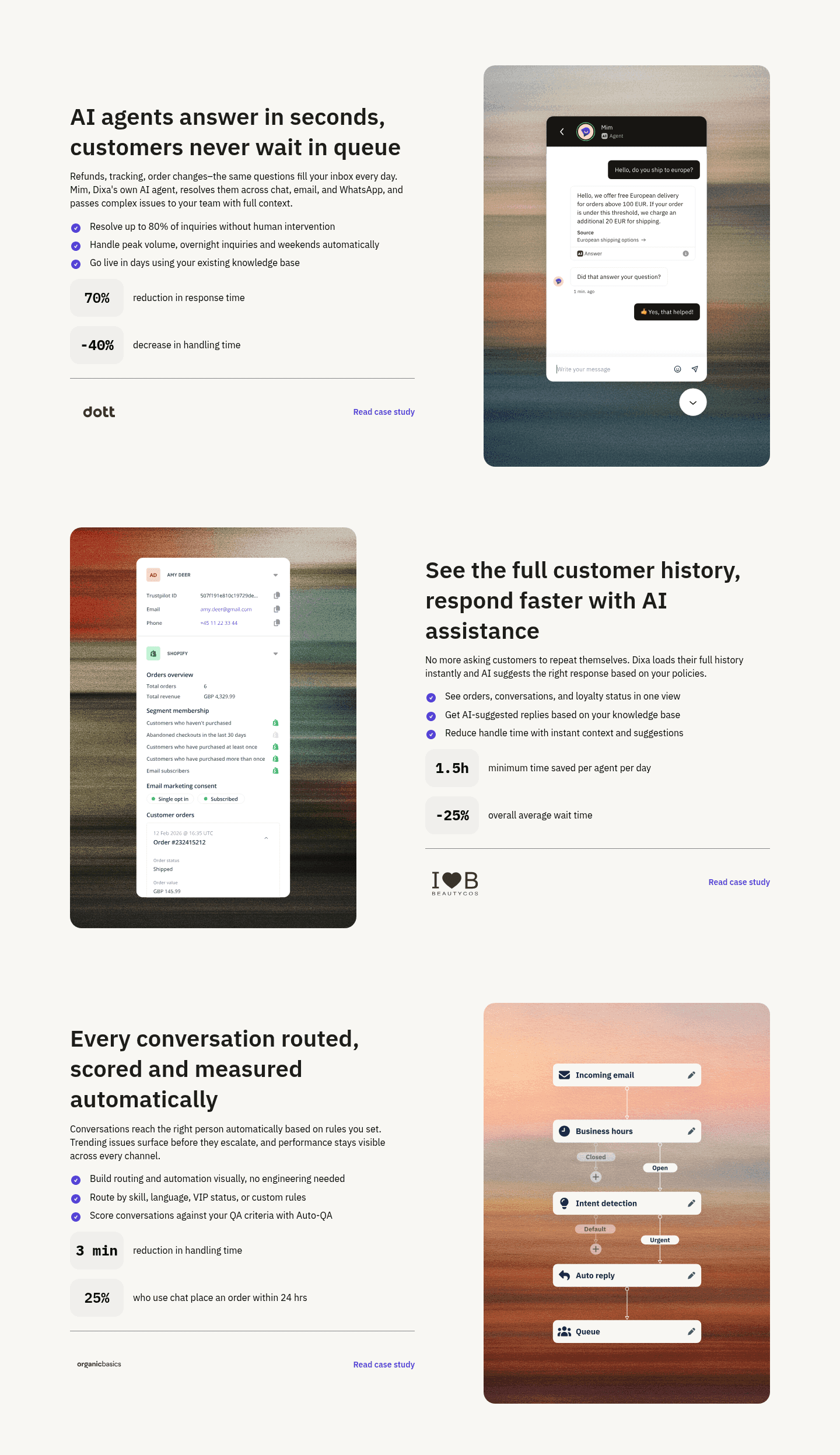
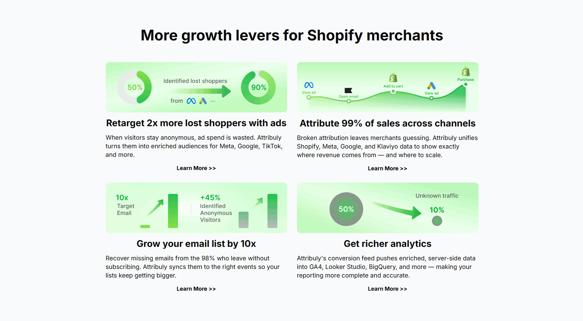
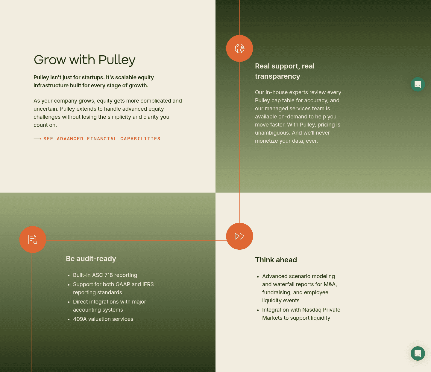
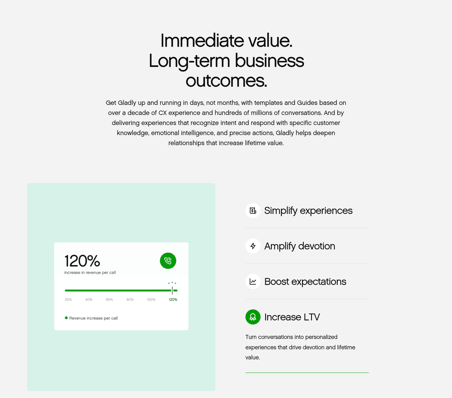
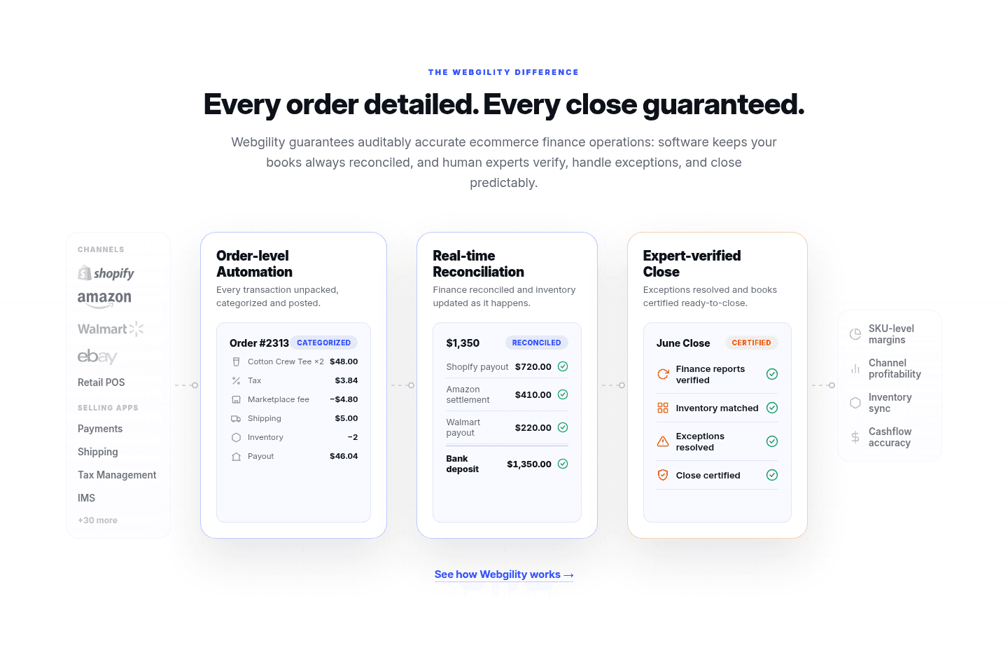
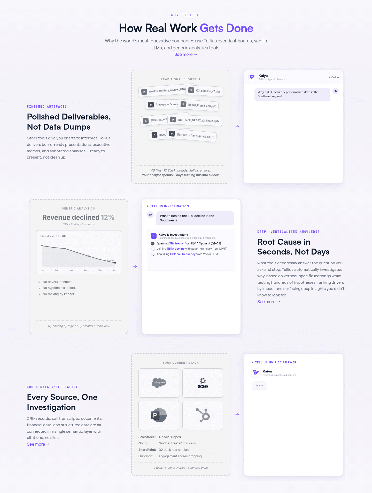
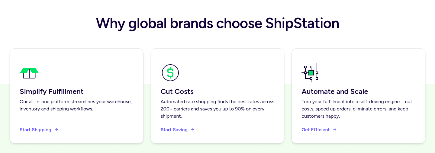
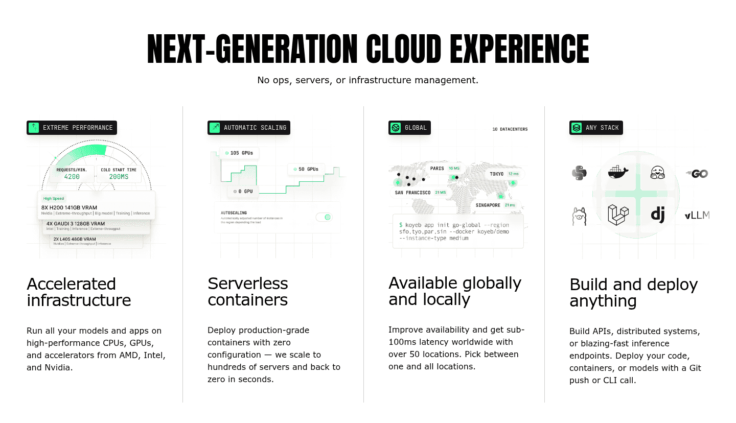
Nearly nine in ten value proposition sections in our library present more than one distinct claim, so the pattern is close to expected. What separates the strong from the weak is whether the propositions are genuinely different and whether each carries its own proof. Across the examples below, the disciplined version keeps every pillar a separate job. Dixa's three pillars, answer in seconds, full customer history, and automatic routing, each address a different part of support rather than restating one benefit. Attribuly runs four growth levers side by side, each headline carrying its own number and its own data visual. Samsara splits its story into three themed cards, and Koyeb gives each of four columns its own diagram and hard figure, so no card leans on the one beside it.
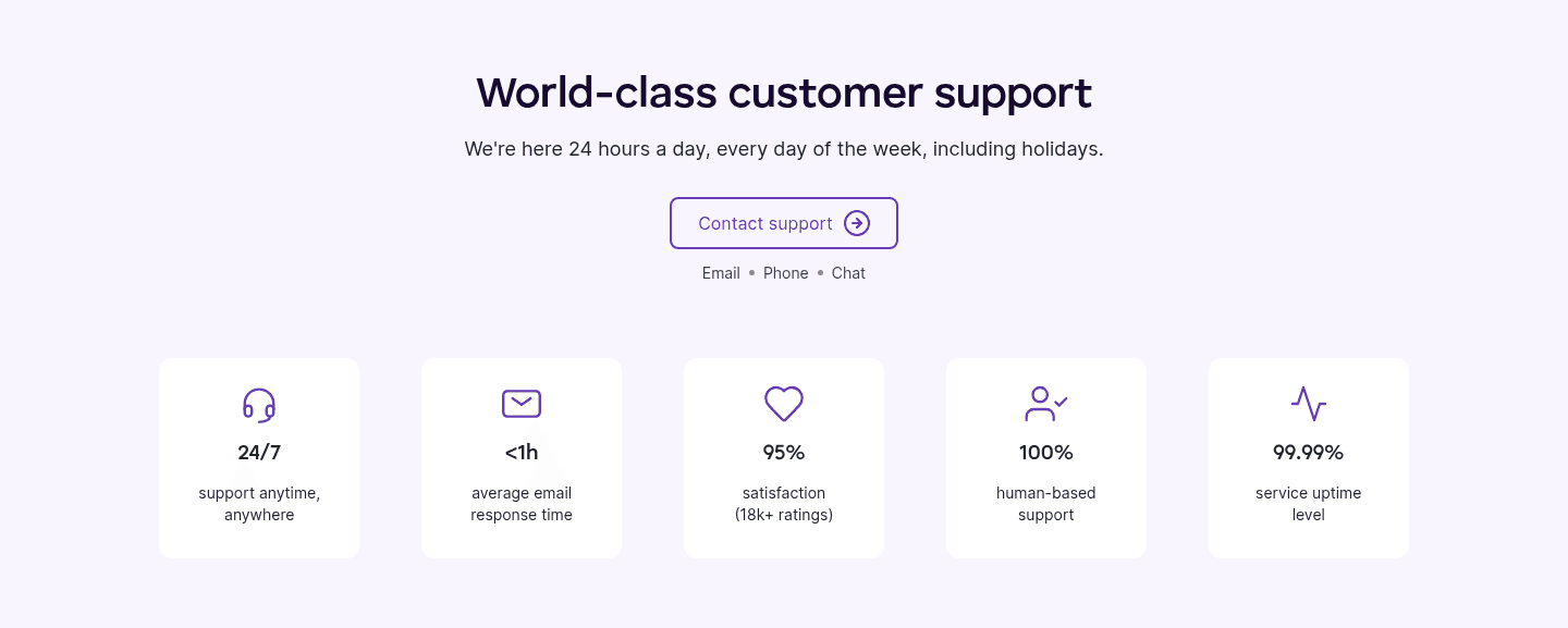
The strongest sets give every proposition its own evidence instead of a shared halo. A set of distinct claims lands hardest when each one puts a real number on its own outcome and offers its own path to dig deeper, the way Cledara ends each card with a Manage payments or Control purchasing link and Deel gives every column its own Learn more. A consistent icon or visual per card keeps the whole set scannable, so a visitor spots their pillar in a glance rather than reading the entire grid to find it.
100/100 0/100
0/100The usual failure is the same benefit reworded: three cards that all promise easy, powerful, and flexible in slightly different words, which reads as one proposition padded out to fill a grid rather than several distinct reasons to buy. The second is the pile with no proof, a row of bare adjectives where no card carries a number, a mechanism, or a visual, so the breadth impresses no one. The third is a set that all speaks to the same buyer, stacking three variations on speed while the visitor who came for security or price finds nothing addressed to them. Make each proposition a genuinely different job, give every one its own proof, and cover the concerns that different buyers actually arrive with.

Curated by
Gabriel Amzallag , Founder, Web Anatomy
5 years CRO + SEO at Qonto (2021–2025). After advising 15+ SaaS on their websites (Payfit, Pigment…), the same patterns kept breaking, so I decided to build the source of truth on what works on the web: the intelligence layer every tool, builder, and team uses to ship sites that perform.
Paste your URL. Get a scored analysis of your value proposition, including whether it presents several distinct, proven claims or rests everything on one. Free, no signup.
The common questions about presenting several distinct value claims at once, with answers drawn from 275 scored examples.
It means the section makes several distinct value claims instead of one, each standing on its own with its own headline and proof. A single-claim section rests everything on one promise; a multiple-proposition section covers several different reasons to buy in parallel, laid out as cards, columns, or a stacked list. Samsara does this with three pillars, Safety, Efficiency, and Reliability, each listing its own capabilities. Ruul spreads seven distinct props across a bento grid, from one-day payout to coverage across 190 countries, so the breadth of the offer is visible at a glance.
Because no two visitors want the same thing. One arrives for speed, another for security, another for price, and a page built on a single claim answers only one of them. Several distinct propositions let each visitor find the reason that matters to them without reading the whole page. They also build a fuller case: a set of separate claims, each with its own proof, is harder to wave away than one promise. Dixa gives three separate pillars, each carrying its own metric, and Attribuly runs four growth levers, each with its own number and its own data visual, so a merchant who only cares about growing an email list still sees a reason aimed squarely at them.
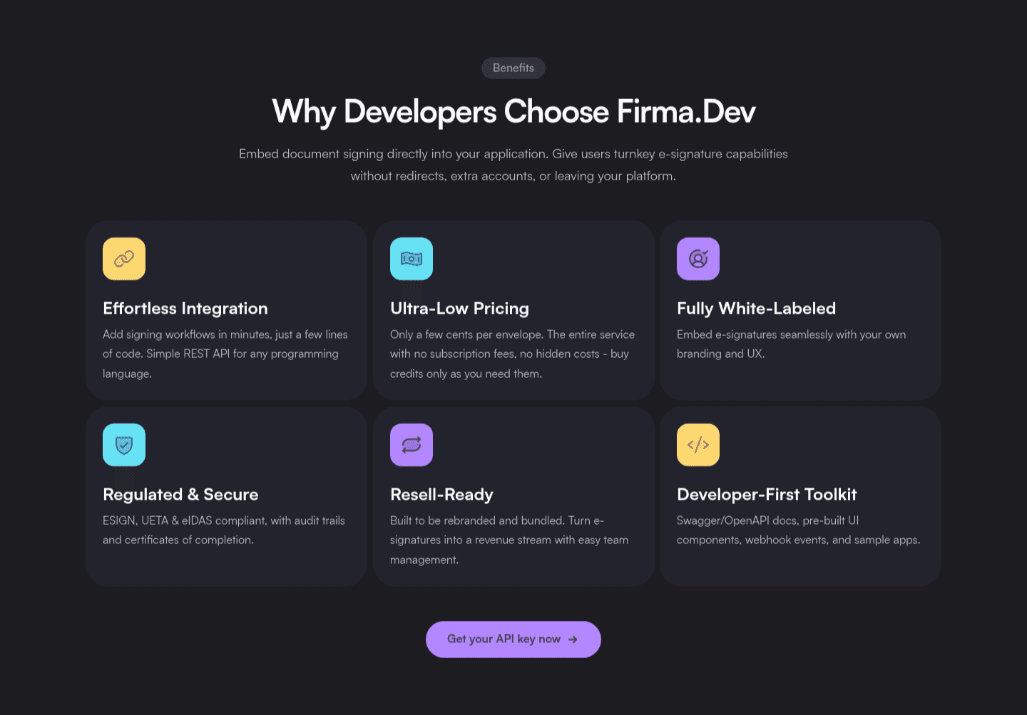
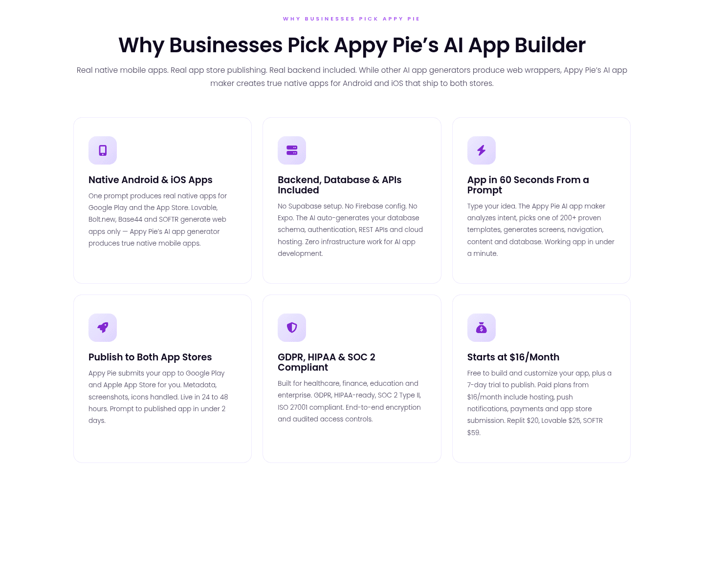
Enough to cover the different reasons buyers arrive with, without turning the section into noise. Across the library the range runs from two to seven: Qonto and Mintlify use two clean, well-proven props; Dixa, Samsara, and Cledara settle on three; Koyeb, Deel, and Finary use four; Firma.dev and Appypie run six. The number matters less than the discipline. Every proposition should be a genuinely different job and carry its own proof. Two distinct, well-supported claims beat six that restate the same benefit in different words.
Two things: each proposition is genuinely distinct, and each carries its own proof. Distinct means a different job rather than the same benefit reworded, the way Deel separates currency coverage, AI hiring, local experts, and a single payroll engine into four claims that do not overlap. Proof means a number, a mechanism, or a visual on every card, not a bare adjective. Koyeb pairs each of its four columns with a diagram and a hard figure, and Cledara ends each card with a deep-dive link so a buyer can act on the one that fits. A wall of features is a long list with no separation and no evidence; distinct propositions are a short set of separate, proven reasons.
Usually just below the hero, as the first block that explains why the product is worth a closer look, laid out as a card grid or a row of columns so the whole set is scannable at once. The best versions give each proposition a consistent icon or visual so a visitor can spot their pillar in a glance, and often a link on each card, the way Samsara and Deel add a Learn more under every one, so a buyer who came for a single reason can dig straight into it.
