Use Cases|
Navigation clarity lets each visitor pick their own role or scenario and land on the outcome that matches them, instead of reading one benefit written for everyone.
Key takeaways
Showing 43–63 of 64 examples
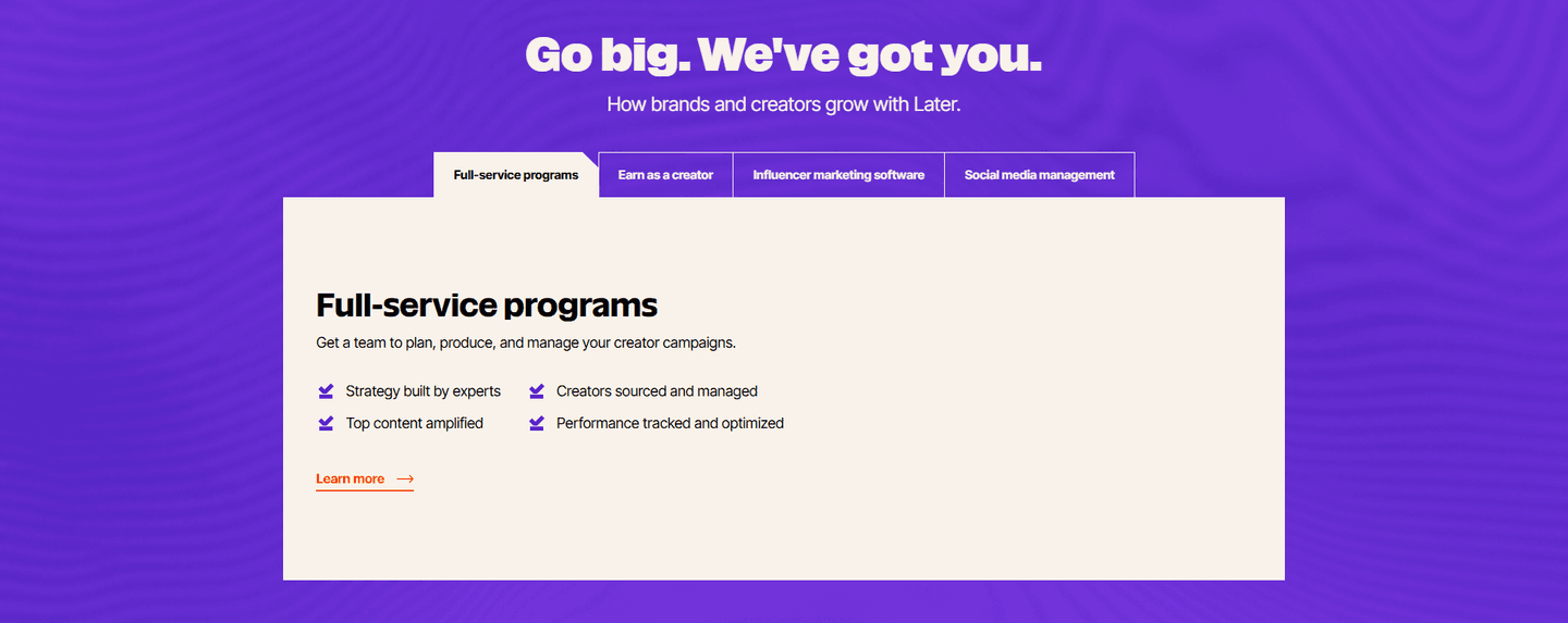
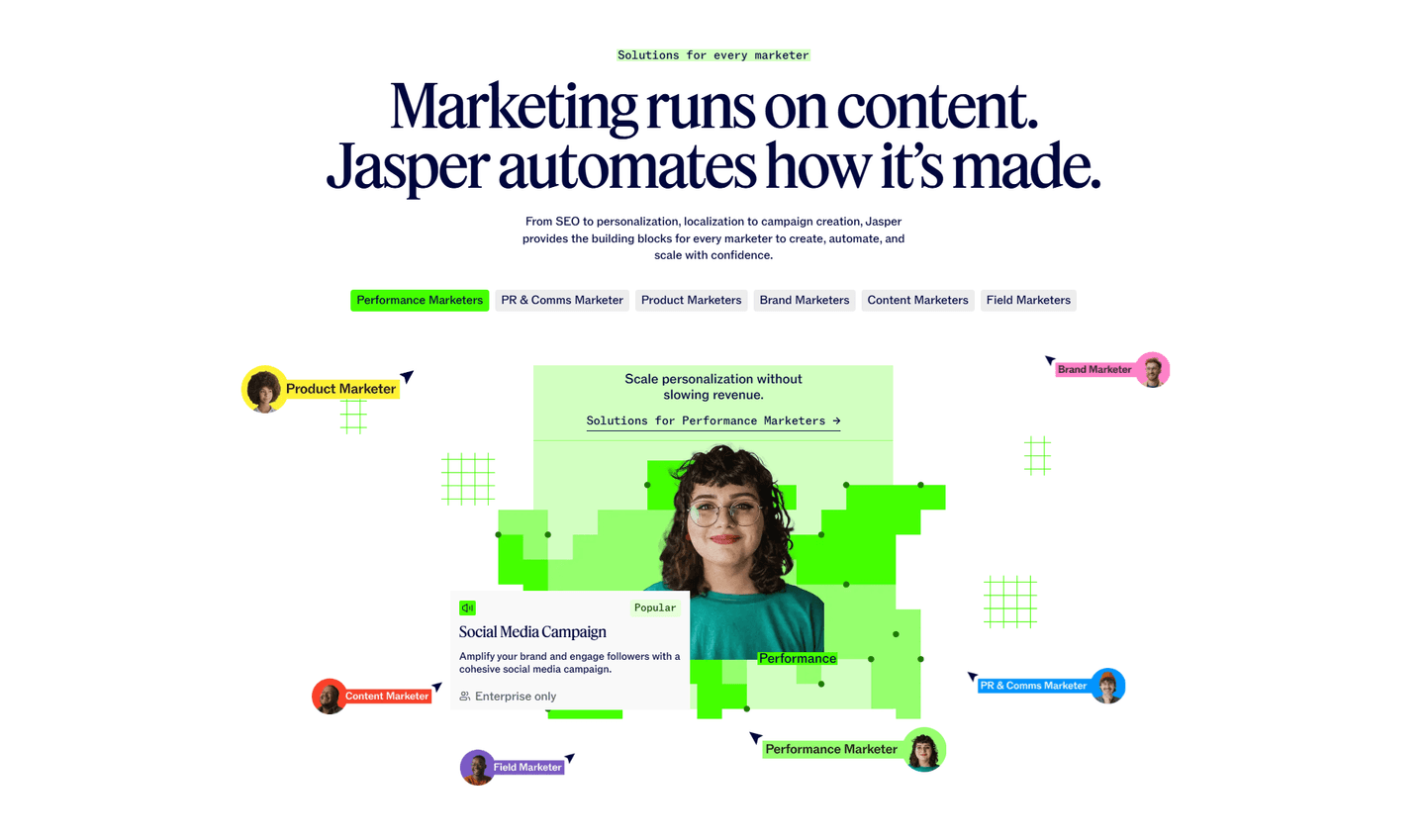

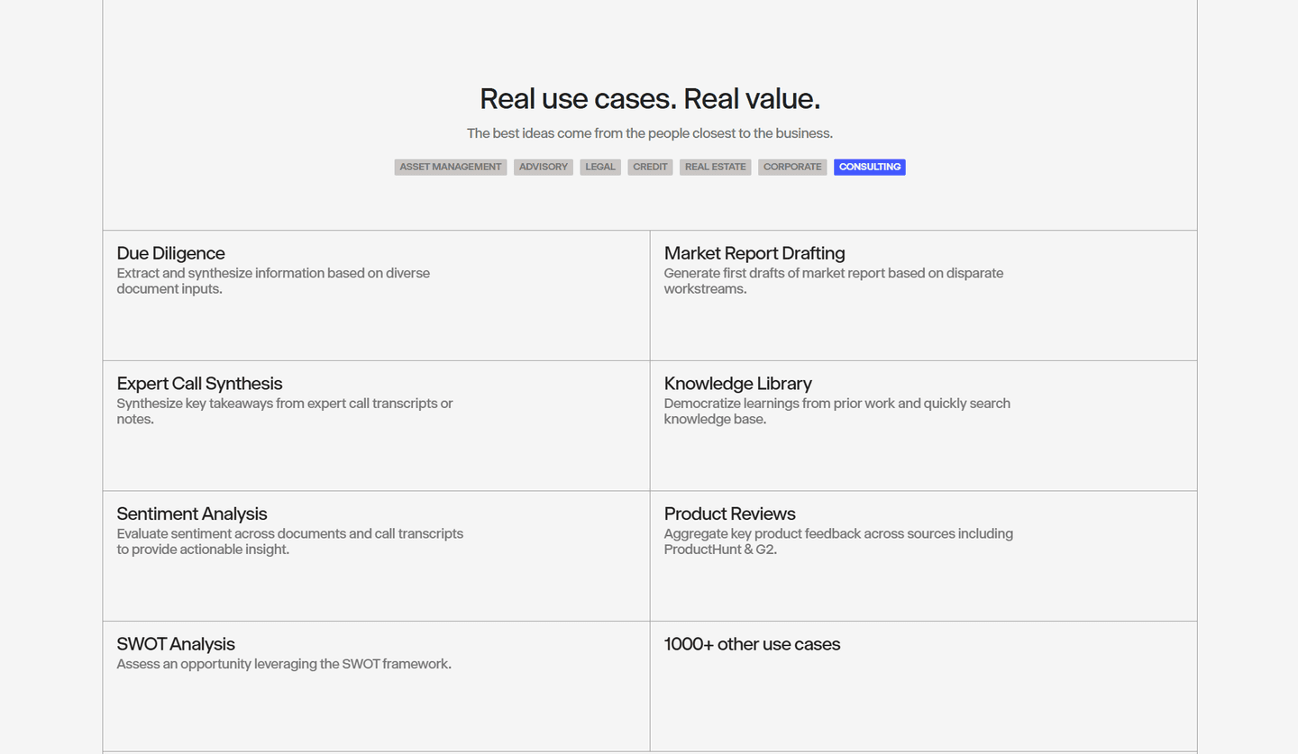
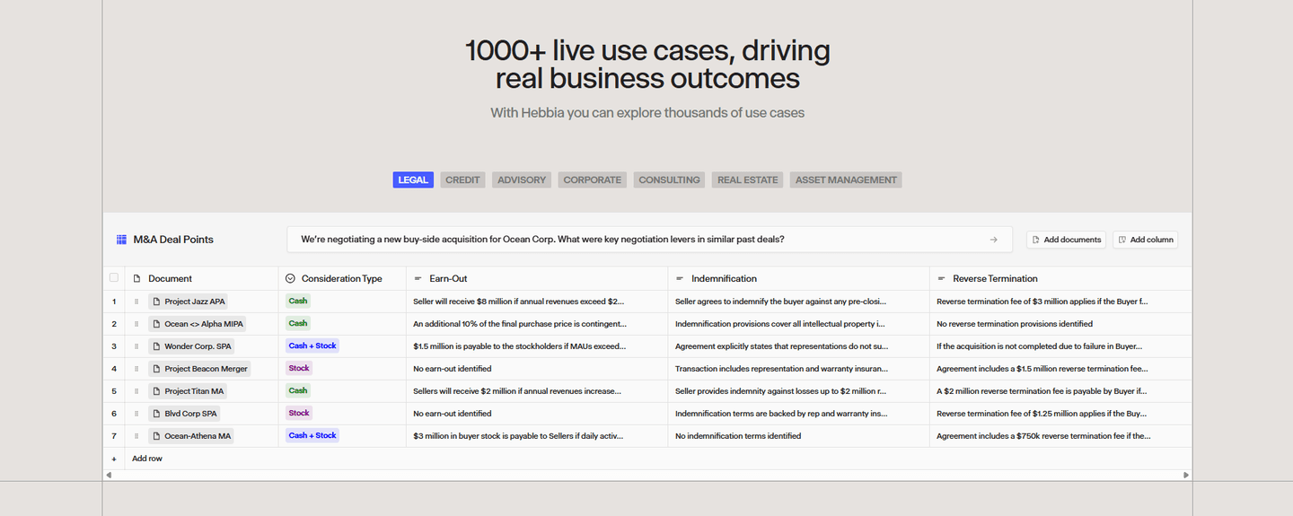
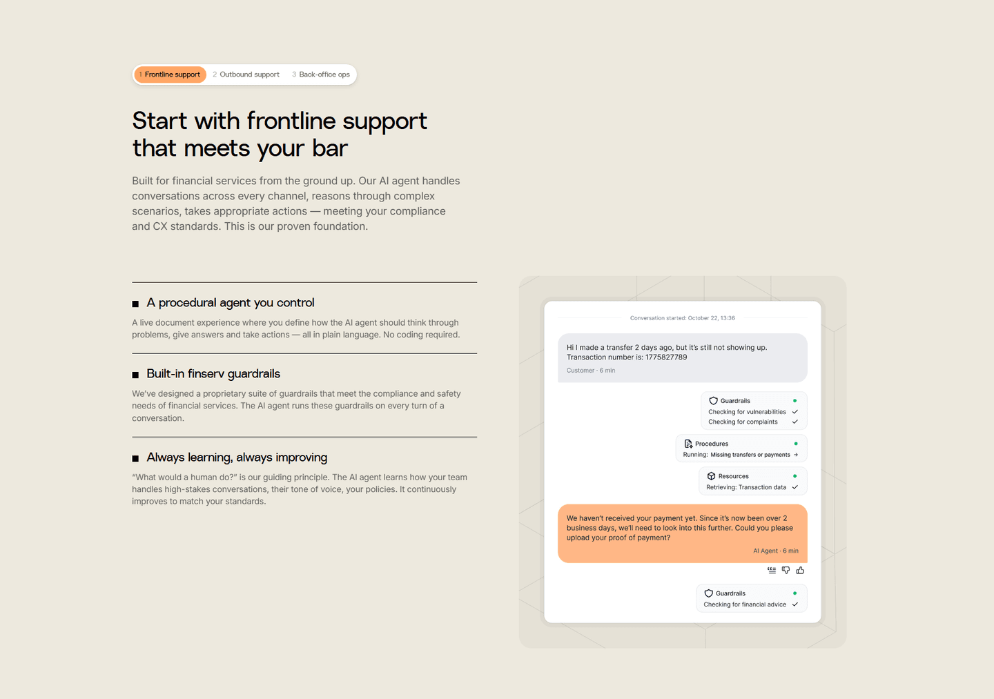
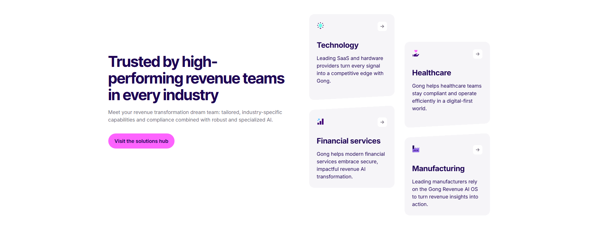
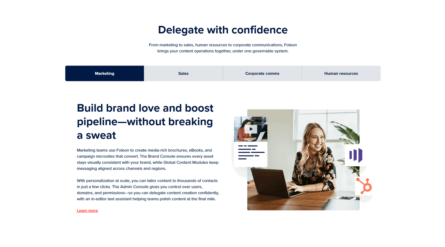
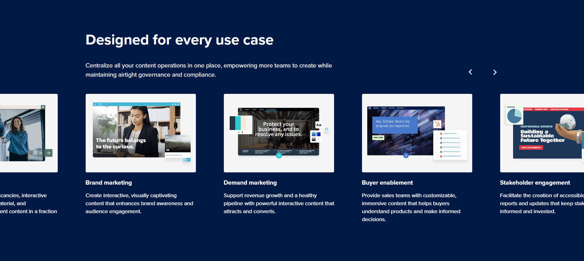
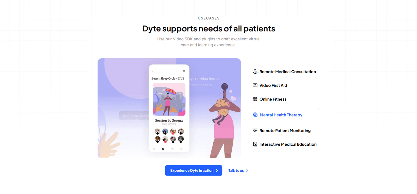
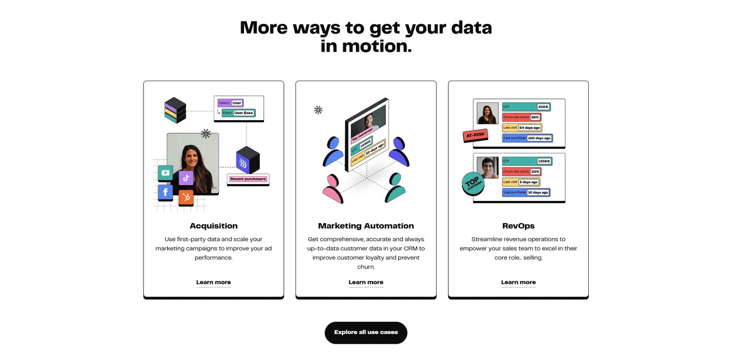
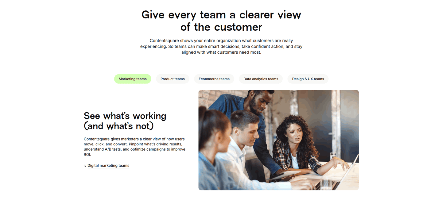
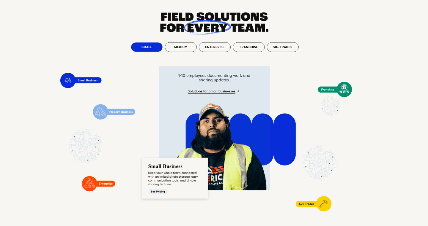
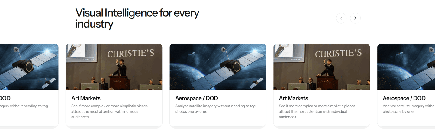
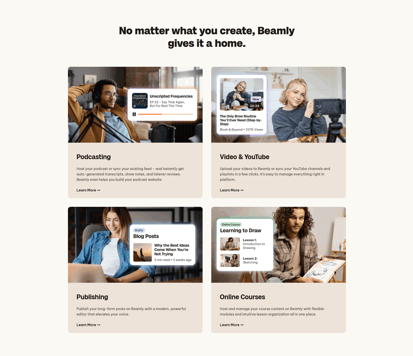
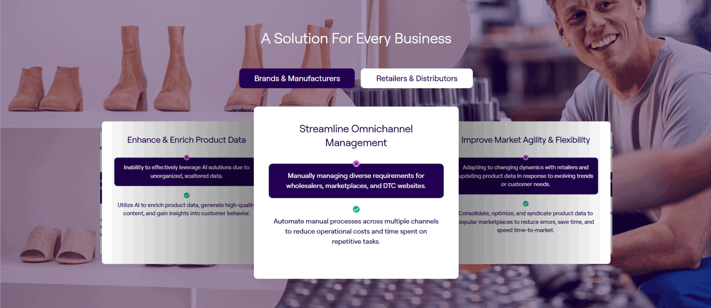
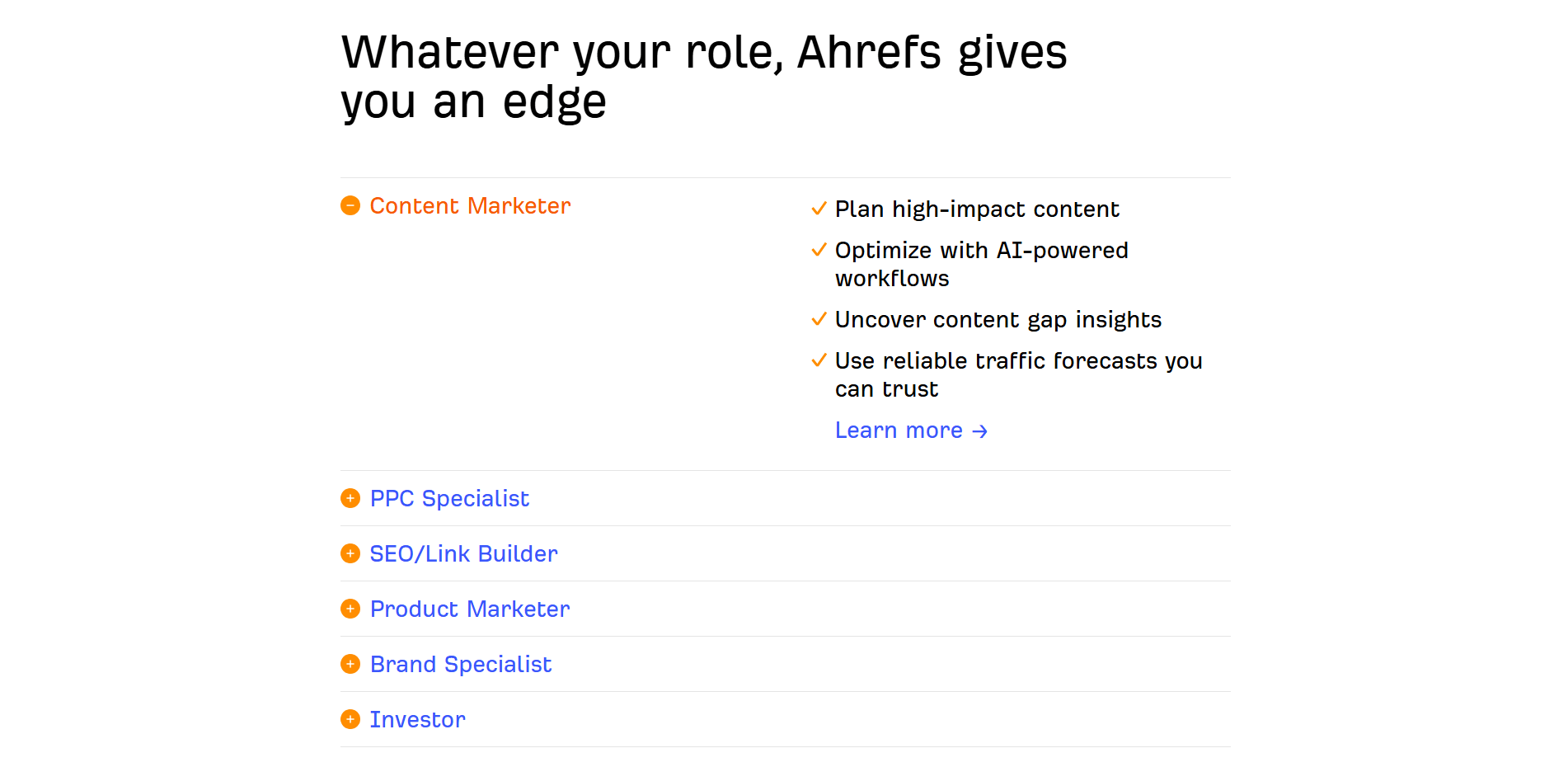
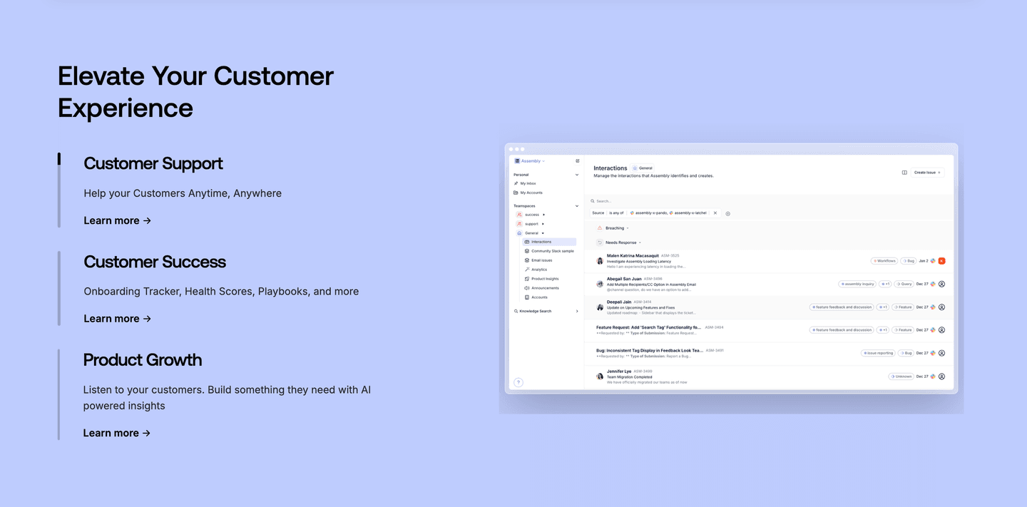
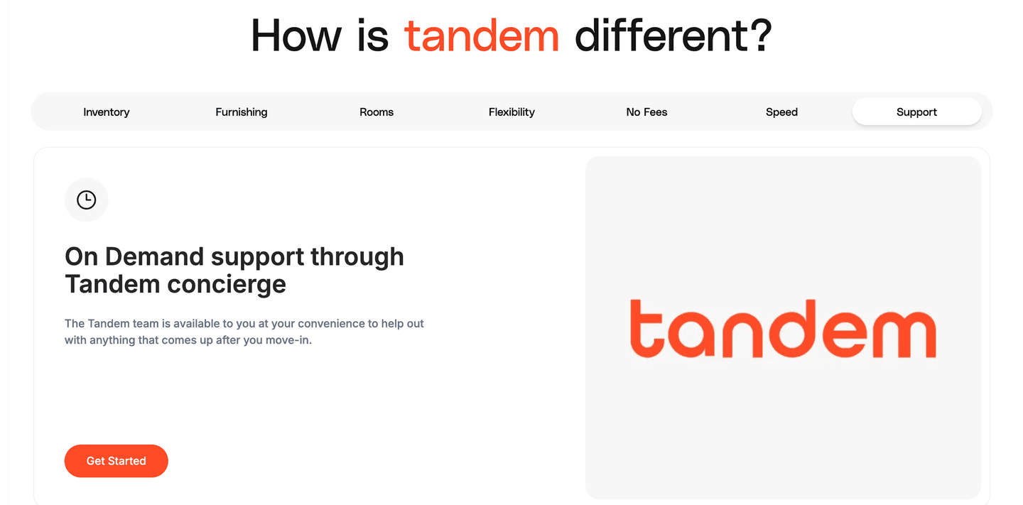
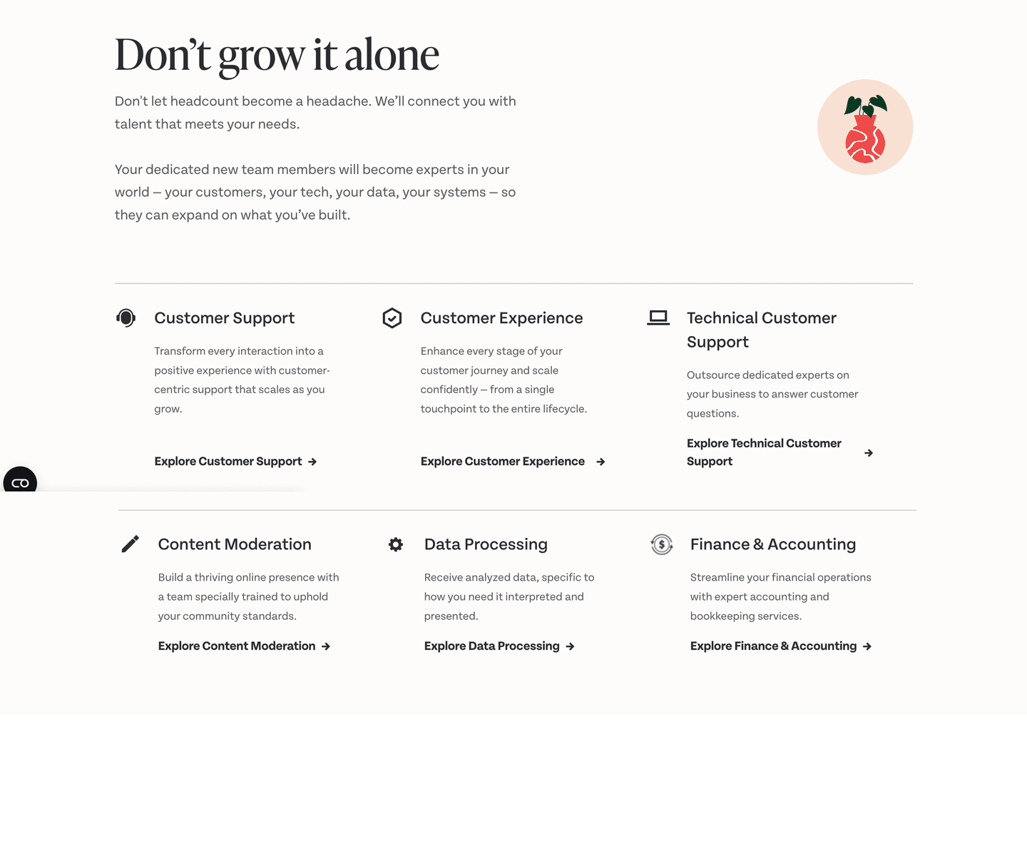
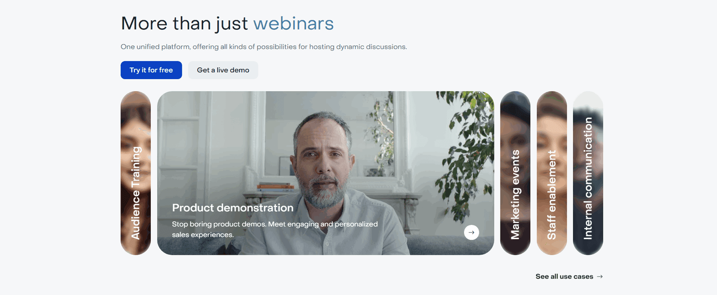
Every use case section is scored across 5 conversion best practices. Copy the best practice stack, not the design. See what converts and why.
Hand-picked from 350+ companies and analyzed by our AI conversion agent. Not a random dump of homepages. Every entry earns its spot.
Found a use case section you admire? Run yours through the same scoring engine. See where you stand on the same best practices, and what to fix first.
Navigation clarity is the decision to let a visitor pick their own role, team, or scenario, so the section shows them the version built for them instead of one benefit written for the whole audience. The section stops being a wall of copy everyone has to read and becomes a short menu where each visitor taps the one path that is theirs.
The best use-cases sections use one of a few forms, and the strongest often combine two:
A page has one hero and one headline, but it rarely has one visitor. A finance leader, an agency owner, and a solo founder each arrive with a different job in mind, and a single generic benefit speaks fully to none of them. Letting a visitor self-select turns that around: instead of reading past three cases that are not theirs to reach the one that is, they tap their own role and see it first.
The clarity is the point. When the paths are clearly labeled and the active one is obvious, choosing costs almost nothing, and the reward is a section that suddenly reads as if it were written for that one person. A visitor who sees their own scenario, in their own words, is far likelier to keep going than one handed a message built for everyone. You can see the whole spread in the full use-cases section gallery.
Roughly seven in ten of the scored use-cases sections in our library let the visitor self-select. Across the examples below, the version that works shares three habits.
The current choice is never in doubt. Amplitude darkens the active team tab, Pitch underlines the active persona, and Agent A by Ahrefs highlights the active row in its left persona nav, so a visitor always knows where they are and that switching is possible.
Each path leads somewhere different. Hive opens every "I am a" tab on its own number instead of a shared claim, Oneflow gives each department card its own one-line job, and Yousign pairs each of its twelve industry tiles with a distinct outcome, so the section reads as breadth rather than one message repeated.
And the labels name the visitor, not the feature. Texau labels its cards Agency owners, Founders, SDR and RevOps teams, and GTM engineers; Behiiv pairs an "I am a" grid with an "I want to" grid so people can enter by who they are or what they want. The visitor recognizes their own words before they read a line of copy.
60/100 20/100
The usual failure is a tab row or card grid where every path says the same thing, so self-selecting changes the label but not the promise, and the visitor learns nothing by clicking. The second is a selection with no visible active state, where a visitor cannot tell which use case they are looking at or that switching is even an option. The third is burying the choice under too many unlabeled options, or a carousel with no hint that more paths exist, so people never find their own lane. The sections that work name each audience plainly, make the active choice obvious, and give every path an outcome worth switching for.

Curated by
Gabriel Amzallag , Founder, Web Anatomy
5 years CRO + SEO at Qonto (2021–2025). After advising 15+ SaaS on their websites (Payfit, Pigment…), the same patterns kept breaking, so I decided to build the source of truth on what works on the web: the intelligence layer every tool, builder, and team uses to ship sites that perform.
Paste your URL. Get a scored analysis of your use-cases section, including whether visitors can self-select and land on the outcome that fits them. Free, no signup.
The common questions about letting visitors self-select in a use-cases section, with answers drawn from 64 scored examples.
It means the section lets a visitor self-select their own role, team, or scenario and go straight to the version built for them, rather than reading one benefit meant for everyone. The common forms are labeled tabs, selectable cards, and first-person lists. Amplitude, for example, splits its section into four team tabs (Product, Marketing, Data, Engineering), each with its own outcome line, so a visitor taps their team and sees the promise written for it.
A page has one hero but rarely one visitor. A finance leader, an agency owner, and a solo founder each arrive with a different job in mind, and a single benefit speaks fully to none of them. Self-selection does the sorting up front: instead of reading past three cases that are not theirs, a visitor taps their own role and sees it first, so the section reads as if it were written for that one person.
Three common ones. Labeled tabs, the way Ahrefs runs six persona tabs (Agencies, Content Marketers, Ecommerce, and more) so any visitor finds their role in a click. Selectable cards, the way Oneflow splits the section into department cards (Finance, Procurement, HR, Operations, Sales) so each buyer finds their lane. And first-person selectors, the way Hive uses 'I am an agency', 'I am a PMO', 'I am a marketer' tabs, or Behiiv pairs an 'I am a' grid with an 'I want to' grid so people enter by who they are or what they want.
Enough to cover the real audiences, few enough to scan in one pass. A short tab row, three to five cards, or a clearly labeled grid works well: Lattice uses four persona cards (Executives, HR Leaders, Managers, Employees), while Yousign lays out twelve labeled industry tiles for a section where the audience really is that wide. If the options run long, a carousel with visible arrows and a progress bar, as Oneflow does, signals that more paths exist and each costs one click.
Three things. Paths that all say the same thing, so switching changes the label but not the promise and the visitor learns nothing by clicking. A selection with no visible active state, so a visitor cannot tell which use case they are looking at or that switching is possible. And a choice that is buried under too many unlabeled options. The sections that work name each audience plainly, make the active choice obvious the way Amplitude's black active tab does, and give every path an outcome worth switching for.