
Integrations|
These integrations sections do more than show logos: each tool links to a dedicated page that explains how the integration actually works, so a buyer can confirm the one they depend on.
Key takeaways
Showing 22–42 of 57 examples




_integrations.png&w=1440&q=75)




Every integrations section is scored across 4 conversion best practices. Copy the best practice stack, not the design. See what converts and why.
Hand-picked from 650+ companies and analyzed by our AI conversion agent. Not a random dump of homepages. Every entry earns its spot.
Found an integrations section you admire? Run yours through the same scoring engine. See where you stand on the same best practices, and what to fix first.
Linking to an integration detail page is the decision to treat the integrations section as an entry point, not a destination. A logo grid tells the visitor a product connects to tools they recognize. A link behind those logos lets the visitor go one step further and find out how a specific integration actually works before they commit.
The best integrations sections use one of a few forms, sometimes more than one together:
A wall of logos answers a shallow question: does this connect to things I have heard of? The buyer who is close to a decision has a sharper one. They have a system of record, a billing tool, or a data warehouse that the product has to support well, and a logo alone does not tell them whether it does. A path to a detail page lets them check for themselves, which is exactly the reassurance a careful buyer needs before they will move forward.
The link also works as a signal. A company that publishes the mechanics of each integration, the fields it syncs and the workflows it enables, is telling the visitor the integration is real and maintained. A grid of logos with nowhere to click can read as decoration, and a skeptical buyer notices the difference.
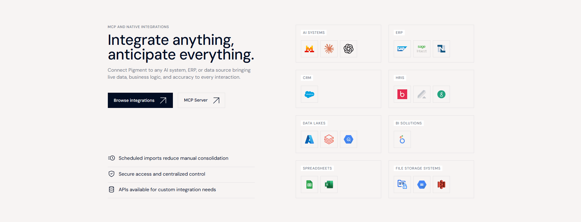
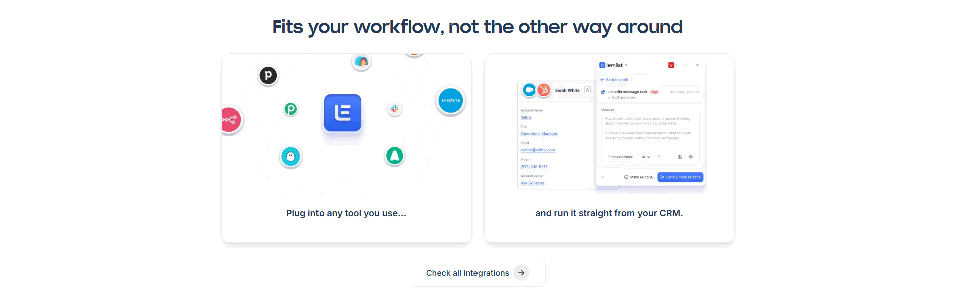
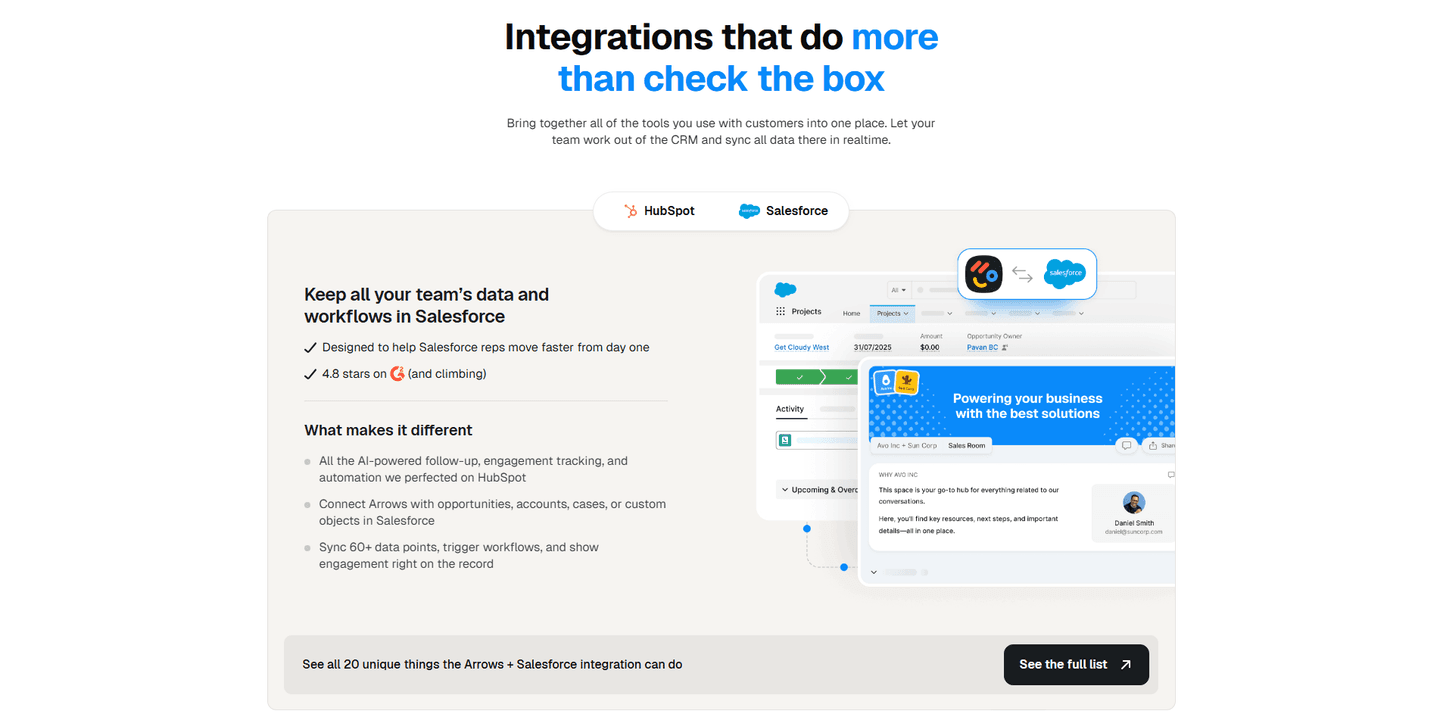
Roughly four in five of the scored integrations sections in our library give the visitor a path to deeper detail, whether a directory or a per-tool page. Across the examples below, the pattern that performs is making the path match the decision. Calendly and HubSpot pair a dense logo grid with a single View all integrations link, which fits products whose buyers mostly want to confirm breadth. Weld goes finer, adding category tabs and per-card View connector links so a visitor can jump straight to their own stack. Sendcloud makes both of its column headers clickable into full directories, and Arrows links out to a page that lists everything its Salesforce integration can do. In each case the homepage section earns the click and the detail page carries the depth.
If a specific integration is the reason a buyer is on the page, the section is only doing half its job until they can reach the page that proves it. Buyers who want to see the full set of patterns can browse every scored integrations section in the library.
75/100 0/100
0/100The usual failure is a logo wall with nowhere to go: a handsome grid of recognizable marks that the buyer cannot click, so the one tool their decision depends on stays unverified. The second failure is the opposite, dumping the entire connector catalog onto the homepage so the integrations that matter are buried and the visitor still has no clearer next step. The third is a link that leads nowhere useful, a View all button that opens a thin page with the same logos and no real detail. Show the tools that matter, and give the buyer a path to a page that actually proves the connection works.

Curated by
Gabriel Amzallag , Founder, Web Anatomy
5 years CRO + SEO at Qonto (2021–2025). After advising 15+ SaaS on their websites (Payfit, Pigment…), the same patterns kept breaking, so I decided to build the source of truth on what works on the web: the intelligence layer every tool, builder, and team uses to ship sites that perform.
Paste your URL. Get a scored analysis of your integrations section, including whether buyers can reach the detail they need. Free, no signup.
The common questions about linking an integrations section to deeper detail pages, with answers drawn from 57 scored examples.
It means the integrations section on the homepage does not stop at a grid of logos. Each tool, or the section as a whole, links to a dedicated page that explains how that specific integration works: what it syncs, which workflows it supports, and how to set it up. The most common forms are a single View all integrations button to a searchable directory, per-logo links to individual connector pages, and category tabs that filter the list down to a buyer's own stack.
A wall of logos answers one question: does this product connect to tools I recognize? It cannot answer the question a serious buyer actually has, which is whether the one tool they depend on is supported well. A link to a detail page lets that buyer check for themselves before committing. It also signals confidence: a company that publishes the specifics of each integration is telling the visitor the integration is real and maintained, not a logo added for decoration.
The specifics a buyer needs to trust it: what data flows in each direction, which triggers and actions are available, setup steps, and any limits. The strongest pages pair that with a concrete workflow, for example syncing contacts and deals or triggering a message from a CRM, so the visitor sees the payoff and not only a feature list. Named proof such as a review score or a count of supported actions helps confirm the integration is used and maintained.
Wherever the visitor is already looking at the tool they care about. A section-level link, such as View all integrations or Explore the marketplace, works when the goal is to send buyers into a full directory. Per-logo or per-card links work better when specific integrations carry the decision, because the buyer can click straight from the tool they use to the page that proves it is supported.
Enough to signal breadth without turning the homepage into a directory. A handful of the most recognizable logos, or the categories that matter most to the target buyer, plus a clear link to the rest is the usual balance. The homepage section earns the click; the detail page or directory carries the depth. Showing every connector on the homepage buries the ones that matter and gives the visitor nowhere new to go.