
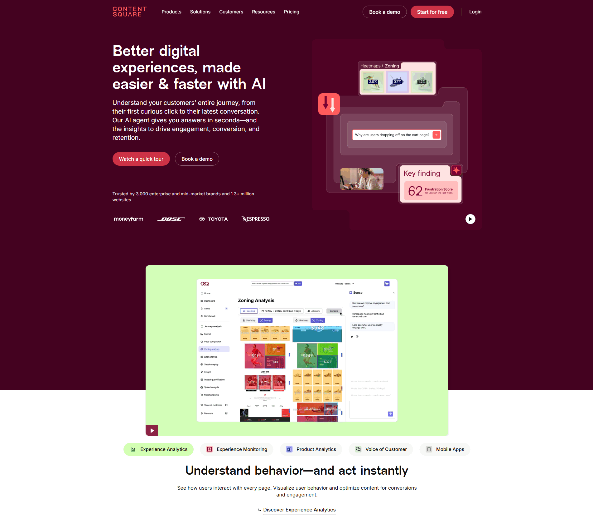
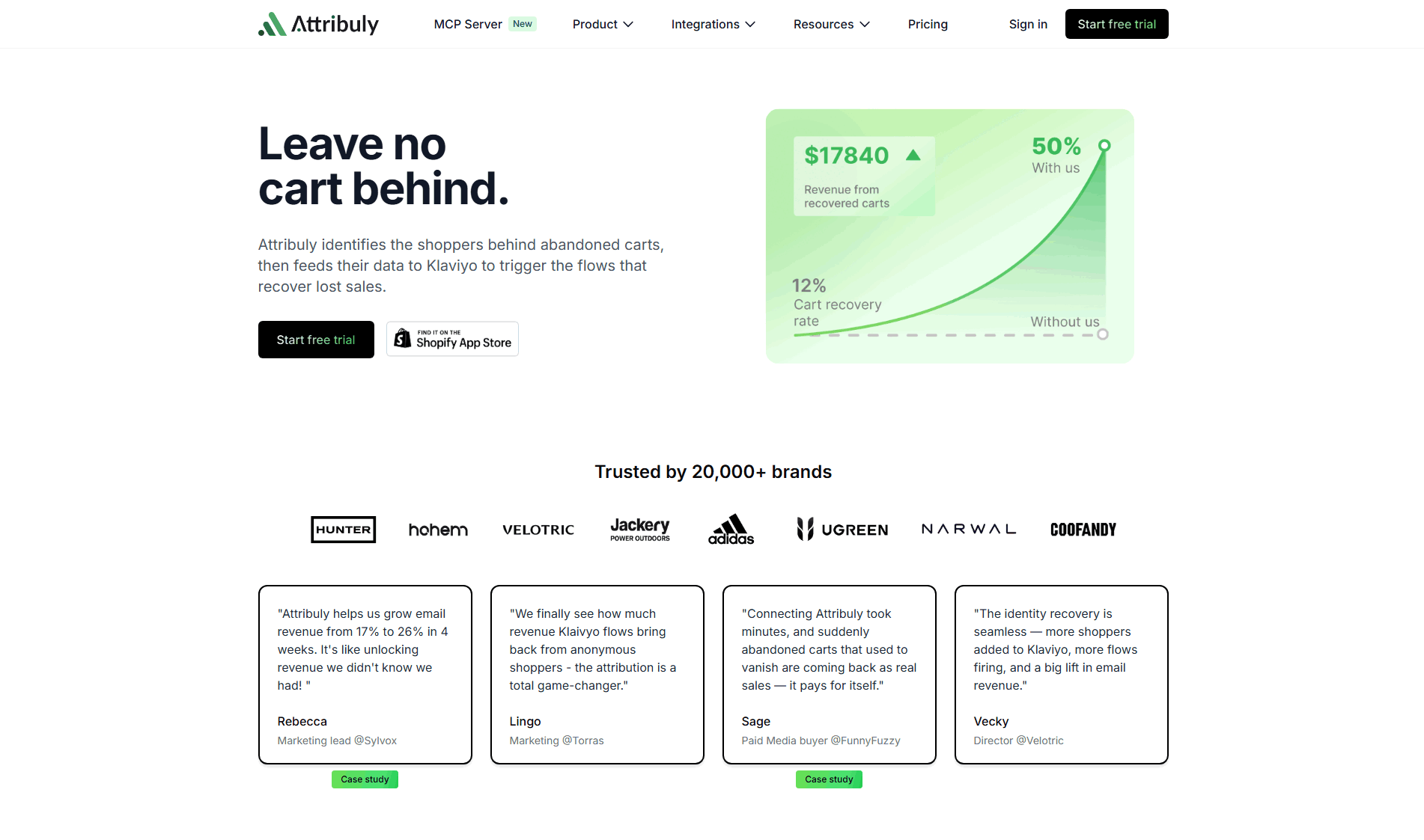
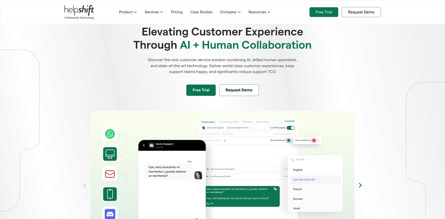
Hero|
A secondary CTA path gives the hero two next steps instead of one, so a self-serve visitor and a sales-assisted buyer each find the action that fits them.
Key takeaways
Showing 64–84 of 177 examples


_hero.png&w=1440&q=75)


Browse every hero pattern by UX best practice, or jump to an industry view.
Every hero section is scored across 6 conversion best practices. Copy the best practice stack, not the design. See what converts and why.
Hand-picked from 350+ companies and analyzed by our AI conversion agent. Not a random dump of homepages. Every entry earns its spot.
Found a hero you admire? Run yours through the same scoring engine. See where you stand on the same best practices, and what to fix first.
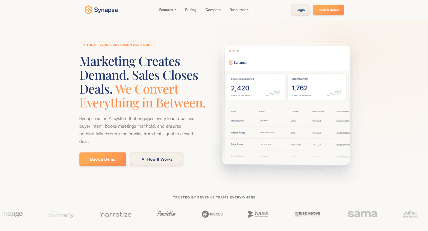
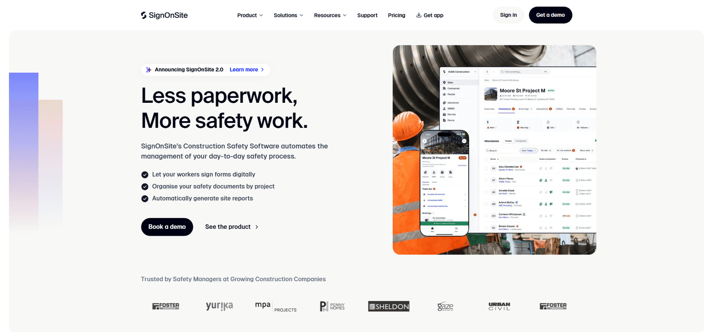
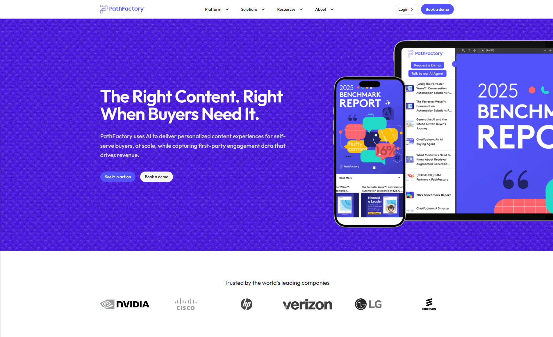
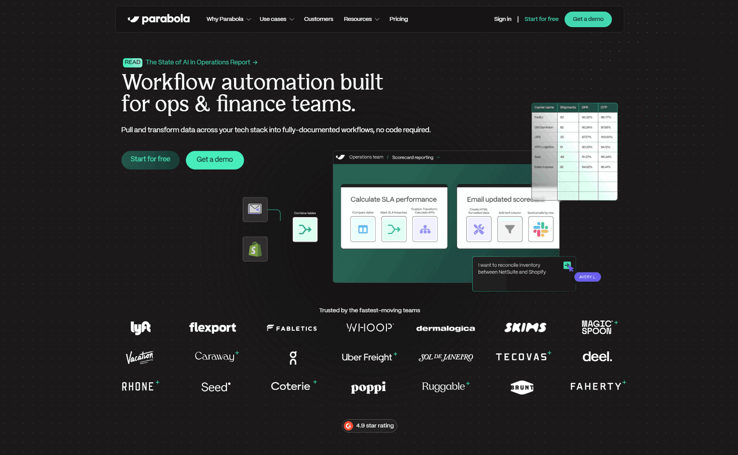
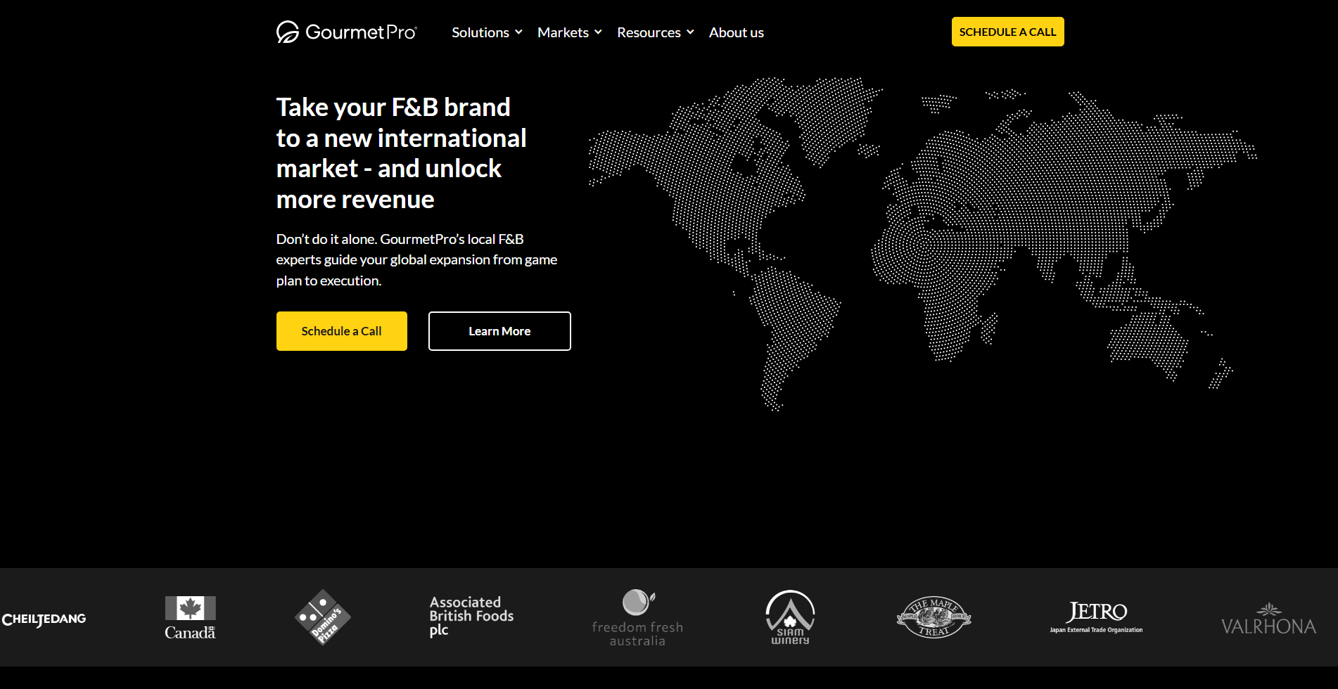
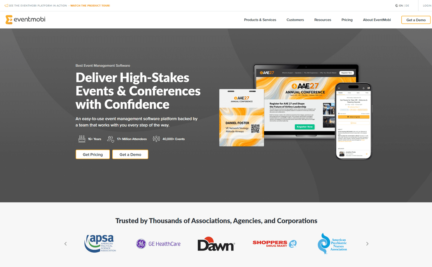
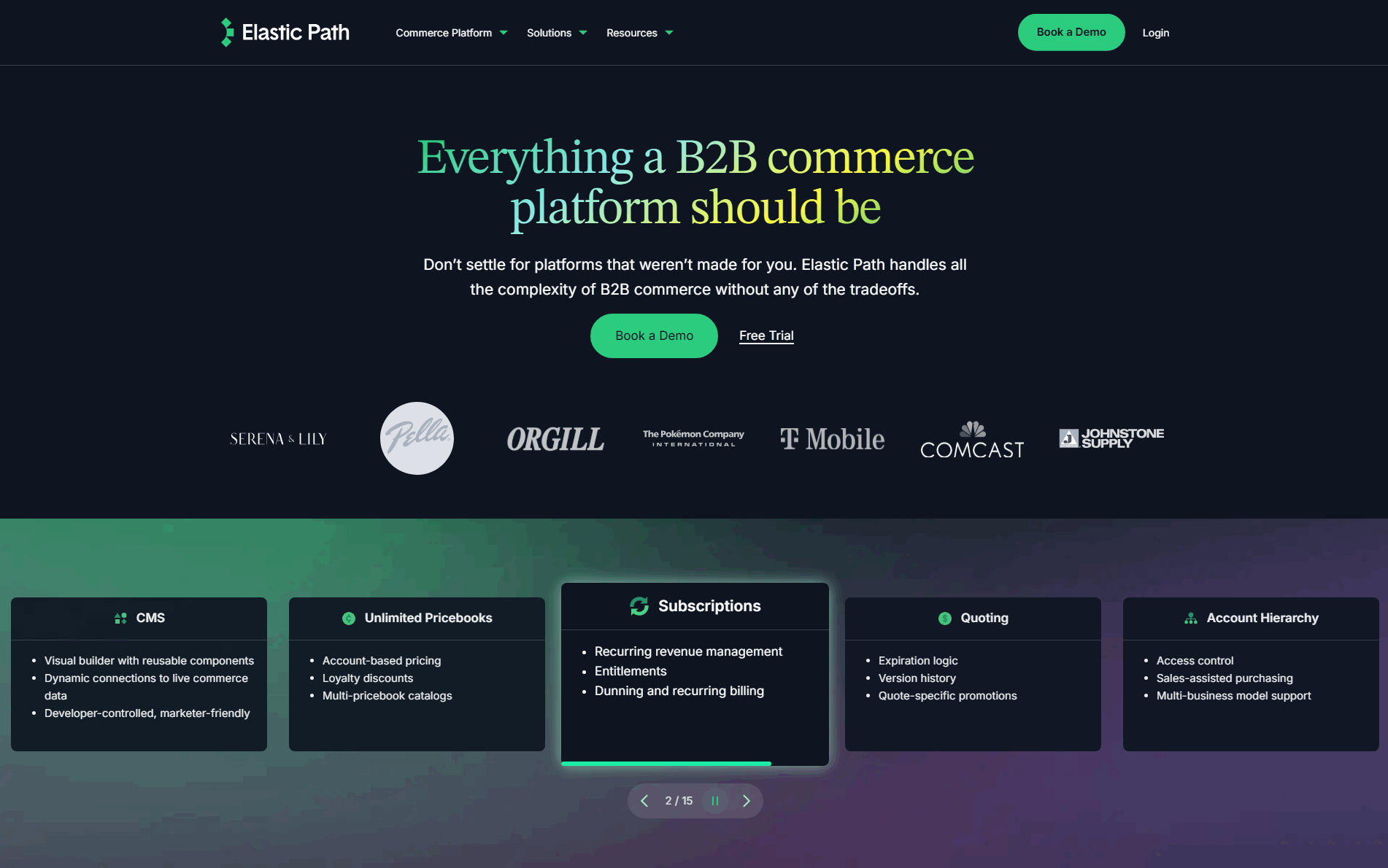
A secondary CTA path is the decision to give the hero two next steps instead of one. The primary action serves the visitor who is ready to act now. The secondary action serves the one who is interested but not ready, by offering a lower-commitment or higher-touch alternative that still moves them forward.
The best heroes use one of a few recurring pairings:
A SaaS hero almost always serves two audiences at the same time. One visitor wants to try the product immediately and resents anything that stands between them and the signup. The other wants to understand the product, or needs buy-in from a team, before committing. A single call to action serves one of them well and abandons the other.
A second path closes that gap. The primary action keeps the self-serve buyer moving, and the secondary action gives the considered buyer something to do other than leave. Done with clear hierarchy, it widens the top of the funnel without slowing the visitor who already knew what they wanted.
About six in ten of the scored hero sections in our library offer a secondary path beside the main CTA. Across the scored examples below, the discipline is hierarchy. The strongest heroes make the primary path obviously dominant, a solid button, and let the secondary sit beside it in a quieter style so the intended default reads at a glance. They also map the split to real buyer types: self-serve trial for individuals and small teams, demo or sales contact for larger evaluations. Heroes from Scoro, Livestorm, and Whatfix pair a free-trial CTA with a demo path; developer-led products like Dyte and Runtime split a build-for-free action from a talk-to-sales path for enterprise buyers.
The second path rarely stands alone. The strongest heroes pair it with a risk reducer in the hero so the self-serve path carries no signup anxiety.
73/100 0/100
0/100The usual failure is two CTAs with equal visual weight, which forces every visitor to make a decision the page should have made for them and slows the buyer who was ready to act. The second failure is a secondary path that goes nowhere useful, a vague "Learn more" that adds a choice without adding a real alternative. Lead with the path most visitors should take, give the second path to the audience it is actually for, and make the hierarchy between them obvious.

Curated by
Gabriel Amzallag , Founder, Web Anatomy
5 years CRO + SEO at Qonto (2021–2025). After advising 15+ SaaS on their websites (Payfit, Pigment…), the same patterns kept breaking, so I decided to build the source of truth on what works on the web: the intelligence layer every tool, builder, and team uses to ship sites that perform.
Paste your URL. Get a scored analysis of your hero section, including whether your CTAs serve self-serve and sales-led buyers. Free, no signup.
The common questions about offering a second hero action, with answers drawn from 177 scored examples.
It is a second call to action placed next to the primary one, aimed at a different kind of visitor. The most common split pairs a self-serve action like 'Start free' with a higher-touch action like 'Book a demo' or 'Talk to sales', so a visitor who is not ready to sign up still has a next step that fits them.
Most SaaS heroes serve two audiences at once: a self-serve buyer who wants to try the product now, and a considered buyer who wants a conversation first. A single CTA forces one of them to leave without acting. A second path captures the buyer the primary action does not fit, without weakening the primary action for the buyer it does fit.
Free trial plus book a demo, build for free plus talk to the team, and one-click signup plus a guided product tour are the patterns that recur most. The pairing usually maps to a self-serve path for individuals and small teams and a sales-assisted path for larger or enterprise buyers.
The primary action stays visually dominant, usually a solid button, and the secondary sits beside or just under it in a lighter style, often a ghost or text button. The hierarchy should make the intended default obvious at a glance, so the second path is available without splitting attention evenly between the two.
It can when both actions carry equal weight, because that forces a choice and slows the visitor who already knew what they wanted. The fix is hierarchy, not removal: lead with the path most visitors should take, and let the second path serve the minority it is meant for without pulling focus from the first.